e-book reader

Saber S.

David Yonge-Mallo
--
David Yonge-Mallo
Software Engineer - Google Waterloo
Saber S.

Roozbeh Pournader
> I can report that the Kindle DX does not support Persian (at least out of
> the box). There's no font, bidi, nor glyph-shaping.
I was shown nicely-rendered Arabic script text on a Kindle quite a
while ago by Addison Philips, an internationalization engineer working
at Amazon. It may have been a developer version, of course.
Roozbeh
PS: Kindle is infected with DRM among other problems
(http://boingboing.net/2007/11/20/amazon-kindle-the-we.html), so it's
not a good idea to buy it even if it supports Persian. Me being a huge
Amazon fan, still can't even think of getting my hand on one. It
promises books, but delivers some air with handcuffs attached.

Behdad Esfahbod
> I was shown nicely-rendered Arabic script text on a Kindle quite a
> while ago by Addison Philips, an internationalization engineer working
> at Amazon. It may have been a developer version, of course.
I believe that's the case.
behdad

Saeed Darya
--
"The best way to predict the future is to create it."
Behdad Esfahbod
> I just sent a persian pdf file to my kindle (the new version3) and it
> worked.
PDF files do not need special support for complex text rendering. Rendering
book metadata and other text on the Kindle does.
behdad
Null
display Persian PDFs without any problem.
Saber S.

Connie Bobroff
Roozbeh Pournader
These two issues are not very related. While OCR for Persian is still
quite limited, that should not limit the adoption of Persian e-books
and Persian-enabled e-book readers. What usually happens with
electronic books is that the publisher usually provides a digital
version of the text with some layout and font information. There is no
need for any pages to be OCR-ed to create an electronic book.
Or, you are talking about something else totally and I fail to
understand your point.
Roozbeh
Connie Bobroff

John Hudson
scholarly editions of classical Indian texts, mostly in Indian scripts
but with a couple of titles in Persian and Urdu. Originally, both the
Persian and Urdu texts would have been written in nastaliq style, and
that is still the clearly preferred style for Urdu. The publishers are
considering what script style to use for the Persian text. I favour
nastaliq for this too, since it is a Persian style and is particularly
appropriate to texts of Mughal Indian origin. The editors, however,
prefer naskh for the Persian on the grounds that this is more common for
Persian typography today, and perhaps think it will be easier for modern
readers. I am intrigued to know what contributors to this list think on
this topic.
JH
--
Tiro Typeworks www.tiro.com
Gulf Islands, BC ti...@tiro.com
A pilgrimage is a journey undertaken in the
light of a story. -- Paul Elie
Roozbeh Pournader
> I have been sitting here in the library turning page after page of print
> books, day after day, looking for instances of ONE WORD.
Believe me, I have also done the same for quite a few things. A funny
one I remember: searching for an example for an isolated form of
Yeh-Hamza in a Persian word (final Yeh-Hamza is there, although rare.
Most famous example is متلألئ). I don't remember if I found any.
What usually happens is, of course, running into some interesting text
on Taghizadeh, or calendars, or Khaarazmi, or Roshdiyye, or something.
And that's the reason I have avoided libraries like crazy. As we say
in Persian, «تو رفتنش با خودمه، ولی بیرون اومدنش با خداس».
> Although I rather
> enjoy it, all this could be accomplished in one split second if this were
> English. Even if someone scans the books, the Persian PDF (or other digital
> format) will not have search capability.
Agreed. We really need good Persian OCR.
> I thought perhaps the makers of
> e-books would hestitate to deal with a language which does not have
> searchable text.
Totally unrelated, IMHO. If there is a market for Persian e-books,
they will do it. Or if Persian support comes for free or very very
cheap (like from supporting Arabic or Urdu), they will do it. Their
e-books will have searchable texts if they are created from digital
sources and not from scanned pages.
> Is OCR not the key to searchable text. Is that not the major hurdle?
Good OCR is needed for digitizing books published before computers (or
when you don't have access to the source files). Other than that, OCR
doesn't play any part in ebooks.
Roozbeh

Peter Hauer
From: Connie Bobroff <con...@gmail.com>
To: Roozbeh Pournader <roo...@gmail.com>
Cc: Saber S. <post...@gmail.com>; Null <sha...@gmx.net>; persian-...@googlegroups.com
Sent: Thu, January 6, 2011 1:56:51 AM
Subject: Re: [p-c] Re: e-book reader

Saeed Rasooli
the cost of complexity! That's because we have not even a full and
bug-less Nastaliq font! The best Nastaliq font I have seen is
IranNastaliq that is about 1 megabytes (because of that complexity),
and even that font have many problems in some cases. Unless there are
few Nastaliq Writer Programs (something like an Office or a Vector
Drawing Software) that have proficiency for writing TRUE Nastaliq. But
anyway Nastaliq is like an ART and not much good for common books.
Thats because almost non of persian books use Nastaliq for their
context, just only may use Nastaliq for their Chapter Titles (as I
know and seen) and other Art-like parts (for example book cover).
There are a couple of fonts that are common for book contents, and
designed to be more readable (or a balance between readability and
beauty). For example Terafik , Koodak and Nazli fonts (from Farsiweb),
FreeFarsi font (from FPF peoject), XB Zar (from IRMUG fonts) and
Nazanin (from Borna fonts)...
My favor font for persian contents (for example web pages) is Terafik.

Nasser Hajloo
font for a book. For sure it's not a good approach to do. You have to
use a simple and easy to read font for this.
I Believe that Farsiweb (Nazli, Terafik, Roya, ...) fonts are just
good enough when you are writing in Persian, in case the creator did
not implement English glyphs on it. So that if you are using something
like SSRS 2008 or other similar tools, those kinds of application
cannot switch font and you will face with serious issues.
IrMug (XB, XM, ..) fonts are better in case of Persian/English issue
but they are not well implemented. for example in XB Traffic you can
see a wrong glyph for - ه - it is not similar to other traffic
glyph.
Dejavu and the rest of Persian fonts have other issues that are not a
good choice to use. For example they are not implemented based on
Unicode ).
By all this, I recommend to use one of the Farsiweb (ROYA, Terafik,
Nazli) or Irmug (XB Nazanin, XB Zar, XB Traffic) or Borna (B
Nazanin // it is not Unicode). I believe that Roya is the in case of
shape and B.B.C Farsi use it for subtitles.
Behdad Esfahbod
> Dejavu and the rest of Persian fonts have other issues that are not a
> good choice to use. For example they are not implemented based on
> Unicode ).
What do you mean?
behdad
Connie Bobroff
Roozbeh Pournader
On Thu, Jan 6, 2011 at 12:11 PM, Connie Bobroff <con...@gmail.com> wrote:
> If it is a [printed-on-paper] scholarly edition, the text should be
> matched in the closest possible font style.
I highly disagree. But it's a long story.
> Why intentionally compromise the
> quality by using an inappropriate font style when the technology exists to
> use a proper font?
If by proper, you mean Nastaliq, I don't think the technology really exists.
> I have not noticed Persian native speakers having any trouble reading typed
> nasta`liq.
I personally do.
> Just look at how fast film credits typed in fancy
> nasta`liq scroll by so fast. (I am the only one rushing to hit the pause
> button!)
There's a difference with familiar names one doesn't usually care
about, and words that one may have not seen before. The former is OK
in Nastaliq, the later is not.
> I should think it would cause more discomfort to read
> the text in an inappropriate naskh than in nasta`liq however,
Agreed. A famous test is avoiding Naskh fonts whose double dots (like
over Teh and under initial-medial Yeh) are not horizontally aligned
for Persian.
> if ease of
> reading is truly the main consideration, please put it in something
> obviously functional (like Tahoma!) so the reader is fully aware that this
> is the situtation.
Tahoma is obviously dysfunctional for Persian, very far from obviously
functional. It works for computer UI, and even barely for that.
If ease of reading is the main consideration, consider fonts like
Nazanin/Nazli, Roya, or Koodak.
> I hope we can get some more opinions and discussion on this issue of typed
> nasta`liq being hard to read for native speakers.
Personal experience: Nastaliq is much slower for me to read, and I
sometimes have trouble reading or distinguishing rarer words,
especially in classical texts. Computer-generated Nastaliq is
especially harder to read for me, as there is also a level of ugliness
inserted that my with-some-editorial-experience eyes can't avoid
noticing, making the experience noticably worse.
Roozbeh
Connie Bobroff
Roozbeh Pournader
> Roozbeh! A lifetime of reading Linux manuals in English has caused you to
> not be comfortable with nasta`liq :) :)
If only I RTFMed...
> Taghizadeh (of whom you appear to be
> a fan) would be very sad to hear you suggesting that Persian be simplified
> rather than you learn the lost art of reading.
Isn't he the guy who said "باید از فرق سر تا ناخن پا فرنگی شویم"? ;)
> Please note that this is a printed, scholarly edition, too.
Exactly for that reason, it should be readable.
> As for whether or not the technology is there, let's see if Tom Milo will
> step in with an update.
I've seen Tom's technology. It's pretty nice, and is perhaps the best
computer Nastaliq I've seen. But it's still quite far from something
good enough to publish fancy books in. But this is moot anyway.
Scholarly editions should not be typeset in Nastaliq.
Roozbeh

Mohsen Emadi
--
Meanwhile everything, everything here

is a miracle only once:
only once Abel's blood
which was to destroy all wars,
only once the irrecoverable, the unconscious of childhood,
only once youth and only once song,
only once love, in the same breath lost...

                                      - Vladimir Holan
Connie Bobroff
Isn't he the guy who said "باید از فرق سر تا ناخن پا فرنگی شویم"? ;)
Exactly for that reason, it should be readable.
> Please note that this is a printed, scholarly edition, too.
I've seen Tom's technology. It's pretty nice, and is perhaps the best
> As for whether or not the technology is there, let's see if Tom Milo will
> step in with an update.
computer Nastaliq I've seen. But it's still quite far from something
good enough to publish fancy books in.
But this is moot anyway.
Scholarly editions should not be typeset in Nastaliq.
Roozbeh Pournader
>> Isn't he the guy who said "باید از فرق سر تا ناخن پا فرنگی شویم"? ;)
>
> Roozbeh, that is completely unfair and out of context but since you jump on
> the band-wagon quoting this infamous line like everyone else, you leave me
> no choice. Can we not argue that he might mean here, IMPROVE the font
> technoogy and teach the scholars who are reading these scholarly texts how
> to read? I cannot imagine Taghizadeh suggesting and text or reader
> settling for the low-hanging-fruit solution.
Please note that I'm a fan of his, have read a bit about the quote,
and this was a joke.
>> > As for whether or not the technology is there, let's see if Tom Milo
>> > will
>> > step in with an update.
>>
>> I've seen Tom's technology. It's pretty nice, and is perhaps the best
>> computer Nastaliq I've seen. But it's still quite far from something
>> good enough to publish fancy books in.
>
> Tom?
"Tom Milo"?
Roozbeh
Connie Bobroff
Please note that I'm a fan of his, have read a bit about the quote,
and this was a joke.
"Tom Milo"?
>> I've seen Tom's technology. It's pretty nice, and is perhaps the best
>> computer Nastaliq I've seen. But it's still quite far from something
>> good enough to publish fancy books in.
>
> Tom?
John Hudson
> Of course Nastaliq is the most beautiful persian style, but that's in
> the cost of complexity! That's because we have not even a full and
> bug-less Nastaliq font!
In this instance, we would be using the Tasmeem plug-in for InDesign ME
to typeset the Persian and Urdu text, so would be using Decotype's
award-winning nastaliq:
http://www.winsoft-international.com/en/products/Tasmeem-fonts-Nastaliq.html
http://www.youtube.com/watch?v=460Qs_c_Ggs
This is confirmed for the Urdu.
It looks like we'll probably use Decotype's Naskh for the Persian.
Connie Bobroff
Hi Connie,Great to hear from you! Happy new year.What a bizarre discussion. I am sure you agree this reverses the argument. There are no books in nastaliq because the technology is failing. Every Iranian knows nastaliq - every student of Persian should. Even a Persian classmate of my daughter (half Dutch, now 24), learned nastaliq in Iran after completing her education in Holland.Allow me to introduce Sam Anwari, who is also following these developments with great interest. I think there is a fundamental misunderstanding in the West about the place of script and about the matter of so-called complexity. I suspect that the editors themselves have difficulty reading nastaliq, but project their ignorance on the target audience.The argument of the missing proper font is of course nonsense. There is IranNastaliq, there are various Urdu nastaliq fonts and there is our DecoType Nastaliq for InDesign. Our own is complete and bug free, it's also very small and covers the Arabic block in Unicode (07xx supplement is not yet ready).With warm regards,t
On 7 Jan 2011, at 20:02, Connie Bobroff wrote:
Tom,Hi, how are you?Can you please participate in this discussion?scroll 1/3 down to the question by John Hudson which has prompted everyone to suggest his publisher (i.e., book, not digital/internet) go for naskh instead of nasta`liq because nasta`liq is 1) hard to read and 2) there is no proper nasta`liq font yet. (It is not clear if the nasta`liq was to be Iran style or Indo style although that does not seem important in this discussion.)It will be a shame if John's publisher goes with naskh unnecessarily.
Thank you.-Connie---------- Forwarded message ----------
From: Behnam Esfahbod ZWNJ <beh...@zwnj.org>
Date: Fri, Jan 7, 2011 at 3:34 AM
Subject: Re: [p-c] Re: Type style for Persian text
To: Connie Bobroff <con...@gmail.com>
Cc: Behdad Esfahbod <beh...@behdad.org>
Connie, Tom Milo is a no-email member, so he can post directly, but he
does not get any email. CC him if you think he should get involved.
-b
On Fri, Jan 7, 2011 at 1:15 AM, Connie Bobroff <con...@gmail.com> wrote:
>>
>> Please note that I'm a fan of his, have read a bit about the quote,
>> and this was a joke.
>
> Have you see this wonderful page someone put together as an archive?
> http://behshad.malakut.org/archives/2006_09.html
> I have often thought that this very list is the closest we have today of the
> Kaveh office in Berlin where these sort of discussions about Persian can
> take place. Of course, we will never have another Taghizadeh, Qazvini,
> Jamalzadeh....
>>
>> >> I've seen Tom's technology. It's pretty nice, and is perhaps the best
>> >> computer Nastaliq I've seen. But it's still quite far from something
>> >> good enough to publish fancy books in.
>> >
>> > Tom?
>>
>> "Tom Milo"?
>
> Exactly. I was just calling out to him (he's a member of this group) hoping
> he would make mincemeat of you! :) Let's see if Tom responds.
>
>
--
' بهنام اسفهبد
' Behnam Esfahbod
'
* .. http://behnam.esfahbod.info
* ` * http://zwnj.org
* o * 3E7F B4B6 6F4C A8AB 9BB9 7520 5701 CA40 259E 0F8B

Thomas Milo
level that we take for granted for Latin, depend on positive reception
and encouragement from the user community. Therefore I do hope
nastaliq will be given a fair chance to be used for what it was
designed: scholarly and literary publications as well as poetry.
In case you're interested, here are some recent examples:
http://www.facebook.com/album.php?aid=45369&id=1806851628&l=fd35445fcb
http://www.facebook.com/photo.php?fbid=1357350112931&set=a.1357346912851.45369.1806851628
http://www.facebook.com/photo.php?fbid=1384167223342&set=a.1357346912851.45369.1806851628
and
http://www.facebook.com/album.php?aid=48367&id=1806851628&l=decdd61832
With best wishes for both the new year and the now rooz
Tom Milo
On Jan 6, 4:38 pm, Roozbeh Pournader <rooz...@gmail.com> wrote:
Thomas Milo
Thomas Milo
For those interested in the versatily of Nastaliq, please take a look
at this footage:
http://www.youtube.com/watch?v=460Qs_c_Ggs
BTW, the next version of our Nastaliq will have keshideh in a regular
Unicode environment. To get an idea what that would entail, consider
this:
http://www.youtube.com/watch?v=ZipEwMFl3hA
t
Roozbeh Pournader
> It looks like we'll probably use Decotype's Naskh for the Persian.
Better than Nastaliq, but DecoType Naskh is still too fancy for
Persian, I believe. I would go for a more modern Naskh.
Roozbeh
Behdad Esfahbod
should be published in Fraktur.
behdad
> tm...@decotype.com <mailto:tm...@decotype.com>
> www.decotype.com <http://www.decotype.com/>
> iPhone +31-6-4188-0859
> Mobile +31-6-2450-3943
> Office +31-20-662-5172
> Skypet.milo
>
> On 7 Jan 2011, at 20:02, Connie Bobroff wrote:
>
>> Tom,
>> Hi, how are you?
>> Can you please participate in this discussion?
>> _http://groups.google.com/group/persian-computing/browse_thread/thread/a6b15aefae90b611_<https://29letters.wordpress.com/2010/12/20/uae-embassy-corporate-type/>
>> * .. http://behnam.esfahbod.info <http://behnam.esfahbod.info/>
>> * ` * http://zwnj.org <http://zwnj.org/>
>> * o * 3E7F B4B6 6F4C A8AB 9BB9 7520 5701 CA40 259E 0F8B
>>
>
>
John Hudson
Naskh is naskh (which is to say that most 'modern naskh' fonts are not,
in fact, naskh; when I'm feeling generous, I call them 'neo-naskh'; when
I'm not feeling generous I call them a lot of rude words, and that goes
even for fonts that I have made). Naskh is a script style composed of a
set of forms and a grammar governing the varieties of ways in which
those forms are used. The virtue of Decotype Naskh is that it implements
that grammar, which means that it *can* be fancy, but it can also be
quite plain, depending on the choices that are made within what the
grammar permits.
Behdad Esfahbod
> Naskh is naskh (which is to say that most 'modern naskh' fonts are not, in
> fact, naskh; when I'm feeling generous, I call them 'neo-naskh'; when I'm not
> feeling generous I call them a lot of rude words, and that goes even for fonts
> that I have made). Naskh is a script style composed of a set of forms and a
> grammar governing the varieties of ways in which those forms are used. The
> virtue of Decotype Naskh is that it implements that grammar, which means that
> it *can* be fancy, but it can also be quite plain, depending on the choices
> that are made within what the grammar permits.
Lets differentiate between Arabic Naskh and Persian Naskh then. Persian Naskh
is a lot simpler than Arabic Naskh.
behdad
Connie Bobroff
http://sartre2.byu.edu/persian/texts/zhaapon1.html
Scan of original AND functional html line-by-line.
Behdad, don't compare German with Persian. Even Americans have lost the ability to read and write cursive English handwriting but we don't care about English the way Iranians care about Persian.
Connie Bobroff
Good OCR is needed for digitizing books published before computers (or
when you don't have access to the source files). Other than that, OCR
doesn't play any part in ebooks.
Roozbeh, yes, that is what I mean, "old" books published before computers. I wasn't even considering works printed in the last decade actually! The older items might actually be the ones with fewer copyright issues but still, I'm not sure if the OCR hurdle is what is keeping these gems offline.
I know of at least one project to scan and digitize entire US library collections,
http://www.hathitrust.org/
they will only make a copyrighted item accessible to IP addresses/users with password if the users would normally be able to use the paper item in that library. I believe international copyright is 75 years and of course--from what I hear--they have no idea what to do with Iran items. Normally, authors can give permission to release part or all of a a work after n years since publication after commercial value dwindles. I believe it is some official policy to respect Iranian works whether or not Iran has signed the copyright treaty or not.
I wonder if there would be a way to let individual authors and publishers in Iran have a choice as to how accessible their books should be? Is anyone working towards this?
John Hudson
> Connie, what you are suggesting is like suggesting that, say, German text
> should be published in Fraktur.
This sort of comparison is not helpful. The use of fraktur -- the norm
for German text for many hundreds of years -- is complicated by
Germany's 20th Century political history. Unless you are implying that
nastaliq has political associations (real or imagined) that have
resulted in its broad cultural abandonment, it is best not to try to
make such cross-cultural comparisons, but rather to try to describe as
accurately as possible the particular role of nastaliq in contemporary
Persian culture (including the influence of technology and its limitations).
John Hudson
> Lets differentiate between Arabic Naskh and Persian Naskh then. Persian Naskh
> is a lot simpler than Arabic Naskh.
Presuming that 'Persian Naskh' represents a preferential subset of
options within the overall grammar of the naskh style, defining an
appropriate Tasmeem preset should be very easy. Of course, this requires
someone to systematically document this preferential subset, i.e. to
describe the characteristics of this use of naskh.
John Hudson
> In reproducing a scholarly text, it is not just the font or the style,
> it's all the details of the formatting and conventions of the day. I
> have learned from this discussion that for scholarly editions, this is
> the only way to go:
> http://sartre2.byu.edu/persian/texts/zhaapon1.html
> Scan of original AND functional html line-by-line.
This depends very much on the nature of the scholarship in question. A
scholarly edition of e.g. Shakespeare's plays does not require a scan on
the First Folio, because the physical characteristics of that edition
are not generally of importance to the textual criticism and comparison
of texts of other early editions. When scholarship deals with a
particular, sometimes unique, manuscript source, then a facsimile of
some kind may be crucial.
Thomas Milo
> >> I've seen Tom's technology. It's pretty nice, and is perhaps the best
> >> computer Nastaliq I've seen. But it's still quite far from something
> >> good enough to publish fancy books in.
you fancy?
On Jan 8, 12:27 am, Roozbeh Pournader <rooz...@gmail.com> wrote:
Thomas Milo
There is no script grammatical difference between Persian Naskh and
Arabic (i.e. Ottoman) Naskh. I have good examples of Persian Naskh in
my library. The differences are stylistic (details of curves and
length of ascenders)
identical in structure and equally simple whether it serves Arabic or
Persian. Again the difference is only stylistic.
Best regards,
Tom
Thomas Milo
There is no script grammatical difference between Persian Naskh and
Arabic (i.e. Ottoman) Naskh. I have good examples of Persian Naskh in
my library. The differences are stylistic (details of curves and
length of ascenders)
On Jan 8, 1:56 am, Behdad Esfahbod <beh...@behdad.org> wrote:
Connie Bobroff
John Hudson
> How did [Linotype] arrive at that style which was quite different
> (less "fancy") than previous fonts? I understand that all this is
> probably a company secret but really, it is their duty to speak up so we
> don't lose this history. If it turns out that it was not actually Tim
> Holloway (or someone else at Linotype) who designed them but rather some
> anonymous Iranian, that is fine, just please let us learn the history.
The Linotype non-Latin archive is now housed at the department of
Typography at the University of Reading in the UK. It is quite well
organised now, but not exhaustively catalogued.
Tim Holloway designed the Karim type -- still my favourite of the
Linotype 'neo-naskh' types --, and the Qalmi nastaliq, as well as types
for Indic scripts. Nazanin was designed by a Mr Haghighi, about whom I
have no other information.
The influence of technical limitations on the development of fonts for
mechanical, photo and even early digital typesetting systems should not
be underestimated. The most obvious example is the development of the
so-called Simplified Arabic style as epitomised by Yakout, which was a
direct result of the limits of newspaper setting machines.
Connie Bobroff
Connie wrote:
The Linotype non-Latin archive is now housed at the department of Typography at the University of Reading in the UK. It is quite well organised now, but not exhaustively catalogued.
Tim Holloway designed the Karim type -- still my favourite of the Linotype 'neo-naskh' types --, and the Qalmi nastaliq, as well as types for Indic scripts. Nazanin was designed by a Mr Haghighi, about whom I have no other information.
The influence of technical limitations on the development of fonts for mechanical, photo and even early digital typesetting systems should not be underestimated. The most obvious example is the development of the so-called Simplified Arabic style as epitomised by Yakout, which was a direct result of the limits of newspaper setting machines.
Thomas Milo
Connie Bobroff
1. Re. Script grammar:
2. Re. Western designs for Arabic:A characteristic feature of Western font designs for Arabic is therefore the absence of grammar.
3. Re. the origin of the "typical Persian naskh style":I have in my library the Persian-Russian dictionary (М.А. Фаффаров, Персидский-Русский Словарь в двух томах) by Mirza Abdullah Gaffarov (ميرزا عبد الله بن عبد الغفار تبريزي М.А.Гаффаров) in two volumes
ʻAbdallāh Ibn-ʻAbd-al-Ġaffār Tibrīzī, and Fedor Evgeńevič Korš. 1902. Muntaḫabāt-i-fārisijja az ātār-i-muallifīn-i-Īrān qarn-i-čahā-rum hiǵrī ilā ajjāminā ba-saʻj wa-imām-i-Mīrzā ʻAbdallāh Ibn-ʻAbd-al-Ġaffār Tibrīzī, Muʻallim dar madrasa-i-Lāzārūf ǵamʻ wanigāšta šud. Trudy po Vostokověděniju, Vyp. 10. Moskva: (Tipo-Lit. ʻRusskago T-va pečatnago i izdatel'skago děla).
It's all very visible in the dictionary, I will put a contrastive example online for those interested.
Thomas Milo
The most moving dictionary preface that I know of adorns the second volume of the Persidsko-Russkii Slovar' [Persian-Russian Dictionary] by M.A. Gaffarov (Mirza Abdallah ebn-e Abd-ol-Ghaffar Tabrizi). The first volume (alef to zhe), replete with explanations of roots, proverbial usages, and quotations from Hafez and Sa'di, had appeared in 1914; the second was delayed by circumstances that will readily, I am sure, suggest themselves. I will let the editor of the second volume tell the story:
The second volume of M.A. Gaffarov's Persian-Russian Dictionary makes its appearance thirteen years after the publication of the first and twenty years after the author began his work. The editor of the first volume, Academician F.E. Korsch, has since passed away, and almost the entire work of putting together the second volume has gone on without his irreplaceable participation. Between the appearance of the first volume and that of the second—everything has changed, even the generally accepted spelling of the Russian language. The initial pages of the second volume (up to the word saf) still preserve the form in which they were published following the appearance of the first volume, i.e., in the old Russian orthography. After the aforementioned word the spelling, paper, and typeface of the book all change—the pages were printed last year and this year, when it has been necessary to content oneself with whatever paper could be found, and to take such type as the printers now have available.The author of the preface was Lev Ivanovich Zhirkov, "one of the founders of national literacy for many unwritten languages of the Northern Caucasus and of the Turkic languages of the USSR" (Vsemirnyi biograficheskii entsiklopedicheskii slovar'). I am happy to report that he lived to a ripe old age and died in 1963.
Naturally, during the preceding years, so rich in events and changes for both Persia and Europe, the languages have changed as well. Both the Persian and Russian languages now include many new words and terms, for the most part pertaining to the social and political spheres, that did not exist when the basic text of the dictionary was being prepared. This unavoidable obsolescence of the material had to be rectified by an extended edition. For the sake of keeping to the plan, it was decided to place all new words and meanings, as well as words added to remedy omissions, in a special section of Addenda. These addenda are quite extensive—the lexicon has undergone too many changes, introduced into the language by life. The not infrequent emendations of the basic text, as well as the not infrequent misprints, are due for the most part to the conditions in which the author was forced to work before and during the war. He worked in the evenings, in the course of long years, after a whole day's labor. The setting of type of various sizes, with lead lining, as well as the lack of skill and experience of the young compositors observable in the beginning, also made matters more difficult and multiplied the deficiencies of the book.
The late F.E. Korsch in his preface to the first volume pointed out the significance of the Dictionary.... The present Dictionary represents the fruit of the living linguistic feeling and extensive erudition of an educated and intelligent Persian. Therein we may see the fundamental significance and fundamental value of this work. The Dictionary presents the entire lexical stock of its author. Thus everything in the Dictionary represents an indisputable fact, existing in a living linguistic consciousness, whereas in the heretofore large Persian dictionaries too much has represented the fruit of the compilers' copying, with varying degrees of critical scrutiny—sometimes greater (Vullers), sometimes lesser (Steingass), and sometimes completely lacking in criticism (Jagiello). In the present Dictionary, perhaps in some respects less material is given, but all of it is unconditionally reliable in the above sense....
For many words in the Dictionary, examples are cited from colloquial, literary and poetic language. On occasion a poetic citation will be encountered even for a word whose meaning would be clear without it. The author thinks that some excess in this respect is no great sin, and hopes that readers and critics will excuse him.
L. Zhirkov.
Connie Bobroff
Thomas Milo
Thomas Milo
Connie Bobroff
|
The Russo-Caucasian origins of the Iranian left : social democracy in modern Iran / Cosroe Chaquéri |
|
Richmond : Curzon, 2001 |
John Hudson
> Do they have letters and diaries and narratives of the history or just
> font sketeches and so forth?
There is at least some documentation: Walter Tracy's filing cabinet went
with the collection, although I can't remember how much stuff and what
was in it. Of course, Fiona Ross teaches at Reading, and has a better
idea of what is contained in the archive.
> But there is more to this. I work with native speakers of Persian all
> day. None of them has any trouble reading nasta`liq at a fast pace
> without any discomfort. I am truly puzzled at the responses to your
> original question. I hope your publisher will make a scan of the
> original in PDF available on a website for download to compensate for
> the recent decision about using naskh. I'm sure most scholars would
> appreciate that.
In this case, I don't think there is an 'original' in the sense of a
particular manuscript. These are new bilingual editions of major
literary works with what I understand to be fairly well established
texts (hence my earlier comparison to scholarly editions of Shakespeare,
which even if they note variant readings between different sources don't
need to produce a facsimile of these).
John Hudson
> I like John's term, "neo-naskh"
> which makes this style seem desirable and I have to say, these
> grammarless fonts are beautiful!
I would say, rather, that *some* of them contain strong graphic forms
and nice treatments of stroke modulation, proportion, etc., and if these
forms were to be married to a proper script grammar, then we'd really be
talking about beauty. Titus Nemeth's Nassim fonts for Tasmeem are a big
step in this direction:
http://www.tntypography.com/nassim.html
On the subject of nastaliq type, I believe that Linotype Qalmi -- which
is not available in any current format -- deserves to be singled out
from much of the approach to Perso-Arabic typeface development among
western type foundries. This was made for early digitial typesetting
systems (before desktop publishing), by Tim Holloway and Fiona Ross,
with dedicated nastaliq software (I'm sorry I can't remember the name of
the man who did the programming. I have copies of the patent
documentation for the Qalmi system, which I made from the originals at
Reading, and it is an intelligent piece of work, both in terms of design
and software. It was designed for Urdu newspaper setting, so it
represents a particular kind of nastaliq performance, rather than a full
grammar such as Tom has implemented, but the analysis is solid.

Hooman Mehr
I wonder if there would be a way to let individual authors and publishers in Iran have a choice as to how accessible their books should be? Is anyone working towards this?
Hooman Mehr
I am consulting with a publisher on the production of a number of scholarly editions of classical Indian texts, mostly in Indian scripts but with a couple of titles in Persian and Urdu. Originally, both the Persian and Urdu texts would have been written in nastaliq style, and that is still the clearly preferred style for Urdu. The publishers are considering what script style to use for the Persian text. I favour nastaliq for this too, since it is a Persian style and is particularly appropriate to texts of Mughal Indian origin. The editors, however, prefer naskh for the Persian on the grounds that this is more common for Persian typography today, and perhaps think it will be easier for modern readers. I am intrigued to know what contributors to this list think on this topic.
JH
--
Tiro Typeworks www.tiro.com
Gulf Islands, BC ti...@tiro.com
A pilgrimage is a journey undertaken in the
light of a story. -- Paul Elie
Thomas Milo
that my judgment was perhaps a bit too harsh. The punch cutter who
created this bold typeface did a good job innovating Arabic script.
What makes it a lanmark is that the innovation as such. He is
certainly playing in a different league than beginners like the
Dutchman Thomas Erpenius and contemporaries, who either had no samples
or were mislead by Hebrew examples. This person must have had ample
access to real manuscript sources, as one can glean from the preface
to the first, 1914 volume. To this day the St Petersburg Oriental
Institute harbours a host of Islamic manuscripts from all over the
Eurasian Russian Empire. The project was financed by Prince Abamelek
Lazarev (http://www.encspb.ru/en/article.php?kod=2804002236), an other
indication that the work was thorough. From the shapes one gets the
impression that the punch cutter took his inspiration from Bihari
script. Distinctive - and innovative - features are the triangle-
shaped Alef and the standardization of open Meem, where naskh script
grammar would require a complementary distribution of open
(horizontally connected) and closed (vertically connected) Meems.
In the second part of the production all the typefaces are different.
It would not be unlikely that all lead was simply requisitioned to be
turned into bullets. The post-revolutionary typography is plain and
utilitarian, none of the original elegance remains. The Arabic
typeface could have been a precursor of the SIL Schehrazade typeface:
no ligatures except Lam-Alef (which is in fact a fusion, not a
ligature).
On Jan 8, 9:40 pm, Thomas Milo <decot...@gmail.com> wrote:
> The observation I would like to bring to our attention is that the design of this - pre-revolutionary - bold typeface is curiously innovative (instead of descriptive, as most contemporary Arabic typefaces tried to be). It is in a clearly non-Middle Eastern in style and has all the hallmarks of what is considered modern Iranian type design.
>
> This all warrants further investigation, but I suspect that this novel bold typeface is a case of Imperial Russian typography comparable with colonial Dutch typography for Arabic and Malay - i.e., pragmatic designs by cultural outsiders with very limited access to source material and no awareness at all of traditional Islamic script grammar - but the with the confidence of power.
>
> The punch cutter was probably ordered to create a bold counterpart to the body text, and was at a loss how to shape it. Apparently he, probably unintentionally, applied his own, alien sense of shape and proportions on the Arabic typeface. This would be very similar to what one can observe in European Arabic typography in general and Dutch Arabic typography in particular.
>
> It's all very visible in the dictionary, I will put a contrastive example online for those interested.
>
> Enjoy,
>
> t
>
> Thomas Milo
> tm...@decotype.comwww.decotype.com
> iPhone +31-6-4188-0859
> Mobile +31-6-2450-3943
> Office +31-20-662-5172
> Skype t.milo
>
> On 8 Jan 2011, at 18:44, Connie Bobroff wrote:
>
> > One thing that would be helpful is if we could finally learn about the history of the Persian naskh fonts that we have all become so accustomed to, we think they are the TRUE Persian style. I'm talking about Nazanin, Roya, etc. Linotype was commusioned by Kayhan newspaper to make these fonts in the 1970s. Fiona Ross had told me--before she got tired of anwering my emails--- the person who actually designed the fonts was Tim Holloway
> >http://www.linotype.com/427/timholloway.html
> > but would not provide any more details. Linotype has produced a small amount of historical documentation and pictures but nothing detailed. Since these fonts have had such an impact on shaping everyone's conception of what Persian naskh is, Fiona and Tim really need to speak up. All those fonts have a certain look and a certain "grammar" as Tom calls it. How did they arrive at that style which was quite different (less "fancy") than previous fonts? I understand that all this is probably a company secret but really, it is their duty to speak up so we don't lose this history. If it turns out that it was not actually Tim Holloway (or someone else at Linotype) who designed them but rather some anonymous Iranian, that is fine, just please let us learn the history.
> > -Connie
>
Saber S.
Thomas Milo
grammar and good design.
Introducing the a linguistic concept like "grammar" in the field of
script analysis creates the opportunity to apply "grammatical"
concepts to the subject matter. I find the notions of "Competence" and
"Performance" helpful. In the field of script handling - writing or
making fonts - Competence relates to knowledge of the grammar while
Performance to the individual application of grammar rules. I think
beauty is brought into script by Performance. For all clarity, a
"grammarless" script has of course still grammar - but it's no longer
legacy grammar. To bring in another linguistic analogy: in comparison
with traditional scripts (handwritten or typeset), modern typefaces
could be called "pidginized". But like pidgin English can be
pronounced beautifully, so a typeface stripped of script grammar can
be designed to look good.

S
the box, i read many of hedayat's books on my Kindle DXG.
I can post pictures if you want to.
"I can report that the Kindle DX does not support Persian (at least
out of
the box). There's no font, bidi, nor glyph-shaping. "
Titus Nemeth
I was copied into this email by Thomas Milo.
Your desire that a history of the Linotype typefaces must be told is very understandable and I agree, such an account is long overdue. Unfortunately most publications that claim to deal with the subject are either omitting half (or indeed all) the story, or are substantially flawed. In many instances the information provided by Linotype GmbH is no exception to this.
As it happens I'm currently undertaking research about the history of mechanised Arabic typography, having, amongst other things, the goal to credit people involved in important developments in Arabic typography. I agree, we do not know much about them, but rather than blaming those that do not 'speak up', one should remember that those, that are all too noisily audible do not always tell (or indeed know) the bigger picture.
You will certainly appreciate that such research, if taken seriously, needs time. However, I hope that eventually it will help to answer questions like the ones you posed.
Best regards
Titus
January 9 - January 16: Marrakech (MOR)
January 21 - January 27: Reading (UK)
--
tntypography.com
--
11, rue Lesage
bâtiment A, 5e étage
75020 Paris
France
--
F landline: (+33)-(0)-1-71 93 32 95
UK mobile: (+44)-(0)-7-551 39 70 78
F mobile: (+33)-(0)-6-10 04 88 46
AT mobile: (+43)-(0)-650-911 0679
--
Skype: titusgarciaramon
--
Thomas Milo
John Hudson
> To bring in another linguistic analogy: in comparison
> with traditional scripts (handwritten or typeset), modern typefaces
> could be called "pidginized". But like pidgin English can be
> pronounced beautifully, so a typeface stripped of script grammar can
> be designed to look good.
And may become, in the hands of a new generation, a fully-fledged creole
with its own grammar, thus completing the analogy.
JH
--
Tiro Typeworks www.tiro.com
Gulf Islands, BC ti...@tiro.com
Thomas Milo
On Jan 9, 6:33 pm, John Hudson <j...@tiro.ca> wrote:
> Thomas Milo wrote:
> > To bring in another linguistic analogy: in comparison
> > with traditional scripts (handwritten or typeset), modern typefaces
> > could be called "pidginized". But like pidgin English can be
> > pronounced beautifully, so a typeface stripped of script grammar can
> > be designed to look good.
>
> And may become, in the hands of a new generation, a fully-fledged creole
> with its own grammar, thus completing the analogy.
>
> JH
>
> --
>
> Tiro Typeworks www.tiro.com
Behdad Esfahbod
You probably are talking about historical Persian Naskh. I don't dispute
that. My point (and I guess Roozbeh's) is that in this day and age, what was
common 100 years ago is irrelevant re what I want to see my Persian text set with.
People keep talking about limitations of technology that simplified Persian
writing. They fail to talk about limitations of handwriting that made it
impossible to have straight lines back then....
To summarize, I don't think we want what was common 100 years ago, even if
technology allows it these days. That's all I'm saying.
behdad
Thomas Milo
I tried to explain that there's Naskh and there's simplified Naskh. For
the consumer it's a matter of choice. My focus is on providing freedom
of choice, by making them all technically possible.
Best regards,
t
--
Behdad Esfahbod
I understand, and appreciate that point of view. I was responding to Connie
mostly who seems to be insisting that technology-permitting, we shall return
to the good old styles of Persian...
b

karine
Thomas Milo wrote:
Introducing the a linguistic concept like "grammar" in the field of
script analysis creates the opportunity to apply "grammatical"
concepts to the subject matter. I find the notions of "Competence" and
"Performance" helpful. In the field of script handling - writing or
making fonts - Competence relates to knowledge of the grammar while
Performance to the individual application of grammar rules. I think
beauty is brought into script by Performance. For all clarity, a
"grammarless" script has of course still grammar - but it's no longer
legacy grammar. To bring in another linguistic analogy: in comparison
Thomas Milo
from a periods between 2400 and 1900 years ago. So I am acutely aware
that to this day the vast majority of western books are printed in
classic Roman typefaces that preserve the essentials of a two-and-a-half
millenia old script. Call it conservative. But in any case, you
shouldn't be surprised that Connie, or me for that matter, are a bit
incredulous that Iranians would trash their glorious text tradition in
favour of a one-century old alien concept, arguing that texts shouldn't
look the way they way they looked a century ago.
:-)
Behdad Esfahbod
First, I don't think the comparison is meaningful. What constitutes
comfortable type for me as a native Persian has nothing to do with what
constitutes comfortable type for you as a native Latin-script user.
Second, it occurs to me that the two-and-a-half millenia script you are
talking about was subject to the same technical limitations that the
century-old Latin script was: both were inscribed, one on stone, the other on
wood / metal. The Arabic script however, became popular when handwriting on
various kinds of "paper" were the common mode of preserving text.
behdad
Connie Bobroff
Connie Bobroff
Tom, I’m still not sure “Arabic” includes “Perso-Arabic” and “Persian.” Maybe in some contexts but not always. Using linguistic terminology, especially “performance” and competence” for the script is very apt. The way a person writes and types is part of his or her identity but subject to environment and possibly can’t really be taught in a “classroom” after a certain age without a “foreign accent.” Note that creoles or any spoken variant of a written/formal language can be even more complex than the original, even if no one bothers to document it. Karine, there REALLY IS a full PRESCRIPTIVE grammar--
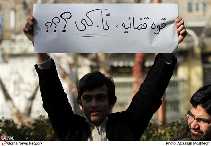
--of the script with tons of rules (mostly forgotten alas!) and it used to be part of the culture to pass these rules down through the generations. I agree for everyday use, it is not so much an issue but in a culture where calligraphy plays a major role, people should have a choice to at least learn the traditional rules. Behdad, please see the attached picture with the little boy holding up his proud Tahoma final Yeh (which h is teacher probably told him was the correct way since it’s on a straight line). Don’t you feel sorry for that little boy? Unlike you, he won’t have the CHOICE to write according to the rules –even for a scholarly reproduction of a classical text-- because he is being deprived of the knowledge of the rules and only knows about neo-naskh and thinks that’s “good old style Persian.” (Ok, I’m exaggerating to make a point but hope this picture scared you!). Hooman, I totally agree that Tasmeem might be dangerous in the wrong hands. Perhaps customers should only be allowed to use it if they have read Tom’s Grammar first. Tom, have you put in some alert pop-ups in the font to prevent something even worse than neo-naskh?!
From Mostofi (just for fun):
….The simplest device was to use the Arabic alphabet, but diversified with art and beauty to give it a special character. Before long the people of Iran surpassed the other Arab-dominated nations in this form of art. The style was divided into four groups of lettering. The “Sols” (one third) style was for the purpose of inscription. “Naskh” was the style for copying books. And the third, “Ta`liq,” was for the purpose of writing decrees and letters. Finally, there is “Toghra” for titles and headings. The rest of the Arab nations followed this precedent. But our Persian forefathers were not content to just be the inventor of the handwriting of the Arab Empire. They had to create a new and different style for their own language. The outcome was the style of “Nasta`liq,” a broken style of handwriting, composed of “Naskh” and “ta`liq,” which was strictly for letter writing. Like any other form of art, this style did not have set rules from its inception. Mir Ali Heravi was a contemporary of Shah Abbas Safavi (1587-1629) and the master of Mir Emad. He devised basic rules for style and altered the existing ones in an edition entitled, “Adab ol-Mashq,” henceforth, making the Persian style of Nasta`liq one of the branches of the fine arts. The style of Mir Emad has remained unchanged to the present day.
Source:
Volume 1 (of 3), p. 147.
Mustawfī, ʻAbd Allāh, d. 1950. Sharḥ-i zindigānī-i man. English. The administrative and social history of the Qajar period : the story of my life / by Abdollah Mostafi ; translated from the Persian by his daughter, Nayer Mostofi Glenn. Pub Info Costa Mesa, Calif. : Mazda Publishers, 1997.
Also see Persian original:
Mustawfī, ʻAbd Allāh, d. 1950. Sharḥ-i zindiganī-i man yā tārīkh-i ijtimāʻī va idārī-yi dawrahʼi Qājāriyah. Ṭihrān : Kitabʹfurūshi-yi Zavvar, [1964-]
Webkarine

Behnam
<AzizallahMoshfeghi.png>
Karine Megerdoomian
Karine, there REALLY IS a full PRESCRIPTIVE grammar--
[3.a. A normative or prescriptive set of rules setting forth the current standard of usage for pedagogical or reference purposes.(Couresty The Free Dictionary)]
Thomas Milo
On Jan 10, 1:44 am, Behdad Esfahbod <beh...@behdad.org> wrote:
> Tom,
>
> First, I don't think the comparison is meaningful. What constitutes
> comfortable type for me as a native Persian has nothing to do with what
> constitutes comfortable type for you as a native Latin-script user.
take your word for it. I am merely observing that what may very well
turn out to be a century old alien design (the bold typeface spotted
in Gaffarov's Persian-Russian dictionary), redesigned and extended
with a lighter weight by Linotype, is in a position to erase a
millennium of Persian contribution to Islamic script.
BTW, it would be interesting to learn what Karina thinks of
"nativeness"of script users :-)
> Second, it occurs to me that the two-and-a-half millenia script you are
> talking about was subject to the same technical limitations that the
> century-old Latin script was: both were inscribed, one on stone, the other on
> wood / metal. The Arabic script however, became popular when handwriting on
> various kinds of "paper" were the common mode of preserving text.
that's not relevant here.
Thomas Milo
On Jan 10, 3:16 am, Connie Bobroff <conn...@gmail.com> wrote:
> Some very hastily written replies:
>
> Tom, I’m still not sure “Arabic” includes “Perso-Arabic” and “Persian.”
all Arabic-scripted languages are welcome and should be supported. So
don't worry: Persian is included.
> Hooman, I totally agree that Tasmeem might be dangerous in the wrong hands.
set of professional menus in InDesign. What danger can it do in wrong
hands? Would you also issue warnings about the Vanishing Point Filter
in Adobe Photoshop? Or Windows Control Panel? Or the new Mac App
store?
> Perhaps customers should only be allowed to use it if they have read Tom’s
> Grammar first.
he/she would do with any other font. The projected Script Grammars
will be academic publications, documenting the research we did into
Arabic script to make this possible.
> Tom, have you put in some alert pop-ups in the font to
> prevent something even worse than neo-naskh?!
Thomas Milo
> Script is very different from language and requires very distinct
> methodology as well as theoretical terminology.
terminology is a very good candidate.
> You may want to revisit the linguistic definition of "competence"...
> being part of someone's "identity" is a social construct, not
> something that is innate (i.e., part of the mental faculty)- big
> difference. I think if you want to use those terms in the script
> context, you really need to redefine them so that we keep a semblance
> of scientific approach.
http://books.google.nl/books?id=wOMO2s7RRsYC&pg=PA6&dq=thomas+milo+ohlig+gross+computing+and+the&hl=en&ei=bjkrTaC0D8nsOaatmesC&sa=X&oi=book_result&ct=result&resnum=1&ved=0CCIQ6AEwAA#v=onepage&q&f=false
Just scroll to page 502
> As for the creole part -- I understand quite well the definition of
> "creole language". The point I was raising was about "creole script"
> that was mentioned in the email thread, which makes no sense
> linguistically as far as I can see.
with my own "Systemzwang". He might also have been referring to this
kind of development:
http://www.khtt.net/page/106/en
> The point you make that people who learn a script beyond a certain age
> are in effect writing with an "accent" is interesting. Has there been
> research on that? Could you send me a reference on that one?
Thomas Milo
On Jan 10, 4:34 am, Karine Megerdoomian <webkar...@zoorna.org> wrote:
> > Karine, there REALLY IS a full PRESCRIPTIVE grammar--
> would've noticed that I said if you're using "script grammar" in the
> sense of prescriptive grammar, i.e., a set of rules that people have
> defined, then that's okay. In fact, I used rules to teach Persian
> handwriting in class when I was teaching heritage Persian at UCSD and
> it worked really well. I would be happy to share that with the list if
> there is interest.
style. The nearest to this gets T F Mitchell with his WRITING ARABIC,
a practical Introduction to the Ruq`ah Script. All else I have ever
seen are collections of hints, most of the very stereotyped and
repetitive.
> But if you're using it in the linguistic sense - which is what Tom
> Milo was suggesting -- then it doesn't make sense. To put it simply,
> grammar in generative linguistics refers to the principles that define
> the innate knowledge of language (i.e., the brain architecture).
> Clearly, this does not apply to scripts and typefaces.
posting with link to the actual article.
> Here's something to consider about the difference between script and
> language: All cultures and societies have a language (or several
> dialects of a language) but not every culture has a script -- one
> argument against script being innate and the same as language.
between speakers will speak - a "wolf-child" doesn't. A Papua child
that grows up in Xinjiang will speak - and probably write - Uyghur,
not Papua - so there's nothing innate about a specific language - nor
script - in the brain architecture, only the faculty of speech - and
writing. And - there is no script without language, so the faculty of
writing cannot be too far off from the faculty of speech. Connie's
suggestion about writing "with an accent" cold also be seen in this
light.

Peter von Kaehne
> The point you make that people who learn a script beyond a certain age
> are in effect writing with an "accent" is interesting. Has there been
> research on that? Could you send me a reference on that one?
http://hal.inria.fr/inria-00112630/en/
--
GMX DSL Doppel-Flat ab 19,99 Euro/mtl.! Jetzt mit
gratis Handy-Flat! http://portal.gmx.net/de/go/dsl
John Hudson
> I am merely observing that what may very well
> turn out to be a century old alien design (the bold typeface spotted
> in Gaffarov's Persian-Russian dictionary), redesigned and extended
> with a lighter weight by Linotype....
Mr Hagighi, whoever he was, was not an in-house designer at Linotype.
The Nazanin typeface appears to have originated, originally under the
name Hagighi, outside Linotype, and to have been brought to them for
manufacture for use with Linotype machines. [Remember that at that date
the typefaces were not the product: the machines were the product, and
the typefaces were added value.]
J.
--
Tiro Typeworks www.tiro.com
Gulf Islands, BC ti...@tiro.com
John Hudson
conventional system. Such a system could be taught as a set of
'prescriptive rules', as Karine suggests, but it isn't inherently
prescriptive; study of a script style involves -- or should involve --
descriptive analysis of the system, as a culturally evolved phenomenon.
The kind of contents of the conventional system of a script style
depends on the characteristics of that style. In the case of script
styles of the (Perso-)Arabic writing system, connectivity of letters is
a key characteristic and, hence, one of the most important features of
the grammar of these script styles is how letters connect and what
happens to them within lettergroups (or 'fusions' as Tom calls them). It
is the difference in this aspect of their grammar that primarily
distinguishes the naskh style from what I call neo-naskh, whereas what
they have in common are superficial aspects of letter shape and detail.
Connectivity of letters is also a characteristic of *some* Latin script
styles, and interestingly for me the grammar of e.g. 18th Century
English round hand are comparable in many ways to those of naskh,
including the important distinction of which letter sequences join from
the top of the letter and which join from the baseline. Similarly, the
challenges to implementation of these script styles in typesetting
systems and fonts parallel each other, with the same issues arising from
the use of ligatures vs. contextual variants or stroke components.
JH
*I use the phrase script style to distinguish from the Unicode concept
of script, which I would call writing system. A writing system is
abstracted ('Arabic script'); a script style is concrete ('Naskh').
Thomas Milo
he trained for it!
On Jan 9, 12:18 am, Connie Bobroff <conn...@gmail.com> wrote:
> There was one Mirza Ilyas Boraganskii (1852-1942) whose "Muslim press made
> invaluable contributions to the cultural advancement of the Muslims of
> Russia".
> I'm attaching his bio which is taken from this source:
> Islam v Sankt-Peterburge : ·en´t`siklopedicheskii slovar’ /
> [redak´t`sionna´i`a kollegi´i`a D.Z. Khairetdinov (sostavitel’ i
> otvetstvennyi redaktor serii) ... et al.]. Moskva ; Nizhnii Novgorod : ID
> "Medina", 2009.
>
> Also, see the following wonderful book, especially about the Iranian
> presence in Baku before WWI. I think an understanding of this period will
> explain a lot.
>
> Chaquèri, Cosroe<http://catalog.lib.washington.edu/search~S6?/aChaqu%7b225%7deri%2C+Co...>.
>
> *The Russo-Caucasian origins of the Iranian left : social democracy in
> modern Iran / Cosroe Chaquéri*
>
> Richmond : Curzon, 2001
>
> On Sat, Jan 8, 2011 at 2:56 PM, Thomas Milo <decot...@gmail.com> wrote:
> > Well - at least Gaffarov clearly proves that Linotype isn't the original
> > source. Original design and respect for copyrights have never been a feature
> > of the typeface industry. G.W. Ovink, the inhouse historian of the Amsterdam
> > Type Foundry N. Tetterode spells this out quite honestly in his History of
> > Tetterode. I am preparing a publication of some great examples exposing
> > Tetterode's Arabic work in this sense.
>
> > How Russian typography came to produce a bold typeface (at that time
> > unheard of for Arabic) is the next thing to be researched. It's a curious
> > innovation and I believe it will provide the answer to your original
> > question: what are the roots of modern "innovative" Persian neo-naskh.
>
> > The distinctive characteristics of "Gaffarov Bold" - some of them we no
> > relation to actual Arabic script practice - remain characteristic of later
> > Soviet Arabic typography, and, curiously and probably through the Linotype
> > connection, for most initial Arabic work of Reading-educated designers.
> > Thomas Milo
> > tm...@decotype.com
> >www.decotype.com
> > iPhone +31-6-4188-0859
> > Mobile +31-6-2450-3943
> > Office +31-20-662-5172
> > Skype t.milo
>
>
> > Yes, this definitely qualifies for "good old Persian". So Gaffarov
> > started it all, not Linotype...
>
> > On Sat, Jan 8, 2011 at 2:30 PM, Thomas Milo <decot...@gmail.com> wrote:
>
> >> Voilà, the two page doublets that document the revolutionary transition
> >> in Gaffarov's dictionary.
>
> >>www.decotype.com/Gaffarov_1914-vs-1928.pdf
> >> Thomas Milo
> >> tm...@decotype.com
> >>www.decotype.com
> >> iPhone +31-6-4188-0859
> >> Mobile +31-6-2450-3943
> >> Office +31-20-662-5172
> >> Skype t.milo
>
> >>http://www.languagehat.com/archives/2002_12.php). I could not identify
> >> the author of this excellent posting.
>
> >> The most moving dictionary preface that I know of adorns the second volume
> >> of the *Persidsko-Russkii Slovar'* [Persian-Russian Dictionary] by M.A.
> >> Gaffarov (Mirza Abdallah ebn-e Abd-ol-Ghaffar Tabrizi). The first volume
> >> (alef to zhe), replete with explanations of roots, proverbial usages, and
> >> quotations from Hafez and Sa'di, had appeared in 1914; the second was
> >> delayed by circumstances that will readily, I am sure, suggest themselves. I
> >> will let the editor of the second volume tell the story:
>
> >> The second volume of M.A. Gaffarov's Persian-Russian Dictionary makes its
> >> appearance thirteen years after the publication of the first and twenty
> >> years after the author began his work. The editor of the first volume,
> >> Academician F.E. Korsch, has since passed away, and almost the entire work
> >> of putting together the second volume has gone on without his irreplaceable
> >> participation. Between the appearance of the first volume and that of the
> >> second—everything has changed, even the generally accepted spelling of the
> >> Russian language. The initial pages of the second volume (up to the word
> >> *saf*) still preserve the form in which they were published following the
> >> appearance of the first volume, i.e., in the old Russian orthography. After
> >> the aforementioned word the spelling, paper, and typeface of the book all
> >> change—the pages were printed last year and this year, when it has been
> >> necessary to content oneself with whatever paper could be found, and to take
> >> such type as the printers now have available.
>
> >> Naturally, during the preceding years, so rich in events and changes for
> >> both Persia and Europe, the languages have changed as well. Both the Persian
> >> and Russian languages now include many new words and terms, for the most
> >> part pertaining to the social and political spheres, that did not exist when
> >> the basic text of the dictionary was being prepared. This unavoidable
> >> obsolescence of the material had to be rectified by an extended edition. For
> >> the sake of keeping to the plan, it was decided to place all new words and
> >> meanings, as well as words added to remedy omissions, in a special section
> >> of Addenda. These addenda are quite extensive—the lexicon has undergone too
> >> many changes, introduced into the language by life. The not infrequent
> >> emendations of the basic text, as well as the not infrequent misprints, are
> >> due for the most part to the conditions in which the author was forced to
> >> work before and during the war. He worked in the evenings, in the course of
> >> long years, after a whole day's labor. The setting of type of various sizes,
> >> with lead lining, as well as the lack of skill and experience of the young
> >> compositors observable in the beginning, also made matters more difficult
> >> and multiplied the deficiencies of the book.
>
> >> The late F.E. Korsch in his preface to the first volume pointed out the
> >> significance of the Dictionary.... The present Dictionary represents the
> >> fruit of the living linguistic feeling and extensive erudition of an
> >> educated and intelligent Persian. Therein we may see the fundamental
> >> significance and fundamental value of this work. The Dictionary presents the
> >> entire lexical stock of its author. Thus everything in the Dictionary
> >> represents an indisputable fact, existing in a living linguistic
> >> consciousness, whereas in the heretofore large Persian dictionaries too much
> >> has represented the fruit of the compilers' copying, with varying degrees of
> >> critical scrutiny—sometimes greater (Vullers), sometimes lesser (Steingass),
> >> and sometimes completely lacking in criticism (Jagiello). In the present
> >> Dictionary, perhaps in some respects less material is given, but all of it
> >> is unconditionally reliable in the above sense....
>
> >> For many words in the Dictionary, examples are cited from colloquial,
> >> literary and poetic language. On occasion a poetic citation will be
> >> encountered even for a word whose meaning would be clear without it. The
> >> author thinks that some excess in this respect is no great sin, and hopes
> >> that readers and critics will excuse him.
>
> >> *L. Zhirkov.*
>
> >> The author of the preface was Lev Ivanovich Zhirkov, "one of the founders
> >> of national literacy for many unwritten languages of the Northern Caucasus
> >> and of the Turkic languages of the USSR" (*Vsemirnyi biograficheskii
> >> entsiklopedicheskii slovar'*). I am happy to report that he lived to a
> >> ripe old age and died in 1963.
>
>
>
> borganskii.pdf
> 172KViewDownload
Connie Bobroff
Thomas Milo
European scholars' total disconnect with Islamic script: Jones was the
author or the first English "Grammar of the Persian Language", which
lends special relevance to this artifact.
Instead of using the Persian script of his days, or at least any kind
of valid contemporary Islamic script, Sir William Jones writes Persian
in a clumsy Arabesque fantasy style that for a long time existed
exclusively among Western scholars - and the Western typographers they
advised. As such Jones falls in line with all other European scholars
whose writings and typesetting I have inspected so far. It this kind
of scholarship that drove Arabic typography into a direction that,
ironically, now threatens to replace the Perso-Arabic script
tradition.
On Jan 11, 7:42 pm, Connie Bobroff <conn...@gmail.com> wrote:
> Attached is treat for you. It is a sample of the handwriting of Sir William
> Jones from his papers stored in New York. (Note the quatrain is probably NOT
> from Khayyaam as indicated but that is not the point here.)
>
> > > > Mobile +31-6-2450-3943begin_of_the_skype_highlighting +31-6-2450-3943 end_of_the_skype_highlighting
> > > > Office +31-20-662-5172begin_of_the_skype_highlighting +31-20-662-5172 end_of_the_skype_highlighting
>
> > > > On 8 Jan 2011, at 23:38, Connie Bobroff wrote:
>
> > > > Yes, this definitely qualifies for "good old Persian". So Gaffarov
> > > > started it all, not Linotype...
>
> > > > On Sat, Jan 8, 2011 at 2:30 PM, Thomas Milo <decot...@gmail.com>
> > wrote:
>
> > > >> Voilà, the two page doublets that document the revolutionary
> > transition
> > > >> in Gaffarov's dictionary.
>
> > > >>www.decotype.com/Gaffarov_1914-vs-1928.pdf
>
> > > >> Thomas Milo
> > > >> tm...@decotype.com
> > > >>www.decotype.com
> > > >> Mobile +31-6-2450-3943begin_of_the_skype_highlighting +31-6-2450-3943 end_of_the_skype_highlighting
> > > >> Office +31-20-662-5172begin_of_the_skype_highlighting +31-20-662-5172 end_of_the_skype_highlighting
> 515KViewDownload
Thomas Milo
pages, there was no relation between the regular and the bold
typeface. The regular weight of Nazanin however, does have such a
relation.
On Jan 10, 8:14 pm, John Hudson <j...@tiro.ca> wrote:
> Thomas Milo wrote:
> > I am merely observing that what may very well
> > turn out to be a century old alien design (the bold typeface spotted
> > in Gaffarov's Persian-Russian dictionary), redesigned and extended
> > with a lighter weight by Linotype....
>
> Mr Hagighi, whoever he was, was not an in-house designer at Linotype.
> The Nazanin typeface appears to have originated, originally under the
> name Hagighi, outside Linotype, and to have been brought to them for
> manufacture for use with Linotype machines. [Remember that at that date
> the typefaces were not the product: the machines were the product, and
> the typefaces were added value.]
>
> J.
>
> --
>
> Tiro Typeworks www.tiro.com
Thomas Milo
pages, there was no relation between the regular and the bold
typeface. The regular weight of Nazanin however, does have such a
relation.
On Jan 10, 8:14 pm, John Hudson <j...@tiro.ca> wrote:
> > I am merely observing that what may very well
> > turn out to be a century old alien design (the bold typeface spotted
> > in Gaffarov's Persian-Russian dictionary), redesigned and extended
> > with a lighter weight by Linotype....
>
> Mr Hagighi, whoever he was, was not an in-house designer at Linotype.
> The Nazanin typeface appears to have originated, originally under the
> name Hagighi, outside Linotype, and to have been brought to them for
> manufacture for use with Linotype machines. [Remember that at that date
> the typefaces were not the product: the machines were the product, and
> the typefaces were added value.]
>
> J.
>
> --
>
> Tiro Typeworks www.tiro.com
Connie Bobroff
Thomas Milo
One should admit, at least it is readable and functional
John Hudson
same pointed nib that he used to write English. Beginning in the 17th
century, and flourishing -- literally as well as figuratively -- in the
18th century, European writing masters developed script styles around
the characteristics of the pointed, split steel nib, as distinct from
the broad nib used in mediaeval and renaissance writing.* The split nib
remained the common writing implement in Europe and the Americas until
the Italic revival of the 20th century.
Jones' English handwriting isn't particularly good, but it works
naturally with the characteristics of the pointed nib. The Arabic
falters terribly though, and I suspect the awkwardness of many of the
forms is a result of trying to push the nib contrary to its natural
direction. Given the difficulty of trying to write this way, I'm not
surprised that Jones fails to observe all of the script rules, as Tom notes.
There is, by the way, a delightfully idiosyncratic fantasy of Arabic
script as it might be written with the split nib that appears among the
engraved plates of 17th and 18th century French and English writing
manuals. The fact that exactly the same image is re-engraved and
published over a period of almost a hundred years makes me think that no
one ever actually developed this as a writing style; rather, it exists
as a one-off image. I had occasion to post an image of this to a
Typophile discussion some months ago:
http://www.typophile.com/node/68821
JH
* I refer to the typical European broad nib styles as 'shallow', whereas
the eastern broad nib styles -- not only Arabic and Hebrew, but also
Byzantine Greek -- are 'steep'. This refers to the angle of the nib
relative to the reading line (which in some methods is not the same as
the writing line, as the page may be turned during execution).
--
Tiro Typeworks www.tiro.com
Gulf Islands, BC ti...@tiro.com
Connie Bobroff
Thomas Milo
On Jan 13, 2:30 am, John Hudson <j...@tiro.ca> wrote:
> It doesn't help that Jones was trying to write Arabic script with the
> same pointed nib that he used to write English.
is helpful. The writing implement can affect the Performance, but not
the Competence.
> Given the difficulty of trying to write this way, I'm not
> surprised that Jones fails to observe all of the script rules, as Tom notes.
Arabic. He merely observes imaginary script rules that are part of the
Western typographical "fourfold breakdown". This system of initial,
middle, final and unconnected forms, first shown in Western type
specimens which is now in widespread use, is never shown or described
in Middle eastern sources. Instructional muraqqa` or mashq sheets only
show Arabic script in fused Letter Blocks - never as dissected letters
out of context.
> There is, by the way, a delightfully idiosyncratic fantasy of Arabic
> script as it might be written with the split nib that appears among the
> engraved plates of 17th and 18th century French and English writing
> manuals. The fact that exactly the same image is re-engraved and
> published over a period of almost a hundred years makes me think that no
> one ever actually developed this as a writing style; rather, it exists
> as a one-off image. I had occasion to post an image of this to a
> Typophile discussion some months ago:http://www.typophile.com/node/68821
falls in line with its contemporaries. It seems to document the kind
of knowledge of Arabic script that the early printers had at their
disposal. The scholars clearly had a good functional understanding of
the letters and knew the spelling rules well. But they didn't know how
to express the script.
For all clarity, Jones' approach to Arabic script is not idiosyncratic
at all. It follows exactly the same system as early European printing.

Dan
1. The National Hand of Iran and Pakistan is obviously Nasta'liq (with
variations for each country, obviously). As little kids, we learned
something like Naskh, but as we got older, we gradually got
"socialized" into Nasta'liq. In Art class, we all whittled our own
reed pens and learned Nasta'liq calligraphy (not so pretty in my case
-- gorgography?).
2. For all that, in Iran, Most books are printed in Naskh. There are
reasons for that:
a. It is possible to produce Naskh mechascript (as opposed to
manuscript)
that does minimal offense to our aesthetic sensibilities. Some
of the
earlier Microsoft attempts were annoying -- too "Arab", frankly
-- And
getting justified text right with the placement of the keshideh
can still
require a professional's eye.
b. Naskh holds up to the typographical requirement of scholarly
printing
(footnotes, annotation, marginal material, critical apparatus,
etc.)
much better than Nasta'liq or any other of the more decorative
scripts.
You don't see anyone in the Arab world, for instance printing
journals
in Ruqa'a, Thulth, or Diwani for the same reasons.
3. There is a place for books in Nasta'liq, and that is bookmaking as
an Art form, where the calligraphy/typography, the illustrations, and
the bookmaker's craft combine to create a harmonious whole. An Art
book version of the Shahnameh, for instance, fills an entirely
different function/purpose/aesthetic from a scholarly edition.
Incidentally, there is such a thing as beautiful Naskh. We're just
used to the mass-produced variety.
I had better quit while I'm ahead :-)
Cheers,
-Dan.
On Jan 6, 4:38 pm, Roozbeh Pournader <rooz...@gmail.com> wrote:
> On Thu, Jan 6, 2011 at 1:28 PM, Connie Bobroff <conn...@gmail.com> wrote:
> >> Isn't he the guy who said "باید از فرق سر تا ناخن پا فرنگی شویم"? ;)
>
> > Roozbeh, that is completely unfair and out of context but since you jump on
> > the band-wagon quoting this infamous line like everyone else, you leave me
> > no choice. Can we not argue that he might mean here, IMPROVE the font
> > technoogy and teach the scholars who are reading these scholarly texts how
> > to read? I cannot imagine Taghizadeh suggesting and text or reader
> > settling for the low-hanging-fruit solution.
>
> Please note that I'm a fan of his, have read a bit about the quote,
> and this was a joke.
>
> >> > As for whether or not the technology is there, let's see if Tom Milo
> >> > will
> >> > step in with an update.
>
> >> I've seen Tom's technology. It's pretty nice, and is perhaps the best
> >> computer Nastaliq I've seen. But it's still quite far from something
> >> good enough to publish fancy books in.
>
> > Tom?
>
> "Tom Milo"?
>
> Roozbeh
Behnam
Nowhere in the world the fonts are carbon copy of a handwriting style. They are product of their purpose. The major difference between Roman and Perso-Arabic script in mechanical technology -and digital thus far- is that the technology was adapted to natural behaviour of Roman script, but Perso-Arabic script had to adapt itself to the natural behaviour of the technology.
What you are saying is a realistic view about what we are faced with. And what we are faced with is a workaround for the lack of typography.
Let me put it differently. With current technology, I can not make a font off my handwriting. I have a horrible horrible handwriting. But this is not the point. The point is that the technology does not allow me to produce a font of my handwriting, or more accurately, in order to produce such font, I have to go through the same pain that I have to go through, for producing a sophisticated Nasta'liq.
In such situation, there can't be any true understanding of something called TYPOGRAPHY. Because our focus is not to produce a text shaping that serves a particular purpose or a particular idea. Our focus is only to overcome technological barriers.
My concern is not, and never has been to reproduce the finest Nasta'liq in a font. My concern is a technology that allows us to do so, therefore it allows us to respect the natural behaviour of our script, and from there, we just BEGIN to encounter a new world called typography.
Behnam
Dan Parvaz
I more or less agree with Dan except one major issue: WE DO NOT HAVE TYPOGRAPHY
Agreed. And don't even get me started on shekasteh :-)
The other promising technology, then, is to look to TeX / Metafont or something like it to literally draw words and place dots/vowels in the right places. I'm not saying this is easy, but it is available to us. The problem is to somehow reproduce aesthetic judgments. I know of no algorithmically consistent way for deciding when to split compound words (i.e. the hamsafar vs ham-safar problem).
Well, thank goodness there are problems or researchers would be out of business...
-Dan.
John Hudson
> Nowhere in the world the fonts are carbon copy of a handwriting style.
That rather depends what you mean by 'handwriting'.
Typical serif Latin type forms are directly derived from the formal
manuscript style used in the Italian renaissance scribal culture in
which these type forms originated. Italic type forms are directly
derived from the informal cursive manuscript style of the same period.
Before that, of course, Gutenberg's textura types were directly derived
from the formal manuscript style of his German scribal culture.
Two general principles are at work historically:
1. Every mature scribal culture develops both formal and informal styles.
Formal styles tend to require slower writing and, in many scripts, are
more likely to involve disconnected letters and, indeed, a broken
ductus, i.e. the pen leaves the page during the construction of the
letter. Informal styles tend to be written faster and display the
characteristic features of speed: horizontal compression, slant,
abbreviation, and cursive construction and connection of letters. The
Perso-Arabic script is among a minority of writing systems in which both
formal and informal styles involve cursive connection and construction
of letters; indeed, the way in which letters connect are normative
aspects of almost all styles and, hence, are often generalised to a
description of the writing system itself.
2. The typical or normative typographic form of a script tends to
reflect the predominant scribal styles at the time of the introduction
of typography.
Hence, five hundred years after the fact, the typical forms of Latin
text typography remain, broadly, those of the Renaissance Italian
humanist formal bookhand, with a secondary role taken by the informal,
chancery hand. Similarly, when typography of Perso-Arabic script was
implemented within the context of the Ottoman Empire, the normative
style of text typography reflected the predominant formal scribal style,
naskh.
Both the divergence of typography from writing and their ongoing
relationship are of interest in the study of individual cultures. Mature
scribal cultures do not disappear overnight. For hundreds of years after
the introduction of printing from cast type in Europe writing continued
to be an important skill and writing masters continued to develop new
styles, and these in turn directly influenced tastes in typography.
Hence the neo-classical and romantic types of the 18th and 19th
centuries clearly display the influence of the split nib steel pen;
indeed, I've amassed plenty of evidence that the English neo-classical
roman type form associated with Baskerville was fully realised by the
writing masters half a century before Baskerville thought to have it
manufactured as type.
> ...the technology was adapted to natural behaviour of Roman script,
but Perso-Arabic script had to adapt itself to the natural behaviour of
the technology.
That has been the case, but it no longer needs to be the case. Even in
Latin script typography there has recently been a major rediscovery of
aspects of manuscript practice that were difficult to achieve under
earlier technologies. The use of contextual variants, for example, and
the application of Tom Milo's analytical approach to Arabic to aspects
of Latin script styles, e.g. the replacement of ligature glyphs with
combinations of specialised forms.
> My concern is not, and never has been to reproduce the finest Nasta'liq in a font. My concern is a technology that allows us to do so, therefore it allows us to respect the natural behaviour of our script, and from there, we just BEGIN to encounter a new world called typography.
Amen.
JH