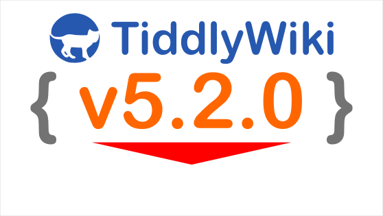
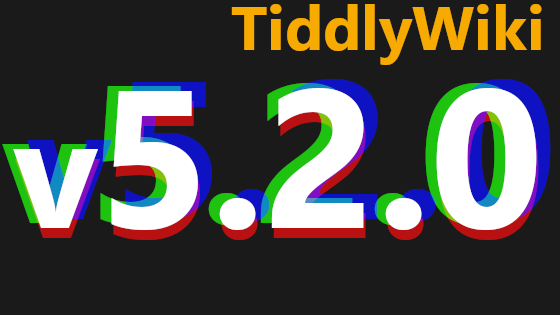
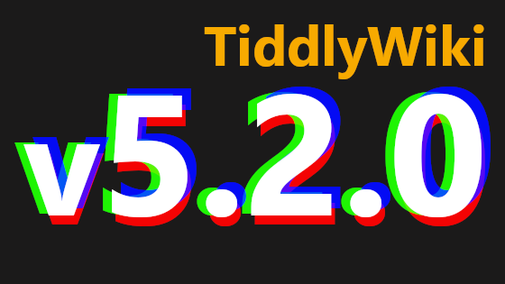
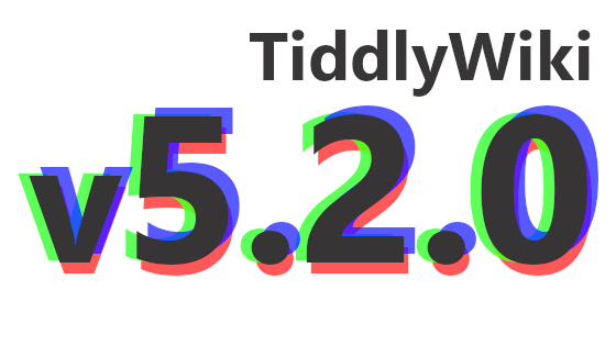
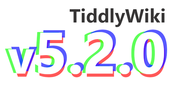
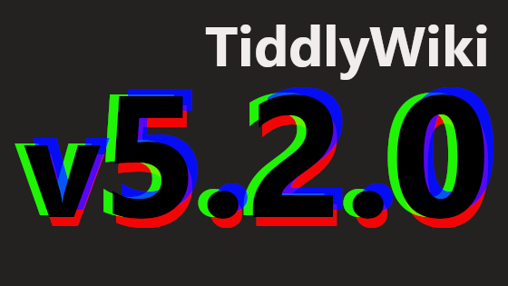
Artwork for v5.2.0
1,641 views
Skip to first unread message

Jeremy Ruston
Jun 13, 2021, 7:14:17 AM6/13/21
to tiddl...@googlegroups.com
This is to announce our regular competition for the artwork for the next release of TiddlyWiki 5. The next release is planned to be called v5.2.0, which requires a little explanation.
We've bumped the minor version number because of a single very important change: for the first time in a decade, we're changing the format used to encode tiddlers into the HTML file.
The new format is based on JSON, making it much easier to develop tools that produce or consume TW5 standalone HTML files. While there is some limited backwards compatibility, the developers of many existing tools will need to make modifications to keep things working with v5.2.0.
Hence the version number change: it's intended to make every developer ask "Gosh, what could have changed to warrant such a big jump", and helps us to make sure that the news of the change is promulgated as widely and prominently as possible.
The change also brings one big improvement for all users: field names now have no restrictions on which characters can be used, and are case-sensitive so that "MyField" is a valid fieldname, and refers to a different field than "myfield" (just like tiddler titles). Finally, we can have fields called "⛄️".
These changes will be merged shortly, but in the meantime can be inspected here:
So, with that, back to the artwork competition. The task is to design the banner image that is shown on the splash screen and within the opening HelloThere tiddler. It is traditional for the artwork to reflect some of the changes in the new version.
The rules for the competition are:
* The version number (with the correct punctuation) must be clear and readable even when the banner is shown at a reduced size
* The image must be a PNG, JPEG or SVG of exactly 560x315 pixels
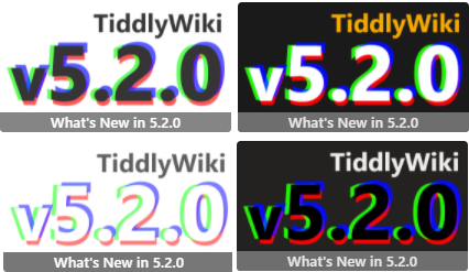
* The bottom 46 pixels will be obscured by the banner text “What’s new in 5.2.0” when it is displayed within HelloThere
* Feel free to enter an updated version of artwork that was a runner-up in a previous competition
* Reply to this message with your entry, or any questions
Here are the posts about previous artwork competitions:
If you’ve got a great idea for the banner image, but don’t have the skills to produce finished artwork, do feel free to share your ideas in case somebody else would like to work on the artwork.
The competition will be open for a week, at which point if there is more than one submission I’ll set up a Google Form for voting.
Best wishes and many thanks,
Jeremy

Mat
Jun 13, 2021, 2:08:15 PM6/13/21
to TiddlyWiki
Freely naming of fields will be fantastic! It will give fields a much more prominent position because they can be used directly as connections to actual tiddlers. Great progress!
@Jeremy can the artwork treat the version number as 5.2 (i.e without .0 at end)? I don't have a particular idea but I imagine it will be easier to come up with ideas for fewer digits.
<:-)
Mat
Jun 13, 2021, 3:02:43 PM6/13/21
to TiddlyWiki
Oooh I just got two cool ideas! Anyone skilled, feel free to create:
First depends on if it is OK with "5.2" (see my previous question). Those two digits have a very similar shape! I think it should be possible to make some kind of mirror reflection to have one show the other.
Second idea uses that new feature with freely named fields. So the design idea is to simply make the string "TiddlyWiki 5.2.0" as a field! E.g the "TiddlyWiki 5" as the field name and the "2.0" as the field value. Should the garbage can that deletes the field be next to it?...
<:-)

springer
Jun 13, 2021, 3:23:15 PM6/13/21
to TiddlyWiki
Jeremy and all,
I'm happy to host all entries again, in an easy-to-compare (and change palettes, etc.) dedicated TW:
-Springer
Jeremy Ruston
Jun 13, 2021, 4:13:44 PM6/13/21
to tiddl...@googlegroups.com
Hi Mat
The artwork needs to show "v5.2.0" (including the "v"!), because there will be a "v5.2.1" at some point, potentially quite soon, and it's important for everybody to be able to unambiguously distinguish the versions. Stated another way, this is not version '5.2', this is version '5.2.0'.
I'd also say that perhaps designs based on the shapes of the letters might be a bit generic. I think the opportunity is to try to capture what is in the release, not just the string of numbers we use to refer to it.
Best wishes
Jeremy.
--
You received this message because you are subscribed to the Google Groups "TiddlyWiki" group.
To unsubscribe from this group and stop receiving emails from it, send an email to tiddlywiki+...@googlegroups.com.
To view this discussion on the web visit https://groups.google.com/d/msgid/tiddlywiki/f67ec0da-de7e-4166-8aa5-840603af0d98n%40googlegroups.com.
Mat
Jun 13, 2021, 4:25:44 PM6/13/21
to TiddlyWiki
Fair enuff!
<:-)
springer
Jun 13, 2021, 4:32:30 PM6/13/21
to TiddlyWiki
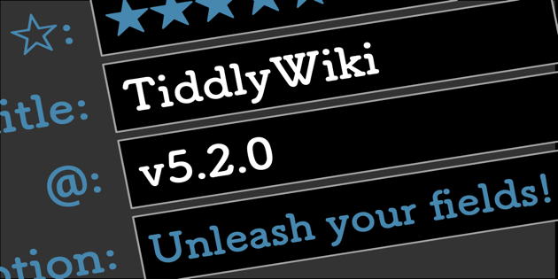
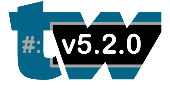
Here's a hasty concept-logo to kick things off, also visible at site: https://tw-logo-contest.tiddlyhost.com/#unleash-your-fields

Saq Imtiaz
Jun 13, 2021, 4:35:34 PM6/13/21
to TiddlyWiki
It might be helpful to look at the release notes:
I am biased but I think visually the image drag and drop stuff in the editor stands out, so that could be an idea.
Mat
Jun 13, 2021, 5:14:53 PM6/13/21
to TiddlyWiki
Springer - brilliant!
Jeremy Ruston
Jun 13, 2021, 5:17:32 PM6/13/21
to tiddl...@googlegroups.com
> I'm happy to host all entries again, in an easy-to-compare (and change palettes, etc.) dedicated TW:
>
> https://tw-logo-contest.tiddlyhost.com/
Best wishes
Jeremy

Mohammad Rahmani
Jun 13, 2021, 11:47:50 PM6/13/21
to tiddl...@googlegroups.com
Hi Springer!
I love your artwork! very nice!
Minor comments:
1. Why not host the image on https://tw-logo-contest.tiddlyhost.com/#unleash-your-fields and why use dropbox?
2. I remember you have hosted artworks for 5.1.23, it is good to see them on https://tw-logo-contest.tiddlyhost.com/#unleash-your-fields
3. It is good to have https://tw-logo-contest.tiddlyhost.com/#unleash-your-fields for past and future artworks competitions all in one place this not only archive all previous efforts but also give ideas to other contributors
Best wishes
Mohammad
To view this discussion on the web visit https://groups.google.com/d/msgid/tiddlywiki/c39ef75b-dcae-4792-9ddd-bc15f52ea39cn%40googlegroups.com.
Message has been deleted

Darth Mole
Jun 14, 2021, 12:43:30 AM6/14/21
to TiddlyWiki
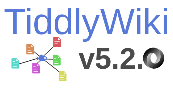
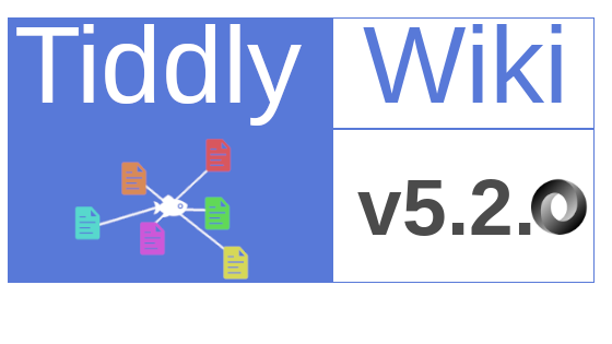
One of my attempts so far. Hope it isn't too off the mark!
Darth Mole
Jun 14, 2021, 2:02:10 AM6/14/21
to TiddlyWiki
Here is another attempt based on what I read regarding a focus on fields.

TW Tones
Jun 14, 2021, 3:37:25 AM6/14/21
to TiddlyWiki
Folks if Drag and Drop ia a key feature then what about a water drop and someone in drag?
:)
Tones

Eric Shulman
Jun 14, 2021, 6:04:12 AM6/14/21
to TiddlyWiki
On Monday, June 14, 2021 at 12:37:25 AM UTC-7 TW Tones wrote:
Folks if Drag and Drop ia a key feature then what about a water drop and someone in drag?
Or perhaps a water drop and a fire-breathing giant reptile ("Dragon Drop")
-e
Mat
Jun 14, 2021, 9:28:41 AM6/14/21
to TiddlyWiki
Or perhaps a water drop and a fire-breathing giant reptile ("Dragon Drop")
Yeah! Or a dragon spouting water/drops! Just above the TiddlyWiki: 5.2.0 field thingy. That would make for a really cool and odd art work.
And it is even a super cool version name: "Dragon Drop"! (even if, admittedly, the drag'n drop we are discussing here is limited. It would be an even more suitable name for if tiddlers were freely movable)
<:-)
springer
Jun 14, 2021, 11:19:28 AM6/14/21
to TiddlyWiki
iamdar..., and all,
I'm sorry I don't know how to attribute an author name to your entries.
For anyone who posts entries here, it would be helpful to include (1) how you'd ilke your authorname to appear, and (2) name of entry.
I'll try to keep an eye out and update the site with entries, as they're shared here, at https://tw-logo-contest.tiddlyhost.com/
-Springer
springer
Jun 14, 2021, 11:21:38 AM6/14/21
to TiddlyWiki
Mohammad,
All good suggestions! Though I usually don't embed images (and don't think tiddlyhost has file directories for such), these images are small, and presumably visitors would want to load them all anyway. So I've embedded each entry so far, and also set up an overview of the final entries from the 5.1.23 contest for inspiration and some sense of continuity:
On Sunday, June 13, 2021 at 11:47:50 PM UTC-4 Mohammad wrote:
Darth Mole
Jun 14, 2021, 11:49:05 AM6/14/21
to TiddlyWiki
Hello Springer and thank you for handling the entries. Please see below for my details.
First Entry-
Name: Assorted Swedish Tiddlers (like the Swedish Fish candy)
Author: IAmDarthMole
Second Entry-
Name: Assorted Swedish Tiddler Fields (original I know)
Author: IAmDarthMole
If I enter anymore I'll be sure to include the name and my name :)
Thanks again!
Message has been deleted

Frank Bruns-Ballhausen
Jun 14, 2021, 5:21:11 PM6/14/21
to TiddlyWiki
I have four ideas. The first two classic square. The last two with alternative borders.
But I think with a banner underneath the round variant does not look good...
But I think with a banner underneath the round variant does not look good...
mwik...@gmail.com schrieb am Montag, 14. Juni 2021 um 19:43:20 UTC+2:
Inspired by Mat, here are my "Dragon Drop" entries on the "field" of a shield : ]I am no artist but it is fun to share and practice my Inkscape skills and hopefully inspire someone with more talent than me. SVGs are available to anyone who wants them./Mike
springer
Jun 14, 2021, 5:33:08 PM6/14/21
to TiddlyWiki
Frank, I've added your designs to the collection at https://tw-logo-contest.tiddlyhost.com/
If you'd like to add any descriptive titles, or author name beyond "Frank B", let me know.
If you'd like to add any descriptive titles, or author name beyond "Frank B", let me know.
-Springer

Mohamed Amin
Jun 15, 2021, 2:37:38 AM6/15/21
to TiddlyWiki
Hi springer,
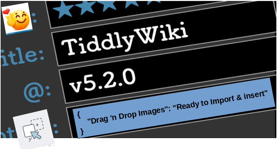
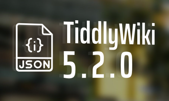
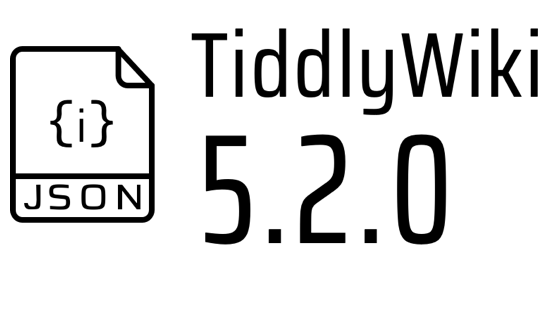
I like your idea a lot, please find below another variation (just a draft , change it as you like) it shows:
- The emoji field names (as per Jeremy's first post)
- Drag & Drop mentioned by Saq (text is from the release note)
- JSON
Mohammad Rahmani
Jun 15, 2021, 2:57:21 AM6/15/21
to tiddl...@googlegroups.com, Jeremy Ruston
On Mon, Jun 14, 2021 at 7:51 PM springer <springer...@gmail.com> wrote:
Mohammad,
Hi Springer,
Many thanks for all your efforts!
@all
WOW, very exciting! I am really happy to see such an active community! I love you TiddlyWiki!
It would be great if you could decide on the name when you move from 5.1 to 5.2
at least I suggest using TW, or TW Platform, or TW framework, instead of Tiddlywiki! Tiddlywiki is MuCh MoRe ThAn a wiki!
Best wishes
Mohammad
--
You received this message because you are subscribed to the Google Groups "TiddlyWiki" group.
To unsubscribe from this group and stop receiving emails from it, send an email to tiddlywiki+...@googlegroups.com.
To view this discussion on the web visit https://groups.google.com/d/msgid/tiddlywiki/8eab0410-a6b7-4742-bff1-211f2375d0c2n%40googlegroups.com.

Jon
Jun 15, 2021, 3:29:06 AM6/15/21
to TiddlyWiki
I agree with Mohammad about the name change at some point . Apart from the wiki aspect, I think the diminutive associations of 'tiddly'
(and I know this bit has been discussed before) are also in opposition to the grand scale of what TW can do.
Regards
Jon
Jeremy Ruston
Jun 15, 2021, 3:47:53 AM6/15/21
to tiddl...@googlegroups.com
Thank you to everyone for the entries so far. I always enjoy these competitions, and I appreciate the effort everyone puts into their designs. And I love the spirit of cooperation and friendly competition.
I would like to make a couple of small steers that might improve the results:
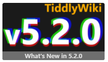
First, I think many of the entries are a bit too complex. Have a look at tiddlywiki.com and check how small the artwork is displayed, particularly on mobile: you'll see it in the splash screen, and in the HelloThere tiddler. Many of the designs this time around have too much detail for an icon of this size. Have a look at the other artwork badges to see how simple they are in comparison to some of the entries here.
Second, I think there is too much textual content in many of the entries. Creating new slogans/taglines for TiddlyWiki is not part of the brief, and just takes up a lot of space. The artwork is designed to break the flow of a generally text-heavy site; packing more text into images makes things worse. The text that needs to be there is "v5.2.0". Adding "TiddlyWiki" is reasonable for the splash screen, but unnecessary within the HelloThere tiddler, so I would recommend that if you include the word it be smaller than the version number.
Third, I would suggest being very careful with visual puns. While they can be funny for the creator, they are often baffling for casual observers. This is an inclusive, broad community, and so we should aim to communicate clearly.
The core of the brief is to make a visual representation of the new release that includes the letters "v5.2.0". Next time, I'll take care to raise these points in the original post.
Best wishes
Jeremy
To view this discussion on the web visit https://groups.google.com/d/msgid/tiddlywiki/e85df72a-8aef-4e62-967f-219fbd8e228fn%40googlegroups.com.

Michael Wiktowy
Jun 15, 2021, 9:27:52 AM6/15/21
to TiddlyWiki
Understood and agree, Jeremy.
I officially withdraw my submissions to avoid cluttering the vote but the SVG is available here under CC0 for anyone who wants to reuse it elsewhere:
springer
Jun 15, 2021, 11:20:30 AM6/15/21
to TiddlyWiki
Jeremy and all,
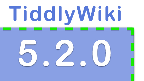
Apologies for starting the trend by cramming something like a feature-slogan into a caption field!
In addition, I recall that reducing file size, of anything that's bound to be handled frequently by servers, is a good aim. In the "dynamic table of images" you can see the file size for images.
I've removed my "busy" entries from the contest HelloThere tiddler, and swapped in some more minimal ones, such as the one below (though I'm still troubleshooting why I'm not achieving smaller sizes in png versions):
-Springer
springer
Jun 15, 2021, 12:45:36 PM6/15/21
to TiddlyWiki
Mohamed,
My reply to you is a bit late here... I wanted to acknowledge your thoughts about adding more graphic hints. In accord with Jeremy's note (posted since your message here), I've moved toward minimizing complexity as much as possible while hinting at both drag-and-drop and flexible field names. So, the hand-cursor has become my compromise for an easily-recognizable drag-and-drop clue that doesn't add much to the color palette and doesn't feel noisy at small scale.
Certainly, playing with graphics can be a fun rabbit-hole! But I confess I need to step away for a bit and get back to my day-job. :)
-Springer

Brian Radspinner
Jun 15, 2021, 1:02:57 PM6/15/21
to TiddlyWiki
I'll throw in my attempts...

TiddlyTweeter
Jun 15, 2021, 1:11:31 PM6/15/21
to TiddlyWiki
jeremy...@gmail.com wrote:
... I think there is too much textual content in many of the entries. Creating new slogans/taglines for TiddlyWiki is not part of the brief, and just takes up a lot of space. The artwork is designed to break the flow of a generally text-heavy site; packing more text into images makes things worse. The text that needs to be there is "v5.2.0".
Totally agree. BUT, also 'v5.2.0' is a kind of "jump" isn't it? What is I mean is, its slightly potentially more newish, hence the number?
A word slogan/flag pointing to that might not be so bad?
Just thoughts
TT
Darth Mole
Jun 15, 2021, 1:34:57 PM6/15/21
to TiddlyWiki
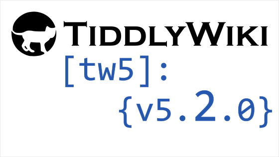
Here a third attempt, less small things. Hopefully those that remain won't be too obscure/hard to see. I wasn't able to really think of any other way to show "drag and drop"
Author: IAmDarthMole
Name: Drag n Drop JSON
Darth Mole
Jun 15, 2021, 4:28:58 PM6/15/21
to TiddlyWiki
Ok, modified 3rd attempt, so technically 4th, with different/larger arrow and hand to hopefully be a bit more visible when smaller. Also added a border.
Author: IAmDarthMole
Name: Drag n Drop JSON LG
TiddlyTweeter
Jun 15, 2021, 6:10:22 PM6/15/21
to TiddlyWiki
iamdar...@gmail.com wrote:
Ok, modified 3rd attempt ...
Author: IAmDarthMoleName: Drag n Drop JSON LG
It kinda grasps that 5.2.0 up is a change.
Just saying, TT
Frank Bruns-Ballhausen
Jun 16, 2021, 5:22:18 PM6/16/21
to TiddlyWiki
Hi,
I have something more...

James Anderson
Jun 16, 2021, 6:26:59 PM6/16/21
to TiddlyWiki
something really basic:
something about breaking things apart and putting them back together :)
Darth Mole
Jun 16, 2021, 7:04:08 PM6/16/21
to TiddlyWiki
I really like that design f.brunsb!
springer
Jun 16, 2021, 11:09:40 PM6/16/21
to TiddlyWiki
Entries -- including through this most recent one submitted by James -- are all posted for easy comparison at
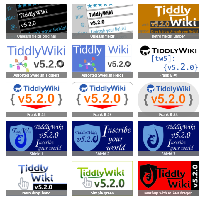
Currently I haven't removed any entries except where authors have withdrawn them or indicated that one image is to replace another. So, Frank B currently has 5 entries, and others have 1-3 each.
If anyone has requests in the next couple days (such as "I'd love to see a variation on this with xyz font or xyz colors), I would be happy to give it a go (and am guessing the same holds for many of us who enjoy this kind of tinkering).
-Springer
Frank Bruns-Ballhausen
Jun 17, 2021, 4:32:41 PM6/17/21
to TiddlyWiki
Hi to all artwork fans,
I can support what springer writes. But perhaps we should already agree on a few pictures where changes make sense.
My three favourites so far are (excluding my pictures - these are the best anyway), here without a ranking:
- iamdar-1.png (IAmDarthMole)
- dark-fields.png (springer)
- 名称未設定.png (James W)
have a nice night, Frank
PS: @IAmDarthMole: Thanks for the pat on the back but which picture?
springer
Jun 17, 2021, 7:26:25 PM6/17/21
to TiddlyWiki
Frank, and all,
My own sense is that your last entry is the most compelling of your set (and is probably the post to which IAmDarthMole is replying), followed by your #2.
Out of IAmDarthMole's submissions, I think (as Frank did, apparently) that the first one (Assorted Swedish Tiddlers) has the most coherence.
I also love James' RGB image, though it's a bit crowded out to the edges. James, if you would pull everything in just a bit to give the content breathing room, I think it would be a good contender!
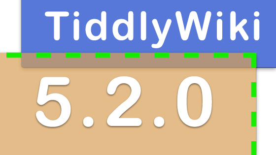
Out of Brian's submissions, I think the second captures something of the drag-and-drop cues better than the first. For some reason, though, the filesize is very large (on both submissions). So I think it would be a better contender if the same idea could fit into a leaner file.
In my more recent attempts I've been stepping away from including the full "TiddlyWiki" label since (1) including that text is a bit redundant in its use-context, and was not part of the version-number images prior to 5.1.23, and (2) even if TiddlyWiki isn't ready to rebrand *now*, it's possible that the conversation will be at a different place by the time we approach the *next* revision... I'm agnostic about what should happen, but I suppose it might be a strong point for a version's graphic banner just to focus on the version number along with whatever feature-hints can show up without getting too busy.
-Springer
Brian Radspinner
Jun 17, 2021, 8:14:15 PM6/17/21
to TiddlyWiki
springer, if you could replace my first two attempts with the below smaller-sized version, I'd appreciate it.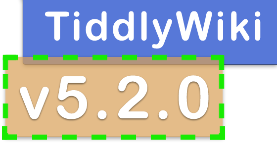
springer
Jun 17, 2021, 8:59:18 PM6/17/21
to TiddlyWiki
Brian, done!
Darth Mole
Jun 17, 2021, 9:00:00 PM6/17/21
to TiddlyWiki
Hello all and thank you very much for your considerations and up votes! I wish to caution though that the when the image is smaller, as it would be viewed on the tiddlywiki homepage, the fish is much harder to identify. That was one of the reasons I switched things up in the 3rd/4th attempt.
f.brunsb, as Springer stated it was the last one at the time, the floating 5.2.0 with the hand holding it that I really liked.
I don't feel comfortable pointing out one of my own but if I should/need to I would say I like my iamdar-1.png (Assorted Swedish Tiddlers) the best (despite my concern about its visibility when smaller) and then Logo4.png (Drag'n'Drop JSON LG) next.
I also really like entw5.png (Tilted Version) and entw2.png (Frank B #2).
Thanks!
On Thursday, June 17, 2021 at 8:14:15 PM UTC-4 Brian Radspinner wrote:
James Anderson
Jun 19, 2021, 6:26:01 AM6/19/21
to TiddlyWiki
Move things in from the sides a little and provided some alternatives ont he same theme,
James Anderson
Jun 19, 2021, 6:46:45 AM6/19/21
to TiddlyWiki
that's the wrong chroma-w, correct one shoud be: 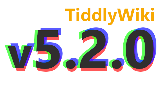
springer
Jun 21, 2021, 8:41:37 AM6/21/21
to TiddlyWiki
Dear all,
Since it's been a week, it may be worth seeing where things stand with graphic options:
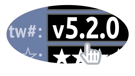
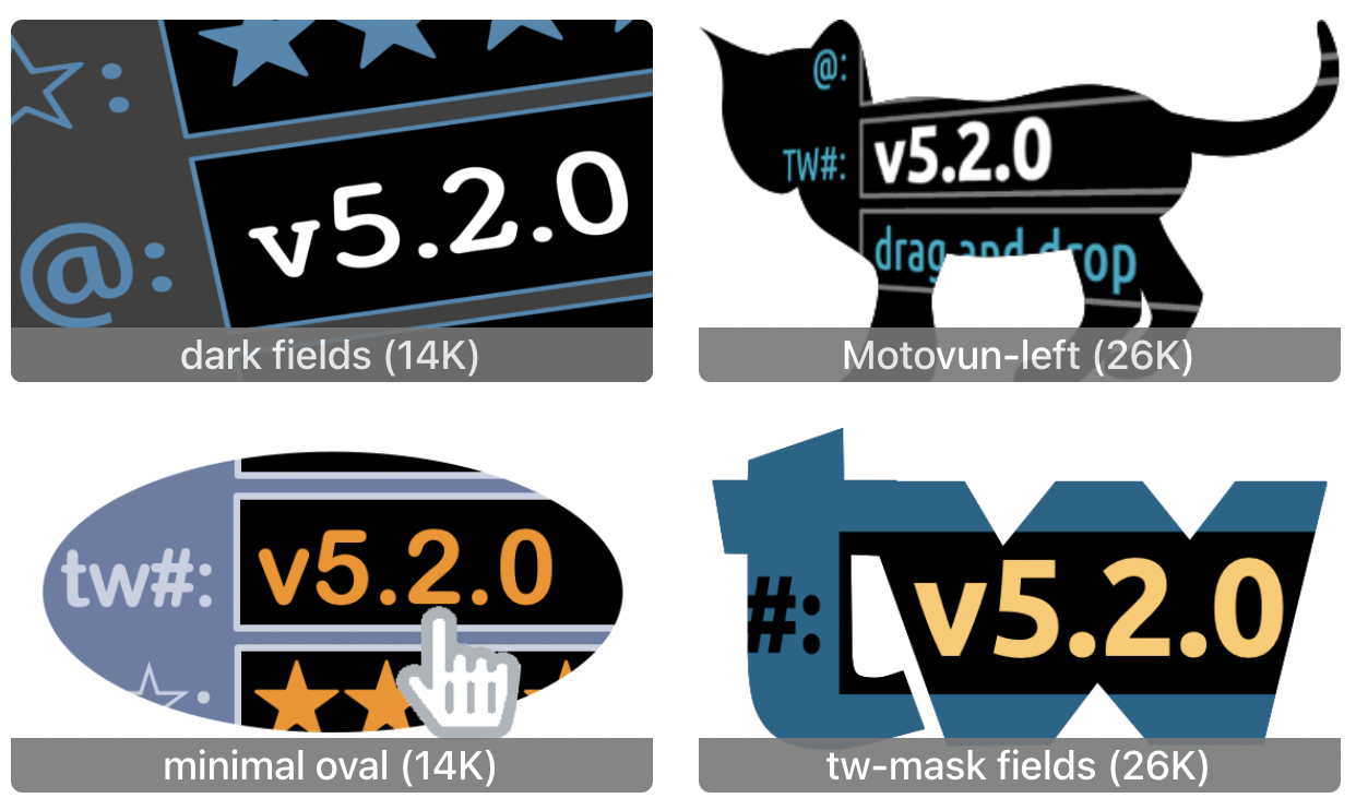
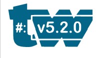
Also, I have not yet posted here some of my own variations on the field-name-flexibility theme playing with masks. In addition to the plain "dark fields" version, there are three, shown below. I'm happy to weed out (or tinker with) whichever ones seem least promising...
I'm not especially attached to the star-character field-name per se (nor to # or @), but I wanted to stick with single-color unicode characters, and these are striking examples of fieldnames that were not possible before, and which could be served up in an intuitive public-facing way.
Cheers, and let me know of other additions/edits/fixes needed at the image-hosting page.
-Springer
TiddlyTweeter
Jun 21, 2021, 10:51:07 AM6/21/21
to TiddlyWiki
springer wrote:
Since it's been a week, it may be worth seeing where things stand with graphic options:
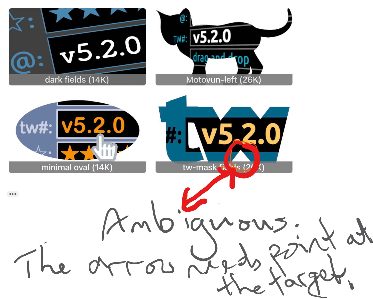
Small comment on your gallery of 4 ...
Best
TT
Message has been deleted
Frank Bruns-Ballhausen
Jun 23, 2021, 4:30:41 PM6/23/21
to TiddlyWiki
@All
Apparently we are not yet at the end of our creative phase. I too have another collection
...bubble...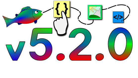
...bubble bubble... 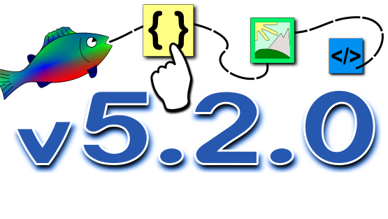
...bubble bubble in the darkness... 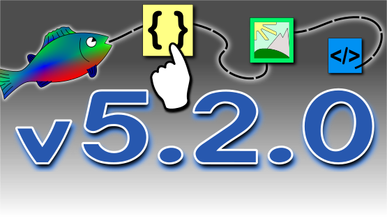
Is there anyone else with further ideas? Maybe someone who can draw badly, or not at all?
Then just make a short and simple sketch. I am sure you will find someone here who will be happy to "pimp" this sketch a little bit.
Then just make a short and simple sketch. I am sure you will find someone here who will be happy to "pimp" this sketch a little bit.
Yes... please give feedback. Otherwise none of us will know which design is the best or if we are completely wrong.
By folks
-Frank
-Frank
springer schrieb am Dienstag, 22. Juni 2021 um 00:00:13 UTC+2:
TT, it did sot occur to me that the mask on the tv letters could look like an arrow. Below is a variant that shifts that effect: (at the expense of somewhat irregular letter-forms)...-Springer,
TiddlyTweeter
Jun 24, 2021, 5:18:19 AM6/24/21
to TiddlyWiki
Ciao springer
Yeah. It is interesting. I saw it as an arrow and only later saw it as the bottom of "W". :-)
Visually the issue is is you had a band at the bottom that abuts the letters that creates a fictive impression.
A small gap under the letters before the bottom-band would likely solve the issue too?
Just a comment
TT
On Tuesday, 22 June 2021 at 00:00:13 UTC+2 springer wrote:
TT, it did sot occur to me that the mask on the tv letters could look like an arrow. Below is a variant that shifts that effect: (at the expense of somewhat irregular letter-forms)...-Springer
On Monday, June 21, 2021 at 10:51:07 AM UTC-4 TiddlyTweeter wrote:
springer
Jun 25, 2021, 11:43:15 AM6/25/21
to TiddlyWiki
Hello all,

Based on helpful feedback from Josiah, I further tweaked the masked-tw image:
Some considerations shaping this submission:
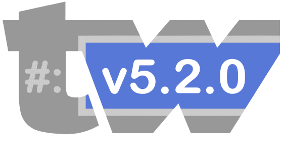
keeping filesize down (just under 28K as png w alpha; 14K as flat jpg), staying visually "digestible" even at small size (while not overlapping the caption-banner), gesturing towards one exciting new feature (opening up of fieldname options). If our collective impulse is to celebrate drag-and-drop, then I'd offer up the "minimal oval" design instead, which includes both feature-gestures.
I'm not sure how to think about color scheme; it's clearly possible to take nearly any design and adjust to nearly any palette.
If I were a wizard with svg, I'd try making a version that pulls colors from the active palette. Even if that's not necessary for the official version-release image, given its role at tiddlywiki.com, we all might enjoy a tw image that "rolls" with changes in the palette. (Someone —telmiger? — shared an svg tool that allowed pulling svg details from fields -- that was lots of fun to play with!)
-Springer
TiddlyTweeter
Jun 26, 2021, 4:34:33 AM6/26/21
to TiddlyWiki
springer wrote (my emphasis) ...
Some considerations shaping this submission:keeping filesize down (just under 28K as png w alpha; 14K as flat jpg), staying visually "digestible" even at small size (while not overlapping the caption-banner), gesturing towards one exciting new feature (opening up of fieldname options). If our collective impulse is to celebrate drag-and-drop, then I'd offer up the "minimal oval" design instead, which includes both feature-gestures.I'm not sure how to think about color scheme; it's clearly possible to take nearly any design and adjust to nearly any palette.If I were a wizard with svg, I'd try making a version that pulls colors from the active palette. Even if that's not necessary for the official version-release image, given its role at tiddlywiki.com, we all might enjoy a tw image that "rolls" with changes in the palette. (Someone —telmiger? — shared an svg tool that allowed pulling svg details from fields -- that was lots of fun to play with!)
Right! Going SVG is ultra-fit for TW as so much of its UI is SVG.
Here is probably not the right place to discuss this. It needs its own thread so it does not interfere with JR's need for a bitmap.
BUT couple of pointers ...
The helpful Telmiger SVG tool for TW is at: https://tid.li/tw5/apps/svg.html
If you can stand open-ended discussion of the technical side of SVG join my discussions with Morosanue about optimizing use of his vast (40,000) SVG icon set in TW at: https://github.com/morosanuae/tw-icons/discussions/2
FYI you CAN convert PNG easily to SVG online BUT most of those online tools can only detect the SHAPE, not the COLOUR ...
Here is your original I converted to svg quickly online (monochrome outcome) ...
If you wanna discuss details I'm happy to comment in a new thread.
Best wishes
TT

John D
Jun 26, 2021, 11:45:11 AM6/26/21
to tiddl...@googlegroups.com
Hi everyone, here's my honest feedback, I hope it will be useful :
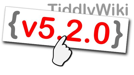
springer : love the simplicity of it. I instantly understood what the update was about, only thing missing is the drag&drop feature, which I agree with saq seems too important to be left out. One way around it maybe would be to "drag and drop the whole image of that logo", adding a mouse cursor at the edge of it .. this would add a lot of clutter tho. The variation @Mohamed did, while showing all the main newelty of this update, is too cluttered IMO. Color wise, I think it would be best to use the color palette of the vanilla TW, since new users will see TW in the vanilla theme and might think that the black and white logo is a way to show that now tiddlywiki as a night mode option. While this is technically true (with the palette), this is not part of the update so it may be a bit confusing. This goes for the font you used too, I might be wrong but it looks like it's not the default font used by TW. The feature slogan is a nifty touch but goes against the brief. You could left the fields empty, use gibberish text (lorem ipsum), or use a conceptual approach and use rectangular bars as a placeholder (something you can see on some website, like when youtube is loading content). I personally don't like the masked versions. This makes the logo trapped into a shape, while all the previous splash screens (that I know of) were either rectangular or open. The mouse cursor suggests that it's hovering a link, while we see a field in the picture so it's a bit confusing.
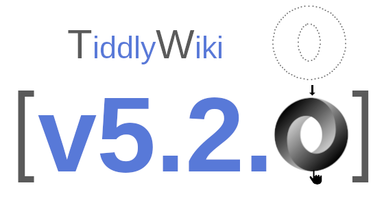
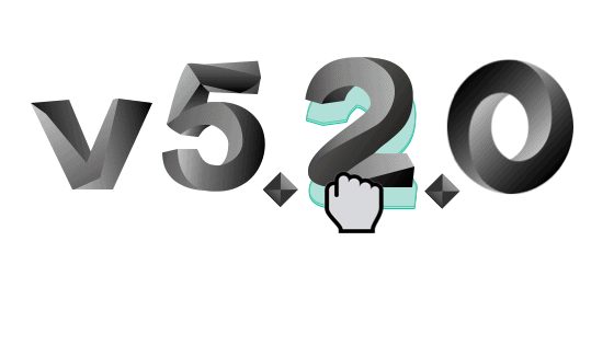
iamdar : the fish logo is very cute and the cloud of files is a great way to show how tiddlers are interconnected. I can't see how this relates to this particular update though. Maybe the fish could be added by drag and drop at the center of the files ? It would show how we can now easily add images inside a wiki, like dropping a fish in a pond. You could even add ripples, but this may be too much. To be honest, I'm really not a fan of the O of the version number though, to me it looks like you meshed up two icons together instead of one. It also makes the numbers a bit less readable. While it's a cool 3D effect, to my eyes it's jarring next to the flat, non-shaded style of the fish. I also fail to see how it relates to the update.
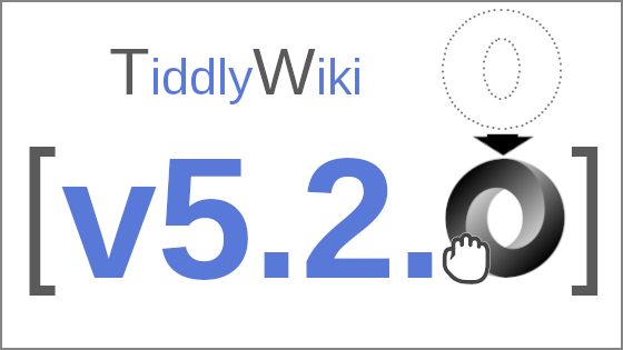
Your second proposition, without the fish, seems a bit better in regard to my previous point (only one logo is best). Maybe use {} instead of [] to appeal to the json change ? I know both are used in JSON but the [] looks more like a tiddlywiki link. Again, not a fan of the 3D look. I do like the dotted line however, it makes it very clear that the 0 is being dropped. It would be best to use a grab cursor instead of a pointer, again it looks like we are about to click on a link instead of drag&dropping a picture. I see you corrected it in your 4th attempt, this looks much better IMO :)
brunsb : using brackets is a really good idea to show how tiddlywiki transit to a json format. However if I understood correctly, this change does not concern the typical end user that much, and I'm not sure this will be understood for someone with no coding background. I feel like @jermolene should clarify that point : who is the targeted audience of that logo ? Do you want to appeal to new users or to devs ? Back to your design @brunsb : while I think it's a good idea, I wouldn't put the red triangle. It doesn't add anything (?) and feels out of place to me.
I like your second design a lot ! It is simple, very clear, we see the drag&drop feature, the version number. Maybe it would be best to not obfuscate the Tiddlywiki name however. The mouse cursor should be a grab cursor.
james : Your logo looks like it implies that TW now has 3D anaglyph capabilities, sorry I don't get it .. the "breaking things apart and putting them back together" concept is clever, but the way you represent it with different colours led me to think that this is about colors, maybe printing ? Also I fail to see how this modular idea is representative to this update, AFAIK tiddlywiki always was modular in the sense we could add tiddlers, plugins, etc easily.
springer : love the simplicity of it. I instantly understood what the update was about, only thing missing is the drag&drop feature, which I agree with saq seems too important to be left out. One way around it maybe would be to "drag and drop the whole image of that logo", adding a mouse cursor at the edge of it .. this would add a lot of clutter tho. The variation @Mohamed did, while showing all the main newelty of this update, is too cluttered IMO. Color wise, I think it would be best to use the color palette of the vanilla TW, since new users will see TW in the vanilla theme and might think that the black and white logo is a way to show that now tiddlywiki as a night mode option. While this is technically true (with the palette), this is not part of the update so it may be a bit confusing. This goes for the font you used too, I might be wrong but it looks like it's not the default font used by TW. The feature slogan is a nifty touch but goes against the brief. You could left the fields empty, use gibberish text (lorem ipsum), or use a conceptual approach and use rectangular bars as a placeholder (something you can see on some website, like when youtube is loading content). I personally don't like the masked versions. This makes the logo trapped into a shape, while all the previous splash screens (that I know of) were either rectangular or open. The mouse cursor suggests that it's hovering a link, while we see a field in the picture so it's a bit confusing.
iamdar : the fish logo is very cute and the cloud of files is a great way to show how tiddlers are interconnected. I can't see how this relates to this particular update though. Maybe the fish could be added by drag and drop at the center of the files ? It would show how we can now easily add images inside a wiki, like dropping a fish in a pond. You could even add ripples, but this may be too much. To be honest, I'm really not a fan of the O of the version number though, to me it looks like you meshed up two icons together instead of one. It also makes the numbers a bit less readable. While it's a cool 3D effect, to my eyes it's jarring next to the flat, non-shaded style of the fish. I also fail to see how it relates to the update.
IMO the version with a white background looks better, the fish is a bit drowned in that blue (no pun intended).
Your second proposition, without the fish, seems a bit better in regard to my previous point (only one logo is best). Maybe use {} instead of [] to appeal to the json change ? I know both are used in JSON but the [] looks more like a tiddlywiki link. Again, not a fan of the 3D look. I do like the dotted line however, it makes it very clear that the 0 is being dropped. It would be best to use a grab cursor instead of a pointer, again it looks like we are about to click on a link instead of drag&dropping a picture. I see you corrected it in your 4th attempt, this looks much better IMO :)
brunsb : using brackets is a really good idea to show how tiddlywiki transit to a json format. However if I understood correctly, this change does not concern the typical end user that much, and I'm not sure this will be understood for someone with no coding background. I feel like @jermolene should clarify that point : who is the targeted audience of that logo ? Do you want to appeal to new users or to devs ? Back to your design @brunsb : while I think it's a good idea, I wouldn't put the red triangle. It doesn't add anything (?) and feels out of place to me.
I like your second design a lot ! It is simple, very clear, we see the drag&drop feature, the version number. Maybe it would be best to not obfuscate the Tiddlywiki name however. The mouse cursor should be a grab cursor.
Brian Radspinner : the dashed line is a good way to represent the drag&drop feature, I like that ! The overall composition looks a bit rough however. Your third version looks much better, I'm not sure about the orange background tho.
james : Your logo looks like it implies that TW now has 3D anaglyph capabilities, sorry I don't get it .. the "breaking things apart and putting them back together" concept is clever, but the way you represent it with different colours led me to think that this is about colors, maybe printing ? Also I fail to see how this modular idea is representative to this update, AFAIK tiddlywiki always was modular in the sense we could add tiddlers, plugins, etc easily.
PS : Regarding the change of name, for all it's worth, I'm strongly against it. Tiddlywiki is an iconic name, and while it is true that it can be customised an almost infinite number of ways, this is not something an average user can do. The main, out of the box use for tiddlywiki is to be a personal wiki. That is to @Jeremy Ruston to decide of course.
--
You received this message because you are subscribed to the Google Groups "TiddlyWiki" group.
To unsubscribe from this group and stop receiving emails from it, send an email to tiddlywiki+...@googlegroups.com.
To view this discussion on the web visit https://groups.google.com/d/msgid/tiddlywiki/7c5a46a8-e46a-482a-a08f-96b2bfaea846n%40googlegroups.com.
Mohammad Rahmani
Jun 26, 2021, 1:56:58 PM6/26/21
to tiddl...@googlegroups.com
Just to have a little fun in this competition!
These are my designs, but I'm not sure if they are suitable for the new release logo!
and also!
Best wishes
Mohammad
On Sun, Jun 13, 2021 at 3:44 PM Jeremy Ruston <jeremy...@gmail.com> wrote:
This is to announce our regular competition for the artwork for the next release of TiddlyWiki 5. The next release is planned to be called v5.2.0, which requires a little explanation.We've bumped the minor version number because of a single very important change: for the first time in a decade, we're changing the format used to encode tiddlers into the HTML file.The new format is based on JSON, making it much easier to develop tools that produce or consume TW5 standalone HTML files. While there is some limited backwards compatibility, the developers of many existing tools will need to make modifications to keep things working with v5.2.0.Hence the version number change: it's intended to make every developer ask "Gosh, what could have changed to warrant such a big jump", and helps us to make sure that the news of the change is promulgated as widely and prominently as possible.The change also brings one big improvement for all users: field names now have no restrictions on which characters can be used, and are case-sensitive so that "MyField" is a valid fieldname, and refers to a different field than "myfield" (just like tiddler titles). Finally, we can have fields called "⛄️".These changes will be merged shortly, but in the meantime can be inspected here:So, with that, back to the artwork competition. The task is to design the banner image that is shown on the splash screen and within the opening HelloThere tiddler. It is traditional for the artwork to reflect some of the changes in the new version.The rules for the competition are:* The version number (with the correct punctuation) must be clear and readable even when the banner is shown at a reduced size* The image must be a PNG, JPEG or SVG of exactly 560x315 pixels* The bottom 46 pixels will be obscured by the banner text “What’s new in 5.2.0” when it is displayed within HelloThere* Feel free to enter an updated version of artwork that was a runner-up in a previous competition* Reply to this message with your entry, or any questionsHere are the posts about previous artwork competitions:If you’ve got a great idea for the banner image, but don’t have the skills to produce finished artwork, do feel free to share your ideas in case somebody else would like to work on the artwork.The competition will be open for a week, at which point if there is more than one submission I’ll set up a Google Form for voting.Best wishes and many thanks,Jeremy
--
You received this message because you are subscribed to the Google Groups "TiddlyWiki" group.
To unsubscribe from this group and stop receiving emails from it, send an email to tiddlywiki+...@googlegroups.com.
To view this discussion on the web visit https://groups.google.com/d/msgid/tiddlywiki/41EF749B-8AC8-412E-BE59-BBFCE7164340%40gmail.com.
springer
Jun 27, 2021, 12:49:06 PM6/27/21
to TiddlyWiki
Hi all, I had an exchange with Mohammad about the actual graphic file, to which he does not have access.
But the work was based on his own sketches, and it's not too hard to replicate after discovering that the font is open-source Saira (google font), apart from the curly brackets, whose font isn't yet clear to me. So here's a rough mockup of Mohammad's design, though I admit I haven't obsessed about replicating all the details:
springer
Jun 27, 2021, 1:02:55 PM6/27/21
to TiddlyWiki
I've tweaked a *bit* more, and added Mohammad's submission to our gallery at:
-Springer
Saq Imtiaz
Jun 27, 2021, 1:05:08 PM6/27/21
to TiddlyWiki
It is probably worth mentioning that the logo does not have to do with any new features being introduced. So if anyone has other ideas, go for it.
James Anderson
Jun 27, 2021, 3:27:45 PM6/27/21
to TiddlyWiki
one more using emojis, though someone would probably need to redo the new and fish tiddlers as i doubt emoji are free to use whereever we like.
>Télumire
>>but the way you represent it with different colours led me to think that this is about colors, maybe printing ?
Not wanting to spell it out, but light can be considered part of a field too :) that was the angle i was going for.
>Mohammed
I like your design! :)
Thanks,
James
Mohammad Rahmani
Jun 27, 2021, 11:27:52 PM6/27/21
to tiddl...@googlegroups.com
Springer,
Many thanks! Your mockup is now great! I appreciate all your efforts both for this mockup and also for hosting the competition art works!
Kudos gos to you!
Best wishes
Mohammad
To view this discussion on the web visit https://groups.google.com/d/msgid/tiddlywiki/8a524438-b6d8-4cf0-bf7e-567d50e01067n%40googlegroups.com.
springer
Jun 28, 2021, 10:21:43 AM6/28/21
to TiddlyWiki
Mohammad,
Thanks! Let me know, of course, if you'd prefer any tweaks to color, opacity, etc., or font choices within the icon part.
-Springer
springer
Jun 28, 2021, 10:53:26 AM6/28/21
to TiddlyWiki
Dear all,
The gallery is now up to date including James' latest submission with emoji. Of course, multi-submission authors will need to winnow our offerings.
I'd love to hear more feedback in the spirit of what Télumire offered over the weekend.
For what it's worth, the images chosen for version banners, up to now, are remarkably heterogeneous -- there's no history of sticking to the fonts used on tiddlywiki.com, nor to any particular palette, and even the TiddlyWiki name was never part of the banner image until 5.1.23 (and invoking a precedent for not using masks seems odd given the heterogeneity of version banners, though I respect individual aesthetic reactions). If there's some emerging consensus around any of these points, then I think we'd all welcome reflections on such things.
There's a delicate balance, in this open-source world between volunteer/amateur enthusiasm and expertise. I love the spirit of this banner image competition, and yet I also recognize that designers (such as Duarte Farrajota Ramos, who won the poster competition) really do bring skills to the challenge of communicating clearly and efficiently through images.
In this spirit, it's worth reflecting further on the audience for this (and other) TiddlyWiki imagery and publicity. Are we looking for images that will feel accessible to those who know little about TiddlyWiki and its innards, or are we aiming primarily to communicate with those who already recognize JSON or curly brackets as familiar reference-points?
Both the puzzle-piece logo of 5.1.22 and the modular shape in Atro's 5.1.23 image presuppose no programming-literacy. The JSON file-icon gesture in Mohammad's entry seems to be at the other end of the spectrum: it surely speaks clearly and elegantly to many users who are at home in code, but perhaps at the risk of intimidating someone who is browsing for a free, flexible, publishable and future-proof alternative to bloatware like evernote, and who would be only slowly tempted to peek under the hood (or "bonnet" for you Brits;) ).
What do you all think?
-Springer
On Saturday, June 26, 2021 at 11:45:11 AM UTC-4 Télumire wrote:
Hi everyone, here's my honest feedback, I hope it will be useful :
springer : love the simplicity of it. ... Color wise, I think it would be best to use the color palette of the vanilla TW... the font you used too... looks like it's not the default font used by TW. ... I personally don't like the masked versions. This makes the logo trapped into a shape, while all the previous splash screens (that I know of) were either rectangular or open. ...
Jeremy Ruston
Jun 28, 2021, 11:10:18 AM6/28/21
to tiddl...@googlegroups.com
Hi Springer
One thing I find myself thinking when I look at the entries is that the new release banner is a frustratingly constrained canvas for the creativity that we see here. The purpose of the new release banner is just to brand each released version, so that visitors to tiddlywiki.com can see the version number at a glance in the splash screen and "HelloThere". So really, the only requirement is that it displays the version number clearly, and is visually distinctive from previous banners.
Nonetheless, I think we'll continue to need a new release banner for each version, but I wonder if we might have the bandwidth for another, ongoing competition that gives contributors a bit more to get their teeth into. Instead of posters, perhaps the designs could be banner advertisements of a specified size: we could have fun imagining how we would advertise TiddlyWiki in big media outlets like the New York Times, Instagram, Reddit or Wired.
We could also host the banner ads on tiddlywiki.com in such a way that anyone who wanted to could add an iframe to their site to add a rotating gallery of TiddlyWiki advertisements. (We would obviously do that without any tracking).
Best wishes
On 28 Jun 2021, at 15:53, springer <springer...@gmail.com> wrote:
--
You received this message because you are subscribed to the Google Groups "TiddlyWiki" group.
To unsubscribe from this group and stop receiving emails from it, send an email to tiddlywiki+...@googlegroups.com.
To view this discussion on the web visit https://groups.google.com/d/msgid/tiddlywiki/2a2c04a5-4276-4544-bd68-fadf307b1b89n%40googlegroups.com.
Mohammad Rahmani
Jun 28, 2021, 1:39:18 PM6/28/21
to tiddl...@googlegroups.com
Hi Springer,
Everything looks great! Thank you!
Best wishes
Mohammad
To view this discussion on the web visit https://groups.google.com/d/msgid/tiddlywiki/19f69d04-abdd-48dc-9f13-cbb83fc32d5fn%40googlegroups.com.
springer
Jun 28, 2021, 2:36:03 PM6/28/21
to TiddlyWiki
Jeremy,
I think your diagnosis is spot on: we have a collective surplus of enthusiastic creative energy from folks who would like to contribute to making TiddlyWiki intuitive, visible, and attractive.
Those of us who have a deeper toolkit/skillset for graphics than for coding are especially eager to step up when there's a call for graphic design. The result is a level of detail-wrangling over a banner image that has a relatively limited role.
Something like a set of public ads would be a more substantive project. Presumably there should be at least something like thematic and stylistic coherence (which helps people recognize multiple ads as being about the same thing), but there are many possible ways to develop such coherence.
-Springer
Frank Bruns-Ballhausen
Jun 28, 2021, 5:55:20 PM6/28/21
to TiddlyWiki
Dear all,
Now I will contribute new designs once again, and definitely for the last time for this contest. I'll say more about that tomorrow, too. But today it is already late...
Cat and SW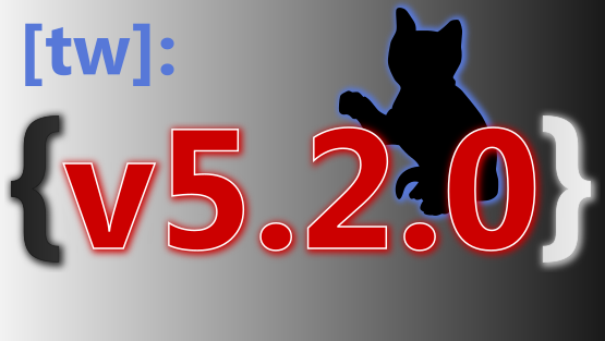
Now I will contribute new designs once again, and definitely for the last time for this contest. I'll say more about that tomorrow, too. But today it is already late...
Cat and Drag 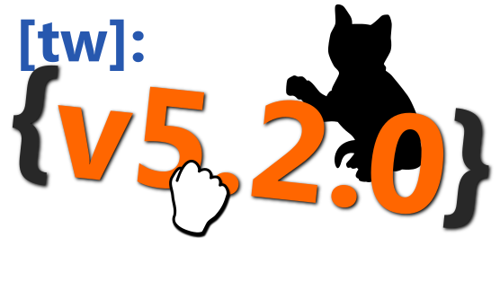
Cat with transparency 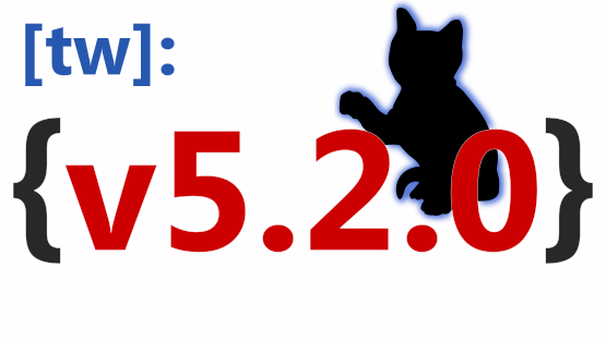
Cat query dark 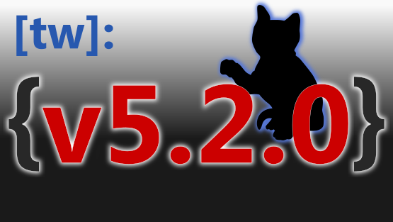
Cat and SW
Good night
- Frank
springer
Jun 29, 2021, 2:14:36 PM6/29/21
to TiddlyWiki
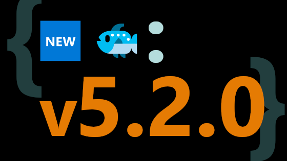
With a tip of the hat to IAmDarthMole, I've been thinking for a while that one logo-version that *deserves* to exist is a version that takes that json mobius image posing as a zero, and makes it fit in seamlessly with the other numbers.
I like that anyone who knows about the JSON logo will "get it" but others will just see a 3D-typography effect, plus drag-and-drop. As a flat png, it comes in at 19K, less than I feared for a fancy set of bezier curves and gradients.
I hope IAmDarthMole takes this as a constructive collaboration! I'm happy to split the pile of prize money. :P
-Springer
On Tuesday, June 15, 2021 at 1:34:57 PM UTC-4 iamdar...@gmail.com wrote:
Here a third attempt, less small things. Hopefully those that remain won't be too obscure/hard to see. I wasn't able to really think of any other way to show "drag and drop"Author: IAmDarthMole
Name: Drag n Drop JSON
On Tuesday, June 15, 2021 at 1:11:31 PM UTC-4 TiddlyTweeter wrote:jeremy...@gmail.com wrote:... I think there is too much textual content in many of the entries. Creating new slogans/taglines for TiddlyWiki is not part of the brief, and just takes up a lot of space. The artwork is designed to break the flow of a generally text-heavy site; packing more text into images makes things worse. The text that needs to be there is "v5.2.0".Totally agree. BUT, also 'v5.2.0' is a kind of "jump" isn't it? What is I mean is, its slightly potentially more newish, hence the number?A word slogan/flag pointing to that might not be so bad?Just thoughtsTT
Frank Bruns-Ballhausen
Jun 29, 2021, 4:03:12 PM6/29/21
to TiddlyWiki
Dear all,
My favourites so far are (excluding my pictures) and without ranking:
I agree with Jeremy, perhaps such a contest would be useful for an advertising banner. For a simple release number, the effort is great, because unfortunately it will soon be replaced again. An advertising banner, if without a number, can at least be used for longer.
A fixed scheme (e.g. logo on the left side, release number on the right side, colours fixed in advance) and ... instead an advertising banner on "HelloThere" in the background? I would, I like that.
Here for this competition I would have liked something like an end date, a deadline. Perhaps also a maximum number of inputs.
As I see it, the many beautiful pictures, only a small number of people have created. More outdoor advertising for such actions is needed. This in turn generates more "word of mouth". More people, more ideas, finished faster.
I will not post any new pictures now. Not that I don't enjoy it. But I don't get to do anything else.
However, I am happy to accept requests for changes. Also who would like to have the original files (is SVG) may contact me.
When it comes to the vote for the best picture (if there is such a thing), I'll be there again.
So have fun. Frank
@springer:
Really cool your last picture ... and now in RGB style like the picture of James "chroma-b-alt.png"... By the way,
I'm missing some pictures on tw-logo-contest.tiddlyhost.com What's going on?
@James.W: Have I mentioned that I like your RGB series? I also like the spirit of "emoji-field-title.png".
There might be more hints of new features swimming in the background ...
My favourites so far are (excluding my pictures) and without ranking:
- 3D twisted version white.png (springer)
- dark-fields.png (springer)
- json-file-icon-semi-alpha.png (Mohammad)
- chroma-b-alt.png (James W)
- emoji-field-title.png (James W)
- iamdar-1.png (IAmDarthMole)
I agree with Jeremy, perhaps such a contest would be useful for an advertising banner. For a simple release number, the effort is great, because unfortunately it will soon be replaced again. An advertising banner, if without a number, can at least be used for longer.
A fixed scheme (e.g. logo on the left side, release number on the right side, colours fixed in advance) and ... instead an advertising banner on "HelloThere" in the background? I would, I like that.
Here for this competition I would have liked something like an end date, a deadline. Perhaps also a maximum number of inputs.
As I see it, the many beautiful pictures, only a small number of people have created. More outdoor advertising for such actions is needed. This in turn generates more "word of mouth". More people, more ideas, finished faster.
I will not post any new pictures now. Not that I don't enjoy it. But I don't get to do anything else.
However, I am happy to accept requests for changes. Also who would like to have the original files (is SVG) may contact me.
When it comes to the vote for the best picture (if there is such a thing), I'll be there again.
So have fun. Frank
James Anderson
Jun 29, 2021, 5:29:33 PM6/29/21
to TiddlyWiki
Hi Frank,
I asked skinner to remove the alts, I was just playing on the same idea and didn't want to flood the list of choices.
Thanks,
James
James Anderson
Jun 29, 2021, 5:30:50 PM6/29/21
to TiddlyWiki
I meant @springer, not whoever skinner is :)
TW Tones
Jul 1, 2021, 8:45:33 PM7/1/21
to TiddlyWiki
All especially those with competition entries,
Love all this work, wish I had these image design skills. Whatever wins it would be nice to collect the final submissions (and previous ones) as collateral people building a wiki could use, on there home tiddler, as icons, favicons (sometimes), Wiki or tiddler backgrounds, or images especially when demonstrating a feature of that release.
When you drag and drop a tiddler to a valid location you see a mouse pointer and a little box with a plus, on my browsers at least. Perhaps stamping your design with this would promote the drag features of the new version. I suggest a different color just to stop people confusing with their own mouse pointer.
Regards
Tones
TW Tones
Jul 1, 2021, 8:50:17 PM7/1/21
to TiddlyWiki
Hey,
I seriously love NEW IN: 5.2.0 Literal macro parameters are supported. For example: [<now [UTC]YYYY0MM0DD0hh0mm0ssXXX>].
Like usual, I have barely come to terms the features in the last release and looking forward to the next.
Tones
On Sunday, 13 June 2021 at 21:14:17 UTC+10 Jeremy Ruston wrote:
This is to announce our regular competition for the artwork for the next release of TiddlyWiki 5. The next release is planned to be called v5.2.0, which requires a little explanation.We've bumped the minor version number because of a single very important change: for the first time in a decade, we're changing the format used to encode tiddlers into the HTML file.The new format is based on JSON, making it much easier to develop tools that produce or consume TW5 standalone HTML files. While there is some limited backwards compatibility, the developers of many existing tools will need to make modifications to keep things working with v5.2.0.Hence the version number change: it's intended to make every developer ask "Gosh, what could have changed to warrant such a big jump", and helps us to make sure that the news of the change is promulgated as widely and prominently as possible.The change also brings one big improvement for all users: field names now have no restrictions on which characters can be used, and are case-sensitive so that "MyField" is a valid fieldname, and refers to a different field than "myfield" (just like tiddler titles). Finally, we can have fields called "⛄️".These changes will be merged shortly, but in the meantime can be inspected here:So, with that, back to the artwork competition. The task is to design the banner image that is shown on the splash screen and within the opening HelloThere tiddler. It is traditional for the artwork to reflect some of the changes in the new version.The rules for the competition are:* The version number (with the correct punctuation) must be clear and readable even when the banner is shown at a reduced size* The image must be a PNG, JPEG or SVG of exactly 560x315 pixels* The bottom 46 pixels will be obscured by the banner text “What’s new in 5.2.0” when it is displayed within HelloThere* Feel free to enter an updated version of artwork that was a runner-up in a previous competition* Reply to this message with your entry, or any questionsHere are the posts about previous artwork competitions:If you’ve got a great idea for the banner image, but don’t have the skills to produce finished artwork, do feel free to share your ideas in case somebody else would like to work on the artwork.The competition will be open for a week, at which point if there is more than one submission I’ll set up a Google Form for voting.Best wishes and many thanks,
Jeremy Ruston
Jul 19, 2021, 8:11:12 AM7/19/21
to tiddl...@googlegroups.com
As is the way of these things, it took a little longer to get v5.2.0 ready for release, but now I think we’re ready to run the voting part of the competition, and close the competition to new submissions.
Thank you to everyone who has entered. The results are impressive, and the discussion here has been interesting, and I hope will bear fruit in other projects in the future.
There are currently 18 entries listed at https://tw-logo-contest.tiddlyhost.com, a lot more than we’ve had before.
In some cases we’ve got some very similar variants which risks splitting the vote for a design.
So, unless anybody has a better suggestion, I will choose my preferred variant of each design as I prepare the voting form.
Best wishes
Jeremy
--
You received this message because you are subscribed to the Google Groups "TiddlyWiki" group.
To unsubscribe from this group and stop receiving emails from it, send an email to tiddlywiki+...@googlegroups.com.
To view this discussion on the web visit https://groups.google.com/d/msgid/tiddlywiki/7a699e1b-3120-4301-9db1-d0339a104176n%40googlegroups.com.
springer
Jul 19, 2021, 3:13:50 PM7/19/21
to TiddlyWiki
Jeremy, that sounds great to me; all designs are offered in the spirit of wondering what might strike the right note. Since you have a sense of the various purposes/audiences to which a version banner would speak (and which purposes/audiences might call for a different kind of design challenge), I'd welcome your perspective on which designs are most promising.
-Spinger
springer
Jul 19, 2021, 3:45:58 PM7/19/21
to TiddlyWiki
Jeremy and all,
Although I haven't done any further design work, I did replace the existing green "tw-mask" graphic with a variant sitting on my desktop that represents my "lightest and leanest" graphic attempt, coming in at 10K, and pasted below. For what it's worth, I see 20 candidates, rather than 18, though some are fairly redundant. I'm happy to tweak the gallery site (https://tw-logo-contest.tiddlyhost.com/) to display only your winnowed batch on the HelloThere tiddler, assuming everyone's ok with that proposal.
-Springer
On Monday, July 19, 2021 at 8:11:12 AM UTC-4 jeremy...@gmail.com wrote:
Jeremy Ruston
Jul 19, 2021, 4:42:02 PM7/19/21
to tiddl...@googlegroups.com
Although I haven't done any further design work, I did replace the existing green "tw-mask" graphic with a variant sitting on my desktop that represents my "lightest and leanest" graphic attempt, coming in at 10K, and pasted below. For what it's worth, I see 20 candidates, rather than 18, though some are fairly redundant. I'm happy to tweak the gallery site (https://tw-logo-contest.tiddlyhost.com/) to display only your winnowed batch on the HelloThere tiddler, assuming everyone's ok with that proposal.
Thank you, I will also transfer the images over to Google Forms, which I have previously used for voting. Hopefully tomorrow, and I'll make a new post announcing the voting.
Many thanks,
Jeremy
-Springer
To view this discussion on the web visit https://groups.google.com/d/msgid/tiddlywiki/f0bf9191-c5f3-446f-b88e-4a53429b7bdan%40googlegroups.com.
<mask-tw-flat.png>
Jeremy Ruston
Jul 20, 2021, 6:39:20 AM7/20/21
to tiddl...@googlegroups.com
After de-duplication, there are now 13 entries. I started a new thread for the voting here:
I’d like to thank everyone again for putting so much into this competition, it’s great to see so many high quality entries.
Best wishes
Jeremy
Reply all
Reply to author
Forward
0 new messages