Chromatic look on a diatonic staff

stuar...@gmail.com
In 2022, I incorporated a new feature into my Alternative Notation design “WYSIWYP – What You See Is What You Play” and its associated Simplified Notation app (SNapp). The original design has separate notehead shapes for sharps and flats. This new feature uses a single combination notehead for both (e.g., C# and Db) and is implemented as an additional user preference option in SNapp.
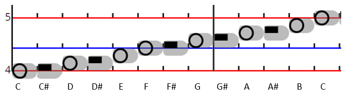
This new approach to sharps and flats is not strictly a chromatic design but it gives the “look” of one in that each of the twelve chromatic notehead center points has its own unique vertical position on the octave. The design remains essentially diatonic however as the naturals are presented as full size overlapping noteheads (just like Traditional Notation). The sharps and flats are “squeezed” in between them in an analogous way to the keyboard where the black keys overlap their adjacent white keys and are roughly half the width.
In the figure below, the diatonic naturals are represented by the hollow circles, while the other five chromatic degrees are represented by black rectangles. This results in a clear mapping of circles to white keys on the keyboard, while black rectangles map to black keys. (Unchanged in the design are staff lines on C and F, and the grey stripe notetails that represent the note duration in terms of beats which are indicated by the “tick” marks.)
I am attaching a document that has the full description of this new approach and how it further develops WYSIWYP as a keyboard tablature in addition to being a full function notation.
Comparison to a chromatic design with similar noteheads
Avid students of the MNMA website may notice the resemblance of this new WYSIWYP feature to the following chromatic design where the rectangular noteheads are half the height of the circular noteheads:
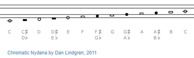
With this chromatic design, the twelve degrees’ noteheads are differentiated by their color (black filled or unfilled) and by shape (circle or rectangle), but there is no consistent pattern of shape and color that distinguishes the diatonic degrees from the other five chromatics. The same is true of many other Alternative Notation designs that employ different shape and color notehead patterns.
Unlike other Alternative Notations, the new WYSIWYP design feature is consistent in both color and shape within a diatonic context. The diatonic naturals are circles without color fill while the other five chromatic flat/sharp combinations are black filled rectangles. This simple and consistent one-to-one mapping results in less mental processing of notehead appearance and thus a more direct route from sheet music to fingers on the black and white keys of the keyboard. In other words, it’s a keyboard tablature.
While Nydana and WYSIWYP have notehead shapes in common, the underlying frameworks are different. Chromatic designs give equal emphasis to each of the twelve degrees. WYSIWYP emphasizes the seven diatonic degrees such that the five sharp/flat degrees are seen as adjustments to the naturals and not as equal members of a chromatic group. This emphasis is reflected firstly by a staff octave where each diatonic degree has a full vertical position (overlapping 50% with adjacent degrees), while the remaining five chromatic degrees have only a half-position (occupying the adjacent natural degrees’ overlap space). And secondly, emphasis is reflected by its use of a common notehead (in terms of shape and color) for the naturals while using a different common notehead for the remaining five sharp/flat combinations. Thus, just as the keyboard appearance is dominated by the larger and more numerous white keys, so too is the WYSIWYP staff by the diatonic naturals.

John F
John F

John Keller
--
You received this message because you are subscribed to the forum of the Music Notation Project (hosted by Google Groups).
To post to this group, send email to musicn...@googlegroups.com
To unsubscribe from this group, send email to musicnotatio...@googlegroups.com
For more options, visit this group at http://groups.google.com/group/musicnotation?hl=en
---
You received this message because you are subscribed to the Google Groups "The Music Notation Project | Forum" group.
To unsubscribe from this group and stop receiving emails from it, send an email to musicnotatio...@googlegroups.com.
To view this discussion on the web visit https://groups.google.com/d/msgid/musicnotation/f8337701-ec57-4275-950c-052c47252a3an%40googlegroups.com.
stuar...@gmail.com
I'll let John F. steer you to the piece he was using. I believe he got it from MuseScore (where you can download the MusicXML file).
John Freestone
I use this one from MuseScore. https://musescore.com/user/32261110/scores/5585485
I'm guessing you'll have a MuseScore account, in which case just click the download button and choose the XML option (or MusicXML), and save it wherever you like, Downloads folder by default, and then either open it from there in SNapp (which handles the compressed .mxl files as well as plain text ones), or move it to another convenient folder where you keep your music XML files.
Alternatively, you will probably find other sources of Moonlight Sonata in MusicXML by doing a general search.
Stuart is right - unfortunately the pitch range of this does stretch the staves quite a lot, but play about with the size values in the SNapp settings and/or the browser's zoom settings, and F11 (on Windows) helps by making it full screen.
Regards
John F
To view this discussion on the web visit https://groups.google.com/d/msgid/musicnotation/f82a467f-804d-4413-9e8f-f1684c560f20n%40googlegroups.com.
John Keller
To view this discussion on the web visit https://groups.google.com/d/msgid/musicnotation/f82a467f-804d-4413-9e8f-f1684c560f20n%40googlegroups.com.
John Freestone
I think what's happened is the SNapp version hasn't updated in the browser. You could try clearing your cache from settings, or it might need some more techy solution. It would be in the Settings on the right under head type if it's updated. I had the same problem and Stuart talked me through it, but it was quite a while ago and I don't have written instructions, so if that doesn't work, you may have to wait for him to reply. It was some juju in the browser with developer tools or something, clearing data in there. I'm sure he'll make it automatically update in time.
Cheers
John Freestone
To view this discussion on the web visit https://groups.google.com/d/msgid/musicnotation/B57C952F-8E8B-43AD-939B-9DF643725B87%40bigpond.net.au.
stuar...@gmail.com
John Keller
To view this discussion on the web visit https://groups.google.com/d/msgid/musicnotation/1692518b-ed3e-4193-a788-4f4b22398c83n%40googlegroups.com.
stuar...@gmail.com
John Keller
To view this discussion on the web visit https://groups.google.com/d/msgid/musicnotation/9b459321-223c-496b-9487-3a848b8c073fn%40googlegroups.com.
stuar...@gmail.com
When you say “I would prefer distances to be identified by distances alone” do you mean instead of color-coding? The purpose of color-coding was mainly intended for diatonic staves where you can’t actually recognize distances directly without some mental computations. CCC is certainly not necessary for chromatic designs.
Yes, I agree that seconds are a not easy to read in my design. The work-around is to use unfilled noteheads to help, but it’s still less than perfect. Skewing one of the notes to the side like TN causes some additional headaches in my design because of the absolute timeline. On the one hand, I want notes in a chord to all line up at the same time, on the other hand they’re hard to read when they overlap. Perhaps I could have special combined noteheads for seconds (one for major and one for minor) that replace both notes in the chord and displayed on the root position. Then the notehead still fits in the same horizontal time space. And maybe the appearance could then be that of the TN seconds. Ideas are welcome on this. Anyway, it’s “on the list.” (And alas, the list is quite long and just keeps getting longer.)
I appreciate the irony you pointed out. You are so right. At least the black key notes have equal standing in Express Stave.
If you have more comments or questions, keep 'em coming.
StuartJohn Freestone
To view this discussion on the web visit https://groups.google.com/d/msgid/musicnotation/27a94374-fe57-4a38-bf1e-b9a5a51870e7n%40googlegroups.com.
John Keller
To view this discussion on the web visit https://groups.google.com/d/msgid/musicnotation/cb73ddfb-4e74-546d-2404-63f26c0abf3a%40gmail.com.