Problems combining Tag CSS & Complicated Stylesheets

147 views
Skip to first unread message

Liyamu

unread,
Nov 15, 2013, 8:18:19 AM11/15/13
to twee...@googlegroups.com

Ok, so I am trying to get Tag CSS (http://www.glorioustrainwrecks.com/node/5013) to work with displaying two fairly-complicated stylesheets, “Capricorn” and “FramingStory” (which can be found here: http://www.glorioustrainwrecks.com/node/5163).

 I cannot for the life of me get it to work.  While I’m not new to Twine, my understanding of CSS is still limited.  I’ve been able to get the individual [data-tags~=whatever] to work on some separate sections of code, ala body or .passage, but I can’t figure out how to apply the tag to the entire stylesheet.  The example shows :

 [data-tags~=dream] {

  color: aqua;

  text-shadow: aqua 0 0 3px;

}

But how would you apply that to chunks of code that already have “{“ in them?  Like #passages { and .passage {

I’d hoped I’d just be able to add my tag at the beginning, along with an extra {  } framing the entire thing, but that doesn’t seem to work. 

I’ve been using a trial and error approach of plugging in data-tags on each section, but I can’t get the thing to work entirely that way either.

Any ideas?   Is it some obvious CSS thing I’m missing?  Or am I wrong to assume this is even possible? 

narF

unread,
Nov 16, 2013, 10:33:31 AM11/16/13
to twee...@googlegroups.com
I'm not sure I understand what you are trying to do. Maybe you could post your file so we can take a look?

Liam Neeley-Brown

unread,
Nov 17, 2013, 1:26:11 PM11/17/13
to twee...@googlegroups.com

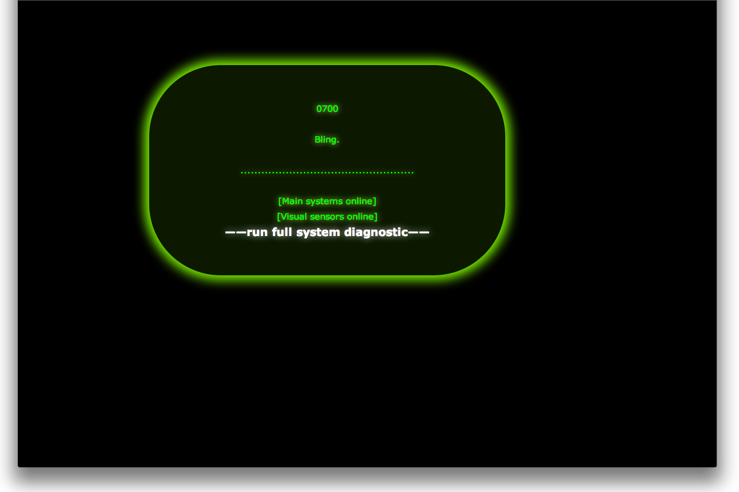
Ok, so basically I have written a story that I’ve split into two parts; the first to use the “Capricorn” stylesheet (a complicated pulsing green box dealy) and the second to use “framing story,” a simpler series of brown boxes that simulate a frame.  Trying to do this using the “Tag CSS” macros (to apply CSS to passages with specific tags) from Glorious Trainwrecks.


I would use “[data-tags~=capricon]” (without quotes) in the stylesheet for the first section, and “[data-tags~=frame]” for the second, having given each passage of each section the appropriate “capricorn” or “frame” tag.
The syntax for adding the tags to the stylesheets is simply [data-tags~=tag_name] {.  I’d hoped I could just add a curly bracket {  }  to enclose the entire stylesheet, but it doesn’t seem to work.  I’m still learning CSS, so I don’t know if there’s something obvious I’m missing.
You can add the data tag to individual elements, but again I couldn’t get it to work that way either.
I’m uploading my twine file, as well 2 HTMLs of the story split into its 2 separate parts so you can see what the stylesheets look like in action.  (which I am trying to combine into a single file).  Feel free to read it if you like.
Thanks!


--
You received this message because you are subscribed to a topic in the Google Groups "Tweecode / Twine" group.
To unsubscribe from this topic, visit https://groups.google.com/d/topic/tweecode/CU_XXFqIq6E/unsubscribe.
To unsubscribe from this group and all its topics, send an email to tweecode+u...@googlegroups.com.
For more options, visit https://groups.google.com/groups/opt_out.

part1.html
All Systems Standby (Twine Adaptation).tws
part2.html

narF

unread,
Nov 18, 2013, 12:35:31 PM11/18/13
to twee...@googlegroups.com
Ouf! That was tricky! Took me a while to figure out.


The answer to your problem is that you actually DO need to put the [data-tags~=capricorn] and the [data-tags~=frame] in every rules of the stylesheet. Something like this:

[data-tags~=capricorn] body{
  width
: 100%;
  margin
-left: 0;
}
[data-tags~=capricorn] #passages{
  font
-size: 1.5em;
  text
-align:center;
  border
-left: 0;
  margin
-left: 0;
  padding
-left: 0;
}
[data-tags~="capricorn"] .passage{
  display
: inline-block;
  width
: 50%;
  padding
: 4em;
  margin
: 5em 0 5em 0;
  border
-radius: 8em;
  border
-color: white;
  border
-width: 2px;
  box
-shadow: 0 0 2.5em 2.5em;
  animation
: borderkeyframe 6s infinite;
 
-webkit-animation: borderkeyframe 6s infinite;
}

If you have a rule that affect multiple things (in other words, if you see a comma in a rule, make sure you put your tag for each one. For example:

[data-tags~=capricorn] a.internalLink:hover, [data-tags~=capricorn] a.externalLink:hover {
  color
: yellow;
  text
-decoration: none;
  text
-shadow: 0 0 1.5em greenyellow, 0 0 0.75em greenyellow;
}

Now, it's not a perfect solution. When you reach the Part Two, the brown frame doesn't use the full size of the screen and I'm not sure why. I'm still looking into it...

narF

narF

unread,
Nov 18, 2013, 12:47:17 PM11/18/13
to twee...@googlegroups.com
Also, in the Capricorn stylesheet, there's some CSS rules that have tags already into them. Like this:
.passage[data-tags~=tier6] {
  text
-shadow: 0 0 1em hsl(0,100%,60%);
  color
: hsl(0,100%,50%);
  background
-color: hsl(0,100%,5%);
}

According to the doc for that template [http://www.glorioustrainwrecks.com/node/5163], it is there for if you want to create some sort of dialog box. If you don't plan to use that dialog box feature, you should remove them, especially the one that start with .passage:not([data-tags*=tier]), because it'll break the Frame template otherwise (all text will be greenish). If you DO plan to use these "tier X" tags, then I *think* you could put the capricorn tag too and it might work. Like this:
[data-tags~=capricorn] .passage[data-tags~=tier6] {
  text
-shadow: 0 0 1em hsl(0,100%,60%);
  color
: hsl(0,100%,50%);
  background
-color: hsl(0,100%,5%);
}

No certainty though. I haven't tried it.

Liam Neeley-Brown

unread,
Nov 19, 2013, 8:40:37 AM11/19/13
to twee...@googlegroups.com
Wow, thanks for helping me with this.  I had the same problem when I went through and added the tags to the framingstory stylesheet.  The outer brown frames are too thick, and the inner white (linen) box where the text goes is not large enough.  I wonder if it's some kind of bug with the macros.  But then again, leaving it untagged (and thus the default for the whole document) doesn't fix the problem.  Argh. 

Were you able to get the first part to look right?  When I added the tags, the animation wouldn't work.  So I removed them from the first two elements "@keyframes borderkeyframe" and "@-webkit-keyframes borderkeyframe."  I figured this would be ok, because FramingStory wouldn't invoke them.  Having done that, it looks ALMOST perfect, pulses and everything, but the text isn't centered in the screen and the box is too narrow.  It's subtle (until you compare it with the standalone Part 1), but it will mess up various line-breaks further along.

I can't help but feel like the problem lies with #passage and .passages somehow.  My grasp of CSS is far from strong, but those sections seem to describe the parts that aren't working.

So frustrating.

narF

unread,
Nov 19, 2013, 10:14:58 AM11/19/13
to twee...@googlegroups.com
While playing around with it, I noticed that some rules need the tag to be before and some needs it after. And some needs it in between.

You said that some rules seems to not be triggered, causing the text to not be centered and the box to be too narrow. You should try to find which CSS rules is responsible and try to put the tag before or after or in between until it works.

Whenever I edit CSS, I use the wonderfull element inspector in Google Chrome to know if a rules is correctly applied to an element. In Chrome, right-click anywhere on the page, then the last option at the bottom is like "element inspection" (I don't have the exact English words since I'm using a French version). By clicking on elements in the code on the left side, you can see on the right side all the CSS rules that affect that element. 

Liyamu

unread,
Nov 22, 2013, 2:56:37 AM11/22/13
to twee...@googlegroups.com
Hey, thanks.  I don't use Chrome, but it turns out firefox has the same (or at least a similar) feature.  Pretty cool!  I've started teaching myself HTML/CSS via web tutorials, so it'll come in real handy.  I've pretty much given up getting them to work at this point.  It's frustrating because they're so close.  I'm hoping once I understand CSS better the problem will be much easier to solve.

Merci mille fois!  (par chance, je parle francais ;)  )

narF

unread,
Nov 22, 2013, 11:38:44 AM11/22/13
to twee...@googlegroups.com
Yeah, I also noticed that all browsers now have the web inspector. It's so useful!

So what do you have working so far? I remember when I poked around earlier that I managed to get it to work near perfectly, switching between both themes. I should have sent you my modified file at that time (now it has been deleted). So yeah, if you send me back your progress, I could take a look.

Liam Neeley-Brown

unread,
Nov 22, 2013, 2:20:06 PM11/22/13
to twee...@googlegroups.com
Thanks!  Ok, so I got a new transition effect working (typewriter), but haven't managed to finish off the two stylesheets. 

The first, "capricorn' is too narrow.  But I don't know if its the text that isn't wide enough, or the green box.  My sense is that it's the text, since the box auto-shapes to fit around the text.  But again, my CSS isn't strong enough yet to be sure, looking at the code.

The second, 'framing story' is more messed up.  The frames are twice as big as they should be (both dark brown and light brown), and the 'linen' (white) background where the text goes doesn't have a default size like it's supposed to.  It starts out just big enough to contain the text, expanding as more text appears, instead of being a stable (and much larger) backdrop.  I have no idea where or what that would be in the code.  Also, when there is a lot of text on the screen, instead of automatically adding a scroll bar to the right, it just auto-scrolls the entire thing downwards, hiding the top part of the frame.

Any ideas?


--
All Systems Standby (Twine Adaptation) 2.tws

narF

unread,
Nov 23, 2013, 6:33:07 PM11/23/13
to twee...@googlegroups.com
Well, they seem to look good to me. What is the problem exactly?

Here are some screenshots of what I see. I'm using Google Chrome.

narF

unread,
Nov 23, 2013, 6:38:22 PM11/23/13
to twee...@googlegroups.com
Oh, I guess you want the framed one to be full screen like the original?

Like this?

narF

unread,
Nov 23, 2013, 7:04:53 PM11/23/13
to twee...@googlegroups.com
Ah, here's a problem I found. It seems you cannot target the "body" with a tag like you can any other. Even by putting the [data-tag...] before or after. So yeah, we'll have to figure out something else. If you can't target the body with a tag, you'll have to make a body rule that will fit both your themes. And then, I guess we can use both Passages and passage divs to adapt your theme.

I'm trying stuff...

Liam Neeley-Brown

unread,
Nov 24, 2013, 4:27:21 AM11/24/13
to twee...@googlegroups.com
The green box should be centered.  The part lacking, I believe, is the code that makes the default width of the passage wider.  As of right now, the box is narrower, and therefore does not look centered in the screen.  Compare this (correct):


with this (not quite right):


And yeah, in the second style, the frame doesn't fit the screen.  The frames aren't thin enough, either.  And the lighter background color only grows to match the current amount of text, rather than stay static (as a background).

I was afraid you were going to say something like that.  My guess is it's a problem with the macros.  He admitted it still had some issues (such as not working with the replace macros), but I don't know if he'll ever get around to fixing them.  :(

You're amazing, by the way.  Thanks for all your help.

narF

unread,
Nov 24, 2013, 10:13:45 PM11/24/13
to twee...@googlegroups.com
For some reason, your screenshots are not displayed... But I still understood what you mean, I guess.

Where did you found that macro you're talking about? If I know what macro you're talking about, maybe I can figure out better.

Anyway, I played with your file a bit. I think I managed to fix the big issues.

I moved the stuff that was in "body" or "html" (because we can't access them with tags) to the .Passages class. And most of it worked! You'll noticed also a new passage (Default CSS) that is another stylesheet for stuff that is common for both themes.

The only issue was with the brown background in Part Two. I had to be creative (read: hack stuff!) to make it work. Since we can't put the brown background in Body or Html, I used an unused div (namely: the sidebar!) as the background, after turning it brown, making it big enough to cover the whole screen and putting it in the back. It's ugly, it's terrible, but it work and it's the best we can do without modifying the html in the header.html.

Look at the attached file!
All Systems Standby (Twine Adaptation) 2.tws

Liam Neeley-Brown

unread,
Nov 25, 2013, 5:57:37 AM11/25/13
to twee...@googlegroups.com
Wow, very creative solution!  You're brilliant!  The first part looks perfect!  Although the brown frame part is still a bit messed up, at least on my machine.  Sizing is still wrong.  I'm attatching a word document with the screenshots in it.

I think I just figured out what the problem is with the second part.  When I told my browser to zoom out, it looked near-perfect.  The text was too small, but otherwise the frames and boundaries looked perfect.  So my guess is maybe there's a piece of code that tells the browser what size/ how much zoom to use when viewing the page?  I would have guessed that's what "height, width 100%" meant.  Still learning CSS, so I can't be sure...

No, it has to be specific to the frames.  Otherwise the text is too small.  Argh.

I'm amazed at how much effort you've put into helping me with this frustrating challenge.  I really appreciate it!  Please feel no obligation to continue though.


--
screenshots.docx

narF (Francis)

unread,
Nov 25, 2013, 10:43:46 AM11/25/13
to twee...@googlegroups.com
Well, to be honest, I think I just liked your story. I've been thinking... is it about hyperactive children or autistic children? That's the feeling I get while reading your story.

When you are testing CSS, you should always leave the zoom of your browser to 100%. Because this is what people will have as their setting when they first reach your story. To change the size of the text, you can modify the CSS rules in HTML, body, or the passages. Look for rules that say "font-size". Font size are specified in a unit called "em". 1 or 2em is probably what you'll need. Or 1.4em maybe. 

The 100% you can see in the HTML rule means that the page should take all of the space in the window. It has nothing to do with zoom. To be honest I'm not super sure it's even useful to write that rule because browsers will always use 100% of the space anyway.

If you want your template to look precisely as you want, I suggest you use the web inspector in your browser to manually change the value in each rules, especially those related with spacing, padding, margins, or border size. Then, you can simply copy paste the rules from your web inspector into your Twine passage. That's how I work when I edit or create CSS style sheets. 

To be honest, I think your story already looks very nice. I'm sure you could probably just release it as is. It will be good enough. And keep in mind that players are looking for interesting stories, not so much for cool looking graphics.

Keep up the good work! I'm glad I was able to help. Just put my name somewhere in the credits (@narf_snw on twitter.narf.ca) when you'll publish your story. And send me the link so I can share it around!
--

--
narF

Minimmense6, webcomic.
« L'important c'est l'hottitude! »

Liam Neeley-Brown

unread,
Nov 27, 2013, 7:14:58 AM11/27/13
to twee...@googlegroups.com
Yeah, thanks.  I'll have to try messing with the inspector.  As I learn more CSS, I think it will be increasingly helpful.  And I'll definitely tip my hat in your direction when I finish.  It might be "good enough," but I want to push the medium as far as I can.

I'd say both of your interpretations of the story would work.  It's a family that has gone through some sort of trauma, and the kid's means of escape.  But the details are up to the reader.

Thanks again.

Liam Neeley-Brown

unread,
Dec 20, 2013, 7:29:33 AM12/20/13
to twee...@googlegroups.com
I finally finished!  I ended up giving up on getting the "tag-css" macros to work, and just pasted the HTML into each page.  It wasn't pretty, but it was guaranteed to work.  I'm hoping the new release of Twine will address the issue (but I haven't played with it yet).

Anyway, thanks again for all your help.  Here's the link:

https://dl.dropboxusercontent.com/u/100285760/All%20Systems%20Stand%20By/All%20Systems%20Stand%20By%20%28Twine%20Adaptation%29%20web.html

   -Liam

narF

unread,
Feb 13, 2014, 11:05:43 AM2/13/14
to twee...@googlegroups.com
(A little late), I just saw your message as I haven't been on this forum in a while.

I like what you did with the pictures in Part 2. I think it's even better than the beige/brown theme from before.

I shared your story on my facebook and twitter :)

Liam Neeley-Brown

unread,
Feb 13, 2014, 8:28:37 PM2/13/14
to twee...@googlegroups.com

Oh awesome, thanks!

Yeah, I don't look at that forum much anymore either.   :)

   - Liam

--
Reply all
Reply to author
Forward
0 new messages