
Edgaras Benediktavicus

Mohammad

Anne-Laure Le Cunff
On Friday, April 24, 2020 at 8:43:43 PM UTC+1, Mohammad wrote:
Hello Edgar,Welcome to the community and great to know yoy are willing to create a new theme!
I may suggest to have a look atThis is one of the best collection of Tiddlywiki resources on the net.
Using good UI (theme) it can plant many roles like blog, notebook, website, database, image gallery, CMS and like that...

TonyM
- TiddlyWiki can already do or be many things
This presents a dilemma, because how do you set a basic standard look for a chameleon? - TiddlyWiki is the answer to so many questions, but which question are you trying to answer?
- There are already innovative tiddlywiki layouts like a trello look alike, the Murri plugin and much more
- The traditional way to address the various needs is to publish themes, plugins or whole "editions"

Mat

Jed Carty
Mat
it really doesn't matter if something is accepted by Jeremy or any of the devs, you can make it anyway.
Jed Carty
Edgaras Benediktavicus
This is one of the best collection of Tiddlywiki resources on the net.
- TiddlyWiki can already do or be many things
- This presents a dilemma, because how do you set a basic standard look for a chameleon?
- TiddlyWiki is the answer to so many questions, but which question are you trying to answer?
- There are already innovative tiddlywiki layouts like a trello look alike, the Murri plugin and much more
- Simple and intuitive interface that feels nice and simple to sit in front of every morning (e.g. Bear app, Notion, Typora)
- Making sure that the notes are as modular and interconnected as possible with backlinks etc. (yet still simple). (RoamResearch achieves that quite well, but it can be better)
- Yet, NONE of those powerful ones are free and personal tools for the new digital knowledge age. I believe everyone has a right to their own personal digital knowledge management, publishing and collaboration.
I have a vision for such a solution I would be happy to share if you want to consider taking it on.
One way I would like to see the recent discussions evolve is a bit like how developers may use wordpress as the back end and write their own front end.
When it comes to static site generation, there are great mechanisms in tiddlywiki to do this already as no doubt people see, but to make it really powerful we need to improve and support the workflow and templates used to do this.
Tiddlywiki as a platform, Software Development Kit, Personal Productivity tool, site generator, database.... interface design ... is almost infinite.
I would like to see a responsive theme that contains elements that come into use only if given content and obeys a set of rules that allows almost any design structure, with default that result in what we currently see, but a small set of changes transforms it.
- Visual layout (font, colors, white space, removing not first priority elements)
- Modeless / Contextual – it does not have to switch to fully different mode for editing. Editing and viewing happens at once. You interact with the smaller elements to get into the deeper editing "mode". For example if you interact with tags - you edit tags, if you interact with your writing cursor with the link in the text, you edit that link. As a result all the options are less overwhelming, it's more contextual.
- More advanced editing features and meta data is hidden one click away ⋮
Edgaras Benediktavicus
Edgaras Benediktavicus
- The navigation when clicking links. Do you find it useful that tiddles are opening as a vertical stack? I find it kind of confusing, and not really helpful when you have increasingly large stack. I would like to explore alternative interactions:
- Swapping the tiddle with a new one, but keeping the breadcrumbs on top (if possible?) and giving < and > navigation, back and forward in time where you've been.
- Stacking tiddle when opening into tabs, so you can switch then by clicking or keyboard shortcut.
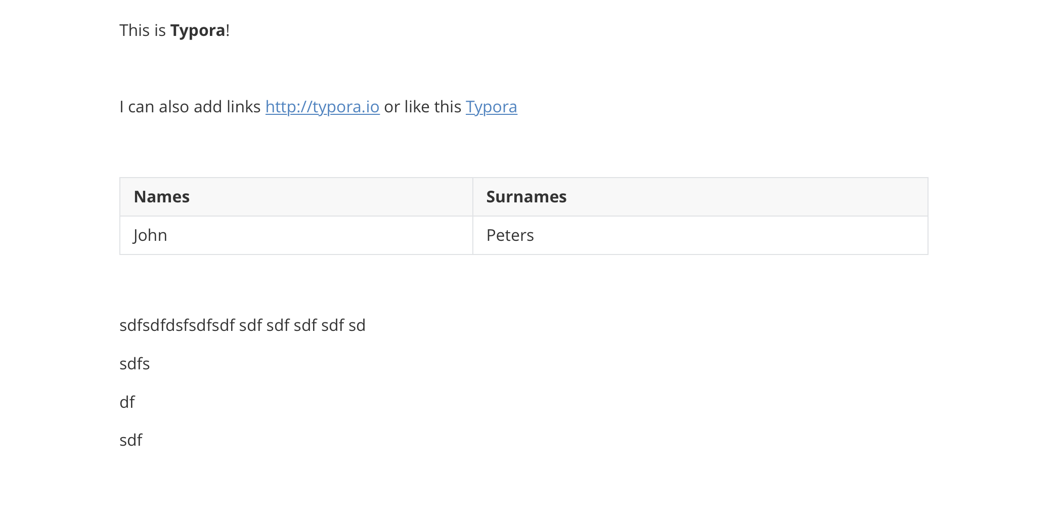
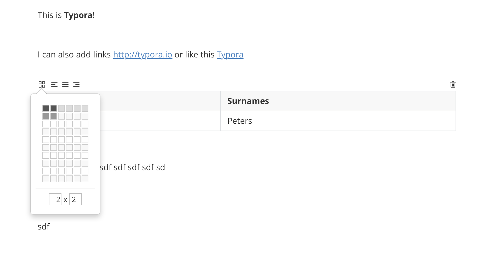
- Editing mode. How can we make the editing more fluent with viewing. It distances you from just writing if you have to click edit and save everytime. You should be able to navigate text with keyboard or just click anywhere in text right away and start editing. Saving should happen automatically (to local storage). All the text-type formatting could be hidden, unless it's relevant for the selected word or sentence. This will reduce visual clutter. Check the simplicity of text editing in Typora! → Quick demo

Birthe C
Edgaras Benediktavicus
Mohammad
Mohammad
You are welcome to comment on top of prototype! And ask me if you want to edit!
Edgaras

David Gifford
On Saturday, April 25, 2020 at 5:31:23 AM UTC-5, Edgaras wrote:
Moving forward I see two main issues that prevents simplicity:
- The navigation when clicking links. Do you find it useful that tiddles are opening as a vertical stack? I find it kind of confusing, and not really helpful when you have increasingly large stack. I would like to explore alternative interactions:
- Swapping the tiddle with a new one, but keeping the breadcrumbs on top (if possible?)
- and giving < and > navigation, back and forward in time where you've been.
- Stacking tiddle when opening into tabs, so you can switch then by clicking or keyboard shortcut.
- Editing mode. How can we make the editing more fluent with viewing. It distances you from just writing if you have to click edit and save everytime. You should be able to navigate text with keyboard or just click anywhere in text right away and start editing. Saving should happen automatically (to local storage). All the text-type formatting could be hidden, unless it's relevant for the selected word or sentence. This will reduce visual clutter. Check the simplicity of text editing in Typora! → Quick demo
Maybe a sticky toolbar for the various parts of the edittemplate. Click to open fields, click to open types, click to open preview, click to have editor toolbar buttons visible, etc
Mohammad
Mohammad
Edgaras
I actually did this part a number of years ago.
Maybe a sticky toolbar for the various parts of the edittemplate
Anne-Laure Le Cunff

Jeremy Ruston
- The navigation when clicking links. Do you find it useful that tiddles are opening as a vertical stack? I find it kind of confusing, and not really helpful when you have increasingly large stack. I would like to explore alternative interactions:
- Swapping the tiddle with a new one, but keeping the breadcrumbs on top (if possible?) and giving < and > navigation, back and forward in time where you've been.
- Stacking tiddle when opening into tabs, so you can switch then by clicking or keyboard shortcut.
- Editing mode. How can we make the editing more fluent with viewing. It distances you from just writing if you have to click edit and save everytime. You should be able to navigate text with keyboard or just click anywhere in text right away and start editing. Saving should happen automatically (to local storage). All the text-type formatting could be hidden, unless it's relevant for the selected word or sentence. This will reduce visual clutter. Check the simplicity of text editing in Typora!
Edgaras
all of the functionality available in the default theme
need for backwards compatibility
Zoomin displays a single tiddler at a time with a transition animation as links are clicked
The difference between editing and view mode is hard to hide away.
It’s based on Quill.js which seems to be popular but I find it very clunky to use, particularly making links.
You are not the first to mention that saving should happen automatically to local storage.
I don’t think there’s a whole lot of low hanging fruit without significant development within the core.

PMario
PMario
IMO we can do everything. ... Installing those 3 themes in ONE wiki and make them switchable will be a challenge. ... But doable, if it needs to be ...
Anne-Laure Le Cunff
- It's the fist time I see the introduction walkthrough, this is going to become my go-to when telling people about TiddlyWiki!
- Tangential - I was about to share the link on Twitter, but checked here first and it looks like there's no link preview. It would be good in a future version to have default link preview parameters so links always look good on social media. Even better if the user can tweak them easily.
- If there are so many limitations in working with the full version of TiddlyWiki, I wonder if Edgaras couldn't design a version that's purposefully restrictive. For instance, we're not able to edit on click because we're not sure what complex transclusion may be computed in the background—maybe that super simple Starter Edition of TiddlyWiki would not support such complex transclusions and focus on pure note-taking? May not be possible at all but just throwing it out there.
- Also, side note that I personally never use Storyview, and what Dave Gifford is creating to look at two tiddlers side-by-side feels much more natural to me, but again may be too much of a departure from the way TiddlyWiki works.

Peter Buyze
@Jeremy: this was such an interesting read, thank you!Just want to jot down some thoughts:
- It's the fist time I see the introduction walkthrough, this is going to become my go-to when telling people about TiddlyWiki!
- Tangential - I was about to share the link on Twitter, but checked here first and it looks like there's no link preview. It would be good in a future version to have default link preview parameters so links always look good on social media. Even better if the user can tweak them easily.
- If there are so many limitations in working with the full version of TiddlyWiki, I wonder if Edgaras couldn't design a version that's purposefully restrictive. For instance, we're not able to edit on click because we're not sure what complex transclusion may be computed in the background—maybe that super simple Starter Edition of TiddlyWiki would not support such complex transclusions and focus on pure note-taking? May not be possible at all but just throwing it out there.
- Also, side note that I personally never use Storyview, and what Dave Gifford is creating to look at two tiddlers side-by-side feels much more natural to me, but again may be too much of a departure from the way TiddlyWiki works.
@Edgaras: I don't think the WYSIWYG part is that important to be honest. The kind of users that will be early adopters of this Starter Edition will probably understand markdown fairly quickly, especially if the onboarding is done correctly. (tens of thousands of non-technical people did with Roam)I think what would be interesting from a design standpoint is figure out everything that should be removed for a Starter Edition, so people can get the best first impression, and then build upon this as they grow along their TiddlyWiki. Very excited to follow the progress on this!
On Saturday, April 25, 2020 at 4:06:09 PM UTC+1, PMario wrote:Hi Edgaras,Welcome to the club!It's nice to see a designer's point of view! I think your designs should be like brainstorming about UI and UX improvements. It's cool to explore new possibilities without thinking about the consequences ;)We developers and power-users should not think about, how of if we can implement "those visions". We shouldn't think about "design" backwards compatibility. The internals need to be compatible. They are ultra flexible already ... We will survive it!I think it's about the "First Impression" for new users. Newbies want to type formatted text. ... Have a TOC ... Create simple ToDo's / shopping / <you name it> lists. ... They seem to like "backlinking" more visible ;) ...I think, if those elements can be made simple and they have the possibility to "store", "reload" and make their stuff visible for others, they are "caught" already.If the second step like dynamic lists need an "extended editor" and transclusions, macros, widgets need an "advanced" editor this doesn't matter anymore. We got them already.-------------Themes can look like:- Hugo static site theme Ghostwriter or- Wordpress Moments or more TW like- Whitespace which IMO has a very nice sidebar concept.IMO we can do everything. ... Installing those 3 themes in ONE wiki and make them switchable will be a challenge. ... But doable, if it needs to be ...There is one more thing, I wanted to show, but it doesn't work atm ;) ... Link will follow.have fun!mario
--You received this message because you are subscribed to the Google Groups "TiddlyWiki" group.To unsubscribe from this group and stop receiving emails from it, send an email to tiddlywiki+...@googlegroups.com.To view this discussion on the web visit https://groups.google.com/d/msgid/tiddlywiki/8500c4e2-d7bf-4dbb-8de1-89ebf95a117d%40googlegroups.com.
Mohammad
Mohammad
- It's the fist time I see the introduction walkthrough, this is going to become my go-to when telling people about TiddlyWiki
Mohammad
Anne-Laure Le Cunff
Mohammad
On Saturday, April 25, 2020 at 11:06:13 PM UTC+4:30, Anne-Laure Le Cunff wrote:
@Mohammad: these look amazing! We need to have a proper gallery of themes in the new tiddlywiki.com - it will really help to get people excited.And talky talky looks amazing, but already a bit more technical :)

Anjar
Edgaras
Plain editing, markup → Select word/sentence/paragraph to call a small toolkit pop-up → Toggle the toolbar → Reveal more advanced toolbar.
Edgaras
David Gifford
David Gifford
Mat
Here is a short screen recording of the prototype:
Mohammad
On Tuesday, April 28, 2020 at 9:02:39 PM UTC+4:30, Edgaras wrote:
I've been prototyping a little bit further last weekend. I took in consideration many things we've discussed above. The prototype is far from final, but I hope it gives the idea of the minimalist vision.Here is a short screen recording of the prototype:
Edgaras
Mat
- Removed the box/frame and left text only to focus on writing experience.
- You can start writing just by clicking on text or TAB on keyboard
- Meta info like "fields" and "content type" is hidden one click away for simplicity.
- Simplier tag management.
- Added "mentions" for backlinks!
- Added a star icon for pinning/adding a tiddler to favorites.
- Added breadcrumb navigation on top
- Simplified sidebar with 4 tabs: opened tiddlers, pinned, recent and all.
- Clicking on a link, you navigate to another note, but you can still access all opened notes in sidebar until you close them all.
Mohammad
On Tuesday, April 28, 2020 at 10:21:47 PM UTC+4:30, Edgaras wrote:
David Gifford Thank you! I was actually thinking something very similar! See the image attached. I tried it on the side stacking vertically, but the problem was titles are too long.So I gave 2 letter initials for each note. I think I should try like you suggest putting notes on top.By the way from your experience how many actual notes do you have open and it's still useful at a given time?–––––Mat, Mohammad woups, made the video file public now!
–––––Mohammad clicking on the "Mentions" (backlinks) will give you a dropdown searchable menu, similar to other dropdown menus like for tags that TiddlyWiki already has.Yes, links and images are very important to markup. Links with [[ ]] convention and images with markdown style to start with (
Editor bar is the next thing to work on, but we need to consider minimalist. We could have just typing and markdown to start with (and give a quick popup for cheatsheets).Or we could make so the toolbar is very minimal, you open it by selecting/highlighting a word/sentence.
Yes, mobile design is the very next thing to address next too! Thanks!
Could you give a bit more detail to the comment about "loose arrangement"? Are you refering to the notes not having a box? This one I am inspiring again from simple editors like Typora, Notion, Roam. It gives the feeling of freedom and minimalism. It might be a bit hard to get the feeling now only from image prototype. It could feel different when it's real.
I really like how in Notion you start with the blank slate (see the screenshot attached)

Thomas Elmiger
https://tid.li/tw5/test/concept.html
TonyM
- There are a number of radically different views available for tiddlywiki including one that looks like trello, Murri which can work even across multiple screens, JDs material plugin that includes buttons for use on mobile and more.
- Quite a few people do come to tiddlywiki looking for minimalist versions for specific purposes. The traditional method was to publish different editions, ideally that could also be constructed from a subset of plugins.
- It is interesting that so many people who have joined us of late, Due to Anne/Product Hunt and perhaps even home isolation for Covid-19 happen to be interested in static sites. This is an importiant direction but to me this is actually only one of many. New users may not yet had a chance to drink the whole bottle of tiddlywiki coolaid.
- I had both in tiddlywiki classic and now in TW5 a personally wiki I share with no one, will never publish.
- It is a project manager,
- To do list and knowledge repository. It has personal records, ideas and projects. It evolves with my needs
- It has planning and time frame handling, menus, custom link sets.
- It helps me build and record work flows and algorithms, instructions and references.
You are already mentioning bunch of great points:
- TiddlyWiki can already do or be many things
- This presents a dilemma, because how do you set a basic standard look for a chameleon?
This is why I am so excited about, it's super powerful, but somehow it seems a bit overwhelming, with all the features shouting for the importance. The tool could be as blank as it can be, while displaying first possible actions, and then introducing complexity as you engage within a context.
- TiddlyWiki is the answer to so many questions, but which question are you trying to answer?
- There are already innovative tiddlywiki layouts like a trello look alike, the Murri plugin and much more
As I see it, TW should be as it is – super powerful personal notebook, with a possibility to quickly and simply publish static website, as if possible (don't know much about it) a collaborative writing tool. Some of the things that I see are missing:
I've seen some of TW themes, but it feels more like as a surface redesign, but underlying issues are there. Yes, some corrections on usability and some nice features like sidebar are there, but many things like fonts, icons, animations, white space feels odd, as most importantly, not much is improved in the usability of editing. Also, obviously I haven't seen enough! Please share if something minimal exist already.I have a vision for such a solution I would be happy to share if you want to consider taking it on.I would love to hear your vision if you are willing to share! Both on the strategy and design, let's collaborate. We can discuss here + draft a more structured google docs + prioritize tasks on Trello + share the actual design vision and comment on Figma prototype.
One way I would like to see the recent discussions evolve is a bit like how developers may use wordpress as the back end and write their own front end.Could you explain a bit more what do you mean here?
When it comes to static site generation, there are great mechanisms in tiddlywiki to do this already as no doubt people see, but to make it really powerful we need to improve and support the workflow and templates used to do this.I really want to dig deeper into the current state of art of TW's static site generation. It must be as simple as in any other SSG, but even simplier! I like what Publii is doing. You just write you site visually and then publish to GitHub Pages or SFTP as a static site with one click (+ first time simple settup).
Tiddlywiki as a platform, Software Development Kit, Personal Productivity tool, site generator, database.... interface design ... is almost infinite.
I would like to see a responsive theme that contains elements that come into use only if given content and obeys a set of rules that allows almost any design structure, with default that result in what we currently see, but a small set of changes transforms it.That's how I see it too! Simple, responsive, contextual, prioritised. There should no unnecessary switching "modes", viewing and editing should feel as one coherent flow. And all the power of the tool can come into the right place, but it should to be prioritised.
Peter Buyze
Thank you for in the depth feedback peeps! This really helps to consider more aspects and improve the design.––––––––––
For default it is not a good idea because the user needs to understand the concept of tiddlers and the framing helps with this conceptualization.
Mat is see what you mean now! I agree with you and maybe even in this theme, tiddlers should stay modular, and have the story view, it has many advantages! There are few things that bothers me in the story view and I want to address those. For example, I loose track of navigation when I jump from one to another tiddler. Maybe I need arrows < > so I can quickly navigate from where I've been before and combine with breadcrumbs. I already have that in the prototype and I can try to prototype
--You received this message because you are subscribed to the Google Groups "TiddlyWiki" group.To unsubscribe from this group and stop receiving emails from it, send an email to tiddlywiki+...@googlegroups.com.
To view this discussion on the web visit https://groups.google.com/d/msgid/tiddlywiki/f3812ef8-f439-4ec1-93a6-4f90612c95b6%40googlegroups.com.
Anne-Laure Le Cunff
- Love the clean design, I find it both relaxing and inviting and could see myself write more with TW with such an interface.
- Yay for proper markdown integration out of the box! Not a question for you, but more with the developer you will partner with on this, but would it be possible to get both markdown as found in this plugin and autocomplete for internal links as found in TiddlyBlink? They currently don't work together.
- Maybe move the mentions at the bottom of the writing or somewhere else? I think the dropdown menu at the top may make them feel like a second thought. I think at the bottom of the writing area with area with a little expand/collapse icon may be an interesting option to explore (similar to what Roam did).
- Even though I agree (as discussed previously) we should not make the settings/tools as central as it currently is in the default TW theme, I don't think there is any link to it at all right now? People will still need access to their settings.
On Wednesday, April 29, 2020 at 8:32:26 AM UTC+1, Peter Buyze wrote:
Regarding the navigation, I installed Ton Gerner's tiddlerbar plug-in because of the same problem you describe. I find the tiddlerbar solved it. When you have many tids open the bar just overflows into an extra line of tabs.29 Apr 2020, 10:29 by edgar...@gmail.com:
Thank you for in the depth feedback peeps! This really helps to consider more aspects and improve the design.––––––––––For default it is not a good idea because the user needs to understand the concept of tiddlers and the framing helps with this conceptualization.Mat is see what you mean now! I agree with you and maybe even in this theme, tiddlers should stay modular, and have the story view, it has many advantages! There are few things that bothers me in the story view and I want to address those. For example, I loose track of navigation when I jump from one to another tiddler. Maybe I need arrows < > so I can quickly navigate from where I've been before and combine with breadcrumbs. I already have that in the prototype and I can try to prototype
--You received this message because you are subscribed to the Google Groups "TiddlyWiki" group.
To unsubscribe from this group and stop receiving emails from it, send an email to tiddl...@googlegroups.com.
Edgaras
For default it is not a good idea because the user needs to understand the concept of tiddlers and the framing helps with this conceptualization.
But... which mode is it we see in the demo/recording? Edit or View mode? How do I switch between these modes?
It is very elegant but in what way is it simpler?
(This is not seen in the demo, right?)
(Not seen in demo, right?)
I'm not sure about putting tab All there instead of More. How do you access the other subtabs of More?
Like normal/current TW, right?
Wonderful! I may prefer wikitext instead of markdown :-)
Hit the return key and get a new block, by default a paragraph, but that can be changed by hitting a shortcut or pressing a button to change the block type.
This is to show how you may not yet have imagined TiddlyWiki yet.
Another key wiki rins on Windows TiddlyDesktop and it interacts with my computer, folders, files links and supports automation, network troubleshooting and more.
this is not at all to diminish your approach, but perhaps even to broaden the possibilities further.
You give me a link or start a thread here or in my personal group
I am not suggesting something so extreme, I am suggesting with different themes and page structure tiddlywiki can and does do the same
The thing is a good design on top of tiddlywiki will benefit from the many advantages within tiddlywiki.
I agree, many need what you say here, but I do want to be able to switch modes
Yay for proper markdown integration out of the box!
Maybe move the mentions at the bottom of the writing or somewhere else? I think the dropdown menu at the top may make them feel like a second thought.
settings
TonyM
I am so glad you are inspired. Your contribution will be appreciated. I think We are in furious agreement and share your visions.
Many of your ideas have had some consideration over recent years here and its good to see that you have insight into these issues even although you are new to tiddlywiki. The truth is tiddlywiki as at the leading edge of personal software in my view, if not yet as accessible to the general public as we wish. Tiddlywiki also has a history of absorbing and reinventing meaningful advances.
Many of us are skilled in diverse areas and expect very different things. From academics and authors to hackers and to Do list users.
Jeremy is the creator and has maintained some strict principals that have got us so far with each advance expanding possibilities exponentially. There are conceptual leaps needed for many to come to terms with tiddlywiki, but someone with your broad insight will find much can be plugged in to the platform. In some ways it is self documented, an important principal, but this sometimes, results less general (although not dummed down) documentation.
the best way is to learn its mechanisiums and build a plugin or edition that demonstrates new solutions. If there is a gap that can be addressed in the core tell us about it, but more often than not someone will have a method or a workaround.
It has being a long standing tradition to encourage people to search for solutions already there, but we ask do not hesitate to ask questions. I am often delighted at the number of different and elegant solutions that come forward.
This is my experienced viewpoint but others may have quite different view points.
I will restate, being able to generate sites is only one opportunity, although it has inspired many new members recently.
I believe its key advantage is how any change can be immediately reflected throughout the whole wiki extremely efficently. This is more powerful than most people recognise.
Also despite the server options, the single file wiki is also an importiant principal and again results in massive advantages. Although it is a rule that can be broken, in a particular instance it will always remain a key principal.
Count on my support, I hope my words help yourself and others gain insight to the current culture here including our openness to new ideas and cultural evolution.
Regards
Tony
Edgaras
TonyM
TonyM
On Wednesday, April 29, 2020 at 11:59:04 PM UTC+10, Edgaras wrote:

Miha Lunar
I really like these ideas and the minimalistic mockups look really nice. Before finding TW I was using Notion for a while and I think it has a really neat UX that's complex under the hood, but presented nicely.
Re: mixing wikitext and Markdown: They are fundamentally incompatible in some areas, e.g. # in MD means header, while in WT it's an ordered list item. Initially I also wanted to just use Markdown, but nowadays I feel like wikitext might actually be "the better Markdown". That's bad because then it's harder to champion for the more mainstream Markdown :)
Re: modeless editing: I feel like this is a really powerful concept that brought text and layout editing to the masses. At the same time, I believe having an editable readable text "source" for a document is powerful in terms of:
• reproducibility - you can copy paste a section of the source to someone and they will get the same thing barring side effects
• consistency - all the state is visible, so it's harder to get into a weird state where some hidden format or layout is affecting your writing unintentionally
• flexibility - since code is usually text too, you can essentially have a way more flexible system if you can also write "code" within text (wikitext has this with transclusions, etc., LaTeX too)
That said, as you mentioned, looking at / parsing all this additional code all the time can be taxing, as as much as we want them to be, human brains aren't really great computer grammar parsers :)
This brings me to what you and others mentioned and what I believe Notion got really right. The concept of logical blocks a page / note consists of. This can be a paragraph, a link, an image, a table, etc. In Notion it's natural to add these, you type a / and up pops a small non-intrusive command search popup, where you just search for a thing to add.
These quick-add slash commands would be essential when it comes to the unified view / edit flow imo. On top of that add drag and drop reordering logic and you're 80% there.
So how do you reconcile having source editing and Notion-like blocks? I would start by keeping the source and having a special type of a UI view that is smart enough to modify the source directly through UI actions like typing in the middle of some text, adding a new block (read: header, image, tiddler link, transclusion, anything that's a toolbar button right now) with a slash command, or reordering some blocks in the tiddler (e.g. dragging a header a few paragraphs higher would move it in source text a few lines up).
Now for a little nerd talk. Jeremy, I hope you're listening ☺
Technically, this would have to be done carefully as to not corrupt or change the source in any unexpected way. The complexity depends a little on how wikitext is parsed currently. If it's the standard lexer-parser setup where you get an Abstract Syntax Tree (AST) somewhere in the middle before you convert it into HTML it would already help a lot.
One interesting feature that many parsers usually don't care about is that we would need is for the AST to be losslessly reversible back into wikitext (including whitespace, comments, everything). That way we would be able to operate on the source in a safe and structured manner without losing any extra stuff in it.
To be able to visually link the blocks back to their source text, we would need to track all the up-to-date character ranges for the parsed tokens / AST leaves and carry their ids up to the UI / HTML elements used to display them. Then when you e.g. have a list of images and you drag an image, the UI knows of the hierarchy behind the display (from the AST) and at the same time knows how to modify the source text (by the character ranges in each AST element) to produce the desired modified output.
Nerd mode off.
Clearly you won't have a UI that allows you to edit every single wikitext feature including transclusions, macros, etc. on day one. But I see great value in having even just bold, italic, headers and links as an MVP and blackboxing everything that is not supported. Since the source wikitext would remain, you could always switch to the source view for more advanced stuff.
Now if we entertain this modeless direct editing experience some more, I can imagine all the blackboxed blocks turning into inline source code editors. Transclusions could provide a way for editing the source tiddler directly by showing a nested UI in the context of the transcluded tiddler with some border or whatever showing up to tell you which one it is.
I'm not saying it would be easy, but it's definitely achievable, especially if you limit the scope of what to do initially. :)
Welp, I spent too much time writing this brain dump, so I hope it gave some ideas to someone at least. :)
Best,
Miha
TonyM
- I tend to keep Real text in standard tiddlers with all code in $:/systemTiddlers, macros or view templates use these.
- I tend to use a view template to display, often conditionally, the content of any standard tiddler, this view template will invoke macros etc... as needed to display the fields and other value. ie they are not placed in the wiki text except in limited circumstances.
- Many of my tiddler have no text field, this is simply retained for additional notes, all the results come from how the tiddler is tagged or fields it contains, tags are used to get information from elsewhere in the wiki.
- Tiddlers are my blocks, and the view template assembles them
- Given this method I can introduce drag and drop reordering if an when desired.
- I will use the occasional class or macros in my wikitext but they are usually meaningful to the reader and do not distract from the notes.
- If transferring content from a TiddlyWiki to another location I do not copy the wikitex,t they can't process, I use the following methods
- Copy and paste the rendered output
- Print to a text file
- Print to a PDF
- Copy the resulting html
- sometimes paste the copied html as plain text
- Generate csv formatted text I copy and paste
In the editor there is a preview mechanism, additional preview formats can be used out of the box or even developed. I use the HTML one to extract HTML snipits for use elsewhere, For example we could have a parser that provided a "preview" that instead of presenting html, presented raw markdown. If you can see something in preview its trival to provide copy to clipboard, export or even drag and drop to move content in another format.
Miha Lunar
Thanks for those details!
It helps to see how some of my points relate to the inner workings already. Note that I was mostly talking in the general sense for the concepts above, so many of the things I mentioned could already exist in some form.
I see your point on tiddlers usually being _the_ content and not the ones containing it via view templates and tag lists. I have this to some degree as well. However for new users, I think there's a big gap between "oh I can enter text and make it bold and save it, that's cool" and "I am the master of tag based filtered list macros" :D
What the above does point towards is that it would be better if the solution was extensible in some way, to support all the custom use cases that arise. Now all this could be at first is just a generic view template that you can install and that adds this functionality to all tiddlers by default.
I don't know how useful it would be for experienced users, but for new users I think it would help ease them into the syntax and help with writing text-based tiddlers.
I want to emphasize here that this would just be a potentially easier way to edit simple notes, it should of course integrate with all the existing TW functionality - meaning editing text would keep being reactive. The "blocks" I was referring to was a shorthand for parts of a note - this might have a big (full?) overlap with Widgets, so if it does, just replace block with Widget in my previous email ;)
Best,
Miha
Edgaras
TonyM
Mohammad
Edgaras
Mohammad

Riz
Edgaras Benediktavicus
Birthe C

Diego Mesa
At this point in time the learning curve is way to high for me to optimize the interface and workflow the way I want with TiddlyWiki.I think TiddlyWiki is still a super tool and is very promising with all what's done. But at the moment a bit too inconsistent, difficult to use. Plugins help but then everything is very patchy.I know for many people TW is a hobby. But I just want a tool that works, I don't want to tinker with it every day, keep fixing bugs and inconsistencies.Therefore, I think it requires a different organised approach to asses the vision and make it more modern, matching the nowadays needs and expectations (RoamResearch, Obsidian content editor, static site builders...).
Mat
[...] I just want a tool that works, I don't want to tinker with it every day, keep fixing bugs and inconsistencies.

BirgitB
Rizwan Ishak
--
You received this message because you are subscribed to a topic in the Google Groups "TiddlyWiki" group.
To unsubscribe from this topic, visit https://groups.google.com/d/topic/tiddlywiki/gX0o8j7Coa8/unsubscribe.
To unsubscribe from this group and all its topics, send an email to tiddlywiki+...@googlegroups.com.
To view this discussion on the web visit https://groups.google.com/d/msgid/tiddlywiki/150fc9a4-7675-4799-a6aa-ce6966ce9ceb%40googlegroups.com.

Scott Sauyet
Edgaras
Given that HTML is the target for both
Rizwan Ishak
Mat I think there is a bit of difference tinkering in tiddlytext and something widespread and future proof as html/css/js.Also there are much more resources, people had every single problem thousands of times.
I strongly agree with central place where to publish stuff. Imagine if there was a website where top solutions are promoted, voted up. Those would get attention and be improved by donations and contributions. Over the month with TW I kept discovering great stuff, just couple of days ago I discovered Tekan by Riz. Truly amazing example of how TW can be anything.–––––––––––––––Riz I am up for a discussion and feedback! I really want to help TW. Let me try to explain.Given that HTML is the target for both
This is not true for me. I only want to publish some of my notes. It's important for me to also build a personal knowledge system. With the right format and organisation system Niklas Luhmann developed his "second brain" – the Zettelkasten modular noting system just by using paper notes. I want to achieve similar with modular human readable, file based digital notes. Markdown fits perfectly for this purpose, the format is universal, very portable, supported by many editors, systems. So I strongly agree with Scott here. Markdown is a strong original readable format. I like the idea of starting with Markdown (in some cases JSON or CSV) as a base data/model format
and then add logic and structure with html/css/js.Next very important thing for me is the editing experience. If I spend a lot of time writing, I want it to be pleasant and calm. That's why I love Typora, a super minimal text editor, doingone job well – editing content. The editing interface is separated from my data files, I can change to another editor at any time I want. That being said, I wish Typora had some of theRoamResearch superpowers. And funny enough something like that was released couple of months ago – Obsidian. I think in time we will see more and more editors that are madefor interconnected thoughts, complex thinking.
I also wish TW would become like that one day – a tool that connects well with other workflows and not a monolith system (that is super modular but internally).I use VSCode but it's optimized for coding and not for writing. The interface is way too complex for a writing tool.Maybe that's another thing that I would like to see in TW – much more separation between building the tool/tinkering and writing, thinking connecting thoughts. It's like when you are driving a car you don't wan to see all the engines and electronics (while some people still would enjoy that).
--
You received this message because you are subscribed to a topic in the Google Groups "TiddlyWiki" group.
To unsubscribe from this topic, visit https://groups.google.com/d/topic/tiddlywiki/gX0o8j7Coa8/unsubscribe.
To unsubscribe from this group and all its topics, send an email to tiddlywiki+...@googlegroups.com.
To view this discussion on the web visit https://groups.google.com/d/msgid/tiddlywiki/75d1df71-630e-4940-a7bd-5457dee823b4%40googlegroups.com.
Edgar B
You received this message because you are subscribed to the Google Groups "TiddlyWiki" group.
To unsubscribe from this group and stop receiving emails from it, send an email to tiddlywiki+...@googlegroups.com.
To view this discussion on the web visit https://groups.google.com/d/msgid/tiddlywiki/CAO0b0pFAG%2BBgfunT-7kRzbs3qj3oVcoRCqDAn9JfJuFQLN%3DNpQ%40mail.gmail.com.
Mat
Definitely I think markdown should be the default to reach broader masses. The focus should be on easy to use interface, easy markup language. Tiddlytext can stay for configurations and customisations, but users don’t need to get there easily, it can be in settings.
Rizwan Ishak
--
You received this message because you are subscribed to a topic in the Google Groups "TiddlyWiki" group.
To unsubscribe from this topic, visit https://groups.google.com/d/topic/tiddlywiki/gX0o8j7Coa8/unsubscribe.
To unsubscribe from this group and all its topics, send an email to tiddlywiki+...@googlegroups.com.
To view this discussion on the web visit https://groups.google.com/d/msgid/tiddlywiki/c851050f-63b3-48af-bd93-04642cf48f54%40googlegroups.com.

Odin Jorna
In summary, I think these three points can really help new users ease into TiddlyWiki more:
1) Change the formatting towards the common standard (*italics* and #header instead of //italics// and !header)
Op dinsdag 19 mei 2020 02:48:30 UTC+2 schreef Edgaras:
Definitely I think markdown should be the default to reach broader masses. The focus should be on easy to use interface, easy markup language. Tiddlytext can stay for configurations and customisations, but users don’t need to get there easily, it can be in settings.
On 19 May 2020, at 02.43, Rizwan Ishak <madapeed...@gmail.com> wrote:
Glad you find Tekan amusing.So if let me try and summarise.If markdown was the main markup system, users would find TW5 more accessible?
On Tue, 19 May 2020, 05:41 Edgaras, <edgar...@gmail.com> wrote:
Mat I think there is a bit of difference tinkering in tiddlytext and something widespread and future proof as html/css/js.Also there are much more resources, people had every single problem thousands of times.I strongly agree with central place where to publish stuff. Imagine if there was a website where top solutions are promoted, voted up. Those would get attention and be improved by donations and contributions. Over the month with TW I kept discovering great stuff, just couple of days ago I discovered Tekan by Riz. Truly amazing example of how TW can be anything.–––––––––––––––Riz I am up for a discussion and feedback! I really want to help TW. Let me try to explain.Given that HTML is the target for bothThis is not true for me. I only want to publish some of my notes. It's important for me to also build a personal knowledge system. With the right format and organisation system Niklas Luhmann developed his "second brain" – the Zettelkasten modular noting system just by using paper notes. I want to achieve similar with modular human readable, file based digital notes. Markdown fits perfectly for this purpose, the format is universal, very portable, supported by many editors, systems. So I strongly agree with Scott here. Markdown is a strong original readable format. I like the idea of starting with Markdown (in some cases JSON or CSV) as a base data/model formatand then add logic and structure with html/css/js.Next very important thing for me is the editing experience. If I spend a lot of time writing, I want it to be pleasant and calm. That's why I love Typora, a super minimal text editor, doingone job well – editing content. The editing interface is separated from my data files, I can change to another editor at any time I want. That being said, I wish Typora had some of theRoamResearch superpowers. And funny enough something like that was released couple of months ago – Obsidian. I think in time we will see more and more editors that are madefor interconnected thoughts, complex thinking.I also wish TW would become like that one day – a tool that connects well with other workflows and not a monolith system (that is super modular but internally).I use VSCode but it's optimized for coding and not for writing. The interface is way too complex for a writing tool.Maybe that's another thing that I would like to see in TW – much more separation between building the tool/tinkering and writing, thinking connecting thoughts. It's like when you are driving a car you don't wan to see all the engines and electronics (while some people still would enjoy that).--
You received this message because you are subscribed to a topic in the Google Groups "TiddlyWiki" group.
To unsubscribe from this topic, visit https://groups.google.com/d/topic/tiddlywiki/gX0o8j7Coa8/unsubscribe.
To unsubscribe from this group and all its topics, send an email to tiddl...@googlegroups.com.
To view this discussion on the web visit https://groups.google.com/d/msgid/tiddlywiki/75d1df71-630e-4940-a7bd-5457dee823b4%40googlegroups.com.
--
You received this message because you are subscribed to the Google Groups "TiddlyWiki" group.
To unsubscribe from this group and stop receiving emails from it, send an email to tiddl...@googlegroups.com.
Mat
May be TW5 can offer an edition where wikitext markup mimic the markdown syntax. It won't be hard, a few regex changes in 20-25 parser tiddlers. That way new users don't have to deal with learning a new markup. If they do not intend to dive deep to use widgets and macros and all, they can simply stick to using just what they want.
Rizwan Ishak
--
You received this message because you are subscribed to a topic in the Google Groups "TiddlyWiki" group.
To unsubscribe from this topic, visit https://groups.google.com/d/topic/tiddlywiki/gX0o8j7Coa8/unsubscribe.
To unsubscribe from this group and all its topics, send an email to tiddlywiki+...@googlegroups.com.
To view this discussion on the web visit https://groups.google.com/d/msgid/tiddlywiki/7cc7a473-59d2-48fa-945c-eda4e01a2202%40googlegroups.com.
Mat
The idea is to get users to use widgets and macros, definitely. However, the question is how to get them to that level quickly. If the syntax for normal things like headings, bold and italics are something they are already familiar with, users don't have to spend time picking them up. That time could be better spent on learning things like macros and widgets.
Edgaras
PMario
Mat
I also think, that the info button should be part of the EditTemplate. Same thing here. Most elements of the editor can be hidden behind it. [...]
Even the tag-editor and the title field can be removed, except, if the tiddler is named New Tiddler or something similar.
With a mechanism like this, plugins can add "reference / backlinking" output into the tiddler info section OR at the end of the xxTemplate, and the user can decide, if and when they want to see this info.
Similar to this example: https://wikilabs.github.io/editions/slant-01/#04-clicking-tag-opens-tagmap ... If you click a tag, it will open something that I called "Tag Map". [...]
If the (i)nfo button would be part of the default UI, I'm pretty sure users will click it, because it is something special and they want to know, what's behind it. I'm sure, the "more" chevron is completely ignored by most users.
<:-)
Rizwan Ishak
--
You received this message because you are subscribed to a topic in the Google Groups "TiddlyWiki" group.
To unsubscribe from this topic, visit https://groups.google.com/d/topic/tiddlywiki/gX0o8j7Coa8/unsubscribe.
To unsubscribe from this group and all its topics, send an email to tiddlywiki+...@googlegroups.com.
To view this discussion on the web visit https://groups.google.com/d/msgid/tiddlywiki/dc1f486f-2630-400e-bdcf-128045403354%40googlegroups.com.
Mat
Edgaras
PMario
I also think, that the info button should be part of the EditTemplate. Same thing here. Most elements of the editor can be hidden behind it. [...]Hear hear.
Even the tag-editor and the title field can be removed, except, if the tiddler is named New Tiddler or something similar.Hmmm... ;-)
With a mechanism like this, plugins can add "reference / backlinking" output into the tiddler info section OR at the end of the xxTemplate, and the user can decide, if and when they want to see this info.Similar to this example: https://wikilabs.github.io/editions/slant-01/#04-clicking-tag-opens-tagmap ... If you click a tag, it will open something that I called "Tag Map". [...]Not sure about that particular proposal
- I think the current behaviour, i.e that you get a dropdown for the current tag is pretty good.
However, interestingly, there is no "feature" if you click tags in edit mode. IMO this place would be useful for tag settings etc.
If the (i)nfo button would be part of the default UI, I'm pretty sure users will click it, because it is something special and they want to know, what's behind it. I'm sure, the "more" chevron is completely ignored by most users.Where do you propose the content from the chevron should go? Or should the chevron stay and there should be four default toolbar buttons?
Edgaras
Edgaras
Rizwan Ishak
--
You received this message because you are subscribed to a topic in the Google Groups "TiddlyWiki" group.
To unsubscribe from this topic, visit https://groups.google.com/d/topic/tiddlywiki/gX0o8j7Coa8/unsubscribe.
To unsubscribe from this group and all its topics, send an email to tiddlywiki+...@googlegroups.com.
To view this discussion on the web visit https://groups.google.com/d/msgid/tiddlywiki/085df749-0bad-4ede-9af5-f1d28461eced%40googlegroups.com.

Joshua Fontany
Best,
Joshua F
To unsubscribe from this group and all its topics, send an email to tiddl...@googlegroups.com.
TonyM
- Propensity to solve perceived gaps with Javascript before knowing how to do it in wikitext/Macros and widgets
- A Strong focus on exporting static files (A strength but only one of the reasons for tiddlywiki), consider exporting whole tiddlywikis.
- Tiddlywiki's capabilities seeming complex, not because it is, but because it allows you to be.
- People placing demanding expectations on tiddlywiki, which it can meet, born from any solution they like on the internet. Yes tiddlywiki can adapt those methods and present them, but it can do this for most algorithms and solutions. To maintain this versatility requires uniquely tiddlywiki solutions that take time to learn, Why?, because it remains versatile, not to one personal preference, but to many peoples desires.
On Saturday, April 25, 2020 at 3:59:32 AM UTC+10, Edgaras wrote:
[Edit] read the original post under the line belowUPDATED: 2020-05-21Google Document outlining the strategy for redesign: TW Rewamp Outline 📄Link to the latest prototype (on Figma design tool): TW revamp v0.03📐Link to the videos of the prototype: Prototype videos🎬–––––––––––––––––––––––––––Hello everyone!I've just recently discovered TiddlyWiki (crazy it's been around for 15 years already!) and I am very pumped up about it! It's not only a great note taking tool, but it's also a powerful CMS + Static Site Builder!I think that TW deserves and has a potential of reaching broader audiences!However, one of the biggest drawbacks for me is the design of TW. And not only the visual design, but also the whole experience of using it. The functionality and features seem very powerful (and I am just scratching the surface), but the first time experience of using the tool is not very pleasant. I really think we could greatly improve the visuals and usability of TW, to match the other modern tools, and people expectations.This would address many of the root causes of these problems: Rethinking tiddlywiki.comI am experienced UI designer and I am willing to volunteer on creating a new minimal and simple, yet still powerful TW theme!I am looking for a developer who knows TW well and who wants to collaborate on creating this new theme. I code myself a bit, but it would be way more effective to collaborate with a bit more experienced coder.If there will be more interest, I will share all the design files on Figma, so anybody can give feedback and we can improve the designs together!Anyhow, I would like to know if anybody can also see the value in what I am talking about? 😊Cheers!- Edgaras

Reet Pandher
- A properly labelled color palette like i suggested here.
- Edit: Simplify the existing font option in control panel.
- Ability to create a todo list without writing a macro (add a todo list option into the editor.)
- Ability to collapse text inside a tiddler (or at the very least allow us to create a shortcut for things like these)
- A proper(and up-to-date) guide on wikitext shortcuts that work in TW5.
- If possible have some color coding inside the editing section(For example color code the headings(Exclamations}, indents{colons} etc.) because currently i feel lost when writing large amount of text. And looking at the preview pane everytime is just so distracting and slows me down significantly.
Odin Jorna
Op donderdag 21 mei 2020 00:26:11 UTC+2 schreef Edgaras:
Edgaras

Saq Imtiaz
It is worth remembering that for the core we have to keep in mind the needs for backwards compatibility, which apply to some extent to UI as well. It does not mean changes cannot be made, but rather that they would need to be well thought out, tested and possibly part of a larger set of layout changes that warranted breaking backwards compatibility.
Working on this a separate vertical edition does not suffer any similar constraints and will get the ball rolling as well. While Jeremy's input is always valuable, in no way is progress on this front dependent on him.
Edgaras
Saq Imtiaz
Hope this helps,
Edgaras
Edgaras
Yes, certain features and abilities will get underplayed in favour of more affordances for others, and that is OK for now since we are not replacing the UI in the standard distribution.

Tony K
Mat
- The + at top right corner, i.e "create new tiddler", is a too frequently used to be so subtle and off center.
- Consider that on wide monitors, things that are stuck to the sides can get very distant.
- What are the do/redo arrows for?
- For smoother acceptance, I'd suggest not changing stuff that are not part of your direct proposal. For example, I imagine that using another edit icon isn't really a feature you really care for. And while the white background is perhaps pretty, it washes out the tiddler. I understand that's a matter of opinion but, then, I don't think it is the background coloring that "makes TW difficult" which I believe is your general target objective.
- For meta info area: Custom fields are way more used than Content type.
- There are a few system fields e.g color, _canonical_uri, list, class that IMO would benefit from more exposure (still in the meta info area) to raise awareness of them (because they're useful). Not sure exactly how it should be manifested, so I'm just saying.
- I want to immediately see if a tiddler is being edited or not. I guess part of your mockup is about hiding this but something needs to make the distinction immediately obvious. I suggest making the Done button (i.e the checkmark) be in red color while editing anything. This is subtle, yet distinct and is equivalent behaviour to the whole wiki Save button.