Persian tastes versus Arab taste in typography

Bahman Eslami
Hi,
Lately we've released a typeface in Typotheque (Harir font family). Before the release and even after that I received some comments about the characteristics of Harir typeface that it has more arabic characteristics so maybe it is more appealing to Arabs rather than Persians. But what are these characteristics and features and how do you define them? What are the most used and preferred typefaces\fonts in Persian culture and Arab culture and how do you know that?
By answering this question I can find the differences between Arab taste and Persian taste.
Thanks,
Bahman

Behnam Esfahbod

--
You received this message because you are subscribed to the Google Groups "Persian Typography" group.
To unsubscribe from this group and stop receiving emails from it, send an email to persian-typogra...@googlegroups.com.
Visit this group at http://groups.google.com/group/persian-typography.
To view this discussion on the web visit https://groups.google.com/d/msgid/persian-typography/37c4d934-77fb-4842-a3be-f79dc5df838b%40googlegroups.com.
For more options, visit https://groups.google.com/groups/opt_out.
http://behnam.es/
Bahman Eslami
Behnam,
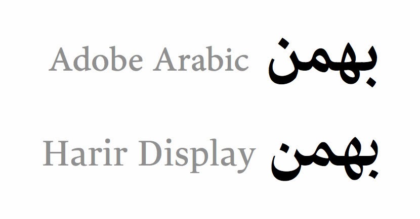
That's a good point, That could be something new in harir but in my opinion it's not abnormal in contemporary persian culture. About 1-2 years ago a new typeface became overused in persian culture and that is Adobe Arabic which is designed by Tim Holloway in 2003. This typeface also has large loops and is used mostly in Iran compared to Arabs.
According to titus's document "Nassim Reflection on Practice" Yakout «یاقوت» is the most used typeface in Arabic newspapers and the equivalent in persian world is Nazanin «نازنین» (I agree about Nazanin but don't know anything about arabic newspapers). There are other typefaces that I list here and they could demonstrate the difference between persian taste and arabic taste in typography.
Persian most influential typefaces (This list is gathered based on my visual memory and it could be biased, so If anyone else could suggest a better way to come up with a list, the result would be more accurate):
Some renown arabic designers and foundries (Since I'm not an arab, I couldn't suggest an accurate list, so I started with searching signage and most recent type design projects):
Based on the above lists here I present my opinion about Persian tastes vs Arabic taste in typography:
Contemporary Persian typography characteristics:
Letter aesthetics are mostly based on calligraphy
Height of teeth are low compared to height of alef
Contrast is based on calligraphy
Baseline is cursive in most of designs
Contemporary Arabic typography characteristics:
Letter aesthetics are mostly based on roman letters and Latin typography
Height of teeth are high compared to height of Alef, and also in many designs height of many letters are aligned to convey x-height in latin script
In modern designs there is no contrast or in some occasions contrast is reversed
Baseline is straight in most of designs
Bahman
On Friday, October 4, 2013 12:44:48 AM UTC+3:30, Behnam Esfahbod wrote:
Bahman,To start with, one feature that stills my attention and makes the typeface a bit alien to my eye is the size of letter Heh, specially the upper loop. I'm just not used to see Heh that big, specifically in comparison with the teeth.-Behnam
On Thu, Oct 3, 2013 at 6:15 AM, Bahman Eslami <eslami...@gmail.com> wrote:
Hi,
Lately we've released a typeface in Typotheque (Harir font family). Before the release and even after that I received some comments about the characteristics of Harir typeface that it has more arabic characteristics so maybe it is more appealing to Arabs rather than Persians. But what are these characteristics and features and how do you define them? What are the most used and preferred typefaces\fonts in Persian culture and Arab culture and how do you know that?
By answering this question I can find the differences between Arab taste and Persian taste.
Thanks,
Bahman
--