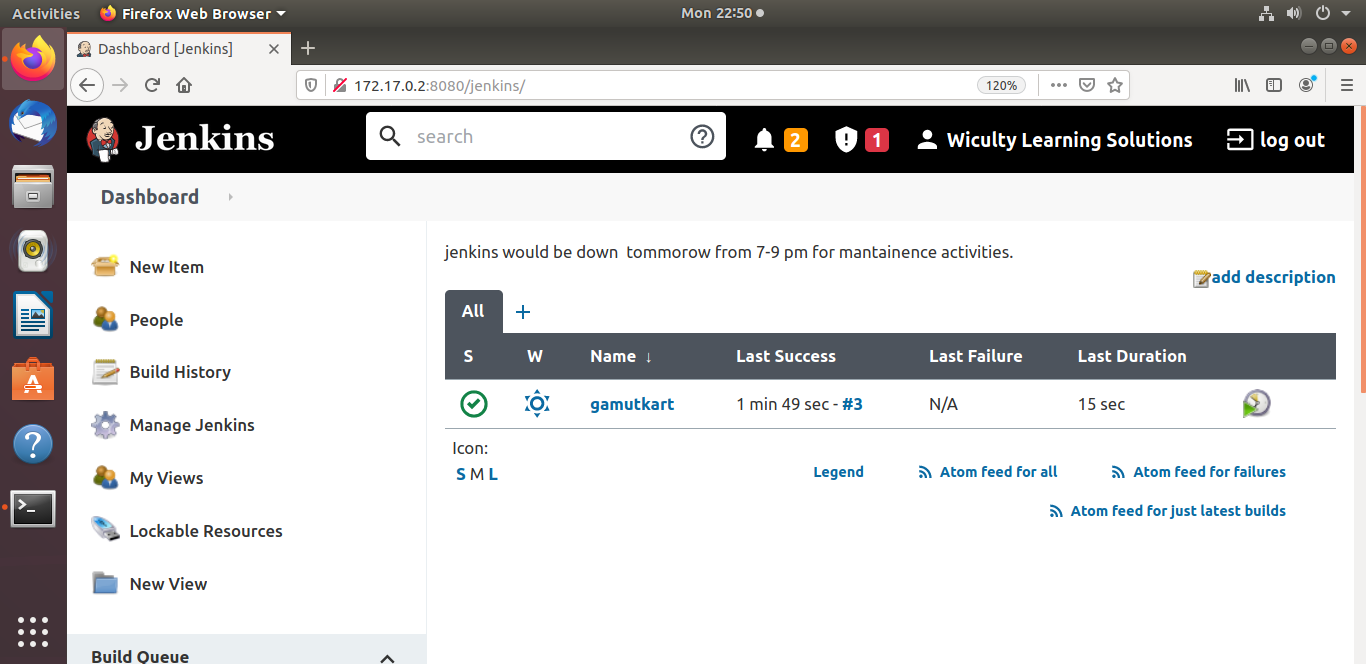
jenkins status page checkmark instrad of green balls
129 views
Skip to first unread message


Ullrich Hafner
Jun 17, 2021, 8:41:19 AM6/17/21
to Jenkins Users
a) Downgrade your Jenkins version (not recommended).
b) Write a Jenkins theme that uses the old and ugly ball images
Am 15.06.2021 um 08:36 schrieb sabsac123 <sab...@gmail.com>:
My jenkins project status page is showing a green checkmark for successful buld instead of green balls. how to bring back the balls icon to the staus page?
--
You received this message because you are subscribed to the Google Groups "Jenkins Users" group.
To unsubscribe from this group and stop receiving emails from it, send an email to jenkinsci-use...@googlegroups.com.
To view this discussion on the web visit https://groups.google.com/d/msgid/jenkinsci-users/2b4c4cb4-e459-4a8e-8b86-670620e69295n%40googlegroups.com.
<jenkins status.png>

Dirk Heinrichs
Jun 17, 2021, 9:06:27 AM6/17/21
to jenkins...@googlegroups.com
Am Donnerstag, den 17.06.2021, 14:41 +0200 schrieb Ullrich Hafner:
b) Write a Jenkins theme that uses the old and ugly ball images
Uglyness always lies in the eye of the beholder, doesn't it? Some people might find the new ones ugly...
Bye...
Dirk
--
Dirk Heinrichs
Senior Systems Engineer, Delivery Pipeline
OpenText ™ Discovery | Recommind
Phone: +49 2226 15966 18
Email: dhei...@opentext.com
Website: www.recommind.de
Recommind GmbH, Von-Liebig-Straße 1, 53359 Rheinbach
Vertretungsberechtigte Geschäftsführer Gordon Davies, Madhu Ranganathan, Christian Waida, Registergericht Amtsgericht Bonn, Registernummer HRB 10646
This e-mail may contain confidential and/or privileged information. If you are not the intended recipient (or have received this e-mail in error) please notify the sender immediately and destroy this e-mail. Any unauthorized copying, disclosure or distribution of the material in this e-mail is strictly forbidden
Diese E-Mail enthält vertrauliche und/oder rechtlich geschützte Informationen. Wenn Sie nicht der richtige Adressat sind oder diese E-Mail irrtümlich erhalten haben, informieren Sie bitte sofort den Absender und vernichten Sie diese Mail. Das unerlaubte Kopieren sowie die unbefugte Weitergabe dieser Mail sind nicht gestattet.

Fabian Cenedese
Jun 17, 2021, 9:13:52 AM6/17/21
to jenkins...@googlegroups.com
At 14:41 17.06.2021, you wrote:
>a) Downgrade your Jenkins version (not recommended).
>b) Write a Jenkins theme that uses the old and ugly ball images
>
>a) Downgrade your Jenkins version (not recommended).
>b) Write a Jenkins theme that uses the old and ugly ball images
>
>>Am 15.06.2021 um 08:36 schrieb sabsac123 <<mailto:sab...@gmail.com>sab...@gmail.com>:
>>
>>My jenkins project status page is showing a green checkmark for successful buld instead of green balls. how to bring back the balls icon to the staus page?
Just to add to the original poster's comment. We too were surprised to
>>
>>My jenkins project status page is showing a green checkmark for successful buld instead of green balls. how to bring back the balls icon to the staus page?
see the new icons. The problem is not whether the new or the old ones
were ugly or not. It's a simple case of clarity. The old icons (ugly or not)
were a lot clearer to grasp. The new weather icons are all the same color.
It's harder to see at one glance what the state of the dozens of jobs is.
Obviously we eventually will get used to the new theme. But I still don't
understand why all people think that flat and abstract is more modern.
Modern is not necessarily also practical.
Just my 1 cent.
bye Fabi
Ullrich Hafner
Jun 17, 2021, 9:56:18 AM6/17/21
to Jenkins Users
Am 17.06.2021 um 15:13 schrieb Fabian Cenedese <Cene...@indel.ch>:At 14:41 17.06.2021, you wrote:a) Downgrade your Jenkins version (not recommended).
b) Write a Jenkins theme that uses the old and ugly ball imagesAm 15.06.2021 um 08:36 schrieb sabsac123 <<mailto:sab...@gmail.com>sab...@gmail.com>:
My jenkins project status page is showing a green checkmark for successful buld instead of green balls. how to bring back the balls icon to the staus page?
Just to add to the original poster's comment. We too were surprised to
see the new icons. The problem is not whether the new or the old ones
were ugly or not. It's a simple case of clarity. The old icons (ugly or not)
were a lot clearer to grasp.
You are talking about the weather icons? This is a different point, please add your comments in https://issues.jenkins.io/browse/JENKINS-65124
The new weather icons are all the same color.
It's harder to see at one glance what the state of the dozens of jobs is.
Obviously we eventually will get used to the new theme. But I still don't
understand why all people think that flat and abstract is more modern.
Modern is not necessarily also practical.
Just my 1 cent.
bye Fabi
--
You received this message because you are subscribed to the Google Groups "Jenkins Users" group.
To unsubscribe from this group and stop receiving emails from it, send an email to jenkinsci-use...@googlegroups.com.
To view this discussion on the web visit https://groups.google.com/d/msgid/jenkinsci-users/20210617131335.AB085467EA38%40macserver.private.
Reply all
Reply to author
Forward
0 new messages