Shopping list items view layout, issue 340

58 views
Skip to first unread message

aap

unread,
Dec 5, 2011, 12:24:01 AM12/5/11
to openi...@googlegroups.com
GCI student Shuhao is working on issue 340, and suggests that we revisit our complete reliance on RelativeLayout for the list item rows. I should have redirected our discussion to this forum hours ago, but better late then never I guess. Shuhao is considering using a LinearLayout within the RelativeLayout for the items which appear mostly on the first row of the RelativeLayout, meaning (I think) priority, quantity, item name, and has_note. 

The general consensus in various blog postings seems to be that putting LinearLayouts inside RelativeLayouts may not give the best performance. On the other hand it seems that our RelativeLayout is too complicated, leading to the note problem described in issue 340 but also some overlapping fields sometimes. There is a chance that the complexity of our RelativeLayout may be just as bad performance-wise as nesting a single LinearLayout would be. So Shuhao is going to give the LinearLayout a try and we will see whether the performance impact is an issue or not. If it does make things slow we might have to think some more about whether there is a way to fix the RelativeLayout without nesting a LinearLayout.

The discussion so far can be found on the GCI task here.

(As an aside, the complexity of the RelativeLayout is one reason I haven't added due date support yet, along with date import from HandyShopper in OI Convert CSV.)

-- Aaron

Peli

unread,
Dec 5, 2011, 4:53:00 AM12/5/11
to OpenIntents
I agree with you - RelativeLayout does not really work well if some of
the items' visibility are set to GONE.

I could throw in one more possible solution:
* Prepare one RelativeLayout for *each* possibility of visible and
gone objects, e.g.
one RelativeLayout to be used when there is only text and nothing
else,
one RelativeLayout when there is text and price
one RelativeLayout when there is priority, text, and note
etc.
Then when the list is built, select for each row dynamically the
layout based on the elements that need to be shown.

The main advantage is that this will work in all cases (because it can
be hand-tweaked for all cases), and it is fast (because one never
needs to nest layouts). (ok, one probably needs to manually keep track
of which RelativeLayouts have been used already, so that those objects
can be recycled when one scrolls the list - not a simple solution....)

The downside of this approach is that this does not scale well at all,
and with every new field, the number of RelativeLayouts doubles.

Devices get faster and faster, so I'd opt for the slower but more
easily maintainable solution of nesting LinearLayouts.

(Anyway the performance impact by changing layouts should scale with
the number of items visible on the screen, not with the total amount
of items in the database, so I think this is acceptable.)

Peli

On Dec 5, 6:24 am, aap <aa...@peromsik.net> wrote:
> GCI student Shuhao is working on issue 340<http://code.google.com/p/openintents/issues/detail?id=340&q=stack%3DS...>,


> and suggests that we revisit our complete reliance on RelativeLayout for
> the list item rows. I should have redirected our discussion to this forum
> hours ago, but better late then never I guess. Shuhao is considering using
> a LinearLayout within the RelativeLayout for the items which appear mostly
> on the first row of the RelativeLayout, meaning (I think) priority,
> quantity, item name, and has_note.
>
> The general consensus in various blog postings seems to be that putting
> LinearLayouts inside RelativeLayouts may not give the best performance. On
> the other hand it seems that our RelativeLayout is too complicated, leading
> to the note problem described in issue 340 but also some overlapping fields
> sometimes. There is a chance that the complexity of our RelativeLayout may
> be just as bad performance-wise as nesting a single LinearLayout would be.
> So Shuhao is going to give the LinearLayout a try and we will see whether
> the performance impact is an issue or not. If it does make things slow we
> might have to think some more about whether there is a way to fix the
> RelativeLayout without nesting a LinearLayout.
>

> The discussion so far can be found on the GCI task here<http://www.google-melange.com/gci/task/view/google/gci2011/7137283>

Shuhao

unread,
Dec 6, 2011, 7:42:10 PM12/6/11
to openi...@googlegroups.com
> one RelativeLayout when there is priority, text, and note

That causes the original problem. As when text wraps, notes gets pushed off the screen.

Aaron Peromsik

unread,
Dec 6, 2011, 7:48:19 PM12/6/11
to openi...@googlegroups.com
Shuhao,

The difference would be that if we knew that flavor of the layout would be used only when all those fields were really active, we might assign the dependencies in such a way that the note would be sure to appear. Your original approach probably would have worked if we carried it further and considered all the fields... the only reason we didn't try, if I understand correctly, is because of the View.GONE problem.

Maintaining separate flavors of the layout would be a pain, but we could achieve the same thing with more upfront work by building the layout in the code instead of XML. 

Hopefully we won't have to go there, if your LinearLayout approach turns out to be fast enough.

-- Aaron

On Tue, Dec 6, 2011 at 7:42 PM, Shuhao <ad...@thekks.net> wrote:
> one RelativeLayout when there is priority, text, and note

That causes the original problem. As when text wraps, notes gets pushed off the screen.

--
You received this message because you are subscribed to the Google Groups "OpenIntents" group.
To view this discussion on the web visit https://groups.google.com/d/msg/openintents/-/SkpOuKzn2e0J.

To post to this group, send email to openi...@googlegroups.com.
To unsubscribe from this group, send email to openintents...@googlegroups.com.
For more options, visit this group at http://groups.google.com/group/openintents?hl=en.

Shuhao

unread,
Dec 7, 2011, 6:01:32 PM12/7/11
to openi...@googlegroups.com
What should the shopping list look like with the all the options filled? I'm getting something like this. Doesn't seem like the correct way to display it, also having trouble positioning the elements as well.

God I hate Android UI


screenshot-1323298781825.png

Aaron Peromsik

unread,
Dec 7, 2011, 7:44:48 PM12/7/11
to openi...@googlegroups.com
Shuhao,

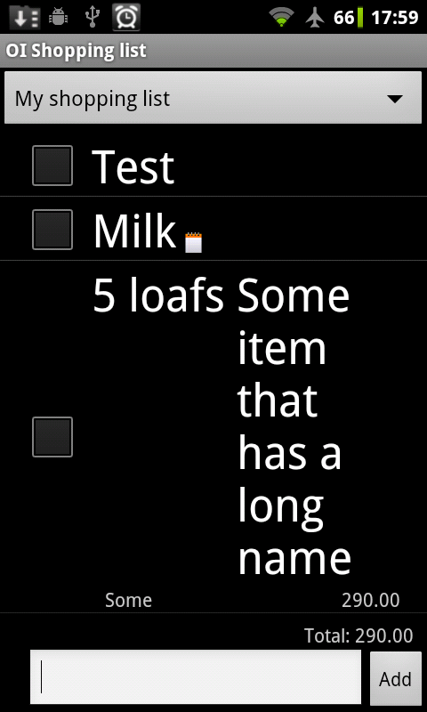
That doesn't look so terrible, relative to the existing display anyway. I could upload some existing screenshots when I get home, or perhaps you could just download the official build into a separate emulator instance and see how it behaves with the same data.

Did you add any priorities on these items? I don't see them in the display. Also, does the "some item that has a long name" item have a note? If not, you might add one to see if the icon shows up now.

-- Aaron

Shuhao Wu

unread,
Dec 7, 2011, 7:46:18 PM12/7/11
to openi...@googlegroups.com

I tried to add priority,  same thing, it also has notes

Shuhao
Sent from my phone.

--
You received this message because you are subscribed to the Google Groups "OpenIntents" group.

Aaron Peromsik

unread,
Dec 7, 2011, 8:09:08 PM12/7/11
to openi...@googlegroups.com
In that case, it seems that either the layout or the code needs to be fixed to show priority, and it also seems like this approach didn't yet help with the original goal of keeping the note on the screen when the item description is long.

-- Aaron

Shuhao Wu

unread,
Dec 7, 2011, 8:09:44 PM12/7/11
to openi...@googlegroups.com
What about scrolling, when the item gets too big?
Shuhao

Aaron Peromsik

unread,
Dec 7, 2011, 9:33:32 PM12/7/11
to openi...@googlegroups.com
Are you suggesting that the item should still take up one line, but the item description should scroll through the available space like an animated sign? Sounds distracting.

If you were suggesting something else, please clarify.

I would expect a normal user who had long items like that would abbreviate somewhat and use a smaller font size. It would not be normal to have a list with many items that occupy five or six lines. But wrapping onto a second line for some items is normal enough, and it would be nice not to lose the note icon in that case.

-- Aaron

Peli

unread,
Dec 10, 2011, 5:26:44 AM12/10/11
to openi...@googlegroups.com
To add another possible solution to the problem of long item names:

In some previous version of OI Shopping List, "quantity+unit+item" were concatenated and printed in a single TextView. This solves the problem of wrapping, because the wraped text would fill the whole width for all lines.

The problem is that currently tapping on "quantity" or "unit" opens the quick edit mode or the edit dialog with focus on those fields, so this functionality should not be lost.

One way out could be to "measure" (using something like Paint.measureText()) [1] the text size of the quantity and unit strings, and manually intercept any clicks within the TextView to test whether one of those fields was clicked. I think in this way, both advantages could be combined (word wrapping and individual click targets).

Peli

Aaron Peromsik

unread,
Dec 11, 2011, 9:05:22 PM12/11/11
to openi...@googlegroups.com
Trying to compute which word was clicked within a single TextView sounds like it could probably work, but it probably would be difficult to get it exactly right. Also that approach does not help with the note indicator, unless we find some glyph to take the place of the current icon and make sure it is defined in all the fonts we use for different themes.

Perhaps a similar effect could be achieved by positioning the item name TextView as if the priority, quantity, and units were not there, but inserting some number of spaces in the beginning of the text of the TextView to leave space for them. Then we could position those views relative to each other and the TextView. 

As far as the note icon goes, it should be relatively straightforward to apply similar logic to show it on the right of the space reserved for the item name, perhaps adding a few spaces to the end of the TextView to leave room for the note. (Would that make the TextView expand to a second line when necessary?) It would be more complicated to make the note's view show up near the end of the text on the last line of the item name TextView-- but perhaps not impossible. Perhaps the has_note view could be positioned at the lower right of the item name TextView, and then at runtime we might consider adding padding to the right of the has_note view based on what getLineBounds() returns for the last line. 

-- Aaron

--
You received this message because you are subscribed to the Google Groups "OpenIntents" group.
To view this discussion on the web visit https://groups.google.com/d/msg/openintents/-/vt__thu047QJ.

Shuhao

unread,
Dec 13, 2011, 12:08:12 AM12/13/11
to openi...@googlegroups.com
Alright I now have time to work on this. Ill try the measure text tomorrow.

Shuhao

unread,
Dec 13, 2011, 4:22:54 PM12/13/11
to openi...@googlegroups.com
I don't think this note thing will work with a text view.. everytime it wraps.. everything disappears according to a couple of different tries.

Friedger Müffke

unread,
Dec 13, 2011, 5:18:33 PM12/13/11
to openi...@googlegroups.com
What about ClickableSpan
http://stackoverflow.com/questions/5183645/android-clickablespan-in-clickable-textview

Friedger

2011/12/13 Shuhao <ad...@thekks.net>:


> I don't think this note thing will work with a text view.. everytime it
> wraps.. everything disappears according to a couple of different tries.
>

> --
> You received this message because you are subscribed to the Google Groups
> "OpenIntents" group.
> To view this discussion on the web visit

> https://groups.google.com/d/msg/openintents/-/ki69i46mAmkJ.


>
> To post to this group, send email to openi...@googlegroups.com.
> To unsubscribe from this group, send email to
> openintents...@googlegroups.com.
> For more options, visit this group at
> http://groups.google.com/group/openintents?hl=en.

--
OpenIntents UG (haftungsbeschränkt)
Suarezstraße 41
14057 Berlin
tel:+49 30 60982220
mailto:in...@openintents.biz
enum:+493060982220

Vertretungsberechtigter Geschäftsführer: Friedger Müffke
Registergericht: Amtsgericht Berlin (Charlottenburg)
Registernummer: HRB 118597
Ust-IdNr: DE265992701

Aaron Peromsik

unread,
Dec 14, 2011, 8:39:11 AM12/14/11
to openi...@googlegroups.com
Friedger,

That sounds like exactly what we are looking for. Not sure if we need to worry about the issue being discussed there with the click callback for the whole TextView getting called before the click callback for the individual regions... perhaps we could make each section have its own callback and not have an overall click listener.

Seems for quantity and units we could definitely use this. Not sure if we should fold in the priority because it displays in a different style. Also not sure how to fold the has_note icon in, unless we can find some way to make a span display an image.

We might want to preserve the old layout behavior as a preference... not sure if some people will like the old way better, despite its issues. For example on tablets the extra space we are trying to save with this approach isn't a big deal.

-- Aaron

Shuhao

unread,
Dec 17, 2011, 12:33:46 AM12/17/11
to openi...@googlegroups.com
I don't think that will work .... The original issue is about how the has_note icon is pushed off screen. All these methods will still result in that problem.

Peli

unread,
Dec 17, 2011, 2:25:46 PM12/17/11
to openi...@googlegroups.com
To solve this issue of the note being pushed off screen, what about the following brute-force solution:
The note is right-aligned, and the right-most element with fixed width, centered within the whole height of a line. This should also be easier to touch by finger.

The disadvantage is that prices would not be aligned anymore if some items have notes and some don't. But prices currently have a similar issue that prices and item name can overlap if they are too long, so that the note would not fit in between.

Shuhao Wu

unread,
Dec 17, 2011, 2:26:49 PM12/17/11
to openi...@googlegroups.com

That's kind of what I did.

Shuhao
Sent from my phone.

--
You received this message because you are subscribed to the Google Groups "OpenIntents" group.
To view this discussion on the web visit https://groups.google.com/d/msg/openintents/-/9xsmeYtiPwcJ.

aap

unread,
Jan 22, 2012, 6:01:23 PM1/22/12
to openi...@googlegroups.com
Another approach might be to subclass RelativeLayout and add some layout parameters and rules. We could keep things in separate views but have the views wrap as though they were text... or maybe just have an alternative set of parameters to use if the main set would result in a view moving off the screen.

-- Aaron
Reply all
Reply to author
Forward
0 new messages