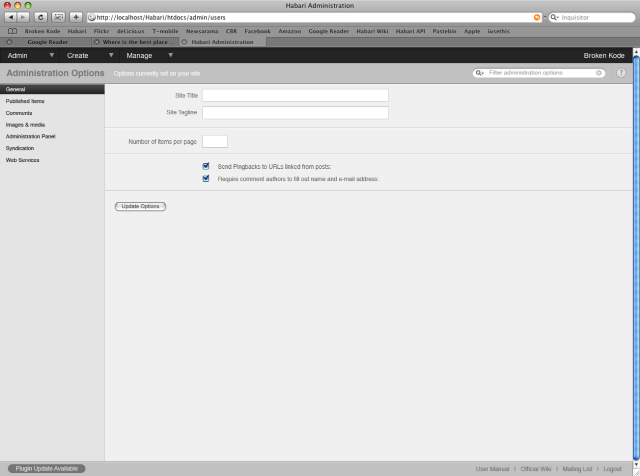
Admin Options Page

Khaled Abou Alfa
Now based on the previous email that I sent all the screenshots of the
various blogging CMS, my personal feeling as a user (not an
administrator) was that the sidebar list felt a lot more intuitive to
me. Now the issue with this is two fold. The first is the fact that
we've maintained a centered admin panel so far. However the way I see
it, by adding the top and bottom horizontal bars you can play with the
location of things dependent on what they are serving. i could be
wrong in this argument and people might feel it's a bit disjointing
going from something that is centered to something that is side
aligned, but I'd like to maintain that different areas of the admin
panel require different solutions.
However I have tried to connect all the pages by making them have
elements that span right across the page. In this instance it's the
lines that distinguish the different areas of the panel, in the create
pages it's the page splitters that go right the way across the page
and in the plugin page...well you'll have to wait for that one till
the next email.
So back to this page, we've got the sidebar. I know what Scott is
saying, it's not user friendly for the administrator that wants to
change things quickly. The truth of the matter is I don't think we can
have both options. We can go for one or the other, or go for both
(thus inviting more work on ourselves) and having the user making that
decision as to how he wants to view this page. Now you might ask where
would the controls for that go? That will become clear in the third
and final mockup if we decide to go down that route.
The width of all the elements from the start of the sidebar to the end
of the text field is 790px so we're still ok for the lower end of the
screen market, but at the same time not penalising those that have
larger screens, or making it look extra long by extending it all the
way to the end. Using only what we need. They're aligned down the
central spine as you can see. We can look at this further if people
feel that the plugin authors would rather have the full area
(subtracting the sidebar of course). I'm just trying to get the basic
concepts across here.
Final point I want to make is the inclusion of the search filter field
in the subtitle bar at the top right hand side.

Michael Heilemann

Owen Winkler
> Not a fan of this either. For most of the same reasons as in the other
> thread. This layout feels old-fashioned to me. The boxs irk me quite
> frankly. It goes almost opposite of what I'd like to see (which is more
> akin to http://flickr.com/photos/heilemann/2183367609/).
At first glance, I really liked the display of the page name in Khaled's
design. I liked that there was a place for it, rather than having a
handful of pages that don't have it, and the rest with. And then I
realized what is bothering me about this whole design process...
There seems to be little demonstration of continuity in the admin UI.
The reason why I do not like Michael H's mockup is because it uses the
dropshadow elements on the sides of the content, which were not used in
any prior mockups. It introduces color, which apart from being a design
no-no for a long time, is not accessible (a very important facet of this
particular component). Still, I might have had less of a problem with
it if I wasn't as surprised with the direction change.
Likewise, I'm not thrilled with this new set of mockups from Khaled.
Too wide. Fluid interfaces where we've had none before.
I like that the current publish page content is narrow, but not too
narrow, and not fluid. I like the splitter areas. I like that the
sides on the installer page "light up" when sections are completed.
I would like to see continuity of these design elements across the
interface. I would like to see more continuity of any kind.
So perhaps rather than trying to nail individual pages, we should agree
on some kind of design conventions first. Create a couple of pages that
serve as templates for the rest, then break those rules only when
there's good reason. Right now, every page seems to seek to do its own
thing, and that's confusing.
If we could define rules for how to display the menu, the name of the
page, a place to enable search when it's approrpiate, a place to display
a link to context help, a bounding area for content, a standard grid of
controls, and the footer, then we'd be able to quickly define every page
at once instead of coming up with individual pages and tweaking the
design each time.
Then when we have the "look", we can examine where each page needs to
diverge from that to provide more usable functionality or more appealing
design to our users.
Owen

Randy Walker
all pages. It's simple, but elegant, and looks like everything is in a
nice, decent place.
~Randy
> <20080113_Admin_Options_sidebar_v007.png>
>
>
>
Michael Heilemann
There seems to be little demonstration of continuity in the admin UI.
Let me be absolutely clear about this: As far as I'm concerned, only _one_ page has currently been designed to a point where it could be considered 'done'; the Create Page. Everything else is undesigned. Untouched. Sitting currently in 'the great hall of pragmatism > aesthetics'.
So _of course_ there is no continuity, because to have continuity, you need at _least_ two fully designed pages; preferably three.
The continuity is something that will be create a couple of months down the line; so please, let's not talk about continuity until there's something to talk about.
The reason why I do not like Michael H's mockup is because it uses the
dropshadow elements on the sides of the content, which were not used in
any prior mockups. It introduces color, which apart from being a design
no-no for a long time, is not accessible (a very important facet of this
particular component). Still, I might have had less of a problem with
it if I wasn't as surprised with the direction change.
The thing is, there is _no_ direction. The Create Page exists, everything else is in limbo. And because the Create page was designed to be as simple as humanly possible, and contains only three major elements, of course its style clashes with something like an options page, where you're going to end up with 10-20 form elements w. labels and what not.
We don't have a style to support that. It doesn't exist anywhere.
In my mockup (http://flickr.com/photos/heilemann/2183367609/), I tried handling it one way (which I still believe in), and Khaled is obviously trying a different route.
As for colors: http://groups.google.com/group/habari-dev/msg/0533da935e3cfd8c
What's worrying me, is how it feels like everyone is reeling simply because things are changing. I feel like I'm repeating myself a bit here, but I don't think we're all on the same page, so it's worth it: http://groups.google.com/group/habari-dev/msg/929ae7a3351678de
I like that the current publish page content is narrow, but not too
narrow, and not fluid. I like the splitter areas. I like that the
sides on the installer page "light up" when sections are completed.
I would like to see continuity of these design elements across the
interface. I would like to see more continuity of any kind.
The installer 'glass', might see its way into the design some way. But as it is, it doesn't work particularly well with the menu bar. I like the glass; I designed the glass. But unless it really works, I prefer not to see it in the admin. In fact, I'd rather redesign the installer than force the glass into the admin for 'continuity' purposes.
So perhaps rather than trying to nail individual pages, we should agree
on some kind of design conventions first. Create a couple of pages that
serve as templates for the rest, then break those rules only when
there's good reason.
If we could define rules for how to display the menu, the name of the
page, a place to enable search when it's approrpiate, a place to display
a link to context help, a bounding area for content, a standard grid of
controls, and the footer, then we'd be able to quickly define every page
at once instead of coming up with individual pages and tweaking the
design each time.
Then when we have the "look", we can examine where each page needs to
diverge from that to provide more usable functionality or more appealing
design to our users.
That might seem like a good idea, but it's my experience that one of two things happen: Either the mockups are done too fast, and important details and the finesse of the individual page is overlooked. Or nobody agrees on anything, and the mockups are bogged down in red tape.
And at the same time, the admin consists of a very finite number of pages, all divided into a few major areas. Create (create post and page), manage (manage comments and entries, log, plugins, themes) and admin (options and probably something else).
While there will be similarities between some of them, each page is unique, and while we need to respect the similarities, we can also safely treat them as uniques, if we know what we're doing. And we do :)
Always the pessimist, I still think it's too early to take on something as big as the options page, let alone the rest of the admin.

Ali B.
Ali B.
"No one can make you feel inferior without your consent."
-- Eleanor Roosevelt
Owen Winkler
>
> There seems to be little demonstration of continuity in the admin UI.
>
>
> Let me be absolutely clear about this: As far as I'm concerned, only
> _one_ page has currently been designed to a point where it could be
> considered 'done'; the Create Page. Everything else is undesigned.
> Untouched. Sitting currently in 'the great hall of pragmatism >
> aesthetics'.
And that's exactly my point. It seems like no time is being applied to
making the admin look like a cohesive application.
Instead, we're getting a slew of mockups of a single page, and each
single page holds only the menu bar in common with the rest of the
admin. It would be more pragmatic to have thought out how things will
look alike in advance than to back in a unified look after the fact.
> So _of course_ there is no continuity, because to have continuity, you
> need at _least_ two fully designed pages; preferably three.
>
> The continuity is something that will be create a couple of months down
> the line; so please, let's not talk about continuity until there's
> something to talk about.
What it seems like your saying is that we'll need to suffer through
slinging designs at the wall to see if they stick until at least three
pass inspection. And THEN we can talk about giving them some unifying
characteristics. This seems completely backwards to me.
I think we need to talk about this right now because we are flailing
without a clear design direction. Deadlines are different because this
isn't a commercial endeavor, but that doesn't mean that we can laze
about until something falls out of the sky, perfect.
It is the absolute intention of our group to release a finished product
(or at least a candidate for being finished) at some point, hopefully
sooner rather than later. It is difficult to produce needed interface
elements in the admin because we lack a design that we can apply them to.
For example, significant work will need to happen to plugin code to
implement several of the designs that have appeared for the options
page. I am personally willing to undertake that work based on the
design. I am not presently willing to retool plugin code in that way
more than once because we need to do two iterations of the page to get
design cohesion between pages.
>
> The thing is, there is _no_ direction. The Create Page exists,
> everything else is in limbo. And because the Create page was designed to
> be as simple as humanly possible, and contains only three major
> elements, of course its style clashes with something like an options
> page, where you're going to end up with 10-20 form elements w. labels
> and what not.
>
> We don't have a style to support that. It doesn't exist anywhere.
Yes. I agree. There is no direction. And that is why I have proposed
that someone think that out and produce something that we can use as a
guideline. This would be used to narrow the focus of what's produced to
parameters that will unify the look of the admin.
I have no problem with pages that must look different looking different
from each other. But for example, what common elements will appear on
the options page and the user page? I assume some. Why can't we get a
handle on these so that we can see if they fit on any new page we create
rather than creating every element anew?
> What's worrying me, is how it feels like everyone is reeling simply
> because things are changing. I feel like I'm repeating myself a bit
> here, but I don't think we're all on the same page, so it's worth it:
> http://groups.google.com/group/habari-dev/msg/929ae7a3351678de
Then come up with a change that applies to the entire design uniformly.
Should we assume that the green and red dots will be elements that
we'll find on other pages? Will the options page have the shadowed
borders? Which of the elements on the page you've designed are ones
that will be shared with other pages to create a unified look in the admin?
I am not afraid of change. I am worried that the changes will cause the
pages of our admin to look like a haphazard collection of separate tools
rather than a cohesive product.
To cite an example I'd rather not: At least WordPress uses the same
button styles, the same awful boxy blue elements and widgets
*everywhere* within their admin. They may not look beautiful but at
least when you see one of those pages you know you're looking at a
WordPress admin page.
Our use of whitespace may be superior, our element design may be
superior, but these are not applied consistently between any of the
pages that have been produced. The only things that maintain cohesion
between pages right now are the menu bar and the monochrome, the latter
of which I hope we eventually do away with.
> So perhaps rather than trying to nail individual pages, we should agree
> on some kind of design conventions first. Create a couple of pages that
> serve as templates for the rest, then break those rules only when
> there's good reason.
> That might seem like a good idea, but it's my experience that one of two
> things happen: Either the mockups are done too fast, and important
> details and the finesse of the individual page is overlooked. Or nobody
> agrees on anything, and the mockups are bogged down in red tape.
That's one thing that I am asking for: More speed in design. We can
apply finesse to the individual pages after the pages are created
according to some unifying design direction.
There's no need to worry about red tape now, because already nobody is
agreeing on anything, anyway. The things they do agree on could be
easily worked into a direction that gets more people to agree. It
follows that if you take the design elements that the most people like
and apply them as part of the style of every page, then people will have
less to complain about.
>
> And at the same time, the admin consists of a very finite number of
> pages, all divided into a few major areas. Create (create post and
> page), manage (manage comments and entries, log, plugins, themes) and
> admin (options and probably something else).
>
> While there will be similarities between some of them, each page is
> unique, and while we need to respect the similarities, we can also
> safely treat them as uniques, if we know what we're doing. And we do :)
I'm not convinced. Clearly, there's design talent at work in the
mockups, but as you say above, you consider the pages to be unique; a
discrete element to be designed on its own. This is not entirely the
case. More care needs to be taken to ensure that these elements will
work together than has been evidenced so far. Each page of the admin is
not a separate project - it's all part of a single end product.
> Always the pessimist, I still think it's too early to take on something
> as big as the options page, let alone the rest of the admin.
Then this is my prediction of what is going to happen, and this isn't an
ultimatum as much as the bracing cold shower of reality:
Code can't wait for designs of the options page to proof through a
multitude of iterations, and you're saying that we're not even going to
get them until much later. We need a function options page right now.
We'll end up recoding the plugins pages to work how we (developers)
think best, and then build our own (likely lousy) design to accommodate
that. Then in six months, twelve months, or however long it takes until
we're "ready" for the options design, we'll go through those multiple
iterations. But the ability to design that page will have changed.
We'll not offer what we're currently offering, which is carte blanc on
how the page displays that information. Note that the information that
we're telling you we could display is information we don't currently
have code to collect or present, but we're willing to write if it
improves the design. Instead, we'll say that we've invested 6-12 months
in the code that makes the page go, and you can produce a design that
makes us change that work when we're dead.
As a matter of fact, we already have a working plugin system, and it
works very well. But the offer has been on the table to revise that
code for the sake of producing the best design possible. The more
people who write plugins for Habari, the more harm may come to revising
the way that system works. I'm not sure how long that offer is going to
stand, because the code has to move forward. I expect the design to do
the same.
Owen
Michael Heilemann
Owen Winkler
>
> The codebase is reliant on UX decisions. But UX/GUI cannot be designed
> by committee. And that's the status quo.
The reason our committee can't design UX/GUI for Habari is because the
UX/GUI design requirements aren't solid public statements, but
unassailable nitpicks that appear against presented mockups.
I'll again ask for these requirements to be spelled out so that others
can successfully contribute to a unified Habari admin design.
Owen

Scott Merrill
> > _one_ page has currently been designed to a point where it could be
> > considered 'done'; the Create Page. Everything else is undesigned.
> > Untouched. Sitting currently in 'the great hall of pragmatism >
> > aesthetics'.
>
> And that's exactly my point. It seems like no time is being applied to
> making the admin look like a cohesive application.
>
> Instead, we're getting a slew of mockups of a single page, and each
> single page holds only the menu bar in common with the rest of the
> admin. It would be more pragmatic to have thought out how things will
> look alike in advance than to back in a unified look after the fact.
Sean kindly began work on a Style Guide page:
http://wiki.habariproject.org/en/Style_Guide
The intent of this page is to hash out in text the decisions that will
guide the development of the admin style. It is here that we can
collaborate and discuss individual design elements that can be used
inside Habari.
Sending around mockups is great, but I agree with Owen here: the
iterative process of refining the admin design should happen AFTER the
overall plan for that design is solidified.
Did you know that many programmers write the documentation to their
product / function first? In this way, they know what the goals are
before they even start, and they ensure that their efforts satisfy
those goals.
What are the clearly articulated goals for the Habari admin? Michael
wants it to be super sweet, and leave an impression like the Amiga
did. While that _might_ occur though sheer inspiration, it's more
likely going to happen through a careful consideration and explanation
of the failings of current admin designs, and a thorough explanation
of how your proposal satisfies the needs of the user.
So, I hereby submit a challenge to everyone working on the admin design:
* describe to us in plain language what you see in your mind. No
mockups permitted.
* contribute to the Style Guide wiki page, in an effort to identify
common trends / themes.
After we've had a couple passes at the above wiki page, we can discuss
in greater depth here what elements have floated to the top, and
hopefully have a clear idea of what it is we'd like to see produced in
a mockup.
Christian Mohn (h0bbel)
and that I think it's time someone with a clue, design wise, sits down
and take a long hard look at how we want to present Habari to the
people. I think that before more mockups are made, there needs to be
some kind of general consensus, or at least a common understanding, of
how the basic design should look.
I'm not talking about colors and/or a definitive branding here, I just
want us to be able to agree on a set of basic rules that the design
should adhere to.
Christian Mohn (h0bbel)
And yeah, listen to the eloquent Mr. Skippy. He said it first. :-)
On Jan 15, 8:24 pm, "Christian Mohn (h0bbel)" <h0b...@gmail.com>
wrote:
> I just want to mentionhttp://wiki.habariproject.org/en/Style_Guide

Michael Bishop
On Jan 15, 2:20 pm, "Scott Merrill" <ski...@skippy.net> wrote:
> So, I hereby submit a challenge to everyone working on the admin design:
> * describe to us in plain language what you see in your mind. No
> mockups permitted.
> * contribute to the Style Guide wiki page, in an effort to identify
> common trends / themes.
>
> After we've had a couple passes at the above wiki page, we can discuss
> in greater depth here what elements have floated to the top, and
> hopefully have a clear idea of what it is we'd like to see produced in
> a mockup.
was introduced. The outcome was that BP was not meant as a band-aid
to be ripped off a few months down the road. I feel from looking at
the most recent mocks, and even the publish page to the most extent,
has moved away from using the BP grid as a design parameter.
It's a bit disheartening to see discussion now arise about whether or
not to be flex width, and what seemingly sounds like going back to
square one. The mocks provided earlier last year were said to have
been the desired goal, and after the hit and run introduction of BP,
much effort was made to work towards those, and bring them into line
with the grid and BP's CSS. Certainly there was/is a long way to go
in that regard.
I was not an advocate of using BP, or familiar with grid design at the
time, however I embraced the group decision to use it, and have
learned more about grid design since. I think before any other design
decisions are made, the use of the BP framework should really be
decided upon (not that it doesn't seem to have already been). If it
is going to be used, then that should put some constraints on the
design, and mockups and introduced code should adhere to it. If not,
then effort needs to be made now to phase it out of the page
considered "done", and not used in any new implementations of code.
Randomly using "bits" of the grid.css doesn't make one iota of sense
to me, but I could be completely missing the grid concept.
Around the same time, much discussion about browser support was
discussed, including links to YUI graded browser support. I think
adoption and adherence to that will also define some constraints, and
should require introduced code to strive for that level of support.
I'm certainly not trying to open a can of worms, or drum up a flame
war, I simply think it's a major player in the current admin, and
hasn't been truly addressed as to how it relates to the direction of
the continued overhaul.
~miklb

Kahi
limiting the discussion on text-form is not the best way as well,
IMHO.
1. "mockups" definitely should contain only page-areas that are on
topic
2. "mockups" (...wireframes?) should not contain any graphic design,
while it's also unsolved (+off topic) question
3. but some visual form should IMHO still exist, because, I think,
it's something like summary of the previous discussion and it can
probably document decisions, changes... What do you think?
Owen Winkler
>
> I think before any other design
> decisions are made, the use of the BP framework should really be
> decided upon (not that it doesn't seem to have already been).
I think that using Blueprint is a fine choice for quickly putting
together grid-based layouts. Why should we reinvent positioning when we
can collaborate with another OSS project?
The caveat here is that there are some design elements, like the page
splitter, that are outside of the workings of BP. I think we should
retain these elements, but still attempt to use BP on those pages for
alignment to the grid both inside and outside of the split area.
I am under the impression that the publish page could be rendered using
BP's grid visually identically to how it is now.
Owen
Michael Bishop
On Jan 15, 4:30 pm, Owen Winkler <epit...@gmail.com> wrote:
> Michael Bishop wrote:
>
> > I think before any other design
> > decisions are made, the use of the BP framework should really be
> > decided upon (not that it doesn't seem to have already been).
>
> I think that using Blueprint is a fine choice for quickly putting
> together grid-based layouts. Why should we reinvent positioning when we
> can collaborate with another OSS project?
simply was stating that several of the most recent mockups seem to
completely deviate from the grid. I could be off base, and would
certainly love to be wrong.
> The caveat here is that there are some design elements, like the page
> splitter, that are outside of the workings of BP. I think we should
> retain these elements, but still attempt to use BP on those pages for
> alignment to the grid both inside and outside of the split area.
>
a very sexy element, and works quite well _with_ the grid.
> I am under the impression that the publish page could be rendered using
> BP's grid visually identically to how it is now.
eliminate some of the extra markup, but was unsuccessful in getting
that to apply, which hindered my attempts at getting the page to
conform to the grid. There is one curious bit of CSS that led me to
believe the layout would be effected if altered. My general point was
though that the page was constructed without adherence to the grid,
and that should be avoided in the future, or (insert sound of the
beating of a dead horse) drop the grid if that's not the desired focus
now.
~miklb

Michael C. Harris
> As for colors:
> [2]http://groups.google.com/group/habari-dev/msg/0533da935e3cfd8c
> What's worrying me, is how it feels like everyone is reeling simply
> because things are changing.
(With a complete sense of community and civility) I find that
offensive. Did my argument against the
red/green/stop/go/inactive/active UI strike you as reeling because of
change?
cheers, Michael
--
Michael C. Harris, School of CS&IT, RMIT University
http://twofishcreative.com/michael/blog