Polar oriented picture, problems with scales

Paul Hiemstra
I made some polar oriented plots. Using coord_map() I can nicely
orient the plot towards the north pole. However, the number of the x
and y-axis (spatial coordinates) are drawn incorrectly. On the x-axis
it seems that two sets of numbers are drawn, and the number on the y-
axis are not on the correct location. My question is whether anyone
knows how to fix this, and if you can reproduce the problem.
The following example illustrates my problem.
library(maps)
library(ggplot2)
theme_set(theme_bw())
xlim = c(-180,180)
ylim = c(60,90)
# Some fake grid data
dat_grid = expand.grid(x = xlim[1]:xlim[2], y = ylim[1]:ylim[2])
dat_grid$value = runif(nrow(dat_grid))
# Map data
dum = map(xlim = c(-180,180), ylim = c(60,90), plot = FALSE)
ant_ggplot = data.frame(dum[c("x","y")])
ant_ggplot$value = mean(dat_grid$value)
## Make some plots
# Reference plot
ggplot(aes(x = x, y = y, fill = value), data = dat_grid) + geom_tile()
+
geom_path(data = ant_ggplot)
# Plot nicely oriented on the north pole, nb Takes a while to plot
# Axis labels are wrong
ggplot(aes(x = x, y = y, fill = value), data = dat_grid) + geom_tile()
+
geom_path(data = ant_ggplot) +
coord_map(projection = "conic", orientation = c(0,90,180), lat0 =
0)
regards,
Paul Hiemstra
Royal Netherlands Meteorological Institute
ps sessionInfo():
R version 2.13.0 (2011-04-13)
Platform: i686-pc-linux-gnu (32-bit)
locale:
[1] LC_CTYPE=en_US.utf8 LC_NUMERIC=C
[3] LC_TIME=en_US.utf8 LC_COLLATE=en_US.utf8
[5] LC_MONETARY=C LC_MESSAGES=en_US.utf8
[7] LC_PAPER=en_US.utf8 LC_NAME=C
[9] LC_ADDRESS=C LC_TELEPHONE=C
[11] LC_MEASUREMENT=en_US.utf8 LC_IDENTIFICATION=C
attached base packages:
[1] grid stats graphics grDevices utils datasets
methods
[8] base
other attached packages:
[1] mapproj_1.1-8.3 ggplot2_0.8.9 proto_0.3-8 reshape_0.8.4
[5] plyr_1.5.2 maps_2.1-6 fortunes_1.4-1
loaded via a namespace (and not attached):
[1] digest_0.4.2 tools_2.13.0


Charlotte Wickham
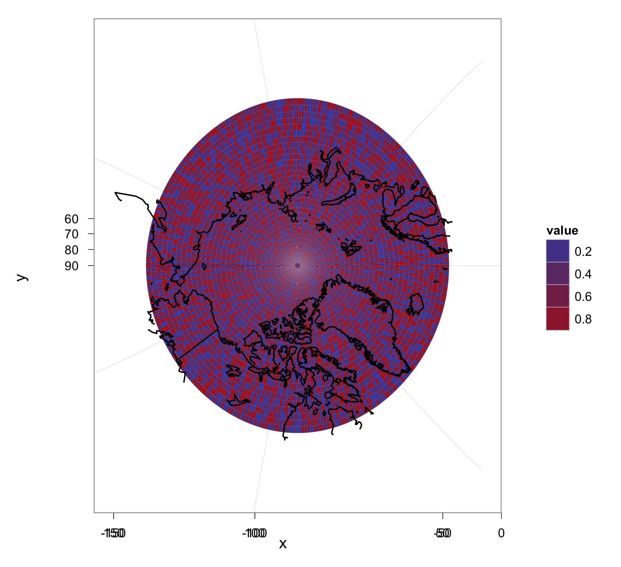
the problem is that coord_map is using cartesian coordinates for
something that would more naturally be plotted in polar coordinates.
The axes have been plotted as rectangular when there should be an
angular axis and a y axis, the double plotting in the x axis is
actually the negative and positive longitude breaks being projected to
the same x-coordinates.
A workaround, is to use coord_polar to force the correct axes:
res <- 1
x_cell_lim <- c(180, -180) + c(1, -1) * res/2
y_cell_lim <- c(90, 60) + c(1, -1) * res/2
ggplot(aes(x = x, y = y, fill = value), data = dat_grid) +
geom_tile() +
geom_path(data = ant_ggplot) +
coord_polar(start = -pi/2, expand = FALSE) +
xlim(x_cell_lim) +
ylim(y_cell_lim)
The little additions to the limits make sure the entire cell in
plotted without any gaps. It might make more sense to have:
x_cell_lim <- c(180, -180) + c(1, +1) * res/2, assuming cells
centered at 180 and -180 longitude are the same.
You probably get some distortion compared to the conic projection but
it might be good enough for your application. You also lose a bit of
Russia due to the axes limits, it shouldn't be too hard to subset it
and shift it 360 degrees.
Hope that helps,
Charlotte
> --
> You received this message because you are subscribed to the ggplot2 mailing
> list.
> Please provide a reproducible example: http://gist.github.com/270442
>
> To post: email ggp...@googlegroups.com
> To unsubscribe: email ggplot2+u...@googlegroups.com
> More options: http://groups.google.com/group/ggplot2
>
Paul Hiemstra
Brandon Hurr
Paul Hiemstra
Apart from some minor adjustments, this is exactly what I was looking for. My final result:
res <- 1 # 1 degree resolution
x_cell_lim <- c(180, -180) + c(1, -1) * res/2
y_cell_lim <- c(90, 60) + c(1, -1) * res/2
ggplot(aes(x = x, y = y, fill = value), data = dat_grid) + geom_tile() +
geom_path(data = ant_ggplot) +
xlim(x_cell_lim) + ylim(y_cell_lim) +
opts(axis.ticks = theme_blank(), axis.text.y = theme_blank(),
axis.title.x = theme_blank(), axis.title.y = theme_blank(),
panel.border = theme_blank())
I summarized my findings in a blog post:
http://www.numbertheory.nl/2011/11/08/drawing-polar-centered-spatial-maps-using-ggplot2/
thanks again!
Paul
I'm not sure I have quite the right terminology to explain this, but