msw dark mode inconsistent control border widths (Issue #23622)

Mark Roszko
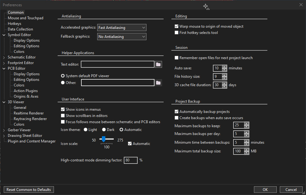
For some reason controls aren't using consistent borders
You can see controls at the top of the screenshot have a rather gentle 1px border but then suddenly controls elsewhere on the page are 2 pixels.

It appears mainly that text input controls and some panels are affected. wxChoice inputs are unaffected.
This screenshot shows that difference of wxChoice vs text controls.
What's even weirder, the "Text Editor" input has a 2 pixel border, but the "Other" box right below it has a 3 px border.
—
Reply to this email directly, view it on GitHub, or unsubscribe.
You are receiving this because you are subscribed to this thread.![]()
VZ
Thanks for noticing this, but I have no idea why is the outer border drawn using #7a7a7a for some controls and (the much brighter) #cccccc for the others.
What are the styles used for the "Text editor" and "Other" text controls here, do they differ by chance?
Also, it looks like they use the same parent but, just to confirm, is this really the case?
—
Reply to this email directly, view it on GitHub, or unsubscribe.
You are receiving this because you are subscribed to this thread.![]()
Mark Roszko
Ah, so the "Other" box in the screenshot has a extra 1px border from being Disabled. Unforunately the disabled state isn't very visible.
We otherwise don't use any weird styling that should be giving them an extra border compared to wxChoice
https://gitlab.com/kicad/code/kicad/-/blob/master/common/dialogs/panel_common_settings_base.cpp#L88
—
Reply to this email directly, view it on GitHub, or unsubscribe.
You are receiving this because you are subscribed to this thread.![]()
Tommy Krul
We noticed the same issue. I ended up working around it by passing the wxBORDER_SIMPLE style for any widget that was drawing a brighter border, which seems to avoid the issue.
—
Reply to this email directly, view it on GitHub, or unsubscribe.
You are receiving this because you are subscribed to this thread.![]()
VZ
Ah, so the "Other" box in the screenshot has a extra 1px border from being Disabled. Unforunately the disabled state isn't very visible.
I am not sure if this is really important, but I actually don't see any extra 1px border on your screenshots and I don't see any 3px borders neither: both controls have 2px border, with the inner side being white (#ffffff) and the outer one being either #7a7a7a in the normal case or #cccccc in the disabled one.
Is it possible to change the background color of a disabled control? The modern UWP windows makes it the lighter grey when disabled, and the black box when enabled
I guess we should indeed do it because the native control does it too in the light mode, so there doesn't seem any good reason not to do it in the dark mode. I have no idea why it doesn't do it on its own, but such is life.
I ended up working around it by passing the wxBORDER_SIMPLE style for any widget that was drawing a brighter border, which seems to avoid the issue.
I actually rather like this solution, it results in using an acceptable #646464 1px border here, which looks reasonable for both enabled and disabled controls. We can easily change the code to use wxBORDER_SIMPLE by default, i.e. if no other border style is explicitly specified. The only problem I see with this is that switching between dark/light modes will now result in controls using inappropriate borders unless we recreate them, but we probably are going to need to recreate them anyhow because there are too many things that get broken when switching modes right now.
What do you think of #23644?
—
Reply to this email directly, view it on GitHub, or unsubscribe.
You are receiving this because you are subscribed to this thread.![]()
VZ
I think this was fixed by f5dd5ea and dc7f934, so closing -- please let me know if you still see something wrong.
—
Reply to this email directly, view it on GitHub, or unsubscribe.
You are receiving this because you are subscribed to this thread.![]()
VZ
Closed #23622 as completed.
—
Reply to this email directly, view it on GitHub, or unsubscribe.
You are receiving this because you are subscribed to this thread.![]()
Mark Roszko
I think this was fixed by f5dd5ea and dc7f934, so closing -- please let me know if you still see something wrong.
Yes, the borders look consistent in width now
The only nit is the color difference between the combobox border/outline and the text control border
—
Reply to this email directly, view it on GitHub, or unsubscribe.
You are receiving this because you are subscribed to this thread.![]()