Sponsors for shirt

Jeremy Clarke
the shirt.
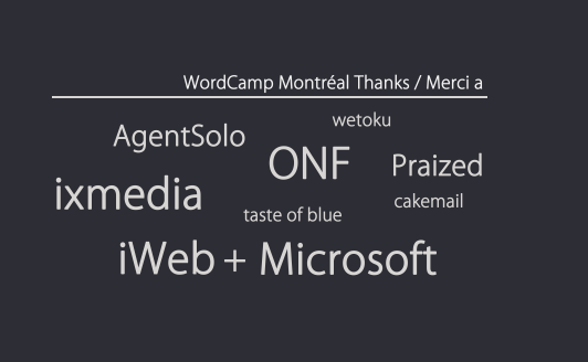
Sylvain managed to convince them that a 'sponsor cloud' of just text
of their names would be a cool way to make it more blog-like while
also saying the names of sponsors.
I put together a 'sponsor cloud' with our sponsors as well as a normal
set of logos. We will probably have to decide by tomorrow, but anyone
who gets this and has an opinion please let me know which you think is
less worse :)
ALSO: It looks like we will have both dark grey and white shirts
available because iWeb is very eager to print us white ones. STRANGE
MUCH? Maybe some people will prefer white?
--
Jeremy Clarke
Code and Design | globalvoicesonline.org

Christine Prefontaine
http://www.flickr.com/photos/marksurman/315863649/in/set-72157594408516988/
http://www.flickr.com/photos/marksurman/315852485/in/set-72157594408516988/
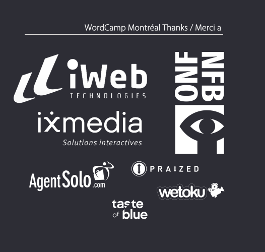
Shirts were done in two languages and colors. This avoided the dreaded-logo-soup syndrome and kept everyone happy. (That said, under this block we had the logos of our three main sponsors. Nothing's perfect.)
Good luck,
C.

Sylvain Carle
closer) - Try running the words in wordle.net just for fun...
> 41KViewDownload
>
> Picture 14.png
> 70KViewDownload

Frances Palaschuk
Hi Jeremy, I like PNG 14.
Thanks!
Frances

Pier-Luc Petitclerc
- pL

Andrea DeMers
I also prefer picture 14. However, it would look nicer without the
first line "WorCamp Montreal Thanks/Merci a". Is it required?
Also, if there is a size small white t-shirt, I'll take it. :-)
Cheers,
Andrea
Jeremy Clarke
>
> Hi Jeremy,
>
> I also prefer picture 14. However, it would look nicer without the
> first line "WorCamp Montreal Thanks/Merci a". Is it required?
It's a matter of opinion I guess, but I hate shirts that have sponsors
on teh back with no explanation. It's just a mess. At least this way
it says 'wordcamp montreal' on the back so someone sitting behind you
can get a sense of what its about instead of just seing logo soup.
So at this point it sounds like actual logos are a pretty clear
winner. This is fine by me as IMHO we might as it will make the
sponsors happier and they all have decent logos, especially NFB/ONF,
who's logo actually *improves* our reputation as far as I'm concerned
:)
Glad to know we'll have at least one person choosing a white shirt.
I'll try to make them exact opposites of the grey ones.