Funny Chart Output
99 views
Skip to first unread message

Krazykid67
Sep 17, 2013, 2:19:46 AM9/17/13
to wfrog...@googlegroups.com
I recently re-initialized by QNAP NAS and had to re-install wfrog (it was previously running fine). Ran into 2 issues.
1) My Optware repository didn't contain pygooglechart anymore. Checked possible mirrors and still no luck. I had to install pygooglechart manually by downloading from its home site and issuing "python setup.py install".
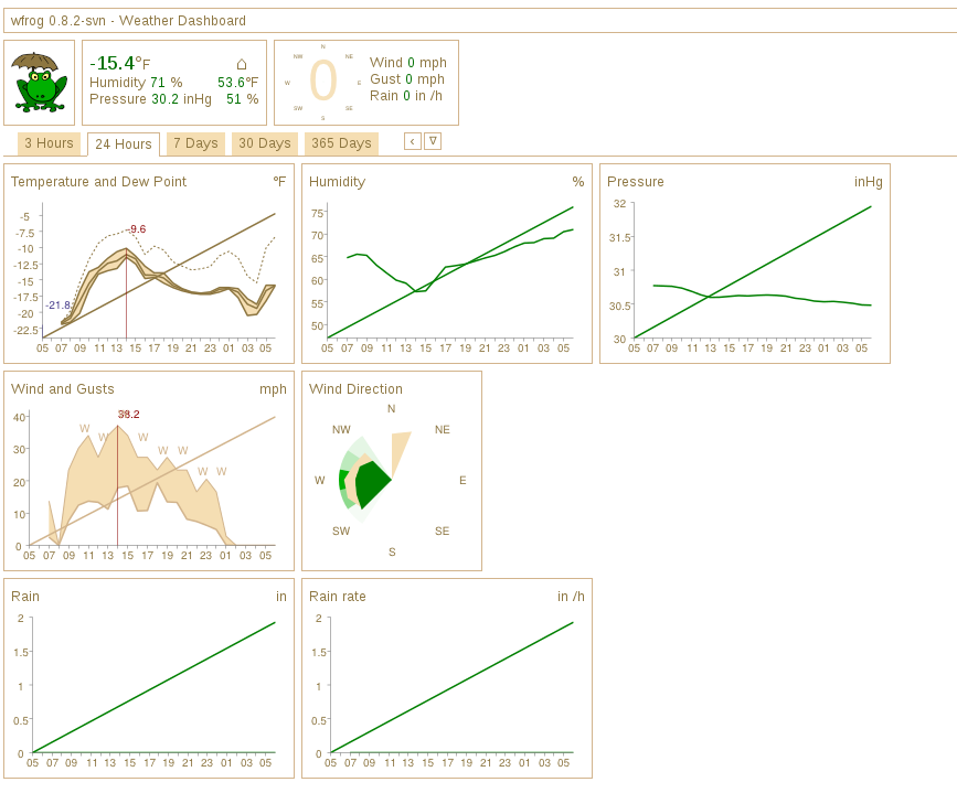
2) Managed to get wfrog running now but the chart output is really weird. There is an extra line in the line charts which goes from the bottom left of the axes (I hesitate to call it the origin since it's not 0,0) to the top right. You can view it here at http://treasures.myqnapcloud.com/wfrog/3hours.html
Anyone have some advice on how to remove the extra line from the plots? Thanks!
Krazykid67
Sep 17, 2013, 9:39:28 PM9/17/13
to wfrog...@googlegroups.com
Update:
Solved the weird extra line problem by installing the older 0.3.0 (2010) version of pygooglecharts. The default download from the website is the version 0.4.0 (2013 June version).

Jordi Puigsegur Figueras
Sep 18, 2013, 3:11:52 AM9/18/13
to wfrog...@googlegroups.com
Hi,
Thanks for reporting this issue. It could be either a compatibility problem of wfrog and the latest pygooglechart version or a bug in pygooglechart itself. We'll have to investigate further if it keeps happening ....
--
You received this message because you are subscribed to the Google Groups "wfrog-users" group.
To unsubscribe from this group and stop receiving emails from it, send an email to wfrog-users...@googlegroups.com.
For more options, visit https://groups.google.com/groups/opt_out.

ed
Jan 7, 2014, 8:28:25 AM1/7/14
to wfrog...@googlegroups.com
Jordi Puigsegur Figueras
Jan 7, 2014, 9:15:26 AM1/7/14
to wfrog...@googlegroups.com
The graphs look ok to me...
Jordi
El dia 07/01/2014 14.28, "ed" <eclu...@frontier.com> va escriure:
--
ed
Jan 7, 2014, 9:49:01 AM1/7/14
to wfrog...@googlegroups.com
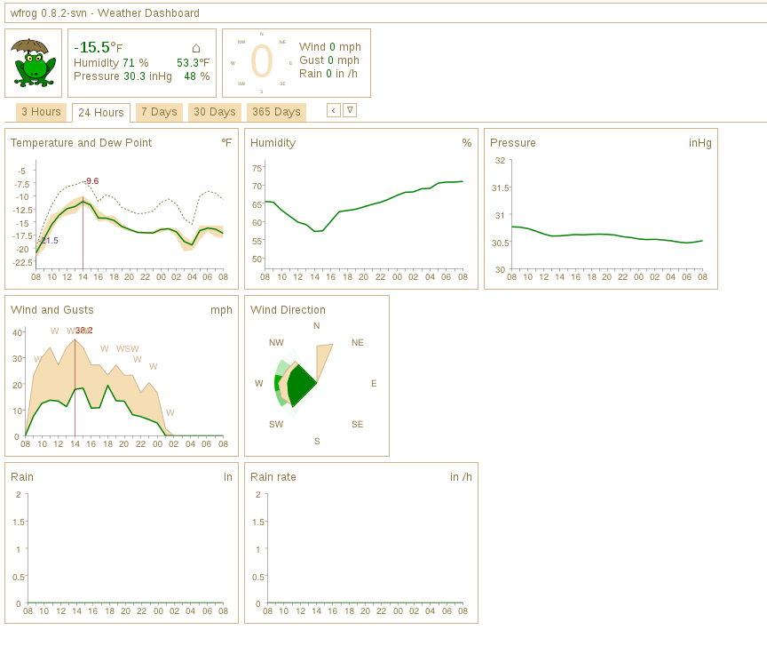
See attached pictures. The chart with the diagonal line from the lower left corner to the upper right corner is using pygooglechart 0.4.0.
The chart with no diagonal line is using pygooglechart 0.3.0.
The chart with no diagonal line is using pygooglechart 0.3.0.

Yotta
Jun 15, 2016, 3:59:04 PM6/15/16
to wfrog-users
I'm having some troubles with the graphs (also running 0.4.0). How did you revert to version 0.3.0?
Yotta
Jun 15, 2016, 4:49:44 PM6/15/16
to wfrog-users
Nevermind, eventually found a link.
The original repository seems to have been taken down (in case it comes back up): https://pypi.python.org/pypi/pygooglechart/0.3.0
Found some mirrors which worked for me (despite the installer throwing errors): http://www.filewatcher.com/m/pygooglechart-0.3.0.tar.gz.27388-0.html
Reply all
Reply to author
Forward
0 new messages