Belchertown skin - wrong historical graphs when gaps in the data
104 views
Skip to first unread message

Christian Gloor
Oct 7, 2021, 11:48:45 PM10/7/21
to weewx-user
Hello everyone,
First off, thank you and kudos to the developers of weewx and the Belcherton skin. I'm all too happy to have found a much better alternative to the terrible WeatherLink application that came with our station.
Here is the relevant section of graphs.conf.
First off, thank you and kudos to the developers of weewx and the Belcherton skin. I'm all too happy to have found a much better alternative to the terrible WeatherLink application that came with our station.
Now, the reports work great with the default configuration but I decided to add some graphs for the historical data. I imported previous years from Weatherlink into weewx and the data is there. Now, I have huge gaps due to the fact that the computer running Weatherlink was down for months at a time. It is not import problem.
This is correctly reported in the NOAA reports attached.
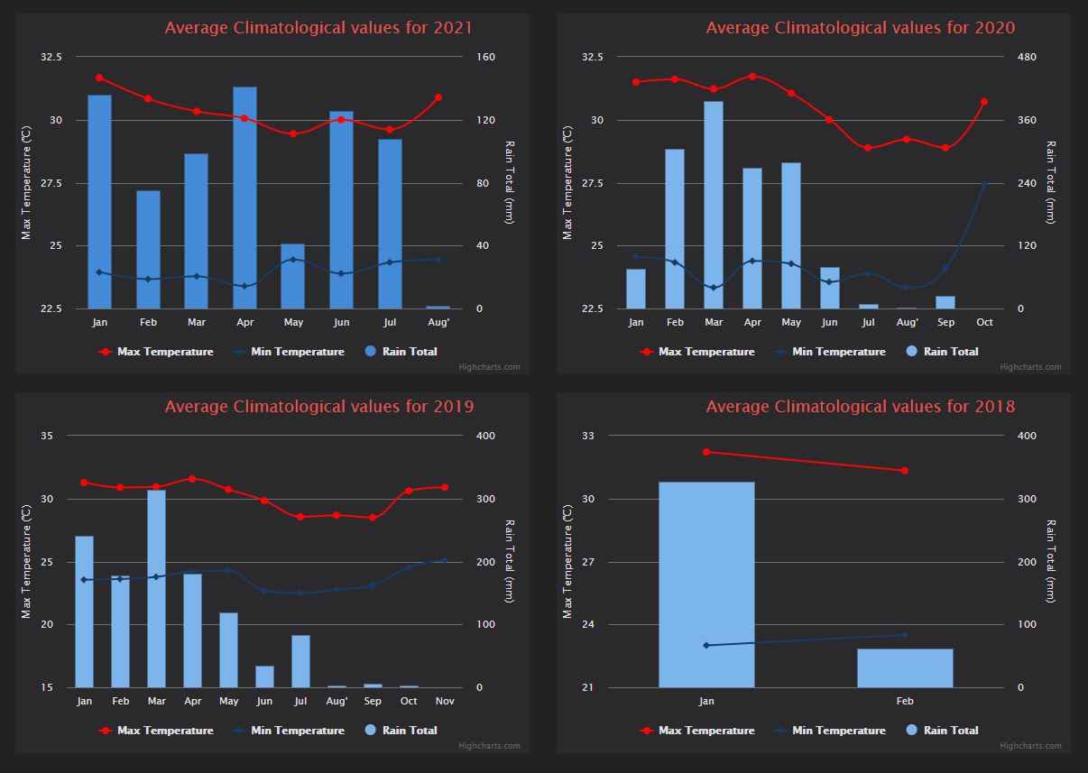
However, when following the examples for the year graphs from the Belchertown wiki, my graphs come out wrong. It doesn't matter where the gaps are in my data. For example, in 2018 I had two months of data in November and December, the graph will report the correct values but in the columns from January and February as shown here:
However, when following the examples for the year graphs from the Belchertown wiki, my graphs come out wrong. It doesn't matter where the gaps are in my data. For example, in 2018 I had two months of data in November and December, the graph will report the correct values but in the columns from January and February as shown here:
Here is the relevant section of graphs.conf.
# Global Chart Defaults
# These are fallback options that charts will use if an option is not defined.
aggregate_type = None
time_length = 90000 # Last 25 hours
type = line
colors = "#7cb5ec, #b2df8a, #f7a35c, #8c6bb1, #dd3497, #e4d354, #268bd2, #f45b5b, #6a3d9a, #33a02c"
tooltip_date_format = "LLL"
connectNulls = false
[History]
Title = "Wakatobi Airport Historical data"
show_button = true
button_text = History
type = spline
time_length = year_specific
aggregate_type = max
aggregate_interval = 86400 # 1 Day
gapsize = 86400000
xAxis_groupby = month
xAxis_categories = 'Jan', 'Feb', 'Mar', 'Apr', 'May', 'Jun', 'Jul', Aug', 'Sep', 'Oct', 'Nov', 'Dec'
[[chart1]]
year_specific = 2021
title = "Average Climatological values for 2021"
[[[outTemp]]]
name = Max Temperature
zIndex = 2
color = "#fc0404"
[[[[marker]]]]
enabled = true
radius = 4
[[[outTemp_min]]]
name = Min Temperature
observation_type = outTemp
aggregate_type = min
zIndex = 2
color = "#173c6a"
[[[[marker]]]]
enabled = true
radius = 4
[[[rainTotal]]]
name = Rain Total
type = column
yAxis = 1
zIndex = 0
color = "#438bd6"
[[chart2]]
year_specific = 2020
title = "Average Climatological values for 2020"
[[[outTemp]]]
name = Max Temperature
zIndex = 2
color = "#fc0404"
[[[[marker]]]]
enabled = true
radius = 4
[[[outTemp_min]]]
name = Min Temperature
observation_type = outTemp
aggregate_type = min
zIndex = 2
color = "#173c6a"
[[[[marker]]]]
enabled = true
radius = 4
[[[rainTotal]]]
name = Rain Total
type = column
yAxis = 1
zIndex = 0
[[chart3]]
year_specific = 2019
title = "Average Climatological values for 2019"
[[[outTemp]]]
name = Max Temperature
zIndex = 2
color = "#fc0404"
[[[[marker]]]]
enabled = true
radius = 4
[[[outTemp_min]]]
name = Min Temperature
observation_type = outTemp
aggregate_type = min
zIndex = 2
color = "#173c6a"
[[[[marker]]]]
enabled = true
radius = 4
[[[rainTotal]]]
name = Rain Total
type = column
yAxis = 1
zIndex = 0
[[chart4]]
year_specific = 2018
title = "Average Climatological values for 2018"
[[[outTemp]]]
name = Max Temperature
zIndex = 2
color = "#fc0404"
[[[[marker]]]]
enabled = true
radius = 4
[[[outTemp_min]]]
name = Min Temperature
observation_type = outTemp
aggregate_type = min
zIndex = 2
color = "#173c6a"
[[[[marker]]]]
enabled = true
radius = 4
[[[rainTotal]]]
name = Rain Total
type = column
yAxis = 1
What am I missing?
I would expect all 4 graphs to show all the months from January to December on the X axis and display the values where they are.
I would expect all 4 graphs to show all the months from January to December on the X axis and display the values where they are.
Thank you in advance for your help.
Chris
Chris
Christian Gloor
Oct 7, 2021, 11:54:54 PM10/7/21
to weewx-user
Ah, I forgot.
I'm running weewx 4.5.1, with the Belchertown skin 1.2, on a Raspberry Pi 3B running Raspbian.
I'm running weewx 4.5.1, with the Belchertown skin 1.2, on a Raspberry Pi 3B running Raspbian.
Cheres,
Chris
Reply all
Reply to author
Forward
0 new messages