
xmetman
Aug 16, 2019, 6:23:11 AM8/16/19
to weathera...@googlegroups.com
I know I've mentioned this before but I can't help myself being the old curmudgeon that I am.
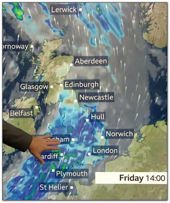
Why do the graphics for the weather radar on the BBC never show the rainfall intensity as used by the Met Office?
It's not informative and it's a little misleading - this morning's weather radar is a perfect case in point.
If I lived across the southwest of Scotland I would have no real idea of the intensity of the rainfall across my part of the world or how heavy that shower coming into northern Ireland.
The shades of textured blue simply don't work I'm afraid.
Is it too much to ask to include an intensity scale and the time of each frame in the animation - 'rainfall so far' is a little imprecise - and using a coastal outline might be an idea for both this and NWP weather charts - what's so difficult?
You could ditch the mm/hr with slight/moderate/heavy/very heavy or something.
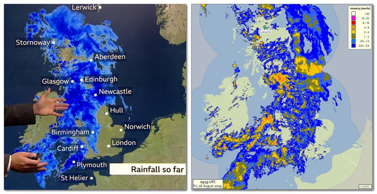
Neither the Met Office or Meteogroup match the intensity colours they use in their weather radar with those from whatever NWP model they are using, this is probably because it would highlight any mismatch that would occur when you swapped from observational to forecast data. I can't see it would be something that they couldn't configure in their graphics engine. I would say from what I've seen of Met Office video's on Youtube they seemed to be loathed to use weather radar very much at all.

Julian Mayes
Aug 16, 2019, 9:14:29 AM8/16/19
to Weather and Climate
I'm sorry to be another old curmudgeon (it must be the rain - and the way it keeps being over-hyped by media idiots!) but both the past radar images and the rainfall model output fields use light blue for light rain and dark blue for heavier rain. I don't see that the fact that the latter goes on to use green / yellow as a huge issue. Surely the main thing is that the radar images are being shown a little more often this week - something I think you've rightly called for. My personal view is that there should be more time given to Nowcasting (what will almost certainly change in the next 6 hours) and less to a template-driven summary of the next 3 days in every single forecast. Radar imagery will help with the former.
Julian
xmetman
Aug 16, 2019, 10:49:50 AM8/16/19
to Weather and Climate
It's perhaps because I've done some work on applications that visualise weather radar imagery (in a previous life) that I don't want to see what to me is valuable information go to waste and lost in a sea of different shades of blue. I would imagine to tie both observational and forecast data together so they both use the same colour scheme for rainfall intensity is probably as easy as editing a config file.
Reply all
Reply to author
Forward
0 new messages