
xmetman
Oct 3, 2016, 3:01:05 PM10/3/16
to Weather and Climate
The Met Office have won the ITV contract. They'll then upgrade the graphics to use their new Visual Cortex system which is probably what swung it for them. The graphics on the ITV have been dreadful for many years always trailing the BBC. Shame that the BBC couldn't wait to see it, although they may prefer to dictate which graphics package is used.

xmetman
Oct 3, 2016, 3:54:05 PM10/3/16
to Weather and Climate
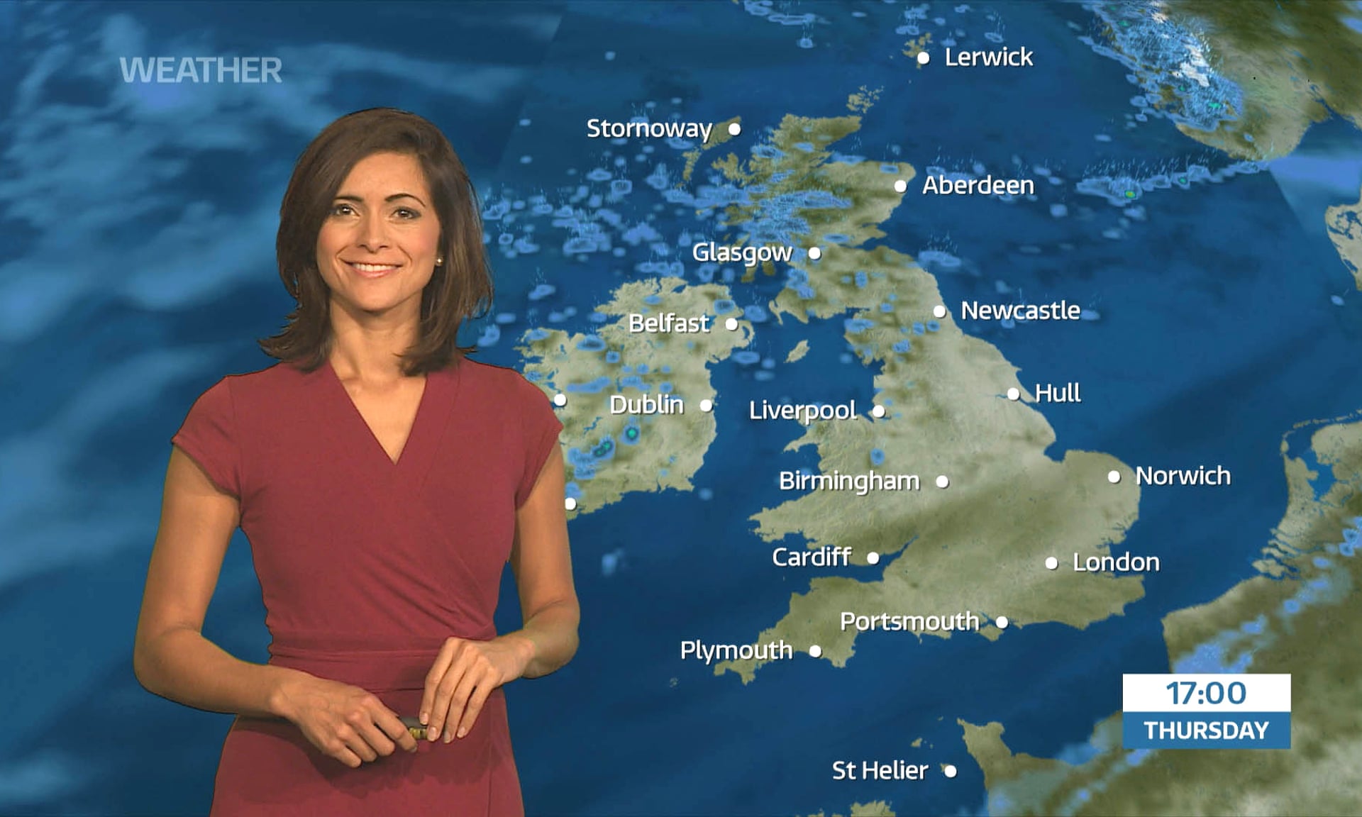
ITV national weather presenter Lucy Verasamy hosts the new-look forecast. Photograph: ITV
I've just be reading a little bit more into the news that Met Office have won the ITV contract and found that the mighty Visual Cortex graphics system that is being used looks as if it can only display maps in the Mercator projection!
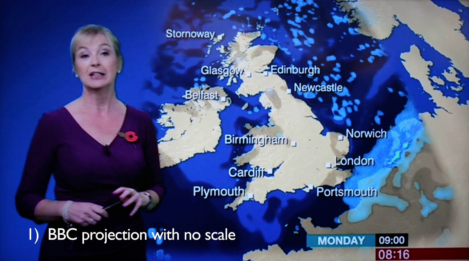
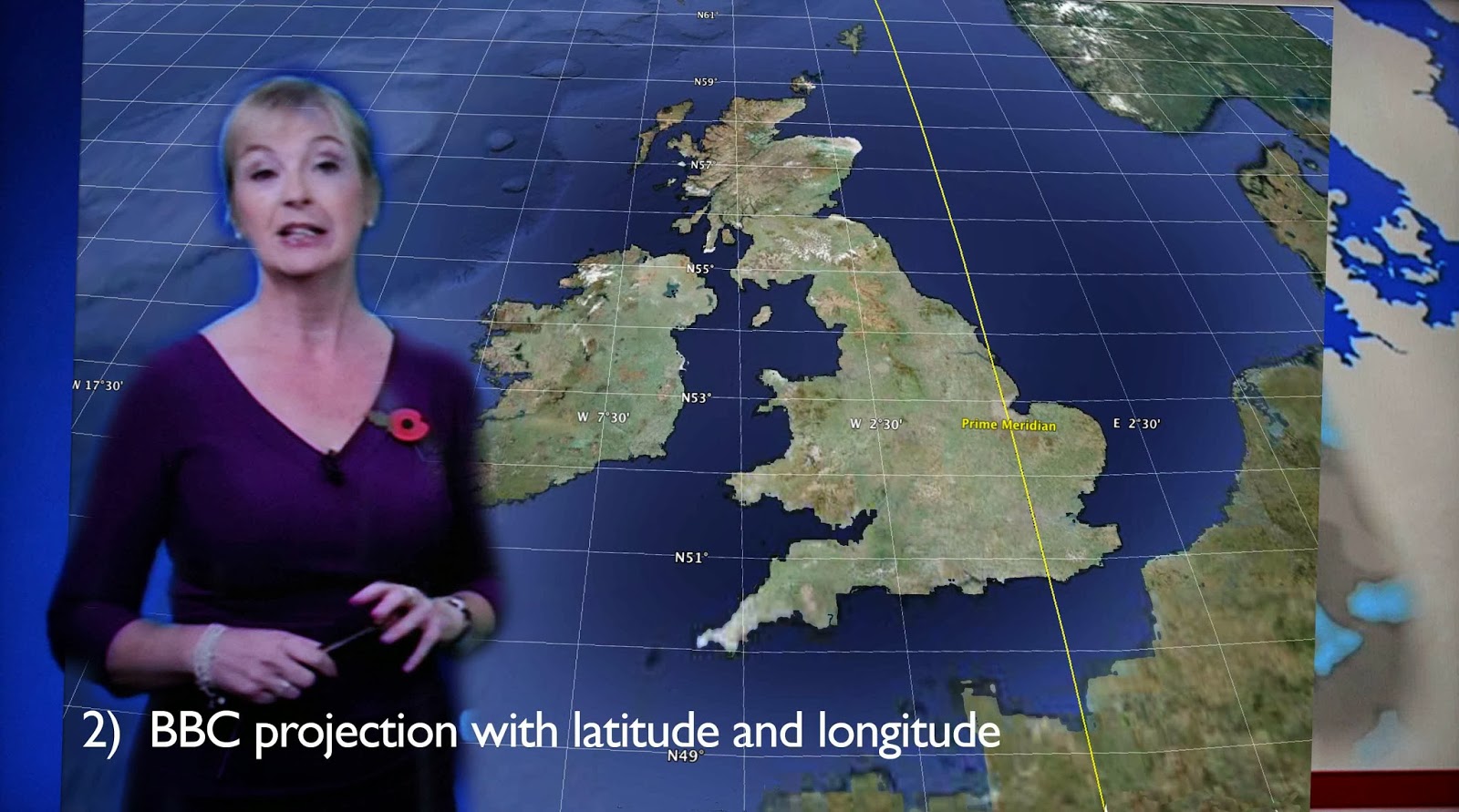
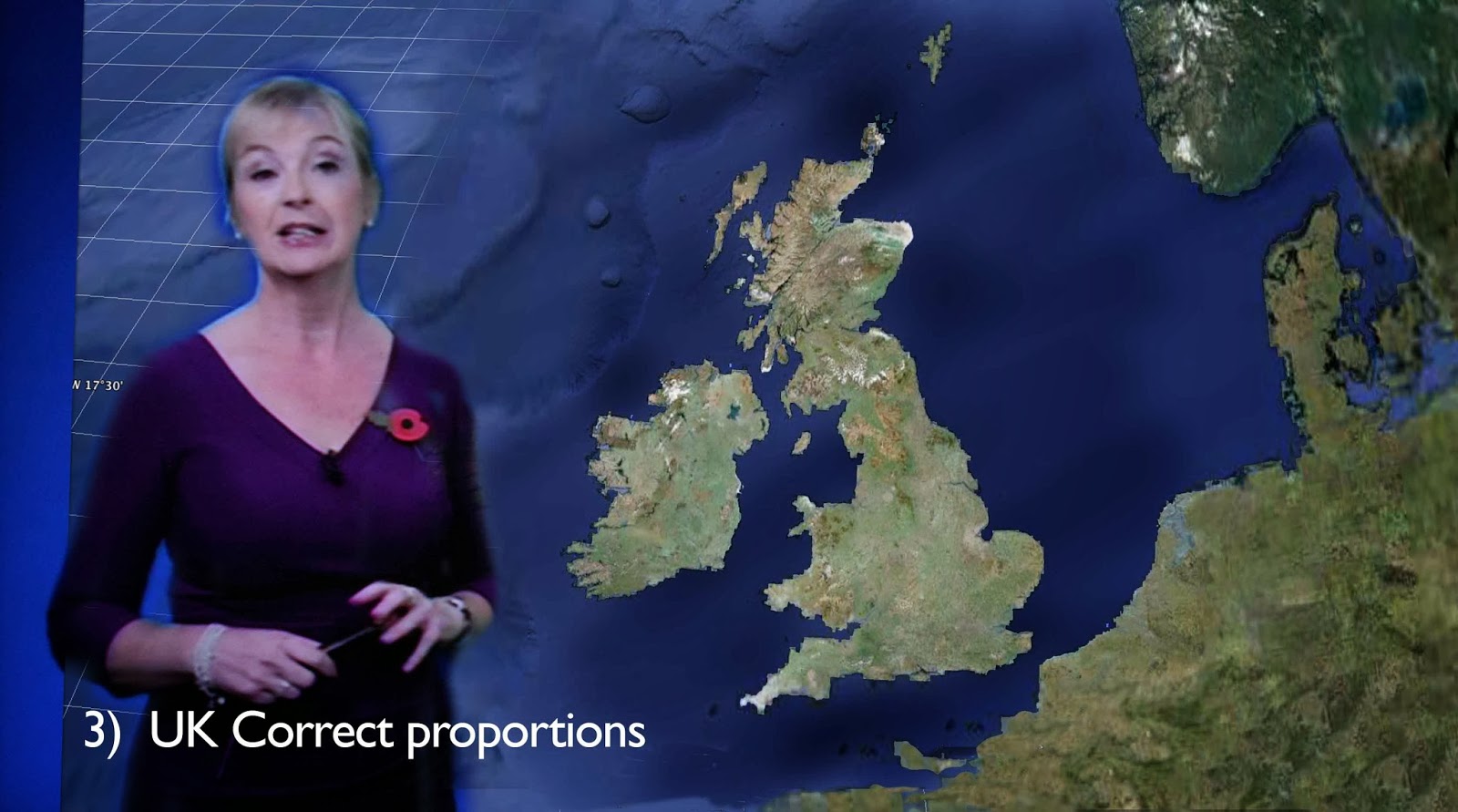
Maybe its because my Father was from Glasgow and I spent 8 years at Kinloss that I have strong feelings about Scotland, but this is ridiculous, millions of people in this country probably live in the delusional belief that Scotland is that shrunken bit at the top of the map. Many Scots petitioned the BBC to change the projection from Mercator back in 2005, but to no avail. I found a wonderful article on the Bella Caledonia web site concerning the BBC graphics which use the same mercator projection. The three images below show the problem in a nutshell (I hope they don't mind me using them!). There is no reason why the Met Office and the ITV couldn't easily swap to a Google map type projection in some configuration file, but yet again Scotland loses out this time to another dinosaur, but this time it's the Met Office, rather than the BBC. I'm sure people in the south wouldn't like it if was the other way round and would soon be up in arms.
I'll leave the final words to Bella Caledonia:-
So back to Scotland, and its place in the BBC animated weather maps. First, forget the fact that the camera swoops over different areas in turn. It’s the big wide shot which creates a false impression. And false it is. Have a look at a less distorted map of Britain. Yes, Scotland is rather more than just a head on England’s body. Slide a map of Scotland on top of one of England and it’s surprising how similar they are. The land area of Scotland is 30,414 square miles, while England has an area of 50,346 square miles. When it comes to renewables and the natural resources of wave and tide Scotland doesn’t just have faster coastal currents. We have more coast. Scotland has 10,246 miles of coastline. England’s coastline is 1,988 miles. So Scotland’s more than just a wee plot on the northern fringes of England.
xmetman
Oct 5, 2016, 9:08:49 AM10/5/16
to Weather and Climate
I've just had another chance to see the Visual Cortex graphics on the ITV and what I find confusing is how they depict low cloud in animations.
It's difficult to decide which areas are clear of cloud and what is actual low cloud.
The clouds seem to be a light khaki green while the land surface appears a silver light grey.
I would have thought that it should be the other way round and the land should be a light green and the clouds grey.
I'll try and capture some screenshots of what it looks like but I'm sure that the ITV do it in the opposite way to how the BBC do!
The other thing is difficult to catch because the ITV audience have a difficulty with any kind of synoptic chart, but when they occasionally do, the new graphics depict a warm and cold front as a continuous line of blue triangles or red semi-circles (with no spaces) which to me is just plain unprofessional!
Reply all
Reply to author
Forward
0 new messages