Skip to first unread message

xmetman
Jun 22, 2019, 4:47:34 AM6/22/19
to Weather and Climate
The visualising of annual mean temperature as a series of coloured stripes (like in a candy bar) from left to right seems to have taken off at the moment with show your stripes.
Show your stripes is another one of those innovative visualising idea by Ed Hawkins to convey just how fast the world is heating.
I think the idea is is that it's a lot more startling to show how things have warmed by using a graphic comprising a series of coloured bands, that it is to say use a table of values that say its warmed by 1.0°C degrees since pre-industrial time.
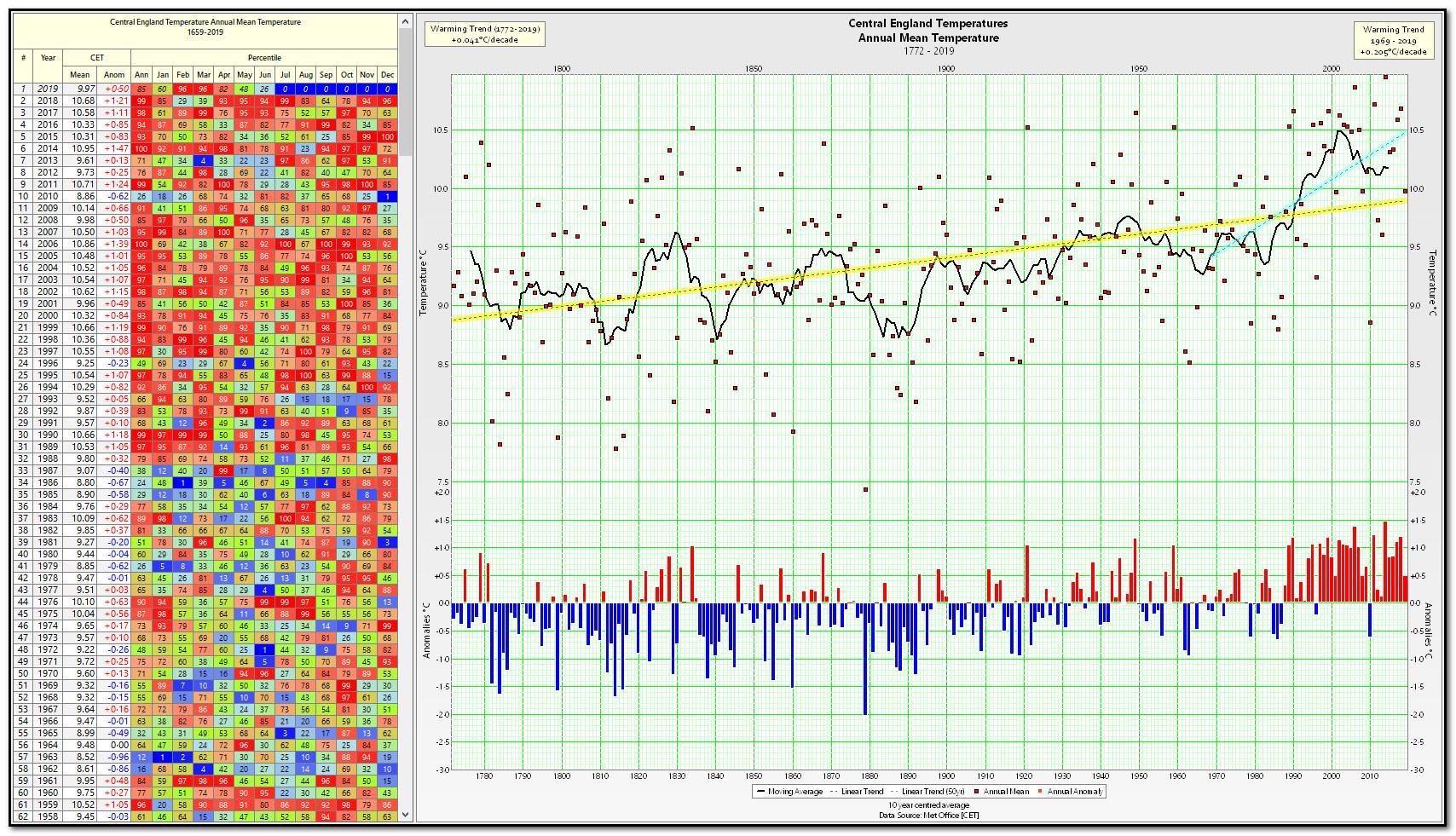
It's noticeable to me (in the show your stripe examples below) is that the longer the series the less effective show your stripes is (see CET).
From the look of it Ed Hawkins is now reaping the whirlwind he has sown on twitter though, but that comes with the territory.


xmetman
Jun 22, 2019, 5:02:49 AM6/22/19
to Weather and Climate
It may need a bit more studying before you know what's going on, but I still like a graph with a couple of trend lines.
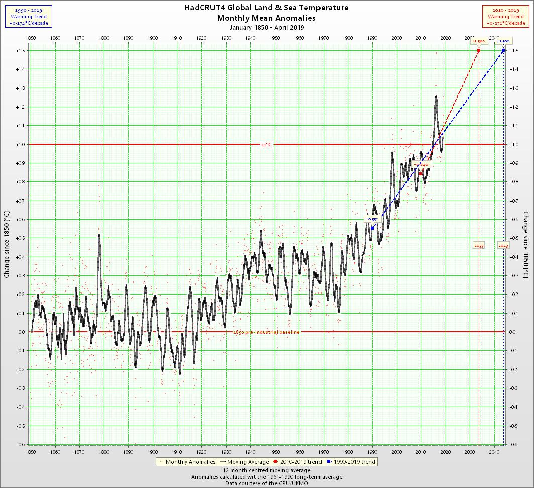
Of course this doesn't make quite as an attractive and bold design on the side of a mug like the stripes make.

Julian Mayes
Jun 22, 2019, 5:44:37 AM6/22/19
to Weather and Climate
Bruce, I don't know if your post was prompted by the story on the BBC website yesterday showing the stripes for each country by continent but I was planning to post on this today after reading this, which had been noticed by a colleague......
A brilliant form of presentation, very clear. But this clarity can show up oddities in the original data-set in this instance - much of it was sourced apparently from a recalculated set of data by 'Berkeley Earth' - http://berkeleyearth.org/about/ I suppose they had calculated the national data so it was convenient to put this into the stripes. 1940-42 appear very cold in each European country whereas they were quite warm elsewhere in the world (this was around the time of the C20th peak in global warmth of course). El Nino is mentioned as a possible explanation (the first three winters of the SWW were very cold - and the stripes look rather like winter temp anoms).
The problem is that those years do not appear exceptionally cold in either the CET (as you show in the diagram above) nor in the MO 'UK' digitised temperature series https://www.metoffice.gov.uk/climate/uk/summaries/datasets
Those years were quite cold in England - as confirmed by the MO anomaly maps at https://www.metoffice.gov.uk/public/weather/climate-anomalies/#?tab=climateAnomalies so the CET and Oxford series would have captured the coldness such as it was.
I have not looked through the Berkeley website in detail to understand what they did with the data - the coldness of 1962 and 1963 seems to have waned too. I've looked at station temperature graphs for a few sites such as Oxford's Radcliffe ob and this confirms the CET and MO datasets - they were not exceptionally cold years.
Julian
xmetman
Jun 22, 2019, 8:14:50 AM6/22/19
to Weather and Climate
Hi Julian
Yes, I saw that piece by Jonathan Amos, and that's what prompted me!
I'm not certain that any type of graph - including this one showing a decadal warming trend of over 0.2°C since 1969 - of the CET series would convince a skeptic, maybe the odd agnostic.
Bruce.
PS ignore the future months of 2019 in the heatmap.
Reply all
Reply to author
Forward
0 new messages