Anyone with a bit of web-design experience?
385 views
Skip to first unread message

Tim Fox
Mar 23, 2015, 1:50:29 PM3/23/15
to ve...@googlegroups.com, vert...@googlegroups.com
Hello folks,
The current Vert.x 3 web-site contains pretty much all the information,
is a single page, and is functional:
http://vert-x3.github.io/
It's very simple and written using Twitter Bootstrap. Although it does
the job, it looks.... well, how do I put it? A bit boring and a bit
amateurish?
I was wondering if there was anyone with a bit of web-design experience,
nothing fancy required, who would like to take a stab at putting a bit
of lipstick on it?
Just thinking along the lines of, maybe a bit more colour, fonts,
alignments etc, not thinking of any grand redesign.
Anyone interested?

Michel Krämer
Mar 26, 2015, 2:16:45 AM3/26/15
to ve...@googlegroups.com, vert...@googlegroups.com
Dear Tim,
I have some experience. I'm not a pro, but I think I should be able to do the job. You can have a look at my latest work (my personal website) for a reference:
http://www.michel-kraemer.com/
What do you think? Shall I try my luck?
I suppose https://github.com/vert-x3/vert-x3.github.io is the right repo?
Any preferences? Colors that should be included (like the purple color in the logo)? Dark theme (like the old site) or light theme?
Cheers,
Michel
Michel Krämer
Mar 26, 2015, 2:29:14 AM3/26/15
to ve...@googlegroups.com, vert...@googlegroups.com
Now here's a *very very rough* sketch of what the website could look
like. I made it in Inkscape in a couple of minutes so don't take it too
serious. Just wanted to give a quick impression.
Cheers,
Michel
Cheers,
Michel

Julien Viet
Mar 26, 2015, 3:15:40 AM3/26/15
to ve...@googlegroups.com, Michel Krämer, vert...@googlegroups.com
--
You received this message because you are subscribed to the Google Groups "vert.x" group.
To unsubscribe from this group and stop receiving emails from it, send an email to vertx+un...@googlegroups.com.
For more options, visit https://groups.google.com/d/optout.
Tim Fox
Mar 26, 2015, 3:29:20 AM3/26/15
to ve...@googlegroups.com
HI Michel,
On 26/03/15 06:16, Michel Krämer wrote:
Dear Tim,
I have some experience. I'm not a pro, but I think I should be able to do the job. You can have a look at my latest work (my personal website) for a reference:
http://www.michel-kraemer.com/
What do you think? Shall I try my luck?
Looks good :) Thanks for offering
https://github.com/vert-x3/vert-x3.github.io is where we push the
website when its built, but it's actually created from this project:
https://github.com/vert-x3/web-site/tree/initial-work (initial-work branch)
You can build the site locally with: mvn site and then just open your browser to the files on disk, i.e. target/site/index.html
The actual content is in files like these:
https://github.com/vert-x3/web-site/blob/initial-work/src/site/resources/templates/page.ftl
https://github.com/vert-x3/web-site/blob/initial-work/src/site/resources/templates/index.html
Any preferences? Colors that should be included (like the purple color in the logo)? Dark theme (like the old site) or light theme?
Personally I would prefer a light theme, and I am not wedded to the
purple. Maybe a light(ish) blue? Perhaps others have suggestions?
Cheers,
Michel
Am Montag, 23. März 2015 18:50:29 UTC+1 schrieb Tim Fox:Hello folks,
The current Vert.x 3 web-site contains pretty much all the information,
is a single page, and is functional:
http://vert-x3.github.io/
It's very simple and written using Twitter Bootstrap. Although it does
the job, it looks.... well, how do I put it? A bit boring and a bit
amateurish?
I was wondering if there was anyone with a bit of web-design experience,
nothing fancy required, who would like to take a stab at putting a bit
of lipstick on it?
Just thinking along the lines of, maybe a bit more colour, fonts,
alignments etc, not thinking of any grand redesign.
Anyone interested?
--
Tim Fox
Mar 26, 2015, 3:32:23 AM3/26/15
to ve...@googlegroups.com
+1.
Not sure we should have the 4 highlight points like we did in the old site or the code example though...
Not sure we should have the 4 highlight points like we did in the old site or the code example though...
Michel Krämer
Mar 26, 2015, 4:16:00 AM3/26/15
to ve...@googlegroups.com
Thanks for pointing me to the right repo!
Not sure we should have the 4 highlight points like we did in the old site or the code example though...
I'm also not sure about the highlight points. In fact, your current draft contains a lot more points. I'll try to come up with an idea for that...
The purple color looks pretty nice IMHO. I was surprised myself how good it fits to the white background and the black font color. I think we should stick to it. Gives it some kind of a unique style.
Regarding the code example: personally, as a programmer I'm always really grateful for short examples on the front page. Either I'm new to the tool and I can immediately see that it's rather easy to use, or I want to create a new project and am looking for a short snippet to copy and paste.
How do we proceed? Should I send you pull requests or should I mirror the site somewhere so that you can preview my changes? Do I need to sign the Eclipse CLA?
Cheers,
Michel
Tim Fox
Mar 26, 2015, 4:22:12 AM3/26/15
to ve...@googlegroups.com
Hi Michel,
On 26/03/15 08:15, Michel Krämer wrote:
Thanks for pointing me to the right repo!
No problem :)
Not sure we should have the 4 highlight points like we did in the old site or the code example though...
I'm also not sure about the highlight points. In fact, your current draft contains a lot more points. I'll try to come up with an idea for that...
The purple color looks pretty nice IMHO. I was surprised myself how good it fits to the white background and the black font color. I think we should stick to it. Gives it some kind of a unique style.
Sounds good. We can always change it at a later date, if need be.
Regarding the code example: personally, as a programmer I'm always really grateful for short examples on the front page. Either I'm new to the tool and I can immediately see that it's rather easy to use, or I want to create a new project and am looking for a short snippet to copy and paste.
How do we proceed? Should I send you pull requests or should I mirror the site somewhere so that you can preview my changes?
I suggest forking the website repo, then you can edit the pom.xml
https://github.com/vert-x3/web-site/blob/initial-work/pom.xml#L472
so that it pushes the web site to your own github pages so it can be
previewed (you can run mvn site-deploy to push).
Then when it's ready to merge, you could send a PR.
Thanks again for offering to do this, it's much appreciated :)
Then when it's ready to merge, you could send a PR.
Thanks again for offering to do this, it's much appreciated :)
Michel Krämer
Mar 26, 2015, 4:27:23 AM3/26/15
to ve...@googlegroups.com
OK great. Let's see what I can do. I'll get back to you when I have something to show...
Cheers,
Michel

Arnaud Estève
Mar 26, 2015, 5:37:57 AM3/26/15
to ve...@googlegroups.com
Regarding colors : when I tried my luck (only with the Chrome web inspector) the blue #243446 was fitting pretty nicely h1 headers and other "important" stuff.
To delimit box contents I used #FAFAFA as background color and #F2F2F2 for borders. http://i.imgur.com/dzKgISm.png to see the colors in action.
Hope this helps you in some way Michel.
I read by curiosity a book about color schemes once, and from what I remember, blue and grey kinda mean "confidence, reliability, effectiveness" to the reader (that's why a lot of banks choose blue for their logo, they said in the book).
Still not sure if this book was bullshit or not but that's what Vert.x inspires me : a well-tested framework I can trust, effective, powerful with no fancyness or bells&whistles. So if I had to choose I'd choose blue :)
And if I think about the (web) frameworks I know, I can quicly associate them with a color in my mind : Rails is red, Spring, Grails, Django are green, node is black, Ratpack is purple, can't think about a blue one (maybe there is a reason why no one chose blue... :\ )
Your first draft looks pretty neat even though I'm not a big fan of purple (it looks abit like Ratpack). I love the code sample on top of the screen though ! And the whole layout too, good job :)
I'd put the list of supported languages more appealing too. That's the first thing people will look for I guess "Is my favorite language supported ?? Yes ! I can continue reading".
Thanks a lot Michel.
Michel Krämer
Mar 26, 2015, 12:14:46 PM3/26/15
to ve...@googlegroups.com
Thanks for the comments and the insights! I like your design as well.
Akka is blue by the way: http://akka.io/ I guess we really have to differentiate from this one?
Ratpack also uses purple, but in the logo it seems they use yellow. I don't know what their primary color is (if they have one even).
I don't have a strong preference for either color. Blue also has its advantages. I specifically like the idea that it means confidence. But if it means vertx is going to be confused with Akka then we should avoid it.
I think I will go for purple for the time being (just because it's in the Vert.x logo). We can easily replace colors later. What do you think? Any other opinions from the community?
Cheers,
Michel
Michel Krämer
Mar 28, 2015, 10:26:57 AM3/28/15
to ve...@googlegroups.com
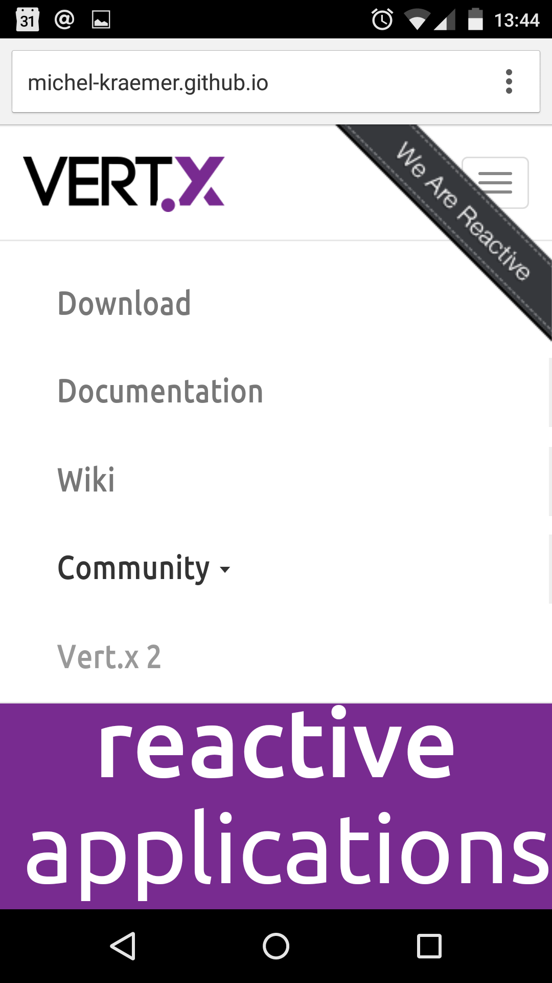
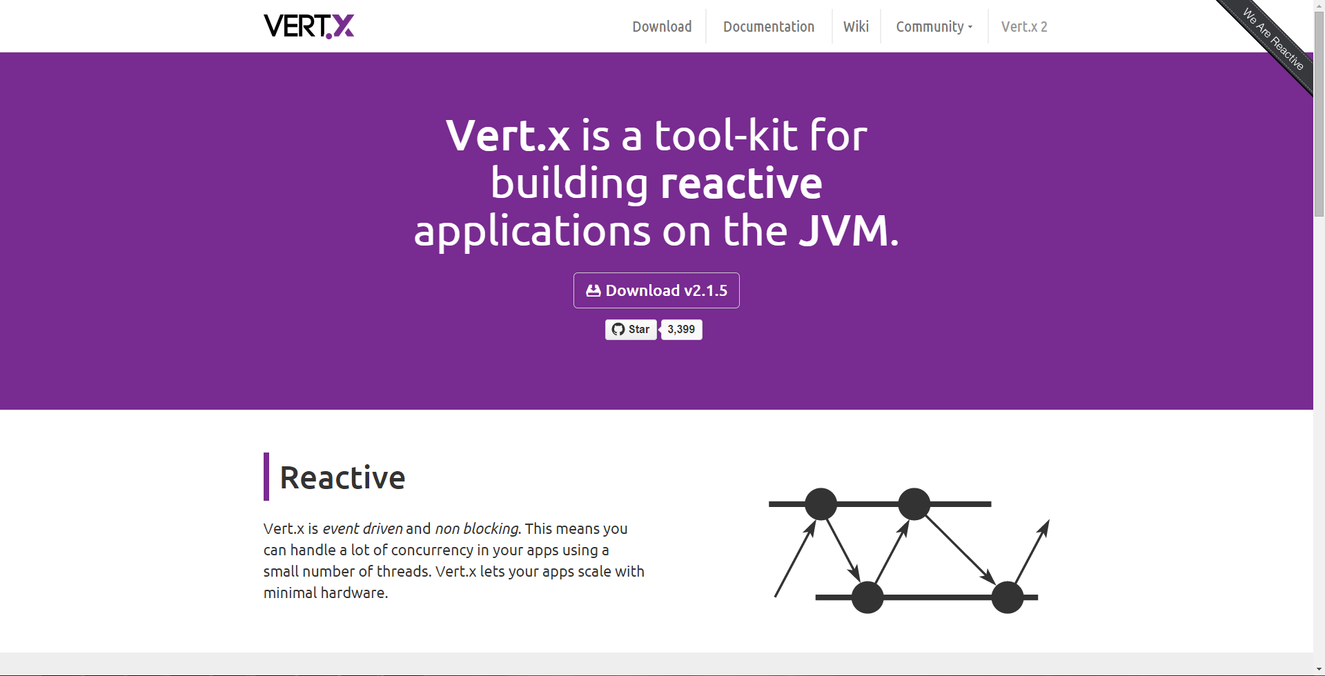
Here you are. Let me know what you think.
http://michel-kraemer.github.io/web-site/
There's still some work to do. The website is not very responsive yet. The code examples are not up to date. And according to your TODO list I guess you want to add some users to the 'who is using vert.x' section too?
Cheers,
Michel
Julien Viet
Mar 28, 2015, 10:34:57 AM3/28/15
to ve...@googlegroups.com, Michel Krämer
Tim Fox
Mar 29, 2015, 5:50:13 AM3/29/15
to ve...@googlegroups.com
This is really good Michel, I'm super
impressed :)
Will comment more tomorrow.
Will comment more tomorrow.

Tim Yates
Mar 29, 2015, 5:54:38 AM3/29/15
to ve...@googlegroups.com
Slight menu issues on android chrome, but I'm being overly picky of an excellent first draft 😉🙌
Michel Krämer
Mar 29, 2015, 8:38:16 AM3/29/15
to ve...@googlegroups.com
Thanks guys! I'm glad you like it.
@Tim Yates: as I said, there are still some glitches that I need to sort out. What menu issue are you talking about exactly? Can you make a screenshot?
Cheers,
Michel
Michel Krämer
Mar 29, 2015, 8:39:46 AM3/29/15
to ve...@googlegroups.com
@Tim Yates: Oh I see, you're talking about Android, so I guess you have a small screen. The website is not responsive yet, so the menu won't work on small screens yet. Of course, I can fix this.
Cheers,
Michel
Tim Yates
Mar 29, 2015, 8:46:24 AM3/29/15
to ve...@googlegroups.com
Sure, here's a screenshot of when the page first loads, followed by a small scroll down. The background of the menu disappears, but not the menu text, and maybe it should start hidden until I click the burger icon top right?
Michel Krämer
Mar 29, 2015, 9:42:55 AM3/29/15
to ve...@googlegroups.com
Dear Tim,
I have some experience. I'm not a pro, but I think I should be able to
do the job. You can have a look at my latest work (my personal website)
for a reference:
http://www.michel-kraemer.com/
What do you think? Shall I try my luck?
I suppose https://github.com/vert-x3/vert-x3.github.io is the right repo?
Any preferences? Colors that should be included (like the purple color
in the logo)? Dark theme (like the old site) or light theme?
Cheers,
Michel
Michel Krämer
Mar 29, 2015, 9:42:56 AM3/29/15
to ve...@googlegroups.com
Now here's a *very very rough* sketch of what the website could look
like. I made it in Inkscape in a couple of minutes so don't take it too
serious. Just wanted to give a quick impression.
like. I made it in Inkscape in a couple of minutes so don't take it too
serious. Just wanted to give a quick impression.
Cheers,
Michel
Am 23.03.2015 um 18:50 schrieb Tim Fox:
Michel
Am 23.03.2015 um 18:50 schrieb Tim Fox:
Michel Krämer
Mar 29, 2015, 12:48:57 PM3/29/15
to ve...@googlegroups.com
Thanks. Should be fixed now.
Michel
Tim Yates
Mar 29, 2015, 12:52:51 PM3/29/15
to ve...@googlegroups.com
Cool! Works here! Good job 😁
Tim Fox
Mar 30, 2015, 4:12:07 AM3/30/15
to ve...@googlegroups.com
So.. the web-site looks really great.
It's just the kind of site (simple, clear, nice design) I have wanted for a long time, but I didn't have the skills to do it myself.
So thank you, I really wasn't expecting so much, so quickly :)
A couple of comments:
* Who's using - this is kind of tricky. Unlike Akka, and other projects which have a commercial offering, we don't offer commercial support for Vert.x (yet), so it's not so easy for us to see who is using us, i.e. we don't have a list of contracts we can just look at. However, I do know various companies and users we could ping.
* The actual manual pages linked from the documentation page, e.g. http://michel-kraemer.github.io/web-site/docs/vertx-core/java/index.html - it would be nice to get those using the same stylesheets as the main site so we could have a consistent look and feel throughout.

Stephane Bastian
Mar 30, 2015, 6:51:39 AM3/30/15
to ve...@googlegroups.com
Hey Michael,
The website looks great !.
Just one minor comment though. Some time ago I came accross the spec from google on their new material design. There is a section for colors:
http://www.google.fr/design/spec/style/color.html#color-color-palette
The purple we've got is nice but kind of darkish. Would you mind trying the purple from MD, it' s a much brighter purple #9C27B0 and sse if it looks better?
All the best,
Stephane
Michel Krämer
Mar 31, 2015, 1:31:07 AM3/31/15
to ve...@googlegroups.com
So.. the web-site looks really great.
It's just the kind of site (simple, clear, nice design) I have wanted for a long time, but I didn't have the skills to do it myself.
Thanks. You're very much welcome. It was the least I could do for such a great tool and community.
* Who's using - this is kind of tricky. Unlike Akka, and other projects which have a commercial offering, we don't offer commercial support for Vert.x (yet), so it's not so easy for us to see who is using us, i.e. we don't have a list of contracts we can just look at. However, I do know various companies and users we could ping.
Sure. I just saw the item in the website's TODO list and thought it would be a great idea. Maybe we can do something like this: we can put some companies that we already know (you could add Fraunhofer for example, the research institute where I'm working J) and maybe a short call like "You want to be listed here? Just contact us!" or something like that. Of course we should accept large and known companies only (Fraunhofer has about 22.000 employees by the way ^^ and is well known in Europe).
* The actual manual pages linked from the documentation page, e.g. http://michel-kraemer.github.io/web-site/docs/vertx-core/java/index.html - it would be nice to get those using the same stylesheets as the main site so we could have a consistent look and feel throughout.
Sure thing. What do you suggest for the toc on the left hand side? I think we should keep it. It helps jump between sections. Maybe we could do something like the menu here: http://getbootstrap.com/css/ (I mean the one on the right hand side)
What do you think of a 'Our team' section with small avatars and maybe the Twitter handle? Do you even have a core team? For newbies it's really hard to see who's behind the project. Maybe in a separate 'About' page?
Cheers,
Michel
...
Michel Krämer
Mar 31, 2015, 1:42:17 AM3/31/15
to ve...@googlegroups.com
Just one minor comment though. Some time ago I came accross the spec from google on their new material design. There is a section for colors:
http://www.google.fr/design/spec/style/color.html#color-color-palette
Cool site. I will add it to my bookmarks. Thanks!
The purple we've got is nice but kind of darkish. Would you mind trying the purple from MD, it' s a much brighter purple #9C27B0 and sse if it looks better?
I made two screenshots. One with the darker purple and one with the lighter one (see attached). The thing with colors is that the larger the surface the more saturated and intense the colors look. You might know this if you have ever painted your living room with a vivid color. You went to the store and chose a red color that looked great on the bucket but when you put it on the wall it was just terribly intense. Of course it also depends on the computer screen and other things (lighting conditions etc.) but I think the brighter purple is just a bit too much. I like the darker one better. On the other hand you're right that it doesn't look as friendly as the bright one. So it's very hard to decide. I would be OK with either of them, but slightly prefer the darker one. What do the others think?
P.S.: Have you tested the site on your mobile device. Mobile device screens tend to saturate the colors even more.
Cheers,
Michel
All the best,
Stephane
Michel Krämer
Mar 31, 2015, 1:49:01 AM3/31/15
to ve...@googlegroups.com
Of course you should view the screenshots fullscreen to see the effect. Maybe we could also choose a color somewhere in the middle of these two?
Michel
Tim Fox
Mar 31, 2015, 2:24:24 AM3/31/15
to ve...@googlegroups.com
On 31/03/15 06:31, Michel Krämer wrote:
So.. the web-site looks really great.It's just the kind of site (simple, clear, nice design) I have wanted for a long time, but I didn't have the skills to do it myself.
Thanks. You're very much welcome. It was the least I could do for such a great tool and community.* Who's using - this is kind of tricky. Unlike Akka, and other projects which have a commercial offering, we don't offer commercial support for Vert.x (yet), so it's not so easy for us to see who is using us, i.e. we don't have a list of contracts we can just look at. However, I do know various companies and users we could ping.
Sure. I just saw the item in the website's TODO list and thought it would be a great idea. Maybe we can do something like this: we can put some companies that we already know (you could add Fraunhofer for example, the research institute where I'm working J) and maybe a short call like "You want to be listed here? Just contact us!" or something like that.
That sounds like a good idea :)
Of course we should accept large and known companies only (Fraunhofer has about 22.000 employees by the way ^^ and is well known in Europe).
+1 It's a very well respected organisation. Even I have heard of it
;)
* The actual manual pages linked from the documentation page, e.g. http://michel-kraemer.github.io/web-site/docs/vertx-core/java/index.html - it would be nice to get those using the same stylesheets as the main site so we could have a consistent look and feel throughout.
Sure thing. What do you suggest for the toc on the left hand side? I think we should keep it. It helps jump between sections. Maybe we could do something like the menu here: http://getbootstrap.com/css/ (I mean the one on the right hand side)
That's nice, although the font size is a bit small.
What do you think of a 'Our team' section with small avatars and maybe the Twitter handle? Do you even have a core team? For newbies it's really hard to see who's behind the project. Maybe in a separate 'About' page?
Also a good idea. The full-time team is currently small (only 2
people, but we are in the process of hiring 2 more), but we have a
lot of contributors.
It would be nice to have everyone who has contributed to be listed (if they want).
It would be nice to have everyone who has contributed to be listed (if they want).
Julien Viet
Mar 31, 2015, 2:30:03 AM3/31/15
to ve...@googlegroups.com, Tim Fox
if you want to change the documentation style : please use the asciidoctor stylesheet factory : https://github.com/vert-x3/web-site/tree/initial-work/asciidoctor-stylesheet-factory
Michel Krämer
Apr 1, 2015, 1:08:24 AM4/1/15
to ve...@googlegroups.com
Also a good idea. The full-time team is currently small (only 2 people, but we are in the process of hiring 2 more), but we have a lot of contributors.
It would be nice to have everyone who has contributed to be listed (if they want).
We could use the GitHub API to get all contributors to the Vert.x repositories:
On the other hand the Vert.x organisation has many repositories so we would produce a lot of requests. Alternatively we could use this:
Another alternative would be to use 'git log' for example to get all contributors from the local repositories.
Of course we could also go the static route and just insert the avatars and other info in plain HTML.
Cheers,
Michel
...
Michel Krämer
Apr 1, 2015, 1:12:47 AM4/1/15
to ve...@googlegroups.com, timv...@gmail.com
if you want to change the documentation style : please use the asciidoctor stylesheet factory : https://github.com/vert-x3/web-site/tree/initial-work/asciidoctor-stylesheet-factory
It seems the stylesheet factory uses foundation instead of bootstrap and compass instead of plain sass. It would be very hard for me to achieve the same styling. I guess it makes more sense to reuse the website stylesheet. I will have to dig a bit deeper into how the documentation is generated to find a good way. I'll get back when I have got something to show.
Cheers,
Michel
Julien Viet
Apr 1, 2015, 1:38:29 AM4/1/15
to ve...@googlegroups.com, Michel Krämer, timv...@gmail.com
Tim Fox
Apr 1, 2015, 2:45:57 AM4/1/15
to ve...@googlegroups.com
On 01/04/15 06:08, Michel Krämer wrote:
Also a good idea. The full-time team is currently small (only 2 people, but we are in the process of hiring 2 more), but we have a lot of contributors.
It would be nice to have everyone who has contributed to be listed (if they want).
We could use the GitHub API to get all contributors to the Vert.x repositories:
I was thinking about that too, but yes it would mean about 80
requests (!) which kinds of rules out it being done each time. But I
guess we could write a script or something that rebuilds a static
page with this info periodically. I guess this is something to think
about going ahead.
On the other hand the Vert.x organisation has many repositories so we would produce a lot of requests. Alternatively we could use this:
I think most Vert.x contributors aren't members of Vert.x teams so I
don't think this would work currently.
Another alternative would be to use 'git log' for example to get all contributors from the local repositories.
Of course we could also go the static route and just insert the avatars and other info in plain HTML.
+1
--
Tim Fox
Apr 1, 2015, 3:40:19 AM4/1/15
to ve...@googlegroups.com
Michel,
Any chance you could submit a PR for what you've done so far here http://michel-kraemer.github.io/web-site/ ?
It's already a _lot_ nicer than what we have here http://vert-x3.github.io/ so would be great, imho, to have it up asap in time for the next milestone, this week :)
Any chance you could submit a PR for what you've done so far here http://michel-kraemer.github.io/web-site/ ?
It's already a _lot_ nicer than what we have here http://vert-x3.github.io/ so would be great, imho, to have it up asap in time for the next milestone, this week :)
On 01/04/15 06:08, Michel Krämer wrote:
--

newoga
Apr 1, 2015, 1:37:31 PM4/1/15
to vert...@googlegroups.com, ve...@googlegroups.com, michel....@googlemail.com
@Michel Kramer, are you working on a rewrite of the website or are we still moving forward with https://github.com/vert-x3/web-site and the jbake implementation of the website.
I just signed the Eclipse CLA yesterday and can make a pull request today with some minor visual improvements but don't want to overstep anything you are working on...
On Thursday, March 26, 2015 at 3:15:39 AM UTC-4, Julien Viet wrote:
looks way better than our previous attempts, I like it.On 26 Mar 2015 at 07:29:16, Michel Krämer (michel....@googlemail.com) wrote:
Now here's a *very very rough* sketch of what the website could look like. I made it in Inkscape in a couple of minutes so don't take it too serious. Just wanted to give a quick impression.
Cheers,
Michel
Am Donnerstag, 26. März 2015 07:16:45 UTC+1 schrieb Michel Krämer:
Dear Tim,
I have some experience. I'm not a pro, but I think I should be able to do the job. You can have a look at my latest work (my personal website) for a reference:
http://www.michel-kraemer.com/
What do you think? Shall I try my luck?
I suppose https://github.com/vert-x3/vert-x3.github.io is the right repo?
Any preferences? Colors that should be included (like the purple color in the logo)? Dark theme (like the old site) or light theme?
Cheers,
Michel
Am Montag, 23. März 2015 18:50:29 UTC+1 schrieb Tim Fox:
Hello folks,
The current Vert.x 3 web-site contains pretty much all the information,
is a single page, and is functional:
http://vert-x3.github.io/
It's very simple and written using Twitter Bootstrap. Although it does
the job, it looks.... well, how do I put it? A bit boring and a bit
amateurish?
I was wondering if there was anyone with a bit of web-design experience,
nothing fancy required, who would like to take a stab at putting a bit
of lipstick on it?
Just thinking along the lines of, maybe a bit more colour, fonts,
alignments etc, not thinking of any grand redesign.
Anyone interested?
--
You received this message because you are subscribed to the Google Groups "vert.x" group.
To unsubscribe from this group and stop receiving emails from it, send an email to vertx+un...@googlegroups.com.
For more options, visit https://groups.google.com/d/optout.
Michel Krämer
Apr 1, 2015, 2:39:38 PM4/1/15
to ve...@googlegroups.com, michel....@googlemail.com, timv...@gmail.com
Thanks. I'll have a look at it.
Michel Krämer
Apr 1, 2015, 2:44:33 PM4/1/15
to ve...@googlegroups.com
I was thinking about that too, but yes it would mean about 80 requests (!) which kinds of rules out it being done each time. But I guess we could write a script or something that rebuilds a static page with this info periodically. I guess this is something to think about going ahead.
Yes. That was my idea too. Of course we can implement this later.
I think most Vert.x contributors aren't members of Vert.x teams so I don't think this would work currently.
Sure. So I suggest we start with the core team (2 persons + 2 persons TBA).
Please forgive my ignorance, I just subscribed to the mailing list a couple of weeks ago. I guess the other permanent developer is Julien?
Thanks,
Michel
...
Tim Fox
Apr 1, 2015, 2:46:15 PM4/1/15
to ve...@googlegroups.com
On 01/04/15 19:44, Michel Krämer wrote:
I was thinking about that too, but yes it would mean about 80 requests (!) which kinds of rules out it being done each time. But I guess we could write a script or something that rebuilds a static page with this info periodically. I guess this is something to think about going ahead.
Yes. That was my idea too. Of course we can implement this later.
I think most Vert.x contributors aren't members of Vert.x teams so I don't think this would work currently.
Sure. So I suggest we start with the core team (2 persons + 2 persons TBA).Please forgive my ignorance, I just subscribed to the mailing list a couple of weeks ago. I guess the other permanent developer is Julien?
Yep :)
I'm currently compiling a list of other contributors, but it won't be ready for a bit.
I'm currently compiling a list of other contributors, but it won't be ready for a bit.
--
Michel Krämer
Apr 1, 2015, 3:16:18 PM4/1/15
to ve...@googlegroups.com
Any chance you could submit a PR for what you've done so far here http://michel-kraemer.github.io/web-site/ ?
Done.
I will send you more PRs as soon as I have added the changes we discussed.
Cheers,
Michel
...
Michel Krämer
Apr 1, 2015, 3:18:42 PM4/1/15
to ve...@googlegroups.com, vert...@googlegroups.com, michel....@googlemail.com
@Michel Kramer, are you working on a rewrite of the website or are we still moving forward with https://github.com/vert-x3/web-site and the jbake implementation of the website.
Thanks for asking! I just sent a PR.
I just signed the Eclipse CLA yesterday and can make a pull request today with some minor visual improvements but don't want to overstep anything you are working on...
You should wait for the PR to be merged or fork my repo. Thanks again!
Cheers,
Michel
Michel Krämer
Apr 1, 2015, 3:22:12 PM4/1/15
to ve...@googlegroups.com
I'm currently compiling a list of other contributors, but it won't be ready for a bit.
Yeah, I saw this on the mailing list. Would you mind if I added myself as a contributor already? Don't want to be cheeky, just asking ^^. I would totally understand if you want to compile the list first.
Just one more question: do I need to sign the Eclipse CLA or is the website handled separately? (it's creative commons anyway)
Cheers,
Michel
...
Tim Fox
Apr 1, 2015, 3:29:24 PM4/1/15
to ve...@googlegroups.com
On 01/04/15 20:22, Michel Krämer wrote:
I'm currently compiling a list of other contributors, but it won't be ready for a bit.
Yeah, I saw this on the mailing list. Would you mind if I added myself as a contributor already? Don't want to be cheeky, just asking ^^.
Of course! Not cheeky at all, this is a major contribution.
I would totally understand if you want to compile the list first.
Just one more question: do I need to sign the Eclipse CLA or is the website handled separately? (it's creative commons anyway)
Good question. I suppose the web-site design and content is CC but
any code or other stuff in the web-site project is ASL 2 (e.g. any
changes to scripts that generate the site).
IANAL... but I guess it wouldn't harm to sign the CLA, and it means if you do later have to change a non content file you won't have to sign it again :)
IANAL... but I guess it wouldn't harm to sign the CLA, and it means if you do later have to change a non content file you won't have to sign it again :)
--
newoga
Apr 1, 2015, 6:32:19 PM4/1/15
to vert...@googlegroups.com, ve...@googlegroups.com, michel....@googlemail.com
Just made a pull request https://github.com/vert-x3/web-site/pull/2...
Even though I don't see another branch that's being worked on, I purposely didn't go crazy with the changes just in case a major overhaul was being done somewhere else. Nevertheless, these are some small improvements that give it a little bit more finish and fix some of the odd positioning issues on the currently deployed site. It's also a little bit more responsive/mobile friendly, but there's still some work that needs to be done on that.
Neil
newoga
Apr 1, 2015, 6:49:46 PM4/1/15
to vert...@googlegroups.com, ve...@googlegroups.com, michel....@googlemail.com
After making my pull request I just saw Michel had made his a few hours ago ;) https://github.com/vert-x3/web-site/pull/1
Looks like we actually had some very similar ideas and have some overlap, haha. I'm just happy with got some of the positioning/responsive issues fixed.
Tim Fox
Apr 2, 2015, 3:27:22 AM4/2/15
to ve...@googlegroups.com
New site is up, and looks great!
http://vert-x3.github.io/
One thought: Perhaps we should add a note on the site "Work in Progress!" (or similar), in case people stumble up on it and think Vert.x 3 is complete...
http://vert-x3.github.io/
One thought: Perhaps we should add a note on the site "Work in Progress!" (or similar), in case people stumble up on it and think Vert.x 3 is complete...
Tim Fox
Apr 2, 2015, 3:59:24 AM4/2/15
to ve...@googlegroups.com
I've also merged the initial-work
branch into master, so we should do any further PRs against master
:)
Julien Viet
Apr 2, 2015, 4:00:05 AM4/2/15
to ve...@googlegroups.com, Tim Fox
Tim Fox
Apr 2, 2015, 4:10:29 AM4/2/15
to ve...@googlegroups.com
On 31/03/15 06:49, Michel Krämer wrote:
Of course you should view the screenshots fullscreen to see the effect. Maybe we could also choose a color somewhere in the middle of these two?
+1 imho, the dark one is too dark. I prefer the bright one, but
perhaps a _little_ less bright
--
Tim Fox
Apr 2, 2015, 4:12:51 AM4/2/15
to ve...@googlegroups.com
Could we also add the Eclipse logo
somewhere at the bottom?
https://eclipse.org/artwork/
(Maybe next to the cloudbees dev@cloud one?)
https://eclipse.org/artwork/
(Maybe next to the cloudbees dev@cloud one?)
--
Tim Fox
Apr 2, 2015, 4:16:53 AM4/2/15
to ve...@googlegroups.com
And could we also add the JAX
innovation award image somewhere too? :) (the one on the vertx.io
website)
Arnaud Estève
Apr 2, 2015, 4:28:21 AM4/2/15
to ve...@googlegroups.com
Wow, very good job, congrats.
I was wondering yesterday :
I was wondering yesterday :
When I'm reading docs / front-page of a new framework I often ask myself : why do people use it ? What does it provide concretely ? Ok it's event-driven or whatever, or unopinionated but in real-life, why did other people people choose to go with this framework in the first place ?
Since there is already a part "Who is using Vert.x", why not adding a part : "Why are they using Vert.x ?" or "What do they do with Vert.x ?".
First, for someone interested, it's a good information : how do people use it ? What is it good for ?
Secondly, since Vert.x is a swiss army knife, it could be a good example of that : "look : someone built a website, someone did some fancy stuff with websockets, a huge company built its whole middletier architecture using Vert.x", ...
Finally, it might be a very good thing for ranking/SEO : people looking for "publish subscribe java lightweight web architecture" for instance could directly be pointed as a concrete use case of Vert.x.
What do you think ?
...

sANTo L
Apr 2, 2015, 7:30:23 AM4/2/15
to ve...@googlegroups.com, vert...@googlegroups.com, michel....@googlemail.com
I noticed that the footer was still not very responsive, so I submitted a PR for that: https://github.com/vert-x3/web-site/pull/3
Michel Krämer
Apr 2, 2015, 12:55:14 PM4/2/15
to ve...@googlegroups.com
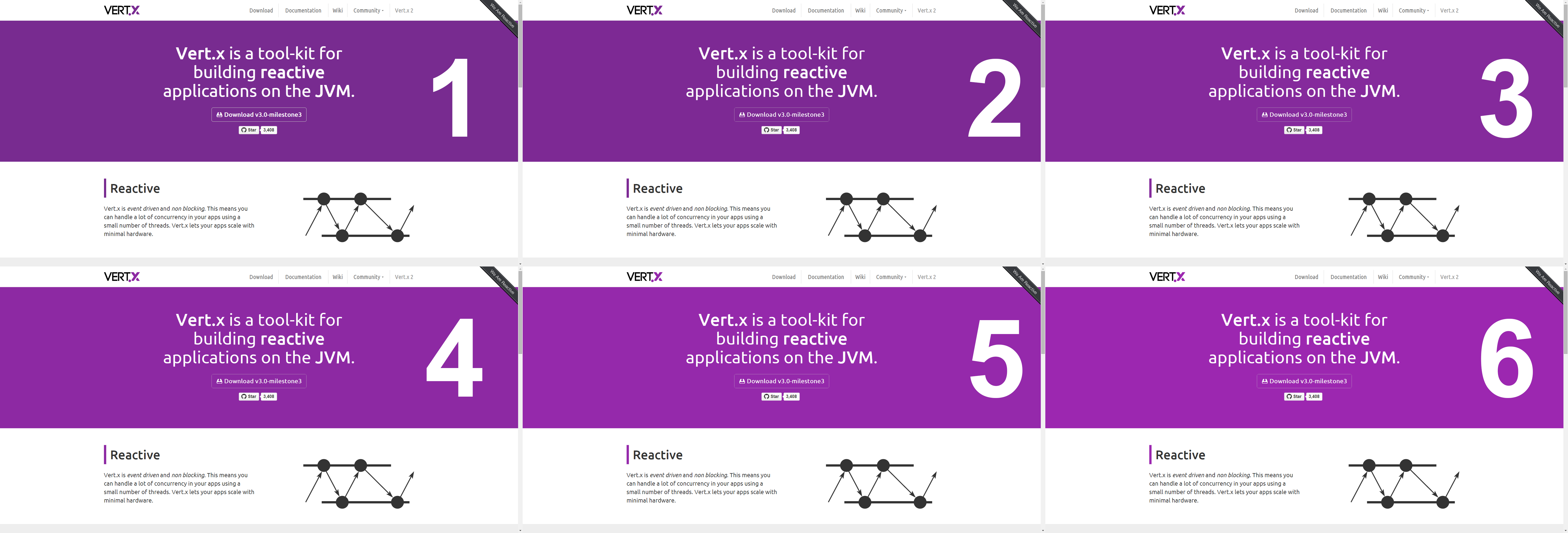
+1 imho, the dark one is too dark. I prefer the bright one, but perhaps a _little_ less bright
I made a quick palette of six shades of purple (see attached image). Please select the one you like :-) Please view the image 100% to really be able to judge the effect. From a design point of view I would prefer no. 3 (maybe even no. 4).
Cheers,
Michel
Michel Krämer
Apr 2, 2015, 1:35:01 PM4/2/15
to ve...@googlegroups.com
Could we also add the Eclipse logo somewhere at the bottom?
You're killing me. So many things to do :-) :-) I need to make a list TODO list somewhere. May I use the repo's issue tracker?
Maybe it would be better if I had write access to the repo so I can make the changes without sending PRs all the time *wink*. I just signed the Eclipse CLA by the way.
Cheers,
Michel
...
Tim Fox
Apr 2, 2015, 2:18:14 PM4/2/15
to ve...@googlegroups.com
On 02/04/15 18:35, Michel Krämer wrote:
Could we also add the Eclipse logo somewhere at the bottom?
You're killing me. So many things to do :-) :-) I need to make a list TODO list somewhere. May I use the repo's issue tracker?
+1. In fact, I should have just posted issues there myself rather
than posting them on this group ;)
Maybe it would be better if I had write access to the repo so I can make the changes without sending PRs all the time *wink*.
So.. the way it works, and this applies to _everyone_ including the
permanent team (me and Julien)... for anything more than, say, 10
lines of changes or so, everything has to be done by PR, and get
reviewed by someone before merging into a master branch.
*But* if it's just a small change or tweak, e.g. adding an image, then you can do that direct in master. So, I'll give you push rights to master of the web-site project and I'll trust that anything more than small changes, you'll do it via PR. Sound fair? :)
More info here https://github.com/vert-x3/wiki/wiki/Development-Process
Tbh simple things like changing a bit of text or an image I can probably do myself, although sometimes I make a mess of the alignment and positioning.
--
newoga
Apr 2, 2015, 2:33:53 PM4/2/15
to ve...@googlegroups.com
Whoa, just realized that this conversation was also going on in the /vertx group and not just the /vertx-dev group, that explains many things! I was also about to suggest the issue tracker too.
I created a few issues myself. Def not high priority, don't want to seem like I'm nitpicking but just wanted to put them there as reminders so we could revisit them.
Also, my vote is for a darker shade of purple (1 or 2) :)
...
newoga
Apr 2, 2015, 2:44:20 PM4/2/15
to ve...@googlegroups.com
Just bringing attention to this particular issue here https://github.com/vert-x3/web-site/issues/8, it's more of a proposal so not sure if we'd rather discuss here or on github.com
Michel Krämer
Apr 3, 2015, 4:00:06 AM4/3/15
to ve...@googlegroups.com
*But* if it's just a small change or tweak, e.g. adding an image, then you can do that direct in master. So, I'll give you push rights to master of the web-site project and I'll trust that anything more than small changes, you'll do it via PR. Sound fair? :)
Absolutely. I'm a big fan of code review (in fact I'm the one who introduced Gerrit in our department).
I'll go through this thread again and create issues.
Cheers,
Michel
...
Michel Krämer
Apr 3, 2015, 4:24:18 AM4/3/15
to ve...@googlegroups.com
Just bringing attention to this particular issue here https://github.com/vert-x3/web-site/issues/8, it's more of a proposal so not sure if we'd rather discuss here or on github.com
Thanks. I guess we should discuss details on github.
Cheers,
Michel
Michel Krämer
Apr 3, 2015, 4:26:07 AM4/3/15
to ve...@googlegroups.com
Since there is already a part "Who is using Vert.x", why not adding a part : "Why are they using Vert.x ?" or "What do they do with Vert.x ?".
I like the idea, but I guess this will be even harder to do than the "Who is using Vert.x?" section. We should start small and can extend later. :-)
Cheers,
Michel
Reply all
Reply to author
Forward
0 new messages