How to draw date interval areas?
41 views
Skip to first unread message

andy
Mar 25, 2021, 1:43:08 PM3/25/21
to vega-js
Hi,
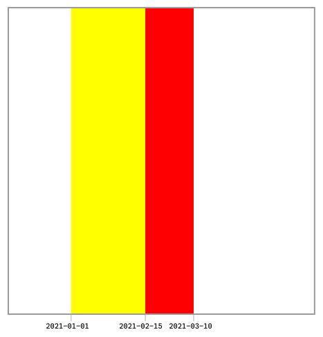
imagine I have this kind of data:
| date | alert |
|---|---|
| 2021-01-01 | yellow |
| 2021-02-15 | red |
| 2021-03-10 | … |
I know when it starts a yellow alert weather period, then I know when it starts a red one and so one.
Is it possible to draw these data as rectangles, having this kind of data schema? If yes how to?
If not, how is it possible to draw date interval areas? How should i change the data schema
Thank you
--
___________________
Andrea Borruso
website: https://medium.com/tantotanto
38° 7' 48" N, 13° 21' 9" E, EPSG:4326
___________________
"cercare e saper riconoscere chi e cosa,
in mezzo all’inferno, non è inferno,
e farlo durare, e dargli spazio"
Italo Calvino
website: https://medium.com/tantotanto
38° 7' 48" N, 13° 21' 9" E, EPSG:4326
___________________
"cercare e saper riconoscere chi e cosa,
in mezzo all’inferno, non è inferno,
e farlo durare, e dargli spazio"
Italo Calvino

Dominik Moritz
Mar 25, 2021, 2:21:42 PM3/25/21
to andy, vega-js
Hi,
Here is an example that uses a linear scale but a time scale should work similarly: https://vega.github.io/vega/examples/falkensee-population/
Cheers,
Dom
--
You received this message because you are subscribed to the Google Groups "vega-js" group.
To unsubscribe from this group and stop receiving emails from it, send an email to vega-js+u...@googlegroups.com.
To view this discussion on the web visit https://groups.google.com/d/msgid/vega-js/CAHEdGZPsHmkHEMORyCxuNugLxnF77VBrME%3DD7rTi030uA5yb8w%40mail.gmail.com.
Andrea Borruso
Mar 26, 2021, 5:35:03 AM3/26/21
to vega-js
Hi,
first of all thank you.
This my result, but I am unable to make it work. I have no rectangles.
I have tried to change data in
{
      "name": "annotation",
      "values": [
        {
          "start": "1933-01-01",
          "end": "1945-01-01",
          "text": "Nazi Rule"
        },
        {
          "start": "1948-01-01",
          "end": "1999-01-01",
          "text": "GDR (East Germany)"
        }
      ]
    }
And encode in
"encode": {
        "enter": {
          "x": {"scale": "x", "field": "start","timeUnit": "yearmonthdate"},
          "x2": {"scale": "x", "field": "end","timeUnit": "yearmonthdate"},
          "y": {"value": 0},
          "y2": {"signal": "height"},
          "fill": {"scale": "color", "field": "text"},
          "opacity": {"value": 0.2}
        }
      }
What Am I doing wrong?
Thank you
Dominik Moritz
Mar 26, 2021, 5:43:57 PM3/26/21
to Andrea Borruso, vega-js
I haven’t looked at it in detail but I notice that you use time unit in the encoding. In Vega, time unit is only a transform, though: https://vega.github.io/vega/docs/transforms/timeunit/. If you use time, you also have to use a time scale. I think you are mixing Vega and Vega-Lite here.
Take a look at the same example in Vega-Lite (https://vega.github.io/editor/#/examples/vega-lite/layer_falkensee) and the compiled Vega spec (see the bottom left of the Vega editor). The Vega spec has a working time scale. Does this help you?
To view this discussion on the web visit https://groups.google.com/d/msgid/vega-js/34ca327e-36d0-4505-ac33-e6c5b1539f0an%40googlegroups.com.
andy
Mar 27, 2021, 3:05:08 AM3/27/21
to Dominik Moritz, vega-js
Dominik, thank you, it works.
I had to specify to you that I wanted to use it in vega-lite.
Best regards
Reply all
Reply to author
Forward
0 new messages