The Hertzsprung-Russell diagram explained, short version

Markopolo
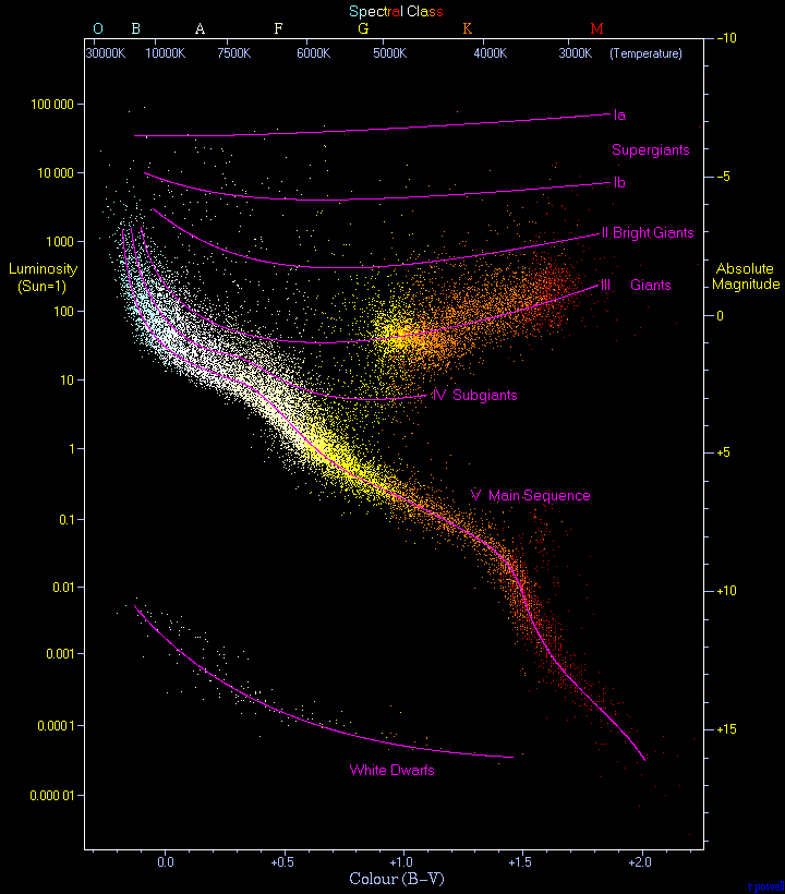
It may appear intimidating, at first glance, and there are some complicated things here, but I'll try to explain it as best I'm able.
As I mentioned above, the horizontal axis represents the temperature of the star which were observed. In this diagram, you can see the temperatures on a scale across the top, ranging from 30,000 degrees Kelvin in the upper left corner to less than 3,000 degrees Kelvin in the upper right corner. So, you might ask, what are the other two scales on the horizontal axis, the "Spectral Class" across the very top, and the "Color B-V" across the bottom? Simply put, they are two other ways to measure the characteristics of a star, both of which correspond directly to the temperature of that star. So, all three characteristics of a star's temperature can shown on the horizontal axis of a single H-R diagram. You may see other H-R diagrams with only one or two of these characteristics on other H-R diagrams, but it is important for you to know that a star's temperature (at it's surface) corresponds directly to it's color, and astronomers categorize the various colored stars into stellar classes as the result.
The Spectral (stellar) Classes are lettered (from hottest to coolest) O, B, A, F, G, K, and M. The reason for this peculiar lettering sequence is a hangover from the development of the classes, before the relationship between temperature and color was clearly understood. Our star, the Sun, happens to be a G2 class star, with a surface temperature of about 5,800 degrees Kelvin. A G0 class star would be somewhat hotter (at 6,000 degrees Kelvin), and a G9 class star would be the coolest G class star before the K class begins at 5,200 degrees Kelvin. There are some additional classes, too, which have been added in the last couple of decades (W, L, T, Y, C, and S, among others), but that really only serves to complicate this discussion. If you focus on the main categories mentioned above (O through M), you'll get a grasp of the H-R diagram.
The Color Index (Color B-V) is simply the color of a star, measured in a quantifiable way, and represented with a number. If you really want to know more about it, check HERE.
So now for the vertical axis of the H-R diagram: as I mentioned above, the vertical axis represents the luminosity (intrinsic brightness) of a star. In the case of the diagram above, the units of luminosity on the left-hand side of the diagram are in multiples of Suns, ranging from stars as bright as 100,000 Suns at the top left corner, down to the very dimmest stars at 0.00001 or 1/10,000th of the brightness of our Sun. What is the Absolute Magnitude on the right side of the chart? It's simply another way to represent the intrinsic brightness of a star. Without going into to much detail, it should be intuitive that a star's apparent brightness (that magnitude which we actually see when we look up in the night sky) must have some relationship to both it's intrinsic brightness and it's distance from us, the observers. A star which is intrinsically 100 times as bright as the Sun would appear exactly the same brightness as the Sun if it were seen from a distance 10 times the actual distance from us to the Sun. (Light intensity decreases as the square of the distance, instead of in a linear relationship). So, in the H-R diagram, we see that the actual (not apparent) brightness of the stars observed is represented along the vertical axis, measured in two different ways. You may see other H-R diagrams which have only one or the other measurement. Absolute Magnitude is defined as the brightnesses that stars would show if they were all theoretically observed from the same distance of 10 parsecs (or 32.6 light-years) away.
Okay, now that we understand how the H-R diagram is laid out, what can we tell about the scattered points which represent observations of actual stars? First (and most important) is the wavy band of points which run generally from the upper left corner down to the lower right corner. In the diagram above, it's marked with a purple line labeled "V Main Sequence". Without getting into the technical details, this band of stars are those which, like our Sun, derive their energy primarily from the fusion of Hydrogen into Helium at their core. In understanding stellar evolution, the story of a star's life from birth to death, the H-R diagram is fundamental. It shows us, visually, a representation of what newborn stars of various sizes look like, how long they live, what changes they go through in their lives, and what they look like before they die.
Main Sequence stars (also called "dwarf" stars) are observed to be physically stable, i.e. their brightness does not change very much, if at all. It has been discovered through observations that the more massive a Main Sequence star is, the shorter it's lifetime will be. The most massive, brightest stars in the upper left corner of the H-R diagram may burn through all their Hydrogen fuel in less than a million years, while the small, red dwarfs in the lower right corner burn their fuel much more slowly, and may last for hundreds of billions of years. The reason for this, figured out by theoretical physicists, is that the mass of a star determines, by gravity, the internal pressure and temperature at the core, both of which determine the rate at which the nuclear reactions take place.
Other classes of stars (IV Subgiants, III Giants, II Bright Giants, and 1a and 1b Supergiants, plus the White Dwarfs in the lower left corner of the H-R diagram) can be seen in the way their observed points are grouped on the chart. It is important to note that these other classes derive their energy from other nuclear fusion reactions, and have different physical processes going on inside their cores and even in their outer layers. Some of these other classes of stars are not physically stable, resulting in a regular pulsating variation in brightness. It's worthwhile to know that the current theory of stellar evolution assumes that most of the stars outside of the Main Sequence began their lives ON the main sequence, burning Hydrogen, then they drift off the band of Main Sequence stars as the age and evolve. I'm attaching a different H-R diagram HERE, which comes from a Wiki article on Variable Stars. If you want to pursue the understanding of non-Main Sequence stars, you might check out the section on "Pulsating Variables". I might take up Variable Stars as a separate thread sometime, but not here. I am going to leave the details of those physical processes and the descriptions of the various classes of stars to another day, another post. I think at this point for most beginner amateur astronomers, I've probably covered enough ground. I hope I've been clear, this (the H-R diagram) really is a very important concept for all astronomers to grasp. I've put a number of links into this post which will take you to Wiki articles explaining the terms I've used. If you want to really study this material, it is worthwhile to follow those links, and try to wade through them as best as you're able. If you get stuck on one of the concepts or another, I'd be glad to answer any question.
Here is a third H-R diagram, one which includes stellar diameters as part of the classification of the stars. This diagram also includes a number of named stars as examples of the various stellar classifications, including our own Sun as a G2 Main Sequence star.
