Many tabs in ModelAdmin (Feature request)
781 views
Skip to first unread message

Josua
Jan 15, 2013, 12:59:21 PM1/15/13
to silverst...@googlegroups.com
Hi all!
If a ModelAdmin has many models, many tabs are displayed in the CMS. In ModelAdmin should be able to choose whether select the model to edit with a DropdownField or by tabs.
In SilverStripe 2.4 is feature was automatic and very interesting.
Ingo has told me :
No sorry, that's no longer a UI we support. If you have excessive amounts of tabs, we recommend splitting into multiple ModelAdmin classes.
But I think that if all elements are related should be in the same ModelAdmin. It would not be logical to have several ModelAdmin. The approximation of SilverStripe 2.4 is better.
Regardless, I think it may be a mistake not to, because the main menu SilverStripe can be overloaded when too many modules are installed.
What think you?
Regards,
Jose A.

Ingo Schommer
Jan 15, 2013, 1:07:17 PM1/15/13
to silverst...@googlegroups.com
Thanks Jose! Just for reference, here's my rationale from the ticket comments (http://open.silverstripe.org/ticket/8180#comment:4):
---
Normally I would say "Show me a pull request", but in this case its simply not a feature we want to have in the UI, because it makes the code more complex to maintain.
---
--
You received this message because you are subscribed to the Google Groups "SilverStripe Core Development" group.
To view this discussion on the web visit https://groups.google.com/d/msg/silverstripe-dev/-/v-V_6Nfpt1UJ.
To post to this group, send email to silverst...@googlegroups.com.
To unsubscribe from this group, send email to silverstripe-d...@googlegroups.com.
For more options, visit this group at http://groups.google.com/group/silverstripe-dev?hl=en.
Uncle Cheese
Jan 15, 2013, 10:28:41 PM1/15/13
to silverst...@googlegroups.com
Yeah, this is a problem, not necessarily because of excessive tabs, but rather because the tabs are functionally ambiguous. On the ModelAdmin list view, the tabs are used to switch between models. When you're in edit view, the tabs toggle between sections of the edit form. I have yet to present this to a user who hasn't been completely confounded by it.
I think we can do better than a dropdown. What's needed is a more useful default view. There should be some kind of dashboard for model admin sections that have multiple managed models. Defaulting to the first model listed is kind of an arbitrary cop out. When there are multiple managed models, lose the tabs, and present a splash screen that can springboard the user into the model he wants to work on.
Thinking about maybe adding it to my Dashboard module, but will probably do it as a separate component.
Ingo Schommer
Jan 16, 2013, 3:28:49 AM1/16/13
to silverst...@googlegroups.com, Paul Clarke
I agree UC's problem is one which needs to be fixed,
and more important than the ability to manage more models in the same ModelAdmin through dropdowns.
The breadcrumbs view helps the user to create a mental map a little bit,
but the complete exchange of tabs in detail views is still counter intuitive.
Any UI with a GridField has that problem actually, incl. pages.
A dashboard view would have similar issues though, right?
It'll disappear as soon as you click into a record (or section).
To view this discussion on the web visit https://groups.google.com/d/msg/silverstripe-dev/-/Z6TfzchtJKwJ.

Ronald van Raaphorst
Jan 16, 2013, 3:47:19 AM1/16/13
to silverst...@googlegroups.com
Hi,
For most simple applications, a few tabs could represent the few models that are added.
For more complex situations, I'd prefer a full blown menu or an accordeon where models can be grouped in a logical way.
I think a dropcombo box is easy to create (for us/automagically), but cumbersome from a usability point of view.
When selecting the ModelAdmin item in the mainmenu left, can't we put a model admin accordeon menu in the place of the main menu on the left.
There could be a 'back' button instead of the silverstripe link on top, just like a lot of mobile apps have them.
Or display the modeladmin menu below the main menu?
Just my 2 cents :)
Ronald van Raaphorst
Josua
Jan 16, 2013, 6:32:55 AM1/16/13
to silverst...@googlegroups.com
This is a similar problem to the sitetree pages.
IMHO an ideal solution would be to follow the same model as the view of the sitetree pages, ie placing a band next to the main menu where you saw all ModelAdmin models. This vertical band would always be visible, although it could be hidden, like the tree of pages, to make more room for the central management of the selected model.
This way, the module Translatable could include the same solution than for the pages of the SiteTree, that is, on the top a DropDownField to select the language of the models included in the ModelAdmin.
I think this idea would be great and would follow the same design as the rest of CMS.
Regards,
Jose A.
Josua
Jan 16, 2013, 11:19:44 AM1/16/13
to silverst...@googlegroups.com
Aaron, your Dashboard module is fantastic, with your experience, sure you can design a magnificent system for managing ModelAdmin.
Thanks,
Regards,
Jose A.

kinglozzer
Jan 17, 2013, 7:34:41 AM1/17/13
to silverst...@googlegroups.com
I think this seems like the best solution, it's consistent with the SiteTree design and is always accessible. However, once you choose a Model to manage, the 'Filter' panel would appear and I don't think having three panels (the blue CMS panel, the new ModelAdmin panel and the filter panel) would work well.
Josua
Jan 17, 2013, 11:15:44 AM1/17/13
to silverst...@googlegroups.com
Regards,
Jose A.
Aaron Carlino
Jan 17, 2013, 11:20:27 AM1/17/13
to silverst...@googlegroups.com
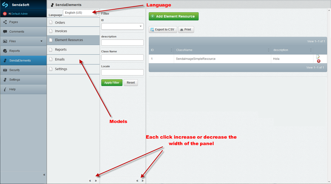
Three sidebars? That's a tough sell for me. One approach I've always fantasized about is having the left menu advance through hierarchy in an iOS fashion of sliding left or right, with a back button to to up in the hierarchy. Clicking SendaElements would pan right to left and expose the Orders, Invoices, etc panel in your mockup, with a back button to pan back to the main navigation.
It's kind of a heroic undertaking, but it would be a much better economy of space, IMO.
Aaron
--
You received this message because you are subscribed to the Google Groups "SilverStripe Core Development" group.
To view this discussion on the web visit https://groups.google.com/d/msg/silverstripe-dev/-/WFrVdFD74IAJ.
Ingo Schommer
Jan 17, 2013, 11:36:59 AM1/17/13
to silverst...@googlegroups.com
-1 on three sidebars, that's a space hog, and will unnecessarily complicate PJAX fragment loading as well as the layout engine.
Shown on the "Reports" section, but it'd be the same principle for ModelAdmin. That actually has been styled and JS-coded already,
and was part of earlier 3.0 betas. We removed it from the only section it was visible though ("Files" with "Edit Files" vs. "Add Files").
Another problem was that the CMSMenu API was never intended for multi-level menus, and its quite complicated to retrofit that.
We could hardcode a special case for ModelAdmins in there to get things started, though.
I'm a bit wary of adding any new UI paradigms like the sliding panels described by UC, simply because
they tend to add a lot of overhead in terms of performance and maintenance. The preview controls in 3.1,
as innocent and simple as they might look, took DAYS to code and test, and they're still not really in a good place.
Josua
Jan 17, 2013, 12:04:16 PM1/17/13
to silverst...@googlegroups.com
Hi Aaron!
Perhaps your approximation be more complicated to build. I don't know But visually it would undoubtedly be very interesting to see and it would result in a very modern environment. :)
Regards,
Jose A.
Perhaps your approximation be more complicated to build. I don't know But visually it would undoubtedly be very interesting to see and it would result in a very modern environment. :)
Regards,
Jose A.
Aaron Carlino
Jan 17, 2013, 12:08:03 PM1/17/13
to silverst...@googlegroups.com
Yeah, I understand it's a non-starter just due to the sheer amount of uprooting and testing you'd have to do, but that's why I said it was a fantasy. ;-)
FWIW, Harmony CMS has an awesome implementation of that paradigm. Hosted solution, free to sign up and check it out. Very mediocre CMS, but there's a lot of UI inspiration to be garnered from it.
Aaron
To view this discussion on the web visit https://groups.google.com/d/msg/silverstripe-dev/-/Cyh8HUVSp64J.
Josua
Jan 17, 2013, 12:25:22 PM1/17/13
to silverst...@googlegroups.com
Hi Ingo!
The multilevel menu (https://github.com/silverstripe/silverstripe-design/blob/master/Design/ss3-ui_reports.jpg) is fine for a few options, for many it is not very viable.
Although you can only put 2 bars, the system of the sitetree pages is better.
Maybe when selecting a model you can replace the model menu bar by filter bar.
Regards,
Jose A.
Ingo Schommer
Jan 17, 2013, 12:30:16 PM1/17/13
to silverst...@googlegroups.com
Just a thought: Maybe you're getting a bit carried away with creating model subclasses? ;)
Can't really judge without knowing details on your domain model, but maybe some of these
subclasses could be combined into a common model with a "type" dropdown, or some boolean flags?
I think the two-level menu would work fine for around a dozen options (beyond that you'll get into too much scrolling).
Josua
Jan 17, 2013, 12:58:52 PM1/17/13
to silverst...@googlegroups.com
I do not think it would fit so many options.
In a normal PC monitor, no MAC (huge monitor 8-o), you can accommodate about 8 options without having to scroll, but depending on the installed modules not hold many more options from the main menu.
The examples I have in the pictures have nothing to do with what I'm trying to make.
What I'm trying to build has to do with the types of elements to be inserted in a HTMLEditor via shortcodes to improve the editing capabilities of the end user.
If you have more thoughts do not hesitate to comment them to me. ;-)
Regards,
Jose A.
kinglozzer
Jan 18, 2013, 8:44:58 AM1/18/13
to silverst...@googlegroups.com
I'd like to see the layout change simple because it's inconsistent like was stated earlier. The tabs at the top in use at the moment are used to select different models to manage, then once an item is selected they're used as different tabs of content to be entered. Again, like was said earlier, this is confusing to explain to CMS users - we as developers understand the difference, of course, but end-users can be confused by this.
I like the idea of having the 'old' multi level main menu that you described, Ingo, I think there are only a few cases where users would end up scrolling.
UC, I love the sound of your idea, here's to v4.0 ;)
Josua
Jan 18, 2013, 12:18:49 PM1/18/13
to silverst...@googlegroups.com

A new improvement for ModelAdmin.
It would be very interesting that the inherited models will be displayed in a ModelAdmin tree (See Image).
In this way, when you click on the parent node all the records of all inherited categories could be seen.
It would also be interesting that the 'Add' button of a parent model allow creating any of the inherited classes, perhaps with a popup window (See Image).
With all this, ModelAdmin could be much more powerful for module developers and for end users.
Regards,
Jose A.
Aaron Carlino
Jan 18, 2013, 12:26:16 PM1/18/13
to silverst...@googlegroups.com
I hate to be a contrarian, but I'm just allergic to the tree metaphor. The little arrows are too fussy, and overall, it just reminds me too much of Windows Explorer circa 1995. I don't really think that paradigm has much place in modern UX. I think hierarchy is much better displayed horizontally than vertically.
Aaron
To view this discussion on the web visit https://groups.google.com/d/msg/silverstripe-dev/-/byyd-3Qc45gJ.

Dan Rye
Jan 18, 2013, 12:58:05 PM1/18/13
to silverstripe-dev
Aaron, I want to agree with you. You are basically talking about the "column" view is OSx Finder correct? That is one thing I've always wanted to like, but when it comes down to it I never use it. Maybe too much Windows brainwashing at an early age :)
Message has been deleted
Josua
Jan 18, 2013, 1:11:33 PM1/18/13
to silverst...@googlegroups.com
Hi Aaron!
So, you do not like the CMS pages tree? Uhhhmmmm
My design is identical to the pages tree and allows the management of inherited models.
The construction of this design would be easy to build, allows you to easily integrate languages management, because it is homogeneous with the rest of the CMS, and end users do not have to learn another type of UI.
If you do not love it, How would you design it?
Regards,
Jose A.
Aaron Carlino
Jan 18, 2013, 1:32:57 PM1/18/13
to silverst...@googlegroups.com
Yeah, community members who know me well are well-aware of my intolerance of the site tree. I've never liked it. It was dated in SS2, and it's even more dated now. I really wish there was more accommodation for list view in SS3. It's sort become a second-class citizen, which is too bad.
That aside, you're right that it does fit into the current SS3 UI, so I think it's the path of least resistance, but I'm a much bigger fan of horizontal progression through hierarchy, and ample calls to action to launch the user into common goal-oriented tasks.
Aaron
To view this discussion on the web visit https://groups.google.com/d/msg/silverstripe-dev/-/1RNBGN4F8hMJ.
Josua
Jan 18, 2013, 2:22:06 PM1/18/13
to silverst...@googlegroups.com
I understand the type of UI you point and is very interesting.
Maybe for SS4 or maybe you can incorporate a better UI for ModelAdmin in SS3. :)
Sure that you have the expertise to do so.
Regards,
Jose A.
Maybe for SS4 or maybe you can incorporate a better UI for ModelAdmin in SS3. :)
Sure that you have the expertise to do so.
Regards,
Jose A.

Frank Mullenger
Jan 18, 2013, 3:59:57 PM1/18/13
to silverst...@googlegroups.com
I'm also a big fan of the "column" view in OSX finder, but I find I always use it with at least 4-5 columns visible at once - with only one column visible I'm not sure how much better than a tree view it would be.
I wasn't that keen on the dropdown in the sidebar menu when we had it for the "Files" section, I found it a little confusing and much prefer the "flat" menu on the left hand side that we have now - when you click on an item you go straight to the LeftAndMain section rather than sometimes displaying a dropdown of further options.
Instead of baking these kind of navigation solutions into SilverStripe I'd prefer more flexibility in ModelAdmin for developers to implement their own solution like a dashboard that devs can customize the look and feel of if they wish, which will provide access to all the different ModelAdmin controllers for different models etc.
This sort of dashboard can almost be achieved currently by subclassing ModelAdmin and rendering a template that has your dashboard on it from getEditForm(), each item in the dashboard linking to a different ModelAdmin controller subclass that would set a different model class in the init() and some other things like url_rule and menu_title etc. I've used this sort of approach on the latest version of SwipeStripe:
However, this can be a bit of work currently and there are little hacks you need to do to stop all the model admin subclasses appearing in the sidebar navigation etc.
To view this discussion on the web visit https://groups.google.com/d/msg/silverstripe-dev/-/F63DAE2DAsYJ.
Nicolaas Thiemen Francken - Sunny Side Up
Jan 19, 2013, 2:49:11 AM1/19/13
to silverst...@googlegroups.com
Frank, your concept looks great. I reckon icons rather than words are even better. If each DataObject had a static $icon, just like SiteTree with perhaps a few size options then we could make a beautiful graphical interface.
Does anyone have any ideas on how this could be improved best?
Nicolaas
kinglozzer
Jan 19, 2013, 3:58:52 AM1/19/13
to silverst...@googlegroups.com
Frank, try subclassing LeftAndMain directly instead of ModelAdmin - take a look at the dashboard module as well for some ideas on that.
It's a tough call between drop downs on the LeftAndMain Menu, SiteTree style navigation and a dashboard layout. I don't mind which, as long as the buttons at the top right aren't used for navigating between different classes anymore - it really bugs me!
Uncle Cheese
Jan 23, 2013, 12:09:01 PM1/23/13
to silverst...@googlegroups.com
FWIW, I created a really rough example of my idea for horizontal hierarchy in SS3. http://labs.unclecheeseproductions.com/admin/
If anyone likes the way this functions and wants to contribute to it, I can post the source, but right now it's just something I threw together as an experiment.

Roman
Jan 23, 2013, 12:40:40 PM1/23/13
to silverst...@googlegroups.com
Hey Aaron, that's really cool. I like
it a lot.
What about pages that have a *lot* of children though? I guess that would be as cumbersome as the SiteTree.
Anyways: Great work, I'd really love to see something like that. It would greatly improve deeply nested sites IMHO.
Cheers - Roman
What about pages that have a *lot* of children though? I guess that would be as cumbersome as the SiteTree.
Anyways: Great work, I'd really love to see something like that. It would greatly improve deeply nested sites IMHO.
Cheers - Roman
--
You received this message because you are subscribed to the Google Groups "SilverStripe Core Development" group.
To view this discussion on the web visit https://groups.google.com/d/msg/silverstripe-dev/-/2pjtlLpg-JMJ.
Josua
Jan 23, 2013, 1:46:54 PM1/23/13
to silverst...@googlegroups.com
Hi Aaron!
This is fine. Great work. :)
However, it requires to consider several aspects, for example the module translatable, or rearranging pages.
IMHO , there should be some configuration to connect or not this functionality in some sections, for example, use this feature only in ModelAdmin, etc.
Regards,
Jose A.
Aaron Carlino
Jan 23, 2013, 2:49:16 PM1/23/13
to silverst...@googlegroups.com
Thanks, guys,
@Josua - Reordering pages is supported from within the current node via drag and drop. To move a page to a different parent, you have to use the dropdown field on the edit form. Not sure about translatable, though.
@Roman - For pages with lots of children, there's two things to consider: first, the CSS right now is just inheriting from the current CMS menu, which creates huge blocks for each link. That would undoubtedly change to make each page take up a lot less space. You can gain 10 times more pages with just a CSS change alone. Second, I was thinking of adding a button in addition to "Add content here" that would allow you to see all the pages in list view. In fact, I believe you can do that in the current version by clicking the parent page name.
Inspiration for the UI:http://unclecheese.harmonyapp.com/admin/#/admin/dashboard
pass: letmein
Aaron
--
You received this message because you are subscribed to the Google Groups "SilverStripe Core Development" group.
To view this discussion on the web visit https://groups.google.com/d/msg/silverstripe-dev/-/SX4dJP2RDgwJ.
Nicolaas Thiemen Francken - Sunny Side Up
Jan 23, 2013, 3:59:41 PM1/23/13
to silverst...@googlegroups.com
@Aaron: that is fantastic. Of course some of the details need to be ironed out, but the overall concept is much better than what we have now. What will it take to develop this for inclusion in the next version of Silverstripe?
Aaron Carlino
Jan 23, 2013, 4:15:43 PM1/23/13
to silverst...@googlegroups.com
Thanks! It was just an experiment, so don't take anything literally. I'll post it to Github, and maybe some ambitious person will take it up as a pet project. I'd really like to see it visited by a good UX designer before it does any further, though. It really needs to be thought through.
Anyone keen to help?
Aaron
On Wednesday, January 23, 2013 at 3:59 PM, Nicolaas Thiemen Francken - Sunny Side Up wrote:
@Aaron: that is fantastic. Of course some of the details need to be ironed out, but the overall concept is much better than what we have now. What will it take to develop this for inclusion in the next version of Silverstripe?
--
You received this message because you are subscribed to the Google Groups "SilverStripe Core Development" group.
Aaron Carlino
Jan 24, 2013, 11:16:57 AM1/24/13
to silverst...@googlegroups.com
It's up on Github now, for anyone who wants to play around with it.
Aaron
Josua
Jan 24, 2013, 11:58:34 AM1/24/13
to silverst...@googlegroups.com
Thanks Aaron.
Regards,
Jose A.
Regards,
Jose A.
Aaron Carlino
Jan 24, 2013, 2:01:57 PM1/24/13
to silverst...@googlegroups.com
CSS ninja Dosuntocero has stepped in and added some awesome styling to this module!
Aaron
Visit this group at http://groups.google.com/group/silverstripe-dev?hl=en.
For more options, visit https://groups.google.com/groups/opt_out.
Josua
Jan 24, 2013, 2:58:47 PM1/24/13
to silverst...@googlegroups.com
Is fine, but the navigation does not work properly when going back and forth.
Regards,
Jose A.
Regards,
Jose A.

g4b0
Jan 25, 2013, 3:34:47 AM1/25/13
to silverst...@googlegroups.com
Il giorno giovedì 24 gennaio 2013 20:58:47 UTC+1, Josua ha scritto:
Is fine, but the navigation does not work properly when going back and forth.
+1. Nice, but need some additional work. Good job UC.
Paul Clarke
Jan 27, 2013, 9:42:53 PM1/27/13
to silverst...@googlegroups.com
I have a few reasons why I wouldn't want this to be a fixed feature within the CMS, I'm sure everybody has reasons subjective to their own user case.
One of the main reasons for not going with a mobile type navigation is that the user does not get a very good overview of the sitetree in relation to what page is selected. From my experience admins like using the sitetree a lot more than the pages list view and basically that is what the mobile navigation is (list view). The proposed mobile navigation actually uses a lot more clicks to get in and out of different sections and desktop users are accustomed to reducing the amount of clicks in favor of using space available.
With the mobile style nav the user has to digest the new menu items presented every time you go up or down, this actually adds a certain complexity to the users experience that is best avoided if possible, for mobile this is mostly unavoidable (Imagine if the main level of a typical website changed all the time and you always need to read it to confirm were you are).
To me a good interface is one that changes as least as possible so the user doesn't need to digest new information which acts as a barrier before completing a task. The mobile style navigation works on mobile devices because the user is purely focusing on navigating somewhere and then chooses to enter a certain area with an additional click, this flow is not as commonly used for desktop for this reason.
One of the main issues with the current system is that the tabs are being used for both navigating down (security users/security groups) and also for changing the presentation of the same information (pagetree & list view). I think we have plenty of ways of fixing this issue without redoing the whole navigation.
I think that by changing to a mobile style nav will introduce a lot of other issues which haven't been identified yet and not just the amount of time needed for the change.
Reply all
Reply to author
Forward
0 new messages