Feature Request: Ability to collapse left and right side menus
20 views
Skip to first unread message

Gregory Youngblood
Oct 19, 2021, 11:52:29 AM10/19/21
to seektable-users
Hello,
I've an idea for UI improvement in the seektable web UI.
The left menu (Cubes/Reports) and right menu (Fields/Format) should be able to collapse to give more screen width to the report itself. It can start out open by default, but when a icon or word is clicked, they could shrink to a narrow vertical column. Want it back, click the little arrow to open it up again.
Several times I've been in situations where, due to other things that need to be on the screen, or the device I am using, there isn't a lot of horizontal screen real estate and only a few columns of data are visible. It's really annoying when there are 8 columns of data, but you can only display 6 or 7, so you constantly have to do horizontal scrolling gymnastics.
It's a common UI pattern. One example would be Acrobat. The thumbnail display (left column) is hidden, but if you click the right facing triangle/arrow the column expands to let you view thumbnails. When you don't need them, click the left facing triangle and that menu collapses back down giving more room for content.
Thanks
Greg
![VF [SeekTable founder]'s profile photo](http://lh3.googleusercontent.com/a-/ALV-UjXxHaYwPlpisHP0yocJgLGQ4ZzdRDPraQCNf3AvAPaHBiv-hRGh=s40-c)
VF [SeekTable founder]
Oct 19, 2021, 12:03:39 PM10/19/21
to seektable-users
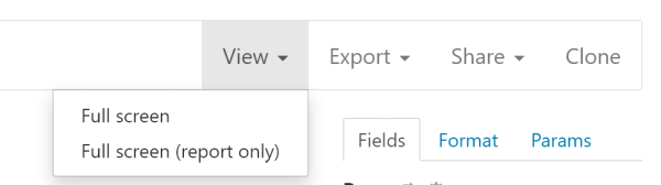
You can use all screen for report only, or with a right-panel.
Gregory Youngblood
Oct 19, 2021, 1:30:59 PM10/19/21
to seektable-users
I thought full screen was going to expand the window to fill the full screen, not just the open window, so I never tried it as I needed multiple windows on the screen and not just seektable. :)
I just tried it and it didn't expand to fill the screen. Then just a simple press of escape to get back to the normal view. This will be helpful. Thanks.
Greg
Reply all
Reply to author
Forward
0 new messages