Initial design
9 views
Skip to first unread message


Dougal Matthews
Jan 31, 2012, 4:49:40 AM1/31/12
to scotland-tec...@googlegroups.com
Looks neat. Some of the colours on the home page look a bit washed out for my tastes, maybe too much of the orange-y colour? Wondering also, will everybody know what it is by looking at that page? Just thinking events like DIBI - people may just call it DIBI, but there is no mistake to what it is on the website when you see this in big writing;
"DESIGN IT. BUILD IT. THE TWO–TRACK WEB CONFERENCE"
But … I'm just a Python guy, this is hardly an area I know anything about :)
Hope that helps!
On Tuesday, 31 January 2012 at 01:58, Juozas wrote:
> Thoughts?
>
> --
> Juozas Kaziukėnas
>
>
> Attachments:
> - 1.jpg
>
> - 2.jpg
>
> - 3.jpg
>

Paul Dragoonis
Jan 31, 2012, 7:38:34 AM1/31/12
to scotland-tec...@googlegroups.com
Hey Joe,
The first one looks more enticing.
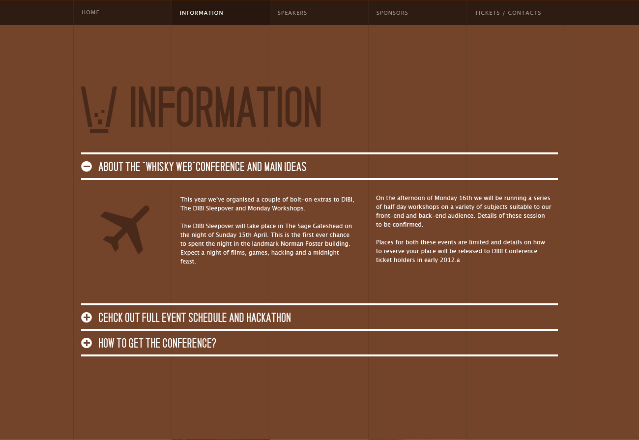
The second one feels too boring.
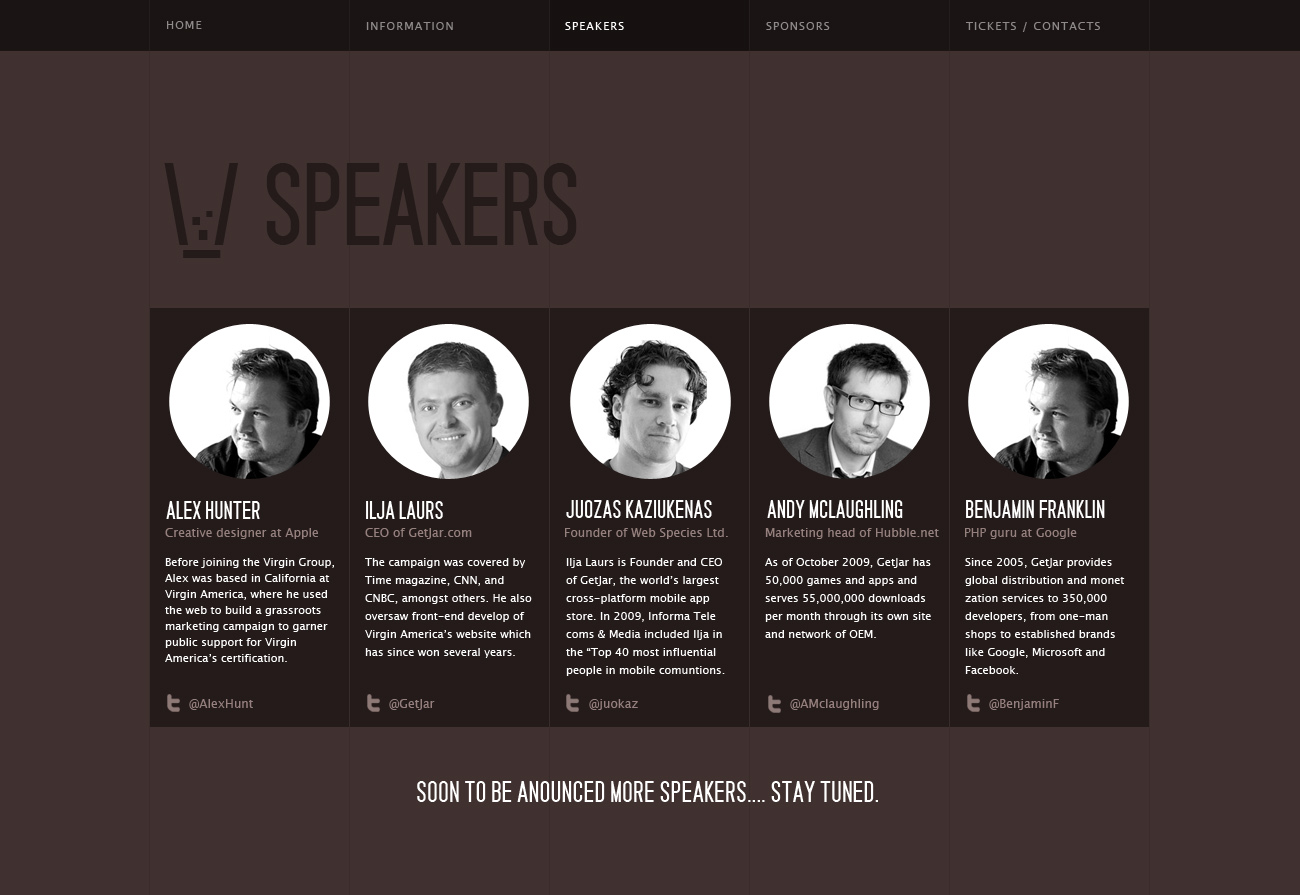
The third one seems more "community" oriented and friendly because there are people's pictures on the homepage making a better connection with the user.
The second one is ruled out IMHO.
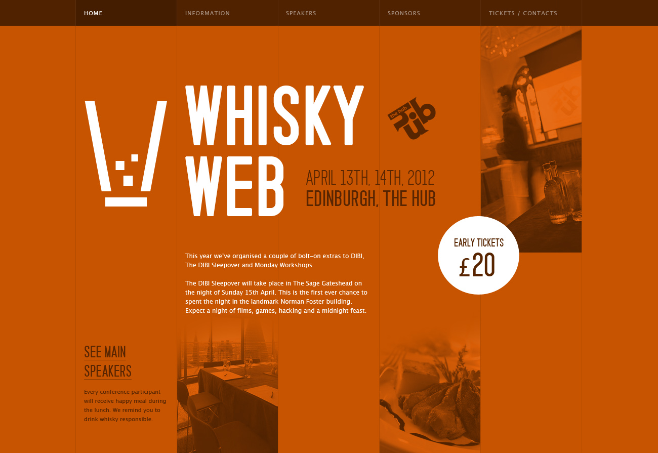
The first one is good but maybe just TOO much orange, recreasing typography and the opacity of the images were too transparent to stand out at you, the orange was more prominent than the images.
The third one was the most readable, best typography.
Since all three images are of different pages on the site, it's difficult to compare them side-by-side.
My conclusion is to mix Pic 1 with Pic 2, having nice visible pictures, good typography but keeping to the "orangy" or "browny" theme color of whisky.
- Paul.
Paul Dragoonis
Jan 31, 2012, 7:55:13 AM1/31/12
to scotland-tec...@googlegroups.com
On Tue, Jan 31, 2012 at 12:52 PM, Dougal Matthews <doug...@gmail.com> wrote:
> Since all three images are of different pages on the site, it's difficult to compare them side-by-side.
My understanding was that each page would have its own look and feel. And thus you are seeing one design, not three.
Perhaps. That's not something i grasped.
I believe it was an attempt at 3 alternative designs while still showing different pages. I'll let Joe clarify on that one.
- Paul.
Juozas
Jan 31, 2012, 8:24:16 AM1/31/12
to scotland-tec...@googlegroups.com
These are separate pages
--
Juozas Kaziukenas. Sent from my BlackBerry
Juozas Kaziukenas. Sent from my BlackBerry
From: Paul Dragoonis <drag...@gmail.com>
Sender: scotland-tec...@googlegroups.com
Date: Tue, 31 Jan 2012 12:55:13 +0000
ReplyTo: scotland-tec...@googlegroups.com
Subject: Re: Initial design
Dougal Matthews
Jan 31, 2012, 7:52:55 AM1/31/12
to scotland-tec...@googlegroups.com
> Since all three images are of different pages on the site, it's difficult to compare them side-by-side.
My understanding was that each page would have its own look and feel. And thus you are seeing one design, not three.
Juozas
Feb 3, 2012, 11:25:45 AM2/3/12
to scotland-tec...@googlegroups.com
Paul Dragoonis
Feb 3, 2012, 3:27:03 PM2/3/12
to scotland-tec...@googlegroups.com
On my mobile.
Looking good the change in theme looks good when its all in one page. Let's make the nav sticky so users can move up and down the page.
I'm happy to progress.
Looking good the change in theme looks good when its all in one page. Let's make the nav sticky so users can move up and down the page.
I'm happy to progress.

Dale Harvey
Feb 3, 2012, 3:49:49 PM2/3/12
to scotland-tec...@googlegroups.com
Yup I think it looks great, ill code it up tomorrow then we can fill in the real content etc
Can you get me the PSD? (mostly just do I can find the fonts etc)
Juozas
Feb 3, 2012, 3:50:32 PM2/3/12
to scotland-tec...@googlegroups.com
Are you ok doing PSD slicing yourself? Im going to get that to you
then.
Juozas Kaziukėnas
Reply all
Reply to author
Forward
0 new messages