Plot of H1 Spectra Data
58 ملاحظات
پہلے نہ پڑھے ہوئے پیغام پر جائیں

49j...@gmail.com
7 اپریل، 2021، 6:16:25 PM7/4/21
بنام Society of Amateur Radio Astronomers
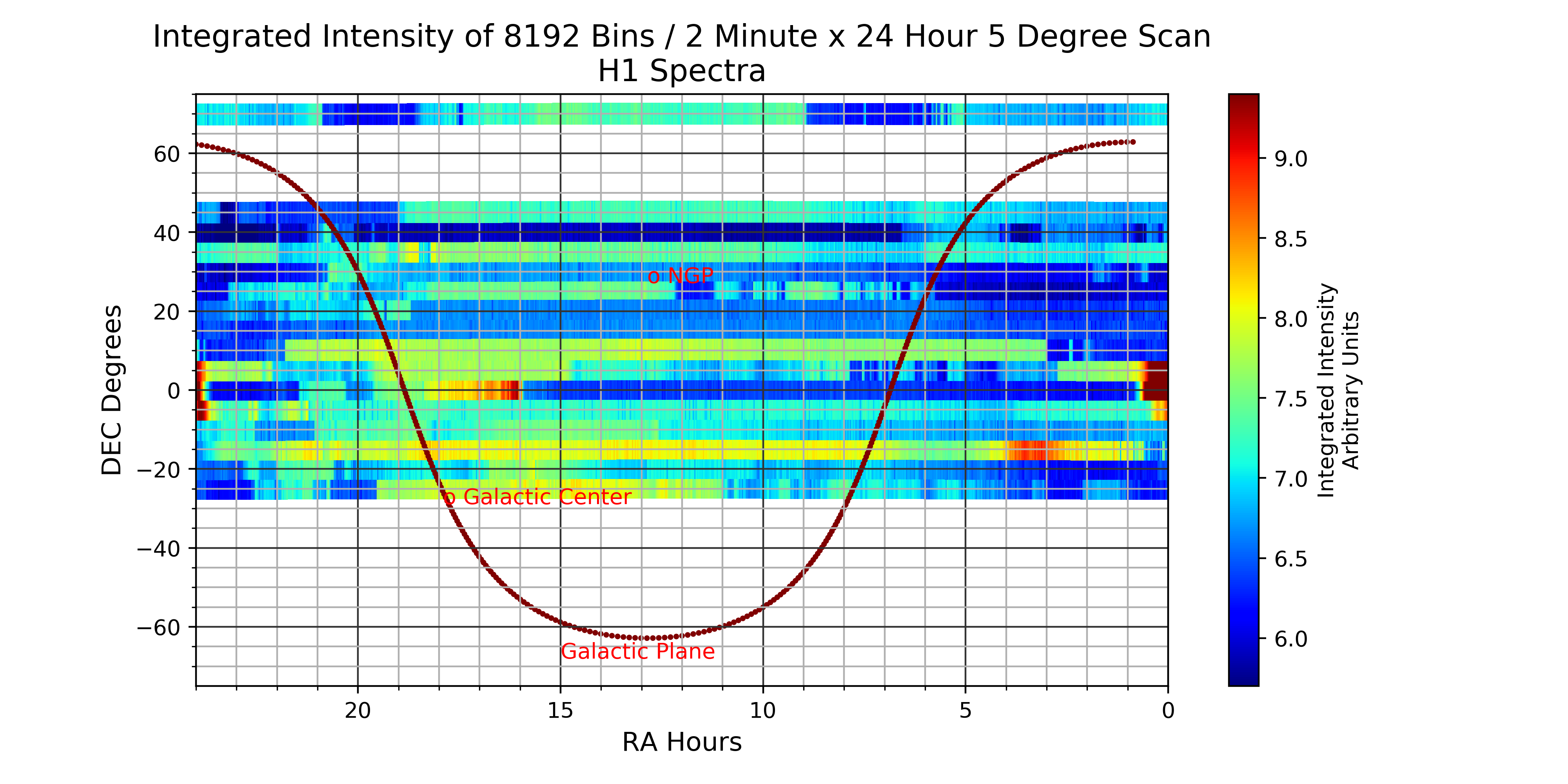
I would like some feedback on the following. I am almost finished with a 5 degree HPBW scan between declination -25 and +70. The data is 2 minute H1 spectra data over a 24 hour period. This spectra data is then integrated for an overall intensity for each of the 2 minute periods. This is collected as 741 FITS files for each 5 degrees of Declination for 24 hours. I am trying to find an effective way of plotting this data. To start with I am plotting the integrated intensity values on a RA vs. DEC grid, with the Galactic Plane plotted as well for reference. In as much as my FITS files have Glon and Glat coordinates as well as RA and DEC I would like to plot this data to a Galactic projection as well, so if anyone has feedback on how to do that please pass it on.
Thank you,
Jack

Dr. Rich Russel
7 اپریل، 2021، 6:26:01 PM7/4/21
بنام 49j...@gmail.com،sara...@googlegroups.com
I have written a number of articles on the plotting and use of HI data.
Rich Russel
--
--
You received this message because you are subscribed to the Google
Groups "Society of Amateur Radio Astronomers" group.
To post to this group, send email to sara...@googlegroups.com
To unsubscribe from this group, send email to
sara-list-...@googlegroups.com
For more options, visit this group at
http://groups.google.com/group/sara-list?hl=en
---
You received this message because you are subscribed to the Google Groups "Society of Amateur Radio Astronomers" group.
To unsubscribe from this group and stop receiving emails from it, send an email to sara-list+...@googlegroups.com.
To view this discussion on the web visit https://groups.google.com/d/msgid/sara-list/d689b83d-92b7-4f43-9a0a-33460a17775cn%40googlegroups.com.

Astronomy For Change
8 اپریل، 2021، 11:05:30 PM8/4/21
بنام sara...@googlegroups.com
HI Jack
May I suggest that the most useful map of the data would be based on galactic coordinates with the Galactic poles used as the origin, much like the attached doppler study was centered on them to show differential rotation (see attached). I would imagine plotting intensity vs constant angle along the Cygnus arm starting from the galactic center (17h, 33m) up through Cygnus (21h:00m) or so, about a 20deg angle from the southern horizon (see attached) would be quite instructive.
Cheers,
Jim Daly
--

fasleitung3
9 اپریل، 2021، 6:35:57 AM9/4/21
بنام sara...@googlegroups.com
Hi Jack,
It seems that you are using matplotlib for the example plot. In this case you can simply select a different projection:
plt.subplot(projection="aitoff"). You need to remember that the coordinates need to be given in radians rather than degrees for this type of plot.
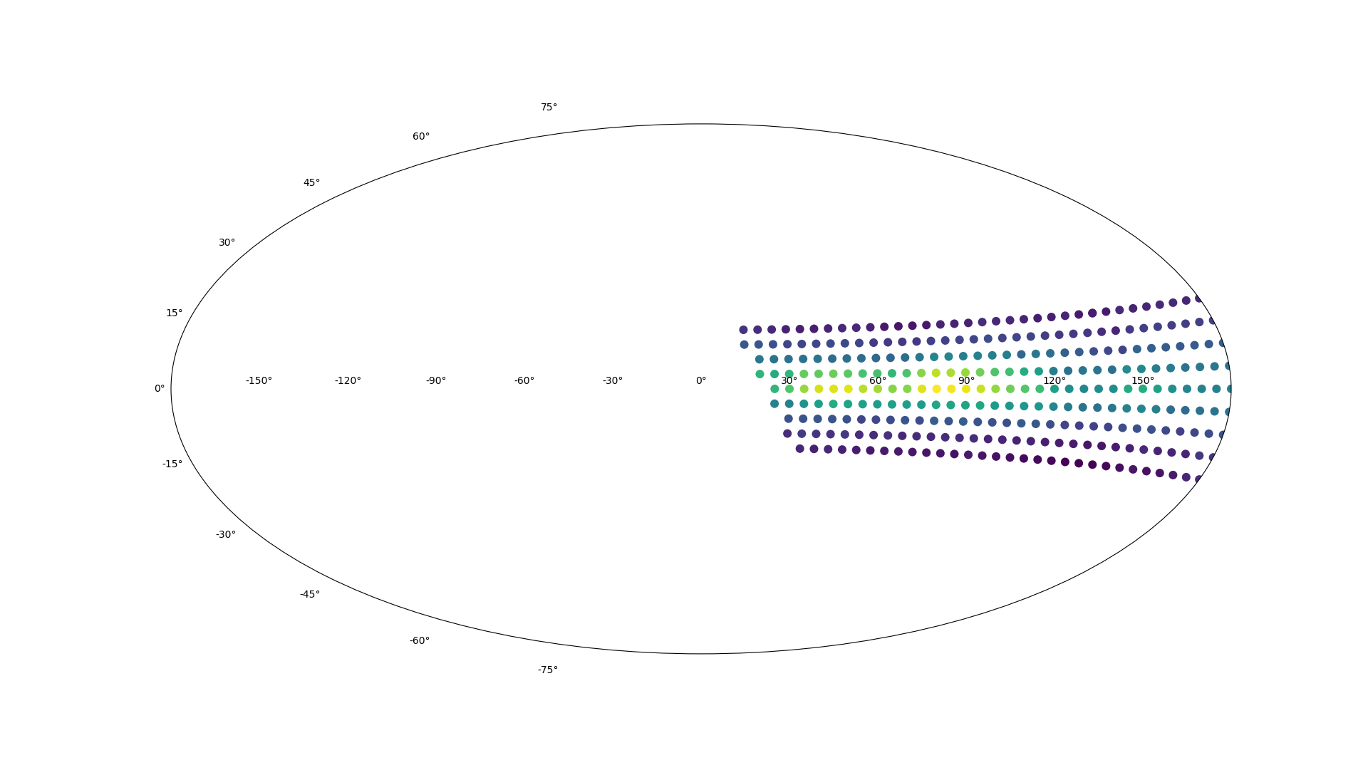
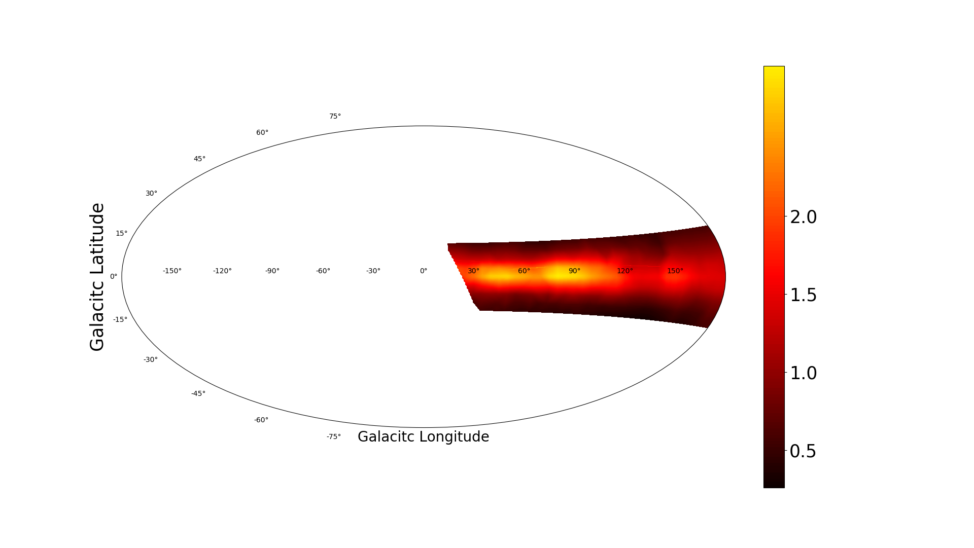
I have attached two example plots from a similar experiment where also the hydrogen intensity (integrated over all velocities) is plotted. The first plot just shows the data points from the different pointings. The second example is the same data, but the data has been "gridded". This means that an array with equidistant points has been created with an interpolation between the actual data points. This can be accomplished by using "griddata" from scipy.interpolate.
As a side note: These data points were taken with our 2.3-m dish as a test and preparation for a full sky scan. I found that I need to make more frequent calibrations than originally planned, so I will eventually start all over.
Best regards,
Wolfgang

Job Geheniau
10 اپریل، 2021، 7:30:15 AM10/4/21
بنام Society of Amateur Radio Astronomers
Hi,
I also did a Northern Sky Survey plot with my 1.5 meter dish (-20 to 90). I didnt changed it in galactic projection, but I like to share the plot itself. Little question is that I don't understand your data. I can't seen any galactic HI distribution.It seems a little random or am I misinterpreting the data?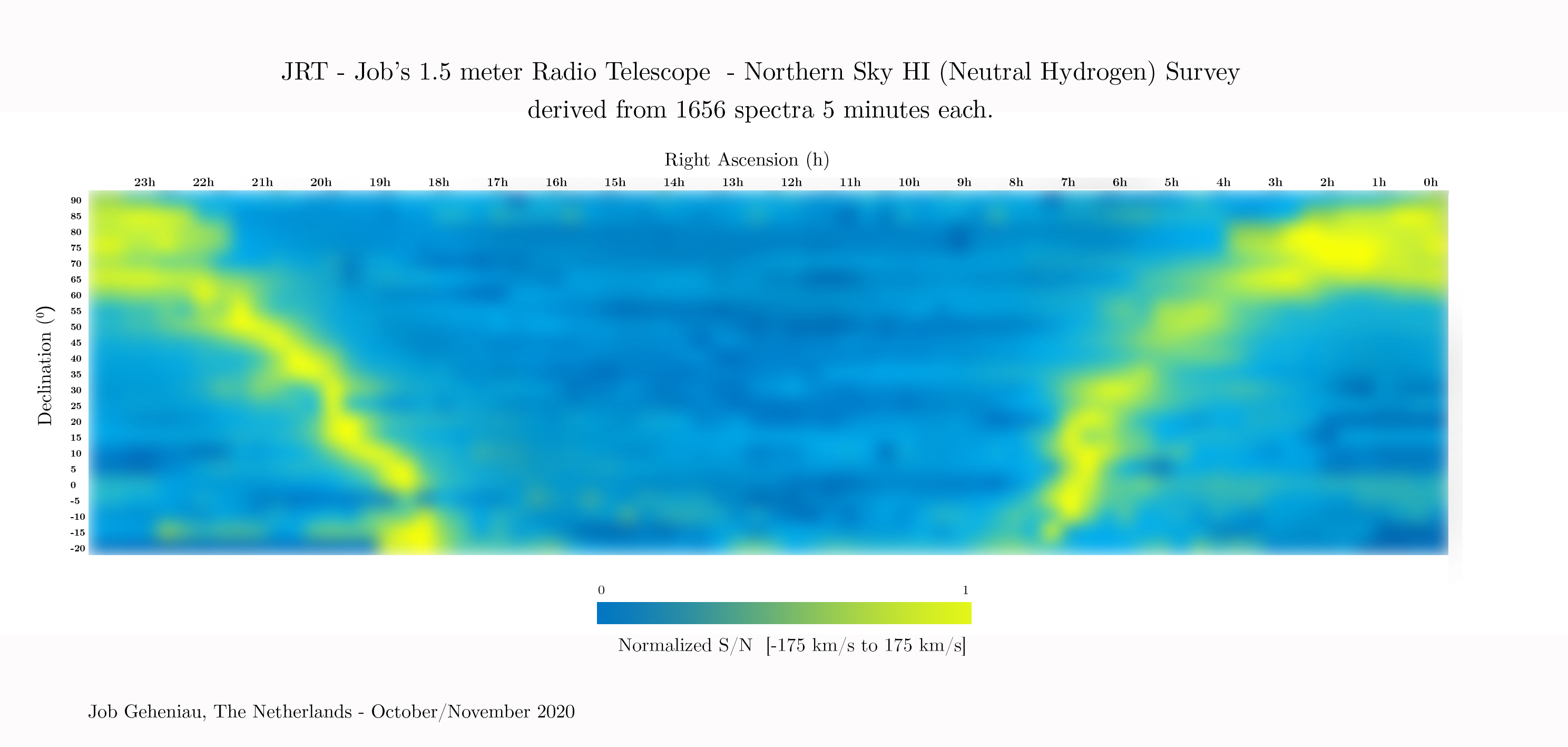
Op donderdag 8 april 2021 om 00:16:25 UTC+2 schreef 49j...@gmail.com:
Jack Lobingier
10 اپریل، 2021، 9:22:16 AM10/4/21
بنام sara...@googlegroups.com
Job, thank you for your reply. I agree, your plot looks more like what I expected to see mine look like. I ‘m not at all sure that I processed the data correctly before I plotted it. How did you process your raw spectra?
Jack
--
--
You received this message because you are subscribed to the Google
Groups "Society of Amateur Radio Astronomers" group.
To post to this group, send email to sara...@googlegroups.com
To unsubscribe from this group, send email to
sara-list-...@googlegroups.com
For more options, visit this group at
http://groups.google.com/group/sara-list?hl=en
---
You received this message because you are subscribed to the Google Groups "Society of Amateur Radio Astronomers" group.
To unsubscribe from this group and stop receiving emails from it, send an email to sara-list+...@googlegroups.com.
To view this discussion on the web visit https://groups.google.com/d/msgid/sara-list/c11fc8ad-7462-4cbd-9aba-d53fa11d2645n%40googlegroups.com.
Job Geheniau
10 اپریل، 2021، 9:45:08 AM10/4/21
بنام Society of Amateur Radio Astronomers
Hi Jack. What I did is take a dark first of course! Then I took a spectrum for every 5 degrees (my beam is 8.4 degrees) from 5 minutes each (that is 1656 spectra total!). With a simple Python Script I added all the values from 1 spectrum (total). Then I put all the observations from a specific degree in one row in Excel. And then I did a 3 color (dark blue lowest, yellow highest) conditional formatting in Excel. And that 23 days (every declination was 1 day of observing). I put a little pdf as attachment.
Op zaterdag 10 april 2021 om 15:22:16 UTC+2 schreef 49j...@gmail.com:
Job Geheniau
10 اپریل، 2021، 12:13:22 PM10/4/21
بنام sara...@googlegroups.com
Oh and by the way Jack, i did 24 driftscans. So 24 days of data gathering.
Op 10 apr. 2021 om 15:45 heeft Job Geheniau <jobge...@gmail.com> het volgende geschreven:
Hi Jack. What I did is take a dark first of course! Then I took a spectrum for every 5 degrees (my beam is 8.4 degrees) from 5 minutes each (that is 1656 spectra total!). With a simple Python Script I added all the values from 1 spectrum (total). Then I put all the observations from a specific degree in one row in Excel. And then I did a 3 color (dark blue lowest, yellow highest) conditional formatting in Excel. And that 23 days (every declination was 1 day of observing). I put a little pdf as attachment.
You received this message because you are subscribed to a topic in the Google Groups "Society of Amateur Radio Astronomers" group.
To unsubscribe from this topic, visit https://groups.google.com/d/topic/sara-list/wwYTh5PMbTU/unsubscribe.
To unsubscribe from this group and all its topics, send an email to sara-list+...@googlegroups.com.
To view this discussion on the web visit https://groups.google.com/d/msgid/sara-list/24643e91-c959-4fd9-ae3d-fee192ca2185n%40googlegroups.com.
<Northern Sky Survey in HI_gecomprimeerd.pdf>
سبھی کو جواب دیں
مصنف کو جواب دیں
فارورڈ کریں
0 نئے پیغامات