New design for pyjs.org website - WE WANT YOU!

Peter Bittner
you may have noticed that the project's website at http://pyjs.org has
changed at least twice, and quite a bit since our project transition
and the move to the GitHub platform earlier this year. We will take
the final step now, and we need YOUR support: If you are a web
designer or just a natural born wizard of beautiful design ideas and
stunning logos. Please volunteer now, WE WANT YOU!
From the very beginning the plan was to move the website into an
environment where it can be edited both easily and safely by everyone
in our community, and provide the collaboratively collected
information on Pyjs as a good-looking state-of-the-art website that
attracts new users and serves all the information needed by people
interested in Pyjs. The not totally obvious, but probably clever
choice was that we wanted to use GitHub's convenient (Wiki)
infrastructure, and use a tool to automagically create a beautiful
website out of it.
The tool of choice was and stil is Sphinx [1], most notably a Python
technology (of course!) to create documentation from reStructuredText
files. The current website is generated from .rest files already,
which is what Wiki pages are on GitHub: version-controlled .rest
files. Sphinx will replace the "hand-coded" generation of the website
that Anthony hacked into the build.py script [2]. What is missing now
is a great design for the new webstite. We need a Corporate Design
with the existing or a new Pyjs logo as a basis for all this.
Can YOU do this? Please volunteer!
Technically, the new website will run Sphinx themes. Built-in themes
are here [3], we'll probably take one of those and adapt it to our
needs. This will be the second part of the web design work we're
looking for volunteers for. If YOU think you can do some of that work,
please speak up now.
Thank you everyone!
[1] http://sphinx.pocoo.org
[2] https://github.com/pyjs/pyjs.org/blob/master/build.py
[3] http://sphinx.pocoo.org/theming.html#builtin-themes

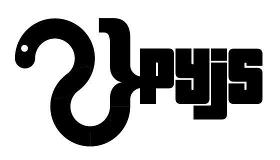
Alessandro D' Aquino
Hi Peter,
I would love to change pyjs "corporate design", but the time at my disposal to volunteer is limited, but at least, here is my first try for a new pyjs logo: If you like it I have the vector file, I could create a repo on github and post the link here on the group, or make a pull request on the pyjs repo of a directory calle "cd" as a beginning with the files inside if you want, just let me know what is the preferred method. As I said I don't have the time to develop the cd further but you can count on me about the logo :)
A note to the logo: This is the raw logo, as you can easily identify my inspiration was to make a pictogram of a python merged with the omnipresent "curly braces" that javascript has.
In terms of meaning, it should mean that python is versatile and can easily take different shapes, in this case that of javascript!
![]()

C Anthony Risinger
<alex.d...@gmail.com> wrote:
>
> Hi Peter,
>
> I would love to change pyjs "corporate design", but the time at my
> disposal to volunteer is limited, but at least, here is my first try for a
> new pyjs logo: If you like it I have the vector file, I could create a repo
> on github and post the link here on the group, or make a pull request on the
> pyjs repo of a directory calle "cd" as a beginning with the files inside if
> you want, just let me know what is the preferred method. As I said I don't
> have the time to develop the cd further but you can count on me about the
> logo :)
>
> A note to the logo: This is the raw logo, as you can easily identify my
> inspiration was to make a pictogram of a python merged with the omnipresent
> "curly braces" that javascript has.
> In terms of meaning, it should mean that python is versatile and can
> easily take different shapes, in this case that of javascript!
--
C Anthony
C Anthony Risinger
here is a respin based of your initial design, a font i've always liked (your desgin instantly reminded me of it), and a little bit of GIMP action:
--
C Anthony
C Anthony Risinger
C Anthony

pjshab
Nice ideas!
Also how about a leftbrace which the python can curl round?
I tried to draw what I mean but my python ended up looking a bit malicious:

Alessandro D' Aquino
Hi guys, I've absorbed all your nice ideas and comments and tried to take everything into consideration (the font, the snake tongue, etc) I showed all the logo variations also to my wife and my very interested 7 months old daughter :) and after an intensive "creative" state of mind and some vector work that is what I came up with... i have to admit that deep in my heart I'm a designer and in my honest opinion a logo should have enough abstraction and less details to let space for the observer to make his own interpretation. This is a slightly changed version ready for new constructive comments :)
![]()
I've also tried to make some application examples:

cheers,
Alex
Alessandro D' Aquino

Greg Warner
--

Apexi 200sx
BH
--

Daniel Gonzalez
C Anthony Risinger
<alex.d...@gmail.com> wrote:
>
> Hi guys, I've absorbed all your nice ideas and comments and tried to take everything into consideration (the font, the snake tongue, etc) I showed all the logo variations also to my wife and my very interested 7 months old daughter :) and after an intensive "creative" state of mind and some vector work that is what I came up with... i have to admit that deep in my heart I'm a designer and in my honest opinion a logo should have enough abstraction and less details to let space for the observer to make his own interpretation. This is a slightly changed version ready for new constructive comments :)
still, but not much else.
can you spin one with the python/snake facing sideways (like the
initial/original) but with some wavy tongue action? i personally like
the snake facing left, but i think a small *hiss* would look nice :-)
--
C Anthony
Alessandro D' Aquino
![]()
On Monday, July 23, 2012 2:34:04 PM UTC+2, C Anthony Risinger wrote:

Luc Chase
C Anthony Risinger
<alex.d...@gmail.com> wrote:
>
>
> Hi Anthony, I had some time to rework the logo including your comments
> (and your favorite font :) have a look:
btw, i'm not dead set on using that font or anything (tho i do like
the result!), i just think it matches the bracket/snake well ... it's
a tough bid because i like the contrast of slim letters too ...
this is why i'm not a designer ;-) i'll easily spend 10hrs on even the
most mundane details.
aside: we need a new tagline -- shorter, sweeter, crisper, awesome-y-er.
--
C Anthony
Alessandro D' Aquino
Hey Anthony, cool that you like the logo :)
The tagline can be separated from the main logo and is of course optional. Later on a tagline of choice can be added to the logo (with some easy photo editing action or even in pure text in a HTML pag) depending on the context used.
Now, If you really like the logo I would love to contribute it. how do you want me to deliver? ;) I can send you the logo file per email, or I can upload it anywhe you want. Then, what format do you prefer? It should be a vector capable format like .eps so you can later export what ever resolution is needed out of the vector file. If you want I can also export easily some png's like, 100x200, 200x400px, etc. so it can be directly be used, only for convenience.
Another small question arises, the snake eye! Right now the snake eye is white overlaid on top of the black snake body, but, I could cut the eye out so the eye circle would let shine trough the background in a transparent png or gif setup. Would you like the eye white or cut out?
Just let me know :)
Cheers,
Alex
Greg Warner
--
Alessandro D' Aquino
Here a simple comparison ...
![]()
C Anthony Risinger
<alex.d...@gmail.com> wrote:
>
> Here a simple comparison ...
is prob somewhere in between (might add some nice angular lines too).
i'm also starting to think that fatty font doesn't look as good or
contrast as well as your original ... what are some nice SANS or
monospace fonts? "Just Say No" to Serif (and drugs too i guess).
as for contributing, we'll likely do a simpl on-list poll -- if you
could send me the SVG files that would be fantastic -- i will ensure
your name is correctly set in the "Authors" field if/when it's
committed.
i also like the mocked site you made, very sleek. i'm no designer, so
i have trouble creating comps; i do 100% backend Python now but in a
past life i used to slice up such images into real websites -- any
assets/comps/PSD/whatever you'd like to provide there would also be
much appreciated. as you (thus far) have been the primary force here,
i'd also ensure you'd have a public place to point references in the
end ;-)
thanks!
--
C Anthony
Alessandro D' Aquino
![]()
On Tue, Jul 24, 2012 at 1:10 PM, Alessandro D' Aquino wrote:
>
> Here a simple comparison ...
hmm .. i kinda like the compactness of the "top snake" ... sweet spot
is prob somewhere in between (might add some nice angular lines too).
i'm also starting to think that fatty font doesn't look as good or
contrast as well as your original ... what are some nice SANS or
monospace fonts? "Just Say No" to Serif (and drugs too i guess).
as for contributing, we'll likely do a simpl on-list poll -- if you
could send me the SVG files that would be fantastic --
i will ensure
your name is correctly set in the "Authors" field if/when it's
committed.
i also like the mocked site you made, very sleek. i'm no designer, so
i have trouble creating comps; i do 100% backend Python now but in a
past life i used to slice up such images into real websites -- any
assets/comps/PSD/whatever you'd like to provide there would also be
much appreciated. as you (thus far) have been the primary force here,
i'd also ensure you'd have a public place to point references in the
end ;-)
thanks!
--
C Anthony
Alessandro D' Aquino
On Friday, July 27, 2012 6:27:48 AM UTC+2, C Anthony Risinger wrote:
thanks!
--
C Anthony
On Friday, July 27, 2012 6:27:48 AM UTC+2, C Anthony Risinger wrote:
Peter Bittner
- Squared logo version: Usually, when you have a logo there should be a roughly squared (n:n) version, which is easier to use -- think of profile pictures, avatars, website logos in the top left corner, etc.
How do we solve that? (Just omit the "pyjs"? Split up the "py" and "js", and place it one on top of the other? Rotate the "pyjs" by 90 degrees? ...) - pyjs vs. Pyjs: The current design suggests that "pyjs" (all small caps) is the preferred version of spelling. We should agree on whether this is what we want, or whether "Pyjs" (camel case) is the preferred version. As soon as something is part of a logo it written law.
- Shadow: I believe the shadow is not final, right? Just thinking, if a shadow goes into a (larger sized) version of the logo it should be real(istic), i.e. a drop shadow of the logo and the writing. I think. Not being a designer myself. (Ignore this if it is ignorant bullshit! :-) )
--
Alessandro D' Aquino
Hi all,very, very nice work, Alessandro! Bellissimo!
Just some thoughts (be)for(e) bringing this online:
- Squared logo version: Usually, when you have a logo there should be a roughly squared (n:n) version, which is easier to use -- think of profile pictures, avatars, website logos in the top left corner, etc.
How do we solve that? (Just omit the "pyjs"? Split up the "py" and "js", and place it one on top of the other? Rotate the "pyjs" by 90 degrees? ...)
Good point! Since the logo is high metaphoric, I think omitting the "pyjs" would be a good option. The pure emblematic shape would be used. To undermine what I mean I just made up quickly an iPhone App Icon (It's of course ironically ment :) to see the logo in action without the "pyjs", I think the shape alone has the necessary features to be easy recognizable.
![]()
- pyjs vs. Pyjs: The current design suggests that "pyjs" (all small caps) is the preferred version of spelling. We should agree on whether this is what we want, or whether "Pyjs" (camel case) is the preferred version. As soon as something is part of a logo it written law.
Personally I prefer "pyjs" before: Pyjs, PyJS or PYJS, simply because the lowercase letters are more geometrically "quiet" and don't steal the attention of the main logo shape. But this is my personal opinion as always.
- Shadow: I believe the shadow is not final, right? Just thinking, if a shadow goes into a (larger sized) version of the logo it should be real(istic), i.e. a drop shadow of the logo and the writing. I think. Not being a designer myself. (Ignore this if it is ignorant bullshit! :-) )
![]()
Cheers,
Alex
Cheers,Peter2012/7/28 Alessandro D' Aquino
Greg Warner
--
C Anthony Risinger
<alex.d...@gmail.com> wrote:
> On Wednesday, August 1, 2012 7:58:10 AM UTC+2, peter.bittner wrote:
>>
>> Squared logo version: Usually, when you have a logo there should be a
>> roughly squared (n:n) version, which is easier to use -- think of profile
>> pictures, avatars, website logos in the top left corner, etc.
>> How do we solve that? (Just omit the "pyjs"? Split up the "py" and "js",
>> and place it one on top of the other? Rotate the "pyjs" by 90 degrees? ...)
>
> Good point! Since the logo is high metaphoric, I think omitting the "pyjs"
> would be a good option. The pure emblematic shape would be used. To
> undermine what I mean I just made up quickly an iPhone App Icon (It's of
> course ironically ment :) to see the logo in action without the "pyjs", I
> think the shape alone has the necessary features to be easy recognizable.
>> pyjs vs. Pyjs: The current design suggests that "pyjs" (all small caps)
>> is the preferred version of spelling. We should agree on whether this is
>> what we want, or whether "Pyjs" (camel case) is the preferred version. As
>> soon as something is part of a logo it written law.
>
> Personally I prefer "pyjs" before: Pyjs, PyJS or PYJS, simply because the
> lowercase letters are more geometrically "quiet" and don't steal the
> attention of the main logo shape. But this is my personal opinion as always.
uppercase unless i'm corresponding with clients or something :-)
if anyone has good reason for preferring otherwise -- speak now!
>> Shadow: I believe the shadow is not final, right? Just thinking, if a
>> shadow goes into a (larger sized) version of the logo it should be
>> real(istic), i.e. a drop shadow of the logo and the writing. I think. Not
>> being a designer myself. (Ignore this if it is ignorant bullshit! :-) )
>
> You are completely right!
> No, the shadow is not part of the logo (neither is the light circular
> gradient around the logo) all stuff beside the logo was only for "logo
> presentation" purposes, to let things clear the logo is what follows :)
awesome, like he's (she's?) look straight ahead at what's coming :-)
it might just be me nitpicking, but the text feels a bit cramped to
me, ie. too close to the logo. it looks like the same space was used
as other letters, but the logo part is so much thicker than a letter
that it needs more whitespace ... but you're the pro so i defer to
your judgement.
if anyone has any additional final input, let's hear it now! the logo
bits look great as Alessandro has been kind enough to donate time in
refining it ... seems a good time to direct our energies to other
parts of the site that require some design thought.
--
C Anthony
Peter Bittner
[...]
>> Personally I prefer "pyjs" before: Pyjs, PyJS or PYJS, simply because the
>> lowercase letters are more geometrically "quiet" and don't steal the
>> attention of the main logo shape. But this is my personal opinion as always.
>
> same -- i prefer the all lowercase as well ... i pretty much never use
> uppercase unless i'm corresponding with clients or something :-)
current website, replacing all Pyjs occurences by their pyjs
counterparts. Also, I've tried to take care that all pythons read
"Python" (capital first letter), and all javascript reads "JavaScript"
(CamelCase) everywhere on pyjs.org. What I also did, I removed the
"Features" page and added its content as a new section to the
"Overview" page.
Anthony, as the automatic re-generation is disabled, could you please ... :-)
>> No, the shadow is not part of the logo (neither is the light circular
>> gradient around the logo) all stuff beside the logo was only for "logo
>> presentation" purposes, to let things clear the logo is what follows :)
>
> this is looking really great Alex -- the 45deg snake head looks
> awesome, like he's (she's?) look straight ahead at what's coming :-)
>
> it might just be me nitpicking, but the text feels a bit cramped to
> me, ie. too close to the logo. it looks like the same space was used
> as other letters, but the logo part is so much thicker than a letter
> that it needs more whitespace ... but you're the pro so i defer to
> your judgement.
artist, and font editor all in one person: Could you put the new logo
as well as the font you modified into a single web-font file? That
would just be great!
I found a neat article on doing that: "How to make your own icon
webfont" [1]. We should then put all the logos and icons we need into
that font file in the Unicode Private Area [2]. More on best practices
aka neat tricks is described in [3] and [4] (taken from the comments
section of the article).
[1] http://www.webdesignerdepot.com/2012/01/how-to-make-your-own-icon-webfont/
[2] http://en.wikipedia.org/wiki/Private_Use_(Unicode)
[3] http://www.heydonworks.com/article/using-icon-web-fonts
[4] http://jsfiddle.net/sujumaku/eNhUf/
I'd love to see all pyjs.org design resources in a single font file
(probably except for a few large graphics or so...), wow! :-)
> if anyone has any additional final input, let's hear it now! the logo
> bits look great as Alessandro has been kind enough to donate time in
> refining it ... seems a good time to direct our energies to other
> parts of the site that require some design thought.
logos and icons. We could even put the new logo on the current
website, and adapt the color scheme accordingly, all with CSS only.
Anyone having a great design idea, or at least a color preference for
the pyjs.org website?
Cheers, Peter

Michael Moore
But pay no attention to me; I sucjk at front-end.
Michael
--
Peter Bittner
You can make the examples' source code shine bright, others will take
care of the website's color scheme. :-)
Peter
2012/8/14 Michael Moore <michaelg...@gmail.com>:
Michael Moore
You're great, Michael! We need more of you. Toolsmiths.
You can make the examples' source code shine bright, others will take
care of the website's color scheme. :-)
Peter
Peter Bittner
2012/8/14 Michael Moore <michaelg...@gmail.com>:
> OK, here's a source-code example with some teaching objectives so people
> don't have to relearn what I learned. Maybe you can make use of it.
>
expect people to pick it up. No matter how brilliant it is.
You should
1.) prepare any code to be included into the examples for inclusion
2.) and make a pull request.
I looked at the code. It's nice. You could improve on commenting and
the empty pass statements, though.
Peter
Alessandro D' Aquino
Peter, I was out of town sorry for the late reply...
I'm very sorry but I don't have the time to fiddle a webfont together...
I've attached the vector art of the logo as ai and svg files, so you should be fine with either version :)
> if anyone has any additional final input, let's hear it now! the logo
> bits look great as Alessandro has been kind enough to donate time in
> refining it ... seems a good time to direct our energies to other
> parts of the site that require some design thought.
Styling the logo is easy with CSS3 as soon as we have a web font with
logos and icons. We could even put the new logo on the current
website, and adapt the color scheme accordingly, all with CSS only.
Anyone having a great design idea, or at least a color preference for
the pyjs.org website?
Cheers, Peter
C Anthony Risinger
>
> I'd love to see all pyjs.org design resources in a single font file
> (probably except for a few large graphics or so...), wow! :-)
> Styling the logo is easy with CSS3 as soon as we have a web font with
> logos and icons. We could even put the new logo on the current
> website, and adapt the color scheme accordingly, all with CSS only.
>
> Anyone having a great design idea, or at least a color preference for
> the pyjs.org website?
http://pyjs.org/raleway-pyjs-demo/ )
so ... i was intrigued by this idea of making a font file, as i had
looked into it before but never got around to doing it. anyways, long
story short, i sort of zoned out on this for ~two weeks or so ...
ultimately learning and burning way more than i needed to get the job
done, but it was fun nonetheless.
i started with Alessandro's SVG concept, but painstakingly whittled it
down to 36 points of mathematical precision and beauty, by hand and a
cheap python app to help me (temp locations):
https://github.com/pyjs/pyjs/wiki/pyjs-svg-logo
http://pyjs.org/raleway-pyjs-demo/pyjs.svg
... clearly derived from Alessandro's work, but i added some design
elements of my own -- there is an absoluteness to it, with many curves
being perfect circles and the like ... overlaying a grid will reveal
many interesting symmetries.
moving on! i also tried to make a custom font package from scratch but
that was taking too much time; luckily i remembered Alessandro
mentioning the font used (very nice font btw! will use throughout
site), so i pulled that font from GOOG (Raleway), and imported the
logo as a new Unicode glyph at position 0xEE00. you can drop the
`otf` or `ttf` fonts in your ~/.fonts directory and start using in any
app immediately, eg. libreoffice (sorry, not sure how to do the same
in Windows):
http://pyjs.org/raleway-pyjs-demo/fonts/raleway.pyjs.org-webfont.otf
http://pyjs.org/raleway-pyjs-demo/fonts/raleway.pyjs.org-webfont.ttf
(also eot and woff avail) ... the otf is the original, the others were
generated by Font Squirrel.
tl;dr, here is that shiny example page again:
http://pyjs.org/raleway-pyjs-demo/
... the above examples are using various CSS3 text shadows from the
net, purely to demonstrate the logo is a real *glyph* like any other.
even bold and italics work (albeit w/bold the eyeball nearly closes
completely) ... now we just need a nice site to go with it :-D
--
C Anthony
C Anthony Risinger
> On Mon, Aug 13, 2012 at 12:13 PM, Peter Bittner <peter....@gmx.net> wrote:
>>
>> I'd love to see all pyjs.org design resources in a single font file
>> (probably except for a few large graphics or so...), wow! :-)
>
> [...]
>
>> Styling the logo is easy with CSS3 as soon as we have a web font with
>> logos and icons. We could even put the new logo on the current
>> website, and adapt the color scheme accordingly, all with CSS only.
>>
>> Anyone having a great design idea, or at least a color preference for
>> the pyjs.org website?
>
> ( here is the part you prob want to see first:
> http://pyjs.org/raleway-pyjs-demo/ )
boxes like other undefined unicode glyphs ... it must have worked at
home because i had the fonts installed locally.
confirmation? ill look closer later tonight ... :-( too bad tho, the
demo's looked really nice.
--
C Anthony

Lex Berezhny
Worked fine on my Droid Razr with stock browser
--
C Anthony Risinger
>
> Worked fine on my Droid Razr with stock browser
unknowingly stripped out everything but western lang glyphs ... the
WOFF file was bad for sure.
regardless, i corrected all the files and republished them -- should
work for everyone now!
thanks,
--
C Anthony

drupin
Lex Berezhny
--

matthew lange
--
C Anthony Risinger
>
> It would take some work, but I think retweaking so that using the snake
> (sans tongue) to make the 'P' in ''PyJS', the white space to make the 'y',
> and the '}' to make the 'J' would be really sexy...it is already nearly
> there
open to additional submissions.
i don't really get the "scariness" bit ... this was a 30+ msg thread
prior to my rekindling it, and the general consensus seemed to be that
it looked pretty badass.
IMO the tongue add quite a bit ... else it's pretty boring on that
side. plus, its a snake -- that is what they do after all.
sans a really convincing reason or additional input (eg, attachments)
i'm inclined to keep it as is:
http://pyjs.org/raleway-pyjs-demo/
... btw i reverted the brace back near verbatim to Alessandro's
original ... i had a concept in mind but i couldn't pull it off like i
wanted, that and his version was prettty solid already.
--
C Anthony
peter.bittner
just for historical reference, I've added the gorgeous Pyjs logo to the Pyjamas wikipedia article at https://en.wikipedia.org/wiki/Pyjamas_(software)
Anthony, I'd also like to replace the old Pyjamas logo on the current website (http://pyjs.org/assets/images/pyjs.128x128.png) with the new logo. But I can't find that file neither in either of the two repositories, nor in the Wiki on Github. It's not in the assets/images/ folder where I would expect it to be: https://github.com/pyjs/pyjs.org/tree/master/assets/images
Can you help?
Peter
Am Samstag, 21. Juli 2012 16:07:36 UTC+2 schrieb Alessandro D' Aquino:
Hi Peter,
I would love to change pyjs "corporate design", but the time at my disposal to volunteer is limited, but at least, here is my first try for a new pyjs logo: If you like it I have the vector file, I could create a repo on github and post the link here on the group, or make a pull request on the pyjs repo of a directory calle "cd" as a beginning with the files inside if you want, just let me know what is the preferred method. As I said I don't have the time to develop the cd further but you can count on me about the logo :)
A note to the logo: This is the raw logo, as you can easily identify my inspiration was to make a pictogram of a python merged with the omnipresent "curly braces" that javascript has.
In terms of meaning, it should mean that python is versatile and can easily take different shapes, in this case that of javascript!
cheers,Alex
On Friday, July 20, 2012 2:39:05 AM UTC+2, peter.bittner wrote:Hi everyone,
you may have noticed that the project's website at http://pyjs.org has
changed at least twice, and quite a bit since our project transition
and the move to the GitHub platform earlier this year. We will take
the final step now, and we need YOUR support: If you are a web
designer or just a natural born wizard of beautiful design ideas and
stunning logos. Please volunteer now, WE WANT YOU!
From the very beginning the plan was to move the website into an
environment where it can be edited both easily and safely by everyone
in our community, and provide the collaboratively collected
information on Pyjs as a good-looking state-of-the-art website that
attracts new users and serves all the information needed by people
interested in Pyjs. The not totally obvious, but probably clever
choice was that we wanted to use GitHub's convenient (Wiki)
infrastructure, and use a tool to automagically create a beautiful
website out of it.
The tool of choice was and stil is Sphinx [1], most notably a Python
technology (of course!) to create documentation from reStructuredText
files. The current website is generated from .rest files already,
which is what Wiki pages are on GitHub: version-controlled .rest
files. Sphinx will replace the "hand-coded" generation of the website
that Anthony hacked into the build.py script [2]. What is missing now
is a great design for the new webstite. We need a Corporate Design
with the existing or a new Pyjs logo as a basis for all this.
Can YOU do this? Please volunteer!
Technically, the new website will run Sphinx themes. Built-in themes
are here [3], we'll probably take one of those and adapt it to our
needs. This will be the second part of the web design work we're
looking for volunteers for. If YOU think you can do some of that work,
please speak up now.
Thank you everyone!
[1] http://sphinx.pocoo.org
[2] https://github.com/pyjs/pyjs.org/blob/master/build.py
[3] http://sphinx.pocoo.org/theming.html#builtin-themes
peter.bittner
just some thoughts on the website. When replacing the old logo with the new one I think it's the right time to use new colors, too.
Following the Python-JavaScript marriage allegory I would use JavaScript's yellow (#f3df49) and light-black (#2e2e2c), as well as a color that is well-associated with Python. I first thought this must be green, maybe inspired by the old Python mascot (favicon on the old Python website), but there is no trace of green on the current Python.org website. They are using yellow and dark-blue. Of course there are even yellow Python snakes, but the partner of JavaScript should wear a different color, shouldn't she?
Anybody having an opinion about the colors the site should use?
Peter
Sources:
- https://github.com/voodootikigod/logo.js/blob/master/registry.md
- http://www.demiurgo.org/charlas/python-unittesting/img/python-logo.png
- http://web.archive.org/web/20050401015445/http://www.python.org/
- http://www.2ndblessingsimagemakeovers.com/wp-content/themes/saturday-658/big-yellow-snake-name
- https://www.python.org/community/logos/