moving WeBWorK Activate button to the top
瀏覽次數:15 次
跳到第一則未讀訊息

Alex Jordan
2022年12月18日 凌晨1:48:302022/12/18
收件者:prete...@googlegroups.com
Recent work with Active Calculus [turning preview activities into long
WeBWorK exercises] reveals that it is bad to leave the Activate button
at the bottom of an exercise.
So I moved it to the top. But it's not clear where to place the
button. And if it still literally has the word "Activate" that's a lot
of space to take up in a region that has less space. Here is what it
looks like:
https://spot.pcc.edu/~ajordan/temp/sample-chapter/frontmatter.html
This involves editing JS, CSS, and the XSL in this pull request. So
it's a bit of a dance. What suggestions to do it differently, better?
This prototype has the button up high, sticking into the right margin
(no conflict with permalink). The button has an accessible aria-label
that still says "Activate" (but that could stand to be more
descriptive). The button just shows an icon (the WeBWorK logo) right
now. Are there better suggestions? When you click it, the exercise
becomes live. The button disappears. There is still the "Revert"
button at the bottom though, and if you click that, you go back to
static and the Activate button comes back.
I went ahead and opened a PR here:
https://github.com/PreTeXtBook/pretext/pull/1874
with the XSL edit for this. CSS changes are easy for David to make. JS
changes are more significant but I think I can do them with backward
compatibility.

Sean Fitzpatrick
2022年12月20日 上午10:46:282022/12/20
收件者:PreTeXt development
It looks good. My only concern would be whether a reader will know what the button is for without instructions.
Since I don't see an example of this in the sample chapter: how well do things fit if there's a two-column exercise layout?
(I know there's been talk of abandoning this for HTML but it's still in effect for APEX.)

Chrissy Safranski
2022年12月20日 下午1:34:522022/12/20
收件者:PreTeXt development
I very much like the button up higher! I've been annoyed at scrolling to the bottom, but never thought to say something, so thank you! Although I agree it's not obvious what the button is for, I can easily tell my students, and in some sense, "activate" at the bottom of a problem wasn't very intuitive either and would have needed explanation.
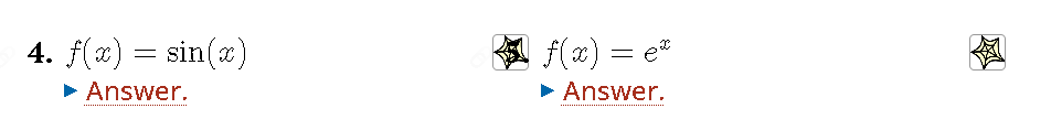
But I think there is an example of a two-column exercise, and it's a problem. Exercise 4 The activate logo for the first column seems to possibly conflict with the permalink for the second column. I can't get the first column problem to activate, at least.
Chrissy
Sean Fitzpatrick
2022年12月20日 下午1:53:442022/12/20
收件者:prete...@googlegroups.com
You were a more dedicated sleuth than I was!
A (probably) easy option for Alex would be to shift the button down by a couple of lines.
But even then, it's straying into the space assigned to the second column.
A (probably) easy option for Alex would be to shift the button down by a couple of lines.
But even then, it's straying into the space assigned to the second column.
--
You received this message because you are subscribed to the Google Groups "PreTeXt development" group.
To unsubscribe from this group and stop receiving emails from it, send an email to pretext-dev...@googlegroups.com.
To view this discussion on the web visit https://groups.google.com/d/msgid/pretext-dev/b5a82eea-08a3-422a-a580-5b45e02b9dccn%40googlegroups.com.
Alex Jordan
2022年12月20日 下午2:24:112022/12/20
收件者:prete...@googlegroups.com
A WW exercise will be laid out with the exercise number, then the
title (if it exists), then the introduction (if it exists). Barring a
huge rewrite of this section of the stylesheet, the activation button
has to come after those things in the HTML source. For example, here:
Exercise 6.: Show Your Work
https://spot.pcc.edu/~ajordan/temp/sample-chapter/section-4.html#ww-use-the-definition-of-the-derivative
You can see that it comes after "...tool, demonstrated here" which is
the end of the "introduction". Right now it is positioned off to the
right. Would it be better as a button that just takes up vertical
space and shifts everything down?
Note that in #4, #5, we already see a line break that seems
unnecessary. I think we (David) wrestles with that kind of line break
and it inevitably becomes a game of whack-a-mole, and it comes back.
But I suspect using a button like I suggest in the previous paragraph
will further complicate any effort to eradicate that line break.
And then what should the button actually look like or say? It's a
small icon in that prototype in recognition that there is not much
horizontal space given where I placed it. If there were more
horizontal space, is there a word or phrase that would work well?
Better than "Activate"?
> To view this discussion on the web visit https://groups.google.com/d/msgid/pretext-dev/b841b439-36dd-a3da-5dd2-d47b125530b9%40gmail.com.
title (if it exists), then the introduction (if it exists). Barring a
huge rewrite of this section of the stylesheet, the activation button
has to come after those things in the HTML source. For example, here:
Exercise 6.: Show Your Work
https://spot.pcc.edu/~ajordan/temp/sample-chapter/section-4.html#ww-use-the-definition-of-the-derivative
You can see that it comes after "...tool, demonstrated here" which is
the end of the "introduction". Right now it is positioned off to the
right. Would it be better as a button that just takes up vertical
space and shifts everything down?
Note that in #4, #5, we already see a line break that seems
unnecessary. I think we (David) wrestles with that kind of line break
and it inevitably becomes a game of whack-a-mole, and it comes back.
But I suspect using a button like I suggest in the previous paragraph
will further complicate any effort to eradicate that line break.
And then what should the button actually look like or say? It's a
small icon in that prototype in recognition that there is not much
horizontal space given where I placed it. If there were more
horizontal space, is there a word or phrase that would work well?
Better than "Activate"?
Sean Fitzpatrick
2022年12月20日 下午2:53:082022/12/20
收件者:prete...@googlegroups.com
At least for me, the Activate button for #4 lands right on top of the 5 for #5.
I'm not sure that I see the line break you're referring to.
To view this discussion on the web visit https://groups.google.com/d/msgid/pretext-dev/CA%2BR-jreokfr_zMP3iXh6BtoN3%2BGFfnjJF4YgszhQ1cbAUAzhUw%40mail.gmail.com.
Alex Jordan
2022年12月20日 下午2:56:482022/12/20
收件者:prete...@googlegroups.com
Sorry, I confused myself by looking at the exercise after it was made active. So what should it look like?
4. [button] f(x) = sin(x)
4. [button]
f(x) = sin(x)
Something else? And then for the ones with a title and/or introduction, what should it do?
6. TITLE. This is an introduction
that goes onto a new line.
[button]
Use the definition...
Or something else?
To view this discussion on the web visit https://groups.google.com/d/msgid/pretext-dev/CAH%2BNcPa94L85-jenNVg%3DUjtZCyynkC2K-YAy0wUzuAoq1omZ8g%40mail.gmail.com.
Sean Fitzpatrick
2022年12月20日 下午3:30:382022/12/20
收件者:prete...@googlegroups.com
I think having the button right after the question number might work. I'm not sure I have an opinion on whether or not there should be a line break after it.
To view this discussion on the web visit https://groups.google.com/d/msgid/pretext-dev/CA%2BR-jrfvzy4DXyKYzRnv55NvbiMmVzWrwEekpQpDd1VC-N01FQ%40mail.gmail.com.
Chrissy Safranski
2022年12月21日 中午12:04:102022/12/21
收件者:PreTeXt development
I don't have an opinion either. It's an improvement if it appears anywhere near the top.
I also like it where it is and just don't do 2 column exercises (sorry Sean!).
Alex Jordan
2023年3月19日 晚上7:22:352023/3/19
收件者:prete...@googlegroups.com
Recent PR merged:
Puts the "Activate" button on the top. Still says "Activate" (not an icon). And it's not off to the side like my prototype was. The submit button and friends still appear at the bottom. Tomorrow it will be in the nightly CLI build, and sometime later in the main CLI version.
Rob/Chrissy, not clear if/when you want to rebuild Active Calculus to have the button be in the new place.
To view this discussion on the web visit https://groups.google.com/d/msgid/pretext-dev/71020275-a854-4823-bb88-9d795a439592n%40googlegroups.com.

Rob Beezer
2023年3月19日 晚上8:26:152023/3/19
收件者:prete...@googlegroups.com
On 3/19/23 16:22, Alex Jordan wrote:
> Rob/Chrissy
Brad/Chrissy?
> Rob/Chrissy
Brad/Chrissy?
Alex Jordan
2023年3月19日 晚上8:48:042023/3/19
收件者:prete...@googlegroups.com
>> Rob/Chrissy
> Brad/Chrissy?
Yes! Short on coffee this afternoon.
> Brad/Chrissy?
Yes! Short on coffee this afternoon.
> --
> You received this message because you are subscribed to the Google Groups "PreTeXt development" group.
> To unsubscribe from this group and stop receiving emails from it, send an email to pretext-dev...@googlegroups.com.
> To view this discussion on the web visit https://groups.google.com/d/msgid/pretext-dev/MTAwMDAzMC5iZWV6ZXI.1679271974%40quikprotect.
> You received this message because you are subscribed to the Google Groups "PreTeXt development" group.
> To unsubscribe from this group and stop receiving emails from it, send an email to pretext-dev...@googlegroups.com.
回覆所有人
回覆作者
轉寄
0 則新訊息