search box: lower right
20 views
Skip to first unread message

David Farmer
Oct 24, 2022, 1:00:29 PM10/24/22
to prete...@googlegroups.com
If you have enabled the new search method (not the old Google
search), then if you reload you should see another search box,
pinned to the lower right if your screen is wide.
Comments welcome (about the new search box, and also about the
new search in general).
David

GVSU Open Education Resources
Nov 16, 2022, 1:47:15 PM11/16/22
to PreTeXt development
Apologies for just getting to this. Love the new search feature. It's very pleasing to see, easy to use and implement, and fast.
Couple of notes:
- Very small thing: any way to remove the new extra search box when the original one is visible? So that two boxes aren't visible at one time which might confuse people?
- The extra search box is still visible on my iPad even though the screen is not enough for that to appear.
- How should I interpret results? What is the difference between the bolded results and the non-bolded results? Could such information be provided at the top of the box or should we put some instructions in the book itself?
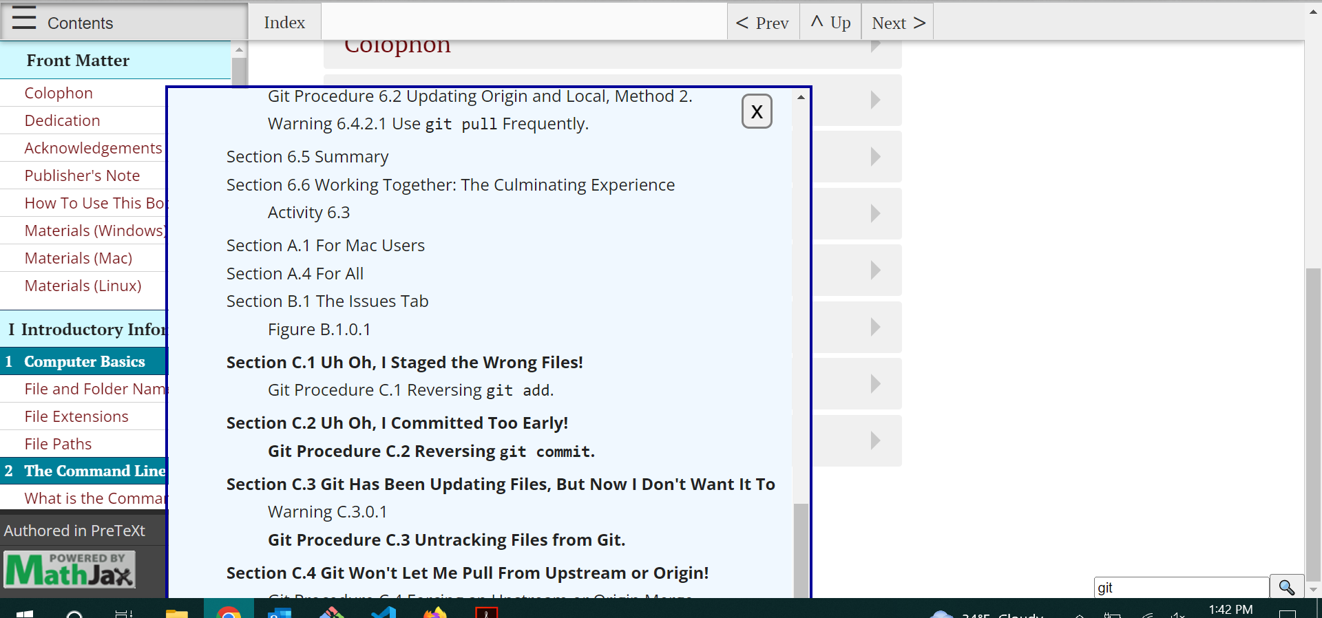
- The current box cuts off some (maybe just one?) of the last results. See image attached or go to this book and search for "git". This is not a problem on my iPad.
Thanks for implementing this! I think it is a great addition to an already great service.
David W. Farmer
Nov 16, 2022, 2:31:02 PM11/16/22
to PreTeXt development
Comments interleaved.
> - Very small thing: any way to remove the new extra search box when the original one is visible? So that two boxes
> aren't visible at one time which might confuse people?
lower search box disappear. So, there are positives and
negatives either way. I am happy to hear claims that one
way is better.
> - The extra search box is still visible on my iPad even though the screen is not enough for that to appear.
see if you refresh.
On a phone, or iPad (depending on font size and orientation) the
search box will be there, just above the bottom navigation
buttons. It will partially cover the bottom line of text.
An alternative (not implemented yet) is to somehow make the search
box an option from the bottom navigation bar. Suggestions welcome
(as are comments that it is okay as-is).
Please ask again if I did not understand your comment.
> - How should I interpret results? What is the difference between the bolded results and the non-bolded results? Could
> such information be provided at the top of the box or should we put some instructions in the book itself?
1) For a reference work, or documentation, we will offer a different
results display which moves the most important results to the top.
(Rob did the PreTeXt work for that, and is waiting on me (or a
volunteer!) to do the JavaScript.)
2) Boldness means higher ranking -- in whatever mysterious
way the code does ranking.
Is documentation needed to tell the user that the bold options are
more likely to be what they are looking for?
> - The current box cuts off some (maybe just one?) of the last results. See image attached or go to this book and
> search for "git". This is not a problem on my iPad.
David
GVSU Open Education Resources
Nov 17, 2022, 12:21:12 PM11/17/22
to PreTeXt development
Thanks for the notes. I think having two boxes is just fine, especially if weird things are happening when messing with it. iPad search bar location looks like it is where it is supposed to be; thank you for confirming that (are there pretext bottom navigation buttons? I don't know if I have those.)
Interesting note on the search bolding. Not sure if a note is necessary or not. On the one hand, it is pretty clear that bold means something extra but I can see some people questioning why some are bolded and some aren't. I would be interested to hear other points of view on this (and on moving relevant results to the top). At the very least, perhaps, could be a "Bolded = more relevant" or something like that?
I'm not sure if the cut-off results is quite right yet? I still have to zoom out on my computer (tried on a Windows and Mac) to see the final result and a half but my iPad still is ok. I'd be happy to provide more screenshots if necessary.

Rob Beezer
Nov 17, 2022, 2:06:40 PM11/17/22
to prete...@googlegroups.com
On 11/17/22 09:21, GVSU Open Education Resources wrote:
> interested to hear other points of view on this (and on moving relevant results
> to the top).
For the "textbook" tuning, results will be in order of appearance. You don't
> interested to hear other points of view on this (and on moving relevant results
> to the top).
usually want something from the last chapter in the second week of class.
For the "reference" tuning (which David noted is in-progress, and not available
yet), the results will be sorted by relevance.
Once we have two tunings to compare, we can *really* debate what is best!
Thanks for all your checking and comments.
Rob
David W. Farmer
Nov 18, 2022, 11:02:16 AM11/18/22
to prete...@googlegroups.com
Here is another way to have only one search box:
https://pretextbook.org/beta/2022-11-13-overhaul-oscarlevin/section-fundamental-theorem.html
Only that page has that option.
I'd like to decide if we really want to go that way,
before I make any more changes.
So, please express an opinion or offer alternatives, if you wish!
David
ps to Rob: The HTML has to change to put the search box there.
I hand-edited that HTML file.
Rob Beezer
Nov 18, 2022, 11:29:33 AM11/18/22
to prete...@googlegroups.com
First look was on my tablet. Where it sits attached to bottom. Which I like,
since I seem to incessantly scroll whatever I'm reading up to the top.
On desktop it is fine, and it seems it won't interfere with the title when page
is initially loaded, but it is hard to tell, since that section has a shorter title.
I'd vote for running with this, and we can change the HTML easily, I'd bet.
Rob
David W. Farmer
Nov 18, 2022, 12:51:13 PM11/18/22
to prete...@googlegroups.com
Once I do that, the CSS will change and the search box in the current
overhaul betas will not look right. In fact, the betas will be
messed-up as soon as I start that, well before I send a pull request.
I think that is okay, since probably I am the only person using them
right now.
David
> You received this message because you are subscribed to the Google Groups
> "PreTeXt development" group.
> To unsubscribe from this group and stop receiving emails from it, send an
> email to pretext-dev...@googlegroups.com.
> To view this discussion on the web visit
> https://groups.google.com/d/msgid/pretext-dev/6a2e7caf-1fc6-c14a-60a0-2f719a8aa14b%40ups.edu.
>
David W. Farmer
Nov 18, 2022, 1:46:42 PM11/18/22
to prete...@googlegroups.com
I sent a pull request to the overhaul branch to float the
search box under the navbar (and also fixed a couple other
things).
I did not test the effect on the CRC layout, so a new beta
would be appreciated (but no hurry as I am unlikely to have
time soon).
Possibly TOC scrolling is the main thing missing before
we are ready to test the non-React overhaul.
Regards,
David

Oscar Levin
Nov 18, 2022, 3:21:32 PM11/18/22
to PreTeXt development
I find the floating search box, either on top or bottom, distracting. What about having a magnifying glass button added to the floating nav menu that expands to a search box when clicked on? This seems like the standard for modern websites.
Rob Beezer
Nov 19, 2022, 12:16:40 PM11/19/22
to prete...@googlegroups.com
Thanks, David, for the push on this front.
On 11/18/22 10:46, David W. Farmer wrote:
> I sent a pull request to the overhaul branch to float the
> search box under the navbar (and also fixed a couple other
> things).
Merged into rbeezer/overhaul so now available there. As before "master" has
evolved, but has no real HTML work, so I did not merge master into overhaul.
> I did not test the effect on the CRC layout, so a new beta
> would be appreciated (but no hurry as I am unlikely to have
> time soon).
Uploading now. At first blush, it is looking good!
https://pretextbook.org/beta/2022-11-19-overhaul-crc
> Possibly TOC scrolling is the main thing missing before
> we are ready to test the non-React overhaul.
Very good. I've set aside time on T-Giving weekend to tidy everything up for
mass testing the week of November 28. Please keep me posted on your plans
(off-list, if you prefer) so I can coordinate with a family visit.
On the PR you said:
> I suggest making native search the default, but I have not implemented that.
I have a branch all set to flip from opt-in to opt-out (ie make it the default).
The betas (all four now) have native search (I opted in). I planned to switch
before the end of the month (CLI schedule) and could do that next weekend, since
there will be a new round of all three betas. Holler if I've misunderstood a
need here on your end.
Thanks,
Rob
On 11/18/22 10:46, David W. Farmer wrote:
> I sent a pull request to the overhaul branch to float the
> search box under the navbar (and also fixed a couple other
> things).
evolved, but has no real HTML work, so I did not merge master into overhaul.
> I did not test the effect on the CRC layout, so a new beta
> would be appreciated (but no hurry as I am unlikely to have
> time soon).
https://pretextbook.org/beta/2022-11-19-overhaul-crc
> Possibly TOC scrolling is the main thing missing before
> we are ready to test the non-React overhaul.
mass testing the week of November 28. Please keep me posted on your plans
(off-list, if you prefer) so I can coordinate with a family visit.
On the PR you said:
> I suggest making native search the default, but I have not implemented that.
I have a branch all set to flip from opt-in to opt-out (ie make it the default).
The betas (all four now) have native search (I opted in). I planned to switch
before the end of the month (CLI schedule) and could do that next weekend, since
there will be a new round of all three betas. Holler if I've misunderstood a
need here on your end.
Thanks,
Rob
Reply all
Reply to author
Forward
0 new messages