Gantt chart
904 views
Skip to first unread message

radim vonka
Dec 1, 2021, 1:58:15 PM12/1/21
to or-tools-discuss
Hello all!
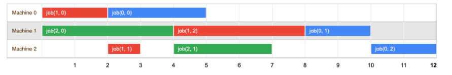
I have a problem with creating a gantt chart when I solving the job shop problem.
I'm creating a planning in Python and I need exactly this Gantt chart, which can be found on the web Google OR-tools (https://developers.google.com/optimization/scheduling/job_shop). I did not find any possible graphic design anywhere.
If anyone can advise me how to create Gantt chart in Python code for the Job Shop Problem, I will be grateful.
Thanks!

Laurent Perron
Dec 1, 2021, 2:50:32 PM12/1/21
to or-tools...@googlegroups.com
plotly, mathplotlib.
There are plenty of libraries out there.
--
You received this message because you are subscribed to the Google Groups "or-tools-discuss" group.
To unsubscribe from this group and stop receiving emails from it, send an email to or-tools-discu...@googlegroups.com.
To view this discussion on the web visit https://groups.google.com/d/msgid/or-tools-discuss/e4c86813-8930-4f65-a578-4e8695dd4dc2n%40googlegroups.com.

Mizux Seiha
Dec 1, 2021, 4:17:05 PM12/1/21
to or-tools-discuss
IIRC done by using https://developers.google.com/chart/interactive/docs/gallery/timeline

Alex Dunfee
Dec 2, 2021, 11:49:42 PM12/2/21
to or-tools-discuss
I created a plotly implementation of the job-shop in python. If you share the general structure of the variables you want plotted, I can share what I put together and try to adapt / hint at what you need to change.
radim vonka
Dec 7, 2021, 5:54:35 AM12/7/21
to or-tools-discuss
HI,
thank you for the advices. I need result in Python. I tried to use Plotly and mathplotlib, but I had a problem with coloring the boxes according to the jobs. I need on the x-axis = time and on the y-axis = machines and boxes colored according to jobs (like the chart I sent).
My Python file I enclosed.
I will be grateful for any further help.
Dne pátek 3. prosince 2021 v 5:49:42 UTC+1 uživatel Alex Dunfee napsal:
Laurent Perron
Dec 7, 2021, 5:57:41 AM12/7/21
to or-tools...@googlegroups.com
Sorry, we are OR experts, not plotly experts :-)
To view this discussion on the web visit https://groups.google.com/d/msgid/or-tools-discuss/5bf702ac-cdf9-43ba-a62d-8cb30a144c45n%40googlegroups.com.

Rushabh Doshi
Dec 7, 2021, 7:55:06 AM12/7/21
to or-tools...@googlegroups.com
Hi Radim,
I have attached a jupyter notebook where I have added a visualization function. I don't remember where I saw it first. I have commented out the print functions.
Check why the optimal schedule length is 0.
To view this discussion on the web visit https://groups.google.com/d/msgid/or-tools-discuss/5bf702ac-cdf9-43ba-a62d-8cb30a144c45n%40googlegroups.com.

Debdeep Banerjee
Dec 8, 2021, 10:37:38 PM12/8/21
to or-tools...@googlegroups.com
To view this discussion on the web visit https://groups.google.com/d/msgid/or-tools-discuss/CABcmEebaNP3Kvy%3D9_6OBLOpXD5h35a4HjVk8A6SXZYJru76%2BvQ%40mail.gmail.com.

Alberto Manzini
Jan 21, 2022, 5:13:26 AM1/21/22
to or-tools-discuss
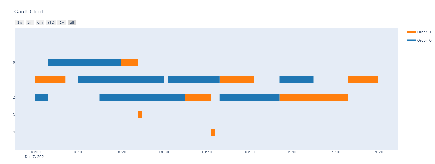
Hi, I'm currently using px.timeline like this
fig_gantt = px.timeline(
df_gantt_plot, # dataframe of the data
x_start='tms_start', # start time of the production (i.e. start of the block)
x_end='tms_end', # end time of the production (i.e. end of the block)
y='cod_machine', # machine on which the production is done (y axis of the gantt)
color='list_orders', # column of the dataframe which determins the color of the block
hover_name='cod_production', # text inside the block of the gantt
hover_data=hover_data, # list of columns you want to show in the hover
)
Reply all
Reply to author
Forward
0 new messages