[The Painting Experiment] How to Make Color Charts (The Richard Schmid Way)
1,786 views
Skip to first unread message

Jackson Robinson
Dec 2, 2009, 8:12:21 AM12/2/09
to onelun...@googlegroups.com
So I wanted to take some time and write a how to on the process of making color charts. Creating my own set of color charts taught me more about color and the technical side of mixing color than my entire 6 year stint in art school. I can discuss the downfall of post modern art school in another post. If you are hearing about color charts for the very first time they are nothing more than a calculated exercise in mixing in paint in different value ranges (Dark to Light) and in varying hues. (hue is another name for the name that is printed on the side of the tube) Color charts will look different depending on the artist that is doing them and the colors or hues they choose to use. Some artist do fast color charts that are nothing more than two or three rows of quick brush strokes of color. Other artist do multiple charts for every color that are tightly taped off and in my oppinion are works of art in and of themselves.
Here is an example of one of my color charts.

Click here to see the high res image
____________________________________________________
Resources:
First and foremost Richard Schmid’s book Alla Prima. I started Mr. Schmid’s book about a week ago and I am trying to dissect every aspect of it that I can. Within his book are detailed instructions to creating color charts. The specific oil colors that I am using are the same colors Mr. Schmid used in his book.

Here is a link to Mr. Schmid’s website where you can view many of his incredible paintings and also buy any of his books and videos.
http://www.richardschmid.com/
The second resource I am using is a website a fellow artist of mine (Jonathan Hardesty) directed me to when I asked him “where is a good place to find out how to make color charts.” He quickly responded Clayton J. Beck III. I went to his site and found it very helpful in supplying technical info of how to get it done and done neatly.
http://www.claytonbeck.com/
http://www.jonathanhardesty.com/
__________________________________________________ _________
First things first.
If you are going to do color charts you are going to need colors so here are the colors I am using.
Windsor & Newton Artist Oil Colours
Cadmium Lemon
Cadmium Yellow Pale
Cadmium Red
Yellow Ochre Light
Terra Rosa
Ivory Black
Rembrandt (Talens)
Cadmium Yellow Deep
Transparent Oxide Red
Viridian
Cobalt Blue Light
Ultramarine Deep
Gamblin
Alizarin Permanent
Lefranc
Titanium White
__________________________________________________ ___________
Materials Needed:
1/4” Masonite Board (Bought at any hardware mega mart)
I had the kind gentlemen at Lowes cut my masonite rectangles that measured 17.5” X 8.5” wide. Odd dimensions I know but I have 13 colors, so that equals 13 columns, and each column will have 5 rows. Each paint square is 1” square and each row has a 1/4” gap and a little over an inch (1 3/8” to be exact) of spacing along the edges. You want to give yourself enough room to handle the charts without touching the paint squares.
For those of you who may have more or less than 13 colors on your palette don’t worry. Here is a simple formula to figure out what dimensions to cut your masonite board.
(The following example is for someone who has 15 colors on their pallet)
Step 1: Take the number of colors you use on your pallet and write that number down.
Step 1 = 15”
Step 2: Take that number and subtract by two, and then multiply by .25.(This gives you how many spaces between each square going width wise using 1/4” as a spacing.)
Step 2 = 3 1/4” (3.25”)
Step 3: Decide how much space you want for a border. (I suggest at least 1” that way the charts will be easy to handle without touching the color squares.)
__________________________________________
For this example I will choose to have a 1” border width wise. Take 1” and multiply it by 2 for both left and rights sides of the chart.
Step 3 = 2”
Step 4: Now add all of your steps together and you will have your width.
Step 1 = 15”
Step 2 = 3 1/4”
Step 3 = 2”
Step 4 = 20 1/4” (20.25”)
Width 20 1/4”
Repeat the process for the hight.
Step 1: You will have a total of 5 rows at 1” a piece.
Step 1 = 5”
Step 2: Take 5 and subtract by 2 then multiply by .25.
Step 2 = 2/3” (.75”)
Step 3: Multiply your desired border by 2.
Step 3 = 2”
Step 1: Add your steps.
Step 1 = 5”
Step 2 = 2/3” (.75”)
Step 3 = 2”
Step 4 = 7 2/3” (7.75”)
Hight 7 2/3” (7.75”)
_____________________________________
Here is a picture of my chart and its measurements for all of you visual learners out there. You may also download it as a pdf if you like, look for the download link under the picture
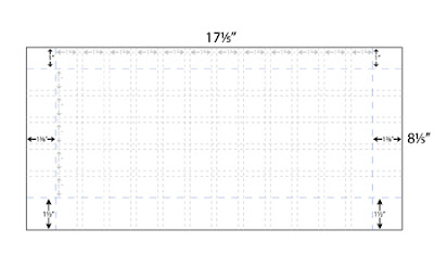
Click here to download the Template PDF
You will notice that I used 1” blue painters tape to mask the sides. Then I used 1/4” Crape Art Tape I bought at Office Max to mask off the gutters in between the squares. I found it easiest to mark off with a ruler on the edges your dimensions by putting a small tick mark on the edge. Once I had the measurements I then used the tick marks to know where to put my tape.

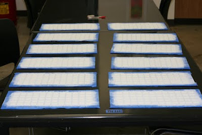


I have twelve boards. You may say… “Hey wait he has 13 colors?!” Your right, but I don’t think I’m going to do a chart specifically for the Ivory Black. Anyways If I change my mind it won’t be that hard to make one more.
If you are wondering what the white paint is for here is the “skinny”. The white paint is actually Acrylic Gesso. In college, in design school I learn an invaluable masking trick that is so easy but it make a HUGE difference.
SAID MASKING TRICK:
After you are finished masking what ever color is underneath the masking tape, paint that over the top of the tape and let in completely dry. Once that is dry THEN you paint your new color on top that you want to have straight lines. That way the places that the paint seeps under the tape and screws up your straight edge will be invisible because you painted the under-base color first, and that is the color that seeps under. The first coat fills all of the open spots. Then when your second new color dries on top, and you pull the tape off BAM! you have a super sweet straight line.
ANOTHER MASKING TIP:
When you are masking, make sure you put down the tape in one direction all at the same time. This makes pulling off the tape much much much more easy.
Tape your edge pieces LAST. I taped them first on the first board I did and realized that I had just covered up all the nice little tick marks that I put on the board.
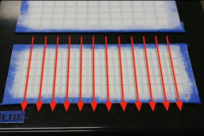
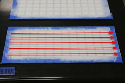
Besides actually doing the charts yourself, one of the most important things to try and do is make sure that the last row of squares are all the same value. To make sure of this “Squint” at the last row as you go and the color should disappear and they should appear all as one value.
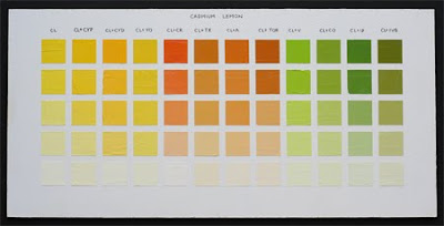
This is the same color chart but I turned it to gray scale to show show you nothing but the values of the colors. Notice how the last row almost merge together and are all the same value.

This chart is my full, straight out of the tube palette. Each color on my palette is represented in its pure form and with Titanium white added and stages.
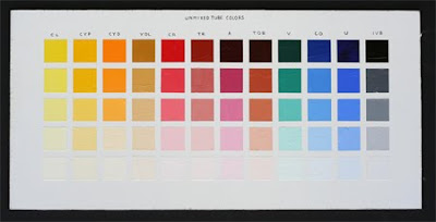
Click Here to see High Res
When you are painting the charts paint the top row first, then the last row. Third, paint the middle value, the middle one shouldn’t lean dark or light but be right in the middle. Lastly paint the to intermediate squares and your done. Take your time, enjoy the process.

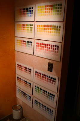
Here are my color charts on my wall right next to my easel for quick reference. I will take pictures of all my charts and upload them for you to see the high res versions.
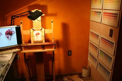
Notice my ugly orange walls! Note to self don't paint your studio anything but white or grey. All my photos that I take in my studio have a burnt orange haze. In the picture you can see a paint can, I'm jut to lazy to open it and repaint the studio.
--
Posted By Jackson Robinson to The Painting Experiment at 12/02/2009 04:23:00 AM
Here is an example of one of my color charts.

Click here to see the high res image
____________________________________________________
Resources:
First and foremost Richard Schmid’s book Alla Prima. I started Mr. Schmid’s book about a week ago and I am trying to dissect every aspect of it that I can. Within his book are detailed instructions to creating color charts. The specific oil colors that I am using are the same colors Mr. Schmid used in his book.
Here is a link to Mr. Schmid’s website where you can view many of his incredible paintings and also buy any of his books and videos.
http://www.richardschmid.com/
The second resource I am using is a website a fellow artist of mine (Jonathan Hardesty) directed me to when I asked him “where is a good place to find out how to make color charts.” He quickly responded Clayton J. Beck III. I went to his site and found it very helpful in supplying technical info of how to get it done and done neatly.
http://www.claytonbeck.com/
http://www.jonathanhardesty.com/
__________________________________________________ _________
First things first.
If you are going to do color charts you are going to need colors so here are the colors I am using.
Windsor & Newton Artist Oil Colours
Cadmium Lemon
Cadmium Yellow Pale
Cadmium Red
Yellow Ochre Light
Terra Rosa
Ivory Black
Rembrandt (Talens)
Cadmium Yellow Deep
Transparent Oxide Red
Viridian
Cobalt Blue Light
Ultramarine Deep
Gamblin
Alizarin Permanent
Lefranc
Titanium White
__________________________________________________ ___________
Materials Needed:
1/4” Masonite Board (Bought at any hardware mega mart)
I had the kind gentlemen at Lowes cut my masonite rectangles that measured 17.5” X 8.5” wide. Odd dimensions I know but I have 13 colors, so that equals 13 columns, and each column will have 5 rows. Each paint square is 1” square and each row has a 1/4” gap and a little over an inch (1 3/8” to be exact) of spacing along the edges. You want to give yourself enough room to handle the charts without touching the paint squares.
For those of you who may have more or less than 13 colors on your palette don’t worry. Here is a simple formula to figure out what dimensions to cut your masonite board.
(The following example is for someone who has 15 colors on their pallet)
Step 1: Take the number of colors you use on your pallet and write that number down.
Step 1 = 15”
Step 2: Take that number and subtract by two, and then multiply by .25.(This gives you how many spaces between each square going width wise using 1/4” as a spacing.)
Step 2 = 3 1/4” (3.25”)
Step 3: Decide how much space you want for a border. (I suggest at least 1” that way the charts will be easy to handle without touching the color squares.)
__________________________________________
For this example I will choose to have a 1” border width wise. Take 1” and multiply it by 2 for both left and rights sides of the chart.
Step 3 = 2”
Step 4: Now add all of your steps together and you will have your width.
Step 1 = 15”
Step 2 = 3 1/4”
Step 3 = 2”
Step 4 = 20 1/4” (20.25”)
Width 20 1/4”
Repeat the process for the hight.
Step 1: You will have a total of 5 rows at 1” a piece.
Step 1 = 5”
Step 2: Take 5 and subtract by 2 then multiply by .25.
Step 2 = 2/3” (.75”)
Step 3: Multiply your desired border by 2.
Step 3 = 2”
Step 1: Add your steps.
Step 1 = 5”
Step 2 = 2/3” (.75”)
Step 3 = 2”
Step 4 = 7 2/3” (7.75”)
Hight 7 2/3” (7.75”)
_____________________________________
Here is a picture of my chart and its measurements for all of you visual learners out there. You may also download it as a pdf if you like, look for the download link under the picture

Click here to download the Template PDF
You will notice that I used 1” blue painters tape to mask the sides. Then I used 1/4” Crape Art Tape I bought at Office Max to mask off the gutters in between the squares. I found it easiest to mark off with a ruler on the edges your dimensions by putting a small tick mark on the edge. Once I had the measurements I then used the tick marks to know where to put my tape.


I have twelve boards. You may say… “Hey wait he has 13 colors?!” Your right, but I don’t think I’m going to do a chart specifically for the Ivory Black. Anyways If I change my mind it won’t be that hard to make one more.
If you are wondering what the white paint is for here is the “skinny”. The white paint is actually Acrylic Gesso. In college, in design school I learn an invaluable masking trick that is so easy but it make a HUGE difference.
SAID MASKING TRICK:
After you are finished masking what ever color is underneath the masking tape, paint that over the top of the tape and let in completely dry. Once that is dry THEN you paint your new color on top that you want to have straight lines. That way the places that the paint seeps under the tape and screws up your straight edge will be invisible because you painted the under-base color first, and that is the color that seeps under. The first coat fills all of the open spots. Then when your second new color dries on top, and you pull the tape off BAM! you have a super sweet straight line.
ANOTHER MASKING TIP:
When you are masking, make sure you put down the tape in one direction all at the same time. This makes pulling off the tape much much much more easy.


Tape your edge pieces LAST. I taped them first on the first board I did and realized that I had just covered up all the nice little tick marks that I put on the board.
Besides actually doing the charts yourself, one of the most important things to try and do is make sure that the last row of squares are all the same value. To make sure of this “Squint” at the last row as you go and the color should disappear and they should appear all as one value.

This is the same color chart but I turned it to gray scale to show show you nothing but the values of the colors. Notice how the last row almost merge together and are all the same value.

This chart is my full, straight out of the tube palette. Each color on my palette is represented in its pure form and with Titanium white added and stages.

Click Here to see High Res
When you are painting the charts paint the top row first, then the last row. Third, paint the middle value, the middle one shouldn’t lean dark or light but be right in the middle. Lastly paint the to intermediate squares and your done. Take your time, enjoy the process.

Here are my color charts on my wall right next to my easel for quick reference. I will take pictures of all my charts and upload them for you to see the high res versions.


Notice my ugly orange walls! Note to self don't paint your studio anything but white or grey. All my photos that I take in my studio have a burnt orange haze. In the picture you can see a paint can, I'm jut to lazy to open it and repaint the studio.
--
Posted By Jackson Robinson to The Painting Experiment at 12/02/2009 04:23:00 AM
Reply all
Reply to author
Forward
0 new messages