Symbol variable update
169 views
Skip to first unread message

Mario Carneiro
Mar 6, 2016, 7:57:36 AM3/6/16
to metamath
I have finished a large-scale update of main set.mm to use symbol variables, with Norm's assistance. Here are the conventions I used:
+g: Primarily ".+". For 'second' additions (like in homomorphisms), use ".+^". For derived structures (like quotients or power structures) use ".+b". (Using ".+" is preferred over multiplicative notation even for noncommutative groups.)*r: Primary ".*", derived ".xb"
LSSum, GrpAct: Primary ".(+)", derived ".+b"
.i: Primary ".,"le: Primary ".<_"
lt: Primary ".<"
join, joinH: Primary ".\/"
meet: Primary "./\"
lt: Primary ".<"
join, joinH: Primary ".\/"
meet: Primary "./\"
oc, ocv, ocA, _|_P, LPol: Primary "._|_"
+f: Primary ".+^"
-g: Primary ".-"/r: Primary "./"
0. and 0g: Primary ".0."
1. and 1r: Primary ".1."
||r: Primary ".||"Er: Primary ".~"
* For vector spaces with vector and ring addition, vector addition is ".+" and ring addition is ".+^".
* When (.g or .s) and .r appear, .g/.s is ".x" and .r is ".X.".
* For symbols like .- which do not have a secondary, the secondary is left as a letter. Derived structures get the symbol, though, with the base operation as a letter.* When (.g or .s) and .r appear, .g/.s is ".x" and .r is ".X.".
* When .g and .s appear, .g is ".xb", .s is ".x." (and .r is ".X.").
Remarks:
* Two zeros were needed quite frequently, and hdmap14lem1 even has three. Perhaps a second zero symbol is needed? (Suggestion: .0b, bold zero)
* Some of the symbols are quite long, which makes them less convenient to read and write in the ascii version. In particular, I'd like to suggest using .|_ or .|. instead of ._|_ and .0 instead of .0. (I know David objected to the latter. My response is that (1) we don't need to worry about confusion with zero, because the whole point is for the variable to look like zero, (2) the ascii tokens are designed for authors, not readers, and they should already have learned that "10" and "1 0" are different things in MM, and (3) it is a few too many dots looking at ( .0. .x. .0. ) = .0. ). Also .x and .X in place of .x. and .X. should help with the latter.
* For theorems such as mplcoe3, the symbol M = ( .g ` ( mulGrp ` P ) ) is used for producing a power of a variable, so I used .^ for this purpose. However, the argument order is reversed from the "usual" for ^ , leading to expressions like ( n .^ X ). This can be fixed by using tpos. Is it worth it?
'
Just for fun, I made a graph of the new symbol variables and the most commonly used letters that were previously used to represent them, which you can see in the attachment.
Although in many cases the variable was adjacent to the letter, in other cases it was not, resulting in a change to downstream proofs (so update your mathboxes if you are likely to use material about abstract algebra or order theory). Cue discussion over my variable choices. Everything is potentially subject to reversion or different variable choices; it will be much easier the second time because the variables are more distinctive now (not as much reuse for different meanings).
Mario

David A. Wheeler
Mar 6, 2016, 9:04:52 AM3/6/16
to metamath, metamath
On Sun, 6 Mar 2016 07:57:35 -0500, Mario Carneiro <di....@gmail.com> wrote:
> I have finished a large-scale update of main set.mm to use symbol
> variables, with Norm's assistance. Here are the conventions I used...
> I have finished a large-scale update of main set.mm to use symbol
Overall looks good.
> and .0 instead of .0. (I know David
I still object to this one :-). Yes, obviously the *computer* can tell the
difference, but I think it's important that *new* authors can obviously tell the difference.
If you haven't already, I strongly recommend that you document this
somewhere other than this email. Perhaps viewable metamath comments
in set.mm. That way future readers can see the current conventions.
Thanks!
--- David A. Wheeler

Norman Megill
Mar 6, 2016, 11:58:51 AM3/6/16
to meta...@googlegroups.com
On 3/6/16 7:57 AM, Mario Carneiro wrote:
> I have finished a large-scale update of main set.mm <http://set.mm> to
> Here are the conventions I
> used:
>
> +g: Primarily ".+". For 'second' additions (like in homomorphisms), use
> ".+^". For derived structures (like quotients or power structures) use
> ".+b". (Using ".+" is preferred over multiplicative notation even for
> noncommutative groups.)
> .r, .s, .g: Primary ".x.", secondary ".X.", derived ".xb"
> *r: Primary ".*", derived ".xb"
> LSSum, GrpAct: Primary ".(+)", derived ".+b"
I don't recall ever seeing .(+) used for LSSum; it always seems to be a
plain overloaded + sign. I have seen (+) used only for direct sum - see
e.g. 'direct sum of modules' on Wikipedia. My intent was to reserve
.(+) for direct sum and use .+b for subspace sum.
If you can find a reference that uses (+) for subspace sum, I'll
withdraw this objection.
I added .0b to set.mm for future use.
> * Some of the symbols are quite long, which makes them less convenient
> to read and write in the ascii version. In particular, I'd like to
> suggest using .|_ or .|. instead of ._|_
I prefer ._|_ and think that "quite long" is mostly an optical illusion
due to the long underscores. In monospaced font it takes exactly the
space of .(+) and is instantly recognizable. It also conforms to our
informal rule, "existing symbol prefixed with .".
(BTW our use of a full-sized _|_ as a prefix function rather than a
superscript is not without precedent. See for example Mittelstaedt's
_Quantum Logic_ p. 9.)
> and .0 instead of .0. (I know
> David objected to the latter. My response is that (1) we don't need to
> worry about confusion with zero, because the whole point is for the
> variable to look like zero, (2) the ascii tokens are designed for
> authors, not readers, and they should already have learned that "10" and
> "1 0" are different things in MM, and (3) it is a few too many dots
> looking at ( .0. .x. .0. ) = .0. ).
I also prefer the .0 over .0. for these reasons. Also, it conforms to
the "prefix existing symbol with ." rule, which we can document
somewhere. I really doubt it will cause confusion because it never (or
hardly ever) will be used in the context of real numbers. The only
people seeing ".0" are set.mm developers who are used to seeing odd
ascii notations and who also know that there must be a space between the
. and the 0 if they were separate symbols. Of more concern is that the
rendered .0 on the web page not be confused with the real number 0,
which is why we have the different color and dotted underline.
> Also .x and .X in place of .x. and
> .X. should help with the latter.
Maybe. I thought of this too but have gone back and forth because it
now conforms to the . in front of an existing symbol rule. I'm leaning
in your direction though.
> * For theorems such as mplcoe3, the symbol M = ( .g ` ( mulGrp ` P ) )
> is used for producing a power of a variable, so I used .^ for this
> purpose. However, the argument order is reversed from the "usual" for ^
> , leading to expressions like ( n .^ X ). This can be fixed by using
> tpos. Is it worth it?
Adding unnecessary complexity is usually not a good thing. Maybe go
back to the M if it's too confusing? (I'm not very familiar with this
so my opinion may not be worth much.)
> Just for fun, I made a graph of the new symbol variables and the most
> commonly used letters that were previously used to represent them, which
> you can see in the attachment.
Neat!
Norm
> I have finished a large-scale update of main set.mm <http://set.mm> to
> use symbol variables, with Norm's assistance.
The us2 site will be updated with these sometime tonight.
> Here are the conventions I
> used:
>
> +g: Primarily ".+". For 'second' additions (like in homomorphisms), use
> ".+^". For derived structures (like quotients or power structures) use
> ".+b". (Using ".+" is preferred over multiplicative notation even for
> noncommutative groups.)
> .r, .s, .g: Primary ".x.", secondary ".X.", derived ".xb"
> *r: Primary ".*", derived ".xb"
> LSSum, GrpAct: Primary ".(+)", derived ".+b"
plain overloaded + sign. I have seen (+) used only for direct sum - see
e.g. 'direct sum of modules' on Wikipedia. My intent was to reserve
.(+) for direct sum and use .+b for subspace sum.
If you can find a reference that uses (+) for subspace sum, I'll
withdraw this objection.
> * Some of the symbols are quite long, which makes them less convenient
> to read and write in the ascii version. In particular, I'd like to
> suggest using .|_ or .|. instead of ._|_
due to the long underscores. In monospaced font it takes exactly the
space of .(+) and is instantly recognizable. It also conforms to our
informal rule, "existing symbol prefixed with .".
(BTW our use of a full-sized _|_ as a prefix function rather than a
superscript is not without precedent. See for example Mittelstaedt's
_Quantum Logic_ p. 9.)
> and .0 instead of .0. (I know
> David objected to the latter. My response is that (1) we don't need to
> worry about confusion with zero, because the whole point is for the
> variable to look like zero, (2) the ascii tokens are designed for
> authors, not readers, and they should already have learned that "10" and
> "1 0" are different things in MM, and (3) it is a few too many dots
> looking at ( .0. .x. .0. ) = .0. ).
the "prefix existing symbol with ." rule, which we can document
somewhere. I really doubt it will cause confusion because it never (or
hardly ever) will be used in the context of real numbers. The only
people seeing ".0" are set.mm developers who are used to seeing odd
ascii notations and who also know that there must be a space between the
. and the 0 if they were separate symbols. Of more concern is that the
rendered .0 on the web page not be confused with the real number 0,
which is why we have the different color and dotted underline.
> Also .x and .X in place of .x. and
> .X. should help with the latter.
now conforms to the . in front of an existing symbol rule. I'm leaning
in your direction though.
> * For theorems such as mplcoe3, the symbol M = ( .g ` ( mulGrp ` P ) )
> is used for producing a power of a variable, so I used .^ for this
> purpose. However, the argument order is reversed from the "usual" for ^
> , leading to expressions like ( n .^ X ). This can be fixed by using
> tpos. Is it worth it?
back to the M if it's too confusing? (I'm not very familiar with this
so my opinion may not be worth much.)
> Just for fun, I made a graph of the new symbol variables and the most
> commonly used letters that were previously used to represent them, which
> you can see in the attachment.
Norm

fl
Mar 6, 2016, 12:16:20 PM3/6/16
to Metamath
+g: Primarily ".+". For 'second' additions (like in homomorphisms), use ".+^".
For homomorphism I definitely suggest indices, It is easy to create using the gifs, and you can add as many of them as you want. It is also true for the zeroes. The apparence in the metamath site is good: the figure is
put in lower position.
--
FL
Mario Carneiro
Mar 7, 2016, 1:41:28 AM3/7/16
to metamath
On Sun, Mar 6, 2016 at 9:04 AM, David A. Wheeler <dwhe...@dwheeler.com> wrote:
> and .0 instead of .0. (I know David
> objected to the latter...
I still object to this one :-). Yes, obviously the *computer* can tell the
difference, but I think it's important that *new* authors can obviously tell the difference.
Keep in mind that there is actually *no way* to define .0 to work like a decimal, because metamath can't parse these characters separately (so even if you didn't know the actual definition, you would know that it can't be decimal). Also, it is really obvious what the meaning is given any theorem in the database, since there will be lots of context, including specifically a ".0 = ..." line right at the start of the theorem. Finally, 0. and 1. are already in use for posets, so there is precedent.
If you haven't already, I strongly recommend that you document this
somewhere other than this email. Perhaps viewable metamath comments
in set.mm. That way future readers can see the current conventions.
This is still not resolved; my recommendation is a section comment for the "Class abstractions (a.k.a. class builders)" section.
On Sun, Mar 6, 2016 at 11:58 AM, Norman Megill <n...@alum.mit.edu> wrote:
On 3/6/16 7:57 AM, Mario Carneiro wrote:
Here are the conventions I
used:
+g: Primarily ".+". For 'second' additions (like in homomorphisms), use
".+^". For derived structures (like quotients or power structures) use
".+b". (Using ".+" is preferred over multiplicative notation even for
noncommutative groups.)
.r, .s, .g: Primary ".x.", secondary ".X.", derived ".xb"
*r: Primary ".*", derived ".xb"
LSSum, GrpAct: Primary ".(+)", derived ".+b"
I don't recall ever seeing .(+) used for LSSum; it always seems to be a plain overloaded + sign. I have seen (+) used only for direct sum - see e.g. 'direct sum of modules' on Wikipedia. My intent was to reserve .(+) for direct sum and use .+b for subspace sum.
If you can find a reference that uses (+) for subspace sum, I'll withdraw this objection.
Here was my reasoning: At first I needed two or three plus-type variables for first and second additions, and derived additions (sometimes all three). These are all associated to the +g slot for different targets.
Later, we start using these three *and* also LSSum, so I needed four plus-sign variables. The reason I preferred .+b for derived additions and .(+) for LSSum is because .+b is more plus-like; I didn't want to use a symbol that suggested that derived addition was something other than an addition operation. With LSSum, it is actually a special, non-addition operation, in the sense that it is not mapped to the +g slot of any structure (certainly not any group). In fact, if/when the order theory stuff gets tied in tighter, this maps much closer to the .\/ operation (of the lattice of subspaces in a vector space).
After making the decision to use .(+) for LSSum, consistently, the convention simplifies, because nothing else really needs .(+) (except a small and quite unrelated section on group actions). It's more a problem of running out of plus-sign variables; some clashes will always happen and I'm just happy I never had to resort to using a letter variable (can't say the same about some other variables, though, like .- and .0 ).
I added .0b to set.mm for future use.
Great, I'll take another look later.
I prefer ._|_ and think that "quite long" is mostly an optical illusion due to the long underscores. In monospaced font it takes exactly the space of .(+) and is instantly recognizable. It also conforms to our informal rule, "existing symbol prefixed with .".
Actually, I was referring to the monospaced size. 4 characters is a big step up from one, especially when the variable is used six times in the theorem (ex: 2polcon4bN). But you are the major consumer of ._|_ theorems, so I'll bow to your opinion here.
(BTW our use of a full-sized _|_ as a prefix function rather than a superscript is not without precedent. See for example Mittelstaedt's _Quantum Logic_ p. 9.)
FYI, I notice that on the HTML, ._|_ shows with surrounding space. This should probably be removed, since we almost always use it for the orthocomplement operation, which is a unary operation using df-fv (so the space is pointless). There is a usage of "A _|_ B" as a relation in math, for example perpendicular lines in geometry or orthogonal vectors (and I could have sworn I read somewhere the use A _|_ B iff A /\ B = 0 in a bounded lattice), but none of these use cases appear in the current version of set.mm.
On Sun, Mar 6, 2016 at 12:16 PM, 'fl' via Metamath <meta...@googlegroups.com> wrote:
+g: Primarily ".+". For 'second' additions (like in homomorphisms), use ".+^".
For homomorphism I definitely suggest indices, It is easy to create using the gifs, and you can add as many of them as you want. It is also true for the zeroes. The apparence in the metamath site is good: the figure isput in lower position.
Regarding homomorphisms specifically, I don't think I have ever seen subscripts used for this purpose. Usually it is done with multiple "plus-like" or "times-like" symbols. For example, https://en.wikipedia.org/wiki/Group_homomorphism uses .x. and .* .
Any thoughts on the current non-use of .* as a multiplication? It is only ever used for involutions (conjugation-like things) right now, but the full-size asterisk is usually used in the literature for some kind of multiplication (like in the group homomorphism wiki page).
Mario
fl
Mar 7, 2016, 6:01:16 AM3/7/16
to Metamath
> I'm not discarding this idea, but I will say it is work for another day. Even before subscripted symbol vars I think
> subscripted letter variables will be helpful (and this will also be easier since we have already had them in a mathbox
> for a long time).
> subscripted letter variables will be helpful (and this will also be easier since we have already had them in a mathbox
> for a long time).
OK we will wait. We are accustomed that everything takes years.
--
FL
Message has been deleted
Message has been deleted
fl
Mar 7, 2016, 6:38:59 AM3/7/16
to Metamath
P.S.
The new <"..."> globally looks nice. It is particularly visible on your Konigsberg Bridges theorem.
http://us2.metamath.org:88/mpegif/konigsberg.html
Some adjustments is needed maybe: a simple "..." will look better in html form. `concat' is too long.
Some space between the elements of the list is required.
--
FL
Norman Megill
Mar 7, 2016, 12:22:57 PM3/7/16
to meta...@googlegroups.com
The converted set.mm is on us2 now.
I'm still not thrilled with the dotted underline as the disambiguating
decoration. For example look at
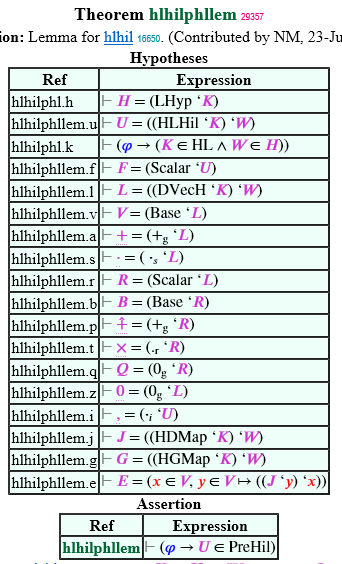
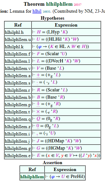
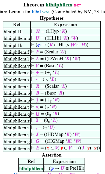
http://us2.metamath.org:88/mpeuni/hlhilphllem.html - at first glance the
underlined + sign almost looks like a +/- sign. Overall it just seems a
little distracting for pleasant readability.
We have done many experiments and dotted underline was the one that I
(and I think Mario) disliked the least, but we can always change our
minds if someone has a better suggestion. It is just a matter of
editing the css in the set.mm $t comment if anyone wants to experiment.
I set up mmsetalt.css to turn off the underline on Unicode pages for
comparison. Select View -> [Page] Style -> mmsetalt in Firefox and IE.
The hlhilphllem page also has center dot ".x." and comma ".,". In FF
Unicode these are small and faint and hard to distinguish, whereas in IE
they are rendered more solidly and are easily visible. It seems a font
doesn't completely define how it's displayed, but I don't understand why.
BTW in FF these symbols start to look very nice when the page is zoomed,
but that's now how most viewers will see it. (I miss the old font
design practice of reverting to carefully designed bitmaps when the size
gets too small.)
In any case, I think we need to improve the ".x." and ".,". Maybe it's
just a matter of making the font size larger for them but I'm open to
suggestions.
By the way, Mario, my original intent was to use .+^ as vector sum and
.+ as scalar sum, not the reverse. The .+^ has a little hat over it
that's intended to suggest "vector" and is sometimes used on unit
vectors i, j, k in elementary books. An arrow over the plus would have
been my first choice but I didn't find it in the Unicode charts.
Norm
I'm still not thrilled with the dotted underline as the disambiguating
decoration. For example look at
http://us2.metamath.org:88/mpeuni/hlhilphllem.html - at first glance the
underlined + sign almost looks like a +/- sign. Overall it just seems a
little distracting for pleasant readability.
We have done many experiments and dotted underline was the one that I
(and I think Mario) disliked the least, but we can always change our
minds if someone has a better suggestion. It is just a matter of
editing the css in the set.mm $t comment if anyone wants to experiment.
I set up mmsetalt.css to turn off the underline on Unicode pages for
comparison. Select View -> [Page] Style -> mmsetalt in Firefox and IE.
The hlhilphllem page also has center dot ".x." and comma ".,". In FF
Unicode these are small and faint and hard to distinguish, whereas in IE
they are rendered more solidly and are easily visible. It seems a font
doesn't completely define how it's displayed, but I don't understand why.
BTW in FF these symbols start to look very nice when the page is zoomed,
but that's now how most viewers will see it. (I miss the old font
design practice of reverting to carefully designed bitmaps when the size
gets too small.)
In any case, I think we need to improve the ".x." and ".,". Maybe it's
just a matter of making the font size larger for them but I'm open to
suggestions.
By the way, Mario, my original intent was to use .+^ as vector sum and
.+ as scalar sum, not the reverse. The .+^ has a little hat over it
that's intended to suggest "vector" and is sometimes used on unit
vectors i, j, k in elementary books. An arrow over the plus would have
been my first choice but I didn't find it in the Unicode charts.
Norm
fl
Mar 7, 2016, 2:09:45 PM3/7/16
to Metamath
A symbol that is missing is a circle. It can be used for concatenation, category
theory morphisms compositions and maybe similar operations.
--
FL
Norman Megill
Mar 7, 2016, 7:34:09 PM3/7/16
to meta...@googlegroups.com
On 3/7/16 6:38 AM, 'fl' via Metamath wrote:
>
> P.S.
>
> The new <"..."> globally looks nice. It is particularly visible on your
> Konigsberg Bridges theorem.
>
> http://us2.metamath.org:88/mpegif/konigsberg.html
>
...
>
> P.S.
>
> The new <"..."> globally looks nice. It is particularly visible on your
> Konigsberg Bridges theorem.
>
> http://us2.metamath.org:88/mpegif/konigsberg.html
>
> Some space between the elements of the list is required.
I will fix this.
In most cases where symbols are too close, we would add a space before
and/or after the symbol in the htmldef, but for bracketing symbols we
want to keep normal spacing as small as possible without the symbols
touching. Otherwise things like deep nested parentheses would waste a
lot of space on the line.
For special cases like the "}{" here where the middle of the braces are
too close, there is a hack in metamath.exe (mmwtex.c line 4901) that
recognizes special combinations like this and adds a space independently
of the htmldef for better appearance, that I fine tune over time. I'll
add this case in the next metamath.exe.
Norm
Mario Carneiro
Mar 7, 2016, 11:13:18 PM3/7/16
to metamath
On Mon, Mar 7, 2016 at 12:22 PM, Norman Megill <n...@alum.mit.edu> wrote:
The converted set.mm is on us2 now.
I'm still not thrilled with the dotted underline as the disambiguating decoration. For example look at http://us2.metamath.org:88/mpeuni/hlhilphllem.html - at first glance the underlined + sign almost looks like a +/- sign. Overall it just seems a little distracting for pleasant readability.
We have done many experiments and dotted underline was the one that I (and I think Mario) disliked the least, but we can always change our minds if someone has a better suggestion. It is just a matter of editing the css in the set.mm $t comment if anyone wants to experiment.
I set up mmsetalt.css to turn off the underline on Unicode pages for comparison. Select View -> [Page] Style -> mmsetalt in Firefox and IE.
I still think that no mark is the cleanest approach. How about using no mark by default and dotted underline in mmsetalt.css? That way you can still get the underline if you are printing monochrome etc., but it won't affect normal reading. (Also, I don't know any brand of color blindness that can't distinguish purple from black.)
The hlhilphllem page also has center dot ".x." and comma ".,". In FF Unicode these are small and faint and hard to distinguish, whereas in IE they are rendered more solidly and are easily visible. It seems a font doesn't completely define how it's displayed, but I don't understand why.
They don't seem too significantly different on my machine (screenshots attached)... Do you have ClearType or other antialiasing enabled in Windows? I strongly recommend turning it on for good Unicode display.
I tried looking at the statement of hlhilphllem in FF 44, IE 11, and Edge 25 (Microsoft's new browser, which will eventually replace IE). There was almost no difference between Edge and IE. The most obvious differences with FF were a flat rather than "3d" style table border and horizontal line, shorter table rows, and slightly darker edge pixels in antialiasing, leading to a slightly heavier font appearance. IMO FF's font output looks better, and my guess is they are sticking closer to the true shape while IE/Edge are bumping up the weight of the text at small sizes to increase readability.
By the way, Mario, my original intent was to use .+^ as vector sum and .+ as scalar sum, not the reverse. The .+^ has a little hat over it that's intended to suggest "vector" and is sometimes used on unit vectors i, j, k in elementary books. An arrow over the plus would have been my first choice but I didn't find it in the Unicode charts.
This goes back to the change for LMod to have the +g slot correspond to the vector addition, instead of the original approach of having it grow out of the ring addition with a whole new set of slots "vadd" etc. for the vector operations. With the new approach, the "primary" addition is the vector operation, and the ring addition is secondary. The way I have applied it, there is nothing special about the hat; it is only being used as a marker for "addition other than +". But I don't have an especially good alternate suggestion. Perhaps a prime on the plus (.+')?
On Mon, Mar 7, 2016 at 2:09 PM, 'fl' via Metamath <meta...@googlegroups.com> wrote:
A symbol that is missing is a circle. It can be used for concatenation, categorytheory morphisms compositions and maybe similar operations.
I like this. It might be a good choice for non-abelian group operations, since it is not particularly associated with either addition or multiplication (probably a bit more for multiplication), and does not suffer from the common convention that "+ is commutative". It is especially good for group operations that are being represented by composition, like addition in SymGrp (symgov) and TGrp (tgrpov).
On Mon, Mar 7, 2016 at 7:34 PM, Norman Megill <n...@alum.mit.edu> wrote:
For special cases like the "}{" here where the middle of the braces are too close, there is a hack in metamath.exe (mmwtex.c line 4901) that recognizes special combinations like this and adds a space independently of the htmldef for better appearance, that I fine tune over time. I'll add this case in the next metamath.exe.
Interesting, I didn't know you could do this. How about a $t command like:
kerning "}{" as " ";
kerning "}{" as " ";
to allow for specifying these in the typesetting? (Other possibilities for the right side include thin spaces or multiple spaces, specified with HTML entities.)
Mario
Mario Carneiro
Mar 7, 2016, 11:30:59 PM3/7/16
to metamath
On Mon, Mar 7, 2016 at 11:13 PM, Mario Carneiro <di....@gmail.com> wrote:
The hlhilphllem page also has center dot ".x." and comma ".,". In FF Unicode these are small and faint and hard to distinguish, whereas in IE they are rendered more solidly and are easily visible. It seems a font doesn't completely define how it's displayed, but I don't understand why.They don't seem too significantly different on my machine (screenshots attached)...
Screenshots actually attached this time.
On Mon, Mar 7, 2016 at 7:34 PM, Norman Megill <n...@alum.mit.edu> wrote:For special cases like the "}{" here where the middle of the braces are too close, there is a hack in metamath.exe (mmwtex.c line 4901) that recognizes special combinations like this and adds a space independently of the htmldef for better appearance, that I fine tune over time. I'll add this case in the next metamath.exe.Interesting, I didn't know you could do this. How about a $t command like:
kerning "}{" as " ";to allow for specifying these in the typesetting? (Other possibilities for the right side include thin spaces or multiple spaces, specified with HTML entities.)
Actually, if "}{" is a sequence of tokens rather than characters, it should probably be:
kerning "} {" as " ";
kerning "} {" as " ";
Also, this command could also remove any trailing whitespace from the HTML for "}" and leading whitespace for "{" before applying the kerning space. That way it could also be used to remove unwanted space under certain conditions. This would allow for nicer handling of the ._|_ spacing issue mentioned earlier; if ._|_ had space around it by default but we had
kerning "( ._|_" as "";
kerning "._|_ `" as "";
then the ._|_ variable would not get space around it if it was being used as a function, but would have space if it was being used as a relation.
Mario
Norman Megill
Mar 8, 2016, 1:08:27 AM3/8/16
to meta...@googlegroups.com
On 3/7/16 11:13 PM, Mario Carneiro wrote:
>
>
> On Mon, Mar 7, 2016 at 12:22 PM, Norman Megill <n...@alum.mit.edu
> <mailto:n...@alum.mit.edu>> wrote:
>
>
> On Mon, Mar 7, 2016 at 12:22 PM, Norman Megill <n...@alum.mit.edu
>
> The converted set.mm <http://set.mm> is on us2 now.
>
> I'm still not thrilled with the dotted underline as the
> disambiguating decoration. For example look at
> http://us2.metamath.org:88/mpeuni/hlhilphllem.html - at first glance
> the underlined + sign almost looks like a +/- sign. Overall it just
> seems a little distracting for pleasant readability.
>
> We have done many experiments and dotted underline was the one that
> I (and I think Mario) disliked the least, but we can always change
> our minds if someone has a better suggestion. It is just a matter
> of editing the css in the set.mm <http://set.mm> $t comment if
> I'm still not thrilled with the dotted underline as the
> disambiguating decoration. For example look at
> http://us2.metamath.org:88/mpeuni/hlhilphllem.html - at first glance
> the underlined + sign almost looks like a +/- sign. Overall it just
> seems a little distracting for pleasant readability.
>
> We have done many experiments and dotted underline was the one that
> I (and I think Mario) disliked the least, but we can always change
> our minds if someone has a better suggestion. It is just a matter
> anyone wants to experiment.
>
> I set up mmsetalt.css to turn off the underline on Unicode pages for
> comparison. Select View -> [Page] Style -> mmsetalt in Firefox and IE.
>
>
> I still think that no mark is the cleanest approach. How about using no
> mark by default and dotted underline in mmsetalt.css? That way you can
> still get the underline if you are printing monochrome etc., but it
> won't affect normal reading. (Also, I don't know any brand of color
> blindness that can't distinguish purple from black.)
I'm OK with this but will wait for other comments.
>
> I set up mmsetalt.css to turn off the underline on Unicode pages for
> comparison. Select View -> [Page] Style -> mmsetalt in Firefox and IE.
>
>
> I still think that no mark is the cleanest approach. How about using no
> mark by default and dotted underline in mmsetalt.css? That way you can
> still get the underline if you are printing monochrome etc., but it
> won't affect normal reading. (Also, I don't know any brand of color
> blindness that can't distinguish purple from black.)
>
> The hlhilphllem page also has center dot ".x." and comma ".,". In
> FF Unicode these are small and faint and hard to distinguish,
> whereas in IE they are rendered more solidly and are easily
> visible. It seems a font doesn't completely define how it's
> displayed, but I don't understand why.
>
>
> They don't seem too significantly different on my machine (screenshots
> attached)... Do you have ClearType or other antialiasing enabled in
> Windows? I strongly recommend turning it on for good Unicode display.
antialiasing/ClearType but have never been able to get used to it,
because my eyes keep trying to focus the blurry letters subconsciously
and tire more quickly. (For PDFs, I usually zoom to a higher
magnification.) I don't use IE specifically because it forces
antialiasing whether you want it or not.
But if other people are happy with antialiasing, then the problem is solved.
more complex situations in there involving quantification where space or
no space depends on the kind of symbol, e.g. space between the two x's
in A. x x = y, meaning a command to specify that would require
conditionals or pattern matching to symbol categories. It's just much
simpler for me to hard-code the handful of cases directly in the code.
But overall this changes very rarely. The last update to that code was
in 2006. It is merely a minor but strictly speaking unnecessary
cosmetic tweak, and I think the number of such cases is too limited to
justify introducing, explaining, and coding a new syntax. Essentially
all cases other than the special case of bracketing symbols can be
handled with spaces around the htmldef. And unlike GIFs, Unicode is a
real font with more intelligent kerning and spacing that usually doesn't
need such treatment; e.g. compare the Unicode version of konigsberg
which seems fine as-is.
My goal isn't to produce professional typesetting but just to provide
something that is reasonably pleasant to read and is "good enough".
I'll let someone else's future web generation tool take it to the next
level if that's important to them.
Norm
Mario Carneiro
Mar 8, 2016, 1:47:08 AM3/8/16
to metamath
On Tue, Mar 8, 2016 at 1:08 AM, Norman Megill <n...@alum.mit.edu> wrote:
Because I'm lazy and a crude hack is easier. :) Also, there are also more complex situations in there involving quantification where space or no space depends on the kind of symbol, e.g. space between the two x's in A. x x = y, meaning a command to specify that would require conditionals or pattern matching to symbol categories. It's just much simpler for me to hard-code the handful of cases directly in the code.
I hate to say it, but this is actually an indicator that you're doing it wrong. The way you are doing it now makes sense for general metamath systems with no grammar, but for grammatical formal systems it is way better to use the parse to drive the presentation. For example, you could define a function HTML_for(expression) over syntax trees such that HTML_for(wal[x, ph]) is "∀" + HTML_for(x) + ", " + HTML_for(ph). A model like this allows you to insert extra characters where it would not be possible in the token-string representation without changing the ASCII token string to include extra garbage tokens like "A. x , ph".
A representation like this would allow for a much freer syntax, such as writing seq M ( F , .+ ) as "seq<sub>[M]</sub>([F], [.+])" (where the bracketed parts are the respective subtree HTML).
It is even possible to support a system like this incrementally over the present system, by defaulting to the sequence of constant HTML strings for syntax axioms that have not been assigned a custom presentation.
Anyway, that's probably work for another day, although I should stress that this is how everyone else does it (grammar-less systems appear to be out of vogue), and is "the way of the future" as far as I am concerned (far though that future may be).
Mario
David A. Wheeler
Mar 8, 2016, 6:58:33 AM3/8/16
to meta...@googlegroups.com, Norman Megill
> I still think that no mark is the cleanest approach
I think it's important that different symbols have SOME visual difference when displayed in HTML. The dots are okay!--- David A.Wheeler
Norman Megill
Mar 8, 2016, 8:54:30 AM3/8/16
to meta...@googlegroups.com
On 3/8/16 1:47 AM, Mario Carneiro wrote:
>
>
> On Tue, Mar 8, 2016 at 1:08 AM, Norman Megill <n...@alum.mit.edu
> <mailto:n...@alum.mit.edu>> wrote:
>
> Because I'm lazy and a crude hack is easier. :) Also, there are
> also more complex situations in there involving quantification where
> space or no space depends on the kind of symbol, e.g. space between
> the two x's in A. x x = y, meaning a command to specify that would
> require conditionals or pattern matching to symbol categories. It's
> just much simpler for me to hard-code the handful of cases directly
> in the code.
>
>
> I hate to say it, but this is actually an indicator that you're doing it
> wrong. The way you are doing it now makes sense for general metamath
> systems with no grammar, but for grammatical formal systems it is way
> better to use the parse to drive the presentation. For example, you
> could define a function HTML_for(expression) over syntax trees such that
> HTML_for(wal[x, ph]) is "∀" + HTML_for(x) + ", " + HTML_for(ph).
> A model like this allows you to insert extra characters where it would
> not be possible in the token-string representation without changing the
> ASCII token string to include extra garbage tokens like "A. x , ph".
It was never my intent to use this outside of a few special cases that
>
>
> On Tue, Mar 8, 2016 at 1:08 AM, Norman Megill <n...@alum.mit.edu
> <mailto:n...@alum.mit.edu>> wrote:
>
> Because I'm lazy and a crude hack is easier. :) Also, there are
> also more complex situations in there involving quantification where
> space or no space depends on the kind of symbol, e.g. space between
> the two x's in A. x x = y, meaning a command to specify that would
> require conditionals or pattern matching to symbol categories. It's
> just much simpler for me to hard-code the handful of cases directly
> in the code.
>
>
> I hate to say it, but this is actually an indicator that you're doing it
> wrong. The way you are doing it now makes sense for general metamath
> systems with no grammar, but for grammatical formal systems it is way
> better to use the parse to drive the presentation. For example, you
> could define a function HTML_for(expression) over syntax trees such that
> HTML_for(wal[x, ph]) is "∀" + HTML_for(x) + ", " + HTML_for(ph).
> A model like this allows you to insert extra characters where it would
> not be possible in the token-string representation without changing the
> ASCII token string to include extra garbage tokens like "A. x , ph".
just didn't look right to me. It is not a "grammatical" rule, it is a
visual judgment call. I'm happy with, and prefer, no additional space
after the x in A. x ph (which a grammatical approach would insert) and
no one has complained. I probably shouldn't have even brought this up
but just left it hidden the code. :)
These special cases were trivial to address with a few lines of code
(that BTW can be removed without side effects). They were in response
to my own personal aesthetic, for better or worse, and not to any
comment from anyone else. I have no plans to add cases outside of
rarities like "}{", which affects only the GIF version anyway and is the
first new case in 10 years.
As I mentioned, essentially all other problematic cases of spacing can
be addressed with spaces around the htmldef, which is currently the
preferred approach.
>
> A representation like this would allow for a much freer syntax, such as
> writing seq M ( F , .+ ) as "seq<sub>[M]</sub>([F], [.+])" (where the
> bracketed parts are the respective subtree HTML).
>
> It is even possible to support a system like this incrementally over the
> present system, by defaulting to the sequence of constant HTML strings
> for syntax axioms that have not been assigned a custom presentation.
>
> Anyway, that's probably work for another day, although I should stress
> that this is how everyone else does it (grammar-less systems appear to
> be out of vogue), and is "the way of the future" as far as I am
> concerned (far though that future may be).
code. A grammatical approach would still require special cases to look
optimal to a human. Typesetting of equations for best appearance is an
art as well a science, as LaTeX experience shows.
Norm
fl
Mar 8, 2016, 11:27:12 AM3/8/16
to Metamath
All this is fine in principle but would require a massive rewrite of the
code.
Something that you might consider is using parallelism for the html pages generation.
It takes so long and the process only uses one core. I don't know if it is feasible or not
beneficial or not. But in a few words, you collect all the dependencies between the two next
pages and then you delegate to each core the generation of each of them.
--
FL
Norman Megill
Mar 8, 2016, 12:57:51 PM3/8/16
to meta...@googlegroups.com
be straightforward to achieve on your own. First remove 'show statement
*/html' in the main script so it runs relatively fast. After the main
script is complete (with all necessary directories created etc.), create
new scripts (or just type the commands by hand), each working on part of
set.mm. E.g.,
Script 1: (start the scripts in the "metamathsite" directory)
#!/bin/sh
cd mpegif
../metamath/metamath "read '../metamath/set.mm'" \
"show statement dummylink~ovolicc2lem4/html" \
"exit"
Script 2:
#!/bin/sh
cd mpegif
../metamath/metamath "read '../metamath/set.mm'" \
"show statement ovolicc2lem5~hlathil/html" \
"exit"
will each do 1/2 of set.mm which you run on separate cores. The above
of course is for the mpegif pages (the slower ones to generate) but you
can also do the mpeuni pages this way.
If you want to regenerate existing web pages, you can add /no_versioning
e.g. "show statement dummylink~ovolicc2lem4/html/no_versioning" to save
disk space and speed things up a little by not creating the ~1, ~2, etc.
backup versions.
The ql, nf, hol, iset pages should all be relatively fast and this
should be unnecessary; just keep them as-is in the main script.
I'll put a note in the install.sh script but don't plan to provide
multiple scripts for this purpose.
(BTW this won't help the us2 site generation time because the us2 server
has only 1 core. It is an old refurbished IBM that I bought for $80 at
Microcenter.)
Norm

Dan Connolly
Mar 8, 2016, 6:28:40 PM3/8/16
to Metamath
You have the patience of a saint. I hope you find this stuff rewarding at least part of the time.
--
Dan Connolly
http://www.madmode.com
Mario Carneiro
Mar 8, 2016, 6:37:55 PM3/8/16
to metamath
On Tue, Mar 8, 2016 at 6:21 PM, Dan Connolly <dc...@madmode.com> wrote:
You have the patience of a saint. I hope you find this stuff rewarding at least part of the time.
Who are you addressing? For my part, I quite enjoy working on Metamath, even when it is tedious work, because measurable progress is never difficult to attain, you can set your own goals, and it's always great being known as the first guy to prove a theorem formally (or at least, the first to prove a theorem in Metamath). It's also responsible for launching my graduate career, which is no small feat.
So yes, I find Metamath to be a very rewarding hobby, and if I didn't I wouldn't blow all my free time on it. I can't speak for others' motivations, but that's my take on it.
Mario
David A. Wheeler
Mar 8, 2016, 8:00:47 PM3/8/16
to meta...@googlegroups.com
On March 7, 2016 6:38:58 AM EST, 'fl' via Metamath <meta...@googlegroups.com> wrote:
>
>P.S.
>
>The new <"..."> globally looks nice. It is particularly visible on your
>
>Konigsberg Bridges theorem.
>
>http://us2.metamath.org:88/mpegif/konigsberg.html
That really is a cool proof, and the <"..."> notation is very nice.
>
>P.S.
>
>The new <"..."> globally looks nice. It is particularly visible on your
>
>Konigsberg Bridges theorem.
>
>http://us2.metamath.org:88/mpegif/konigsberg.html
I realize it is a style issue, but I prefer to see proofs of constant statements like these as separate theorems:
¬ 2 ∥ 3 and ¬ 3 ∈ {0, 1}
If they were separate theorems they would be much easier to reuse. I also think it would improve readability - most humans will think that statement is obvious and would not further proof within the longer proof.
But please don't let that style comment distract from the very nice proof here, with some nice supporting notation.
--- David A.Wheeler
fl
Mar 9, 2016, 7:53:52 AM3/9/16
to Metamath
There is no dependency during web page generation. What you want should
be straightforward to achieve on your own.
OK it works. Every core is at 100%. Hope it will speed up the full generation.
--
FL
Norman Megill
Mar 9, 2016, 8:18:00 PM3/9/16
to meta...@googlegroups.com
On 3/8/16 6:21 PM, Dan Connolly wrote:
> You have the patience of a saint. I hope you find this stuff rewarding
> at least part of the time.
Hi Dan,
> You have the patience of a saint. I hope you find this stuff rewarding
> at least part of the time.
I appreciate your support, but there is nothing to be concerned about.
I enjoy Metamath all of the time and never find it boring. It is
probably the software project I have enjoyed the most in my life.
While I'm not sure specifically what you think I'm being patient about,
I often solicit comments on new features because I want them to be as
useful as possible. Naturally people will have different opinions.
This can lead to discussions that may appear argumentative, but this is
expected and is often fruitful.
As for answering questions, it is always satisfying to be able to help
people.
As for Metamath itself, I strongly believe that some day, in some form,
a Metamath-like language will be seen as the right approach to
formalizing math in the most faithful and transparent way, while keeping
the underlying formalism so simple a child could in principle follow it.
As its originator, I'm the first to acknowledge that the Metamath
language has some imperfections, but it is certainly good enough to
serve as a reliable, permanent container for formal proofs that people
create. If a successor to the Metamath language becomes popular, the
proofs will simply be translated to the new container.
Indeed, by far the most important part of the Metamath project is not
the language but the proofs people have contributed. While it is
interesting to speculate how Metamath might evolve in 100 years with
advances in computer technology, proofs that I formalize now will, in
some form, live on forever as a foundation that will be built upon and
always have my name associated with it. They are permanent. This
contrasts to almost everything else in the software world, which with
few exceptions become obsolete and forgotten in a decade or two, like
almost every program I wrote (for my job) in say the 1990s.
A key feature of the Metamath language and databases is the underlying
conceptual simplicity, which I try hard to preserve. The original
author of the mmj2 proof assistant, Mel O'Cat, once said, "What is most
appealing to me is that a Metamath database user-language is self
defining. One could envision encoding a .mm file such as set.mm and
beaming it to an alien race without accompanying documentation."
Finally, a very satisfying aspect of creating a Metamath proof is that
once it passes verification, you are done; it will have no bugs. This
is very unlike almost any computer program, where you never know if
you've covered all possible edge cases in testing. No one is ever going
to bother you in the middle of the night because a proof crashed. :)
Norm
fl
Mar 10, 2016, 8:23:36 AM3/10/16
to Metamath
No one is ever going to bother you in the middle of the night because a proof crashed. :)
:-)
I submit another aphorism of Norm to the readers: "Nobody knows if arithmetic is consistent,
but if it is not it will be a surprise."
--
FL
Norman Megill
Apr 6, 2016, 9:03:35 AM4/6/16
to meta...@googlegroups.com
On 3/8/16 8:00 PM, David A. Wheeler wrote:
> On March 7, 2016 6:38:58 AM EST, 'fl' via Metamath
> <meta...@googlegroups.com> wrote:
>>
>> P.S.
>>
>> The new <"..."> globally looks nice. It is particularly visible on
>> your
>>
>> Konigsberg Bridges theorem.
>>
>> http://us2.metamath.org:88/mpegif/konigsberg.html
>
> That really is a cool proof, and the <"..."> notation is very nice.
>
> I realize it is a style issue, but I prefer to see proofs of constant
> statements like these as separate theorems: ¬ 2 ∥ 3 and ¬ 3 ∈ {0, 1}
> If they were separate theorems they would be much easier to reuse. I
> also think it would improve readability - most humans will think that
> statement is obvious and would not further proof within the longer
> proof.
This piece of the proof has been shortened using your theorem AneBC that
> On March 7, 2016 6:38:58 AM EST, 'fl' via Metamath
> <meta...@googlegroups.com> wrote:
>>
>> P.S.
>>
>> The new <"..."> globally looks nice. It is particularly visible on
>> your
>>
>> Konigsberg Bridges theorem.
>>
>> http://us2.metamath.org:88/mpegif/konigsberg.html
>
> That really is a cool proof, and the <"..."> notation is very nice.
>
> I realize it is a style issue, but I prefer to see proofs of constant
> statements like these as separate theorems: ¬ 2 ∥ 3 and ¬ 3 ∈ {0, 1}
> If they were separate theorems they would be much easier to reuse. I
> also think it would improve readability - most humans will think that
> statement is obvious and would not further proof within the longer
> proof.
I exported from your mathbox and renamed to nelpri (n=not + el=element
of + pr=unordered pair + i=inference version). Compare the new one
above to the original below:
http://us2.metamath.org:88/mpegif/konigsbergOLD.html
Norm
David A. Wheeler
Apr 6, 2016, 2:50:16 PM4/6/16
to metamath
David A. Wheeler wrote:
> > I realize it is a style issue, but I prefer to see proofs of constant
> > statements like these as separate theorems: ¬ 2 ∥ 3 and ¬ 3 ∈ {0, 1}
> > I realize it is a style issue, but I prefer to see proofs of constant
> > statements like these as separate theorems: ¬ 2 ∥ 3 and ¬ 3 ∈ {0, 1}
On Wed, 06 Apr 2016 09:03:05 -0400, Norman Megill <n...@alum.mit.edu> wrote:
> This piece of the proof has been shortened using your theorem AneBC that
> I exported from your mathbox and renamed to nelpri (n=not + el=element
> of + pr=unordered pair + i=inference version).
Thanks so much! Glad to help, and glad you found "nelpri" useful.
> This piece of the proof has been shortened using your theorem AneBC that
> I exported from your mathbox and renamed to nelpri (n=not + el=element
> of + pr=unordered pair + i=inference version).
I still think that simple facts like ¬ 2 ∥ 3 are useful as separate theorems, since:
1. it's unlikely most readers will *want* to see that particular proof ("it's obvious"), and
2. it's easier to reuse them that way.
Even so, I do think this proof is nice:
http://us2.metamath.org:88/mpegif/konigsberg.html
The <" ... "> is a real improvement.
--- David A. Wheeler
Mario Carneiro
Apr 6, 2016, 3:24:30 PM4/6/16
to metamath
On Wed, Apr 6, 2016 at 2:50 PM, David A. Wheeler <dwhe...@dwheeler.com> wrote:
I still think that simple facts like ¬ 2 ∥ 3 are useful as separate theorems, since:
1. it's unlikely most readers will *want* to see that particular proof ("it's obvious"), and
2. it's easier to reuse them that way.
For (1), there are better, more principled approaches to resolving the problem, specifically, hiding proof subtrees subject to some criterion (of course, the criterion itself is hotly debated). For (2), we already have a "standing order" to separate out subproofs that are reused enough to make them worthwhile to isolate, and future tools could help with identifying these as well.
Mario
Reply all
Reply to author
Forward
0 new messages