Plotting latency/jitter data

Michael Mattoss

Wojciech Kudla
For up to 20 mio data points R + ggplot2 does the trick for me. If you're after extracting a more general profile over time series than point plot + alpha turns out to be useful.
Beyond 20 mio datapoints ggplot2 takes too long to render for my liking.
I know some people use matlab, but that's commercial software.
--
You received this message because you are subscribed to the Google Groups "mechanical-sympathy" group.
To unsubscribe from this group and stop receiving emails from it, send an email to mechanical-symp...@googlegroups.com.
For more options, visit https://groups.google.com/d/optout.

Anton Lebedevich
As an example there are about 120k black points on this graph http://mabrek.github.io/anomaly-detection-devops2013/graph/two-weeks.png (2 weeks of data with 10s resolution) and it's still too dense to understand what's really going on. It might be better to split data into short intervals (like 1 second) and then calculate min/median/percentilles for each interval and get something like this http://mabrek.github.io/img/multivariate/latencies.png
http://mabrek.github.io/

Ross Bencina
10M doesn't sound like too many. I've certainly plotted large data sets
with it.
Ross.

Alex Bagehot
Wojciech Kudla
> There are not enough pixels on a screen to draw 10m points so they'll overlap.
Correct. That's when alpha becomes really handy. You will loose the visibility of the outliers though, unless alpha is a function of absolute value.
>
> Regards,
>
> Anton Lebedevich
> http://mabrek.github.io/
>
> On Mon, Aug 31, 2015 at 8:01 PM, Wojciech Kudla <wojciec...@gmail.com> wrote:
>>
>> For up to 20 mio data points R + ggplot2 does the trick for me. If you're after extracting a more general profile over time series than point plot + alpha turns out to be useful.
>> Beyond 20 mio datapoints ggplot2 takes too long to render for my liking.
>> I know some people use matlab, but that's commercial software.
>>
>> On Mon, 31 Aug 2015 17:50 Michael Mattoss <michael...@gmail.com> wrote:
>>>
>>> Hi,
>>>
>>> I would like to collect latency data from our system in the form of <timestamp, latency value> and later create a chart for further analysis.
>>>
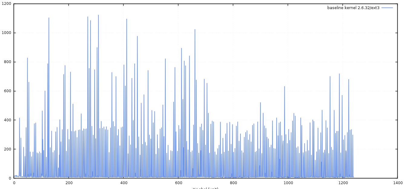
>>> However, there are 10M+ data points and I can't seem to find a plotting software which can handle that much data (e.g. Excel is limited to 2^20=1048576 rows).
>>>
>>> Just to be clear, I'm not talking about a latency curve chart (percentiles) but rather something similar to the attached image.
>>>
>>> I was wondering if someone here knows of such software (either open source or commercial), preferably with an option to zoom in/out.
>>>
>>> Thank you!
>>>
>>> Michael
>>>
>>>
>>>
>>>
>>> --
>>> You received this message because you are subscribed to the Google Groups "mechanical-sympathy" group.
>>> To unsubscribe from this group and stop receiving emails from it, send an email to mechanical-symp...@googlegroups.com.
>>> For more options, visit https://groups.google.com/d/optout.

Raphael Luta
I’ve successfully used OpenTSDB + Grafana for similar use cases.
— raphael
> Le 31 août 2015 à 19:01, Wojciech Kudla <wojciec...@gmail.com> a écrit :
>
> For up to 20 mio data points R + ggplot2 does the trick for me. If you're after extracting a more general profile over time series than point plot + alpha turns out to be useful.
> Beyond 20 mio datapoints ggplot2 takes too long to render for my liking.
> I know some people use matlab, but that's commercial software.
>
> On Mon, 31 Aug 2015 17:50 Michael Mattoss <michael...@gmail.com> wrote:
> Hi,
>
> I would like to collect latency data from our system in the form of <timestamp, latency value> and later create a chart for further analysis.
> However, there are 10M+ data points and I can't seem to find a plotting software which can handle that much data (e.g. Excel is limited to 2^20=1048576 rows).
> Just to be clear, I'm not talking about a latency curve chart (percentiles) but rather something similar to the attached image.
> I was wondering if someone here knows of such software (either open source or commercial), preferably with an option to zoom in/out.
>
> Thank you!
> Michael
>
>
>
>
>
>
>
>
