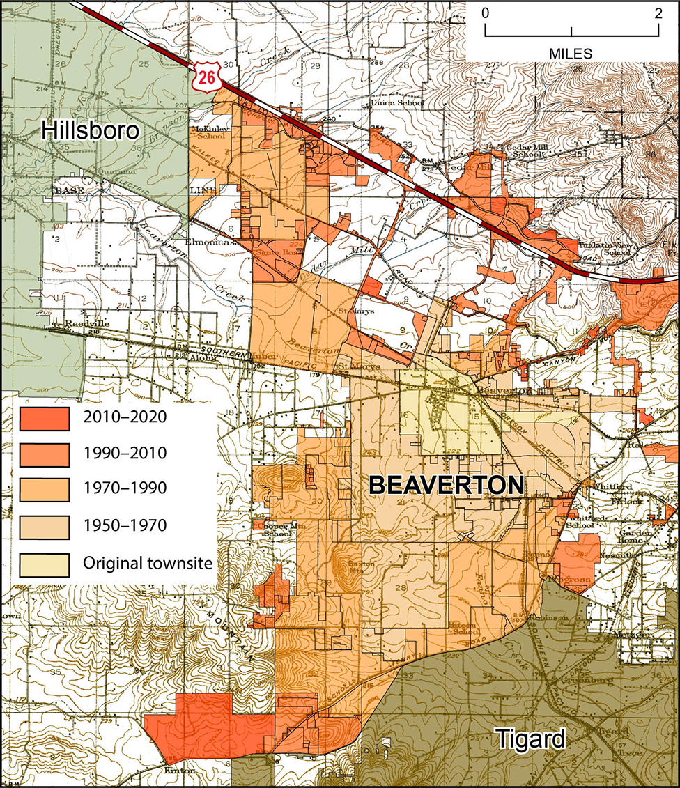
Temporal Analysis
Louise Kavanagh
Hi All,
I have a dataset of buildings with a date column which is the date the building was constructed. I would like the temporal analysis to show how the amount of buildings has increased over time. The temporal analysis shows the buildings built within different time frames over time, i.e. the buildings built in 2018, followed by the buildings built in 2019, followed by the buildings built in 2020, etc. What I would like it to show is the buildings built in 2018 then add the buildings built in 2019 and then the buildings built in 2020 so the accumulation of new buildings can be seen.
Does anyone have any ideas?
Many thanks,
Louise
Louise Kavanagh
Managing Director
![]()
![]() | louise....@apogeedata.co.uk | +44 (0)7736 438822 | Subscribe
| louise....@apogeedata.co.uk | +44 (0)7736 438822 | Subscribe
Peter Horsbøll Møller
Hi Louise
I have done something similar, but with properties.

The trick is to change the Map Time Options to only use the End for the Query.

Peter
From: mapi...@googlegroups.com <mapi...@googlegroups.com>
On Behalf Of Louise Kavanagh
Sent: Tuesday, 20 September 2022 11.53
To: mapi...@googlegroups.com
Subject: [MI-L] Temporal Analysis
|
This message originated Externally. Use proper judgement and caution with attachments, links, or responses. |
--
--
You received this message because you are subscribed to the
Google Groups "MapInfo-L" group.To post a message to this group, send
email to mapi...@googlegroups.com
To unsubscribe from this group, go to:
http://groups.google.com/group/mapinfo-l/subscribe?hl=en
For more options, information and links to MapInfo resources (searching
archives, feature requests, to visit our Wiki, visit the Welcome page at
http://groups.google.com/group/mapinfo-l?hl=en
---
You received this message because you are subscribed to the Google Groups "MapInfo-L" group.
To unsubscribe from this group and stop receiving emails from it, send an email to
mapinfo-l+...@googlegroups.com.
To view this discussion on the web visit
https://groups.google.com/d/msgid/mapinfo-l/00bc01d8ccd6%24c664c4b0%24532e4e10%24%40apogeedata.co.uk.
David Sherrod

Louise Kavanagh
Thanks Peter – I knew there had to be a simple way of doing it.
David – thank you for your idea regarding a graph to plot the increase over time. Something I will certainly consider alongside the map.
Best wishes,
To view this discussion on the web visit https://groups.google.com/d/msgid/mapinfo-l/1150837955.209515.1663671574980%40mail.yahoo.com.
