PyPlot Examples
3,232 views
Skip to first unread message

RecentConvert
Oct 25, 2013, 9:35:36 AM10/25/13
to julia...@googlegroups.com
I couldn't find good examples of plotting in Julia and PyPlot so I'll
post batches of examples here. Hopefully this will help people. At some
point when I have more time I'd like to move it to something more
permanent like a GIT wiki, Sphinx, or something else suggested in the
Cookbook post.
Enjoy.
__________________________________________________________________________
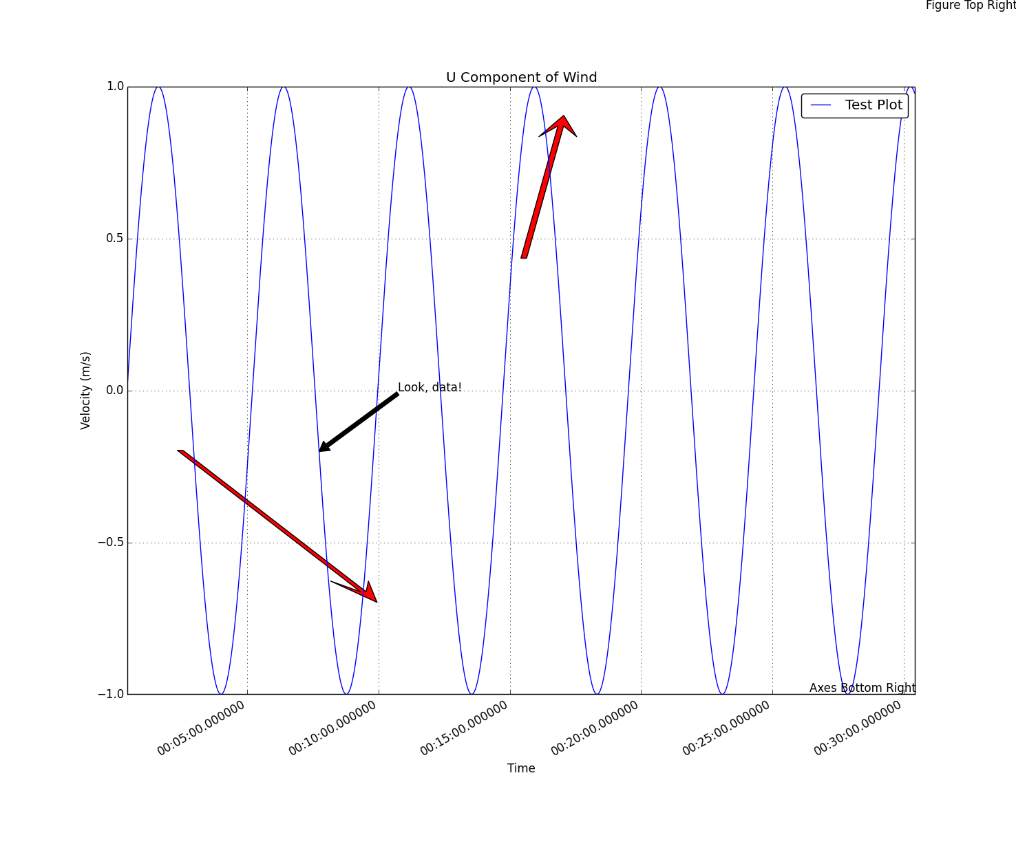
# Julia 0.2 RC1
# Last Edit: 25.10.13

using Datetime
using PyPlot

close("all")

# Generate an hour of data at 10Hz
x = Array(DateTime,int64(36000))
for i=1:1:length(x)
    x[i] = datetime(2013,10,4,0,0,0,50*i);
end
println(x[floor(length(x)/2)])

println("From " * string(x[1]) * " to " * string(x[end]))

x = float64(x)/1000/60/60/24 # Convert time from milliseconds from day 0 to days from day 0
y = sin(2*pi*[0:2*pi/length(x):2*pi-(2*pi/length(x))])
dx = maximum(x) - minimum(x)
dy = maximum(y) - minimum(y)

fig = figure() # Create a figure and save its handle
p = plot_date(x,y,linestyle="-",marker="None",label="Test Plot") # Plot a basic line
axis("tight") # Fit the axis tightly to the plot
ax = gca() # Get the handle of the current axis
title("U Component of Wind")
xlabel("Time")
ylabel("Velocity (m/s)")
grid("on")
legend(loc="upper right",fancybox="true") # Create a legend of all the existing plots using their labels as names

# Arrow Tests
# This arrows oriengt toward the x-axis, the more horizontal they are the more skewed they look
arrow(x[floor(length(x)/2)],
    0.4,
    0.0009,
    0.4,
    head_width=0.001,
    width=0.00015,
    head_length=0.07,
    overhang=0.5,
    head_starts_at_zero="true",
    facecolor="red")
arrow(x[floor(0.3length(x))]-0.25dx,
    y[floor(0.3length(y))]+0.25dy,
    0.25dx,
    -0.25dy,
    head_width=0.001,
    width=0.00015,
    head_length=0.07,
    overhang=0.5,
    head_starts_at_zero="true",
    facecolor="red",
    length_includes_head="true")

# Text Annotation Tests
annotate("Look, data!",
    xy=[x[floor(length(x)/4.1)];y[floor(length(y)/4.1)]],
    xytext=[x[floor(length(x)/4.1)]+0.1dx;y[floor(length(y)/4.1)]+0.1dy],
    xycoords="data",
    arrowprops=PyDict({"facecolor"=>"black"}))
annotate("Figure Top Right",
    xy=[1;1],
    xycoords="figure fraction",
    textcoords="offset points",
    ha="right",
    va="top")
annotate("Axes Bottom Right",
    xy=[1;0],
    xycoords="axes fraction",
    textcoords="offset points",
    ha="right",va="bottom")

fig[:autofmt_xdate](bottom=0.2,rotation=30,ha="right")
fig[:canvas][:draw]() # Update the figure
RecentConvert
Oct 25, 2013, 9:36:51 AM10/25/13
to julia...@googlegroups.com
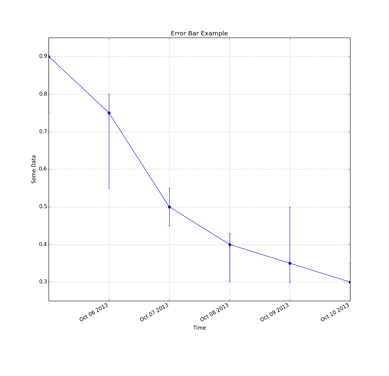
# Julia 0.2 RC1
# Last Edit: 25.10.13

using Datetime
using PyPlot

close("all")

# Generate an hour of data at 10Hz
x = Array(DateTime,int64(6))
for i=1:1:length(x)
    x[i] = datetime(2013,10,4+i,0,0,0);
end
y = [0.9;0.75;0.5;0.4;0.35;0.3]
uppererror = [0.05 0.05 0.05 0.03 0.15 0.05]
lowererror = [0.15 0.2 0.05 0.1 0.05 0.05]
errs = [lowererror;uppererror]
println("From " * string(x[1]) * " to " * string(x[end]))

x = float64(x)/1000/60/60/24 # Convert time from milliseconds from day 0 to days from day 0
fig = figure() # Create a new figure
p = plot_date(x,y,linestyle="-",marker="None",label="Base Plot") # Basic line plot
pe = errorbar(x,y,yerr=errs,fmt="o") # Plot irregular error bars
axis("tight")
ax = gca() # Get the handle of the current axis
title("Error Bar Example")
xlabel("Time")
ylabel("Some Data")
grid("on")

fig[:autofmt_xdate](bottom=0.2,rotation=30,ha="right") # Autoformat the time format and rotate the labels so they don't overlapRecentConvert
Oct 25, 2013, 9:38:27 AM10/25/13
to julia...@googlegroups.com

# Julia 0.2 RC1
# Last Edit: 25.10.13
using PyPlot

# Create Data
theta = [0:2pi/30:2pi]
r = rand(length(theta))
width = 2pi/length(theta) # Desired width of each bar in the bar plot

#########################
##  Windrose Bar Plot  ##
#########################
fig = figure() # Create a new figure
ax = axes(polar="true") # Create a polar axis
title("Wind Rose - Bar")
b = bar(theta,r,width=width) # Bar plot

dtheta = 10
ax[:set_thetagrids]([0:dtheta:360-dtheta]) # Show grid lines from 0 to 360 in increments of dtheta
ax[:set_theta_zero_location]("N") # Set 0 degrees to the top of the plot
ax[:set_theta_direction](-1) # Switch to clockwiseRecentConvert
Oct 25, 2013, 9:40:44 AM10/25/13
to julia...@googlegroups.com

# Julia 0.2 RC1
# Last Edit: 25.10.13

using PyPlot

# Create Data
theta = [0:2pi/30:2pi]
r = rand(length(theta))
width = 2pi/length(theta) # Desired width of each bar in the bar plot

##########################
##  Windrose Line Plot  ##
##########################
fig = figure() # Create a new figure
ax = axes(polar="true") # Create a polar axis
title("Wind Rose - Line")
p = plot(theta,r,linestyle="-",marker="None") # Basic line plotRecentConvert
Oct 25, 2013, 9:41:57 AM10/25/13
to julia...@googlegroups.com
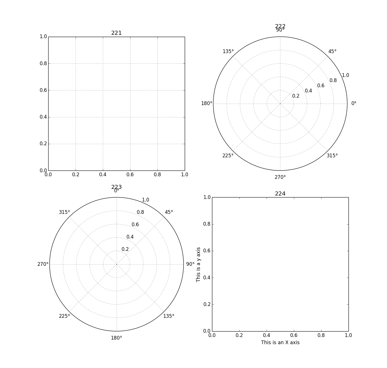
# Julia 0.2 RC1
# Last Edit: 25.10.13

using PyPlot
#####################
##  2x2 Plot Grid  ##
#####################
fig = figure() # Create a new blank figure
#fig[:set_figheight](7) # Doesn't work
#fig[:set_figwidth](3) # Doesn't work
subplot(221) # Create the 1st axis of a 2x2 arrax of axes
grid("on") # Create a grid on the axis
title("221") # Give the most recent axis a title
subplot(222,polar="true") # Create a plot and make it a polar plot, 2nd axis of 2x2 axis grid
title("222")
ax = subplot(223,polar="true") # Create a plot and make it a polar plot, 3rd axis of 2x2 axis grid
ax[:set_theta_zero_location]("N") # Set 0 degrees to the top of the plot
ax[:set_theta_direction](-1) # Switch the polar plot to clockwise
title("223")
subplot(224) # Create the 4th axis of a 2x2 arrax of axes
xlabel("This is an X axis")
ylabel("This is a y axis")
title("224")RecentConvert
Oct 25, 2013, 9:43:10 AM10/25/13
to julia...@googlegroups.com
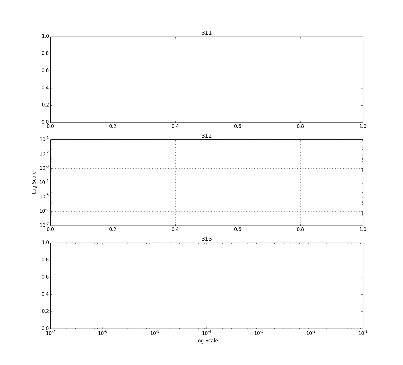
# Julia 0.2 RC1
# Last Edit: 25.10.13

using PyPlot

###################
##  Column Plot  ##
###################
fig = figure()
subplot(311) # Create the 1st axis of a 3x1 array of axes
title("311")
subplot(312) # Create the 2nd axis of a 3x1 arrax of axes
ax = gca() # Get the handle of the current axis
ax[:set_yscale]("log") # Set the y axis to a logarithmic scale
grid("on")
ylabel("Log Scale")
title("312")
subplot(313) # Create the 3rd axis of a 3x1 array of axes
ax = gca()
ax[:set_xscale]("log") # Set the x axis to a logarithmic scale
xlabel("Log Scale")
title("313")RecentConvert
Oct 25, 2013, 9:44:38 AM10/25/13
to julia...@googlegroups.com
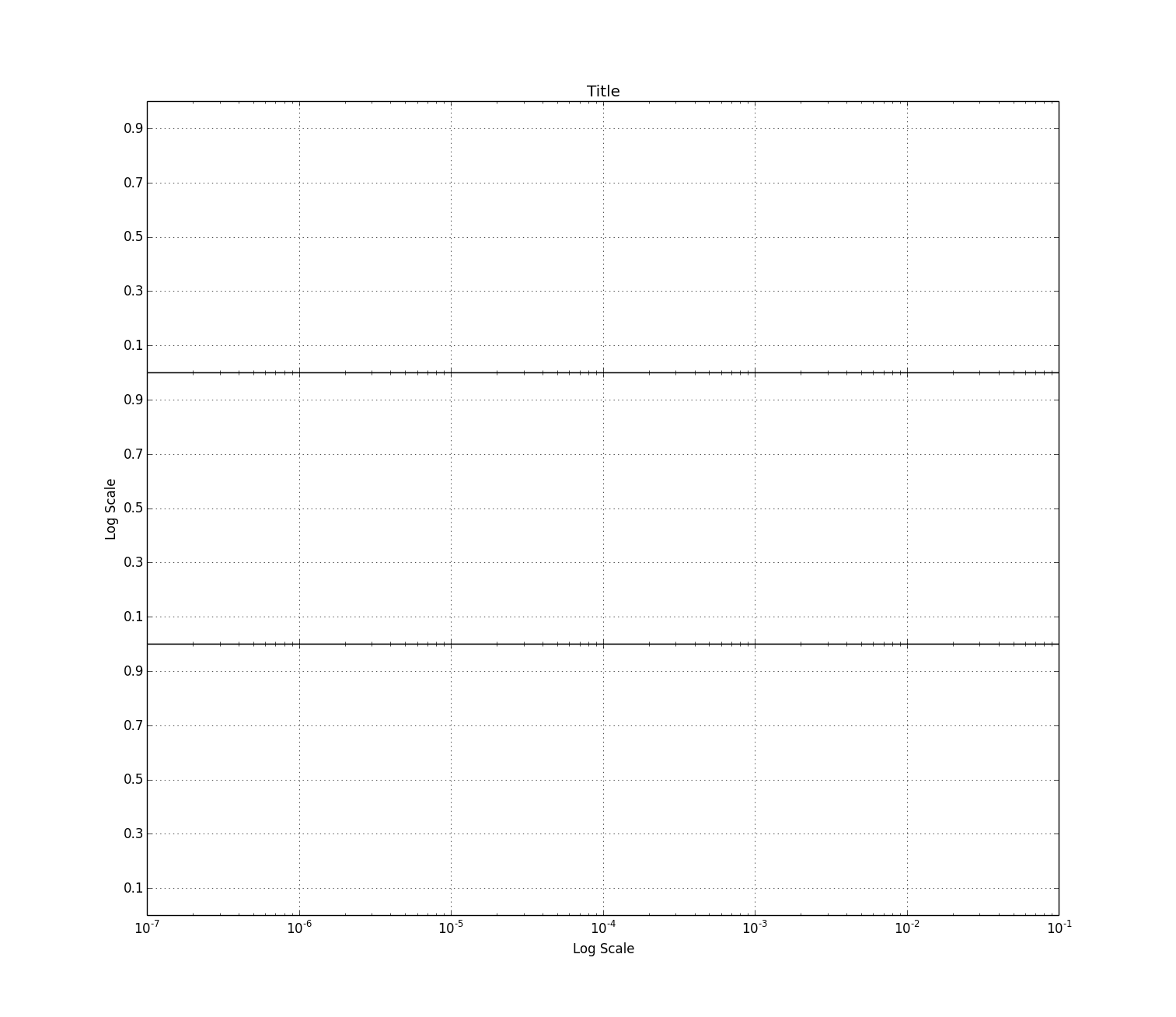
# Julia 0.2 RC1
# Last Edit: 25.10.13

using PyPlot

###################
##  Shared Axis  ##
###################
fig = figure()
subplots_adjust(hspace=0.0) # Set the vertical spacing between axes
subplot(311) # Create the 1st axis of a 3x1 array of axes
ax1 = gca()
ax1[:set_xscale]("log") # Set the x axis to a logarithmic scale
setp(ax1[:get_xticklabels](),visible=false) # Disable x tick labels
grid("on")
title("Title")
yticks(0.1:0.2:0.9) # Set the y-tick range and step size, 0.1 to 0.9 in increments of 0.2
ylim(0.0,1.0) # Set the y-limits from 0.0 to 1.0
subplot(312,sharex=ax1) # Create the 2nd axis of a 3x1 array of axes
ax2 = gca()
ax2[:set_xscale]("log") # Set the x axis to a logarithmic scale
setp(ax2[:get_xticklabels](),visible=false) # Disable x tick labels
grid("on")
ylabel("Log Scale")
yticks(0.1:0.2:0.9)
ylim(0.0,1.0)
subplot(313,sharex=ax2) # Create the 3rd axis of a 3x1 array of axes
ax3 = gca()
ax3[:set_xscale]("log") # Set the x axis to a logarithmic scale
grid("on")
xlabel("Log Scale")
yticks(0.1:0.2:0.9)
ylim(0.0,1.0)
Tim Holy
Oct 25, 2013, 9:47:05 AM10/25/13
to julia...@googlegroups.com
On Friday, October 25, 2013 06:35:36 AM RecentConvert wrote:
> I couldn't find good examples of plotting in Julia and PyPlot so I'll post
> batches of examples here. Hopefully this will help people. At some point
> when I have more time I'd like to move it to something more permanent like
> a GIT wiki, Sphinx, or something else suggested in the Cookbook post.
My recommendation would be to submit a pull request to put these in an
> I couldn't find good examples of plotting in Julia and PyPlot so I'll post
> batches of examples here. Hopefully this will help people. At some point
> when I have more time I'd like to move it to something more permanent like
> a GIT wiki, Sphinx, or something else suggested in the Cookbook post.
"examples" directory in PyPlot.jl.
--Tim

Steven G. Johnson
Oct 25, 2013, 10:42:20 AM10/25/13
to julia...@googlegroups.com
I'd prefer to have IJulia notebooks that include the plot output.
RecentConvert
Oct 25, 2013, 11:03:11 AM10/25/13
to julia...@googlegroups.com
I'll post them somewhere next week. I need to figure out how to use GIT Hub and how to export IJulia notebooks.

Stefan Karpinski
Oct 25, 2013, 12:29:31 PM10/25/13
to Julia Users
Exporting notebooks is pretty easy – just post the .ipynb file somewhere online (using gist.github.com is an easy way) and then use nbviewer.ipython.org to see it (understands gist IDs as a special case).

Aditya Mahajan
Oct 25, 2013, 3:31:03 PM10/25/13
to julia...@googlegroups.com
> On Fri, Oct 25, 2013 at 11:03 AM, RecentConvert <giz...@gmail.com> wrote:
>
>> I'll post them somewhere next week. I need to figure out how to use GIT
>> Hub and how to export IJulia notebooks.
>
>> I'll post them somewhere next week. I need to figure out how to use GIT
>> Hub and how to export IJulia notebooks.
On Fri, 25 Oct 2013, Stefan Karpinski wrote:
> Exporting notebooks is pretty easy – just post the .ipynb file somewhere
> online (using gist.github.com is an easy way) and then use
> nbviewer.ipython.org to see it (understands gist IDs as a special case).
Here is an example for one of the plots (I can't seem to install the
> Exporting notebooks is pretty easy – just post the .ipynb file somewhere
> online (using gist.github.com is an easy way) and then use
> nbviewer.ipython.org to see it (understands gist IDs as a special case).
Datetime package, so cannot get other plots to work):
http://nbviewer.ipython.org/7160406
https://gist.github.com/adityam/7160406
Aditya

Jacob Quinn
Oct 25, 2013, 3:47:04 PM10/25/13
to julia...@googlegroups.com
What trouble did you have with Datetime? It should just be
Pkg.add("Datetime")
Let me know if that doesn't work.
-Jacob
Aditya Mahajan
Oct 25, 2013, 6:52:20 PM10/25/13
to julia...@googlegroups.com
On Fri, 25 Oct 2013, Jacob Quinn wrote:
> What trouble did you have with Datetime? It should just be
>
> Pkg.add("Datetime")
I was just copy pasting RecentConvert's examples:
> What trouble did you have with Datetime? It should just be
>
> Pkg.add("Datetime")
~~~
using Datetime
x = Array(DateTime,int64(36000))
for i=1:1:length(x)
x[i] = datetime(2013,10,4,0,0,0,50*i);
end
gives
ERROR: no method datetime(Int32,Int32,Int32,Int32,Int32,Int32,Int32)
I don't use Datetime package, so I didn't look into the reason for the
error (Probably just a typo in the above code).
Aditya

Avik Sengupta
Oct 26, 2013, 5:51:38 AM10/26/13
to julia...@googlegroups.com
Ah, you're presumably on a 32 bit Julia? The `datetime` function definitions have Int64 arguments. They need to be `Int` to work accoss 32/64 bit machines. However, given that the underlying structures are bitstypes, I imagine some some more conversions will be required to keep everything consistent.
For the moment, if you want to get it working, convert your arguments to Int64 like this
datetime(int64(2013),int64(10),int64(4),int64(0),int64(0),int64(0), int64(50*i))
It's ugly, but it will work for now.
Regards
-
Avik
For the moment, if you want to get it working, convert your arguments to Int64 like this
datetime(int64(2013),int64(10),int64(4),int64(0),int64(0),int64(0), int64(50*i))
It's ugly, but it will work for now.
Regards
-
Avik
Jacob Quinn
Oct 26, 2013, 6:59:05 AM10/26/13
to julia...@googlegroups.com
No, there's a `datetime()` that takes any Real and does the necessary conversions. I think you just haven't added the package yet. Just calling `using Datetime` or `using Package` for any package doesn't automatically install it. You first have to run `Pkg.add("Datetime")` to install the package, and then use call `using Datetime` to load the code into the namespace.
If you're actually running into some other 32-bit issue, please let me know, but there shouldn't be.
-Jacob
Aditya Mahajan
Oct 26, 2013, 3:40:37 PM10/26/13
to julia...@googlegroups.com
I had installed date time package (otherwise I would have received an error when calling using DateTime). I am indeed using a 32 bit machine. I will look into this more on Monday, but as I had said earlier, I don't really use DateTime package; I was just testing the plotting examples.
Aditya
Avik Sengupta
Oct 27, 2013, 8:44:40 PM10/27/13
to julia...@googlegroups.com
This was a real issue with 32 bit julia (but not exactly for the reasons outlined in my previous email) There's a pull request with a fix @ https://github.com/karbarcca/Datetime.jl/issues/20
RecentConvert
Oct 28, 2013, 3:59:35 AM10/28/13
to julia...@googlegroups.com
The Datetime function was part of the example. Certain applications require plotting against readable timestamps and this was the method I chose. In the end you just need to plot using Matlab time, a number of similar type to your other axis in units of days since midnight, January 1, 0 AD. However you get there is up to you.
Reply all
Reply to author
Forward
0 new messages