February Monthly Technical Report
18 views
Skip to first unread message

APURVA SHETH
Feb 4, 2013, 11:24:31 PM2/4/13
to
Monthly Technical Report February 2013

• The index
started the year on an extremely positive note with 2 consecutive gap up
openings on the 1st and 2nd of January 2013 however the index barely managed
to move a 100 points higher after that during the entire month and finally
ended the first month of 2013 with gains of 130 points at 6035.
• January’s
monthly candle was a short green candle with a small shadow at the top
suggesting relatively weak buying pressure with little price movement which is
a sign of consolidation/continuation of the earlier trend.
• The index
managed to cross above the upper band of the 20 month Bollinger Band during the
month but that didn't enthuse the bulls to
push the index higher as it drifted sideways and closed below the upper
band currently placed at 6111, thus the index is likely to face resistance
around the same levels.
• In our
monthly technical report dated 3rd Dec 2012 we
mentioned that the current upmove was unlike the 2007 bull market when the
index touched the upper Bollinger band in September 2007 and continued to move
higher until the Euphoria died away in January 2008 but it was more of an
upmove like October 2010 when the index moved in a sideways churning action
after hitting the upper band, so far the index has moved exactly as anticipated
however the main reason for making this argument is to point out that the index
has reached a churning/distribution stage and taking a short term call from
current levels is difficult as such stages are marked by high volatility
however from a long term perspective the index has far greater downside risks
than upside potential.

• The Nifty
remained in a sideways range and traded with an alternating positive
–negative-positive bias for the first three weeks of January while the fourth
week ended on a flat note and the last week ended on a negative note with a
‘Bearish Engulfing Candle’ suggesting that bears are gaining strength.
• The index
has been moving higher in a Rising Channel running since July’12 and the lower
edge of this channel has provided support from time to time which is currently
placed at 5930 however it has formed a ‘Rising Wedge Pattern’ within this
channel which is a bearish reversal pattern and a break below the lower edge
(5930) would confirm a reversal.
• The 14 Week
RSI Indicator has touched the 70% overbought zone and has moved below its
moving average after 2 months.
• Therefore
all of the above indicate that the bulls are loosing control of the index
though the bears are far from garnering a stronger position and that would be
only after it moves below 5930 levels
and until then the index may trade in a broad range of 6130 to 5930.
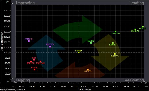
• Relative
Rotation Graphs (RRG) are used to visualize relative strength of all elements
in a universe (BSE Sectoral Indices) vis-à-vis a benchmark (BSE SENSEX).
• RRG is
primarily based on Relative Strength which is the value of a sector divided by
the value of index typically a benchmark which allows us to compare the
performance of the sector. However, this ratio does not provide a numerical
value that is suitable for comparison with other sectors.
• RRG solves
this problem by providing us with a Relative Strength Ratio value which is
normalized to oscillate around 100 (plotted on X axis) not only this but it
also provides us with the speed and direction of the Relative Strength Ratio
(plotted on Y axis) and is known as Relative Strength Momentum also normalized
to oscillate around 100.
• RRG follows
a clock-wise rotation pattern beginning with the sector which scores above 100
on both scales means it is outperforming the benchmark and is placed in the
Leading Quadrant (top right) and as the performance deteriorates it enters the
Weakening Quadrant (bottom right) which means that the stock is still
outperforming the index but at a declining rate. If the pace of outperformance
declines further the sector begins to underperform and enters the Lagging
Quadrant (bottom left) and once the sector has run its course the momentum will
start improving before the sector and that’s when it enters in the Improving
Quadrant (top left).

• The RRG on the previous slide has been plotted by using last 5 weeks
closing prices of BSE SENSEX and all the Sectors.
• The
benchmark index traded in a narrow range for the month of January as most of
its constituents which participated in the rally during November-December and
were a part of the Leading Quadrant lost momentum and shifted into the
Weakening Quadrant. The Leading Quadrant is now graced by 3 sectors i.e. BSE
Realty which is still ranking good on both the
RS-Strength & RS-Momentum scale while the BSE Bankex is witnessing
weakening momentum and may soon join others in the Weakening Quadrant and
therefore it is our Sector in Focus, and the BSE
Teck Index which has just entered the Leading Quadrant.
• The BSE Auto
& Consumer Durables Index has witnessed sharp fall on RS-Momentum scale and
are placed in the Weakening Quadrant.
• The Lagging
Quadrant is now home to Capital Goods, FMCG, Healthcare & Power Index which
is showing signs of improvement, the 2 defensives FMCG & HC have moved in
line with the Sensex while CG has underperformed the benchmark considerably.
• All the
laggards of last month i.e. BSE IT, Metal, Oil&Gas & PSU Index have
shot up remarkably on the RS-Momentum scale and have entered the Improving
Quadrant. Out of these Oil&Gas Index is our top pick and should be watched
out by those who want to trade on the long side.

• The sector
in focus for the month of January is the BSE Bankex and is currently placed at
14,465.
• The BSE
Bankex was our sector in focus in the month of December and it has obtained our
target of 14700 in the first week of January however the index faced
considerable resistance just below its previous highs of 15000 and since then
has remained sideways.
• The Bankex
formed a ‘Shooting Star Candlestick Pattern’ last week and has closed below the
lower edge of the rising channel it was trading in for the last 6 months.
• The 14 Week
RSI has given a negative crossover to its moving average in the overbought zone
suggesting weakening momentum.
• Thus we
expect the index to correct and touch the lower edge of the Triangular Pattern
and hit our target of 13500, this view will negated only if the index moves
above the 15000 levels.

• Though not a
part of the Bankex; Karnataka Bank Ltd is one of
our top picks to go short on.
• The stock
moved in rising channel and more than doubled from a low of 80 in Sep’12 to a
high of 200 in Dec’12.
• Since then
stock has traded in a ‘Symmetrical Triangle Pattern’ and broke below the same
on 23rd Jan 2013.
• The stock
has been consolidating in a Inverse Flag Pattern for the last one week and may
again resume its downtrend pretty soon thus we recommend shorting the stock at
CMP of 162.5 and on rallies to 170 for a target of 140, 125 with a stoploss of
180.

• Union Bank of India Ltd. broke out from an Inverse
Head & Shoulder Pattern in Nov’12 and hit a 52 Week High of 290 in Jan’13;
however the stock has now broken down of a Head & Shoulder Bearish Reversal
Pattern and is trading below its neckline of 255.
• The stock has closed below the upward sloping channel running since August 2012
along with that it has also moved below its 50 Day EMA.
• The daily RSI has moved below the 50% centreline and is
threatening to move in the bearish zone.
• Thus we recommend to short the stock at CMP of 249 for a target
of 220 with a stoploss of 268.

• BSE 500
Index has a large number of stocks from diverse sectors and industries and is
often considered as a true measure of the overall health of an uptrend. The
above chart compares the price movement of
Nifty with the number of stocks hitting a new 52 week High/Low on BSE 500.
• An uptrend
is considered healthy when an increasing number of stock are hitting new highs
daily while lesser number of stocks hitting new high during an uptrend suggests
weakening market breadth.
• We have seen
a number of diverging trends from the above chart the first one being the No.
of days when more than 50 stocks hit a new 52 week high were more in 2010
suggesting a much broader participation compared to the ongoing rally where
this no. has barely managed to hit 50 (black horizontal line).
• The second
divergence is seen at market peak in November 2010 when the no. of stocks
hitting new 52 week high actually fell before the Nifty did; which is also the
case now as the Nifty has continued to rally even after this indicator topped
out in October 2012. Thus both of the above suggests a deteriorating market
breadth which is a bearish picture.
• The ‘soldiers’ are deserting even while the ‘generals’
continue to march forward. In a war, this would be a prelude to disaster. In
the stock market, it may be the same.”
--
Regards,
Apurva Sheth
Reply all
Reply to author
Forward
0 new messages