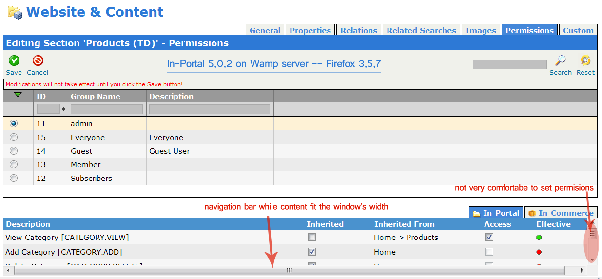
Category Permissions Section Too Small

Phil ..:: domicilis.biz ::..
in 502, english only installation, I got the following problem when I
display Permission Section for Produts:
The bottom view with tabs and radio buttons is -too much- small, using
normal size in Firefox on a standard display size (1440x900), while
the top group radio buttons selector uses a lot of space and could be
reduced, as we select one group at a time, and many different
permissions for it. It'd be easier to have a smaller group list, as we
have group sorting if needed, and much more space for permissions
setting.
Additionnaly, I always have an horizontal navigation bar, while the
content is not larger than window.
see attached image, in png :)
I'm waiting your comments.
Phil.

Alexander Obuhovich
your monitor dimensions in inches, because I have 20 inches wide
screen on work and my resolution is different.
> --
> You received this message because you are subscribed to the Google Groups
> "In-Portal Design & Interfaces Team" group.
> To post to this group, send email to in-porta...@googlegroups.com.
> To unsubscribe from this group, send email to
> in-portal-desi...@googlegroups.com.
> For more options, visit this group at
> http://groups.google.com/group/in-portal-design?hl=en.
>
>
--
Sent from my mobile device
Best Regards,

Dmitry Andrejev
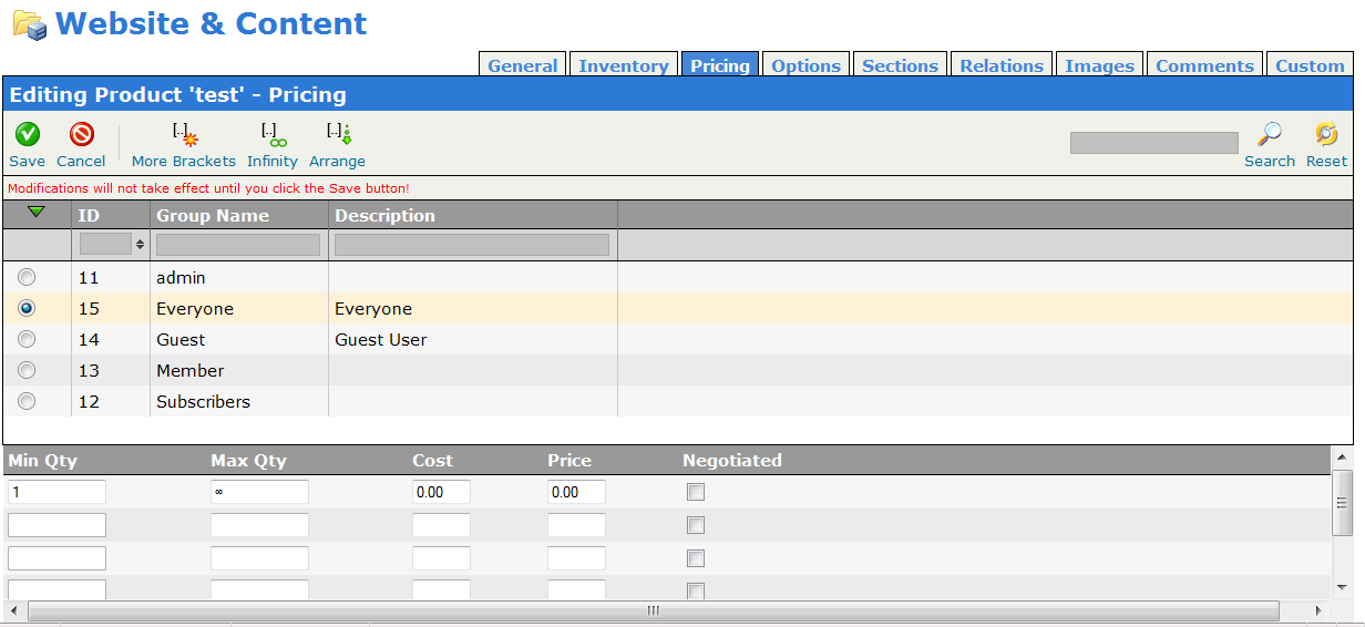
Phil ..:: domicilis.biz ::..
attached is my product pricing view. I'm on a 17" wide screen
(laptop), but the only data is I'm in full size for mozilla, on a
1444x900 res. You can notice the wide space between left and right
border.
I bet that on a 20" you have more space, but an average user have the
same screen as mine: wide and not too much big in height.
We could have groups on 2 columns, even 3, as there nothing special to
know about them, the main data is at bottom.
Phil.
2010/2/5 Phil ..:: domicilis.biz ::.. <ph...@domicilis.biz>:
Dmitry A.
whole page and User Group selector as a Drop-down above that.
I am sure every one will agree that there is NO point of having as
Radio buttons when we can have simple Drop-down...
DA.
On Feb 5, 3:03 am, "Phil ..:: domicilis.biz ::.." <p...@domicilis.biz>
wrote:
> Hi Alexander,
>
> attached is my product pricing view. I'm on a 17" wide screen
> (laptop), but the only data is I'm in full size for mozilla, on a
> 1444x900 res. You can notice the wide space between left and right
> border.
> I bet that on a 20" you have more space, but an average user have the
> same screen as mine: wide and not too much big in height.
>
> We could have groups on 2 columns, even 3, as there nothing special to
> know about them, the main data is at bottom.
>
> Phil.
>
> 2010/2/5 Phil ..:: domicilis.biz ::.. <p...@domicilis.biz>:
>
>
>
> > Hello,
>
> > in 502, english only installation, I got the following problem when I
> > display Permission Section for Produts:
>
> > The bottom view with tabs and radio buttons is -too much- small, using
> > normal size in Firefox on a standard display size (1440x900), while
> > the top group radio buttons selector uses a lot of space and could be
> > reduced, as we select one group at a time, and many different
> > permissions for it. It'd be easier to have a smaller group list, as we
> > have group sorting if needed, and much more space for permissions
> > setting.
>
> > Additionnaly, I always have an horizontal navigation bar, while the
> > content is not larger than window.
>
> > see attached image, in png :)
>
> > I'm waiting your comments.
> > Phil.
>
>
>
> pricing-tab-view.png
> 46KViewDownload
Alexander Obuhovich
--
You received this message because you are subscribed to the Google Groups "In-Portal Design & Interfaces Team" group.
To post to this group, send email to in-porta...@googlegroups.com.
To unsubscribe from this group, send email to in-portal-desi...@googlegroups.com.
For more options, visit this group at http://groups.google.com/group/in-portal-design?hl=en.
--