quantiles summary and qp_plot
224 views
Skip to first unread message

DunovanK
Sep 25, 2012, 10:10:28 PM9/25/12
to hddm-...@googlegroups.com
Hello all,
I have recently tried using the quantiles_summary and qp_plot modules but have run into some roadblocks. I first ran a model called 'model' then called
quantiles_summary(model, method='deviance', n_samples=50,
quantiles = (10, 30, 50, 70, 90), sorted_idx = None,
cdf_range = (-6, 6))
Which led kicked back:
AttributeError Traceback (most recent call last)
<ipython-input-43-8a6de8a1d14d> in <module>()
1 quantiles_summary(model, method='deviance', n_samples=50,
2 quantiles = (10, 30, 50, 70, 90), sorted_idx = None,
----> 3 cdf_range = (-5, 5))
/Library/Frameworks/Python.framework/Versions/2.7/lib/python2.7/site-packages/hddm/utils.pyc in quantiles_summary(hm, method, n_samples, quantiles, sorted_idx, cdf_range)
636 #Init
637 n_q = len(quantiles)
--> 638 wfpt_dict = hm.params_dict['wfpt'].subj_nodes
639 conds = wfpt_dict.keys()
640 n_conds = len(conds)
AttributeError: 'HDDM' object has no attribute 'params_dict'
Do I need to input the models parameter dict myself somewhere? After getting a quantiles summary, I would like to create a quantile-probability plot of the data. With respect to the qp_plot() function, I'm not exactly sure what the split_function does. Could someone provide an example of how this should be set up? I have experimented with simulating data sets using the group estimated parameters but I would like to try this method out as well.
Thank you for your help,
Kyle

Thomas Wiecki
Sep 26, 2012, 9:46:55 AM9/26/12
to hddm-...@googlegroups.com
Hi Kyle,
Thanks for reporting, that's a bug. I filed an issue here:
https://github.com/hddm-devs/hddm/issues/9
Thomas
Thanks for reporting, that's a bug. I filed an issue here:
https://github.com/hddm-devs/hddm/issues/9
Thomas
DunovanK
Sep 26, 2012, 10:24:17 AM9/26/12
to hddm-...@googlegroups.com
Great, thanks Thomas.

abstract thoughts
Oct 10, 2021, 11:37:00 AM10/10/21
to hddm-users
Hi,
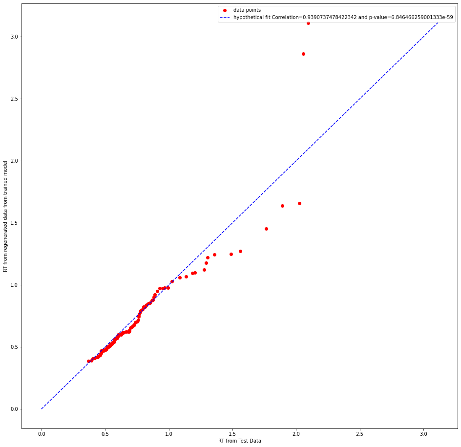
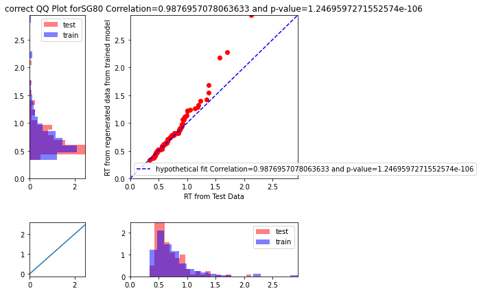
I also have some doubts on Q-Q plot. As a method
for quantifying test error I split the data at the level of condition
per subject using a binomial distribution. I trained one model on that
and then using post_pred_gen, I generated data from the trained
model(sampled 500 times). Then I appended the data labels that is there
in the training set to the ppc_data. Then I estimated the quantiles
using numpy function quantile. And compared the distribution of
RT(condition wise) that I am getting from the held out data and the
regenerated data with the help of a quantile-quantile plot separately
for error RT and correct RT. But, I am getting a quite high pearson's
correlation value. I am not sure whether I am missing something here or
whether it is the correct test statistic to use.Can someone please clarify this doubt? I am attaching few plots below
Thank you
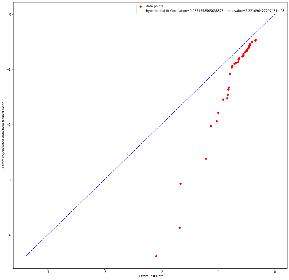
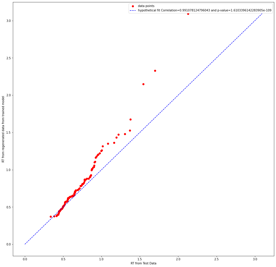
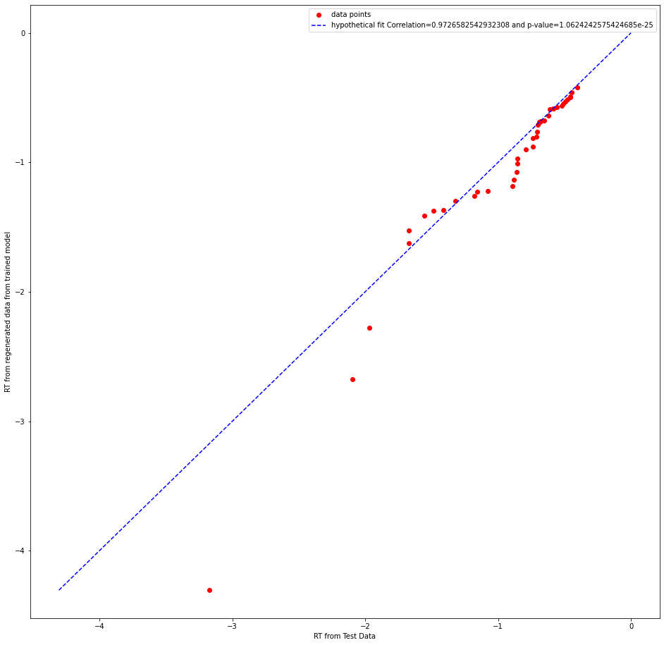
abstract thoughts
Oct 11, 2021, 8:52:06 AM10/11/21
to hddm-users
Hi,
I think the plot maybe a bit unclear, a better one is adding below!
Thank you

Michael J Frank
Oct 11, 2021, 2:20:47 PM10/11/21
to hddm-...@googlegroups.com
I think a Q-P plot (which Ratcliff uses a lot) is more informative than a Q-Q plot - because it assesses not just whether RT distributions match up for any one response but simultaneously whether it captures the proportion of responses in that condition.
also you might as well take advantage of the bayesian analysis, so when you simulate a given condition you can show the uncertainty about where the data is expected for that quantile (by sampling from the distribution in the PPC) and see if the true data fall within that uncertainty. An example of this for QP plot is in this paper, fig 2.
Re your QQ plot, I agree with your intuition that the pearson correlation is not the best stat here, especially in that it essentially has to be high almost by definition (ie if you rank order the quantiles for simulated data they will always go up and so will the quantiles for the real data). The absolute fit (e.g. MSE for a given quantile) is a better metric. In your example plot it seems the fitted model captures the first part of the distribution quite well (QQ plot on the diagonal), but overestimates the tail -- this would be expected if - for example - the true generative model had a collapsing bound but the data was fit by a fixed bound.
M
--
You received this message because you are subscribed to the Google Groups "hddm-users" group.
To unsubscribe from this group and stop receiving emails from it, send an email to hddm-users+...@googlegroups.com.
To view this discussion on the web visit https://groups.google.com/d/msgid/hddm-users/4c484b60-1964-4edc-a892-277bd2ba84e8n%40googlegroups.com.
abstract thoughts
Oct 13, 2021, 1:58:07 AM10/13/21
to hddm-users
Sir,
Thanks for your response. I could understand the q-p plot contains a greater amount of details than in the q-q plot. I tried to plot that by using post_pred_gen function from the hddm package and then calculated it's mean and standard deviation along the two axes and used that to plot the confidence ellipse in the plot using the function:
def Define_Ellipse(x_mean, y_mean, x_r, y_r):
Angles=np.pi*np.linspace(start=0,stop=2,num=360)
x=x_mean+(x_r*np.cos(Angles))
y=y_mean+(y_r*np.sin(Angles))
return x,y
But, I have used a log scale for y axis to get a good separation. And obtained a plot like the below one:
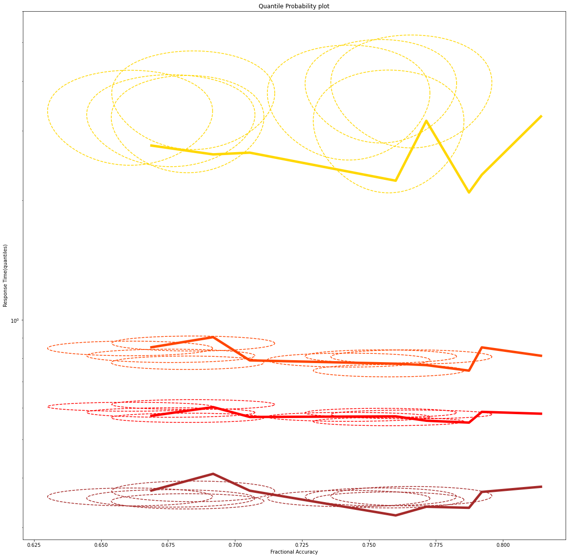
Here the width of the ellipse in the direction of an axes gives two times the standard deviation.
Reply all
Reply to author
Forward
0 new messages