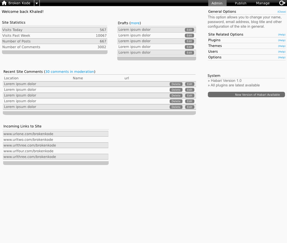
Usability Admin Options

Khaled Abou Alfa
name to be honest but we can work that out later), is clicked then a
small description comes down that has the most pertinent information
regarding this particular sub-option of the panel.
Saves people from having to guess things, or having to remember things
(eventually they will) but this allows them the luxury to learn at their
own pace, and demystifies things for the newbie while not getting in the
way of the seasoned user.

Scott Merrill
> Just a quick addition. When the help link (dunno if it's the appropriate
> name to be honest but we can work that out later), is clicked then a
> small description comes down that has the most pertinent information
> regarding this particular sub-option of the panel.
I think this would be better served via a single sentence tool-tip,
rather than a drop-down widget. I think too many sliding, dropping,
moving pieces confuses the average user.

khaled Abou Alfa
By keeping this sort of thing within the programme it's just feels a lot less intrusive to be honest. What does everyone else feel?

Owen Winkler
> I think most users hate pops or anything similar. From the main admin page
> we'd have a few distinct elements that people will associate. The small
> triangle drops down a menu.
My only concern at the moment is that our dropdowns don't look like crap.
I don't know if you've seen the Mambo admin UI, but the dropdown menus
in there really suck. They feel like they were coded by a wage-slave
with enough free time to learn Frontpage.
Along those lines of thinking, everything about the UI should look as
professional as we can make it. If there are "help" tooltips or
popups or sliding navs then they need to be consistent, obvious to the
user, and only activated on explicit demand.
Yes, I'm saying a lot of obvious stuff here, but I really hate those
Mambo menus.
Owen
Scott Merrill
> I think most users hate pops or anything similar. From the main admin
> page we'd have a few distinct elements that people will associate. The
> small triangle drops down a menu. The help menu links could be another
> colour or form and the internal links (like the draft link or the
> moderation link) could be another form or colour as well. That way we
> associate a specific action to a certain kind of link.
>
> By keeping this sort of thing within the programme it's just feels a lot
> less intrusive to be honest. What does everyone else feel?
I'm not a usability expert. I don't even play one on TV. Asking me for
my opinion on usability issues is probably a bad idea.
That said, I can parrot back all of the usability hype I've heard over
the years: how will the above suggestions be perceived by color-blind
people? How will the above be perceived by blind people? How will the
above be handled in text-only browsers?
Here's my thinking: this is a _web based_ application we're developing.
The web has certain specific conventions, most of which I think most
people can deal with these days. I have a strong negative reaction to
web-based applications that break my understanding of web-based
conventions in some misguided attempted to look like a desktop application.
Clicking a help link should, in my opinion, open a new window with the
relevant portion of the manual displayed for reading. The manual should
contain links to other pages / sections of the manual, and all of those
links should open within the same help window. (That is to say, Habari
ought not spawn more than one help window ever.)
For things that are incidental, or stuff we assume users will come to
understand over time, I think we should work very hard to make the
presentation as understandable as possible to new users without getting
in the way for advanced users. Once a user learns which menu links do
what in the Habari admin interface, what's the point of keeping
drop-down widgets available to them? Are they likely to forget which
sub-menu contains the item they need? Would a simple _static_ sentence
of explanatory text be acceptable to display to all users? Lines of
text won't slow down the rendering of the page; they won't confuse new
users as to where to find things; and power users won't be annoyed with
buttons and widgets in their interface that they never click.
--
ski...@skippy.net | http://skippy.net/
gpg --keyserver pgp.mit.edu --recv-keys 9CFA4B35
506C F8BB 17AE 8A05 0B49 3544 476A 7DEC 9CFA 4B35
khaled Abou Alfa
I'm approaching this from a completely novice pov. My actual model is a friend of mine that doesn't understand anything of what's going on in the wp admin. He doesn't understand what a plugin is, he's not sure how to change his email address, that sort of thing. He's also not interested in going elsewhere to look for it. I'm looking at that user after a fashion that doesn't care for technical things and who wants byte sized information.
I also don't want to clutter up the interface, so text should only be there if it's always serving a purpose, or if it's describing areas that are used once in a blue moon, so even the expert might forget issues (this'll hopefully become more apparent when we deal with the actual options pages).
As such maybe we don't call it help in that case? Maybe we replace it with the i for information icon (and in a text-only browser it becomes the words info or something like that? Changes in link colours was just an example really more than anything, just to make sure that the different kinds of links are actually distinguished differently.
I'm not too bothered about it to be honest, it's just I think it's a good enhancement for the users as refreshers, less time wasting in general, and explaning while at the same time keeping the clutter away..