Station platform data changed drastically
136 views
Skip to first unread message

KC
Apr 20, 2022, 1:02:30 AM4/20/22
to GTFS-realtime
I use Maps for public transit services in my city (Brisbane, QLD, Australia). In the past couple of months, several major bus stations had platform data feeds drastically changed. For example, a major bus station with two platforms would have separate departure data - e.g., if you clicked on the bus icon for Platform 1, it would only show departure data for that platform.
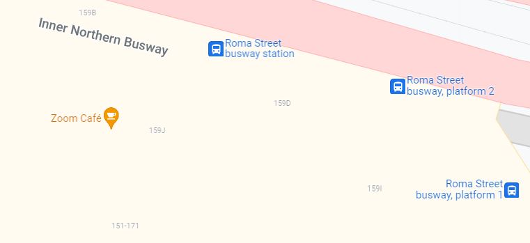
Not long ago, several stations' Platform 1 data disappeared entirely. Platform 2 was still showing departures, but 1 had no info. Shortly thereafter, Platform 2's data also disappeared and a mysterious "new" platform appeared, combining both Platform 1 *and* 2 departures.
Now there are a bunch of stations with literally 3 bus icons stacked over each other: 1, 2, and the new conglomerated platform. The format is a giant mess, as many of these stations are huge hubs with scores of routes passing through.
Better yet, the desktop version of this feed doesn't indicate which route is on which platform!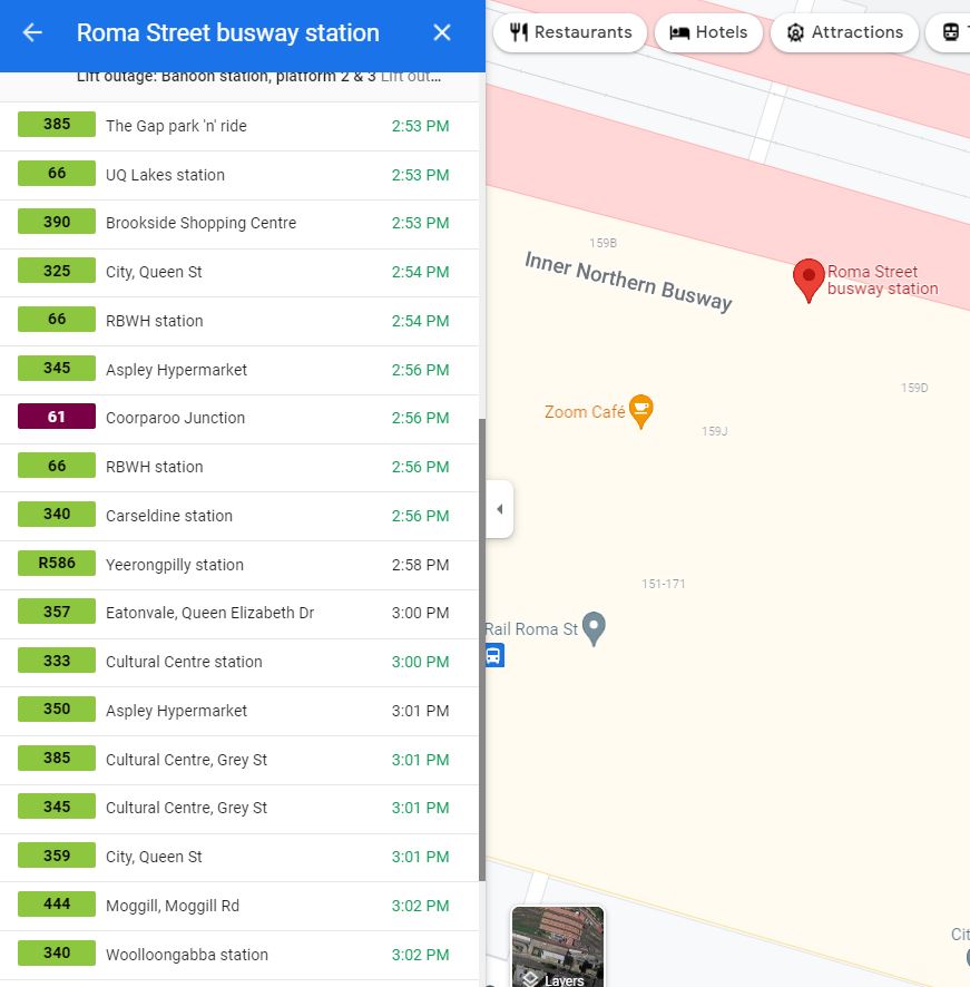
The mobile app does show which platform the route is on, but it's an absolute mess to scroll through and figure out which bus is yours, what time it leaves, and which platform.
From an accessibility perspective, this is a nightmare. A visually user is going to have a hard enough time getting to the station, let along the correct platform if they can't even find their route in a sea of bi-directional bus routes.
I asked on the local Google Groups Translink (our service provider), and they acted like these stations had been like this the whole time, and it was not their problem - it was a Google issue.
I'm unable to see past datasets in order to compare and see when exactly the platform data converged, but it was definitely within the past couple of months.
This has become a huge mess and is confusing for every single user out there. What can I do to help fix it?
-KC

Stefan de Konink
Apr 20, 2022, 3:10:18 AM4/20/22
to gtfs-r...@googlegroups.com
On Wednesday, April 20, 2022 7:02:30 AM CEST, KC wrote:
> This has become a huge mess and is confusing for every single
> user out there. What can I do to help fix it?
I almost wonder if this is the first phase of actually using GTFS data for
> This has become a huge mess and is confusing for every single
> user out there. What can I do to help fix it?
stops in Google Maps rather than having some Indian folks mapping stops
separately...
--
Stefan
KC
Apr 26, 2022, 7:01:14 PM4/26/22
to GTFS-realtime
No one can assist with this? At some stops there are literally 4 separate bus icons because of all the additional stops that have been added.
Stefan de Konink
Apr 27, 2022, 2:31:23 AM4/27/22
to gtfs-r...@googlegroups.com
On Wednesday, April 27, 2022 1:01:14 AM CEST, KC wrote:
> No one can assist with this? At some stops there are literally 4 separate
> bus icons because of all the additional stops that have been added.
Reach out to your transit partners contact :)
> No one can assist with this? At some stops there are literally 4 separate
> bus icons because of all the additional stops that have been added.
--
Stefan

Brian Ferris
Apr 27, 2022, 12:32:40 PM4/27/22
to gtfs-r...@googlegroups.com
I opened an internal ticket for this last week. I'll let you know how it goes. Apologies for the initial lack of response, my mail filters were hiding this thread. Thanks!
--
You received this message because you are subscribed to the Google Groups "GTFS-realtime" group.
To unsubscribe from this group and stop receiving emails from it, send an email to gtfs-realtim...@googlegroups.com.
To view this discussion on the web visit https://groups.google.com/d/msgid/gtfs-realtime/87f1491c-b8ad-479a-9e64-14fdb0be5a1fn%40googlegroups.com.
KC
May 3, 2022, 10:49:54 PM5/3/22
to GTFS-realtime
Thank you! @Stefan, I did, and they claimed it wasn't their problem, it was Google's. I then went on the GTFS group for the transit provider, and they basically said there was nothing they could do...
Reply all
Reply to author
Forward
0 new messages