Legend for Heatmaps in GSEA Report
656 views
Skip to first unread message

Charles Warden
May 4, 2021, 4:17:35 PM5/4/21
to gsea-help
Hi,
I am wondering if there is a way to find out more information generated for the heatmaps linked in the HTML report.
For example:
1) What is being plotted? For example, is this standardized expression (with mean of 0 and standard deviation of 1, for each gene) from the provided expression values?
2) What cutoffs correspond the color changes? Are values greater than some amount (such as |Z| > 2) set to some maximal color for all heatmaps? Or, does the darkest shade of red or blue mean something different in every heatmap?
I also added a comment to this discussion, but I don't think that precisely answers the question either (at least not currently).
Thank you very much!
Sincerely,
Charles

Anthony Castanza
May 4, 2021, 4:22:20 PM5/4/21
to gsea...@googlegroups.com
Hi Charles,
The heatmap plots the expression value from the input data from each gene for each sample as-is. The colors are row normalized such that the maximum value for each gene is plotted as red and the minimum value is plotted as blue.
-Anthony
Anthony S. Castanza, PhD
Curator, Molecular Signatures Database
Mesirov Lab, Department of Medicine
University of California, San Diego
--
You received this message because you are subscribed to the Google Groups "gsea-help" group.
To unsubscribe from this group and stop receiving emails from it, send an email to
gsea-help+...@googlegroups.com.
To view this discussion on the web visit
https://groups.google.com/d/msgid/gsea-help/07f2aa19-528c-42aa-9e55-3c0685713ab1n%40googlegroups.com.

David Eby
May 4, 2021, 4:34:46 PM5/4/21
to gsea...@googlegroups.com
Also note that changing the "Create GCT files" setting to "true" (under Advanced fields) will produce a GCT file with the corresponding data if you are interested in customizing the HeatMaps or using this data in another way downstream. Look for the heat_map_Top_50_Features.gct file in the results directory. This can be loaded into R, Python, Excel, etc for further processing.
To view this discussion on the web visit https://groups.google.com/d/msgid/gsea-help/BYAPR05MB57822A760D57FDC801CA6941F75A9%40BYAPR05MB5782.namprd05.prod.outlook.com.
Charles Warden
May 4, 2021, 8:21:39 PM5/4/21
to gsea-help
Thank you both for your answers!
Anthony - am I correctly understanding that the scale for red and blue therefore varies for each gene?
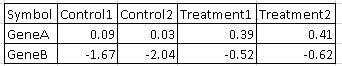
For example, lets' say the starting log2(FPKM + 0.1) expression for 2 genes is as follows:
Will a given shade of red or blue mean something different for Gene A vs Gene B? Thus, you can't show 1 legend with colors associated with matching ranges of expression between genes?
In the GSEA plot for the above example, the control samples are shades of blue for both GeneA and GeneB, and the treatment samples are shades of red for both GeneA and GeneB (when calculating enrichment for a given gene set in the "Treatment" group). However, the absolute value was higher for GeneA among all 4 samples, unless some transformation like standardization is applied.
David - are you saying that files can be created with subsets of the provided expression? Or, is there something to reflect the breaks used for the provided expression? If there is no transformation, the only other thing that I could imaging being output like a range of "[0.0 - 0.05]" or "break1".
Thank you very much.
Sincerely,
Charles
David Eby
May 5, 2021, 4:23:35 PM5/5/21
to gsea...@googlegroups.com
Hi Charles,
Yes, that's essentially correct: it's a per-row coloring scheme. The code is a bit inscrutable (it predates both Anthony and myself) but that's my take on it by my reading.
Regarding the "Create GCT files" option, these files are simply selections out of the original input dataset for the given genes being plotted in the heatmap. There are no data transformations whatsoever. I thought you were asking about the "Top 50 Features" heatmap, but the same is true of all the GCTs produced for the detailed enrichment results pages as well.
I hope that helps.
Regards,
David
David Eby
www.gsea-msigdb.org
igv.org
genepattern.org
To view this discussion on the web visit https://groups.google.com/d/msgid/gsea-help/4d96666c-aa41-4eb9-b915-0ea417d50656n%40googlegroups.com.
Charles Warden
May 5, 2021, 6:42:39 PM5/5/21
to gsea-help
Hi David,
Great - thank you very much for your confirmation!
Sincerely,
Charles
Reply all
Reply to author
Forward
0 new messages