Ysabeau Greek Review

Christian Thalmann

Irene Vlachou
Christian Thalmann
thank you, that looks very helpful indeed!
What shape would you recommend for kappa? A simple corner like /k/?
And I guess the levels of xi should be more like stacked semicircles than diagonals?
Cheers, Christian
Irene Vlachou
> And I guess the levels of xi should be more like stacked semicircles than diagonals
Christian Thalmann

Christian Thalmann
Christian Thalmann
Irene Vlachou
Hi Christian,
Christian Thalmann
Irene Vlachou
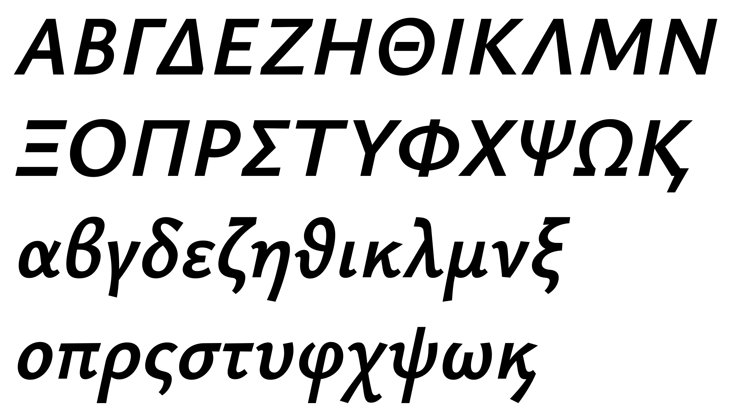
Are you sure Gamma needs to be that narrow? Looks a bit strange to me...
BTW, I changed Kappa because I'm also working on Latin with another reviewer (Andreas Stötzner), and he insisted on that thinner and shorter upper arm. It looks weird to me up close, but I guess it does work in text. Does that work for Kappa, too?
Christian Thalmann
- Doesn't /Xi/ become too light if its strokes are modeled after /E/ without the benefit of a vertical stem?
- /Sigma/: Should I also try to alternate the contrast between the strokes more? Thin roof, thick foot?
- /Omega/: Yes, that's a tough one. I think I tried too hard to stick to the stroke of /O/ in the upper part.
- /Captonos/: I think I made it more vertical than the lowercase one because it always looks wrong to me when it's strongly slanted. It reminds me of the common malpractice in Latin to use grave accents instead of apostrophes... should I use the same slant as in lowercase, then?
- /alpha/: I see what you mean, but I find it hard to cram all that structure into a narrow space without visually dissolving the intersection. Would you prefer using the /a/-like alternate as the default shape for /alpha/?
- /epsilon/: Hm, it already looks quite wide to me, and a bit crude because of that (Verdana-ish?). Maybe because /a/ and /e/ are also quite narrow in a Garamond? I'll certainly try out your suggestion.
- /zeta, xi, sigmafinal/: The heavy part of the stroke extends from the left «hip» to the right «knee» because all of those follow a «strong» diagonal. Would you prefer I keep the stress more horizontal and thin out the up- and downswings? Isn't /zeta/ in particular going to be too light after that?
- /eta/: The juncture is currently modeled after /n/, but I suppose it's not important that they look the same...
- /lambda/: I'm having trouble with that instroke. Do you have a good reference?
- /sigma/: I believe the problem is that the round body needs to transition into a straight top rather quickly so as to keep the top visually flat... and it's also a weak diagonal, so I need to thin it out. I can try moving the stroke inwards; hopefully that's not going to lean the whole glyph to the right...
- /phi, psi/: I'll give the tapering a try. Not sure it will fit the visual style, though.
- /dieresistonos/: OK, good to know! It's going to get tight there, but I guess I'm allowed to exceed the sidebearings of the /iota/ body...? It /iotadieresistonos/ usually surrounded by vowels on both sides?
Irene Vlachou

 > > /eta/: The juncture is currently modeled after /n/, but I suppose it's not important that they look the same...
 > > /phi, psi/: I'll give the tapering a try. Not sure it will fit the visual style, though.
Christian Thalmann


Thomas Linard
Irene gave some examples of Capital Kai here:
https://github.com/adobe-type-tools/adobe-greek-charsets/issues/1#issuecomment-364510177
Christian Thalmann

Christian Thalmann

Christian Thalmann
Irene Vlachou
Irene Vlachou
Christian Thalmann
Hi Irene,
I thanks for the notes! I'm not quite clear on the orientation of alpha; how would you prefer it? Less diagonal than in current Hairline and Bold but more than in Black?
Is the dash on /Upsilon/ in the Hairline spurious? If it's a note, I don't understand it. ;)
Are you principally OK with /sigmafinal/ being the only glyph with «reversed contrast»? Should I do that with other glyphs as well, or try to avoid it in /sigmafinal/?
I'm surprised at the proposed compression of /eta/, since it's the most directly comparable «stem» letter to the Latin and I used it as a reference for the weight and size of the other letters... but I'm happy to give it a try.
Cheers, Christian
Irene Vlachou
> I thanks for the notes! I'm not quite clear on the orientation of alpha; how would you prefer it? Less diagonal than in current Hairline and Bold but more than in Black?
Irene Vlachou
μια μια μιαμι αμια αμμια μια μα μι μα μα η μια μια μια μ μιαμι αμια αμμια ια μη μια μη η η μι μια η μια μια μη μια μη μι η μια μια μα μια μη η μια η μι μι μι μιαμι αμια αμ μιαμι αμια αμμια μια α μη μια μια μια μια μια μη μια μι μη η μη η μια μ μιαμι αμια αμμια η μια μια μια μα μι μια μιαμι αμια αμμια μι η η η μια μα μι μιαμι αμια αμμια αμι αμια αμμια μα μια μα η μια μια μι μη μη μι μια μια μη μα μια η η μια μη μα η μια μια μια μι η μι μια μια η
## αηιμυ
Μια Μια Μιαμι Αμια Αμμια Μια Μα Μι Μα Μα Η Μια Μια Μια Μ Μιαμι Αμια Αμμια Ια Μη Μια Μη Η Η Μι Μια Η Μια Μια Μη Μια Μη Μι Η Μια Μια Μα Μια Μη Η Μια Η Μι Μι Μι Μιαμι Αμια Αμ Μιαμι Αμια Αμμια Μια Α Μη Μια Μια Μια Μια Μια Μη Μια Μι Μη Η Μη Η Μια Μ Μιαμι Αμια Αμμια Η Μια Μια Μια Μα Μι Μια Μιαμι Αμια Αμμια Μι Η Η Η Μια Μα Μι Μιαμι Αμια Αμμια Αμι Αμια Αμμια Μα Μια Μα Η Μια Μια Μι Μη Μη Μι Μια Μια Μη Μα Μια Η Η Μια Μη Μα Η Μια Μια Μια Μι Η Μι Μια Μια Η
## αηιμυ
μια μια μιαμι αμια αμμια μια μα μι μα μα η μια μια μια μ μιαμι αμια αμμια ια μη μια μη η η μι μια η μια μια μη μια μη μι η μια μια μα μια μη η μια η μι μι μι μιαμι αμια αμ μιαμι αμια αμμια μια α μη μια μια μια μια μια μη μια μι μη η μη η μια μ μιαμι αμια αμμια η μια μια μια μα μι μια μιαμι αμια αμμια μι η η η μια μα μι μιαμι αμια αμμια αμι αμια αμμια μα μια μα η μια μια μι μη μη μι μια μια μη μα μια η η μια μη μα η μια μια μια μι η μι μια μια
## αηιμυ + ψφ
μια μια η μιψα ιψμια αφ μια η μια φαιψ φαψι φι μια μη φα μιαψι η η μια μια η μια η μια μη μια μια μια φι μιφιψι φι φι μα μια φιαφ μια φιη φι μι μια μη μια μια φιψι μι αφ μιαψι η μια αφ μια μια μια μη η φι η μια μια μια μια η μια η μια φι μια αφη μια φα μια η μιαφα η φιαμια μια η μια φα μια μι μι μη μια μι η μια φι μια φα μια η μιαφιψια
## Αηιμυ + Ψφ
Μια Μια Η Μιψα Ιψμια Αφ Μια Η Μια Φαιψ Φαψι Φι Μια Μη Φα Μιαψι Η Η Μια Μια Η Μια Η Μια Μη Μια Μια Μια Φι Μιφιψι Φι Φι Μα Μια Φιαφ Μια Φιη Φι Μι Μια Μη Μια Μια Φιψι Μι Αφ Μιαψι Η Μια Αφ Μια Μια Μια Μη Η Φι Η Μια Μια Μια Μια Η Μια Η Μια Φι Μια Αφη Μια Φα Μια Η Μιαφα Η Φιαμια Μια Η Μια Φα Μια Μι Μι Μη Μια Μι Η Μια Φι Μια Φα Μια Η Μιαφιψια
## αηιμυ + ψφ
μια μια η μιψα ιψμια αφ μια η μια φαιψ φαψι φι μια μη φα μιαψι η η μια μια η μια η μια μη μια μια μια φι μιφιψι φι φι μα μια φιαφ μια φιη φι μι μια μη μια μια φιψι μι αφ μιαψι η μια αφ μια μια μια μη η φι η μια μια μια μια η μια η μια φι μια αφη μια φα μια η μιαφα η φιαμια μια η μια φα μια μι μι μη μια μι η μια φι μια φα μια η μιαφιψιαχ
## αηιμυ + πτ
μπιτ παμπ τι μπα η παμπ παμπ μπα παπα ταυ μι μπιτ η μπιτ πια μι μη ματ παπα μπα παμπ παπα η απ μπιτ μια τη παμπ πια η μι πια η μπιτ τι ταμ μπα ταυ μπιτ μπιτ παμπ μη πα μια υπ πια μπα πα η υπ ταμ μη ταμ υπ παμπ παπα παμπ μα ταμ παμπ τι μα παπα μπιτ η υπ ταυ η ταυ παμπ η ταμ η ταυ μια ματ τα απ μι μπιτ μπιτ μπιτ παπα παμπ παπα η η τι παμπ ταμ μια παμπ πια μια παπα απ ματ ματ παπα τι μπιτ η ταμ παπα πια ταμ παμπ ταμ απ παπα ταυ ταυ τη μπα ματ η ταυ τα πι μη πα παπα παπα μπιτ απ παμπ πια η μια παμπ υπ μπιτ παπα η πα μια ταυ παπα πι παπα παμπ η η μπι
## Αηιμυ + Πτ
Μπιτ Παμπ Τι Μπα Η Παμπ Παμπ Μπα Παπα Ταυ Μι Μπιτ Η Μπιτ Πια Μι Μη Ματ Παπα Μπα Παμπ Παπα Η Απ Μπιτ Μια Τη Παμπ Πια Η Μι Πια Η Μπιτ Τι Ταμ Μπα Ταυ Μπιτ Μπιτ Παμπ Μη Πα Μια Υπ Πια Μπα Πα Η Υπ Ταμ Μη Ταμ Υπ Παμπ Παπα Παμπ Μα Ταμ Παμπ Τι Μα Παπα Μπιτ Η Υπ Ταυ Η Ταυ Παμπ Η Ταμ Η Ταυ Μια Ματ Τα Απ Μι Μπιτ Μπιτ Μπιτ Παπα Παμπ Παπα Η Η Τι Παμπ Ταμ Μια Παμπ Πια Μια Παπα Απ Ματ Ματ Παπα Τι Μπιτ Η Ταμ Παπα Πια Ταμ Παμπ Ταμ Απ Παπα Ταυ Ταυ Τη Μπα Ματ Η Ταυ Τα Πι Μη Πα Παπα Παπα Μπιτ Απ Παμπ Πια Η Μια Παμπ Υπ Μπιτ Παπα
## αηιμυ + πτ
μπιτ παμπ τι μπα η παμπ παμπ μπα παπα ταυ μι μπιτ η μπιτ πια μι μη ματ παπα μπα παμπ παπα η απ μπιτ μια τη παμπ πια η μι πια η μπιτ τι ταμ μπα ταυ μπιτ μπιτ παμπ μη πα μια υπ πια μπα πα η υπ ταμ μη ταμ υπ παμπ παπα παμπ μα ταμ παμπ τι μα παπα μπιτ η υπ ταυ η ταυ παμπ η ταμ η ταυ μια ματ τα απ μι μπιτ μπιτ μπιτ παπα παμπ παπα η η τι παμπ ταμ μια παμπ πια μια παπα απ ματ ματ παπα τι
## αηιμυ + ζξς
η ξις μα ηξα μια η μα μη η μια μις ηξα μιας ζηξα μια μια ηξα μια μη μια ηξας μα μις μι ζηξι η μι η μια αιξ αιξ μης η ζη μι μι ζηξα η μια αιξ ηξα μιας μι η μη ζημια ξι η μια μα ηξα ηξα μας μι μη μα μια μια ηξαζις μιας η μις μη αιξ αιξ μι μια μα μα μι μια ξι η ξι ξι ηξα η μια μι αιξ η αιξ μια μιας μι μια μια η ξι μα η αιξ η μιζας μιας μια ηξα μι
## Αηιμυ + Ζξς
Η Ξις Μα Ηξα Μια Η Μα Μη Η Μια Μις Ηξα Μιας Ζηξα Μια Μια Ηξα Μια Μη Μια Ηξας Μα Μις Μι Ζηξι Η Μι Η Μια Αιξ Αιξ Μης Η Ζη Μι Μι Ζηξα Η Μια Αιξ Ηξα Μιας Μι Η Μη Ζημια Ξι Η Μια Μα Ηξα Ηξα Μας Μι Μη Μα Μια Μια Ηξαζις Μιας Η Μις Μη Αιξ Αιξ Μι Μια Μα Μα Μι Μια Ξι Η Ξι Ξι Ηξα Η Μια Μι Αιξ Η Αιξ Μια Μιας Μι Μια Μια Η Ξι Μα Η Αιξ Η Μιζας Μιας Μια Ηξα Μι
## ΑΗΙΜΥ + ΖΞΣ
Η ΞΙΣ ΜΑ ΗΞΑ ΜΙΑ Η ΜΑ ΜΗ Η ΜΙΑ ΜΙΣ ΗΞΑ ΜΙΑΣ ΖΗΞΑ ΜΙΑ ΜΙΑ ΗΞΑ ΜΙΑ ΜΗ ΜΙΑ ΗΞΑΣ ΜΑ ΜΙΣ ΜΙ ΖΗΞΙ Η ΜΙ Η ΜΙΑ ΑΙΞ ΑΙΞ ΜΗΣ Η ΖΗ ΜΙ ΜΙ ΖΗΞΑ Η ΜΙΑ ΑΙΞ ΗΞΑ ΜΙΑΣ ΜΙ Η ΜΗ ΖΗΜΙΑ ΞΙ Η ΜΙΑ ΜΑ ΗΞΑ ΗΞΑ ΜΑΣ ΜΙ ΜΗ ΜΑ ΜΙΑ ΜΙΑ ΗΞΑΖΙΣ ΜΙΑΣ Η ΜΙΣ ΜΗ ΑΙΞ ΑΙΞ ΜΙ ΜΙΑ ΜΑ ΜΑ ΜΙ ΜΙΑ ΞΙ Η ΞΙ ΞΙ ΗΞΑ Η ΜΙΑ ΜΙ ΑΙΞ Η ΑΙΞ ΜΙΑ ΜΙΑΣ ΜΙ ΜΙΑ ΜΙΑ Η ΞΙ ΜΑ Η ΑΙΞ Η ΜΙΖΑΣ ΜΙΑΣ ΜΙΑ ΗΞΑ ΜΙ
## αηιμυ + γκλνχ
αλλ χλια γι κλαιν ην μην η μιαν μην μην χλια λακ για μι μα μιαν κλαιν και η γα μια κλαιν η χλια κη μιαν η να η νυν χλια κλαιν καιν μιαν ην χλια αλλ μινγκ μινγκ μιαν η λακ ναι καν γη μινγκ κλαιν χλια μιαν γι αλλ ναι καιν χλια λα κλικ μινγκ κλαιν μινγκ κη λα καιν κλικ χλια χλια μιαν γι νια μνα μνα η κλαιν η αλλ η μινγκ γη χλια κλακ χμ μη κλικ χλια κλαιν μινγκ λακ νια μινγκ κλακ αν για μινγκ κλακ νυν μινγκ κλικ μα αν κλακ αλλ ναι καιν νυν για κλικ μινγκ κλαιν ναι μινγκ μι κλαιν γα αλλ χα η μιακ
## Αηιμυ + Γκλνχ
Αλλ Χλια Γι Κλαιν Ην Μην Η Μιαν Μην Μην Χλια Λακ Για Μι Μα Μιαν Κλαιν Και Η Γα Μια Κλαιν Η Χλια Κη Μιαν Η Να Η Νυν Χλια Κλαιν Καιν Μιαν Ην Χλια Αλλ Μινγκ Μινγκ Μιαν Η Λακ Ναι Καν Γη Μινγκ Κλαιν Χλια Μιαν Γι Αλλ Ναι Καιν Χλια Λα Κλικ Μινγκ Κλαιν Μινγκ Κη Λα Καιν Κλικ Χλια Χλια Μιαν Γι Νια Μνα Μνα Η Κλαιν Η Αλλ Η Μινγκ Γη Χλια Κλακ Χμ Μη Κλικ Χλια Κλαιν Μινγκ Λακ Νια Μινγκ Κλακ Αν Για Μινγκ Κλακ Νυν Μινγκ Κλικ Μα Αν Κλακ Αλλ Ναι Καιν Νυν Γι Η Για Κλικ Μινγκ
## αηιμυ + γκλνχ
αλλ χλια γι κλαιν ην μην η μιαν μην μην χλια λακ για μι μα μιαν κλαιν και η γα μια κλαιν η χλια κη μιαν η να η νυν χλια κλαιν καιν μιαν ην χλια αλλ μινγκ μινγκ μιαν η λακ ναι καν γη μινγκ κλαιν χλια μιαν γι αλλ ναι καιν χλια λα κλικ μινγκ κλαιν μινγκ κη λα καιν κλικ χλια χλια μιαν γι νια μνα μνα η κλαιν η αλλ η μινγκ γη χλια κλακ χμ μη κλικ χλια κλαιν μινγκ λακ νια μινγκ κλακ αν για μινγκ κλακ νυν μινγκ κλικ μα αν κλακ αλλ ναι καιν νυν γι η για κλικ μινγκ κλαιν ναι μινγκ μι κλαιν γα αλλ χα η μιαν καν η αν η καιν μινγκ η αλλ μα μινγκ γι και νυν μη ην και μιαν
## αηιμυ + βδεθορσω
βδηρα δρυ σα θρου δια σα ηρθει θρου θρου βρε αρθουρ σιορ σαι βρει ρθουρ δρα σο δη σερ σιορ βρει ρω ρθουρ θρου δρυ βδηρα με ο θειε βρω βρω θειο βρει ρθουρ σα ηρθει βδηρα σα η μα δια θρου θρου θειο βδηρα θειου θρου μα θειε βρω ο η σου θειε βδηρα δια βα σε βδηρα ρω η βρε ο θειου δυο ου ρθουρ ρθουρ ο σερ βρει σιορ μοβ η μοβ δη θειο σιορ θειου θειου ρη θρου θειε σαι βρω βρει ο δει ρω σιορ βρω θειο μη βδηρα σο μι ρω θειε θειο δυο ρου ρθουρ μου δη θειε ρου ο βρει δει θρου σιορ ηρθει θειου θρου θειε ηρθει δρυ ση ρθουρ θειο θρου ει ρθουρ θειε θειε θρου η ηρθει θειου δι δια θα θρου δρα σερ σε μια ρου θειε η δυο μοβ ερθουρα
## Αηιμυ + Βδεθορσω
Βδηρα Δρυ Σα Θρου Δια Σα Ηρθει Θρου Θρου Βρε Αρθουρ Σιορ Σαι Βρει Ρθουρ Δρα Σο Δη Σερ Σιορ Βρει Ρω Ρθουρ Θρου Δρυ Βδηρα Με Ο Θειε Βρω Βρω Θειο Βρει Ρθουρ Σα Ηρθει Βδηρα Σα Η Μα Δια Θρου Θρου Θειο Βδηρα Θειου Θρου Μα Θειε Βρω Ο Η Σου Θειε Βδηρα Δια Βα Σε Βδηρα Ρω Η Βρε Ο Θειου Δυο Ου Ρθουρ Ρθουρ Ο Σερ Βρει Σιορ Μοβ Η Μοβ Δη Θειο Σιορ Θειου Θειου Ρη Θρου Θειε Σαι Βρω Βρει Ο Δει Ρω Σιορ Βρω Θειο Μη Βδηρα Σο Μι Ρω Θειε Θειο Δυο Ρου Ρθουρ Μου Δη Θειε Ρου Ο Βρει Δει Θρου Σιορ Ηρθει Θειου Θρου Θειε Ηρθει Δρυ Ση Ρθουρ
## Lower case combinations (all possible combinations)
νηπιάας καράβι σαγανάκι καιάδας αέρας νάζια μάης ψάθα κεραία φάκα σαλάτα σαματάς μανούλα αταξία αορτή κάπα παράθυρο αφασία καταρρίπτω αυτιά ράφια μαχαλάς καψαλίζω φάω πας. βαρκούλα αββάς έβγαλε βδέλα μανιβέλα βζιν βλάβη βίδα τάβλα σβούρα αβρός βυτίο ράβω. αγάπη αγγαρία έγδυσε αγέρας σαγήνη σκάγια αγκαλιά γλαφυρός σίγμα αγνοώ έλεγξα αγόρι αγρός γύρω αγχώδης αγώνας. αδαής σαδδουκαίος άδεια αδημονώ παιδί κάδμος αφίδναι ειδοποίηση αμυδρός δυαδικός εδώ. αθέατη ανέβα σέγα μεδούλι λέει τέζα δέηση πεθαμένος ρειάκι καρέκλα σέλα δέμα αναμένα έβρεξα θεός λεπτό τέρας μπέσα βέτο πεύκο νεφέλη έβρεχα κλεψιά λέω θες. ζάχαρη μαζεύω έζησα νάζια ζλότι αζναβούρ αζόρες έζρα αζτέκος ζυμώνω ζώα. πίθηαι ήβη πηγάδι αηδία ήειδε πήζω λήθη καθεστυκηία σηκώνω ψηλά σημάδι μήνας ήξερα οδυσσήος σήπεται χήρα έζησα θήτα νηυσίν ηφαίστειο άηχος σήψη τεθνηώτος ζωής. καθαρός αθέατος άνθησε καλάθια κάθκαρτ αθλητής ασθμαίνω θνητός θολούρα θρόισμα θυμιατό αθώος αδιάβαστος λίβας σιγά παιδάκι σείεται ρίζα πνοιής είθε προίκα μίλα αίμα είναι μίξα άγριος πίπα χαίρομαι κάθισα επαίτης ιυ σιφώνι σιχαίνομαι δίψα λιώμα ελπίς άκακος έκβαση εκδίκαση ακέφαλος έκζεμα κήπος έκθεση χαλάκια εκκλησία έκλαψε ακμή οκνηρός ακοή εκπλήρωση έκρηξη έκτακτο κυοφορία έκφραση σάκχαρο εκών νικς. λαός χαλβά ς άλγος αλδινό πλειάδα έλζα αλήθεια έλθει σάλια αλκαλικό αλλά αλμύρα χαλνώ έλξη άλογο ελπίδα έλροϊ άλσος ψάλτης αλυσίδα άλφα κάλχας αλώβητος βαλς. αμάθεια άμβωνας έμδεν εμμένω αμήχανος λάμια σίμκα κάμλα βάμμα αμνηστία ομόνεια ρόμπα αμριτσάρ κομσομόλ καμτσίκι αμυδρά εμφανής καμχής λάμψη άμωμος έιμπραμς ανανάς ανβάρ ένδεια ανέχεια ανζού ανήσυχος ενθύμιο ανία κονκάρδα καραμανλής μάννα εννοώ μονρόε πένσα αντλία νύχτα ανφάς μάνχαϊμ ανώγι χανς εξαπτέρυγο αξεσουάρ εξήγηση αξία αξλ ξόανο εξπέρ έξυσε εξωτερικό. στοά κόβω λόγος οδός ροές ρόζος βοήθεια πόθος κοιλιά πρόκα χολή ρόμπα μονάχος οξεία κλόουν ρόπτρο πόρτα όστια ποτό ρούχο λόφος οχιά κόψιμο προώθηση πράος. απάτη περίπου πηλίκιο πιθάρι έπκοτ απλός άπνοια απόσταση κάππα έπραξε απτός πύον πφφ απώτερο καπς. αράδα αρβύλα αργά γιάρδα παρέα τερζής κρητικός πάρθιος ψάρια μάρκα αρλούμπα αρμενίζω αρνί ξέρξης πρότερο αρπαγή θάρρος άρση χαρτί δάκρυα ερφούρτη αρχή τέρψη ήρωας αρς. κάσα ασβός σγουρός βασδέκης ασεβής ασήμαντος ασθενής όσιος σκηφτός ασλάνης χάσμα σνομπ πασούμι ράσπα καρλσρούη θάλασσα μαστός ασύδοτος ασφάλεια έσχατος άσωτος σς. τασάκι ετβά καλλιτεχνικός ατζαμής έστησα κάτθανε μάτια άτλαντας ατμός πατούσα άτρακτος πίτσα θάλαττα στυφός κατώι κατς. μυαλό κουβάς αυγό άναυδος μυελός ούζο εύηχος αύθα υιός καύκαλο παύλα τραύμα μαούνα σύξυλος λουόμενος τρύπα αύρα καθυστέρηση αυτιά καύφαλο ευχή υψηλός λύω ναυς. φαγητό αφγανιστάν εφεξής αφηνιασμένος άφθονος μαφία κάφκαλο καράφλα έξαφνα αφορμή αφρός φσιτ αφτιά φυτικό φχαριστώ φωταψίες παφς χάρακας χειρότερος όχημα αχθοφόρος αχινός αχλάδι αιχμηρό πάχνη αχούρι σαχπασίδης αχρείαστος οχτώηχος αχυρώνας αδιαχώρητο χς. καψαλίζω ψείρες αψηφώ ταψιά άψογος έμψυχος ψώρα. ζώα ιωβηλαίος διωγμός ωδή ζωές έσωζε ζωή ώθηση ωιμέ εσώκλειστο κώλυμα λιώμα άμβωνας βωξίτης ζώον αναζωπύρωση τώρα έσωσα ρωτάω ζωύφιο κωφός μολώχ μύωψ ζώων πως
## Mix case combinations (all possible combinations)
Ααρών Άβατο Αγύριστος Αδικαιολόγητα Αέναος Αζήτητα Αήττητος Αθηναίος Αίαντας Ακαταστασία Αλλαγή Αμήχανα Αναμασώ Αξίνα Αόρατος Απείραχτος Αριβιστής Ασυγχώρητος Αττίλας Αυταρέσκεια Αφουγκράζομαι Αχέροντας Αψίδα Αώο Ας. Βάμμα Βγήκα Βδέλλα Βερόνα Βηματοδότης Βιρμανία Βλέψη Βολταϊκός Βρασίδας Βυθός Βωξ.Γαλοπούλα Γδύνω Γεράνι Γήρας Γιατί Γκαρίζω Γλαφυρός Γνέφω Γομάρι Γραικός Γυρεύω Γωνία. Δάδα Δγυρίζω Δέντρο Δη Διορίζω Δοκάρι Δπαίζω Δράκος Δύο Δφάληρο Δώμα. Εαρινός Έβαινα Εγώ Έδωσα Έζησα Έθιμο Είμαστε Έκλειψη Έλαμψα Έμενα Ενίοτε Εξαίρεση Εορτασμός Έπρεπε Έρχεται Εσωτερικός Ετοιμόλογος Ευτυχώς Εφεδρικός Έχει Έψησα Έως Ες. Ζαρωμένος Ζβόλος ΖγάταΖέα Ζην Ζιγκολό Ζλότι Ζορζ Ζυγαριά Ζωγράφος. Ηβικός Ηγεμόνας Ηδύποτο Ήθελα Ηκέτης Ηλιακός Ήμερος Ηνίο Ήξερα Ηπατικός Ηριδανός Ησαΐας Ήττα Ηυξημένος Ήφαιστος Ηχείο Ηψηλά Ης. Θαλάμι Θέλημα Θζήτημα Θηρίο Θιάσος Θκάππα Θνητός Θολούρα Θρασύς Θυμάρι Θφακός Θωμάς. Ιανός ΙβηρικόςΙγμόρειο Ιδιαίτερος Ιερεμίας Ίζημα Ιησουίτης Ιθαγένεια Ίκτερος Ιλαρά Ιμιτασιόν Ινία Ιξός Ίος Ιππικός Ίριδα Ισσός Ιτιά Ιύφαλος Ιφακός Ιχθύς Ίψεν Ιωβηλαίο Ις. Κακία Κβαντική Κένταυρος Κηδεία Κιάτο Κλέβω Κνήμη Κοροϊδία Κράση Κτήμα Κύμα Κωδεΐνη. Λαμία ΛέραΛζήτω Λήθη Λιώμα Λοβοτομή Λυδία Λωτός. Μαδέρι Μειδίαμα Μζάρι Μην Μιάου Μνήμα Μόδα Μπαρμπούνι Μύδια Μωρία Μς. Νανούρισμα Νεότερος Νήπιο Νίκη Νκακία Νοοτροπία Νταμάρι Νυμφαίο Νώε Νς. Ξανά ΞημέρωσεΞιπόλητος Ξόρκι Ξυράφι Ξωκλήσι Ξς. Όαση Οβελίας Ογδόντα Οδοιπόρος Όζον Οθέλος Οικονομία Οκλαχόμα Ολόκληρος Ομόνοια Όνειρο ΌξινοςΌπερα Ορός Όσιος Όταν Ουρανία Όφελος Οχιά Όψιμος Ος. Παπαρούνα Περιβόλι Πζάρι Πήγαινα Πίνω Πλένω Πνεύμα Ποτήρι Πρωτιά Πυρίμαχος Πώς Πς. Ρεμάλι Ρήγμα Ρίζα Ρόπτρο Ρυμουλκό Ρωμαϊκός Ρς. Σαβάνα Σβήνω Σγουρός Σδένω Σελήνη Σήμερα Σθένος Σιρόπι Σκελέα Σλιπ Σμέρνα Σνιφάρω Σοπράνο Σπιούνος Σρι λάνκα Σσερσέμης Σταλιά Σύμμαχος Σφετεριστής Σχήμα Σωθικά Σς. Ταβέρνα Τεμάχιο Τζάμι Τηγάνι Τιβέριος Τμήμα Τοπογραφικό Τριβιζάς Τσέχος Τυφώνας Τώρα Τς. Υάκινθος Υβριδικός Υγεία Υδάτινος Υεμένη Υιός Υκαρμίνα Υλικός Υμών Υνί Υπέρ Ύστατος Ύφαλος ΥχροιάΎψος Υς. Φαγητό Φευγαλέος Φήμη Φθιώτιδα Φιλικός Φλύαρος Φνακ Φορτωμένος Φραγή Φτυάρι Φυσάει Φωκίδα Φς. Χαρούλα Χεβιμεταλάς Χήνα Χιώτης Χλοερός Χμ Χνάρι Χολέρα Χριστιανέ Χτένι Χυτά Χωμενίδης Χς. Ψαρόβαρκα Ψεύτικα Ψησταριά Ψιλικά Ψοφόκρυο Ψυχή Ψωμί Ψς. Ωά Ωγυγία ΩδείοΏθηση Ωκεανός Ωλένη ΩμόςΩνάσηςΩοειδής Ωράριο Ώσμωση Ώτα Ωφέλιμος Ωχ! Ως.
## Upper case combinations (all possible combinations)
ΝΗΠΙΑΑΣ ΚΑΡΑΒΙ ΣΑΓΑΝΑΚΙ ΚΑΙΑΔΑΣ ΑΕΡΑΣ ΝΑΖΙΑ ΜΑΗΣ ΨΑΘΑ ΚΕΡΑΙΑ ΦΑΚΑ ΣΑΛΑΤΑ ΣΑΜΑΤΑΣ ΜΑΝΟΥΛΑ ΑΤΑΞΙΑ ΑΟΡΤΗ ΚΑΠΑ ΠΑΡΑΘΥΡΟ ΑΦΑΣΙΑ ΚΑΤΑΡΡΙΠΤΩ ΑΥΤΙΑ ΡΑΦΙΑ ΜΑΧΑΛΑΣ ΚΑΨΑΛΙΖΩ ΦΑΩ ΠΑΣ. ΒΑΡΚΟΥΛΑ ΑΒΒΑΣ ΕΒΓΑΛΕ ΒΔΕΛΑ ΜΑΝΙΒΕΛΑ ΒΖΙΝ ΒΛΑΒΗ ΒΙΔΑ ΤΑΒΛΑ ΣΒΟΥΡΑ ΑΒΡΟΣ ΒΥΤΙΟ ΡΑΒΩ. ΑΓΑΠΗ ΑΓΓΑΡΙΑ ΕΓΔΥΣΕ ΑΓΕΡΑΣ ΣΑΓΗΝΗ ΣΚΑΓΙΑ ΑΓΚΑΛΙΑ ΓΛΑΦΥΡΟΣ ΣΙΓΜΑ ΑΓΝΟΩ ΕΛΕΓΞΑ ΑΓΟΡΙ ΑΓΡΟΣ ΓΥΡΩ ΑΓΧΩΔΗΣ ΑΓΩΝΑΣ. ΑΔΑΗΣ ΣΑΔΔΟΥΚΑΙΟΣ ΑΔΕΙΑ ΑΔΗΜΟΝΩ ΠΑΙΔΙ ΚΑΔΜΟΣ ΑΦΙΔΝΑΙ ΕΙΔΟΠΟΙΗΣΗ ΑΜΥΔΡΟΣ ΔΥΑΔΙΚΟΣ ΕΔΩ. ΑΘΕΑΤΗ ΑΝΕΒΑ ΣΕΓΑ ΜΕΔΟΥΛΙ ΛΕΕΙ ΤΕΖΑ ΔΕΗΣΗ ΠΕΘΑΜΕΝΟΣ ΡΕΙΑΚΙ ΚΙ ΚΑΡΕΚΛΑ ΣΕΛΑ ΔΕΜΑ ΑΝΑΜΕΝΑ ΕΒΡΕΞΑ ΘΕΟΣ ΛΕΠΤΟ ΤΕΡΑΣ ΜΠΕΣΑ ΒΕΤΟ ΠΕΥΚΟ ΝΕΦΕΛΗ ΕΒΡΕΧΑ ΚΛΕΨΙΑ ΛΕΩ ΘΕΣ. ΖΑΧΑΡΗ ΜΑΖΕΥΩ ΕΖΗΣΑ ΝΑΖΙΑ ΖΛΟΤΙ ΑΖΝΑΒΟΥΡ ΑΖΟΡΕΣ ΕΖΡΑ ΑΖΤΕΚΟΣ ΖΥΜΩΝΩ ΖΩΑ. ΠΙΘΗΑΙ ΗΒΗ ΠΗΓΑΔΙ ΑΗΔΙΑ ΗΕΙΔΕ ΠΗΖΩ ΛΗΘΗ ΚΑΘΕΣΤΥΚΗΙΑ ΣΗΚΩΝΩ ΨΗΛΑ ΣΗΜΑΔΙ ΜΗΝΑΣ ΗΞΕΡΑ ΟΔΥΣΣΗΟΣ ΣΗΠΕΤΑΙ ΧΗΡΑ ΕΖΗΣΑ ΘΗΤΑ ΝΗΥΣΙΝ ΗΦΑΙΣΤΕΙΟ ΑΗΧΟΣ ΣΗΨΗ ΤΕΘΝΗΩΤΟΣ ΖΩΗΣ. ΚΑΘΑΡΟΣ ΑΘΕΑΤΟΣ ΑΝΘΗΣΕ ΚΑΛΑΘΙΑ ΚΑΘΚΑΡΤ ΑΘΛΗΤΗΣ ΑΣΘΜΑΙΝΩ ΘΝΗΤΟΣ ΘΟΛΟΥΡΑ ΘΡΟΪΣΜΑ ΘΥΜΙΑΤΟ ΑΘΩΟΣ ΑΔΙΑΒΑΣΤΟΣ ΛΙΒΑΣ ΣΙΓΑ ΠΑΙΔΑΚΙ ΣΕΙΕΤΑΙ ΡΙΖΑ ΠΝΟΙΗΣ ΕΙΘΕ ΠΡΟΙΚΑ ΜΙΛΑ ΑΙΜΑ ΕΙΝΑΙ ΜΙΞΑ ΑΓ ΕΙΝΑΙ ΜΙΞΑ ΑΓΡΙΟΣ ΠΙΠΑ ΧΑΙΡΟΜΑΙ ΚΑΘΙΣΑ ΕΠΑΙΤΗΣ ΙΥ ΣΙΦΩΝΙ ΣΙΧΑΙΝΟΜΑΙ ΔΙΨΑ ΛΙΩΜΑ ΕΛΠΙΣ ΑΚΑΚΟΣ ΕΚΒΑΣΗ ΕΚΔΙΚΑΣΗ ΑΚΕΦΑΛΟΣ ΕΚΖΕΜΑ ΚΗΠΟΣ ΕΚΘΕΣΗ ΧΑΛΑΚΙΑ ΕΚΚΛΗΣΙΑ ΕΚΛΑΨΕ ΑΚΜΗ ΟΚΝΗΡΟΣ ΑΚΟΗ ΕΚΠΛΗΡΩΣΗ ΕΚΡΗΞΗ ΕΚΤΑΚΤΟ ΚΥΟΦΟΡΙΑ ΕΚΦΡΑΣΗ ΣΑΚΧΑΡΟ ΕΚΩΝ ΝΙΚΣ. ΛΑΟΣ ΧΑΛΒΑ Σ ΑΛΓΟΣ ΑΛΔΙΝΟ ΠΛΕΙΑΔΑ ΕΛΖΑ ΑΛΗΘΕΙΑ ΕΛΘΕΙ ΣΑΛΙΑ ΑΛΚΑΛΙΚΟ ΑΛΛΑ ΑΛΜΥΡΑ ΧΑΛΝΩ ΕΛΞΗ ΑΛΟΓΟ ΕΛΠΙΔΑ ΕΛΡΟΪ ΑΛΣΟΣ ΨΑΛΤΗΣ ΑΛΥΣΙΔΑ ΑΛΦΑ ΚΑΛΧΑΣ ΑΛΩΒΗΤΟΣ ΒΑΛΣ. ΑΜΑΘΕΙΑ ΑΜΒΩΝΑΣ ΕΜΔΕΝ ΕΜΜΕΝΩ ΑΜΗΧΑΝΟΣ ΛΑΜΙΑ ΣΙΜΚΑ ΚΑΜΛΑ ΒΑΜΜΑ ΑΜΝΗΣΤΙΑ ΟΜΟΝΕΙΑ ΡΟΜΠΑ ΑΜΡΙΤΣΑΡ ΚΟΜΣΟΜΟΛ ΚΑΜΤΣΙΚΙ ΤΣΙΚΙ ΑΜΥΔΡΑ ΕΜΦΑΝΗΣ ΚΑΜΧΗΣ ΛΑΜΨΗ ΑΜΩΜΟΣ ΕΪΜΠΡΑΜΣ ΑΝΑΝΑΣ ΑΝΒΑΡ ΕΝΔΕΙΑ ΑΝΕΧΕΙΑ ΑΝΖΟΥ ΑΝΗΣΥΧΟΣ ΕΝΘΥΜΙΟ ΑΝΙΑ ΚΟΝΚΑΡΔΑ ΚΑΡΑΜΑΝΛΗΣ ΜΑΝΝΑ ΕΝΝΟΩ ΜΟΝΡΟΕ ΠΕΝΣΑ ΑΝΤΛΙΑ ΝΥΧΤΑ ΑΝΦΑΣ ΜΑΝΧΑΪΜ ΑΝΩΓΙ ΧΑΝΣ ΕΞΑΠΤΕΡΥΓΟ ΑΞΕΣΟΥΑΡ ΕΞΗΓΗΣΗ ΑΞΙΑ ΑΞΛ ΞΟΑΝΟ ΕΞΠΕΡ ΕΞΥΣΕ ΕΞΩΤΕΡΙΚΟ. ΣΤΟΑ ΚΟΒΩ ΛΟΓΟΣ ΟΔΟΣ ΡΟΕΣ ΡΟΖΟΣ ΒΟΗΘΕΙΑ ΠΟΘΟΣ ΚΟΙΛΙΑ ΠΡΟΚΑ ΧΟΛΗ ΡΟΜΠΑ ΜΟΝΑΧΟΣ ΟΞΕΙΑ ΚΛΟΟΥΝ ΡΟΠΤΡΟ ΠΟΡΤΑ ΟΣΤΙΑ ΠΟΤΟ ΡΟΥΧΟ ΛΟΦΟΣ ΟΧΙΑ ΚΟΨΙΜΟ ΠΡΟΩΘΗΣΗ ΠΡΑΟΣ. ΑΠΑΤΗ ΠΕΡΙΠΟΥ ΠΗΛΙΚΙΟ ΠΙΘΑΡΙ ΕΠΚΟΤ ΑΠΛΟΣ ΑΠΝΟΙΑ ΑΠΟΣΤΑΣΗ ΚΑΠΠΑ ΕΠΡΑΞΕ ΑΠΤΟΣ ΠΥΟΝ ΠΦΦ ΑΠΩΤΕΡΟ ΚΑΠΣ. ΑΡΑΠΣ. ΑΡΑΔΑ ΑΡΒΥΛΑ ΑΡΓΑ ΓΙΑΡΔΑ ΠΑΡΕΑ ΤΕΡΖΗΣ ΚΡΗΤΙΚΟΣ ΠΑΡΘΙΟΣ ΨΑΡΙΑ ΜΑΡΚΑ ΑΡΛΟΥΜΠΑ ΑΡΜΕΝΙΖΩ ΑΡΝΙ ΞΕΡΞΗΣ ΠΡΟΤΕΡΟ ΑΡΠΑΓΗ ΘΑΡΡΟΣ ΑΡΣΗ ΧΑΡΤΙ ΔΑΚΡΥΑ ΕΡΦΟΥΡΤΗ ΑΡΧΗ ΤΕΡΨΗ ΗΡΩΑΣ ΑΡΣ. ΚΑΣΑ ΑΣΒΟΣ ΣΓΟΥΡΟΣ ΒΑΣΔΕΚΗΣ ΑΣΕΒΗΣ ΑΣΗΜΑΝΤΟΣ ΑΣΘΕΝΗΣ ΟΣΙΟΣ ΣΚΗΦΤΟΣ ΑΣΛΑΝΗΣ ΧΑΣΜΑ ΣΝΟΜΠ ΠΑΣΟΥΜΙ ΡΑΣΠΑ ΚΑΡΛΣΡΟΥΗ ΘΑΛΑΣΣΑ ΜΑΣΤΟΣ ΑΣΥΔΟΤΟΣ ΑΣΦΑΛΕΙΑ ΕΣΧΑΤΟΣ ΑΣΩΤΟΣ ΣΣ. ΤΑΣΑΚΙ ΕΤΒΑ ΚΑΛΛΙΤΕΧΝΙΚΟΣ ΑΤΖΑΜΗΣ ΕΣΤΗΣΑ ΚΑΤΘΑΝΕ ΜΑΤΙΑ ΑΤΛΑΝΤΑΣ ΑΤΜΟΣ ΠΑΤΟΥΣΑ ΑΤΡΑΚΤΟΣ ΠΙΤΣΑ ΘΑΛΑΤΤΑ ΣΤΥΦΟΣ ΚΑΤΩΪ ΚΑΤΣ. ΜΥΑΛΟ ΚΟΥΒΑΣ ΑΥΓΟ ΑΝΑΥΔΟΣ ΜΥΕΛΟΣ ΟΥΖΟ ΕΥΗΧΟΣ ΑΥΘΑ ΥΙΟΣ ΘΑ ΥΙΟΣ ΚΑΥΚΑΛΟ ΠΑΥΛΑ ΤΡΑΥΜΑ ΜΑΟΥΝΑ ΣΥΞΥΛΟΣ ΛΟΥΟΜΕΝΟΣ ΤΡΥΠΑ ΑΥΡΑ ΚΑΘΥΣΤΕΡΗΣΗ ΑΥΤΙΑ ΚΑΥΦΑΛΟ ΕΥΧΗ ΥΨΗΛΟΣ ΛΥΩ ΝΑΥΣ. ΦΑΓΗΤΟ ΑΦΓΑΝΙΣΤΑΝ ΕΦΕΞΗΣ ΑΦΗΝΙΑΣΜΕΝΟΣ ΑΦΘΟΝΟΣ ΜΑΦΙΑ ΚΑΦΚΑΛΟ ΚΑΡΑΦΛΑ ΕΞΑΦΝΑ ΑΦΟΡΜΗ ΑΦΡΟΣ ΦΣΙΤ ΑΦΤΙΑ ΦΥΤΙΚΟ ΦΧΑΡΙΣΤΩ ΦΩΤΑΨΙΕΣ ΠΑΦΣ ΧΑΡΑΚΑΣ ΧΕΙΡΟΤΕΡΟΣ ΟΧΗΜΑ ΑΧΘΟΦΟΡΟΣ ΑΧΙΝΟΣ ΑΧΛΑΔΙ ΑΙΧΜΗΡΟ ΠΑΧΝΗ ΑΧΟΥΡΙ ΣΑΧΠΑΣΙΔΗΣ ΑΧΡΕΙΑΣΤΟΣ ΟΧΤΩΗΧΟΣ ΑΧΥΡΩΝΑΣ ΑΔΙΑΧΩΡΗΤΟ ΧΣ. ΚΑΨΑΛΙΖΩ ΨΕΙΡΕΣ ΑΨΗΦΩ ΤΑΨΙΑ ΑΨΟΓΟΣ ΕΜΨΥΧΟΣ ΨΩΡΑ. ΖΩΑ ΙΩΒΗΛΑΙΟΣ ΔΙΩΓΜΟΣ ΩΔΗ ΖΩΕΣ ΕΣΩΖΕ ΖΩΗ ΩΘΗΣΗ ΩΙΜΕ ΕΣΩΚΛΕΙΣΤΟ ΚΩΛΥΜΑ ΛΙΩΜΑ ΑΜΒΩΝΑΣ ΒΩΞΙΤΗΣ ΖΩΟΣ ΖΩΟΝ ΑΝΑΖΩΠΥΡΩΣΗ ΤΩΡΑ ΕΣΩΣΑ ΡΩΤΑΩ ΖΩΥΦΙΟ ΚΩΦΟΣ ΜΟΛΩΧ ΜΥΩΨ ΖΩΩΝ ΠΩΣ
## πεζά - lowercase (all combinations)
- ααβαγαδαεαζαηαθαιακαλαμαναξαπαρασαταυαφαχαψαωας
- βαββγβδβεβζβηβθβιβκβλβμβνβξβπβρβσβτβυβφβχβψβωβς
- γαγβγγδγεγζγηγθγιγκγλγμγνγξγπγργσγτγυγφγχγψγωγς
- δαδβδγδδεδζδηδθδιδκδλδμδνδξδπδρδσδτδυδφδχδψδωδς
- εαεβεγεδεεζεηεθειεκελεμενεξεπερεσετευεφεχεψεωες
- ζαζβζγζδζεζζηζθζιζκζλζμζνζξζπζρζσζτζυζφζχζψζωζς
- ηαηβηγηδηεηζηηθηιηκηλημηνηξηπηρησητηυηφηχηψηωης
- θαθβθγθδθεθζθηθθιθκθλθμθνθξθπθρθσθτθυθφθχθψθωθς
- ιαιβιγιδιειζιηιθιικιλιμινιξιπιρισιτιυιφιχιψιωις
- ίαίβίγίδίείζίηίθίίκίλίμίνίξίπίρίσίτίυίφίχίψίωίς
- ϊαϊβϊγϊδϊεϊζϊηϊθϊϊκϊλϊμϊνϊξϊπϊρϊσϊτϊυϊφϊχϊψϊωϊς
- ΐαΐβΐγΐδΐεΐζΐηΐθΐΐκΐλΐμΐνΐξΐπΐρΐσΐτΐυΐφΐχΐψΐωΐς
- κακβκγκδκεκζκηκθκικκλκμκνκξκπκρκσκτκυκφκχκψκωκς
- λαλβλγλδλελζληλθλιλκλλμλνλξλπλρλσλτλυλφλχλψλωλς
- μαμβμγμδμεμζμημθμιμκμλμμνμξμπμρμσμτμυμφμχμψμωμς
- νανβνγνδνενζνηνθνινκνλνμνννξνπνρνσντνυνφνχνψνωνς
- ξαξβξγξδξεξζξηξθξιξκξλξμξνξξπξρξσξτξυξφξχξψξωξς
- οαοβογοδοεοζοηοθοιοκολομονοξοποροσοτουοφοχοψοωος
- παπβπγπδπεπζπηπθπιπκπλπμπνπξποπρπσπτπυπφπχπψπωπς
- ραρβργρδρερζρηρθριρκρλρμρνρξρορπρσρτρυρφρχρψρωρς
- σασβσγσδσεσζσησθσισκσλσμσνσξσοσπσρστσυσφσχσψσωσς
- τατβτγτδτετζτητθτιτκτλτμτντξτοτπτρτστυτφτχτψτωτς
- υαυβυγυδυευζυηυθυιυκυλυμυνυξυουπυρυσυτυφυχυψυωυς
- ύαύβύγύδύεύζύηύθύύκύλύμύνύξύπύρύσύτύυύφύχύψύωύς
- ϋαϋβϋγϋδϋεϋζϋηϋθϋϋκϋλϋμϋνϋξϋπϋρϋσϋτϋυϋφϋχϋψϋωϋς
- ΰαΰβΰγΰδΰεΰζΰηΰθΰΰκΰλΰμΰνΰξΰπΰρΰσΰτΰυΰφΰχΰψΰωΰς
- φαφβφγφδφεφζφηφθφιφκφλφμφνφξφοφπφρφσφτφυφχφψφωφς
- χαχβχγχδχεχζχηχθχιχκχλχμχνχξχοχπχρχσχτχυχφχψχωχς
- ψαψβψγψδψεψζψηψθψιψκψλψμψνψξψοψπψρψσψτψυψφψχψωψς
- ωαωβωγωδωεωζωηωθωιωκωλωμωνωξωοωπωρωσωτωυωφωχωψως
## κεφαλαία - uppercase (all combinations):
- ΑΑΑΒΑΓΑΔΑΕΑΖΑΗΑΘΑΙΑΚΑΛΑΜΑΝΑΞΑΟΑΠΑΡΑΣΑΤΑΥΑΦΑΧΑΨΑΩ
- ΒΑΒΒΒΓΒΔΒΕΒΖΒΗΒΘΒΙΒΚΒΛΒΜΒΝΒΞΒΟΒΠΒΡΒΣΒΤΒΥΒΦΒΧΒΨΒΩ
- ΓΑΓΒΓΓΓΔΓΕΓΖΓΗΓΘΓΙΓΚΓΛΓΜΓΝΓΞΓΟΓΠΓΡΓΣΓΤΓΥΓΦΓΧΓΨΓΩ
- ΔΑΔΒΔΓΔΔΔΕΔΖΔΗΔΘΔΙΔΚΔΛΔΜΔΝΔΞΔΟΔΠΔΡΔΣΔΤΔΥΔΦΔΧΔΨΔΩ
- ΕΑΕΒΕΓΕΔΕΕΕΖΕΗΕΘΕΙΕΚΕΛΕΜΕΝΕΞΕΟΕΠΕΡΕΣΕΤΕΥΕΦΕΧΕΨΕΩ
- ΖΑΖΒΖΓΖΔΖΕΖΖΖΗΖΘΖΙΖΚΖΛΖΜΖΝΖΞΖΟΖΠΖΡΖΣΖΤΖΥΖΦΖΧΖΨΖΩ
- ΗΑΗΒΗΓΗΔΗΕΗΖΗΗΗΘΗΙΗΚΗΛΗΜΗΝΗΞΗΟΗΠΗΡΗΣΗΤΗΥΗΦΗΧΗΨΗΩ
- ΘΑΘΒΘΓΘΔΘΕΘΖΘΗΘΘΘΙΘΚΘΛΘΜΘΝΘΞΘΟΘΠΘΡΘΣΘΤΘΥΘΦΘΧΘΨΘΩ
- ΙΑΙΒΙΓΙΔΙΕΙΖΙΗΙΘΙΙΙΚΙΛΙΜΙΝΙΞΙΟΙΠΙΡΙΣΙΤΙΥΙΦΙΧΙΨΙΩ
- ΪΑΪΒΪΓΪΔΪΕΪΖΪΗΪΘΪΚΪΛΪΜΪΝΪΞΪΟΪΠΪΡΪΣΪΤΪΥΪΦΪΧΪΨΪΩ
- ΚΑΚΒΚΓΚΔΚΕΚΖΚΗΚΘΚΙΚΚΚΛΚΜΚΝΚΞΚΟΚΠΚΡΚΣΚΤΚΥΚΦΚΧΚΨΚΩ
- ΛΑΛΒΛΓΛΔΛΕΛΖΛΗΛΘΛΙΛΚΛΛΛΜΛΝΛΞΛΟΛΠΛΡΛΣΛΤΛΥΛΦΛΧΛΨΛΩ
- ΜΑΜΒΜΓΜΔΜΕΜΖΜΗΜΘΜΙΜΚΜΛΜΜΜΝΜΞΜΟΜΠΜΡΜΣΜΤΜΥΜΚΜΦΜΧΜΨΜΩ
- ΝΑΝΒΝΓΝΔΝΕΝΖΝΗΝΘΝΙΝΚΝΛΝΜΝΝΝΞΝΟΝΠΝΡΝΣΝΤΝΥΝΦΝΧΝΨΝΩ
- ΞΑΞΒΞΓΞΔΞΕΞΖΞΗΞΘΞΙΞΚΞΛΞΜΞΝΞΞΞΟΞΠΞΡΞΣΞΤΞΥΞΦΞΧΞΨΞΩ
- ΟΑΟΒΟΓΟΔΟΕΟΖΟΗΟΘΟΙΟΚΟΛΟΜΟΝΟΞΟΟΟΠΟΡΟΣΟΤΟΥΟΦΟΧΟΨΟΩΟ
- ΠΑΠΒΠΓΠΔΠΕΠΖΠΗΠΘΠΙΠΚΠΛΠΜΠΝΠΞΠΟΠΠΠΡΠΣΠΤΠΥΠΦΠΧΠΨΠΩΠ
- ΡΑΡΒΡΓΡΔΡΕΡΖΡΗΡΘΡΙΡΚΡΛΡΜΡΝΡΞΡΟΡΠΡΡΡΣΡΤΡΥΡΦΡΧΡΨΡΩ
- ΣΑΣΒΣΓΣΔΣΕΣΖΣΗΣΘΣΙΣΚΣΛΣΜΣΝΣΞΣΟΣΠΣΡΣΣΣΤΣΥΣΦΣΧΣΨΣΩ
- ΤΑΤΒΤΓΤΔΤΕΤΖΤΗΤΘΤΙΤΚΤΛΤΜΤΝΤΞΤΟΤΠΤΡΤΣΤΤΤΥΤΦΤΧΤΨΤΩ
- ΥΑΥΒΥΓΥΔΥΕΥΖΥΗΥΘΥΙΥΚΥΛΥΜΥΝΥΞΥΟΥΠΥΡΥΣΥΤΥΥΥΦΥΧΥΨΥΩ
- ΫΑΫΒΫΓΫΔΫΕΫΖΫΗΫΘΫΙΫΚΫΛΫΜΫΝΫΞΫΟΫΠΫΡΫΣΫΤΫΦΫΧΫΨΫΩ
- ΦΑΦΒΦΓΦΔΦΕΦΖΦΗΦΘΦΙΦΚΦΛΦΜΦΝΦΞΦΟΦΠΦΡΦΣΦΤΦΥΦΦΦΧΦΨΦΩ
- ΧΑΧΒΧΓΧΔΧΕΧΖΧΗΧΘΧΙΧΚΧΛΧΜΧΝΧΞΧΟΧΠΧΡΧΣΧΤΧΥΧΦΧΧΧΨΧΩ
- ΨΑΨΒΨΓΨΔΨΕΨΖΨΗΨΘΨΙΨΚΨΛΨΜΨΝΨΞΨΟΨΠΨΡΨΣΨΤΨΥΨΦΨΧΨΨΨΩ
- ΩΑΩΒΩΓΩΔΩΕΩΖΩΗΩΘΩΙΩΚΩΛΩΜΩΝΩΞΩΟΩΠΩΡΩΣΩΤΩΥΩΦΩΧΩΨΩΩ
## κεφαλαία+πεζά - UC+lc (all combinations):
- ΑαΑβΑγΑδΑεΑζΑηΑθΑιΑκΑλΑμΑνΑξΑοΑπΑρΑσΑτΑυΑφΑχΑψΑωΑςΑάΑίΑήΑέΑόΑύΑώΑϊΑϋΑΐΑΰ
- ΒαΒβΒγΒδΒεΒζΒηΒθΒιΒκΒλΒμΒνΒξΒοΒπΒρΒσΒτΒυΒφΒχΒψΒωΒςΒάΒίΒήΒέΒόΒύΒώ
- ΓαΓβΓγΓδΓεΓζΓηΓθΓιΓκΓλΓμΓνΓξΓοΓπΓρΓσΓτΓυΓφΓχΓψΓωΓςΓάΓίΓήΓέΓόΓύΓώ
- ΔαΔβΔγΔδΔεΔζΔηΔθΔιΔκΔλΔμΔνΔξΔοΔπΔρΔσΔτΔυΔφΔχΔψΔωΔςΔάΔίΔήΔέΔόΔύΔώ
- ΕαΕβΕγΕδΕεΕζΕηΕθΕιΕκΕλΕμΕνΕξΕοΕπΕρΕσΕτΕυΕφΕχΕψΕωΕςΕάΕίΕήΕέΕόΕύΕώΕϊΕϋΕΐΕΰ
- ΖαΖβΖγΖδΖεΖζΖηΖθΖιΖκΖλΖμΖνΖξΖοΖπΖρΖσΖτΖυΖφΖχΖψΖωΖςΖάΖίΖήΖέΖόΖύΖώ
- ΗαΗβΗγΗδΗεΗζΗηΗθΗιΗκΗλΗμΗνΗξΗοΗπΗρΗσΗτΗυΗφΗχΗψΗωΗςΗάΗίΗήΗέΗόΗύΗώΗϊΗϋΗΐΗΰ
- ΘαΘβΘγΘδΘεΘζΘηΘθΘιΘκΘλΘμΘνΘξΘοΘπΘρΘσΘτΘυΘφΘχΘψΘωΘςΘάΘίΘήΘέΘόΘύΘώ
- ΙαΙβΙγΙδΙεΙζΙηΙθΙιΙκΙλΙμΙνΙξΙοΙπΙρΙσΙτΙυΙφΙχΙψΙωΙςΙάΙίΙήΙέΙόΙύΙώΙϊΙϋΙΐΙΰ
- ΚαΚβΚγΚδΚεΚζΚηΚθΚιΚκΚλΚμΚνΚξΚοΚπΚρΚσΚτΚυΚφΚχΚψΚωΚςΚάΚίΚήΚέΚόΚύΚώ
- ΛαΛβΛγΛδΛεΛζΛηΛθΛιΛκΛλΛμΛνΛξΛοΛπΛρΛσΛτΛυΛφΛχΛψΛωΛςΛάΛίΛήΛέΛόΛύΛώ
- ΜαΜβΜγΜδΜεΜζΜηΜθΜιΜκΜλΜμΜνΜξΜοΜπΜρΜσΜτΜυΜφΜχΜψΜωΜςΜάΜίΜήΜέΜόΜύΜώ
- ΝαΝβΝγΝδΝεΝζΝηΝθΝιΝκΝλΝμΝνΝξΝοΝπΝρΝσΝτΝυΝφΝχΝψΝωΝςΝάΝίΝήΝέΝόΝύΝώ
- ΞαΞβΞγΞδΞεΞζΞηΞθΞιΞκΞλΞμΞΞΞξΞοΞπΞρΞσΞτΞυΞφΞχΞψΞωΞςΞάΞίΞήΞέΞόΞύΞώ
- ΟαΟβΟγΟδΟεΟζΟηΟθΟιΟκΟλΟμΟνΟξΟοΟπΟρΟσΟτΟυΟφΟχΟψΟωΟςΟάΟίΟήΟέΟόΟύΟώΟϊΟϋΟΐΟΰ
- ΠαΠβΠγΠδΠεΠζΠηΠθΠιΠκΠλΠμΠνΠξΠοΠπΠρΠσΠτΠυΠφΠχΠψΠωΠςΠάΠίΠήΠέΠόΠύΠώ
- ΡαΡβΡγΡδΡεΡζΡηΡθΡιΡκΡλΡμΡνΡξΡοΡπΡρΡσΡτΡυΡφΡχΡψΡωΡςΡάΡίΡήΡέΡόΡύΡώ
- ΣαΣβΣγΣδΣεΣζΣηΣθΣιΣκΣλΣμΣνΣξΣοΣπΣρΣσΣτΣυΣφΣχΣψΣωΣςΣάΣίΣήΣέΣόΣύΣώ
- ΤαΤβΤγΤδΤεΤζΤηΤθΤιΤκΤλΤμΤνΤξΤοΤπΤρΤσΤτΤυΤφΤχΤψΤωΤςΤάΤίΤήΤέΤόΤύΤώ
- ΥαΥβΥγΥδΥεΥζΥηΥθΥιΥκΥλΥμΥνΥξΥοΥπΥρΥσΥτΥυΥφΥχΥψΥωΥςΥάΥίΥήΥέΥόΥύΥώΥϊΥϋΥΐΥΰ
- ΦαΦβΦγΦδΦεΦζΦηΦθΦιΦκΦλΦμΦνΦξΦοΦπΦρΦσΦτΦυΦφΦχΦψΦωΦςΦάΦίΦήΦέΦόΦύΦώ
- ΧαΧβΧγΧδΧεΧζΧηΧθΧιΧκΧλΧμΧνΧξΧοΧπΧρΧσΧτΧυΧφΧχΧψΧωΧςΧάΧίΧήΧέΧόΧύΧώ
- ΨαΨβΨγΨδΨεΨζΨηΨθΨιΨκΨλΨμΨνΨξΨοΨπΨρΨσΨτΨυΨφΨχΨψΨωΨςΨάΨίΨήΨέΨόΨύΨώ
- ΩαΩβΩγΩδΩεΩζΩηΩθΩιΩκΩλΩμΩνΩξΩοΩπΩρΩσΩτΩυΩφΩχΩψΩωΩςΩάΩίΩήΩέΩόΩύΩώΩϊΩϋΩΐΩΰ
## πεζά+στίξη - lc+punctuation:
- .α.β.γ.δ.ε.ζ.η.θ.ι.κ.λ.μ.ν.ξ.ο.π.ρ.σ.τ.υ.φ.χ.ψ.ω.ς.ϗ.
- ·α·β·γ·δ·ε·ζ·η·θ·ι·κ·λ·μ·ν·ξ·ο·π·ρ·σ·τ·υ·φ·χ·ψ·ω·ς·ϗ·
- ,α,β,γ,δ,ε,ζ,η,θ,ι,κ,λ,μ,ν,ξ,ο,π,ρ,σ,τ,υ,φ,χ,ψ,ω,ς,ϗ,
- !α!β!γ!δ!ε!ζ!η!θ!ι!κ!λ!μ!ν!ξ!ο!π!ρ!σ!τ!υ!φ!χ!ψ!ω!ς!ϗ!
- ;α;β;γ;δ;ε;ζ;η;θ;ι;κ;λ;μ;ν;ξ;ο;π;ρ;σ;τ;υ;φ;χ;ψ;ω;ς;ϗ;
- (α(β(γ(δ(ε(ζ(η(θ(ι(κ(λ(μ(ν(ξ(ο(π(ρ(σ(τ(υ(φ(χ(ψ(ω(ς(ϗ(
- )α)β)γ)δ)ε)ζ)η)θ)ι)κ)λ)μ)ν)ξ)ο)π)ρ)σ)τ)υ)φ)χ)ψ)ω)ς)ϗ)
- [α[β[γ[δ[ε[ζ[η[θ[ι[κ[λ[μ[ν[ξ[ο[π[ρ[σ[τ[υ[φ[χ[ψ[ω[ς[ϗ[
- ]α]β]γ]δ]ε]ζ]η]θ]ι]κ]λ]μ]ν]ξ]ο]π]ρ]σ]τ]υ]φ]χ]ψ]ω]ς]ϗ]
- {α{β{γ{δ{ε{ζ{η{θ{ι{κ{λ{μ{ν{ξ{ο{π{ρ{σ{τ{υ{φ{χ{ψ{ω{ς{ϗ{
- }α}β}γ}δ}ε}ζ}η}θ}ι}κ}λ}μ}ν}ξ}ο}π}ρ}σ}τ}υ}φ}χ}ψ}ω}ς}ϗ}
- /α/β/γ/δ/ε/ζ/η/θ/ι/κ/λ/μ/ν/ξ/ο/π/ρ/σ/τ/υ/φ/χ/ψ/ω/ς/ϗ/
- ¦α¦β¦γ¦δ¦ε¦ζ¦η¦θ¦ι¦κ¦λ¦μ¦ν¦ξ¦ο¦π¦ρ¦σ¦τ¦υ¦φ¦χ¦ψ¦ω¦ς¦ϗ¦
- |α|β|γ|δ|ε|ζ|η|θ|ι|κ|λ|μ|ν|ξ|ο|π|ρ|σ|τ|υ|φ|χ|ψ|ω|ς|ϗ|
- “α“β“γ“δ“ε“ζ“η“θ“ι“κ“λ“μ“ν“ξ“ο“π“ρ“σ“τ“υ“φ“χ“ψ“ω“ς“ϗ“
- ‘α‘β‘γ‘δ‘ε‘ζ‘η‘θ‘ι‘κ‘λ‘μ‘ν‘ξ‘ο‘π‘ρ‘σ‘τ‘υ‘φ‘χ‘ψ‘ω‘ς‘ϗ‘
- 'α'β'γ'δ'ε'ζ'η'θ'ι'κ'λ'μ'ν'ξ'ο'π'ρ'σ'τ'υ'φ'χ'ψ'ω'ς'ϗ'
- «α«β«γ«δ«ε«ζ«η«θ«ι«κ«λ«μ«ν«ξ«ο«π«ρ«σ«τ«υ«φ«χ«ψ«ω«ς«ϗ«
- »α»β»γ»δ»ε»ζ»η»θ»ι»κ»λ»μ»ν»ξ»ο»π»ρ»σ»τ»υ»φ»χ»ψ»ω»ς»ϗ»
- …α…β…γ…δ…ε…ζ…η…θ…ι…κ…λ…μ…ν…ξ…ο…π…ρ…σ…τ…υ…φ…χ…ψ…ω…ς…ϗ…
- :α:β:γ:δ:ε:ζ:η:θ:ι:κ:λ:μ:ν:ξ:ο:π:ρ:σ:τ:υ:φ:χ:ψ:ω:ς:ϗ:
- _α_β_γ_δ_ε_ζ_η_θ_ι_κ_λ_μ_ν_ξ_ο_π_ρ_σ_τ_υ_φ_χ_ψ_ω_ς_ϗ_
- ¯α¯β¯γ¯δ¯ε¯ζ¯η¯θ¯ι¯κ¯λ¯μ¯ν¯ξ¯ο¯π¯ρ¯σ¯τ¯υ¯φ¯χ¯ψ¯ω¯ς¯ϗ¯
- –α–β–γ–δ–ε–ζ–η–θ–ι–κ–λ–μ–ν–ξ–ο–π–ρ–σ–τ–υ–φ–χ–ψ–ω–ς–ϗ–
- ‑α‑β‑γ‑δ‑ε‑ζ‑η‑θ‑ι‑κ‑λ‑μ‑ν‑ξ‑ο‑π‑ρ‑σ‑τ‑υ‑φ‑χ‑ψ‑ω‑ς‑ϗ‑
- ——α—β—γ—δ—ε—ζ—η—θ—ι—κ—λ—μ—ν—ξ—ο—π—ρ—σ—τ—υ—φ—χ—ψ—ω—ς—ϗ—
- ‚α‚β‚γ‚δ‚ε‚ζ‚η‚θ‚ι‚κ‚λ‚μ‚ν‚ξ‚ο‚π‚ρ‚σ‚τ‚υ‚φ‚χ‚ψ‚ω‚ς‚ϗ‚
- §α§β§γ§δ§ε§ζ§η§θ§ι§κ§λ§μ§ν§ξ§ο§π§ρ§σ§τ§υ§φ§χ§ψ§ω§ς§ϗ§
- #α#β#γ#δ#ε#ζ#η#θ#ι#κ#λ#μ#ν#ξ#ο#π#ρ#σ#τ#υ#φ#χ#ψ#ω#ς#ϗ#
- ¶α¶β¶γ¶δ¶ε¶ζ¶η¶θ¶ι¶κ¶λ¶μ¶ν¶ξ¶ο¶π¶ρ¶σ¶τ¶υ¶φ¶χ¶ψ¶ω¶ς¶ϗ¶
- †α†β†γ†δ†ε†ζ†η†θ†ι†κ†λ†μ†ν†ξ†ο†π†ρ†σ†τ†υ†φ†χ†ψ†ω†ς†ϗ†
- \α\β\γ\δ\ε\ζ\η\θ\ι\κ\λ\μ\ν\ξ\ο\π\ρ\σ\τ\υ\φ\χ\ψ\ω\ς\ϗ\
- ~α~β~γ~δ~ε~ζ~η~θ~ι~κ~λ~μ~ν~ξ~ο~π~ρ~σ~τ~υ~φ~χ~ψ~ω~ς~ϗ~
- ʹαʹβʹγʹδʹεʹζʹηʹθʹιʹκʹλʹμʹνʹξʹοʹπʹρʹσʹτʹυʹφʹχʹψʹωʹςʹϗʹ
- ͵α͵β͵γ͵δ͵ε͵ζ͵η͵θ͵ι͵κ͵λ͵μ͵ν͵ξ͵ο͵π͵ρ͵σ͵τ͵υ͵φ͵χ͵ψ͵ω͵ς͵ϗ͵
- *α*βδ*ε*ζ*η*θ*ι*κ*λ*μ*ν*ξ*ο*π*ρ*σ*τ*υ*φ*χ*ψ*ω*ς*ϗ*
## κεφαλαία+στίξη - UC+punctuation:
- .Α.Β.Γ.Δ.Ε.Ζ.Η.Θ.Ι.Κ.Λ.Μ.Ν.Ξ.Ο.Π.Ρ.Σ.Τ.Υ.Φ.Χ.Ψ.Ω.Ά.Έ.Ή.Ί.Ό.Ύ.Ώ.Ϗ.
- ·α·β·γ·δ·ε·ζ·η·θ·ι·κ·λ·μ·ν·ξ·ο·π·ρ·σ·τ·υ·φ·χ·ψ·ω·ς·Ά·Έ·Ή·Ί·Ό·Ύ·Ώ·Ϗ·
- ,Α,Β,Γ,Δ,Ε,Ζ,Η,Θ,Ι,Κ,Λ,Μ,Ν,Ξ,Ο,Π,Ρ,Σ,Τ,Υ,Φ,Χ,Ψ,Ω,Ά,Έ,Ή,Ί,Ό,Ύ,Ώ,Ϗ,
- !Α!Β!Γ!Δ!Ε!Ζ!Η!Θ!Ι!Κ!Λ!Μ!Ν!Ξ!Ο!Π!Ρ!Σ!Τ!Υ!Φ!Χ!Ψ!Ω!Ά!Έ!Ή!Ί!Ό!Ύ!Ώ!Ϗ!
- ;Α;Β;Γ;Δ;Ε;Ζ;Η;Θ;Ι;Κ;Λ;Μ;Ν;Ξ;Ο;Π;Ρ;Σ;Τ;Υ;Φ;Χ;Ψ;Ω;Ά;Έ;Ή;Ί;Ό;Ύ;Ώ;Ϗ;
- (Α(Β(Γ(Δ(Ε(Ζ(Η(Θ(Ι(Κ(Λ(Μ(Ν(Ξ(Ο(Π(Ρ(Σ(Τ(Υ(Φ(Χ(Ψ(Ω(Ά(Έ(Ή(Ί(Ό(Ύ(Ώ(Ϗ(
- )Α)Β)Γ)Δ)Ε)Ζ)Η)Θ)Ι)Κ)Λ)Μ)Ν)Ξ)Ο)Π)Ρ)Σ)Τ)Υ)Φ)Χ)Ψ)Ω)Ά)Έ)Ή)Ί)Ό)Ύ)Ώ)Ϗ)
- [Α[Β[Γ[Δ[Ε[Ζ[Η[Θ[Ι[Κ[Λ[Μ[Ν[Ξ[Ο[Π[Ρ[Σ[Τ[Υ[Φ[Χ[Ψ[Ω[Ά[Έ[Ή[Ί[Ό[Ύ[Ώ[Ϗ[
- ]Α]Β]Γ]Δ]Ε]Ζ]Η]Θ]Ι]Κ]Λ]Μ]Ν]Ξ]Ο]Π]Ρ]Σ]Τ]Υ]Φ]Χ]Ψ]Ω]Ά]Έ]Ή]Ί]Ό]Ύ]Ώ]Ϗ]
- {Α{Β{Γ{Δ{Ε{Ζ{Η{Θ{Ι{Κ{Λ{Μ{Ν{Ξ{Ο{Π{Ρ{Σ{Τ{Υ{Φ{Χ{Ψ{Ω{Ά{Έ{Ή{Ί{Ό{Ύ{Ώ{Ϗ{
- }Α}Β}Γ}Δ}Ε}Ζ}Η}Θ}Ι}Κ}Λ}Μ}Ν}Ξ}Ο}Π}Ρ}Σ}Τ}Υ}Φ}Χ}Ψ}Ω}Ά}Έ}Ή}Ί}Ό}Ύ}Ώ}Ϗ}
- *Α*Β*Γ*Δ*Ε*Ζ*Η*Θ*Ι*Κ*Λ*Μ*Ν*Ξ*Ο*Π*Ρ*Σ*Τ*Υ*Φ*Χ*Ψ*Ω*Ά*Έ*Ή*Ί*Ό*Ύ*Ώ*Ϗ*
- •Α•Β•Γ•Δ•Ε•Ζ•Η•Θ•Ι•Κ•Λ•Μ•Ν•Ξ•Ο•Π•Ρ•Σ•Τ•Υ•Φ•Χ•Ψ•Ω•Ά•Έ•Ή•Ί•Ό•Ύ•Ώ•Ϗ•
- —Α—Β—Γ—Δ—Ε—Ζ—Η—Θ—Ι—Κ—Λ—Μ—Ν—Ξ—Ο—Π—Ρ—Σ—Τ—Υ—Φ—Χ—Ψ—Ω—Ά—Έ—Ή—Ί—Ό—Ύ—Ώ—Ϗ—
- –Α–Β–Γ–Δ–Ε–Ζ–Η–Θ–Ι–Κ–Λ–Μ–Ν–Ξ–Ο–Π–Ρ–Σ–Τ–Υ–Φ–Χ–Ψ–Ω–Ά–Έ–Ή–Ί–Ό–Ύ–Ώ–Ϗ–
- -Α-Β-Γ-Δ-Ε-Ζ-Η-Θ-Ι-Κ-Λ-Μ-Ν-Ξ-Ο-Π-Ρ-Σ-Τ-Υ-Φ-Χ-Ψ-Ω-Ά-Έ-Ή-Ί-Ό-Ύ-Ώ-Ϗ-
- _Α_Β_Γ_Δ_Ε_Ζ_Η_Θ_Ι_Κ_Λ_Μ_Ν_Ξ_Ο_Π_Ρ_Σ_Τ_Υ_Φ_Χ_Ψ_Ω_Ά_Έ_Ή_Ί_Ό_Ύ_Ώ_Ϗ_
- Α Β Γ Δ Ε Ζ Η Θ Ι Κ Λ Μ Ν Ξ Ο Π Ρ Σ Τ Υ Φ Χ Ψ Ω Σ Ά Έ Ή Ί Ό Ύ Ώ Ϗ
- /Α/Β/Γ/Δ/Ε/Ζ/Η/Θ/Ι/Κ/Λ/Μ/Ν/Ξ/Ο/Π/Ρ/Σ/Τ/Υ/Φ/Χ/Ψ/Ω/Σ/Ά/Έ/Ή/Ί/Ό/Ύ/Ώ/Ϗ/
- ¦Α¦Β¦Γ¦Δ¦Ε¦Ζ¦Η¦Θ¦Ι¦Κ¦Λ¦Μ¦Ν¦Ξ¦Ο¦Π¦Ρ¦Σ¦Τ¦Υ¦Φ¦Χ¦Ψ¦Ω¦Σ¦Ά¦Έ¦Ή¦Ί¦Ό¦Ύ¦Ώ¦Ϗ¦
- |Α|Β|Γ|Δ|Ε|Ζ|Η|Θ|Ι|Κ|Λ|Μ|Ν|Ξ|Ο|Π|Ρ|Σ|Τ|Υ|Φ|Χ|Ψ|Ω|Σ|Ά|Έ|Ή|Ί|Ό|Ύ|Ώ|Ϗ|
- “Α““ÓēœƓǓȓɓʓ˓͓̓ΓϓГѓӓԓՓ֓דؓٓӓΆ“Έ“Ή“Ί“Ό“Ύ“Ώ“Ϗ“
- ‘Α‘‘ÑđőƑǑȑɑʑˑ̑͑ΑϑБёӑԑՑ֑בّؑӑΆ‘Έ‘Ή‘Ί‘Ό‘Ύ‘Ώ‘Ϗ‘
- 'Α'Β'Γ'Δ'Ε'Ζ'Η'Θ'Ι'Κ'Λ'Μ'Ν'Ξ'Ο'Π'Ρ'Σ'Τ'Υ'Φ'Χ'Ψ'Ω'Σ'Ά'Έ'Ή'Ί'Ό'Ώ'Ϗ'
- «Α«Β«Γ«Δ«Ε«Ζ«Η«Θ«Ι«Κ«Λ«Μ«Ν«Ξ«Ο«Π«Ρ«Σ«Τ«Υ«Φ«Χ«Ψ«Ω«Σ«Ά«Έ«Ή«Ί«Ό«Ύ«Ώ««
- »Α»Β»Γ»Δ»Ε»Ζ»Η»Θ»Ι»Κ»Λ»Μ»Ν»Ξ»Ο»Π»Ρ»Σ»Τ»Υ»Φ»Χ»Ψ»Ω»Σ»Ά»Έ»Ή»Ί»Ό»Ύ»Ώ»Ϗ»
- …Α…Β…Γ…Δ…Ε…Ζ…Η…Θ…Ι…Κ…Λ…Μ…Ν…Ξ…Ο…Π…Ρ…Σ…Τ…Υ…Φ…Χ…Ψ…Ω…Σ…Ά…Έ…Ή…Ί…Ό…Ύ…Ώ…Ϗ…
- :Α:Β:Γ:Δ:Ε:Ζ:Η:Θ:Ι:Κ:Λ:Μ:Ν:Ξ:Ο:Π:Ρ:Σ:Τ:Υ:Φ:Χ:Ψ:Ω:Σ:Ά:Έ:Ή:Ί:Ό:Ύ:Ώ:Ϗ:
- _Α_Β_Γ_Δ_Ε_Ζ_Η_Θ_Ι_Κ_Λ_Μ_Ν_Ξ_Ο_Π_Ρ_Σ_Τ_Υ_Φ_Χ_Ψ_Ω_Σ_Ά_Έ_Ή_Ί_Ό_Ύ_Ώ_Ϗ_
- ¯Α¯Β¯Γ¯Δ¯Ε¯Ζ¯Η¯Θ¯Ι¯Κ¯Λ¯Μ¯Ν¯Ξ¯Ο¯Π¯Ρ¯Σ¯Τ¯Υ¯Φ¯Χ¯Ψ¯Ω¯Σ¯Ά¯Έ¯Ή¯Ί¯Ό¯Ύ¯Ώ¯Ϗ¯
- –Α–Β–Γ–Δ–Ε–Ζ–Η–Θ–Ι–Κ–Λ–Μ–Ν–Ξ–Ο–Π–Ρ–Σ–Τ–Υ–Φ–Χ–Ψ–Ω–Σ–Ά–Έ–Ή–Ί–Ό–Ύ–Ώ–Ϗ–
- ‑Α‑Β‑Γ‑Δ‑Ε‑Ζ‑Η‑Θ‑Ι‑Κ‑Λ‑Μ‑Ν‑Ξ‑Ο‑Π‑Ρ‑Σ‑Τ‑Υ‑Φ‑Χ‑Ψ‑Ω‑Σ‑Ά‑Έ‑Ή‑Ί‑Ό‑Ώ‑Ϗ‑
- ——Α—Β—Γ—Δ—Ε—Ζ—Η—Θ—Ι—Κ—Λ—Μ—Ν—Ξ—Ο—Π—Ρ—Σ—Τ—Υ—Φ—Χ—Ψ—Ω—Σ—Ά—Έ—Ή—Ί—Ό—Ύ—Ώ—Ϗ—
- ‚Α‚‚ÂĂłƂǂȂɂʂ˂̂͂΂ςЂтӂԂՂւׂ؂قӂΆ‚Έ‚Ή‚Ί‚Ό‚Ύ‚Ώ‚Ϗ‚
- §Α§Β§Γ§Δ§Ε§Ζ§Η§Θ§Ι§Κ§Λ§Μ§Ν§Ξ§Ο§Π§Ρ§Σ§Τ§Υ§Φ§Χ§Ψ§Ω§Σ§Ά§Έ§Ή§Ί§Ό§Ύ§Ώ§Ϗ§
- #Α#Β#Γ#Δ#Ε#Ζ#Η#Θ#Ι#Κ#Λ#Μ#Ν#Ξ#Ο#Π#Ρ#Σ#Τ#Υ#Φ#Χ#Ψ#Ω#Σ#Ά#Έ#Ή#Ί#Ό#Ύ#Ώ#Ϗ#
- ¶Α¶Β¶Γ¶Δ¶Ε¶Ζ¶Η¶Θ¶Ι¶Κ¶Λ¶Μ¶Ν¶Ξ¶Ο¶Π¶Ρ¶Σ¶Τ¶Υ¶Φ¶Χ¶Ψ¶Ω¶Σ¶Ά¶Έ¶Ή¶Ί¶Ό¶Ύ¶Ώ¶Ϗ¶
Christian Thalmann
Hi Irene,
> Is the dash on /Upsilon/ in the Hairline spurious? If it's a note, I don't understand it. ;)
No, no they are a bit high up, you need to bring them lower.
What is a bit high up? The joint of Upsilon? Or the bottom of cap tonos? I really don't understand the annotation.
> Are you principally OK with /sigmafinal/ being the only glyph with «reversed contrast»? Should I do that with other glyphs as well, or try to avoid it in /sigmafinal/?
I think it's a nice idea, but keeping it means that you need to change other glyphs too to maintain some consistency. I would go back to have it as it was I think.
If you are of a big change, you should think which other glyphs could have this reverse contrast too and experiment :)
Eh, I guess I'll stick with the regular contrast then.
I know it sounds weird, but bear in mind that Greek is really round compare to Latin, not many straight vertical strokes, is keeping the exact same width to latin, it doesn't always work. So we usually "steal" some units here and there to maintaining the same colour.
Aha, good to know! I'll try it.
Cheers, Christian
Christian Thalmann


Irene Vlachou
Irene Vlachou
Irene Vlachou
Christian Thalmann


Christian Thalmann
Christian Thalmann
Irene Vlachou
Irene Vlachou
Christian Thalmann


Irene Vlachou
On 5 Apr 2022, at 6:03 PM, Christian Thalmann <christian....@gmail.com> wrote:
Hi Irene,thanks for your reply! The dieresistonos should have been fixed a long time ago... How does this kerning solution work for /eta/mu/ and /eta/rho/? (Sorry for the nonsense word!)
Cheers, Christian <Screenshot 2022-04-05 at 18.01.27.png><Screenshot 2022-04-05 at 18.01.19.png>
--
You received this message because you are subscribed to a topic in the Google Groups "Google Fonts Discussions" group.
To unsubscribe from this topic, visit https://groups.google.com/d/topic/googlefonts-discuss/gHsn5U7MBH0/unsubscribe.
To unsubscribe from this group and all its topics, send an email to googlefonts-dis...@googlegroups.com.
To view this discussion on the web visit https://groups.google.com/d/msgid/googlefonts-discuss/e4e08aa8-a41c-4fbd-a0fc-0dd66a3d86e2n%40googlegroups.com.
<Screenshot 2022-04-05 at 18.01.27.png><Screenshot 2022-04-05 at 18.01.19.png>
Irene Vlachou
Christian Thalmann


Christian Thalmann
Irene Vlachou
Also, when looking at Bold Italic text from afar, the /phi/ and /psi/ catch my eye with their three thin stems in compressed formation. Is that expected, or should I widen them a bit?
To view this discussion on the web visit https://groups.google.com/d/msgid/googlefonts-discuss/dd5eda03-b6d5-49ec-9fd7-244c94e2e649n%40googlegroups.com.
<Ysabeau_Greek_Test_Words.pdf>
Christian Thalmann
Irene Vlachou
You received this message because you are subscribed to the Google Groups "Google Fonts Discussions" group.
To unsubscribe from this group and stop receiving emails from it, send an email to googlefonts-dis...@googlegroups.com.
To view this discussion on the web visit https://groups.google.com/d/msgid/googlefonts-discuss/7ee38382-2285-4c2e-929b-e7beb719622en%40googlegroups.com.
Christian Thalmann


Irene Vlachou
To view this discussion on the web visit https://groups.google.com/d/msgid/googlefonts-discuss/aa7ec319-1e12-4b98-af44-089b28a30af5n%40googlegroups.com.


Christian Thalmann
Christian Thalmann
Christian Thalmann

Christian Thalmann
Irene Vlachou
To view this discussion on the web visit https://groups.google.com/d/msgid/googlefonts-discuss/98eacea9-d4fa-4f11-ab7b-c580eb60b769n%40googlegroups.com.
Christian Thalmann
Irene Vlachou
To view this discussion on the web visit https://groups.google.com/d/msgid/googlefonts-discuss/1e99c49f-d4bf-4452-b11b-7ac08547f26bn%40googlegroups.com.