Fixing Rubik's Hebrew

Meir Sadan
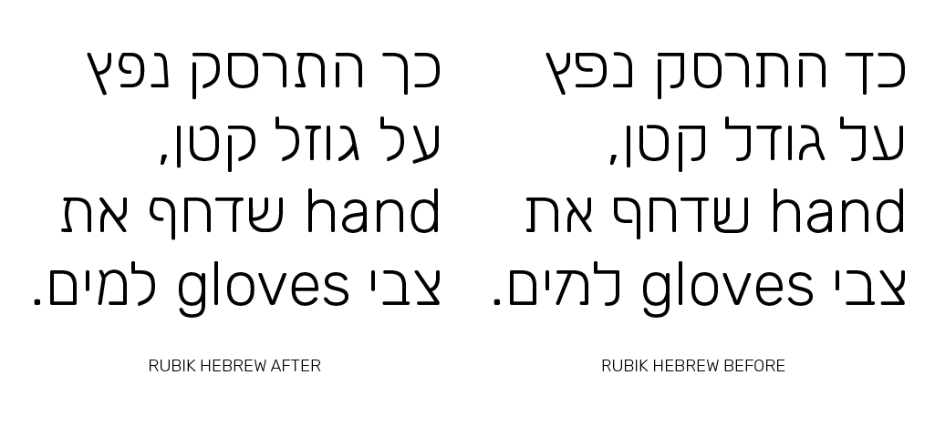
I tried maintaining the overall color and feel of the typeface, as well as the relatively open apertures and geometric nods. Some letters such as ג (gimel) and מ (mem) had to be completely redrawn to be correctly recognized by Hebrew readers, and some - like ז (zayin) and ש (shin) needed just a few nudges to make the proportions more correct. Hebrew, unlike the Latin script, is a fairly "ungeometric" script with odd angles and unconventional shapes. So my revisions tend to move slightly further away from the geometric style but still have some geometry in them.
Although there have been several Hebrew designs that are considered very geometric - such as Haim and Narkiss Block, they tend to miss a lot of the roundness that is expressed in this particular font, and I tried preserving that feel as well, perhaps similarly to what Zvi Narkiss has done in Narkiss New (without being too much like it...)
I've also managed to add vowel marks (nikkud) to the light set, and in the next week I will start work on the black master, so that I could export the entire 5-weight range.
You can follow the development of the font on GitHub, as well:
http://meirsadan.github.io/rubik-hebrew/
Would love anyone's thoughts on this, as this is all work in progress and shapes will probably shift around some more.
Good night!
Meir
Meir Sadan


Ben Nathan

Meir Sadan
Meir Sadan
This week I incorporated some of Ben's revisions for the glyphs (as mentioned in the previous thread) and it certainly improved several of the interpolations (especially א aleph and ע ayin)
Today I continued to work on diacritics (nikkud) - enlarged the marks and spaced them better from the letter (I'm using Yanek Iontef's Open Sans Hebrew as a reference to the proportions and placements)
Next is doing the same for the black weight and hoping it will all interpolate well :>

Meir Sadan

Meir Sadan

Dave Crossland
It's been a bit hectic technically – I'm working with Glyphs and saving UFO files, working with separate masters for each weight and style so that certain OT features and glyphs could be better adjusted and also because the original Rubik glyphs aren't made for interpolation. Glyphs is okay with saving Glyphs files but less so with UFOs.
Dave

Liron Lavi Turkenich
Wow Meir,
I am so happy you were asked and did those corrections for the Hebrew. The original version had many problems, and I find your version a huge improvement. I also find your tweaks for a bit less geometric add much to the typeface as a whole.
Few small notes:
- I think you have alefdagesh missing from your character set.
- In the black weight, some of the Hebrew joints become cluttered. Your solution to the joint of the Shin (thinning it) is really good, and matches well the Latin solution to the same problem. Perhaps add it to those as well? Mem, Gimmel, Tav. (Maybe the Alef as well?)
- Perhaps the leg of the Lamed (again, black weight only) could be extended a bit further to the left?
- I thought your solution for the Pe in the black weight was really good. I saw that you decided not to use it in the final files. Why? (The dagesh is really being cluttered inside the Pe in this weight)
- In the light weight- the separate stroke of the Kuf and He don’t start from the same hight. I think it would be better to go with the hight of the He.
I liked your sharing of the process. A lot can be learnt from it, so thank you! The scope of the 10 weights all with correct positions for the Nikkud is huge, and very impressive.
Have a lovely evening,
Liron