Basic Devanagari Calligraphy Reference
3,890 views
Skip to first unread message

Noopur Datye
Jul 12, 2014, 7:29:55 AM7/12/14
to googlefontdir...@googlegroups.com
Hi all,
Since many of you are designing modulated devanagari typefaces.
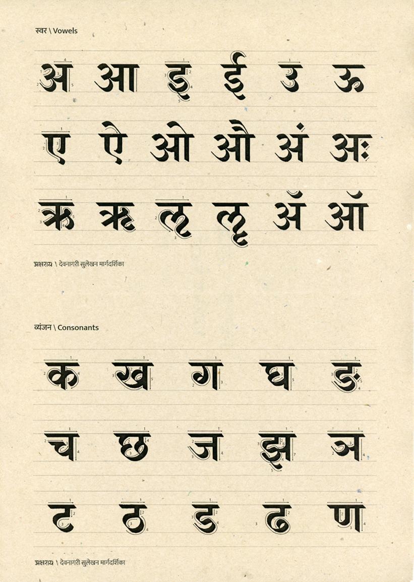
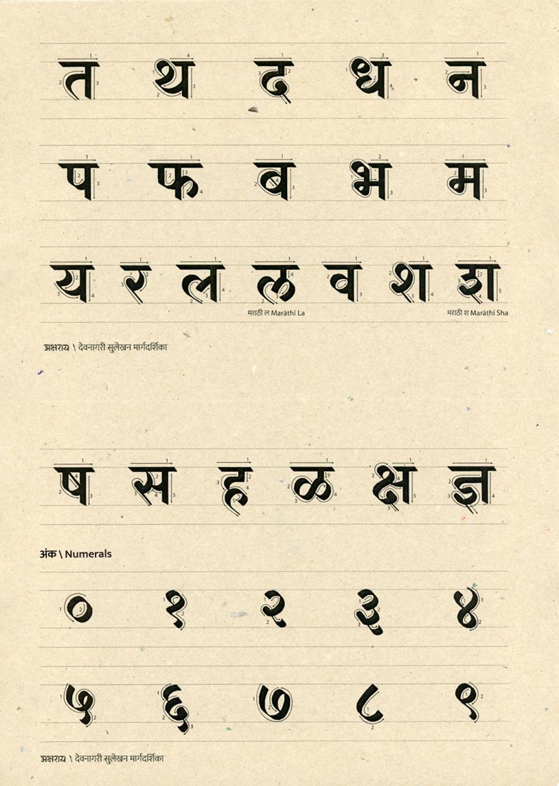
Attached are 2 pages from Aksharaya's Devanagari calligraphy Manual, which can be used as a reference for pen angle and letter proportions.
I cannot upload the entire manual, but all basic characters and numbers are included here.
Cheers!
Noopur Datye
Ek Type

Juan Pablo del Peral
Jul 12, 2014, 4:02:31 PM7/12/14
to googlefontdir...@googlegroups.com
Great. Thanks!!
--
--
Google Font Directory Discussions
http://groups.google.com/group/googlefontdirectory-discuss
---
You received this message because you are subscribed to the Google Groups "Google Font Directory Discussions" group.
To unsubscribe from this group and stop receiving emails from it, send an email to googlefontdirectory...@googlegroups.com.
For more options, visit https://groups.google.com/d/optout.
<Aksharaya_calligraphy manual_1.jpg>
<Aksharaya_calligraphy manual_2.jpg>

WeiH
Jul 13, 2014, 3:21:06 AM7/13/14
to googlefontdir...@googlegroups.com
Thanks!

Eben Sorkin
Jul 13, 2014, 9:51:03 AM7/13/14
to googlefontdir...@googlegroups.com
Thank you!
-e.

Dave Crossland
Jul 13, 2014, 2:03:11 PM7/13/14
to googlefontdirectory-discuss
Hi
Awesome! Thanks very much :)
Why can't you upload the whole manual? :)
Cheers
Dave

Erin McLaughlin
Jul 14, 2014, 3:21:29 PM7/14/14
to googlefontdir...@googlegroups.com, da...@lab6.com
Hi everyone! Noopur just made a great post in another discussion, that I hope everyone reads:
This might not apply to everyone, but I think it's great to be reminded that we don't have to be so conservative with design decisions -- there are so few Devanagari typefaces out there (compared to Latin), I think that it seems like a wasted opportunity if Google Web Fonts releases a bunch of very similar typefaces.
Whether you've already designed 100 glyphs, or just 10, it might be worthwhile if you look at examples of Devanagari lettering, to see just how diverse proportions and treatments CAN be. I would challenge anyone new to the script, especially those working on a "sans" design, to spend a few hours scrolling through and looking at images from these Flickr galleries. Looking especially at hand-painted signs, lettered book covers, and other hand-made things, you can see that the typefaces that we've been looking at for inspiration are just the tip of the iceberg in terms of possibilities:
https://www.flickr.com/search/groups/?q=devanagari
I'm also attaching a .pdf from Modular Infotech - a company that has digitized many fonts for use in native language text-editing and publishing software. Not all of these are widely accepted or used, but it might spark your imagination and make you feel less timid about altering proportions and changing elements.
I don't mean this in a negative tone at all! I think it's rather an exciting time in the history of Indic type design, and we are lucky to be among the first people making web fonts for this script! I hope we can make some great work!!!!
:) Erin
Wei Huang
Jul 14, 2014, 4:26:16 PM7/14/14
to googlefontdirectory-discuss, Dave Crossland
Thanks for the post Erin!
I'm curious to know more of people's thoughts on 'Latinising' Devanagari – I see comments and sentiments expressed here (and elsewhere – a good discussion on Typophile about Aparajita) that suggest it should usually be avoided, but in this catalogue there are many designs that look 'Latinised' – and to my non-Devanagari reading brain/eyes, they look quite nice too.
What do you guys make of it?
--
You received this message because you are subscribed to a topic in the Google Groups "Google Font Directory Discussions" group.
To unsubscribe from this topic, visit https://groups.google.com/d/topic/googlefontdirectory-discuss/XRYMYHZpUVc/unsubscribe.
To unsubscribe from this group and all its topics, send an email to googlefontdirectory...@googlegroups.com.
Juan Pablo del Peral
Jul 15, 2014, 8:53:43 AM7/15/14
to googlefontdir...@googlegroups.com
I just found an interesting article from Sarang Kulkarni:
It is not incorrect to design typefaces that match/or are based on Latin typefaces1. But the authenticity of individual scripts needs to be maintained. It is important to adapt the essence of the typeface from one script to the other rather than just the outer appearance.
(…)
Looking at the existing situation in the field of type design in India, one realizes that the Devanagari script needs new exploration and fresh ideas. One needs to look at Devanagari type design independently and not as secondary to Latin type design.
You received this message because you are subscribed to the Google Groups "Google Font Directory Discussions" group.
To unsubscribe from this group and stop receiving emails from it, send an email to googlefontdirectory...@googlegroups.com.
Reply all
Reply to author
Forward
0 new messages