Google Greek character sets [proposals]

Irene Vlachou
In this thread I will try to present some thoughts that have been developing for a few years now on the subject of expanding a latin typeface with a Greek set. Many articles and threads have been written about the need for expansion in principle which, to be honest, needs no further comment here. What does need discussion is the prioritisation – which typefaces to extend first and how far to extend them.
–hope this provokes some discussions!–
iv
The popularity of a typeface and the fashions in typography and graphic design are one of the main reasons that an expansion can be decided. Apart from the trends, these expansions may also be regarded as practical tools, whose function is to support a complex text, less commonly spoken languages, dead languages or writing systems for historical purposes.
-what will be the use of the typeface so we can decide on the char set
As a first step, it is always useful to understand the possible usage and ability of problem solving that this typeface has. This will mainly help us to define the desired character set that is more suitable for our project.
Let's be more specific and talk about Greek.
Greek is a script that supports mainly one language, or, to be more precise, various forms: ancient, katharevousa (a 19th century conception) and
the demotic. The everyday language, official since 1976, is the demotic. Until 1982, it was written using multiple accents (Polytonic), as are katharevousa and ancient greek. But in 1982, by government decree, the polytonic system was abolished from all state institutions, including the educational system, and was replaced by the Monotonic system, which just used the tonos accent.
So broadly we have two categories, monotonic and polytonic.
-proposed charsets
Over the years, I have felt the need to refine these sets, and this is based on my experience as a typeface designer and on the feedback that I had from users. We mentioned before the variations of the language and now let's see a more analytical usage.
First of all we have a) modern Greek, simple straight forward monotonic. Next we have b) scholarly texts that can be written in Demotic language but with the use of multiple accents and breathings. This is something which, as weird as it might sound, still happens a lot, especially in literature, poetry and academic essays. The relatively recent official abolition (1982) of the polytonic system means that many of today's educators and academics choose to write in this way, even in their handwriting. Katharevousa is also covered by the same category. Third comes c) the biblical and ancient texts, that require a more extended set, one that contains archaic numerals and perhaps their variants. And lastly d) support for papyri and archaic texts, that require the archaic variants and possibly the variant letterforms. The list from there on is almost endless. Depending on the actual text that needs to be typeset, the set can be expanded to various historic scripts, from Coptic to Ancient Greek numbers, to Cypriot Syllabary. It is useful to open and see the character set of fonts like SBL Greek, that apart from the extended set, has custom greek numerals, the greek lower case with overbars on that are used for ancient and medieval manuscripts to denote numerals.
*Fun fact the number of the beast (666) is χ̅ξ̅σ̅ :)
to summarise:
a. support of modern Greek
b. support for scholarly Greek
c. biblical/ancient-historical
d. archaic, papyri
which in typographic terms translates to:
a. monotonic
b. basic Polytonic
c. extended Polytonic
d. archaic (maybe +14 coptic for compatibility purposes that belong to the “Greek-Coptic” Unicode block)
As I mentioned in the beginning I felt the need to redefine these sets and in order to do that, I'll go one by one to explain my additions to them.
a. Monotonic (Demotic Greek)
USE: Everyday modern Greek in newspapers, books and websites. Mandatory in schools.
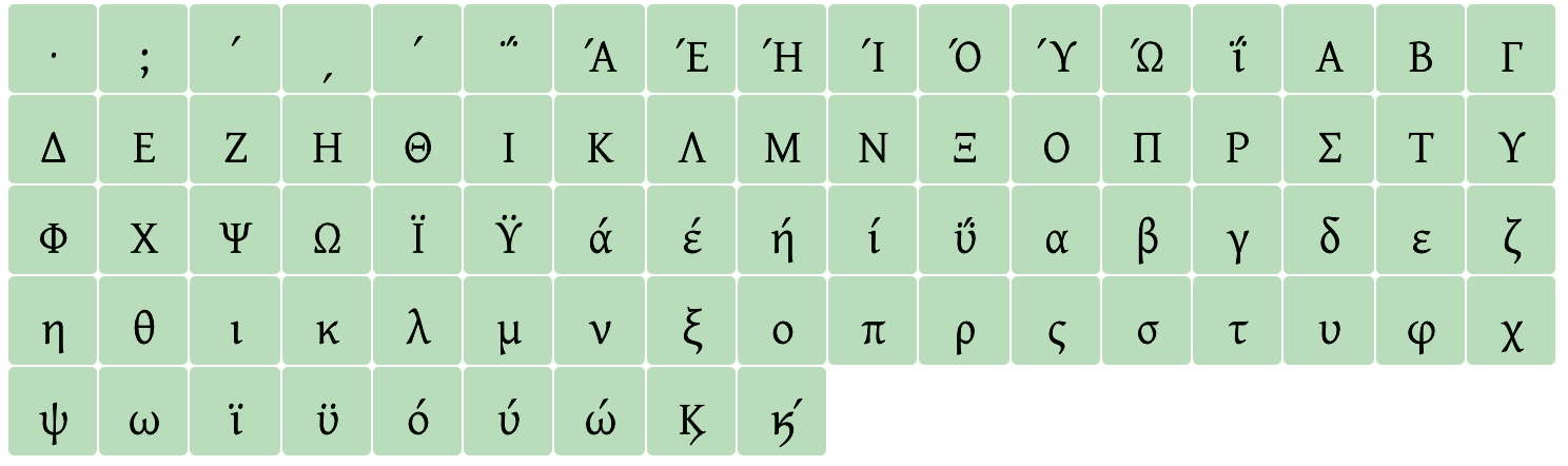
Usually this set contains the lower case, the uppercase, the tonos accent, the dieresis, dieresistonos and the greek question mark, identical to the semicolon. In this set it is always useful to add the “anoteleia”, the greek semicolon, and the two forms of “keraia”, the greek numeric signs. We rarely see these signs as part of the monotonic set, and it’s a shame, because they have an everyday use. When they are combined with lower case letters, they indicate numbers and they are used mainly as ordinals, especially denoting book volumes, academic semesters etc.
https://en.wikipedia.org/wiki/Greek_numerals#Table
https://en.wikipedia.org/wiki/Greek_numerals#Description
Another addition to the monotonic set that I would like to suggest is the greek ampersand. We often find it in older publications and on old handmade signage, but in my opinion it keeps some charm of old times and it could easily be used in titles/display settings.
https://en.wikipedia.org/wiki/Kai_(conjunction)
Since Unicode 5.1, an uppercase form of that symbol has been added, to match better an all caps setting (03CF).
At the end of this post I have included appendices that show these sets in detail.
b. Basic Polytonic (Demotic with breathings, Katharevousa)
USE: Modern Greek in books and particularly traditional or religious publications.
This set adds all the accented letters, lower case and upper case, and the accents+breathings necessary to build these composites. It's basically what Unicode defines as “Greek Extended” with the addition of forgotten iota subscript (uni037A).
http://www.unicode.org/charts/PDF/U1F00.pdf
In this category I avoid adding the archaic numerals. The reason I'm doing that is this:
The specific archaic numerals, even if they aren't many, require special attention and research on behalf of the designer. These numerals are rarely used and most of the designers don't even know how to typeset them, hence the existing examples of these characters are, most of the time, really poorly designed.
My approach might appear a bit unorthodox but the main reason I propose to avoid adding these numerals to our basic Polytonic set is primarily because I want to promote the expansion of Greek character sets to Polytonic. Adding polytonic to a pre-existing greek set can be done almost entirely by the use of composites. Speeding up the process of creating polytonic greek fonts will give polytonic users the chance to typeset their text with a much wider variety of typefaces, and hopefully many a bit more modern looking than Didot :)
*Fun fact, I'm not personally a fan or a user of the polytonic orthography!
c. Extended Polytonic (Katharevousa, Ancient)
USE: Scholarly and religious texts, textbooks for ancient greek studies
This set would contain the “traditional” polytonic set, including the archaic numerals.
d. Archaic, papyri
USE: Ancient texts, including archaic set and variable letterforms
This set includes the remaining Greek letterforms and numerals that the “Greek-Coptic” block in Unicode includes; these are the archaic variants and the variant letterform symbols.
A note on Coptic
Seven lower case and their respective uppercase letterforms of the Coptic script have been part of the “Greek-Coptic” Unicode block since version 1.1. The similarity and the historical connections of the two scripts led to shared codes in Unicode, which leads sometimes to misunderstanding of which characters are necessary for typesetting Greek. In my opinion the need of a Coptic set must be separately decided and executed. Coptic is a language that is used only for liturgical language in the Coptic church thus a more “Byzantine-looking” set was in order. In 2005 Unicode version 4.1, devoted a separate block for the Coptic set (2C80-2CFF). So a full Coptic set requires 2C80-2CFF as well as the 14 characters inside the “Greek-Coptic” block (03E2-03EF), all treated as a homogenous design.
On Friday, 23 December 2016 23:10:16 UTC, Thomas Linard wrote:
Hello Irene,
That's very good news!
For extended Greek, the question is: for what purpose?
If you want to quote biblical Greek according to scholarly standards, you need characters used for the critical apparatus.
See SBLGreek:
https://www.sbl-site.org/educational/BiblicalFonts_SBLGreek.aspx
If you want to quote ancient papyri, perhaps commercial, you probably need ancient Greek numbers, weights & currency symbols (talents, drachmas, etc.).
See IFAOGrec and New Athena Unicode:
http://www.ifao.egnet.net/publications/publier/outils-ed/polices/#grec
http://ucbclassics.dreamhosters.com/djm/greekkeys/NAUdownload.html
This page is a good reference:
http://www.tlg.uci.edu/help/UnicodeTest.php
Le vendredi 23 décembre 2016 01:11:51 UTC+1, Irene Vlachou a écrit :Hello everyone,
I’m Irene Vlachou, a Type Designer and Greek font consultant based in Athens. After completing the Reading MA programme in 2004 I’ve been working for Type-Together, other foundries large and small, and many projects for corporations and OS makers.My first task is to review and make necessary changes to following families:
1. Play
2. Comfortaa
3. Didact Gothic
4. JuraSeparate threads will follow, with comments on the typefaces and notes on my design process and workflow.
The first two, Play and Comfortaa, are to have Greek Monotonic and the last two, Didact Gothic and Jura, will have Monotonic and Extended Greek, thus full support of Polytonic.
I'll create a thread to propose and discuss standard definitions for Greek character sets. The Monotonic and Polytonic Greek sets, that are required for their respective orthographies, cannot simply be deduced from their Unicode predefined encoding pages.Another issue to be clarified is the relation to the “simple” Coptic set that is included in the Greek encoding pages, and its relation to the extended Coptic set (added in Unicode version 6.1).
Please feel free to comment and share your suggestions and proposals openly in this forum.
I hope my contribution is valuable and useful to this community and the Greek language users and font makers.
iv
Irene Vlachou

Thomas Linard
Thanks for your proposal! I totally agree with your stance on Coptic characters. And I think your proposal for Monotonic and Basic Polytonic sets are very good (though: you mention U1FD6-U1FD7. I've found ῖ but not ῗ. And what about ὀ͂?).
But I think your Extended Polytonic and Archaic sets aren't quite so satisfying. For Latin set, you can't only define Latin letters, because people don't use only that, even for basic communication. And so, even in GF Latin Core, are defined basic mathematical ideograms (0123456789 + − ÷ × ), currency symbols, basic punctuation &c. If a font is lacking these basic characters, its usefulness is very poor.
I think it's the same for scholarly use of polytonic Greek (your Extended Polytonic set): even if the font has all the defined characters of Extended Polytonic, you can't use it for practical work. So the purpose of the set is void.
For example, to quote biblical Greek according to scholarly standards (but I believe these characters for critical apparatus can be used in other contexts — for example U+0323 is useful in so many contexts), you need characters (I don't even speak of the glyphs) from various blocks :
U+02D9 ˙ ˙ ˙ DOT ABOVE
U+0305 ̅ ̅ ̅ COMBINING OVERLINE
U+0323 ̣ ̣ ̣ COMBINING DOT BELOW
U+2016 ‖ ‖ ‖ DOUBLE VERTICAL LINE
U+2038 ‸ ‸ ‸ CARET
U+2056 ⁖ ⁖ ⁖ THREE DOT PUNCTUATION
U+2058 ⁘ ⁘ ⁘ FOUR DOT PUNCTUATION
U+2059 ⁙ ⁙ ⁙ FIVE DOT PUNCTUATION
U+205A ⁚ ⁚ ⁚ TWO DOT PUNCTUATION
U+205B ⁛ ⁛ ⁛ FOUR DOT MARK
U+205C ⁜ ⁜ ⁜ DOTTED CROSS
U+205D ⁝ ⁝ ⁝ TRICOLON
U+205E ⁞ ⁞ ⁞ VERTICAL FOUR DOTS
U+207A ⁺ ⁺ ⁺ SUPERSCRIPT PLUS SIGN
U+207B ⁻ ⁻ ⁻ SUPERSCRIPT MINUS
U+207C ⁼ ⁼ ⁼ SUPERSCRIPT EQUALS SIGN
U+208A ₊ ₊ ₊ SUBSCRIPT PLUS SIGN
U+208B ₋ ₋ ₋ SUBSCRIPT MINUS
U+208C ₌ ₌ ₌ SUBSCRIPT EQUALS SIGN
U+2135 ℵ ℵ ALEF SYMBOL
U+2136 ℶ ℶ ℶ BET SYMBOL
U+22EE ⋮ ⋮ ⋮ VERTICAL ELLIPSIS
U+25A1 □ □ □ WHITE SQUARE
U+25CB ○ ○ ○ WHITE CIRCLE
U+25CC ◌ ◌ ◌ DOTTED CIRCLE
U+25E6 ◦ ◦ ◦ WHITE BULLET
U+273D ✽ ✽ ✽ HEAVY TEARDROP-SPOKED ASTERISK
U+2AFD ⫽ ⫽ ⫽ DOUBLE SOLIDUS OPERATOR
U+2E00 ⸀ ⸀ ⸀ RIGHT ANGLE SUBSTITUTION MARKER
U+2E01 ⸁ ⸁ ⸁ RIGHT ANGLE DOTTED SUBSTITUTION MARKER
U+2E02 ⸂ ⸂ ⸂ LEFT SUBSTITUTION BRACKET
U+2E03 ⸃ ⸃ ⸃ RIGHT SUBSTITUTION BRACKET
U+2E04 ⸄ ⸄ ⸄ LEFT DOTTED SUBSTITUTION BRACKET
U+2E05 ⸅ ⸅ ⸅ RIGHT DOTTED SUBSTITUTION BRACKET
U+2E06 ⸆ ⸆ ⸆ RAISED INTERPOLATION MARKER
U+2E07 ⸇ ⸇ ⸇ RAISED DOTTED INTERPOLATION MARKER
U+2E08 ⸈ ⸈ ⸈ DOTTED TRANSPOSITION MARKER
U+2E09 ⸉ ⸉ ⸉ LEFT TRANSPOSITION BRACKET
U+2E0A ⸊ ⸊ ⸊ RIGHT TRANSPOSITION BRACKET
U+2E0B ⸋ ⸋ ⸋ RAISED SQUARE
U+2E0C ⸌ ⸌ ⸌ LEFT RAISED OMISSION BRACKET
U+2E0D ⸍ ⸍ ⸍ RIGHT RAISED OMISSION BRACKET
U+2E0E ⸎ ⸎ ⸎ EDITORIAL CORONIS
U+2E0F ⸏ ⸏ ⸏ PARAGRAPHOS
U+2E10 ⸐ ⸐ ⸐ FORKED PARAGRAPHOS
U+2E11 ⸑ ⸑ ⸑ REVERSED FORKED PARAGRAPHOS
U+2E12 ⸒ ⸒ ⸒ HYPODIASTOLE
U+2E13 ⸓ ⸓ ⸓ DOTTED OBELOS
U+2E14 ⸔ ⸔ ⸔ DOWNWARDS ANCORA
U+2E15 ⸕ ⸕ ⸕ UPWARDS ANCORA
U+2E16 ⸖ ⸖ ⸖ DOTTED RIGHT-POINTING ANGLE
U+2E17 ⸗ ⸗ ⸗ DOUBLE OBLIQUE HYPHEN
U+3008 〈 〈 〈 LEFT ANGLE BRACKET
U+3009 〉 〉 〉 RIGHT ANGLE BRACKET
U+300A 《 《 《 LEFT DOUBLE ANGLE BRACKET
U+300B 》 》 》 RIGHT DOUBLE ANGLE BRACKET
U+300C 「 「 「 LEFT CORNER BRACKET
U+300D 」 」 」 RIGHT CORNER BRACKET
U+301A 〚 〚 〚 LEFT WHITE SQUARE BRACKET
U+301B 〛 〛 〛 RIGHT WHITE SQUARE BRACKET
Of course, it's far more work, but a font creator won't be deluded to believe, because he or she added a stigma and a sampi, the font is now useful for scholarly work.
For the Archaic set, I believe the entire Ancient Greek Numbers block should be integrated :
U+10140 𐅀 𐅀 𐅀 GREEK ACROPHONIC ATTIC ONE QUARTER
U+10141 𐅁 𐅁 𐅁 GREEK ACROPHONIC ATTIC ONE HALF
U+10142 𐅂 𐅂 𐅂 GREEK ACROPHONIC ATTIC ONE DRACHMA
U+10143 𐅃 𐅃 𐅃 GREEK ACROPHONIC ATTIC FIVE
U+10144 𐅄 𐅄 𐅄 GREEK ACROPHONIC ATTIC FIFTY
U+10145 𐅅 𐅅 𐅅 GREEK ACROPHONIC ATTIC FIVE HUNDRED
U+10146 𐅆 𐅆 𐅆 GREEK ACROPHONIC ATTIC FIVE THOUSAND
U+10147 𐅇 𐅇 𐅇 GREEK ACROPHONIC ATTIC FIFTY THOUSAND
U+10148 𐅈 𐅈 𐅈 GREEK ACROPHONIC ATTIC FIVE TALENTS
U+10149 𐅉 𐅉 𐅉 GREEK ACROPHONIC ATTIC TEN TALENTS
U+1014A 𐅊 𐅊 𐅊 GREEK ACROPHONIC ATTIC FIFTY TALENTS
U+1014B 𐅋 𐅋 𐅋 GREEK ACROPHONIC ATTIC ONE HUNDRED TALENTS
U+1014C 𐅌 𐅌 𐅌 GREEK ACROPHONIC ATTIC FIVE HUNDRED TALENTS
U+1014D 𐅍 𐅍 𐅍 GREEK ACROPHONIC ATTIC ONE THOUSAND TALENTS
U+1014E 𐅎 𐅎 𐅎 GREEK ACROPHONIC ATTIC FIVE THOUSAND TALENTS
U+1014F 𐅏 𐅏 𐅏 GREEK ACROPHONIC ATTIC FIVE STATERS
U+10150 𐅐 𐅐 𐅐 GREEK ACROPHONIC ATTIC TEN STATERS
U+10151 𐅑 𐅑 𐅑 GREEK ACROPHONIC ATTIC FIFTY STATERS
U+10152 𐅒 𐅒 𐅒 GREEK ACROPHONIC ATTIC ONE HUNDRED STATERS
U+10153 𐅓 𐅓 𐅓 GREEK ACROPHONIC ATTIC FIVE HUNDRED STATERS
U+10154 𐅔 𐅔 𐅔 GREEK ACROPHONIC ATTIC ONE THOUSAND STATERS
U+10155 𐅕 𐅕 𐅕 GREEK ACROPHONIC ATTIC TEN THOUSAND STATERS
U+10156 𐅖 𐅖 𐅖 GREEK ACROPHONIC ATTIC FIFTY THOUSAND STATERS
U+10157 𐅗 𐅗 𐅗 GREEK ACROPHONIC ATTIC TEN MNAS
U+10158 𐅘 𐅘 𐅘 GREEK ACROPHONIC HERAEUM ONE PLETHRON
U+10159 𐅙 𐅙 𐅙 GREEK ACROPHONIC THESPIAN ONE
U+1015A 𐅚 𐅚 𐅚 GREEK ACROPHONIC HERMIONIAN ONE
U+1015B 𐅛 𐅛 𐅛 GREEK ACROPHONIC EPIDAUREAN TWO
U+1015C 𐅜 𐅜 𐅜 GREEK ACROPHONIC THESPIAN TWO
U+1015D 𐅝 𐅝 𐅝 GREEK ACROPHONIC CYRENAIC TWO DRACHMAS
U+1015E 𐅞 𐅞 𐅞 GREEK ACROPHONIC EPIDAUREAN TWO DRACHMAS
U+1015F 𐅟 𐅟 𐅟 GREEK ACROPHONIC TROEZENIAN FIVE
U+10160 𐅠 𐅠 𐅠 GREEK ACROPHONIC TROEZENIAN TEN
U+10161 𐅡 𐅡 𐅡 GREEK ACROPHONIC TROEZENIAN TEN ALTERNATE FORM
U+10162 𐅢 𐅢 𐅢 GREEK ACROPHONIC HERMIONIAN TEN
U+10163 𐅣 𐅣 𐅣 GREEK ACROPHONIC MESSENIAN TEN
U+10164 𐅤 𐅤 𐅤 GREEK ACROPHONIC THESPIAN TEN
U+10165 𐅥 𐅥 𐅥 GREEK ACROPHONIC THESPIAN THIRTY
U+10166 𐅦 𐅦 𐅦 GREEK ACROPHONIC TROEZENIAN FIFTY
U+10167 𐅧 𐅧 𐅧 GREEK ACROPHONIC TROEZENIAN FIFTY ALTERNATE FORM
U+10168 𐅨 𐅨 𐅨 GREEK ACROPHONIC HERMIONIAN FIFTY
U+10169 𐅩 𐅩 𐅩 GREEK ACROPHONIC THESPIAN FIFTY
U+1016A 𐅪 𐅪 𐅪 GREEK ACROPHONIC THESPIAN ONE HUNDRED
U+1016B 𐅫 𐅫 𐅫 GREEK ACROPHONIC THESPIAN THREE HUNDRED
U+1016C 𐅬 𐅬 𐅬 GREEK ACROPHONIC EPIDAUREAN FIVE HUNDRED
U+1016D 𐅭 𐅭 𐅭 GREEK ACROPHONIC TROEZENIAN FIVE HUNDRED
U+1016E 𐅮 𐅮 𐅮 GREEK ACROPHONIC THESPIAN FIVE HUNDRED
U+1016F 𐅯 𐅯 𐅯 GREEK ACROPHONIC CARYSTIAN FIVE HUNDRED
U+10170 𐅰 𐅰 𐅰 GREEK ACROPHONIC NAXIAN FIVE HUNDRED
U+10171 𐅱 𐅱 𐅱 GREEK ACROPHONIC THESPIAN ONE THOUSAND
U+10172 𐅲 𐅲 𐅲 GREEK ACROPHONIC THESPIAN FIVE THOUSAND
U+10173 𐅳 𐅳 𐅳 GREEK ACROPHONIC DELPHIC FIVE MNAS
U+10174 𐅴 𐅴 𐅴 GREEK ACROPHONIC STRATIAN FIFTY MNAS
U+10175 𐅵 𐅵 𐅵 GREEK ONE HALF SIGN
U+10176 𐅶 𐅶 𐅶 GREEK ONE HALF SIGN ALTERNATE FORM
U+10177 𐅷 𐅷 𐅷 GREEK TWO THIRDS SIGN
U+10178 𐅸 𐅸 𐅸 GREEK THREE QUARTERS SIGN
U+10179 𐅹 𐅹 𐅹 GREEK YEAR SIGN
U+1017A 𐅺 𐅺 𐅺 GREEK TALENT SIGN
U+1017B 𐅻 𐅻 𐅻 GREEK DRACHMA SIGN
U+1017C 𐅼 𐅼 𐅼 GREEK OBOL SIGN
U+1017D 𐅽 𐅽 𐅽 GREEK TWO OBOLS SIGN
U+1017E 𐅾 𐅾 𐅾 GREEK THREE OBOLS SIGN
U+1017F 𐅿 𐅿 𐅿 GREEK FOUR OBOLS SIGN
U+10180 𐆀 𐆀 𐆀 GREEK FIVE OBOLS SIGN
U+10181 𐆁 𐆁 𐆁 GREEK METRETES SIGN
U+10182 𐆂 𐆂 𐆂 GREEK KYATHOS BASE SIGN
U+10183 𐆃 𐆃 𐆃 GREEK LITRA SIGN
U+10184 𐆄 𐆄 𐆄 GREEK OUNKIA SIGN
U+10185 𐆅 𐆅 𐆅 GREEK XESTES SIGN
U+10186 𐆆 𐆆 𐆆 GREEK ARTABE SIGN
U+10187 𐆇 𐆇 𐆇 GREEK AROURA SIGN
U+10188 𐆈 𐆈 𐆈 GREEK GRAMMA SIGN
U+10189 𐆉 𐆉 𐆉 GREEK TRYBLION BASE SIGN
U+1018A 𐆊 𐆊 𐆊 GREEK ZERO SIGN
Irene Vlachou
Hi Thomas,
I'm so glad that you spent some time on my proposal (and found all my mistakes) and we can now continue this conversation.
I must admit that my primary reason for opening this thread was to push the B category (the basic polytonic), as part of the revision that is happening on the Greek sets of Google fonts. I have to say that I'm not an expert on the requirements for typesetting scholarly and archaic texts, apart from basic ones, so your input is much more than welcome, it's enlightening.
I'm very happy that you approve my proposal for the B category. I think it's really important to keep B and C separated especially now that you pointed out all the characters that I missed to add to it.
Category B in my view, is a category that can cover requirements of everyday text. Category C on the other hand, needs to be treated as a specialized one, with specific aim and use. So I would say that the support of scholarly and biblical texts, should be a milestone on its own, with the appropriate focus and feedback from the experts that actually use and typeset these documents.
As you said designing stigma and a sampi, aren't enough to support the requirements of scholarly texts.
One question about this extra set of punctuation that you suggest. In most cases the Greek set is simply an addition to a Latin typeface. If this Latin companion had a predefined use for scholarly purposes, wouldn't it already include this extra punctuation sets? Is it a set, that would be added only for Greek scholarly texts or for latin too? I mean, might these archaic punctuation marks (paragraphs, obelos, diple etc.) sometimes appear in latin texts?
For the Archaic yes, I agree it should include the Ancient Greek Numbers, I think I mentioned it on my intro along with the Cypriot Syllabary, but I guess they aren't of the same importance or popularity (in the sense of usage).
In any case I feel that we don't want to let the finalizing of the C and D sets delay the adoption of the A and B sets, as we can make use of them right away during the current projects.
Btw. thank you for spotting my two missing iotas, I'll update my PDF :) The ὀ͂ doesn't have its own unicode number, and as far as I know, it's a combined character or would be a precomposed glyph with some private use area code.
Thomas Linard
I agree with you, the finalizing of the C and D sets shouldn't delay the adoption of the A and B sets.
For ὀ͂, it's a combined character (U+03CC + U+0342 or U+03BF + U+0313 + U+0342), but the combining with U+0342 isn't always well handled, so a warning for font creators about extra care is a good thing. The Unicode Test page <http://www.tlg.uci.edu/help/UnicodeTest.php> notices:
"Displays well in Athena and New Athena Unicode, Alphabetum, Antioch, Brill, Everson Mono, FreeSerif, Galatia SIL. Circumflex appears beneath or on top of breathing mark in Arial, Gentium, Code 2000, Lucida Grande and TITUS Cyberbit. Circumflex appears to the side of breathing in Tahoma. Breathing appears to the side of the circumflex in Galilee Unicode Gk. Combining diacritics do not exist in Magenta or Aisa; only combining acute, grave, and diaeresis exist in FreeMono."
Unicode Test also mentions Α῀ (U+0391 + U+1FC0), but I fail to see why U+1FC0 and not U+0342.
Sadly, the text critical symbols used in critical apparatus (the critical sigla) aren't unified. The Biblical Studies are great consumers of critical sigla, but, of course, aren't the only ones. The signification of some ancient symbols, like obelus <https://en.wikipedia.org/wiki/Dagger_(typography)> (found in GF Latin Plus set), are relatively unified: <http://udallasclassics.org/maurer_files/APPARATUSABBREVIATIONS.pdf>. So a certain amount of overlap between various critical sigla systems, or Latin and Greek uses, is to be expected.
A very incomplete page about the critical sigla in Biblical Greek studies:
http://ntresources.com/blog/?p=774
Far better:
https://jeffblock.com/greek/
http://www.marquette.edu/maqom/ApparatusGuide.pdf
I think two extreme approaches are possible: 1) a very large set covering the need of publications in the humanities, not only Greek ones. It's the choice retained by Cardo (a Google Font: <https://github.com/google/fonts/tree/master/ofl/cardo>) or Brill <http://www.brill.com/about/brill-fonts>.
2) Or the choice of a specialized set, like Biblical Greek studies for SBLGreek.
Between the two approaches, IFAOGrec and New Athena Unicode tend to cover all the scholarly needs related to Greek texts.
To begin, it seems to me than Obelism and Ancient Greek punctuation should be minimum requirements for the C set:
https://en.wikipedia.org/wiki/Obelism
https://en.wikipedia.org/wiki/Greek_orthography#Punctuation
For Cypriot Syllabary, I don't believe it's place is in the D set. Symbols for obol, talent, drachma, acrophonic numerals (= the Ancient Greek Numbers block) are mixed with "modern" Greek letters (written in koine) in ancient papyri, they aren't another writing system, so their place is in the D set. On the other hand, I think Linear A, Linear B, Cypriot Syllabary and Aegean Numbers must be treated like different subjects altogether (and so, not in the D set), even if close.
But the inclusion of the Ancient Greek Musical Notation block <https://en.wikipedia.org/wiki/Ancient_Greek_Musical_Notation> and Byzantine Musical Symbols <https://en.wikipedia.org/wiki/Byzantine_Musical_Symbols> could be considered (or reserved for a "musical E set").

Alexei Vanyashin
- Core Basic Monotonic set for modern Greek. (set A)
- Plus Basic Polytonic set for scholarly Greek (set B)
- Pro Extended Polytonic set for biblical / ancient-historical Greek. (set C)
- Archaic Papyri (set D)
- Coptic
- Ancient Greek Musical Notation
We have moved forward in our discussion with Irene, but for now we've been talking about a list of characters, and we'll have to go to a list of glyphs (for small caps, notably).
- Core Basic Monotonic set for modern Greek. (set A). Dark Green

2. Plus Basic Polytonic set for scholarly Greek (set B). Light Green.
Dark green glyphs overlap with Core set.
 3.
3.
3. Pro Extended Polytonic set for biblical / ancient-historical Greek. (set C)
![]()
4.Archaic Papyri (set D)

5.Coptic (set E)

Thomas Linard
I think a Expert set is missing (for small caps, superior letters, &c.). As they should be polytonic small caps, it seems fit for the Expert set to be after the Pro, before the Archaic.
Thomas Linard
Here is a draft proposal for an Expert set:
1. Iota adscript
It should include the glyphs defined in https://github.com/irenevl/Google-Greek-Sets/blob/master/GRKCharsetIV20170104.pdf
"b. Basic Polytonic Greek
upper case:
stylistic alternates to UC with iota subscript, using the iota adscript"
This could form an ss01 stylistic set.
2. Small caps
This should include:
1. small caps for polytonic letters, combining diacritics and Kai ligature defined in the Pro set.
2. small caps for the ss01 set defined in "1. Iota adscript", in two variants: a) all small caps, b) regular caps and small cap iota
3. Superior letters
Monotonic superior letters, uppercase and lowercase.
4. Ligatures
Double gamma and double lambda could be a minimum set of ligatures (of course, a "Grecs du Roi" revival like the one by Franck Jalleau http://www.kaleidoscopeye.com/wp-content/uploads/DesignGraphique_AffichesLURE_LucieBaratte_3-900x600.jpg needs much more)
5. (Optional, historical) Precomposed glyphs with overline (U+0305)
Precomposed monotonic letters (uppercase, lowercase and small caps) with U+0305.
SBL Greek have much precomposed glyphs: with simple overline, with cap height overline for lowercase, with initial overline or final overline for caps and small caps.
Irene, what do you think?
Irene Vlachou
agree with you, the finalizing of the C and D sets shouldn't delay the adoption of the A and B sets.
For ὀ͂, it's a combined character (U+03CC + U+0342 or U+03BF + U+0313 + U+0342), but the combining with U+0342 isn't always well handled, so a warning for font creators about extra care is a good thing. The Unicode Test page <http://www.tlg.uci.edu/help/UnicodeTest.php> notices:
"Displays well in Athena and New Athena Unicode, Alphabetum, Antioch, Brill, Everson Mono, FreeSerif, Galatia SIL. Circumflex appears beneath or on top of breathing mark in Arial, Gentium, Code 2000, Lucida Grande and TITUS Cyberbit. Circumflex appears to the side of breathing in Tahoma. Breathing appears to the side of the circumflex in Galilee Unicode Gk. Combining diacritics do not exist in Magenta or Aisa; only combining acute, grave, and diaeresis exist in FreeMono."
Unicode Test also mentions Α῀ (U+0391 + U+1FC0), but I fail to see why U+1FC0 and not U+0342.
Irene Vlachou
- Core Basic Monotonic set for modern Greek. (set A). Dark Green
3. Pro Extended Polytonic set for biblical / ancient-historical Greek. (set C)
4.Archaic Papyri (set D)
5.Coptic (set E)
Irene Vlachou
On Monday, 16 January 2017 15:53:48 UTC, Thomas Linard wrote:
Hi,
Here is a draft proposal for an Expert set:
1. Iota adscript
It should include the glyphs defined in https://github.com/irenevl/Google-Greek-Sets/blob/master/GRKCharsetIV20170104.pdf
"b. Basic Polytonic Greek
upper case:
stylistic alternates to UC with iota subscript, using the iota adscript"
This could form an ss01 stylistic set.
2. Small caps
This should include:
1. small caps for polytonic letters, combining diacritics and Kai ligature defined in the Pro set.
2. small caps for the ss01 set defined in "1. Iota adscript", in two variants: a) all small caps, b) regular caps and small cap iota
3. Superior letters
Monotonic superior letters, uppercase and lowercase.
4. Ligatures
Double gamma and double lambda could be a minimum set of ligatures (of course, a "Grecs du Roi" revival like the one by Franck Jalleau http://www.kaleidoscopeye.com/wp-content/uploads/DesignGraphique_AffichesLURE_LucieBaratte_3-900x600.jpg needs much more)
5. (Optional, historical) Precomposed glyphs with overline (U+0305)
Precomposed monotonic letters (uppercase, lowercase and small caps) with U+0305.
SBL Greek have much precomposed glyphs: with simple overline, with cap height overline for lowercase, with initial overline or final overline for caps and small caps.
Alexei Vanyashin
The Plus Set: the glyphs ta you have highlighted aren't overlapping with the Core set. They share similar design but they are different glyphs, with unique name and unicode values. One can argue that tonos and oxia are the same, but there are a couple examples that the designers did something different with them. Also the iota adscript, isn't always a full iota. It could be a lower case iota but also a smaller/shorter one. Kind request, it would be preferable to use fonts that they don't have problems with the accent and breathings position, it just makes it difficult to check these sets.
| ͺ | ypogegrammeni | uni037A |


| # | Character | nice name | uni name |
| 1 | Ⲁ | Alfa-coptic | uni2C80 |
| 2 | ⲁ | alfa-coptic | uni2C81 |
| 3 | Ⲃ | Vida-coptic | uni2C82 |
| 4 | ⲃ | vida-coptic | uni2C83 |
| 5 | Ⲅ | Gamma-coptic | uni2C84 |
| 6 | ⲅ | gamma-coptic | uni2C85 |
| 7 | Ⲇ | Dalda-coptic | uni2C86 |
| 8 | ⲇ | dalda-coptic | uni2C87 |
| 9 | Ⲉ | Eie-coptic | uni2C88 |
| 10 | ⲉ | eie-coptic | uni2C89 |
| 11 | Ⲋ | Sou-coptic | uni2C8A |
| 12 | ⲋ | sou-coptic | uni2C8B |
| 13 | Ⲍ | Zata-coptic | uni2C8C |
| 14 | ⲍ | zata-coptic | uni2C8D |
| 15 | Ⲏ | Hate-coptic | uni2C8E |
| 16 | ⲏ | hate-coptic | uni2C8F |
| 17 | Ⲑ | Thethe-coptic | uni2C90 |
| 18 | ⲑ | thethe-coptic | uni2C91 |
| 19 | Ⲓ | Iauda-coptic | uni2C92 |
| 20 | ⲓ | iauda-coptic | uni2C93 |
| 21 | Ⲕ | Kapa-coptic | uni2C94 |
| 22 | ⲕ | kapa-coptic | uni2C95 |
| 23 | Ⲗ | Laula-coptic | uni2C96 |
| 24 | ⲗ | laula-coptic | uni2C97 |
| 25 | Ⲙ | Mi-coptic | uni2C98 |
| 26 | ⲙ | mi-coptic | uni2C99 |
| 27 | Ⲛ | Ni-coptic | uni2C9A |
| 28 | ⲛ | ni-coptic | uni2C9B |
| 29 | Ⲝ | Ksi-coptic | uni2C9C |
| 30 | ⲝ | ksi-coptic | uni2C9D |
| 31 | Ⲟ | O-coptic | uni2C9E |
| 32 | ⲟ | o-coptic | uni2C9F |
| 33 | Ⲡ | Pi-coptic | uni2CA0 |
| 34 | ⲡ | pi-coptic | uni2CA1 |
| 35 | Ⲣ | Ro-coptic | uni2CA2 |
| 36 | ⲣ | ro-coptic | uni2CA3 |
| 37 | Ⲥ | Sima-coptic | uni2CA4 |
| 38 | ⲥ | sima-coptic | uni2CA5 |
| 39 | Ⲧ | Tau-coptic | uni2CA6 |
| 40 | ⲧ | tau-coptic | uni2CA7 |
| 41 | Ⲩ | Ua-coptic | uni2CA8 |
| 42 | ⲩ | ua-coptic | uni2CA9 |
| 43 | Ⲫ | Fi-coptic | uni2CAA |
| 44 | ⲫ | fi-coptic | uni2CAB |
| 45 | Ⲭ | Khi-coptic | uni2CAC |
| 46 | ⲭ | khi-coptic | uni2CAD |
| 47 | Ⲯ | Psi-coptic | uni2CAE |
| 48 | ⲯ | psi-coptic | uni2CAF |
| 49 | Ⲱ | Oou-coptic | uni2CB0 |
| 50 | ⲱ | oou-coptic | uni2CB1 |
| 51 | Ⲳ | dialectPalef-coptic | uni2CB2 |
| 52 | ⲳ | dialectpalef-coptic | uni2CB3 |
| 53 | Ⲵ | oldAin-coptic | uni2CB4 |
| 54 | ⲵ | oldain-coptic | uni2CB5 |
| 55 | Ⲷ | Cryptogrammiceie-coptic | uni2CB6 |
| 56 | ⲷ | cryptogrammiceie-coptic | uni2CB7 |
| 57 | Ⲹ | dialectPkapa-coptic | uni2CB8 |
| 58 | ⲹ | dialectpkapa-coptic | uni2CB9 |
| 59 | Ⲻ | dialectPni-coptic | uni2CBA |
| 60 | ⲻ | dialectpni-coptic | uni2CBB |
| 61 | Ⲽ | Cryptogrammicni-coptic | uni2CBC |
| 62 | ⲽ | cryptogrammicni-coptic | uni2CBD |
| 63 | Ⲿ | ldOou-coptic | uni2CBE |
| 64 | ⲿ | oldoou-coptic | uni2CBF |
| 65 | Ⳁ | Sampi-coptic | uni2CC0 |
| 66 | ⳁ | sampi-coptic | uni2CC1 |
| 67 | Ⳃ | Crossedshei-coptic | uni2CC2 |
| 68 | ⳃ | crossedshei-coptic | uni2CC3 |
| 69 | Ⳅ | oldShei-coptic | uni2CC4 |
| 70 | ⳅ | oldshei-coptic | uni2CC5 |
| 71 | Ⳇ | oldEsh-coptic | uni2CC6 |
| 72 | ⳇ | oldesh-coptic | uni2CC7 |
| 73 | Ⳉ | Akhmimickhei-coptic | uni2CC8 |
| 74 | ⳉ | akhmimickhei-coptic | uni2CC9 |
| 75 | Ⳋ | dialectPhori-coptic | uni2CCA |
| 76 | ⳋ | dialectphori-coptic | uni2CCB |
| 77 | Ⳍ | oldHori-coptic | uni2CCC |
| 78 | ⳍ | oldhori-coptic | uni2CCD |
| 79 | Ⳏ | oldHa-coptic | uni2CCE |
| 80 | ⳏ | oldha-coptic | uni2CCF |
| 81 | Ⳑ | LshapedHa-coptic | uni2CD0 |
| 82 | ⳑ | Lshapedha-coptic | uni2CD1 |
| 83 | Ⳓ | oldHei-coptic | uni2CD2 |
| 84 | ⳓ | oldhei-coptic | uni2CD3 |
| 85 | Ⳕ | oldHat-coptic | uni2CD4 |
| 86 | ⳕ | oldhat-coptic | uni2CD5 |
| 87 | Ⳗ | oldGangia-coptic | uni2CD6 |
| 88 | ⳗ | oldgangia-coptic | uni2CD7 |
| 89 | Ⳙ | oldDja-coptic | uni2CD8 |
| 90 | ⳙ | olddja-coptic | uni2CD9 |
| 91 | Ⳛ | oldShima-coptic | uni2CDA |
| 92 | ⳛ | oldshima-coptic | uni2CDB |
| 93 | Ⳝ | oldShima-nubian-coptic | uni2CDC |
| 94 | ⳝ | oldshima-nubian-coptic | uni2CDD |
| 95 | Ⳟ | oldNgi-nubian-coptic | uni2CDE |
| 96 | ⳟ | oldngi-nubian-coptic | uni2CDF |
| 97 | Ⳡ | oldNyi-nubian-coptic | uni2CE0 |
| 98 | ⳡ | oldnyi-nubian-coptic | uni2CE1 |
| 99 | Ⳣ | oldWau-nubian-coptic | uni2CE2 |
| 100 | ⳣ | oldwau-nubian-coptic | uni2CE3 |
| 101 | ⳤ | kai-coptic | uni2CE4 |
| 102 | ⳥ | miro-coptic | uni2CE5 |
| 103 | ⳦ | piro-coptic | uni2CE6 |
| 104 | ⳧ | stauros-coptic | uni2CE7 |
| 105 | ⳨ | tauro-coptic | uni2CE8 |
| 106 | ⳩ | khiro-coptic | uni2CE9 |
| 107 | ⳪ | shimasima-coptic | uni2CEA |
| 108 | Ⳬ | uni2CEB | uni2CEB |
| 109 | ⳬ | uni2CEC | uni2CEC |
| 110 | Ⳮ | uni2CED | uni2CED |
| 111 | ⳮ | uni2CEE | uni2CEE |
| 112 | ⳯ | uni2CEF | uni2CEF |
| 113 | ⳰ | uni2CF0 | uni2CF0 |
| 114 | ⳱ | uni2CF1 | uni2CF1 |
| 115 | Ⳳ | uni2CF2 | uni2CF2 |
| 116 | ⳳ | uni2CF3 | uni2CF3 |
| 117 | ⳹ | oldfullstop-nubian-coptic | uni2CF9 |
| 118 | ⳺ | olddirectquestion-nubian-coptic | uni2CFA |
| 119 | ⳻ | oldindirectquestion-nubian-coptic | uni2CFB |
| 120 | ⳼ | oldversedivider-nubian-coptic | uni2CFC |
| 121 | ⳽ | fractiononehalf-coptic | uni2CFD |
| 122 | ⳾ | fullstop-coptic | uni2CFE |
| 123 | ⳿ | morphologicaldivider-coptic | uni2CFF |
Irene Vlachou
Thomas Linard
Thanks for your answers! Do you agree to my proposal to have obelism and ancient punctuation as minimum requirements for the Pro set?
https://en.wikipedia.org/wiki/Obelism
https://en.wikipedia.org/wiki/Greek_orthography#Punctuation
It will add:
‿ enotikon uni203F
͜ cominingdoublebrevebelow uni035C
˙ dotaccent uni02D9
⁖ threedotpunctuation uni2056
⁘ fourdotpunctuation uni2058
⁙ pentonkion uni2059
⁚ twodotpunctuation uni205A
⁛ fourdotmark uni205B
⁜ dottedcross uni205C
⁝ tricolon uni205D
⁞ verticalfourdots uni205E
⸎ editorialcoronis uni2E0E
⸏ paragraphos uni2E0F
⸐ forkedparagraphos uni2E10
⸑ reversedforkedparagraphos uni2E11
⸒ hypodiastole uni2E12
⸓ dottedobelos uni2E13
⸔ downwardsancora uni2E14
⸕ upwardsancora uni2E15
⸖ dipleperiestigmene uni2E16
But for Biblical studies, it's insufficient. I suggest that we add:
̅ combiningoverline uni0305
̣ combiningdotbelow uni0323
‖ doubleverticalline uni2016
‸ caret uni2038
⁺ superscriptplussign uni207a
⁻ superscriptminus uni207b
⁼ superscriptequalssign uni207c
₊ subscriptplussign uni208a
₋ subscriptminus uni208b
₌ subscriptequalssign uni208c
ℵ alefsymbol uni2135
ℶ betsymbol uni2136
⋮ verticalellipsis uni22ee
□ whitesquare uni25a1
○ whitecircle uni25cb
◌ dottedcircle uni25cc
◦ whitebullet uni25e6
✽ heavyteardrop-spokedasterisk uni273d
⫽ doublesolidusoperator uni2afd
⸀ rightanglesubstitutionmarker uni2e00
⸁ rightangledottedsubstitutionmarker uni2e01
⸂ leftsubstitutionbracket uni2e02
⸃ rightsubstitutionbracket uni2e03
⸄ leftdottedsubstitutionbracket uni2e04
⸅ rightdottedsubstitutionbracket uni2e05
⸆ raisedinterpolationmarker uni2e06
⸇ raiseddottedinterpolationmarker uni2e07
⸈ dottedtranspositionmarker uni2e08
⸉ lefttranspositionbracket uni2e09
⸊ righttranspositionbracket uni2e0a
⸋ raisedsquare uni2e0b
⸌ leftraisedomissionbracket uni2e0c
⸍ rightraisedomissionbracket uni2e0d
⸗ doubleobliquehyphen uni2e17
〈 leftanglebracket uni3008
〉 rightanglebracket uni3009
《 leftdoubleanglebracket uni300a
》 rightdoubleanglebracket uni300b
「 leftcornerbracket uni300c
」 rightcornerbracket uni300d
〚 leftwhitesquarebracket uni301a
〛 rightwhitesquarebracket uni301b
So the set will provide coverage of Greek Biblical studies. If some characters are missing for Byzantine scholars, they could be added in a subsequent version.
oh yes, the small caps :)I think this should be a separate set. In the sense of small caps might be required by the simple Core set.So I would add small caps (even superior letters) in a section b. set, that can be added in any of the nicely defined categories of Alexei.So like “extras”, instead of a category between Pro and Archaic.
I don't see very well how an optional part could work. So, I added some characters to the spreadsheet provided by Alexei, but not yet the supplementary glyphs (small caps, superior letters). Could you add your ideas to the spreadsheet?
Also I believe, that the adscript alt and the uppercase Kai, need to part of the standard set, in Plus and Core sets respectively.
Absolutely.
4. Ligatures
Basic ligatures, γγ and λλ look always quite cool. Why don't we add them from the Plus set and on?
OK.
5. (Optional, historical) Precomposed glyphs with overline (U+0305)
and the overline ones, as part of the Pro set?
OK. So we validate uni0305?
Thomas Linard
Today I checked all the proposals by the Thesaurus Linguae Graecae to Unicode listed here:
https://escholarship.org/uc/tlg_unicode
And I filled some missing characters in the spreadsheet.
I also checked http://stephanus.tlg.uci.edu/fonts.php and http://www.tlg.uci.edu/encoding/quickbeta.pdf (but the latter is perhaps too huge, it could be disheartening), so I added some more.
I have a doubt about a bunch of astronomical characters (used in astrological and magical papyri): they are archaic, but also still in common use today as astronomical and chemical symbols.
Alexei Vanyashin
- I think a Expert set is missing (for small caps, superior letters, &c.). As they should be polytonic small caps, it seems fit for the Expert set to be after the Pro, before the Archaic
| ϛ | stigma.sc | uni03DB.sc |
| ϟ | koppa.sc | uni03DF.sc |
| ϡ | sampi.sc | uni03E1.sc |
| ϝ | digamma.sc | uni03DD.sc |
U+03E2 – U+03EF range (Coptic in the Greek and Coptic table) for Coptic set. - I have a doubt about a bunch of astronomical characters (used in astrological and magical papyri): they are archaic, but also still in common use today as astronomical and chemical symbols.
--
You received this message because you are subscribed to a topic in the Google Groups "Google Fonts Discussions" group.
To unsubscribe from this topic, visit https://groups.google.com/d/topic/googlefonts-discuss/WACSJEHgeDc/unsubscribe.
To unsubscribe from this group and all its topics, send an email to googlefonts-dis...@googlegroups.com.
To post to this group, send email to googlefon...@googlegroups.com.
Visit this group at https://groups.google.com/group/googlefonts-discuss.
To view this discussion on the web visit https://groups.google.com/d/msgid/googlefonts-discuss/22cc5e21-1b1c-496b-81fe-7469b5954909%40googlegroups.com.
For more options, visit https://groups.google.com/d/optout.
Alexei Vanyashin
- Do you agree to my proposal to have obelism and ancient punctuation as minimum requirements for the Pro set?
Thomas Linard
I understood your concern for "overwhelming". But like I said earlier on the topic, a font creator shouldn't be deluded to believe, because he or she added a stigma and a sampi, that the font is now useful for scholarly work.
How a scholar can edit a text like the ones mentioned in https://escholarship.org/uc/item/3bn592k6#page-11 (last page) with a restricted set?
Or:
https://escholarship.org/uc/item/7dp4b4tb#page-4
https://escholarship.org/uc/item/71q5761h#page-3
https://escholarship.org/uc/item/6r21t939#page-3
https://escholarship.org/uc/item/7v48m19j#page-8
In fact, the Pro, Archaic, "Ancient Musical Symbols" and "Biblical Studies", they all form a unique "Scholarly" set. Because the size of the set is overwhelming, we extract big ranges of specialized characters from it, like the Ancient Greek Numbers block, the Ancient Greek Musical Notation block, the Byzantine Musical Symbols block, and some astronomical characters, and we made separate sets. It's already a simplification, we shouldn't go too far in this way.
It's perfectly fine if a font creator doesn't want to go beyond the Plus set. But if she or he wants to make a font supporting scholarly edition of ancient texts in Greek, the set can't be too small (I made some corrections to the spreadsheet accordingly)
For the README, my propositions:
Addendum
A. Ancient Musical Symbols Greek and Byzantine Musical Symbols B. Coptic Liturgical language for Coptic Church
GF Greek Pro, 82 glyphs total
Extended Polytonic Greek, for scholarly edition of ancient texts (Ancient and Roman Greece studies, Byzantine studies, Greek Biblical studies)
Archaic Numerals ϛ ϟ ϡ ϝ
Ancient Greek textual symbols ⸎ ⸏ ⸐ ⸑ ⸒ ⸓ ⸔ ⸕ ⸖
Archaic Punctuation ‿ ͜ ˙ ⁖ ⁘ ⁙ ⁚ ⁛ ⁜ ⁝ ⁞
Greek Metrical Symbols ⏑ ⏒ ⏓ ⏔ ⏕ ⏖ ⏗ ⏘ ⏙
Critical Sigla ⸀ ⸁ ⸂ ⸃ ⸄ ⸅ ⸆ ⸇ ⸈ ⸉ ⸊ ⸋ ⸌ ⸍
Biblical Apparatus ℵ ℶ 𝑙 𝔖 𝔐
GF Greek Archaic, 113 glyphs total
Archaic, Papyri
Archaic UC ϘϚϜϞϠϺ
Archaic LC ϙϛϝϟϡϻ
Variant Letterforms κρςΣ, Θϐϑϒϓϔϕϖε϶
Additional Letter ϳ
Additional archaic letters for Bactrian Ϸϸ
Symbol ϼ ☧
Editorial symbols ϽϾϿ
Ancient Greek mathematical character ⟀ ⟁
Greek Acrophonic Symbols 𐅀𐅁𐅂𐅃𐅆𐅇𐅈𐅉𐅊𐅋𐅌𐅍𐅎𐅏𐅐𐅑𐅒𐅓𐅔𐅕𐅖𐅗𐅘𐅙𐅚𐅛𐅜𐅝𐅞𐅟𐅠𐅡𐅢𐅣𐅤𐅥𐅦𐅧𐅨𐅩𐅪𐅫𐅬𐅭𐅮𐅯𐅰𐅱𐅲𐅳𐅴
(Note: Arcophonic > Acrophonic)
Do these Archaic Numerals require .sc variants?
ϛ stigma.sc uni03DB.sc ϟ koppa.sc uni03DF.sc ϡ sampi.sc uni03E1.sc ϝ digamma.sc uni03DD.sc
Well, why not, but I've never seen them. Irene?
- I have a doubt about a bunch of astronomical characters (used in astrological and magical papyri): they are archaic, but also still in common use today as astronomical and chemical symbols.
We can include them in the the Greek Optional section, similar to what we have in Recommended.md for Latin.
OK.
Alexei Vanyashin

Thomas Linard
I see. I think the divide between everyday use and scholarly is important. What if we structure the sets in this manner:
Yes, it seems good to me.
Thomas, to confirm do I understand correctly that proposed section "B. Biblical Studies Obelisms and Ancient Greek Punctuation" is now reordered into other sets?
Yes. As more and more I was thinking about the set, a strict division didn't feel right: some characters could be used by different disciplines (Biblical studies, Byzantine studies), so I believe the division between Pro and Archaic is now better balanced between the requirements of coherency, usefulness and the need not to be too overwhelming.
I have made amends as you suggested to the characters lists in the README.
Thanks! Some corrections: the second Scholarly Use is at the same hierarchical level that the surrounding text. Perhaps *Scholarly Use*?
For the Pro set, here's a complete version:
* Archaic Letters and Numerals `Ϛ Ϟ Ϡ Ϝ ϛ ϟ ϡ ϝ`
* Ancient Greek textual symbols `⸎ ⸏ ⸐ ⸑ ⸒ ⸓ ⸔ ⸕ ⸖ ⸗`
* Archaic Punctuation `※ ⁂ ‿ ͜ ˙ ⁖ ⁘ ⁙ ⁚ ⁛ ⁜ ⁝ ⁞ ⊗ ⋮`
* Greek Metrical Symbols `⏑ ⏒ ⏓ ⏔ ⏕ ⏖ ⏗ ⏘ ⏙`
* Critical Sigla `̅ ̣ ͙ ‖ ⁺ ⁻ ⁼ ₊ ₋ ₌ ⫽ ⸀ ⸁ ⸂ ⸃ ⸄ ⸅ ⸆ ⸇ ⸈ ⸉ ⸊ ⸋ ⸌ ⸍ 〈 〉《 》「 」〚 〛`
* Biblical Apparatus `ℵ ℶ 𝑙 𝔖 𝔐 𝔓 𝔭`
> + † ‡ ¹ ² ³ ⁴ in GF-latin-plus
> + ⁰ ⁵ ⁶ ⁷ ⁸ ⁹ ₀ ₁ ₂ ₃ ₄ ₅ ₆ ₇ ₈ ₉ in GF-latin-pro
Also, I expected Irene have some time to add the stylistic alternates to uppercase letters with iota subscript (using the iota adscript, or the reverse if the default glyph is using an iota subscript), for the Plus set: uni1F88.ss01-uni1F8F.ss01, uni1F98.ss01-uni1F9F.ss01, uni1FBC.ss01, uni1FC8.ss01, uni1FCC.ss01, uni1FFC.ss01, but I can do it and Irene will check.
The Expert set need to have uni1F88.scss01-uni1F8F.scss01, uni1F98.scss01-uni1F9F.scss01, uni1FBC.scss01, uni1FC8.scss01, uni1FCC.scss01, uni1FFC.scss01 (regular caps and small cap iota adscript) + uni1F80.scss01-uni1F87.scss01, uni1F90.scss01-uni1F97.scss01, uni1FA0.scss01-uni1FA7.scss01 (all small caps).
Monotonic superior letters, uppercase and lowercase, and some basic ligatures like λλ and γγ, for the Expert set would be nice, also.
We can also include a recommendation for the Plus set about perispomenicomb (uni0342), as in ὀ͂ (uni03CC + uni0342): the combining with perispomenicomb isn't always checked, but needs to be.
For the Pro set, a recommendation about uni0305, the overline (that are used, in combination with uppercase and lowercase letters, in ancient and medieval manuscripts to denote numerals), could be useful: multiple glyphs need to be prepared to be used with uppercase and lowercase (2 vertical positions), in initial, medial and final position (3 horizontals).
Irene Vlachou
Do these Archaic Numerals require .sc variants?
ϛ stigma.sc uni03DB.sc ϟ koppa.sc uni03DF.sc ϡ sampi.sc uni03E1.sc ϝ digamma.sc uni03DD.sc
Well, why not, but I've never seen them. Irene?
Thomas Linard
I'll have a look today and I'll complete the list.thank you both for contributing so much in this.
Hi Irene,
Thank you very much! We'll soon have finished!
Best,
Thomas
Alexei Vanyashin
Thanks! Some corrections: the second Scholarly Use is at the same hierarchical level that the surrounding text. Perhaps *Scholarly Use*?
For the Pro set, here's a complete version:
* Archaic Letters and Numerals `Ϛ Ϟ Ϡ Ϝ ϛ ϟ ϡ ϝ`
* Ancient Greek textual symbols `⸎ ⸏ ⸐ ⸑ ⸒ ⸓ ⸔ ⸕ ⸖ ⸗`
* Archaic Punctuation `※ ⁂ ‿ ͜ ˙ ⁖ ⁘ ⁙ ⁚ ⁛ ⁜ ⁝ ⁞ ⊗ ⋮`
* Greek Metrical Symbols `⏑ ⏒ ⏓ ⏔ ⏕ ⏖ ⏗ ⏘ ⏙`
* Critical Sigla `̅ ̣ ͙ ‖ ⁺ ⁻ ⁼ ₊ ₋ ₌ ⫽ ⸀ ⸁ ⸂ ⸃ ⸄ ⸅ ⸆ ⸇ ⸈ ⸉ ⸊ ⸋ ⸌ ⸍ 〈 〉《 》「 」〚 〛`
* Biblical Apparatus `ℵ ℶ 𝑙 𝔖 𝔐 𝔓 𝔭`
> + † ‡ ¹ ² ³ ⁴ in GF-latin-plus
> + ⁰ ⁵ ⁶ ⁷ ⁸ ⁹ ₀ ₁ ₂ ₃ ₄ ₅ ₆ ₇ ₈ ₉ in GF-latin-pro
Also, I expected Irene have some time to add the stylistic alternates to uppercase letters with iota subscript (using the iota adscript, or the reverse if the default glyph is using an iota subscript), for the Plus set: uni1F88.ss01-uni1F8F.ss01, uni1F98.ss01-uni1F9F.ss01, uni1FBC.ss01, uni1FC8.ss01, uni1FCC.ss01, uni1FFC.ss01, but I can do it and Irene will check.
The Expert set need to have uni1F88.scss01-uni1F8F.scss01, uni1F98.scss01-uni1F9F.scss01, uni1FBC.scss01, uni1FC8.scss01, uni1FCC.scss01, uni1FFC.scss01 (regular caps and small cap iota adscript) + uni1F80.scss01-uni1F87.scss01, uni1F90.scss01-uni1F97.scss01, uni1FA0.scss01-uni1FA7.scss01 (all small caps).
Monotonic superior letters, uppercase and lowercase, and some basic ligatures like λλ and γγ, for the Expert set would be nice, also.
We can also include a recommendation for the Plus set about perispomenicomb (uni0342), as in ὀ͂ (uni03CC + uni0342): the combining with perispomenicomb isn't always checked, but needs to be.
| 235 | ͂ | perispomenicomb | uni0342 | Combining Marks |
| 236 | ̓ | koroniscomb | uni0343 | Combining Marks |
| 237 | ̈́ | dialytikatonoscomb | uni0344 | Combining Marks |
| 238 | ͅ | dialytikatonoscomb | uni0345 | Combining Marks |
For the Pro set, a recommendation about uni0305, the overline (that are used, in combination with uppercase and lowercase letters, in ancient and medieval manuscripts to denote numerals), could be useful: multiple glyphs need to be prepared to be used with uppercase and lowercase (2 vertical positions), in initial, medial and final position (3 horizontals).
| ˙ | dotaccent | uni02D9 | Archaic Punctuation |
| ̅ | overlinecomb | uni0305 | Critical Sigla |
| ̣ | dotbelowcomb | uni0323 | Critical Sigla |
| ͙ | asteriskbelowcomb | uni0359 | Critical Sigla |
| ͜ | doublebrevebelowcomb | uni035C | Archaic Punctuation |
Thomas Linard
Also, I expected Irene have some time to add the stylistic alternates to uppercase letters with iota subscript (using the iota adscript, or the reverse if the default glyph is using an iota subscript), for the Plus set: uni1F88.ss01-uni1F8F.ss01, uni1F98.ss01-uni1F9F.ss01, uni1FBC.ss01, uni1FC8.ss01, uni1FCC.ss01, uni1FFC.ss01, but I can do it and Irene will check.Yes, please add these to the spreadsheets.The Expert set need to have uni1F88.scss01-uni1F8F.scss01, uni1F98.scss01-uni1F9F.scss01, uni1FBC.scss01, uni1FC8.scss01, uni1FCC.scss01, uni1FFC.scss01 (regular caps and small cap iota adscript) + uni1F80.scss01-uni1F87.scss01, uni1F90.scss01-uni1F97.scss01, uni1FA0.scss01-uni1FA7.scss01 (all small caps).
Monotonic superior letters, uppercase and lowercase, and some basic ligatures like λλ and γγ, for the Expert set would be nice, also.I am not knowlegeable about the unicodes and names of these glyphs, please add them to the spreadsheet.
OK, I did, but I'm more used to Western practice (iota adscript), so I'd prefer this to be checked by Irene.
We can also include a recommendation for the Plus set about perispomenicomb (uni0342), as in ὀ͂ (uni03CC + uni0342): the combining with perispomenicomb isn't always checked, but needs to be.perispomenicomb and other comb marks are already in the Plus set. Are there any other combining marks for Greek? Technically there are very important to have.
235 ͂ perispomenicomb uni0342 Combining Marks 236 ̓ koroniscomb uni0343 Combining Marks 237 ̈́ dialytikatonoscomb uni0344 Combining Marks 238 ͅ dialytikatonoscomb uni0345 Combining Marks
To my knowledge, it's complete, but perispomenicomb, in rare cases, stacks above diacritics already present (a bit like in Vietnamese: in ὀ͂, the omicron has already a tonos and gains a perispomenicomb, this isn't a common scenario). If you think extra warning aren't needed, that's fine.
For the Pro set, a recommendation about uni0305, the overline (that are used, in combination with uppercase and lowercase letters, in ancient and medieval manuscripts to denote numerals), could be useful: multiple glyphs need to be prepared to be used with uppercase and lowercase (2 vertical positions), in initial, medial and final position (3 horizontals).Overline is in the Pro set already.
Yes, but it needs 5 glyphs to be rendered properly. But perhaps this isn't the right place to clarify this point.
Alexei Vanyashin
To my knowledge, it's complete, but perispomenicomb, in rare cases, stacks above diacritics already present (a bit like in Vietnamese: in ὀ͂, the omicron has already a tonos and gains a perispomenicomb, this isn't a common scenario). If you think extra warning aren't needed, that's fine.


For the Pro set, a recommendation about uni0305, the overline (that are used, in combination with uppercase and lowercase letters, in ancient and medieval manuscripts to denote numerals), could be useful: multiple glyphs need to be prepared to be used with uppercase and lowercase (2 vertical positions), in initial, medial and final position (3 horizontals).Overline is in the Pro set already.
Yes, but it needs 5 glyphs to be rendered properly. But perhaps this isn't the right place to clarify this point.
Thomas Linard
This is easily implemented :1. tonos needs a 'top' anchor. (Not present in GlyphsData.XML)2.perispomenicomb respectively a "_top" anchorsGlyph App automatically suggests to add a "top" anchor on psili. Maybe that is what you meant?If tonos also needs a perispomenicomb on top we can make a custom glyphsdata.XML file for out projects.


Of course! My mistake, it's a psili, not a tonos! I didn't remember why I insisted on a tonos… I've checked GlyphData.xml, tonos has anchors="_top", it's sufficient.
Yes, but it needs 5 glyphs to be rendered properly. But perhaps this isn't the right place to clarify this point.'overlinecomb' includes a top anchor for stacked diacritics. If you list these 5 glyphs, I can check how they render using the combined overline.
Six glyphs with the default glyph. But overlinecomb has anchors="_top, top", so probably glyphs for uppercase (or small caps) aren't needed. But we still need:
- overlinecomb, the default
- overlinecomb.init, cropped on the left
- overlinecomb.fina, cropped on the right
Alexei Vanyashin
--
You received this message because you are subscribed to a topic in the Google Groups "Google Fonts Discussions" group.
To unsubscribe from this topic, visit https://groups.google.com/d/topic/googlefonts-discuss/WACSJEHgeDc/unsubscribe.
To unsubscribe from this group and all its topics, send an email to googlefonts-discuss+unsubscribe...@googlegroups.com.
To post to this group, send email to googlefonts-discuss@googlegroups.com.
Visit this group at https://groups.google.com/group/googlefonts-discuss.
To view this discussion on the web visit https://groups.google.com/d/msgid/googlefonts-discuss/0655996a-d8e7-413a-9a4a-a0f615cfa69a%40googlegroups.com.
Thomas Linard
If the precomposed glyphs in SBL have private Unicodes
They don't.
they are unnecessary. Judging by release date 2009 this seems like an old school solution for non-ccmp-savvy text rendering engines.
I agree.
About overline.fina and overline.init: is this a design-specific issue? I think Gentium for example uses just a single glyph for all use cases.If so, maybe put it in recommendations as best practice?
The overlinecomb needs to form a continuous line above a group of letters (to denote numerals). I suppose that .init and .fina aren't mandatory, a best practice recommendation should be fine. Thanks Alexei!
Alexei Vanyashin
Thomas Linard
For the nam files, should they not follow Lasse's new proposal to have header #$ include mechanism?

Lasse Fister
For the nam files, should they not follow Lasse's new proposal to have header #$ include mechanism?
The README can be best consumed here btw. https://github.com/graphicore/fonts/blob/5932cdf66ff672e74e8c1317008c62b5397cdfac/tools/encodings/README.md
L.
On 10.02.2017 15:07, Thomas Linard wrote:
Thank you so much, Alexei!
For the nam files, should they not follow Lasse's new proposal to have header #$ include mechanism?
--
You received this message because you are subscribed to the Google Groups "Google Fonts Discussions" group.
To unsubscribe from this group and stop receiving emails from it, send an email to googlefonts-dis...@googlegroups.com.
To post to this group, send email to googlefon...@googlegroups.com.
Visit this group at https://groups.google.com/group/googlefonts-discuss.
To view this discussion on the web visit https://groups.google.com/d/msgid/googlefonts-discuss/c5679fbe-cd30-4aa5-8df0-ef81f46eb532%40googlegroups.com.
For more options, visit https://groups.google.com/d/optout.
--
Lasse Fister

Tel.: +49 (160) 949 106 15

Galgenhofstraße 12
90459 Nürnberg

Visit www.graphicore.de