Coiny - Latin + Tamil display typeface

Marcelo Magalhães
Today I'm starting a new project for GWF with great challenges ahead, very different than my first type, Londrina // https://github.com/marcelommp/Londrina-Typeface typeface. //
I named this project Coiny, because I think it's a funny name, easy to talk and also it's linked with some of inspirations what I'm looking to draw my first letters. As the letterings that we can see in a Hot-Dog or Ice Cream stand. Certainly with some coins in your pocket you can have some fun. Searching for inspiration in vernacular typography to mix elements with the simplicity of a geometric modular font are my goals to start drawing. Fat-face and Fun are keywords of this project.


In addition to the Latin alphabet I'll work also in Tamil, that is a great opportunity to dive into another culture. And of course, using and helping to improve the tools that I love to work and encouraging the use in my classes here in Brazil, Inkscape and Fontforge, it's gonna be great.
I hope to get help and opinions of everyone!
Marcelo Magalhães
https://github.com/marcelommp/Coinyhttp://marcelommp.github.io/Coiny/
Twitter: @tipografialibre
Instagram: tipografialibre
marcelommp
facebook.com/tipografialibre
- - - - - - - - -
Today's work
• Get involved with social network to share this project
• Understand Github in general and publish a page via Github pages
• Organize references to start a presentation to share the development of this typeface
Tomorrow's Work
• Draw a lot on paper
• Start testing some shapes in Inkscape
• Share with Felipe a screenscast using powerstroke and a similar tool from proprietary software

Tharique Azeez
Marcelo Magalhães
Aaram Tamil looks very interesting and look for its development will help me to start my own alphabet in Tamil.
I I'm following your board on pinterest right now!
Cheers,
Marcelo
Marcelo Magalhães
*Today's work*
• Screencast about Inkscape PowerStroke and Illustrator width tool
• First sketches of Coiny (very first)
*Tomorrow's Work*
• Draw a lot on paper, produce a lot of better *nep's* examples
• Try to incorporate some geometrical shapes // combine this with some
vernacular flavor
• Reinstall Inkscape and screencast new tests with simple shapes
Marcelo Magalhães
Today's work
• Reinstall Inkscape and XQuartz to work with powerstroke, still crashing
• More Sketches of Coiny
• Updating presentations with daily drawings

Tomorrow's Work
• Draw a lot on paper, produce a lot of better *nep's* examples
• Make it work using powerstroke
Marcelo Magalhães
Working on key letters nep
Bold in the morning and fatty after lunch:


Today's work
• Powerstroke tests
• Screencast of n letter with powerstroke
• Refining key letters nep, more fat, more fun, rounded
• try to import e and o powerswtroke to fontforge without convert object to path

Dave Crossland
Marcelo Magalhães
Please include links to your G+ posts about the project in these emails :)
Yes! Sorry, I forgot to share the powerstroke and fontforge experiences with everyone
When is your target delivery date?
OCTOBER 9
Marcelo Magalhães
I'd to share some initial tests and my discussions with Felipe Sanches who is working to improve this tools.
https://plus.google.com/110296248605870779500/posts/Vkp4zy45gzZ
https://plus.google.com/110296248605870779500/posts/CaCznMyg82k
https://plus.google.com/110296248605870779500/posts/BREtWkgY4D9
Today was great to refine some key letters I've been drawing from the beggining of the week, I have to make a lot of decisions about some basic shapes...

Today's work
• Creating new basic characters from lowercase, mastering components and shortcuts
• Trying some different shapes for p/b/q
Tomorrow's work
• Make decisions about the design of the lowercase
• Refine shapes
• Try to get a cool s and g
Dave Crossland
--
You received this message because you are subscribed to the Google Groups "Google Fonts Discussions" group.
To unsubscribe from this group and stop receiving emails from it, send an email to googlefonts-dis...@googlegroups.com.
To post to this group, send email to googlefon...@googlegroups.com.
Visit this group at http://groups.google.com/group/googlefonts-discuss.
To view this discussion on the web visit https://groups.google.com/d/msgid/googlefonts-discuss/7369d7fa-cf7a-4a7e-8653-a1a731ffa418%40googlegroups.com.
Dave
Marcelo Magalhães
Em quinta-feira, 6 de agosto de 2015 20:47:18 UTC-3, Dave Crossland escreveu:
I think this design will be too dark to be good as a mobile/web font. Please test it on your phone :)
On 6 August 2015 at 19:25, Marcelo Magalhães <marce...@gmail.com> wrote:
I've been using Inkscape and powerstroke to draw my letters of Coiny and then refine in fontforge.
I'd to share some initial tests and my discussions with Felipe Sanches who is working to improve this tools.
https://plus.google.com/110296248605870779500/posts/Vkp4zy45gzZ
https://plus.google.com/110296248605870779500/posts/CaCznMyg82k
https://plus.google.com/110296248605870779500/posts/BREtWkgY4D9
Today was great to refine some key letters I've been drawing from the beggining of the week, I have to make a lot of decisions about some basic shapes...
Today's work
• Get better curves for nep
• Creating new basic characters from lowercase, mastering components and shortcuts
• Trying some different shapes for p/b/q
Tomorrow's work
• Make decisions about the design of the lowercase
• Refine shapes
• Try to get a cool s and g
--
You received this message because you are subscribed to the Google Groups "Google Fonts Discussions" group.
To unsubscribe from this group and stop receiving emails from it, send an email to googlefonts-discuss+unsub...@googlegroups.com.
To post to this group, send email to googlefonts-discuss@googlegroups.com.
Visit this group at http://groups.google.com/group/googlefonts-discuss.
To view this discussion on the web visit https://groups.google.com/d/msgid/googlefonts-discuss/7369d7fa-cf7a-4a7e-8653-a1a731ffa418%40googlegroups.com.
--Cheers
Dave

Felipe Sanches
Tharique Azeez
--
You received this message because you are subscribed to the Google Groups "Google Fonts Discussions" group.
To unsubscribe from this group and stop receiving emails from it, send an email to googlefonts-dis...@googlegroups.com.
To post to this group, send email to googlefon...@googlegroups.com.
Visit this group at http://groups.google.com/group/googlefonts-discuss.
To view this discussion on the web visit https://groups.google.com/d/msgid/googlefonts-discuss/CAK6XL6CNyZhxMcq3ESxVgRiW3bw%3DgPsSKGHKdT%2Bay8E%2BVXeSZA%40mail.gmail.com.
Marcelo Magalhães
This is the last image I posted, but i already did some modifications that I'll post later.
https://plus.google.com/110296248605870779500/posts/GUHBuoht8zM
Marcelo
Felipe Sanches
--
You received this message because you are subscribed to the Google Groups "Google Fonts Discussions" group.
To unsubscribe from this group and stop receiving emails from it, send an email to googlefonts-dis...@googlegroups.com.
To post to this group, send email to googlefon...@googlegroups.com.
Visit this group at http://groups.google.com/group/googlefonts-discuss.
To view this discussion on the web visit https://groups.google.com/d/msgid/googlefonts-discuss/adae70f8-d2e6-45a1-8726-fd56bc18c0b4%40googlegroups.com.
Marcelo Magalhães
My work today refining some shapes, trying no to be so bold to have best results on small sizes.
Thinking about it, I have some options to follow:
1)Follow
this shape, finding the balance between geometric and hand painted
style, but trying to be different from this Dave mentioned as similar:
https://www.google.com/search?q=modak+font&tbm=isch
2) Go to
rounded hot dog style, pure and geometric curve. Can be a good option to
test powerstroke with all shapes but need some flavor to become a good
project.
3) Like this result because there's some kind of
horizontal rhythm pushing the letters to the baseline. This version
isn't refined to small size yet.


• Trying some new options, searching a key to this project
Tomorrow's work
• Choose the way I have to follow
• Redraw and test small sizes
• Try to make some new shapes with powerstroke
Cheers,
Marcelo
Dave Crossland
2) Go to rounded hot dog style, pure and geometric curve. Can be a good option to test powerstroke with all shapes but need some flavor to become a good project.
Marcelo Magalhães

This is the result of the today's work
Basically FF was corrupting my .sfd files after saving and crashing when I was working on spacing or copying components.
I tried to save UFO and OTF files to backup my work but without good results, just the OTF opened but this file can't keep components.
So, let's try another strategy tomorrow
I couldn't find this FF version here:
http://fuuko.libferris.com/osx/packages/FontForge_latest-HEAD.app.dmg
Today's work
• Reintall FF so many times
• Refining lowercase
Tomorrow's work
• Refine lowercase
• Make FF works
• Try a different strategy using Inkscape
Marcelo Magalhães
I couldn't fix fontforge in my mac but I found another computer to work, and I'll ask for help to Felipe...
Another day refining lowercase characters and drawing some new shapes, finding a balance between geometric and some relaxed curves.


Today
* Lowercase characters, fixing curves and contrast
• Drawing new shapes
• research about encode and trying to fix fontforge
Tomorrow
• Try to finish lowercase and check curves and proportions
• Spacing
• Suggest a useful tool to Inkscape
Cheers,
Marcelo
Dave Crossland
Please also check the Maza project Sarang is posting here to ensure they are distinct :)
--
You received this message because you are subscribed to the Google Groups "Google Fonts Discussions" group.
To unsubscribe from this group and stop receiving emails from it, send an email to googlefonts-dis...@googlegroups.com.
To post to this group, send email to googlefon...@googlegroups.com.
Visit this group at http://groups.google.com/group/googlefonts-discuss.
To view this discussion on the web visit https://groups.google.com/d/msgid/googlefonts-discuss/5c71e73a-183f-4770-8b4b-51699cc1f284%40googlegroups.com.
Marcelo Magalhães
Is that you mentioned?
I'll keep working looking forward to opinions and observations :)
Marcelo
Em quarta-feira, 12 de agosto de 2015 02:01:29 UTC-3, Dave Crossland escreveu:
Please also check the Maza project Sarang is posting here to ensure they are distinct :)
On Aug 11, 2015 7:19 PM, "Marcelo Magalhães" <marce...@gmail.com> wrote:
--I couldn't fix fontforge in my mac but I found another computer to work, and I'll ask for help to Felipe...
Another day refining lowercase characters and drawing some new shapes, finding a balance between geometric and some relaxed curves.
Today
* Lowercase characters, fixing curves and contrast
• Drawing new shapes
• research about encode and trying to fix fontforge
Tomorrow
• Try to finish lowercase and check curves and proportions
• Spacing
• Suggest a useful tool to Inkscape
Cheers,
Marcelo
You received this message because you are subscribed to the Google Groups "Google Fonts Discussions" group.
To unsubscribe from this group and stop receiving emails from it, send an email to googlefonts-discuss+unsub...@googlegroups.com.
To post to this group, send email to googlefonts-discuss@googlegroups.com.
Dave Crossland
I just found this Maza font from gaslight: https://www.myfonts.com/fonts/gaslight/maza/
Is that you mentioned?
Tharique Azeez
--
You received this message because you are subscribed to the Google Groups "Google Fonts Discussions" group.
To unsubscribe from this group and stop receiving emails from it, send an email to googlefonts-dis...@googlegroups.com.
To post to this group, send email to googlefon...@googlegroups.com.
Visit this group at http://groups.google.com/group/googlefonts-discuss.
To view this discussion on the web visit https://groups.google.com/d/msgid/googlefonts-discuss/CAEozd0wiOxyc6VdjXsd_hswG1U1Rn-UsFUvytf%2Bvov8X1x1Pyw%40mail.gmail.com.
Marcelo Magalhães
Very soon I'll start to drawing some Tamil characters, and your opinion will be very welcome.
cheers,
Marcelo
Em quarta-feira, 12 de agosto de 2015 13:31:42 UTC-3, Tharique Azeez escreveu:
Hi Marcelo,I am replying your question you've asked on Aaram's thread, regarding the encoding in FF for Coiny. I have created a postscript encoding file for the GOADB. Please find attached ps file and load (Encoding > Load Encoding..) in FF and you'll have the option to choose the TamilPlusLatin3 encoding on the menu item. That's it. :)On other note, for the inspiration on Tamil letterforms, I'd love to suggest you to look at Pria's Catamaran Tamil - Ultra Bold (900) weight too. https://github.com/VanillaandCream/Catamaran-TamilGood luck. Can't wait to see Coiny's Tamil counterpart progress. :)Cheers.
Tharique AzeezDocendo discimus
On 12 August 2015 at 19:38, Dave Crossland <da...@lab6.com> wrote:
On 12 August 2015 at 09:10, Marcelo Magalhães <marce...@gmail.com> wrote:I just found this Maza font from gaslight: https://www.myfonts.com/fonts/gaslight/maza/
Is that you mentioned?
--
You received this message because you are subscribed to the Google Groups "Google Fonts Discussions" group.
To unsubscribe from this group and stop receiving emails from it, send an email to googlefonts-discuss+unsub...@googlegroups.com.
To post to this group, send email to googlefonts-discuss@googlegroups.com.
Visit this group at http://groups.google.com/group/googlefonts-discuss.
Marcelo Magalhães
A lot of adjustments to work, contrast and refining shapes.
I'll be working on spacing tonight and configuring some print tests.
Don't know why my Tamil letters don't fix in the fontforge glyph box... (image 5).
This tool is very useful, and I was thinking if it can work in Inkscape
Today's work
• Latin Lowercase
• Start Tamil
• Do spacing and configure tests
Tomorrow's work
• Teste space
• Refine lowercase
• Draw more Tamil


Marcelo Magalhães
• Latin Lowercase
• first spacing test
Tomorrow's work
• look for spacing
• look for proportions, contrast etc...
• Draw more Tamil
Marcelo Magalhães
Today's work
• Latin Lowercase
• 1+ Tamil
• Spacing
Tomorrow's work
• start latin caps
• check drawing, positioning points
• Draw more Tamil
https://github.com/marcelommp/Coiny/blob/gh-pages/Spacing%20tests/spacing-tests.pdf

Marcelo Magalhães
Today's work
• Starting latin uppercase
• Tamil glyphs
• lowercase adjustments
Tomorrow's work
• Uppercase
• Tamil glyphs

Marcelo Magalhães
Today's work
•Drawing uppercase
Tomorrow's work
•Finish uppercase
•Draw more Tamil glyphs

Marcelo Magalhães
• Finished first round of uppercase
• Chat with Felipe about Inkscape/Fontforge issues I've experienced last week
Felipe described here our conversation: https://groups.google.com/d/msg/googlefonts-discuss/gKOXFAa1HjI/fT7mfer5JAAJ
• Update on presentation
Tomorrow's work
• Print tests
• Make adjustments and work on more spacing
• Take a look for Tamil glyphs after working on Latin
Marcelo Magalhães
• Printing spacing tests
• Adjustments in proportions and spacing on lowercase and uppercase Latin.
• Spacing again
Tomorrow
• Latin numerals
https://github.com/marcelommp/Coiny/blob/gh-pages/PDF%20tests/Amanita.pdf
https://github.com/marcelommp/Coiny/blob/gh-pages/PDF%20tests/spacing-tests.pdf
Cheers
Marcelo
Marcelo Magalhães
• More Tamil Glyphs
• Some Numerals
• Chat with Felipe about a fontforge bug (encoding change)
Tomorrow's work
• Finish Numerals
• Draw more Tamil glyphs
* finish first round of Tamil untill the end of the week
https://github.com/marcelommp/Coiny/tree/gh-pages/UFO/Coiny-Regular.ufo
Marcelo Magalhães
• Working on numerals
• Drawing more Tamil Glyphs
Tomorrow
• Finish numerals
• Draw more Tamil
https://github.com/marcelommp/Coiny/tree/gh-pages/UFO/Coiny-Regular.ufo
Cheers,
Marcelo

Dave Crossland
Thanks Marcelo. Are you still interested in Modular Tamil 3488?
Dave
--
You received this message because you are subscribed to the Google Groups "Google Fonts Discussions" group.
To unsubscribe from this group and stop receiving emails from it, send an email to googlefonts-dis...@googlegroups.com.
To post to this group, send email to googlefon...@googlegroups.com.
Visit this group at http://groups.google.com/group/googlefonts-discuss.
To view this discussion on the web visit https://groups.google.com/d/msgid/googlefonts-discuss/b7031407-3438-4985-9df1-1177aba422af%40googlegroups.com.
Marcelo Magalhães
There's a lot of good references here and I'm working on Tamil at the same time I refine the Latin alphabet, mixing the shapes.
Thank you anyway,
Cheers,
Marcelo
Marcelo Magalhães
• Working on numerals and punctuation marks
Tomorrow's work
• Finish punctuation marks
• Test font / Latin spacing
https://github.com/marcelommp/Coiny/tree/gh-pages/UFO/Coiny-Regular.ufo
Cheers,
Marcelo
Marcelo Magalhães
• Diacrits and punctuation
• Testing Pria's Catamaran file with Coiny
Tomorrow
• Back to Tamil
• Print some proofs to make adjustments
• Show some ideias to inkscape/fontforge to Felipe and talk about fontforge plugins
https://github.com/marcelommp/Coiny/tree/gh-pages/UFO/Coiny-Regular.ufo
Marcelo Magalhães


Today I was moving my glyphs from Coiny .sfd file to Pria's Catamaram file as Dave suggested, it's a great reference to work with and I can use the opentype. But I have a doubt about my curves.
I'm uploading 2 image, G_1 (my original drawing) and G_2 (my drawing after pasted in Pria's Catamaram). I noted some new curve points created after paste in Pria's file and I just wondering if this is a automatic resource of fontforge to correct my curves or a plugin I wasn't using while working in my original file, and I'm thinking if is better to clean up again my shapes to get less numbers of points using this reference.
Marcelo
Dave Crossland
Today I was moving my glyphs from Coiny .sfd file to Pria's Catamaram file as Dave suggested, it's a great reference to work with and I can use the opentype. But I have a doubt about my curves.
I'm uploading 2 image, G_1 (my original drawing) and G_2 (my drawing after pasted in Pria's Catamaram). I noted some new curve points created after paste in Pria's file and I just wondering if this is a automatic resource of fontforge to correct my curves or a plugin I wasn't using while working in my original file, and I'm thinking if is better to clean up again my shapes to get less numbers of points using this reference.
<img style="" src="data:<;base64,iVBORw0KGgoAAAANSUhEUgAAAvsAAAJ7CAYAAAB9MV6WAAAYMWlDQ1BJQ0MgUHJvZmlsZQAAWIWVeQdUFE2zds/OBhZ2yTnnnHOQnJPkjOKypCVLBkEkiAIqmFABQZKIJMEAIiIgoCiCBAHBA
Please put such images in your github and link to them :)
Marcelo Magalhães
Felipe Sanches
Can you send me a copy of the original .sfd and the resulting one so
that I can take a look more closely?
Dave, do you have any insight on Marcelo's question?
Felipe
> You received this message because you are subscribed to the Google Groups
> "Google Fonts Discussions" group.
> To unsubscribe from this group and stop receiving emails from it, send an
> email to googlefonts-dis...@googlegroups.com.
> To post to this group, send email to googlefon...@googlegroups.com.
> Visit this group at http://groups.google.com/group/googlefonts-discuss.
> To view this discussion on the web visit
Felipe Sanches
Based on the PNGs that I got from your git repository, by overlaying
the two images on top of each other using Inkscape, I could see that
the resulting curve is precisely the same. It seems that fontforge may
have done some vector algebra to generate intermediate points while
keeping the curves equivalent. It is not clear to me why it did it.
Maybe Dave has a clue. It seems, also, that these are 2 different
modes. The new one reuses control points in all consecutive path
segments.
Dave, is there a project global setting in fontforge for selecting the
behaviour of the path editing tool? Maybe that's what was triggered in
this case?
Dave Crossland
Thanks! You opened get ttf, not her source file, so ff is converting your pasted cubic outline into quadratic, which is bad :)
--
You received this message because you are subscribed to the Google Groups "Google Fonts Discussions" group.
To unsubscribe from this group and stop receiving emails from it, send an email to googlefonts-dis...@googlegroups.com.
To post to this group, send email to googlefon...@googlegroups.com.
Visit this group at http://groups.google.com/group/googlefonts-discuss.
To view this discussion on the web visit https://groups.google.com/d/msgid/googlefonts-discuss/8c240a54-0247-4e25-9e7f-e7bddf15405e%40googlegroups.com.
Felipe Sanches
Marcelo,
try loading the sfd project and redoing your pasting and if you
continue having problems let me know and I can help you in person this
week when we meet at your office.
Dave's comment clarified things and I'll be able to help you.
Marcelo Magalhães
>> email to googlefonts-discuss+unsub...@googlegroups.com.
>> To post to this group, send email to googlefon...@googlegroups.com.
>> Visit this group at http://groups.google.com/group/googlefonts-discuss.
>> To view this discussion on the web visit
>> https://groups.google.com/d/msgid/googlefonts-discuss/8c240a54-0247-4e25-9e7f-e7bddf15405e%40googlegroups.com.
>> For more options, visit https://groups.google.com/d/optout.
>
> --
> You received this message because you are subscribed to the Google Groups
> "Google Fonts Discussions" group.
> To unsubscribe from this group and stop receiving emails from it, send an
> email to googlefonts-discuss+unsub...@googlegroups.com.
Dave Crossland
Marcelo,
Based on the PNGs that I got from your git repository, by overlaying
the two images on top of each other using Inkscape, I could see that
the resulting curve is precisely the same.
It seems that fontforge may
have done some vector algebra to generate intermediate points while
keeping the curves equivalent. It is not clear to me why it did it.
Maybe Dave has a clue. It seems, also, that these are 2 different
modes. The new one reuses control points in all consecutive path
segments.
Dave, is there a project global setting in fontforge for selecting the
behaviour of the path editing tool? Maybe that's what was triggered in
this case?
Marcelo Magalhães
Tomorrow
• Adjustments on Latin based on my print proofs
• Draw more Tamil looking for proportions between Latin glyphs
Marcelo Magalhães
I'm still trying to figure out how to work with anchors in fontforge, if I'm getting a bug or doing something wrong.
At this moment I'm working in Londrina, a city in upstate of Paraná where I was invited to talk about Inkscape and Fontforge for a bunch of interested students of the local university. Coming back Wednesday to SP to talk to Felipe about some new issues I found in Inkscape while I was working in this weekend workshop. Good to work with a lot of new people interested in Libre software.
Coiny working file:
https://github.com/marcelommp/Coiny/tree/gh-pages/UFO/Coiny-Regular.ufo
Some print screens ofr quick view:
https://github.com/marcelommp/Coiny/blob/gh-pages/PDF%20tests/01.png
https://github.com/marcelommp/Coiny/blob/gh-pages/PDF%20tests/02.png
https://github.com/marcelommp/Coiny/blob/gh-pages/PDF%20tests/03.png
Tomorrow I'll work in more Tamil Glyphs.
Cheers,
Marcelo
Marcelo Magalhães
• Finish first round of tamil Glyphs
Tomorrow:
Spacing on fontforge
print tests
Mark adjustments in drawing both Latin adn Tamil
https://github.com/marcelommp/Coiny/tree/gh-pages/FONTFORGE_Files
https://github.com/marcelommp/Coiny/tree/gh-pages/UFO/Coiny-Regular.ufo
https://github.com/marcelommp/Coiny/tree/gh-pages/OTF
Marcelo Magalhães
• Working with fontforge anchors classes to Tamil. Everything is working on "Anchor control" mode view :)
But it's not working in my PDF tests when I generate the font :(
https://github.com/marcelommp/Coiny/blob/gh-pages/PDF%20tests/anchor_01.png
And when I generate my PDF test the Tamil glyphs of Coiny are substitued for a defaul font.
It's not working in impallari test for Tamil glhyps too.
Probably some issue about encoding?
• Refining spacing of latin lowercase
https://github.com/marcelommp/Coiny/blob/gh-pages/PDF%20tests/spacing-tests.pdf
Tommorow's work
• Make my anchors and Tamil glyphs work and test
• Adjust proportions of Latin uppercase
• Create anchors for latin diacritics
Marcelo Magalhães
Resolved: Anchors working in fontforge / Tamil alphabet working in impallari tests :)
Still refining uppercase latin letters
Tomorrow's work
Set up all anchors for diacricts in latin alphabet
Draw missing glyphs in latin alphabet
Dave Crossland
Today's work
Resolved: Anchors working in fontforge / Tamil alphabet working in impallari tests :)
Marcelo Magalhães
I because was generating the.otf files in my desktop to test quickly and I just forget to move the file to the correct folder before commit to github :)
Now the last .otf is synced.
Marcelo Magalhães
I'm refining Tamil Shapes and creating Lookups/Gsubs for Glyph base substitutions in FontForge and now it's working fine :) Finally FF wants to be my friend.
Tomorrow's work
Finish the lookups for glyphs substitutions.
Dave Crossland
Marcelo Magalhães
I'm working in some PDFs tests for the Tamil version of Coiny and the anchors and some features from Gsubs tables are not working.
I think it's strange because the font is working in some softwares like Mac Text Edit and not in others like Open Office and Adobe InDesign.
Here a PDF with images of the font in use Working and Not working.
https://github.com/marcelommp/Coiny/blob/gh-pages/PDF%20tests/test_tamil_01.pdf
Any tip?
Anyway, thanks Tharique and Pria for the documentation on Catamaran and Aaram, this is my base to developing Tamil for Coiny.
Marcelo Magalhães
http://blogs.adobe.com/vikrant/2012/05/indesign-cs6-indic-support-and-preferences/
Cheers,
Marcelo
Marcelo Magalhães
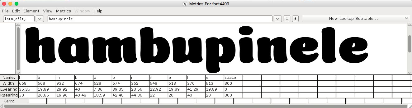
The last week I was working in Fontforge with kerning and I had some crash problems usingclasses and I had to work with individuals pairs. I've been learning a lot of FF with this project and in general is working good for me.
https://github.com/marcelommp/Coiny
