Caveat Cyrillic
423 views
Skip to first unread message

Alexei Vanyashin
Sep 20, 2017, 2:24:23 AM9/20/17
to Google Fonts Discussions
Hi
I am happy to be working on a Cyrillic extension for Caveat in collaboration with a professional calligrapher whom I will introduce in next posts.
Caveat is a handwritten font by Pablo Impallari with contextual alternates for basic Latin glyphs. The OT code is described in this Glyphs tutorial. A similar approach will be used for the Cyrillic subset with three alternating glyph for the core range, and a single glyph for extended Cyrillic.
Alexei Vanyashin
Sep 20, 2017, 3:56:21 AM9/20/17
to googlefonts-discuss, Pablo Impallari
Hola Pablo! I am adding you to this thread so you can keep track of Caveat Cyrillic project. Here is my git fork.
I would like to ask what instrument you were using to create original Caveat drawings, and what scale were the letters drawn in.
Did you achieve the rough edges effect on paper or digitally?
Did you achieve the rough edges effect on paper or digitally?
A calligrapher will be working on the Cyrillic sketches, and I am attaching a PDF template that he will be using. I anticipate your answer.
--
You received this message because you are subscribed to a topic in the Google Groups "Google Fonts Discussions" group.
To unsubscribe from this topic, visit https://groups.google.com/d/topic/googlefonts-discuss/ByQjaXzrgFM/unsubscribe.
To unsubscribe from this group and all its topics, send an email to googlefonts-discuss+unsubscribe...@googlegroups.com.
To post to this group, send email to googlefonts-discuss@googlegroups.com.
Visit this group at https://groups.google.com/group/googlefonts-discuss.
To view this discussion on the web visit https://groups.google.com/d/msgid/googlefonts-discuss/c6b2cf50-0697-4866-88e2-fddb3c0103c2%40googlegroups.com.
For more options, visit https://groups.google.com/d/optout.
Alexei Vanyashin
Sep 20, 2017, 4:00:01 AM9/20/17
to googlefonts-discuss
Now, back to my project log.
Upon examining the sources I realize the Bold style is an emboldened version of Regular. So I will be working with the Regular weight, and use an offset filter to create the Bold style, after which some cleanup will be required.

I measured the stems in H to get offset Values.
93 – 86 = 28.
28 divided by half is 14, the value for Horizontal Stem gain.

Applying the filter to make Bold.

Going
from Bold to Regular via offset gives similar artefacts. I bet Pablo
used a FontLab filter or a script, since the number of point is the same
across styles in the sources.

Glyphs App will show contextual alternates in the Type Preview if the respective feature [calt] is on.

But if you are old-fashioned and prefer the hard way like myself you can use a bit of Regex to achieve the same result.


Copying this list into Glyphs will yield the same results. I studied this tutorial to learn Regex, which comes very handy for such cases.
Before
expanding a font, I always start checking the marks. Caveat lacked
combing marks, which I quickly created using mekkablue's 'Combing Mark Maker' script.

Left: Regular. Right: Bold. The .cap marks for Bold are the ones from Regular. I think this is unintentional and should be fixed.
Alexei Vanyashin
Sep 20, 2017, 4:38:43 AM9/20/17
to googlefonts-discuss
It's time to show the overall progress.
A good starting point for Cyrillic is creating "free" glyphs from Latin Components. 
Г was derived from Latin F, with a little angle correction.

Perhaps a little redundant.
Followed by a bit more complex glyphs using a mix-and-match approach. For /ф I used default /d and /p from Stylistic Set 2 to
avoid redundancy while maintaining coherency with the original concept.

Mixing styles — better.
Using this logic here is the maximum number of glyphs I was able to create without any drawing. These glyphs can now be used for first PDF text tests and provide a baseline for adding new glyphs.


x — marks glyphs that need to be properly re-drawn.

The two scripts look coherent to me. At the same time I see what Cyrillic glyphs pop out and should be redrawn properly. I have marked them with X's in the above images.
Now, let me introduce my collaborator Eugene Spizh who is a Cyrillic calligrapher that loves brush-script. He is based in Kiev and teaches various calligraphy styles.
I created a template for the Eugene where he can practice copying existing Latin glyph to taste the font's spirit.

After studying existing glyphs, Eugene will start on Cyrillic. Together, we will choose the default forms and alternates.

For key glyphs I created a special template where the letter in question is missed.

The templates and PDF test sheets can be found the sources folder in the git repo:
In my next post I will show Eugene's first sketches, and how they align with the font in overall.

Dave Crossland
Sep 20, 2017, 8:14:11 AM9/20/17
to googlefonts-discuss
This thread is fantastic! Thank you Alexei
Alexei Vanyashin
Sep 27, 2017, 4:50:38 AM9/27/17
to googlefon...@googlegroups.com
Eugene sent me his first digitized sketches:


In this image I added a bent line imitating the left stem of H to check the letter's alignment and picked a single letter of each to add to the set. My first impression was that the slant angle is too strong, and the letter-skelet needs to be more strict.
I liked how the contour is edgy and how it matches the Pablo's marker style.
Sample /П from original sketch

But I though the form is too sloppy and should be aligned with neighbouring letters using guides.
Top /П is from the original sketch, and bottom is my first correction.

More letter from original sketch. Perhaps to much jumping.

This image shows how I alligned the original imported glyphs with stems of H. Bottom is corrected version.

After adding a single letter of each, and some clean-up I fired up Font Testing Page to compare the new Cyrillic glyphs in regard to Latin. I realized Cyrillic is trying to be too nice, and quiet. While Latin is screaming and partying hard.

This is mainly due to the differences in horizontal stem heights. Latin glyphs are jumping all around the baseline, while Cyrillic are firmly tied to it.
To remedy this I made more alterations to stem heights, and added various baseline h-offsets. This is a step back towards the Eugene's sketches.

This seems a closer match too me.
More glyphs ahead.
On Wed, Sep 20, 2017 at 4:14 PM Dave Crossland <da...@lab6.com> wrote:
This thread is fantastic! Thank you Alexei
--
You received this message because you are subscribed to a topic in the Google Groups "Google Fonts Discussions" group.
To unsubscribe from this topic, visit https://groups.google.com/d/topic/googlefonts-discuss/ByQjaXzrgFM/unsubscribe.
To unsubscribe from this group and all its topics, send an email to googlefonts-dis...@googlegroups.com.
To post to this group, send email to googlefon...@googlegroups.com.
Visit this group at https://groups.google.com/group/googlefonts-discuss.
To view this discussion on the web visit https://groups.google.com/d/msgid/googlefonts-discuss/CAEozd0wB%2BKxNTPZK99LnExUsDCcac6dhSXiyhWXRT5vpoC3H1w%40mail.gmail.com.
Dave Crossland
Sep 27, 2017, 2:29:49 PM9/27/17
to googlefonts-discuss
Love it - your corrections look good tome
Alexei Vanyashin
Oct 2, 2017, 2:42:08 AM10/2/17
to googlefon...@googlegroups.com
Adding more calligraphic glyphs from sketches. I starred default characters.

/Д from original sketch

Corrected /Д.

I like that the original marker sketches have a strong vibrant character. It is easier to neutralize a glyph rather than squeezing out its expressivity.
Some other glyphs require a contrast correction
Ц. before:

Ц. after:

Now it's time to test the new glyphs in words.

Lowercase. Starred glyphs were used for the default shape:

The new lowercase glyphs require a bit more corrections.

By looking at the Title Case test I have concerns on glyphs /щ and /т


Instead of too fancy cursive glyphs I think we should try the typographic blocky forms. A simpler shape will be create less dissonance with the original Latin font.
Schematically drawn /щ and /т if you excuse my poor pencil drawing skills in Sketch App.
On Wed, Sep 27, 2017 at 10:29 PM Dave Crossland <da...@lab6.com> wrote:
Love it - your corrections look good tome
--
You received this message because you are subscribed to a topic in the Google Groups "Google Fonts Discussions" group.
To unsubscribe from this topic, visit https://groups.google.com/d/topic/googlefonts-discuss/ByQjaXzrgFM/unsubscribe.
To unsubscribe from this group and all its topics, send an email to googlefonts-dis...@googlegroups.com.
To post to this group, send email to googlefon...@googlegroups.com.
Visit this group at https://groups.google.com/group/googlefonts-discuss.
To view this discussion on the web visit https://groups.google.com/d/msgid/googlefonts-discuss/CAEozd0w4HPhk7x4W6BakEk28hNVDjeLaupnZzUng2qopQ%3DqQ8Q%40mail.gmail.com.
Alexei Vanyashin
Oct 7, 2017, 7:56:13 AM10/7/17
to googlefon...@googlegroups.com
Here are more sketches of UC glyphs:


and here are the remaining core lowercase glyphs:


After adding new glyphs and updating a few existing I have highlighted the ones I am not happy about.

Another concern is the /б. I made an illustration for the calligrapher to show what I need. It is falling to the left, and I would like to see two forms. I used o.ss01 as a base for /б in my sketch.

Another issue is with /Л. It mimics the curves of /E.

But I would like to see it match against /П:

Here is a gif showing three iterations of my adaptation and adjustment work:

Alexei Vanyashin
Oct 7, 2017, 8:04:42 AM10/7/17
to googlefon...@googlegroups.com
At this stage the core glyph set is complete, and there are four new sketches of letters pending to be replaced.


I think it is time for more fine-tuning, such as working on a color. I have reduced the amount of black in several glyphs:
it should be tested against Latin lowercase
UC Cyrillic:
UC Latin:
One more test I will show you today — a wordlist of lowercase, uppercase, and title case:
Dave Crossland
Oct 7, 2017, 8:24:53 PM10/7/17
to googlefonts-discuss
Fabulous!!
Alexei Vanyashin
Oct 12, 2017, 11:31:31 AM10/12/17
to googlefon...@googlegroups.com
Thank you, Dave!
As were are getting ready for the first Core Cyrillic release Eugene shared photos of his creative process behind all the sketches. It's a giant pile of work:


--
You received this message because you are subscribed to a topic in the Google Groups "Google Fonts Discussions" group.
To unsubscribe from this topic, visit https://groups.google.com/d/topic/googlefonts-discuss/ByQjaXzrgFM/unsubscribe.
To unsubscribe from this group and all its topics, send an email to googlefonts-dis...@googlegroups.com.
To post to this group, send email to googlefon...@googlegroups.com.
Visit this group at https://groups.google.com/group/googlefonts-discuss.
To view this discussion on the web visit https://groups.google.com/d/msgid/googlefonts-discuss/CAEozd0ySX6tiZCa7fyNcnGimUteNJ81VExJFWUD2-hBKoT7t%2BQ%40mail.gmail.com.
Alexei Vanyashin
Oct 16, 2017, 11:59:49 AM10/16/17
to googlefon...@googlegroups.com
I have updated a few glyphs that were in dubious with these new ones:


Then I worked on the Bold version. New glyphs were created using an offset filter, and each manually cleaned up and adjusted.
First outcome:
After adjusting the darkness to match the Latin:
Metrics were adjusted and a few kerning pairs added in Both styles. There are no kerning groups at this stage, and I doubt their value. (Except for accented characters)
kerning Regular:
For checkin metrics and kerning I also used this grid test:
Alexei Vanyashin
Oct 16, 2017, 12:14:00 PM10/16/17
to googlefon...@googlegroups.com, Marc Foley
Hi Marc
Caveat v.1.300 adds support for GF Cyrillic Core:
— 129 new Cyrillic glyphs (117 new encoded glyphs)
— fixes #4
It passes GF QA test, and fontbakery. WinAscent and WinDescent have been changes as per GF QA recommendations:
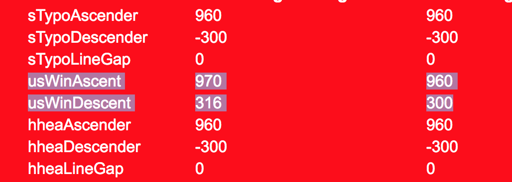
Regression Test shows no vertical metrics changes: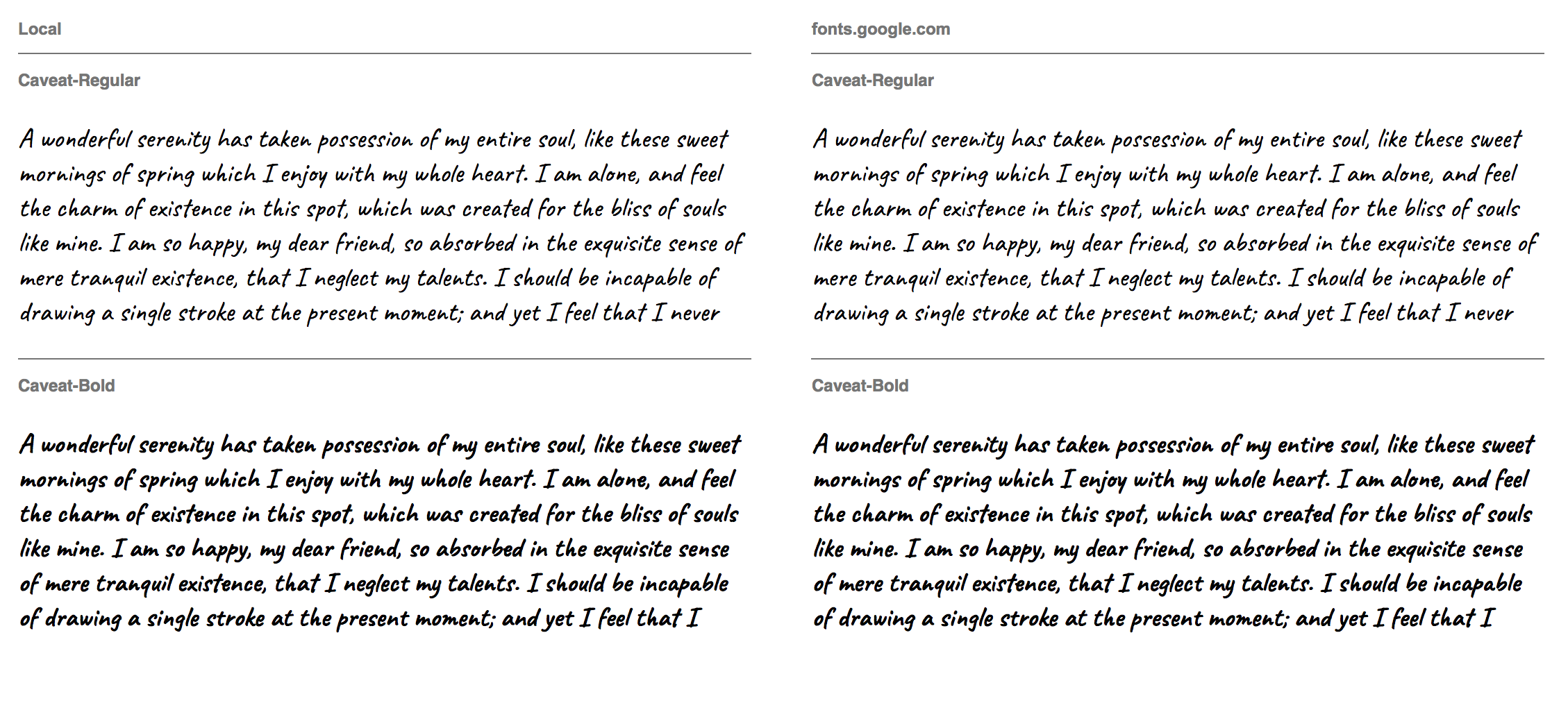
This is the first release for Caveat Cyrillic. Next update will add support for GF Cyrillic Pro, and alternate Cyrillic glyphs.
Alexei Vanyashin
Nov 7, 2017, 1:35:32 PM11/7/17
to googlefon...@googlegroups.com
Caveat Cyrillic has been pushed live:

But we are still continuing to work on Cyrillic Pro expansion. I suggested some historical samples of cursive forms:

Which Eugene incorporated in his new round of sketches:


Initially I suggested a straight-top Ѵ U+0474, but later I realized this was a mistake and asked Eugene to make a soft curve as in Amatic.

Here is the updated Ѵ:

It is now a better fit.
I feel that choosing handwritten forms was a correct decision. They were not easy to find for some of the extended set. A drawn ӄ is better than one made from components, and adds more variety. Which is inline with the rotating alternates in the Basic Sets.
Current state of affairs:

Alexei
Dec 15, 2017, 10:15:37 AM12/15/17
to googlefon...@googlegroups.com
Caveat (v1.500) now fully supports Cyrillic Pro, has Cyrillic kerning and the rotating calt feature.
The update is waiting to be rolled out.

Dave Crossland
Dec 15, 2017, 10:19:32 AM12/15/17
to googlefonts-discuss
Thank you Alexei!
Reply all
Reply to author
Forward
0 new messages