Amatic SC Hebrew

242 views
Skip to first unread message

Ben Nathan

unread,
Oct 27, 2015, 3:51:27 PM10/27/15
to Google Fonts Discussions
Hi All,

Here's a new Hebrew version I started working on:


The git for my Hebrew version - https://github.com/hafontia/Amatic_SC

This one is kinda funny but it's a challenge as well. I will try to make it feel like a grownup draw child's letters and not the other way around :)
I started my design with the Bold - after i'll finalise it i'll draw the regular, do spacing and add Nikud.

Good Night!
Ben 

Meir Sadan

unread,
Oct 28, 2015, 10:02:19 AM10/28/15
to Google Fonts Discussions
Oh! Cool :> I love some of the details like the bottom tail on the ל lamed and high joining in the צ tsadi.
Here are some quick points:
I think the ו vav and י yod need their top horizontal strokes ("roofs") - to better fit with the serifed capital I from the original latin font.
Maybe try a sharp corner on the top left of פ pe and ף final pe?
Also, the Hebrew looks a bit narrower than the latin, which has several letters made arbitrarily wider. Maybe play a bit more with the overall widths?
Good stuff.

Ben Nathan

unread,
Oct 28, 2015, 7:57:31 PM10/28/15
to Google Fonts Discussions
Hi Meir !

Good points, thanks!
I will try playing with the widths, and while i'm at it i'll try to play with the baseline, some Amatic letters dance around it, gives the font a nice shake :)
I agree about the Yud/Vav, and i'm searching for more places to add fun details, maybe add a twirl to the ז stem? 
פ will be redesigned, I feel the ג could be better, it's a little sloppy-funny now
Next post I will add tests with English so we could see the relationships better.

Cheers!
Ben

Dave Crossland

unread,
Oct 29, 2015, 4:04:46 AM10/29/15
to googlefon...@googlegroups.com

Hi

I'd prefer to leave the Latin intact as much as possible, but if you see things that are obvious 'mistakes' then please do mention them here as it would be great if you could fix them as part of this work :) 

Vernon made almost all of his fonts very quickly and there are doubtless some rough edges in most of them :) 

Cheers
Dave

Ben Nathan

unread,
Nov 1, 2015, 4:43:26 AM11/1/15
to Google Fonts Discussions
Thanks Dave!

Here's a new version, I added the regular weight and did some changes to the Hebrew like:
- Yud & Vav got a roof
- Pe got a straight roof,
- Small changes in all the letters, I'll keep on working on it.

Next - Add Nikud and test the font further in order to space it right and adjust all the letter form to fit the Latin.

See image:


Cheers,

Ben

Ben Nathan

unread,
Nov 3, 2015, 5:08:40 PM11/3/15
to Google Fonts Discussions
Hi All,

Updates:
- Added Nikud.
- Fixed some of the letters and made the כ longer (thanks Meir!).
- Spacing and kerning.

Check out the test PDF at github.


Cheers!
Ben

Liron Lavi Turkenich

unread,
Nov 10, 2015, 2:56:44 AM11/10/15
to Google Fonts Discussions
Hi Ben!

I really like the style and atmosphere you gave the Hebrew. I have a feeling it will become very popular for display. A tiny tiny thought I had (hope it's not too late!) - I think that the Samech (ס) and Tet (ט) are a bit to similar, and could cause a challenge in readability is smaller sizes. 

Have a lovely day,
Liron

Ben Nathan

unread,
Nov 10, 2015, 7:44:19 AM11/10/15
to Google Fonts Discussions
Thanks Liron! 
I added a roof to the Samech.

I finished working on the font - Please review the final version at my github page.

I've made a master with regular and bold (with no interpolation, just for an easier work). 
And I've made small changes to the Latin on the way in order to make a nice Glyphs master file :)


* Here you'll find a PDF sample showcasing the font.


Cheers!
Ben

Liron Lavi Turkenich

unread,
Dec 22, 2015, 10:19:03 AM12/22/15
to Google Fonts Discussions

Hi Ben, 


As I wrote before, I think this typeface is very good and a lot of fun. I think you have done a great job with the details, and it is working really well with the Latin in terms of harmonisation and weight. 

Few small notes: 


- Some glyphs that are missing: the Sheqel symbol (uni20AA), the upper Maqaf (uni05BE), Geresh (uni05F3), Gershaym (uni05F4)

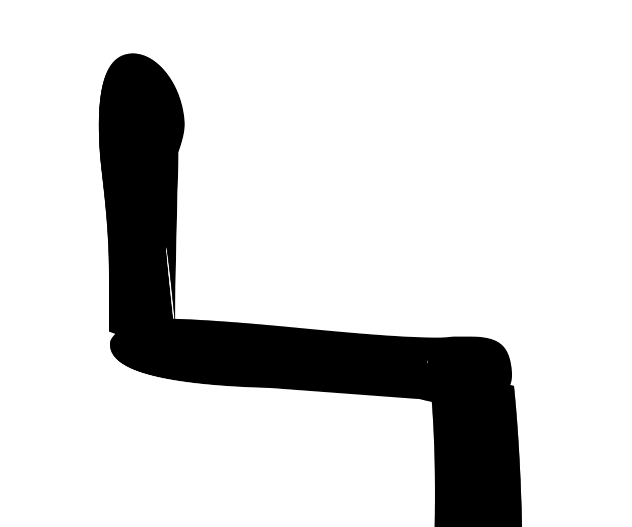
- By looking at the glyphs (on Glyphsapp) in a very large size, I could see that the Lamed has some strange things going on with white string inside the black (the construction of the glyph

Same in the Nun. 


- The Holam in the Vav should be in the middle. Right now its far to the left. 


- Even though you already added a roof to the Samech, I still think that the Tet is a bit too similar. Perhaps bringing the middle stroke of the Tet a bit downward?

- Perhaps this is personal taste, but I think the arm of the Ayin is too wiggely. I think it can be mellowed a little. 

- I think the leg of the Kuf is too close to the rest of it (especially in the bold weight).

- One more tiny detail, I think that some kerning should be between Resh and period (same with the similar characters and the comma).


I really like the outstroke of the Pe. And I can definitely see people using it for children’s stories and many other fun stuff!


Have a lovely day, 

Liron 


Ben Nathan

unread,
Dec 25, 2015, 6:23:24 AM12/25/15
to Google Fonts Discussions
Hi Liron !

Thank you for your insightful inputs, I fixed all the errors and updated the git page - https://github.com/hafontia/Amatic_SC/tree/master/Glyphs

Happy Xmas :)
Ben
Reply all
Reply to author
Forward
0 new messages