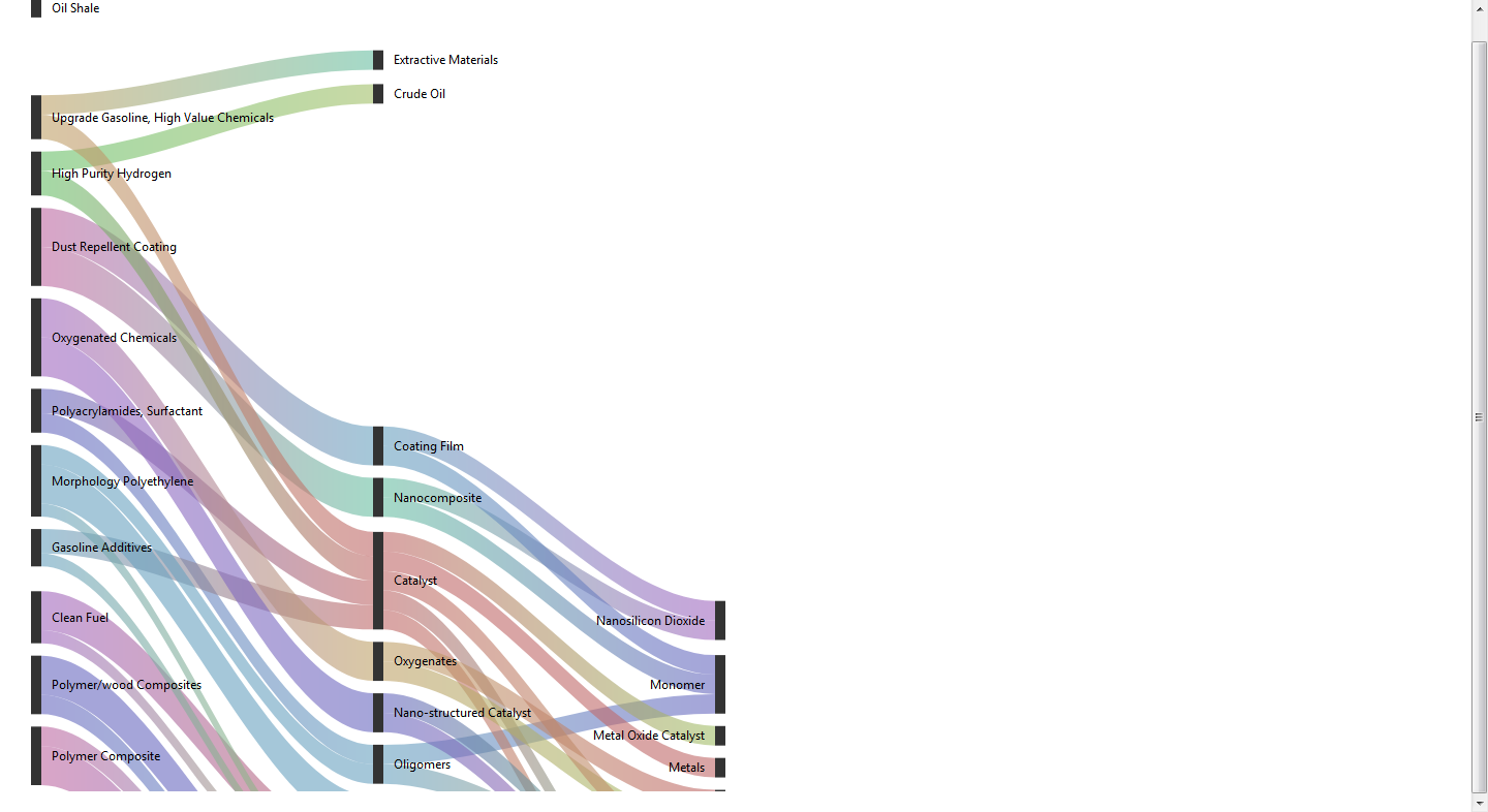
Sankey diagram cut off from the bottom
1,459 views
Skip to first unread message

issa
Feb 5, 2019, 1:47:50 AM2/5/19
to Google Visualization API
Hello,
I'm using Google Charts' Sankey diagram. Due to its aligning the image to the bottom of the bottom most source node and cutting everything beneath it it's removing some links and nodes in the process (see attached image). Is there anyway I can assign some padding to the bottom or tell it to align the nodes to the center instead of the bottom (which would also lead to more visually appealing more symmetrical diagrams)?
Thanks,
Issa
Issa

Susenthiran Jayaraman
Feb 5, 2019, 2:50:05 AM2/5/19
to google-visua...@googlegroups.com
Hi issa.
i want to show 50 legends on google pie chart, then it's shows navigate button, but when i take printout only print on visible legends, not print all legends. any one help me?
--
You received this message because you are subscribed to the Google Groups "Google Visualization API" group.
To unsubscribe from this group and stop receiving emails from it, send an email to google-visualizati...@googlegroups.com.
To post to this group, send email to google-visua...@googlegroups.com.
Visit this group at https://groups.google.com/group/google-visualization-api.
To view this discussion on the web visit https://groups.google.com/d/msgid/google-visualization-api/3cbaa57c-d26f-4c76-ad1d-7ffc67f4e287%40googlegroups.com.
For more options, visit https://groups.google.com/d/optout.
Thanks & Regards,
J.Susenthiran

RickW
May 13, 2019, 10:37:04 AM5/13/19
to Google Visualization API
I'm having a similar problem, that data gets cut off at the bottom. Is there a practical limitation on the number of entries? Because changing the height option only increases the size of the diagram's elements and it cuts off at the same place.
Thanks,
Rick

Sina Bahrami
Aug 8, 2019, 5:35:53 AM8/8/19
to Google Visualization API
Did you find a solution? I have the same problem.

Charles Friedo
Jul 5, 2021, 11:29:41 AM7/5/21
to Google Visualization API
Hello,
Installation Sources:
I would love to share with you how to visualize your data through Sankey diagram in Google Sheets and Excel.
Sharing video on How to create Sankey diagram.
I used ChartExpo™ to make charts in just few clicks.
ChartExpo™ is both an Excel and Google Sheets data visualization tool.
What makes it so easy is that since it works perfectly with both spreadsheets, you can use it with your favorite spreadsheet.
You can easily use ChartExpo™ without any knowledge of coding or programming.
ChartExpo™ has over 80 visualizations in its library.Installation Sources:
Google Sheets: https://chartexpo.com/utmAction/MTErY29tbXVuaXR5K2dzK1NCK0dHKw==
MS Excel & 365: https://chartexpo.com/utmAction/MTErY29tbXVuaXR5K3hsK1NCK0dHKw==
Regards.
MS Excel & 365: https://chartexpo.com/utmAction/MTErY29tbXVuaXR5K3hsK1NCK0dHKw==
Regards.
Reply all
Reply to author
Forward
0 new messages