Re: google corechart: uniqe bar colors, uniqe labels on h axis
153 views
Skip to first unread message

asgallant
Jan 3, 2013, 11:33:25 AM1/3/13
to google-visua...@googlegroups.com
X-axis labels are determined by the domain column (the first column in the DataTable typically). Use a "string" type column, with the custom labels for all your data rows where you want axis labels. All of the rows where you don't want labels should have an empty string in this column. Making some bars a different color is possible under certain circumstances, but more difficult to implement (you must have some way to distinguish which bars you want to change color in the DataTable; this becomes easier if you want all of the labelled bars to be a different color). Here's an example: http://jsfiddle.net/asgallant/hcALL/
On Thursday, January 3, 2013 3:43:18 AM UTC-5, light...@gmail.com wrote:
On Thursday, January 3, 2013 3:43:18 AM UTC-5, light...@gmail.com wrote:
hi,
I'm new in google api, and not expert in programming :)
I find some examples and I've created a working "corechart".
How can I change some bar's color, and how can I add custom labels to the H-axis for this bars?
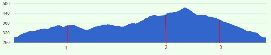
Here is a picture what I want to create:
thank's for any help

light...@gmail.com
Jan 3, 2013, 11:48:05 AM1/3/13
to google-visua...@googlegroups.com
ohohooooo!! :)
thank you very mutch!!
thank you very mutch!!
asgallant
Jan 3, 2013, 11:49:17 AM1/3/13
to google-visua...@googlegroups.com
You're welcome.
Reply all
Reply to author
Forward
0 new messages