I need to add the averages of the values to my chart of type "ChartAreas".
296 views
Skip to first unread message

José Vicente Zahonero
Apr 29, 2023, 3:59:39 AM4/29/23
to Google Visualization API
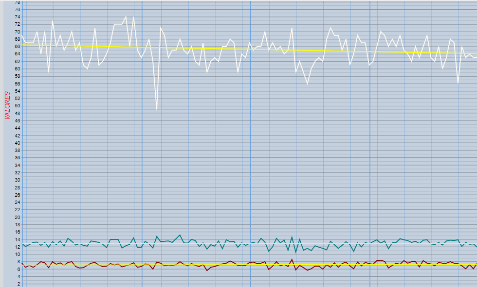
Hi, I have an area chart in which I represent some values taken from a csv file. I would like to be able to add the averages corresponding to each column to the graph, can you help me?
My code is in the attached file.
Thanks for you help.

Ray Thomas
Apr 30, 2023, 7:41:03 PM4/30/23
to Google Visualization API
The quickest way is to add a trendline to the graph. Add this something like this under your series statements in the options secion:
trendlines: {
0:{type: 'linear', color: 'yellow', visibleInLegend: true, lineWidth:2},
1:{type: 'linear', color: 'yellow', visibleInLegend: true, lineWidth:2},
2:{type: 'linear', color: 'yellow', visibleInLegend: true, lineWidth:2},
3:{type: 'linear', color: 'yellow', visibleInLegend: true, lineWidth:2}
},
0:{type: 'linear', color: 'yellow', visibleInLegend: true, lineWidth:2},
1:{type: 'linear', color: 'yellow', visibleInLegend: true, lineWidth:2},
2:{type: 'linear', color: 'yellow', visibleInLegend: true, lineWidth:2},
3:{type: 'linear', color: 'yellow', visibleInLegend: true, lineWidth:2}
},
Trendlines do not work on discrete data such as strings, so you have to change your CSV file to the preferred date format which for a CSV file is yyyy-MM-dd or do it in the datatable. The trendline help is at https://developers.google.com/chart/interactive/docs/gallery/trendlines
Trendlines are not averages, so if you really need those you need to create new columns in the datatable and calculate them yourself. The example in the ComboChart help at https://developers.google.com/chart/interactive/docs/gallery/combochart uses the averages of the row data but you need it for the column data. So you'll need 4 new columns, one for each of the current columns, and each of the new columns will contain all the same number, the column averages.
Another method of getting the averages is to use the aggregation method. The help for that is at https://developers.google.com/chart/interactive/docs/reference#data-manipulation-methods. Because that depends on grouping the data, you are going to need a new column containing a single value in all the rows so they can be grouped together. How to use this properly has come up fairly often so there are examples on Stack Overflow. Here are some:
I don't know who WhiteHat is, but they certainly know their way around the API.
José Vicente Zahonero
May 1, 2023, 2:12:51 AM5/1/23
to Google Visualization API
Hi, I have tried changing the format of the dates to 'yyyy-MM-dd' in the csv and I have added the code you have indicated but it doesn't show me any average line in the graph.
Ray Thomas
May 1, 2023, 6:50:00 AM5/1/23
to Google Visualization API
I used a LineChart because Trendlines only work on Scatter Charts, Bar Charts, Column Charts, and Line Charts.
Sorry, I should have explained that in my answer.
I also don't have PHP installed so what I did was use a query to open the CSV file after I rewrote the dates. The complete code I used is at https://brisray.com/test/jose.htm (which is where the screenshot came from) and the CSV file is at https://brisray.com/test/jose.csv
José Vicente Zahonero
May 1, 2023, 7:59:37 AM5/1/23
to Google Visualization API
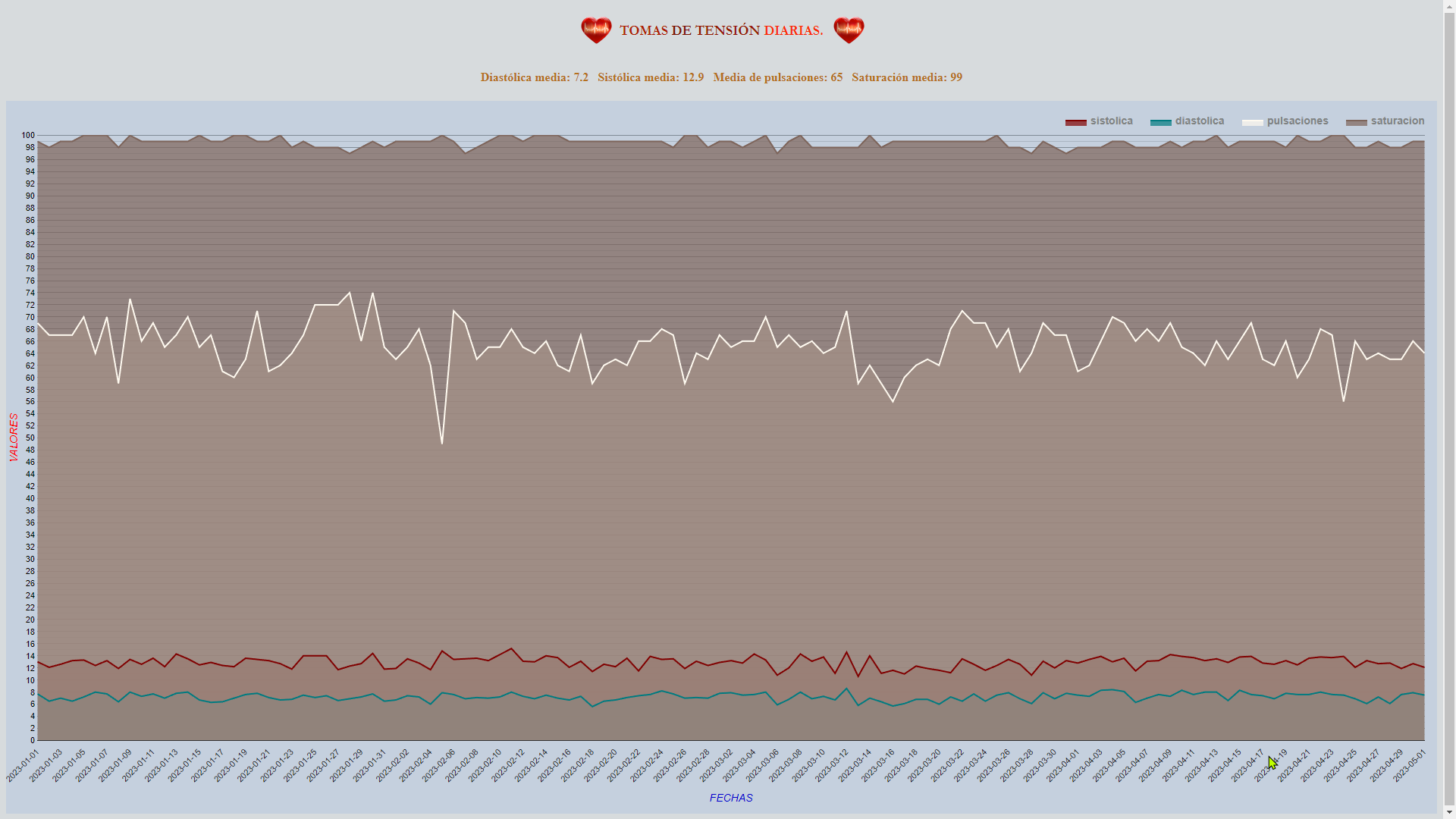
Hi, I have modified my HTML-PHP file with your specifications and I still can't see the lines with the averages. The only difference between your proposal and mine is the way to create the csv file, I create it from a Postgres query and you do not. I attach the code I have and a screenshot of what it returns. Best regards.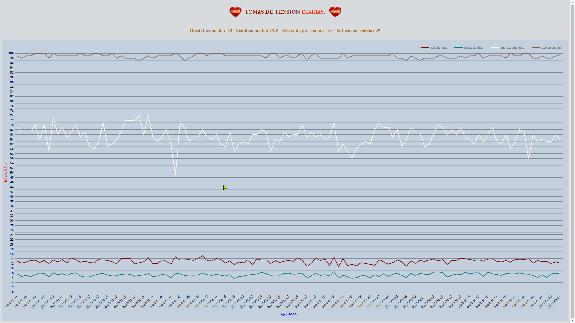
Ray Thomas
May 1, 2023, 7:34:17 PM5/1/23
to Google Visualization API
When CSV files are used by the API, it guesses the data type of each column. It's reading the number columns properly but I think it is importing the date as a string and so cannot graph it on a trendline.
From https://developers.google.com/chart/interactive/docs/reference#google.visualization.arraytodatatable you can change the header of the CSV file to {label: 'fecha', type: 'date'},sistolica,diastolica,pulsaciones,saturacion
José Vicente Zahonero
May 2, 2023, 12:07:58 AM5/2/23
to Google Visualization API
Hi, I have just read the documentation in the link you sent me and it didn't clarify much, to be honest. When I convert the table to csv the columns are specified in the database, moreover, then I convert that csv to Excel and there is no problem when it comes to differentiate the dates from the numbers to calculate the averages.
Anyway, what I want to embed is a line with the average of each column, not the trend it has. I don't know if I've made myself clear.
I'm sorry if I'm wasting your time. I thank you for the trouble you are taking with my problem.
Translated with www.DeepL.com/Translator (free version)
Anyway, what I want to embed is a line with the average of each column, not the trend it has. I don't know if I've made myself clear.
I'm sorry if I'm wasting your time. I thank you for the trouble you are taking with my problem.
Translated with www.DeepL.com/Translator (free version)
Ray Thomas
May 4, 2023, 10:16:35 PM5/4/23
to Google Visualization API
Aftere reading all the links I gave (several times), I finally worked this out. It confused me why so many tables seemed to be made. Here's the sequence of events:
1) Import the data into a datatable
2) Create a new table view with the grouping data and averages . As all the data is being used, the grouping data is all the same (in this case an empty string). Then use then aggregation to calculate the averages.
3) Create the averages variables from the above table view - they are all going to be the same.
4) Make a new view from the original datatable and add the the calcuated averages to new columns.
What I did was start from scratch to make things clearer:
<script src="https://www.gstatic.com/charts/loader.js"></script>
<script>
google.charts.load('current', {'packages':['corechart']});
google.charts.setOnLoadCallback(drawChart);
function drawChart() {
var queryOptions = {
// Define the CSV data columns
csvColumns: ['date', 'number', 'number', 'number', 'number'],
// This should be false if your CSV file doesn't have a header
csvHasHeader: true
}
// Create the query giving the path and name of the CSV file
var query = new google.visualization.Query('jose.csv', queryOptions);
query.send(handleQueryResponse);
}
function handleQueryResponse(response) {
if (response.isError()) {
alert('Error in query: ' + response.getMessage() + ' ' + response.getDetailedMessage());
return;
}
var dataTable = response.getDataTable();dataTable
//Create the averages using aggregation
var averages = google.visualization.data.group(
dataTable,
// The first column is what to group on, in this case an empty string
[{column: 0, type: 'string', modifier: function () {return '';}}],
[
{column: 1, type: 'number', aggregation: google.visualization.data.avg},
{column: 2, type: 'number', aggregation: google.visualization.data.avg},
{column: 3, type: 'number', aggregation: google.visualization.data.avg},
{column: 4, type: 'number', aggregation: google.visualization.data.avg}
]
);
// Put the calculated averages into variables
var diastolAvg = averages.getValue(0, 1);
var sistolAvg = averages.getValue(0, 2);
var pulsaAvg = averages.getValue(0, 3);
var saturaAvg = averages.getValue(0, 4);
// Create a new view from the table and add the averages
var dataView = new google.visualization.DataView(dataTable);
dataView.setColumns([0, 1, 2, 3, 4, {
label: 'diastolAvg',
type: 'number',
calc: function (dt, row) {
return diastolAvg;
}
}, {
label: 'sistolAvg',
type: 'number',
calc: function (dt, row) {
return sistolAvg;
}
}, {
label: 'pulsaAvg',
type: 'number',
calc: function (dt, row) {
return pulsaAvg;
}
}, {
label: 'saturaAvg',
type: 'number',
calc: function (dt, row) {
return saturaAvg;
}
}]);
var options = {
series: {
0:{type: 'area'},
1:{type: 'area'},
2:{type: 'area'},
3:{type: 'area'},
4:{type: 'line'},
5:{type: 'line'},
6:{type: 'line'},
7:{type: 'line'}
}
};
var joseChart = new google.visualization.ComboChart(document.getElementById('joseChart-div'));
joseChart.draw(dataView, options);
}
</script>
<div id="joseChart-div" style="width:100%; height:900px;"></div>
You should be able to add all your options back into this. You can see this simplified chart at https://brisray.com/test/jose-simple.htm
Just so I don't forget how to do this, I've also started a new page - https://brisray.com/google-charts/calcs.htm - where it should permanently along with some other bits and pieces.
Like most things, it's easy once you understand what's going on.
José Vicente Zahonero
May 5, 2023, 4:21:37 AM5/5/23
to Google Visualization API
First of all, thanks you for your time. I have just tried your code and first of all I get an error when I try to run it, it says "b.getTimezoneOffset is not a function". Apart from that, I have tried to add a variable to the path of the csv file so that each year it reads the corresponding file and I don't have to change it every year but it also gives me an error. I want to solve first the problem of the error and then the problem of the path to the file.
I leave the code for you to have a look. Thanks a lot.
I leave the code for you to have a look. Thanks a lot.
Ray Thomas
May 5, 2023, 6:11:18 AM5/5/23
to Google Visualization API
You are getting the "b.getTimezoneOffset is not a function" error because the date in CSV file is in the wrong format. This is your original format:
01-01-2023,7.7,13.0,69,99
02-01-2023,6.5,12.1,67,98
03-01-2023,7.0,12.6,67,99
02-01-2023,6.5,12.1,67,98
03-01-2023,7.0,12.6,67,99
It should be:
2023-01-01,7.7,13,69,99
2023-01-02,6.5,12.1,67,98
2023-01-03,7,12.6,67,99
2023-01-02,6.5,12.1,67,98
2023-01-03,7,12.6,67,99
It really is fussy about how the dates are arranged in CSV files. You can see the difference more clearly by opening the file in a text editor like Notepad rather than something like Excel. When I tried it, the dates are shown as being in the same format, but they are not.
But there's an easy way to fix this. In the line:
csvColumns: ['date', 'number', 'number', 'number', 'number'],
Change date to string, so it becomes:
csvColumns: ['string', 'number', 'number', 'number', 'number'],
That way it doesn't matter what format the date is in. The only downside is that you are now using discrete text values for the first column, not a continuous date series. Depending on what you want to do, that may not matter.
Ray Thomas
May 5, 2023, 6:52:18 AM5/5/23
to Google Visualization API
The second bit is easier. I created copies of the CSV file and changed the year in them, now I had three files to test this on, jose-2022.csv, jose-2023.csv and jose-2024.csv.
// Create the query giving the path and name of the CSV file
var query = new google.visualization.Query('jose.csv', queryOptions);
query.send(handleQueryResponse);
// Create the query giving the path and name of the CSV file
To get the current year in JavaScript use new Date().getFullYear();
Then it's just a matter of creating the new file name from that and importing it. So,
var query = new google.visualization.Query('jose.csv', queryOptions);
query.send(handleQueryResponse);
}
Use a variable where the file name string was, so the above is now:
var thisYear = new Date().getFullYear();
var fileName = 'jose-' + thisYear + '.csv';
var fileName = 'jose-' + thisYear + '.csv';
// Create the query giving the path and name of the CSV file
var query = new google.visualization.Query(fileName, queryOptions);
query.send(handleQueryResponse);
}
query.send(handleQueryResponse);
}
To get the jose-2022.csv file, you could use:
var lastYear = new Date().getFullYear() - 1;
var fileName = 'jose-' + lastYear + '.csv';
var fileName = 'jose-' + lastYear + '.csv';
And to get the jose-2024.csv file, you could use:
var nextYear = new Date().getFullYear() + 1;
var fileName = 'jose-' + nextYear + '.csv';
var fileName = 'jose-' + nextYear + '.csv';
But that's just standard JavaScript string manipulation.
0 new messages