Problem when using dates in a Line Chart with a trendline
48 views
Skip to first unread message

Bonte
Nov 27, 2015, 4:55:41 AM11/27/15
to Google Visualization API
Hi,
if I plot the same data on a LineChart using Date on the x-axis I get a different result when using an "index" on the x-axis.
For example if I plot
["2015-04-26T15:00:00", 46.20]
["2015-04-26T17:00:00", 43.23]
["2015-04-26T19:00:00", 52.25]
["2015-04-27T09:00:00", 96.19]
["2015-04-27T10:00:00", 41.65]
I get a different result when plotting
[0, 46.20]
[1, 43.23]
[2, 52.25]
[3, 96.19]
[4, 41.65]
It seems that some data are removed when using date.
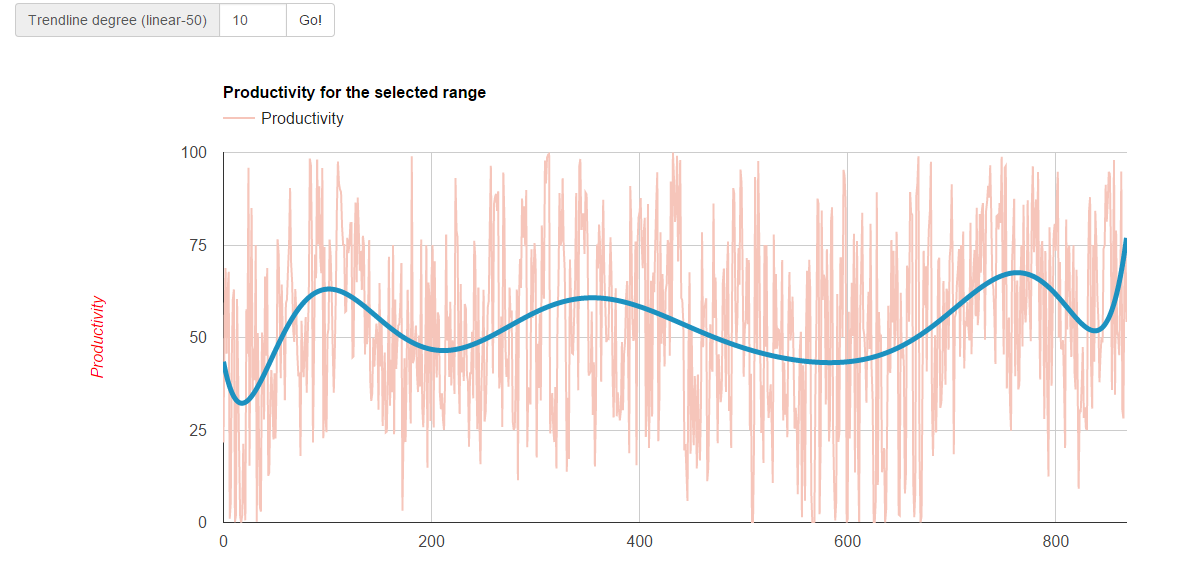
Also: when using date the trendline does not work properly
Here is my code: http://pastebin.com/pMKNZUSM
What's wrong?
In the following pictures the dataset used is the same. Note that the trendline in both graph is polynomial with 10 degree

PS: sorry for my english: is not my native language :)
Bonte
Nov 28, 2015, 9:46:41 AM11/28/15
to Google Visualization API
I have understood why the data "looks different": it is because when using the index 'i' the data are plotted contiguously and when using the Date object some days may be missing so there is some space between the points.
I still have the problem with the trendline...

Sergey Grabkovsky
Nov 30, 2015, 10:07:14 AM11/30/15
to Google Visualization API
Hello Bonte,
The issue with your chart is that it is not using dates. It is using a discrete axis where your values happen to look like dates (of course there's no way the chart can know this). You can find documentation about the numerous ways you can represent dates and times here.
On Sat, Nov 28, 2015 at 9:46 AM Bonte <davide...@gmail.com> wrote:
I have understood why the data "looks different": it is because when using the index 'i' the data are plotted contiguously and when using the Date object some days may be missing so there is some space between the points.I still have the problem with the trendline...
--
You received this message because you are subscribed to the Google Groups "Google Visualization API" group.
To unsubscribe from this group and stop receiving emails from it, send an email to google-visualizati...@googlegroups.com.
To post to this group, send email to google-visua...@googlegroups.com.
Visit this group at http://groups.google.com/group/google-visualization-api.
To view this discussion on the web visit https://groups.google.com/d/msgid/google-visualization-api/d0280458-0bf4-40a4-85ac-623de52caafe%40googlegroups.com.
For more options, visit https://groups.google.com/d/optout.
--
• • • • | Sergey Grabkovsky Software Engineer Google, Inc |

Reply all
Reply to author
Forward
0 new messages